Fundamental Design Elements: The Building Blocks of Great Architecture
Good design doesn’t just show up out of nowhere. It starts with a few simple tools—lines, shapes, balance, texture, color, space—and the way you put them together.
These are the things that make a space feel balanced, interesting, and alive. Without them, you’re just stacking stuff in a room or sketching something that looks okay but feels flat.
So, why should you care? Because these elements aren’t just for architects or designers. They’re for anyone who wants to create something that works—whether that’s a home, a logo, a layout, or a mood.
Down below, we’ll break each one down. No theory dumps. Just the real stuff that helps you notice what works, avoid what doesn’t, and design things people actually connect with.
And once you start seeing these patterns, you won’t unsee them. They show up everywhere—on buildings, in rooms, in posters, in parks. That’s the fun of it. You start designing with more purpose, less guessing.
Let’s take a look at what really holds design together—and how to make it work for you.
Understanding the Basics of Fundamental Design Elements
Understanding the Core Principles of Visual Composition

Image: White concrete building in Brasília, Brazil, demonstrating core principles of visual composition by using bold design elements to highlight the sky and enhance architectural features.
Visuals that work—really work—don’t happen by chance. Behind every great design, there’s a simple set of tools doing the heavy lifting: lines, shapes, color, texture, and form.
These aren’t just “nice to know” concepts. They’re the foundation. Whether you’re working on a painting, a logo, a building, or even just figuring out how to make a space feel right—these elements are what hold it all together.
Down below, we’ll break each one down and show how they work as a team.
Once you get the basics, everything starts to click. You’ll start to see what makes a design feel balanced, how to spot when something’s off, and how to fix it.
Let’s dig in and make sense of the stuff that makes great design actually happen.
How to Master the Basics of Design for Impact
Image: Low-angle view of a building, highlighting the architectural design elements that shape its structure and visual impact.
Before you start memorizing rules, learn how to really see. Not just with your eyes—but with intention.
Great designers walk into a space or glance at a layout and instinctively know what feels right—or why something feels off. That awareness comes from learning the fundamentals and actually spotting them in use.
Forget theory dumps. Here's what works:
1. Train Your Eye
Line, shape, color, texture, space, balance—they’re everywhere.
Study them in rooms, buildings, posters, websites. Ask yourself:
Why does this feel good? Why does this feel off?
The more you look with purpose, the sharper your instincts get.
2. Start Small
You don’t need big projects to get better.
Make a layout with three elements. Rearrange it. Strip it down.
Push it too far. Then pull it back. That’s how you learn proportion and balance.
3. Rework, Don’t Restart
Take something almost-good and fix it.
Tweak just one thing—spacing, color, rhythm.
Focus on what changes, and why it changes the feel.
4. Use Restraint
Beginner mistake? Trying too hard.
Too many colors, shapes, effects.
Good design often comes from knowing when to stop.
5. Test It in Context
Design doesn’t live in a vacuum.
Ask: How does someone use this?
Walk through it. Read it. Interact with it like a real person would.
If it’s a poster, can the message be read in three seconds?
If it’s a space, does it guide people naturally?
6. Feel It—Then Learn Why
Instinct is good. But if you can explain why something works, you’re leveling up.
Saying, “It just feels balanced,” is okay.
But saying, “This works because the contrast pulls focus to the center, while the alignment creates flow”—that’s next level.
The Real Test: Everyday Practice
You get better by doing—not guessing.
Design with fewer elements. Adjust one thing at a time.
Focus on how it feels, not just how it looks.
Real Projects That Prove the Point
We once worked on a small café that had great materials—wood, warm lights—but it still felt off. The fix?
We pulled the lines from the exposed beams into the shelving, softened shapes, and tweaked contrast.
The change wasn’t dramatic—but suddenly, everything felt connected.
Same lesson in a school signage project.
The signs looked great on paper, but people got lost.
It wasn’t a color issue—it was flow.
We rethought placement, aligned spacing, and used consistent line thickness. The signs became useful—not just decorative.
Good design starts by noticing what’s already there—and making it better.
Quick Reminders to Keep You Grounded
▪ Train your eye – Study design that works (and doesn’t).
▪ Practice restraint – Remove more than you add.
▪ Make intentional choices – Spacing, contrast, repetition—they all do work.
▪ Feel it – If it feels wrong, it probably is. Step back and check flow.
When your design is built on strong basics, you stop guessing.It holds up without needing trends, filters, or explanations.
It just work
Real Examples That Show How to Design for Impact
A closer look at how core design principles are applied in real-world examples.
Mastering Design Basics Through Real Projects That Worked
Design impact isn’t theory—it’s practice. These real-life architecture examples break down how simple, thoughtful moves can lead to powerful results.
How to Learn Design Thinking from Real Architecture Examples
Smart Design Moves You Can Actually Learn From
1. Start With One Big Idea (Not Ten)
Real Example: Jeanne Gang’s Aqua Tower (Chicago)
She started with one strong idea: how to shape balconies to reduce wind and add outdoor space. That’s it.
The impact? A distinct, wavy skyscraper that stands out and functions better.
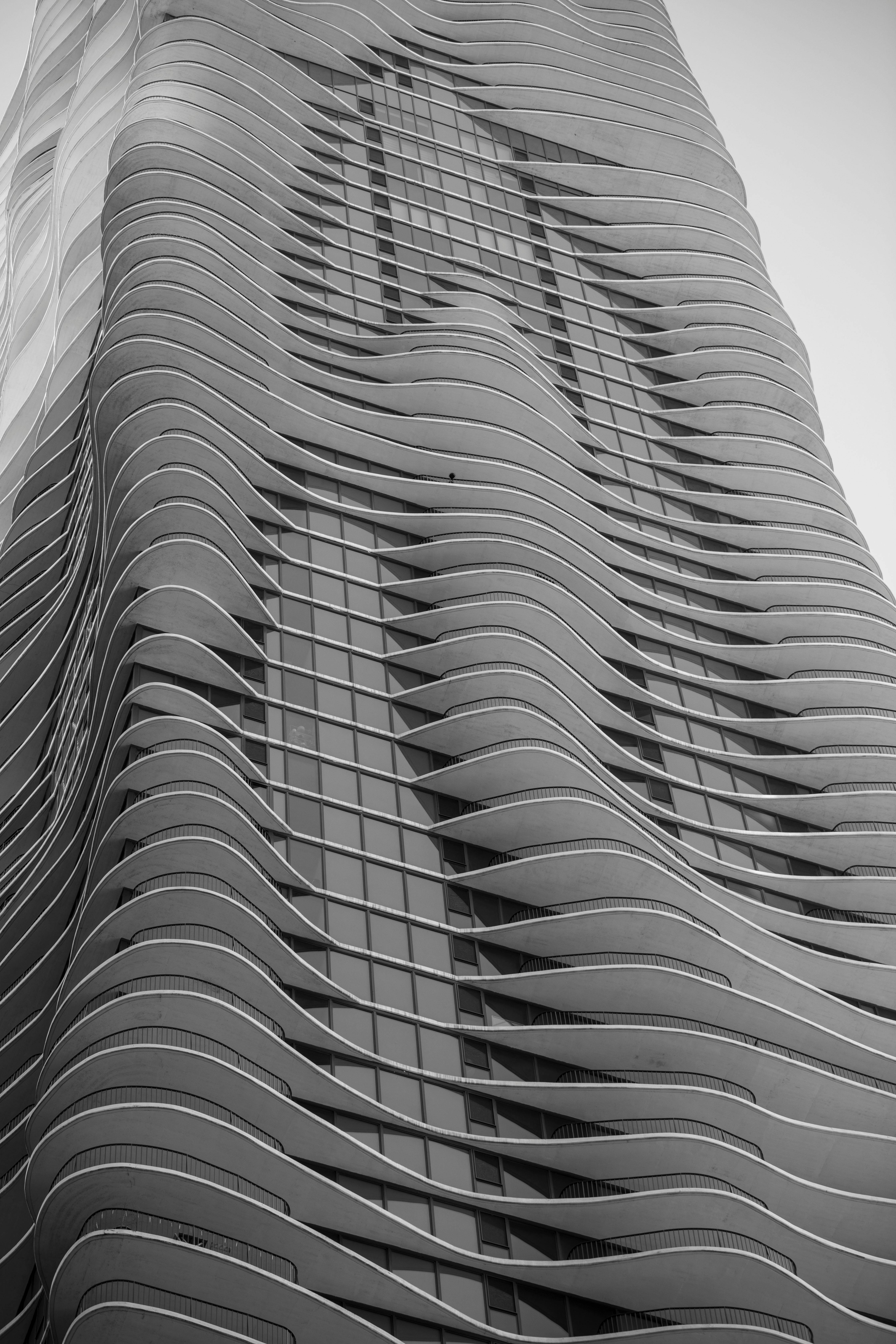
Image: Jeanne Gang’s Aqua Tower in Chicago, showcasing its unique curvilinear balconies and cutting-edge design that blend functionality with artistic expression.
Lesson:
Pick one clear concept—comfort, light, wind, rhythm, etc.—and let that guide every move. Don’t pile on extra ideas just to show range.
2. Design for People, Not Just Diagrams
Real Example: Alejandro Aravena’s “Half a House” (Chile)
Instead of designing a full house for low-income families, he designed half—the essential part. Families could expand the rest themselves when ready.
Lesson:
Design with real life in mind. Ask: “How will this be used in 1 year? 5 years?”
Great design meets people where they are—not just where the plan ends.
3. Use Light as a Material
Real Example: Louis Kahn’s Salk Institute (California)
It’s a research facility made of concrete and clean geometry—but the way light moves through the courtyard at different times of day gives the space a calm, almost meditative strength.
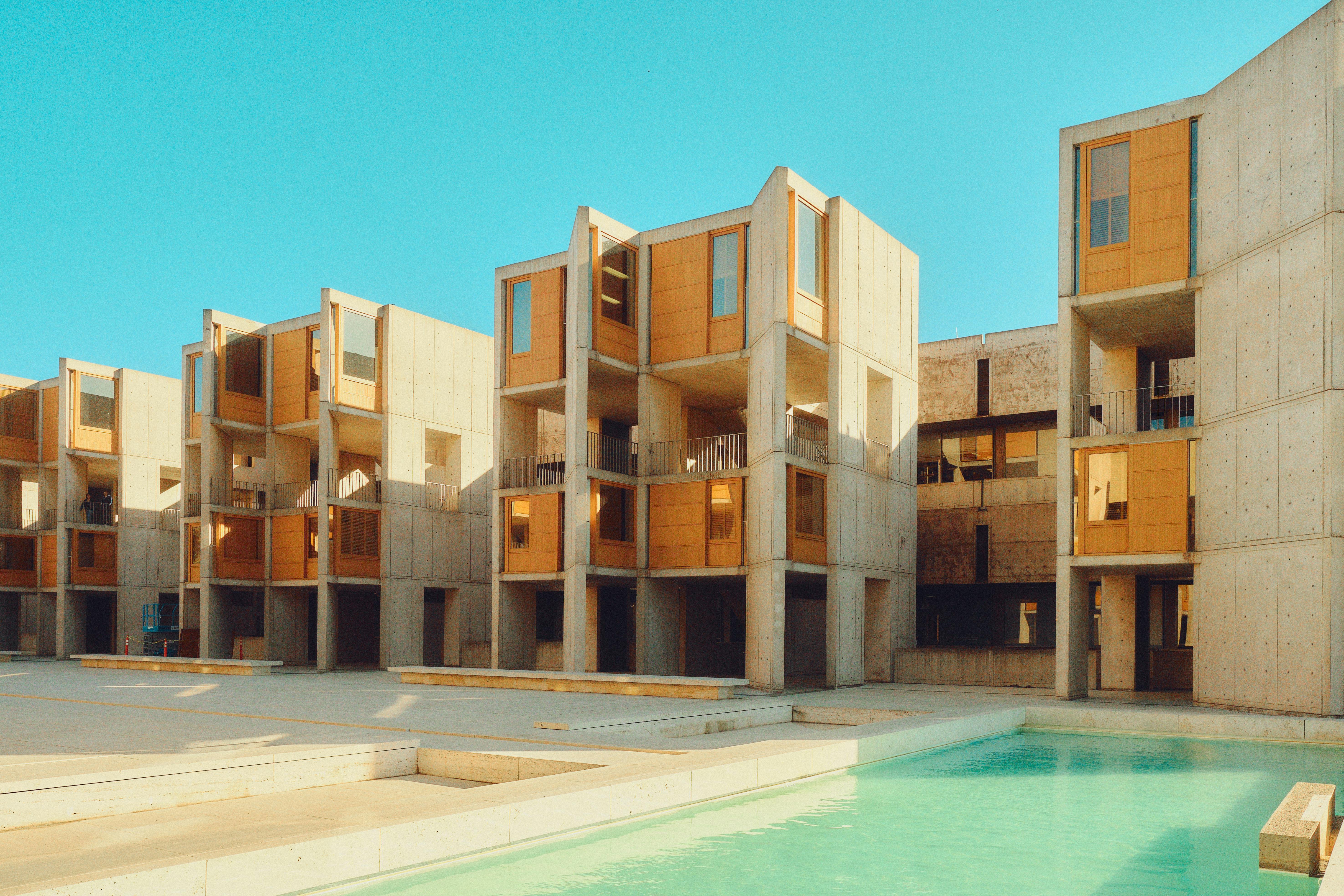
Image: Modern Brutalist architecture of Louis Kahn’s Salk Institute in San Diego, showcasing the iconic concrete structures and expansive open courtyards that define its design.
Lesson:
Mastering daylight is free—and powerful. Good light = less need for flashy materials. The simplest forms can feel rich when the light is handled right.
4. Let Movement Guide Form
Real Example: The High Line (New York)
It’s a park on an old railway. But what made it successful? It’s designed around how people move—pausing, walking, sitting, observing.
Lesson:
Design with motion in mind. Don’t just draw things that look good. Think about how people will actually experience it.
5. Think in Simple Materials with Strong Contrast
Real Example: Rural Studio Projects (Alabama, USA)
Students used salvaged wood, metal, and concrete to build beautiful, low-cost homes for underserved communities.
Lesson:
You don’t need expensive materials. But you do need to understand texture, contrast, and proportion.
6. Borrow From Nature, But Not Literally
Real Example: Alvar Aalto’s Paimio Sanatorium (Finland)
He didn’t draw trees on walls. He studied how patients needed peace, airflow, and calm—then designed around that.
Lesson:
Don’t just copy nature. Understand it—and respond to what it teaches.
7. Test Ideas in Real Life, Not Just Studio Crits
Real Example: IKEA’s Small Space Living Labs (Global)
They build real-life mockups of small homes to test furniture layout, light, usability, and stress levels before finalizing design.
Lesson:
Mock it up. Test it. Let people walk through it. Even a cardboard model can teach you what a render can’t.
Bonus Rule: Design for Impact = Thinking Small First
Impact doesn’t mean dramatic. It means something worked—quietly, smoothly, for real people.
You don’t need a landmark. You just need to solve something well.
Category 1: Core Visual Elements

Representation focusing on the fundamental design elements: lines, shapes, form, and value.
Category 1: Core Visual Elements
The Real Foundation of Every Design
Before textures, color palettes, or crazy lighting setups—comes this. Lines, shapes, form, and value. Get these wrong, and nothing else works. Get them right, and everything feels like it belongs.
Let’s break them down with real examples and why they matter.
1. Lines

The Quiet Boss of All Design
Lines tell your eyes where to go—even when you don’t realize it. They're subtle, but they drive flow, balance, and structure in everything from architecture to web layouts.
Types of Lines That Do the Heavy Lifting:
-
Straight lines → order, structure (like the frame of a skyscraper or the edge of a table)
-
Curved lines → calm, softness (great in landscapes or cozy furniture)
-
Horizontal lines → peaceful, grounding (used in serene interiors or spa design)
-
Vertical lines → strength and presence (think columns or high-rise towers)
-
Diagonal lines → energy, movement (used in dynamic logos, sharp interiors)
Where I’ve used it:
In one living room design, I used diagonal ceiling beams to pull focus toward a fireplace. Just that one move shifted the whole vibe from “static” to “intentional.”
Don't overdo it:
Too many strong lines fighting each other? That’s visual noise. Stick with one dominant line direction and support it subtly.
2. Shape

The Building Blocks of What You See
Shapes are how we recognize and feel things. They create structure, carry symbolism, and influence emotion.
Core Shape Types:
-
Squares/rectangles → stability, logic (good for layouts, grids, and furniture)
-
Circles → harmony, unity, friendliness (used in gathering spaces, lights, logos)
-
Triangles → energy, direction, risk (used in edgy designs or bold architecture)
Real talk:
I once did a logo concept that looked clean—but felt tense. The problem? Too many triangle shapes. I swapped a few for rounded corners and instantly it felt more welcoming.
Key tip:
Use sharp shapes for energy, and soft ones for comfort. Balance them so the design breathes.
3. Form
Turning Flat Into Real
Form is what makes a shape feel 3D. It’s how you add depth and volume to something simple. This is especially big in architecture and product design.
Why it matters:
A circle becomes a sphere. A square becomes a cube. Add shadows, depth, or physical structure—and now it feels real.
Example from my work:
In a store layout, I used flat signage behind bold, sculptural product stands. The 3D forms drew people in—they didn’t just look at it, they wanted to walk around it.
Watch out:
Too much form makes a design heavy. Use depth where it helps clarity or impact—not just to show off.
4. Value
Light, Dark, and Everything In Between
Value is about how light or dark something is. It controls contrast, depth, and mood more than most people realize.
Why it's essential:
-
High contrast → grabs attention, sets drama
-
Low contrast → calm, soft, minimal
-
Gradients → create depth and focus
Example:
In a cozy family room remodel, I paired light cream walls with deep brown furniture and black accents. The value contrast brought warmth and made the space feel grounded without being too loud.
Don’t fall into the trap:
Too much contrast = visual shouting. Not enough = boring. Use value changes to highlight what matters.
Why These 4 Elements Matter So Much
Every great design—logo, house, poster, room—leans on line, shape, form, and value. If something looks off, it’s usually because one of these is out of balance.
Here’s how they stack up:
-
Lines guide the eye
-
Shapes define structure
-
Form adds depth
-
Value controls contrast and emotion
Start noticing these in the real world. Walk through a room. What lines are guiding you? What shapes are dominating? Where’s the contrast? You’ll sharpen your eye just by paying attention.
Category 2: Sensory Engagement

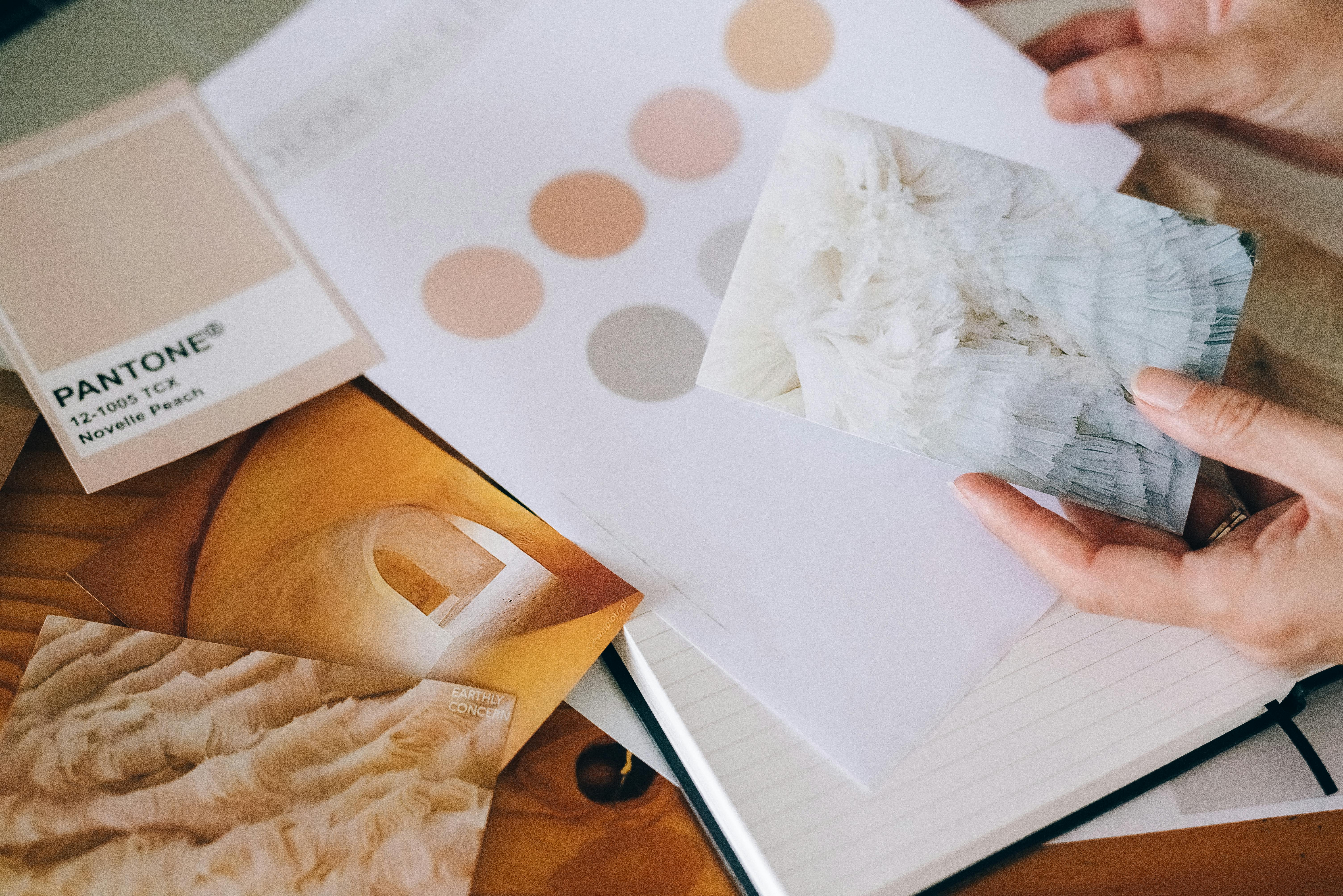
Design isn’t just about what you see—it’s about engaging multiple senses to create a truly immersive experience. Color and texture are two fundamental elements that trigger emotional responses and enhance the way people experience a space.
Understanding how to use these elements effectively can elevate your designs, making them not only visually appealing but also emotionally impactful.
5. Color
- The Psychology of Color
Color plays a huge role in how we feel and react to our surroundings. Different hues can trigger specific emotional responses or even influence behavior.- Why it works: Warm colors like red and yellow are energizing and can create a sense of urgency or warmth, which is why they are often used in restaurants and marketing. On the other hand, cool colors like blue and green promote calmness and tranquility, which is why they work well in bedrooms or healthcare settings.
- Practical Example: In one of my projects, I used soft greens and blues in a yoga studio to create a calming environment, while incorporating touches of orange in the decor to inspire energy without overwhelming the space.
- Why not overdo it: Using too many warm tones in a room can make it feel overwhelming and even stressful. The key is balance—don’t go overboard with one color family.
- Color Harmony
Color harmony refers to the pleasing arrangement of colors that work well together. There are several ways to combine colors to achieve harmony in your designs.- Complementary Colors: These are colors opposite each other on the color wheel (like blue and orange). They create contrast, but when used correctly, they can make a design pop.
- Analogous Colors: These are colors next to each other on the color wheel (like blue, blue-green, and green). They create a sense of unity and are typically calming.
- Triadic Colors: Using three colors evenly spaced around the color wheel, like red, blue, and yellow, creates a vibrant, balanced composition.
- Practical Example: In a recent project, I combined complementary colors—blue and orange—on a building’s façade, creating a striking visual impact without feeling jarring. On the interior, I used analogous colors to create a smooth, harmonious flow from room to room.
- Why not overdo it: Too much contrast can lead to a chaotic design. It’s important to balance bold colors with more neutral tones to avoid overwhelming the senses.
6. Texture
- Engaging the Senses
Texture isn’t just something you feel—it’s something you see, too. A well-considered texture can bring a design to life, adding depth and richness. From the tactile sensations of a rough stone wall to the soft visual illusion of a fabric pattern, texture stimulates the senses in both physical and visual ways.- Why it works: Texture helps define the personality of a space. Rough textures like exposed brick or stone can evoke a sense of rustic warmth or industrial chic, while soft textures like velvet and silk create a sense of luxury and comfort.
- Practical Example: In a luxury hotel project, I used a combination of smooth, reflective surfaces like glass and marble for elegance, complemented by tactile textures like plush carpeting and velvet cushions to evoke comfort and opulence.
- Why not overdo it: Too many competing textures can create visual clutter and make a space feel overwhelming. Stick to a balance of textures to enhance the experience without overstimulating the senses.
- Physical and Visual Texture
Physical texture refers to the actual tactile feeling of a material, like the roughness of concrete or the smoothness of marble. Visual texture, on the other hand, is the illusion of texture, like the soft texture of a photograph or the pattern on a wallpaper.- Why it works: Physical texture adds a layer of sensory interaction—something people can touch and feel. Visual texture, though intangible, can still evoke emotional responses, like the cozy feeling you get from a woolen throw blanket pattern, even if you can’t touch it.
- Practical Example: In one of my recent interior design projects, I used physical texture by incorporating a concrete feature wall, but balanced it with visual texture through soft, patterned textiles on cushions and rugs. This provided a rich contrast and added depth to the space.
- Why not overdo it: Too much physical texture in a room can create a sensory overload, making it uncomfortable. Similarly, overusing visual textures without real tactile experience can make a space feel flat and uninviting.
Wrapping It Up: Sensory Engagement in Design
Design isn’t just about what you see—it’s about how the space feels, from the colors that evoke emotions to the textures that invite touch. Understanding how to balance these sensory elements can transform a good design into an unforgettable one.
For example, I’ve learned firsthand that using color thoughtfully can make all the difference. In one project, soft greens and blues created a calming environment, while a pop of orange added just the right amount of energy. It’s about striking that balance.
When it comes to texture, I’ve seen how blending tactile materials, like plush fabrics and sleek surfaces, can make a space feel both luxurious and comfortable. The key is always moderation—too much of anything can easily overwhelm the senses.
In the end, it’s about creating a space that resonates with the people who experience it. Whether through the colors you choose or the textures you incorporate, each element should complement the other to create a space that’s not only visually appealing but emotionally engaging.
So keep experimenting, trust your instincts, and don’t be afraid to play with color and texture to bring your designs to life.
Category 3: Spatial Organization

7. Space
Defining Space
Space is the foundation of all design. It’s the canvas on which everything else rests. In architecture and design, space defines relationships between elements and dictates how they interact with one another.
Properly balancing space allows for clarity, flow, and functionality.
Think about how a well-organized room feels balanced versus one where the furniture is crammed into every corner—space has the power to shape the overall feel of a space.
Utilizing Positive and Negative Space
Positive space refers to the areas filled with objects or materials, while negative space refers to the empty areas around them.
It’s easy to think of empty space as "wasted," but in reality, it’s crucial for creating balance and focus. For example, a room full of furniture might feel cluttered and chaotic unless there's enough negative space to allow the elements to breathe.
Properly utilizing both types of space enhances the design and improves how we experience a room or building.
Practical Example:
When designing a home office, I placed the desk by the window to maximize natural light and left plenty of room around it. The surrounding space allowed the desk to stand out and created a calm, focused environment.
The empty floor space and open layout helped avoid the feeling of being boxed in, and it was one of my favorite design outcomes.
8. White Space
The Importance of White Space
White space, also known as "negative space," is often misunderstood as an empty or wasted part of a design. But it’s a critical element that provides structure and clarity.
White space offers visual relief, helping to guide the viewer’s attention, frame important elements, and improve the flow of the design.
It also gives the composition room to "breathe," making it easier for the mind to process the information.
Why It Works:
In graphic design, white space can make a logo look sleek and professional or allow a page of text to be more readable. In interior design, it helps define key areas and provides a sense of calm.
If you've ever walked into a room that felt "open" or "light," it’s likely due to an effective use of white space.
By creating room for elements to stand out, white space ensures that a design doesn’t become visually overwhelming.
Practical Example:
In one recent project, I used white space extensively in the layout of a modern living room. Rather than crowding the space with furniture, I used minimal pieces, allowing the walls, floor, and light fixtures to stand out.
This use of space created a sense of openness and sophistication, transforming the room into a peaceful retreat.
Why Not Overdo It:
While white space is vital, too much can make a design feel barren or incomplete. It’s about finding the right balance between occupied and unoccupied space, ensuring that every area serves a purpose without feeling either too crowded or too empty.
A design should never feel "unfinished" because of excessive white space, but should use it strategically to guide the experience.
Final Thoughts: Mastering the use of space, both positive and negative, along with effective white space, is essential for any designer looking to create compelling, balanced compositions.
Whether you’re designing a living room, a website, or a logo, space is one of the most powerful tools you have to shape how people experience your design.
Get comfortable with letting your design elements breathe—too little space can make things feel cramped, while too much can make them feel disconnected. It’s about striking the right balance and using space intentionally to enhance the overall composition.
Category 4: Composition and Balance
9. Balance
Achieving Visual Balance
Balance is the cornerstone of any great design. It’s not just about making a space look good—it’s about making it feel right. Balance involves distributing visual weight evenly, whether through symmetry, asymmetry, or radial designs. When balanced properly, a space feels organized and comfortable, making the design experience more engaging.
From my own experience, understanding balance has been a game changer.
Early on in my career, I was focused on making designs look visually perfect, but I learned quickly that perfection isn’t always the goal. Instead, I began to prioritize harmony—sometimes through symmetry, sometimes through contrast.
In a recent home renovation, I combined asymmetrical elements, like a larger art piece on one wall with smaller decor on the other, and it instantly brought balance to the room without feeling stiff or forced.
The Takeaway:
Don’t be afraid to experiment with balance. Nature has a lot to teach us here—look at mountains, rivers, and forests. Their natural balance is all about variety and flow.
Find ways to incorporate these principles into your own projects, and trust your instincts. Balance is what makes a space feel complete, welcoming, and memorable.
Final Tip:
Balance isn’t a one-time decision—it evolves. Like nature, your design will grow and change. Keep experimenting, push boundaries, and always strive for harmony in your work.
10. Proportion
Creating Proportionate Designs
Proportion is about ensuring that the elements within your design relate to one another in a way that feels balanced. It’s about finding the right size, scale, and relationship between components.
Proportion can make or break a design. If elements are too large or too small relative to one another, it throws off the overall harmony.
Mastering Proportional Techniques:
The golden ratio, a proportional technique often found in nature, architecture, and art, is a powerful tool for achieving aesthetically pleasing proportions.
In one of my projects, I used the golden ratio to guide the placement of furniture and architectural features in a living room, which helped create a sense of natural balance.
The ratio provided a subtle but effective way to place key design elements in the room to make everything feel cohesive.
Why It Works:
Proportion is essential for creating spaces that feel "right." It ensures that the visual weight of design elements complements one another and that no element overpowers the others.
Proportional design techniques help guide the eye and establish flow within a space, enhancing both its function and beauty.
11. Alignment
Establishing Alignment
Alignment is the invisible thread that ties elements together in a design. It creates a sense of order and coherence by organizing elements along common axes. Good alignment ensures that everything has a visual connection, leading the eye naturally from one element to the next.
Practical Example:
In one of my commercial design projects, I used strict alignment for the furniture and shelving units in an open office space. By aligning everything to a central line, I was able to create a space that felt clean, organized, and functional, allowing for easy navigation without unnecessary clutter.
Why Alignment Works:

When done correctly, alignment improves readability and clarity, both visually and functionally. For example, in a website design, properly aligned text and images can make the content easier to digest, improving the user experience. In physical spaces, alignment helps lead the eye, guiding visitors through the design and making the space feel more cohesive.
Final Tip:
Use alignment to create order, but don’t feel like every element needs to be rigidly aligned. In some cases, slight misalignment can create a more dynamic and interesting design, so trust your intuition and play with it.
Final Thoughts: Creating balanced, proportionate, and aligned designs is essential for making spaces that feel right. By using these principles, you ensure that every element serves its purpose, contributing to a cohesive, functional, and beautiful design.
Whether you’re working on a small renovation or a large-scale project, these core principles will help you navigate the design process with confidence.
Keep experimenting, trust your instincts, and most importantly—have fun with it. The beauty of design lies in the endless possibilities.
Category 5: Design Dynamics
12. Movement
Making the Eye (and People) Flow
Movement is about flow—visually or physically. It's how you guide someone’s eye across a layout or lead them through a space without signs shouting directions. Lines, shapes, light, and even furniture placement can create subtle motion.
What I Learned On the Job:
In one project, we had a long, winding hallway that felt like a dead zone. Instead of redoing the layout, we used soft curves, angled lighting, and floor materials that naturally pulled people forward. No signs. Just rhythm.
Why It Works:
Good movement keeps people engaged. They look longer, walk farther, and feel more connected to the space. Whether you're designing a gallery or a garden, movement helps tell the story—step by step.
13. Contrast
How to Make Things Pop (Without Yelling)
Contrast is how you grab attention—dark vs. light, smooth vs. rough, big vs. small. It’s visual drama without the noise.
From My Office Project:
We had pale walls and pale floors. It looked clean but flat. So we brought in dark walnut furniture. Suddenly, everything had definition. It grounded the space and gave the eye something to land on.
Why It Works:
Contrast creates hierarchy. It tells the viewer where to look first. Too little contrast feels blah. Too much feels like a carnival. Get the balance right, and the whole thing starts clicking.
14. Emphasis
Every Space Needs a Star
Emphasis is about focus. One clear focal point pulls the design together and anchors the room. It could be a bold entry, a killer pendant light, or even a quiet detail that quietly owns the space.
Real-World Fix:
A commercial lobby I worked on felt aimless. So we lit the entrance with oversized hanging lights and pulled the flooring pattern toward the doors. No confusion about where to look or walk. It made the whole experience feel intentional.
Why It Works:
People want direction—even if they don’t know it. Emphasis sets the tone. Without it, everything competes. With it, things feel calm and clear.
15. Unity
Make It All Belong Together
Unity is what keeps your design from feeling like five Pinterest boards crashed into each other. It's about consistency—color palette, material choices, visual rhythm, tone.
One Client’s Home:
Each room had its own vibe, but we repeated the same wood tones and muted colors throughout. The result? A house that felt personal and connected, not chaotic.
Why It Works:
Unity builds trust. It tells the eye, “You’re still in the same story.” Even if styles change slightly room to room, the underlying language stays consistent.
16. Harmony
Balance Without Boredom
Harmony means different things playing well together—variety without the chaos. You can mix wood and steel, curves and edges, bold and soft—as long as it’s done with control.
Example That Hit Right:
In an urban plaza project, we combined crisp concrete lines with warm timber seating and wild native plants. It felt grounded but alive—thanks to a shared color palette and repeated materials that tied it all together.
Why It Works:
Harmony is what makes complexity feel effortless. It keeps designs from feeling like a mood board gone wrong. Think of it like a band—different instruments, one song.
Final Thought on Design Dynamics
These five principles—movement, contrast, emphasis, unity, and harmony—are your backstage crew. When they work together, your design sings without needing to shout.
▪ Movement keeps people engaged.
▪ Contrast directs the eye.
▪ Emphasis sets the tone.
▪ Unity brings clarity.
▪ Harmony ties it all together.
When something feels off? One of these probably isn’t doing its job. Tweak it. Test it. Trust your gut.
And if you’re ever stuck—remove one thing, not add ten more.
Category 6: Typography and Patterns
17. Typography
The Art of Typography
Typography is more than just choosing a font—it’s about how text conveys mood and meaning. The right typeface can make your message feel bold, playful, elegant, or trustworthy.
Practical Tip: For example, serif fonts like Times New Roman exude tradition and formality, while sans-serif fonts like Helvetica feel modern and clean. Use typography to match the tone of your design.
Typography in Design
The details of typography—kerning (space between letters), leading (space between lines), and font pairings—can transform a design. A well-paired combination of fonts, like a bold header with a clean body text, adds professionalism and clarity.
Real-World Insight: In one of my projects, a bold sans-serif font for headings paired with a light, serif body text helped establish hierarchy and made the content easier to follow.
Avoid Common Mistakes: Don’t overdo it with too many typefaces in one design. Stick to a maximum of two or three for cohesion and readability.
18. Pattern
Using Patterns Effectively
Patterns create rhythm and add personality, but they require balance. Too many patterns can overwhelm, while just the right amount enhances your design’s depth and visual appeal.
Why It Works: Patterns create consistency and rhythm. For instance, a repeating geometric pattern on a wall or fabric can tie a room’s design together.
Practical Application: In an interior project, I used a subtle chevron pattern on a throw pillow to complement the clean lines of a modern sofa. This small touch added interest without cluttering the space.
Tips for Success:
- Use patterns sparingly as accents in larger designs.
- Experiment with scale—smaller patterns work well in confined spaces, while larger patterns make a bold statement in open areas.
Avoid Overdoing It: Mixing too many clashing patterns can feel chaotic. Stick to a single dominant pattern and pair it with subtle textures or solid colors to keep the design balanced.
These core elements of typography and patterns, when used thoughtfully, elevate the quality and effectiveness of your designs. With careful selection and application, they add personality, structure, and visual interest to everything from a webpage to an interior layout.
Category 7: Scaling and Hierarchy
19. Scale
Mastering Size and Scale
Scale is all about proportions—making certain elements larger or smaller to draw attention and create balance. When used thoughtfully, it guides the viewer’s focus and ensures key components stand out.
Practical Tip: In architecture, using a large central feature like a grand staircase or an oversized window can create a focal point, while smaller details complement and enhance the overall design.
Real-Life Experience: During a museum project, we used varying scales in the exhibit layout—large banners for overarching themes and smaller plaques for detailed descriptions. This balance allowed visitors to navigate the space effortlessly.
Avoid Overwhelming the Viewer: Overusing oversized elements can make a design feel cluttered. Instead, balance dominant features with negative space or supporting elements to maintain clarity.
20. Hierarchy
Establishing Visual Priority
Hierarchy ensures that viewers understand what to look at first, second, and so on. By structuring elements by importance, you create designs that are easy to navigate and engaging to interact with.
Why It Matters: Imagine a website where the headline grabs your attention, followed by a subheading and a clear call to action. Without hierarchy, the content would feel jumbled, and the message would get lost.
Practical Techniques:
- Size: Larger elements naturally draw more attention.
- Color: Bright or contrasting colors highlight important sections.
- Placement: Items placed at the top or center of a layout often feel more significant.
Example from My Work: In an office lobby redesign, we used a striking art installation as the focal point, with directional signage subtly leading visitors to various areas. This clear hierarchy improved both aesthetics and functionality.
Common Mistake to Avoid: Don’t make everything look equally important. If all elements are emphasized, none will truly stand out. Be deliberate in prioritizing key information or features.
Takeaway
Scaling and hierarchy are essential for creating designs that communicate effectively and guide users naturally. Mastering these principles allows you to craft layouts and spaces that feel both intuitive and impactful. Whether designing a webpage, a room, or a city plaza, remember to think about what stands out and why—it’s the secret to making your work memorable and easy to understand.
Category 8: Variety and Dominance
21. Variety
Creating Interest Through Variety
Variety injects energy into your designs, breaking away from monotony by introducing diverse elements like shapes, colors, textures, or patterns. It’s about keeping things dynamic without veering into chaos.
Why Variety Matters:
- It keeps the viewer’s eye engaged by offering a mix of visual elements.
- Helps create a narrative or progression within the design, guiding viewers through different focal points.
Real-World Example: The Guggenheim Museum in Bilbao by Frank Gehry uses a variety of materials and forms—curves, angles, and reflective surfaces—to create a visually arresting structure.
From My Experience: In a residential project, I used a combination of wooden beams, glass panels, and brickwork in the living space. The mix of textures added depth and character without feeling disjointed.
Tips for Practical Use:
- Combine smooth and rough textures, such as polished marble against raw concrete.
- Balance vibrant colors with neutral tones to maintain harmony.
- Use variety intentionally—too much can make the design feel cluttered.
22. Dominance
Highlighting Key Elements
Dominance is about creating a focal point that draws attention. It ensures viewers immediately grasp the most important part of your design. Think of it as the "main character" in your composition.
How to Achieve Dominance:
- Use contrasting colors or bold textures to highlight the key element.
- Position dominant features strategically—central placement often draws the eye.
- Size matters: Larger elements naturally stand out in a design.
Example of Dominance: The Eiffel Tower in Paris dominates the skyline, its height and distinct form making it the clear focal point amidst the city’s architectural variety.
From My Work: In an interior renovation project, I used a bold, oversized light fixture in the dining room as the dominant element. Its unique shape and warm glow immediately became the centerpiece of the space.
Practical Applications:
- Use accent walls or bold-colored furniture to anchor a room.
- In landscapes, a central sculpture or a striking tree can act as the dominant element.
- Balance dominance with supporting elements to avoid overwhelming the design.
Key Takeaway: Variety and dominance go hand in hand to create engaging, balanced designs. While variety adds energy and movement, dominance provides a clear focal point, grounding the composition. Used thoughtfully, these principles ensure your designs are both dynamic and cohesive, leaving a lasting impression.
Category 9: Interaction and Engagement
23. Rhythm
Establishing Rhythm in Design
Rhythm in design mirrors rhythm in music—it sets the pace and guides the eye. By repeating elements like shapes, colors, or lines, you can create a sense of movement that draws viewers through the composition naturally.
Why Rhythm Matters:
- It provides structure and flow, ensuring the design doesn’t feel chaotic.
- Helps highlight key elements by leading the viewer’s eye in a deliberate way.
Real-World Example: The repetition of arches in Gothic cathedrals creates a rhythmic pattern that leads the eye toward the altar, establishing a sense of journey and focus.
From My Work: In an office redesign, I used alternating wood and metal panels along the walls. The rhythm created by the repeated pattern softened the industrial look and added depth.
Practical Tips:
- Use repetitive elements like floor tiles, furniture arrangements, or wall art to establish rhythm.
- Introduce subtle variations in the pattern to maintain interest—like alternating colors or sizes.
- Align rhythm with the function of the space. For instance, in hallways, rhythmic lighting can guide people naturally through the area.
24. Gestalt Principles
Leveraging Gestalt for Perception
The Gestalt principles explain how people perceive visual elements as unified wholes rather than as separate parts. These principles—such as proximity, similarity, and closure—help designers craft cohesive, engaging layouts that feel intuitive.
Key Gestalt Concepts:
- Proximity: Elements close together are perceived as related.
Example: In web design, grouping navigation buttons ensures users see them as part of the same menu. - Similarity: Similar colors, shapes, or textures make elements feel connected.
Example: Using consistent icon styles in an app interface reinforces unity. - Closure: Viewers mentally fill in missing parts to see a complete shape.
Example: Logos like the WWF panda use minimal lines but are perceived as whole images.
From My Experience: When designing a gallery layout, I grouped artwork by color palette and theme. The Gestalt principle of similarity helped visitors understand the connections between pieces at a glance.
Practical Applications:
- Use proximity to group related items, such as menu options or clustered seating areas.
- Apply similarity in branding—ensure fonts, colors, and imagery are consistent across platforms.
- Take advantage of closure for minimalist designs; let the viewer’s mind complete the shapes.
Key Takeaway: Rhythm and Gestalt principles enhance interaction and engagement in your designs. While rhythm ensures a smooth visual flow, Gestalt principles create cohesion and clarity. Mastering these concepts makes your designs not only aesthetically pleasing but also intuitive and user-friendly.
Category 10: Functional Considerations
25. Accessibility
Designing for Everyone
Accessibility ensures that your designs can be experienced and appreciated by everyone, including people with disabilities. By prioritizing inclusivity, you not only comply with ethical and legal standards but also make your work more impactful and user-friendly.
Why Accessibility Matters:
- Enhances usability for a broader audience.
- Creates equal opportunities for engagement and appreciation of your designs.
Real-World Example: Designing a museum exhibit with Braille labels and audio guides ensures that visually impaired visitors can fully engage with the content.
From My Work: During a website project, I added high-contrast text, large buttons, and keyboard navigation support. These changes significantly improved usability for individuals with visual or motor impairments.
Practical Tips:
- Use high contrast between text and background for readability.
- Choose fonts that are clear and easy to read, avoiding overly decorative styles.
- Provide alternative ways to access information, like alt text for images or captions for videos.
- Test your designs with accessibility tools to identify areas for improvement.
26. Context
Designing with Purpose
Context in design refers to understanding where and how your work will be seen or used. Whether it’s a poster in a busy subway station or a digital ad on a smartphone, your designs should adapt to their environment and medium.
Why Context Matters:
- A design that works well in one setting might fail in another.
- Adapting to the medium ensures the message is clear and effective.
Real-World Example: Think of a billboard on a highway—it needs large, bold text and minimal content so drivers can understand it in seconds.
From My Experience: While designing branding materials for a company, I adapted the logo for different mediums—simplifying it for mobile use but keeping intricate details for large-scale print.
Practical Tips:
- Always consider the audience and how they’ll interact with your design.
Example: A touchscreen kiosk interface should have large, easy-to-press buttons. - Test your designs in the intended medium. Colors that look vibrant on a computer screen might dull in print.
- Be mindful of the environment—outdoor signage needs weatherproof materials and high visibility, while indoor designs can focus on finer details.
Key Takeaway: Functional considerations like accessibility and context are the backbone of successful design. Accessibility ensures inclusivity, while context tailors your work to its purpose. Together, they transform good designs into impactful, universally appreciated experiences.
Category 11: Strategy and Conceptual Elements
.27. Storytelling
Telling Stories Through Design
Design is more than just aesthetics; it’s a medium for storytelling. A compelling narrative can transform a simple layout into an engaging experience, drawing viewers in and creating a lasting impression.
Why Storytelling Matters:
- Gives your design a purpose beyond its visual appeal.
- Creates emotional connections with the audience.
Real-World Example: Apple’s branding tells a consistent story of innovation and simplicity, not just through words but also in their sleek product designs and clean advertisements.
From My Experience: While designing a museum exhibit, I crafted the layout to guide visitors through a historical timeline. Each section built on the last, telling a cohesive story and keeping the audience engaged.
Practical Tips:
- Define the story you want to tell—what’s the message or feeling you want your audience to take away?
- Use visuals that align with your narrative. Example: Warm tones and handwritten fonts evoke nostalgia, while sleek lines and bold colors suggest modernity.
- Structure your design with a beginning, middle, and end to guide viewers through the narrative.
28. Mood
Setting the Mood
Mood in design is the emotional undertone that shapes how people perceive your work. It’s influenced by elements like color, typography, and imagery, and it sets the stage for how your audience feels.
Why Mood Matters:
- Directly impacts how people connect with and remember your design.
- Aligns the visual language with the purpose of the project.
Real-World Example: A luxury spa’s branding uses soft, muted tones and elegant typography to create a calming, high-end atmosphere, reflecting the experience they want their clients to have.
From My Experience: I worked on a branding project for a children’s education center. Using bright, playful colors and rounded fonts, I created a cheerful, welcoming mood that resonated with both kids and parents.
Practical Tips:
- Choose colors thoughtfully: blues and greens for calmness, reds and oranges for energy.
- Match typography to the desired tone. Example: Serif fonts often feel traditional, while sans-serif feels modern.
- Incorporate imagery that supports the emotional message, such as serene landscapes for relaxation or energetic action shots for excitement.
Key Takeaway: Both storytelling and mood are strategic tools that elevate your designs from functional to memorable. By weaving narratives and setting the right emotional tone, you can create designs that resonate deeply with your audience and leave a lasting impression.
Category 12: Trends and Innovation
29. Minimalism
Less is More
Minimalism is about focusing on what’s essential, stripping away the excess to create clean, impactful designs. It’s not just a style; it’s a philosophy that values clarity and purpose over decoration.
Why Minimalism Matters:
- Simplifies communication, making the message clear and direct.
- Reduces visual clutter, allowing the key elements to stand out.
Real-World Example: The Guggenheim Museum in New York, designed by Frank Lloyd Wright, embodies minimalism with its clean, spiraling structure that focuses attention on the art within.
From My Experience: While redesigning a corporate website, I shifted from a cluttered interface to a minimalist layout. By reducing the number of elements on each page and focusing on whitespace, we improved user navigation and engagement significantly.
Practical Tips:
- Focus on a few strong visual elements, such as bold typography or a striking color palette.
- Use whitespace strategically to draw attention to key details.
- Ensure every design element serves a purpose; if it doesn’t, remove it.
30. Sustainability
Eco-Friendly Design Choices
Sustainability in design is more than a trend; it’s a responsibility. Designers now prioritize eco-conscious practices, incorporating renewable materials and energy-efficient methods into their work.
Why Sustainability Matters:
- Reduces the environmental footprint of your designs.
- Meets the growing demand for eco-friendly solutions.
Real-World Example: Foster + Partners’ "The Gherkin" in London integrates sustainable practices like natural ventilation and energy-efficient glass, setting a standard for green building design.
From My Experience: In a recent residential project, I incorporated recycled wood for flooring and solar panels for energy efficiency. The client loved the aesthetic, and it significantly reduced the building’s environmental impact.
Practical Tips:
- Choose sustainable materials like bamboo, recycled metal, or reclaimed wood.
- Incorporate energy-efficient systems, such as LED lighting or passive heating and cooling techniques.
- Focus on designs that adapt to their environment, minimizing waste and maximizing functionality.
Key Takeaway: Minimalism and sustainability are not just design trends—they’re essential approaches to modern design. While minimalism enhances clarity and focus, sustainability ensures your work aligns with environmental values. Together, they pave the way for thoughtful, impactful, and future-forward designs.
Category 13: Architecture-Specific Principles
31. Structural Integrity
Balancing Aesthetics with Functionality
Structural integrity isn’t just about making sure a building stands—it’s about balancing engineering strength with design elegance. A visually stunning structure is only as good as its ability to endure.
What It Means in Practice: Think of the Eiffel Tower. It’s not just an iconic landmark but also an engineering marvel, using lattice steelwork to distribute weight efficiently while maintaining its light, airy aesthetic.
Practical Insight: In one of my projects, we designed a cantilevered structure that seemed to defy gravity. Achieving the desired visual impact required close collaboration with engineers to balance the loads and ensure safety without compromising the design.
Avoid This Mistake: Don’t let aesthetics compromise functionality. A poorly calculated design might look good on paper but fail under real-world conditions.
32. Contextual Design
Blending with the Environment
Architecture doesn’t exist in isolation; it interacts with its surroundings. Contextual design respects the local culture, history, and natural environment, creating harmony between the building and its setting.
Why It Matters: Consider Fallingwater by Frank Lloyd Wright. The house seamlessly integrates with its wooded landscape, appearing as an extension of the natural rock formations.
Practical Tip: During an urban project, we studied the surrounding streetscape and adapted the façade design to complement the neighborhood's architectural rhythm, ensuring it felt cohesive yet modern.
Common Pitfall: Ignoring the local context can result in buildings that feel out of place, disrupting the character of the area.
33. Sustainability in Architecture
Designing for the Future
Sustainable architecture prioritizes the environment. From renewable materials to energy-efficient systems, sustainable design meets present needs without compromising future generations.
Key Practices:
- Passive Design: Use natural ventilation, shading, and thermal mass to reduce energy use.
- Renewable Materials: Incorporate bamboo, reclaimed wood, or recycled steel.
- Energy Efficiency: Design for solar panels, rainwater harvesting, or green roofs.
Example: Singapore’s Marina Bay Sands integrates green spaces, energy-efficient cooling, and water recycling, showing how sustainability can be both functional and luxurious.
In My Experience: A client once asked for a fully sustainable home. We combined solar panels, cross-ventilation, and locally sourced materials to reduce the home’s environmental footprint significantly.
34. Spatial Experience
Crafting Human-Centric Spaces
Architecture isn’t just about buildings; it’s about how people feel and move within them. Proportions, light, and flow shape the emotional and functional experience of a space.
Why It Works: Think of the Pantheon in Rome. Its perfect proportions and interplay of natural light create a spiritual and awe-inspiring atmosphere.
Tips for Better Spatial Design:
- Use light to highlight paths and focal points.
- Ensure spaces flow intuitively—people should naturally know where to go.
- Keep proportions human-scaled for comfort, but use monumental elements sparingly to inspire.
Practical Insight: In a recent community center project, we focused on creating open, sunlit gathering areas while ensuring the layout naturally guided visitors from one zone to another.
Takeaway: Architecture-specific principles go beyond aesthetics—they combine functionality, sustainability, and human experience. Whether you’re crafting a skyscraper or a simple home, keeping these principles in mind will ensure your designs are not just visually striking but also meaningful and enduring.
“A study by MIT found that people form an impression of a website’s visual appeal in 50 milliseconds.”
Category 14: Interior Design-Specific Principles

35. Materiality
Choosing the Right Materials
The choice of materials can make or break an interior design. Materials add personality, depth, and functionality to spaces, influencing how they look and feel.
Why It Matters: Think of the difference between a sleek marble countertop and a rustic reclaimed wood table. Each material tells its own story and sets the tone for the space.
Practical Example: In one of my projects, I paired polished concrete floors with soft velvet upholstery. The contrast between hard and soft materials created a dynamic yet inviting ambiance.
Tips:
- Use natural materials like wood or stone to bring warmth and authenticity.
- Layer textures—mix smooth surfaces with rough ones for added depth.
- Consider maintenance and durability—marble might look luxurious, but it’s not ideal for high-traffic areas prone to stains.
36. Light Design
Mastering Natural and Artificial Light
Lighting isn’t just functional—it shapes mood and defines the character of a space. A well-lit room can feel expansive and welcoming, while poor lighting can make even the best designs fall flat.
Natural Light: Maximize daylight by positioning windows strategically and using reflective surfaces to bounce light.
Artificial Light: Use layered lighting, combining ambient, task, and accent lights to create a flexible and balanced atmosphere.
Example: In a small urban apartment, we used sheer curtains to diffuse natural light and installed LED strip lighting under shelves for a soft, modern glow.
Quick Tips:
- Warm light (around 2700K) is ideal for cozy spaces like living rooms, while cooler light (4000K) works well in kitchens and offices.
- Install dimmers for flexibility in creating different moods throughout the day.
37. Ergonomics
Designing for Comfort
Interior design is more than aesthetics—it’s about creating spaces that function seamlessly with daily life. Ergonomics focuses on making environments comfortable, efficient, and human-centric.
What It Means: A well-designed chair isn’t just stylish; it supports posture. A thoughtfully spaced kitchen ensures easy movement between prep, cooking, and cleaning zones.
In My Work: For a co-working space, we designed modular desks with adjustable heights and ergonomic seating to accommodate diverse user needs. The result? A space where functionality met style effortlessly.
Things to Watch:
- Avoid overcrowding—leave enough space for easy movement.
- Consider the user’s experience—test layouts to ensure they feel intuitive and practical.
38. Sensory Design
Engaging All the Senses
Great interiors don’t just look good—they engage all the senses. From the texture of a plush carpet underfoot to the calming scent of natural wood, sensory design creates an immersive experience.
Key Elements:
- Touch: Use a mix of materials—smooth, soft, and textured—for tactile engagement.
- Sound: Incorporate acoustic panels or rugs to control noise in larger spaces.
- Smell: Select materials like cedarwood or incorporate candles and diffusers for subtle scents.
Example: In a spa project, we used soft bamboo flooring, low ambient lighting, and eucalyptus-infused air to create a calming retreat.
Practical Tip: Always balance sensory elements to avoid overwhelming users. A space that’s too noisy, visually cluttered, or heavily scented can quickly lose its charm.
Takeaway: Interior design isn’t just about appearances—it’s about how spaces feel, function, and connect with people. Whether you’re selecting materials, designing with light, or focusing on ergonomics, every decision should enhance the overall experience. Keep experimenting and refining to craft interiors that truly resonate with all the senses.
Category 15: Urban Design-Specific Principles

39. Walkability
Designing for People, Not Cars
Urban spaces thrive when they prioritize people over vehicles. Walkable neighborhoods aren’t just convenient—they’re healthier, safer, and more enjoyable for residents.
Key Features:
- Wide, shaded sidewalks with clear pathways.
- Accessibility for all, including ramps and level crossings.
- Integration of green spaces and benches to enhance the walking experience.
Real-World Example: Cities like Copenhagen have prioritized walkability with pedestrian-only streets and bike-friendly infrastructure, creating vibrant, people-centered communities.
In My Work: On a recent urban project, we designed a mixed-use neighborhood where walkways linked residential areas with local shops and parks. Clear signage and landscaping turned basic pathways into inviting promenades.
Tip: Avoid clutter—wide, uninterrupted walkways encourage movement and improve usability.
40. Mixed-Use Design
Integrating Work, Play, and Living
Mixed-use developments foster vibrant communities by blending residential, commercial, and recreational spaces. These designs create neighborhoods where people can live, work, and relax without needing to commute long distances.
Why It Works:
- Reduces reliance on vehicles, promoting sustainability.
- Encourages interaction between diverse groups of people.
- Makes neighborhoods more dynamic and economically resilient.
Example: The Seaside community in Florida is a prime example of mixed-use urban planning, where homes, shops, and gathering spaces are within walking distance, creating a sense of community.
Quick Insight: Successful mixed-use design requires careful zoning to ensure that each use complements the others. For example, residential spaces should be insulated from noise-heavy commercial areas.
41. Public Space Activation
Making Cities Feel Alive
Public spaces—like plazas, parks, and community hubs—are essential for vibrant urban life. These areas become gathering points, promoting social interaction and fostering a sense of community.
How to Activate Public Spaces:
- Include features like playgrounds, fountains, and art installations to attract diverse users.
- Ensure spaces are safe, well-lit, and accessible for all age groups.
- Incorporate flexible designs that can adapt for events like markets or performances.
Example: New York’s High Line transformed an abandoned railway into a thriving public park, blending art, greenery, and social spaces to create an iconic urban experience.
Practical Tip: Balance aesthetics with functionality—design spaces that are visually appealing but also usable year-round.
42. Resilience in Urban Planning
Designing for a Changing Climate
As cities face growing climate challenges, urban design must adapt. Resilience means creating environments that can withstand and recover from floods, heatwaves, and other environmental stresses.
Strategies for Resilient Urban Design:
- Use permeable surfaces and green roofs to manage stormwater and reduce flooding.
- Incorporate shade trees and reflective materials to combat urban heat islands.
- Design adaptive infrastructure that can evolve with changing needs.
Real-World Example: Rotterdam’s "water squares" serve as recreational areas during dry periods and as reservoirs during heavy rainfall, blending utility with beauty.
Insight from My Work: In one project, we implemented bioswales and rain gardens to manage stormwater naturally, reducing the strain on city drainage systems while enhancing green space.
Tip: Collaborate with environmental experts to ensure designs are sustainable and forward-thinking.
Takeaway: Urban design isn’t just about buildings; it’s about creating spaces where people can thrive. Whether it’s crafting walkable streets, dynamic mixed-use areas, or resilient infrastructure, the focus should always be on improving quality of life. By considering walkability, public engagement, and climate resilience, urban spaces can become vibrant, inclusive, and future-ready.
“Most design fails aren’t due to bad creativity—they fail because of poor spatial logic or contrast.”
Applying the Principles of Design
How to Actually Use Design Elements to Make Something That Works
So now you’ve got a handle on the building blocks—line, shape, form, space, color, texture, and the rest. Great. But here’s the part that really matters:
How do you use all that stuff to actually make a space feel right?
That’s where the principles of design come in. These aren’t fancy theories—they’re just smart ways to organize what you’ve got, so your design doesn’t feel like a random Pinterest board exploded on the wall.
Elements vs. Principles: Quick Breakdown
Think of the elements as your ingredients (like wood, steel, glass, fabric).
The principles? They’re how you cook. Timing, balance, heat—whatever makes the dish come together.
So let’s stop treating them like a theory test and talk about how they actually help you design better—in interiors, exteriors, or even graphics and furniture.
The Core Principles (and How They Show Up in Real Design)
✅ Balance
You need things to feel stable. Doesn’t always mean symmetry—sometimes a big piece on the left and two smaller ones on the right is all you need.
● Symmetrical = classic, formal
● Asymmetrical = modern, more relaxed
● Radial = circular layouts, often used in lobbies or garden design
Tip: If a room feels “off” but you can’t figure out why, it’s usually a balance problem.
✅ Contrast
Light vs. dark. Rough vs. smooth. Big vs. tiny. You need contrast to make stuff pop.
● Black countertop under white cabinets? That’s contrast.
● Rough brick next to sleek glass? Same thing.
Don’t overdo it. Contrast adds tension. That’s good in small doses—not every corner needs to scream for attention.
✅ Rhythm & Movement
This is about flow. Where does the eye go? Where do your feet go?
● Repeating beams in a ceiling = visual rhythm
● A hallway arch leading to another = movement
● Lighting stepping down a corridor = rhythm in action
It’s like choreography for a space.
✅ Emphasis
Every room needs a star. A focal point. Something that says, “Hey—look here first.”
● Could be a fireplace, a view, an art piece
● Could even be the arch that frames your dining space
Just don’t let five things fight for the spotlight. Pick one. Let it lead.
✅ Proportion & Scale
Tiny lights in a vaulted ceiling? Weird.
A 10-foot couch in a 6-foot room? Worse.
The pieces in a room need to relate to each other and to the space they live in. You’ll feel it when the scale is wrong.
✅ Unity
This is what makes everything feel like it belongs in the same story.
● Repeat a shape (arches, circles, squares) across rooms
● Stick to a palette (color or material)
● Use lighting that speaks the same language
The best-designed homes don’t match—they connect.
What Happens When You Actually Use This Stuff?
Here’s a story.
On one of my early projects, I made everything way too symmetrical. Perfectly centered lights. Mirror-image built-ins. It looked fine—but felt stiff.
So I tweaked the layout. Shifted the focal point. Changed some finishes. Mixed textures. Suddenly, it felt like someone could actually live there. That’s the magic of using principles, not just elements.
Design Isn’t Guesswork
When you apply these principles, it’s not about rules—it’s about choices that make sense.
● Want the room to feel calm? Balance + unity
● Want energy? Contrast + rhythm
● Want luxury? Emphasis + proportion
These aren’t “nice to know.” They’re how real designers solve problems every day.
Final Thoughts
Design that feels effortless? It’s not luck.
It’s knowing what to use—and how to use it together.
So go beyond the basics.
● Don’t just put stuff in a room—organize it with purpose
● Don’t just follow trends—learn why they work (or don’t)
● Don’t just copy photos—understand the thinking behind them
That’s how you get better—not just as a designer, but as someone who knows how to shape space like it matters.
Common Mistakes That Wreck Good Design
You can have the best concept in the world—but if the basics are off, the whole thing falls apart. Here’s what trips people up the most:
1. Layout That Fights Itself
● Crowded corners and crammed margins
Too many elements stuffed together = visual stress. Give things room to breathe. White space isn’t wasted space—it’s structure.
● No visual path
Your eye should know where to look first, then second. If everything shouts, nothing speaks. Build hierarchy. Lead the eye.
● Poor alignment
Misaligned boxes, buttons, or shelves look amateur fast. Even slight shifts make things feel disconnected. Use grids—even loose ones—to pull it together.
2. Color That Overwhelms (or Underwhelms)
● Too many colors
More than three strong colors in one space or screen? Now it’s a birthday party. Stick to a focused palette. Let one color lead, and others support.
● Color without contrast
Light gray text on a white background? No one can read that. Contrast isn’t just aesthetic—it’s functional. Especially for accessibility.
● Ignoring color mood
Colors carry emotion. Cool tones calm, warm tones energize. If the palette doesn’t match the purpose (e.g., neon pink in a meditation app), it feels off—even if it looks “cool.”
3. Ignoring Scale and Proportion
● Tiny details in giant spaces
A tiny light in a high-ceiling room just disappears. Same with furniture too small for the space—it feels awkward and unfinished.
● Oversized elements with no breathing room
That massive sofa in a small room? It’s swallowing the space. Big pieces need space around them to feel intentional, not jammed in.
● Inconsistent scaling across elements
Mixing huge text with tiny buttons? Visually jarring. Keep proportions logical. If something’s important, show it in scale—not just color.
Bottom Line:
It’s not about doing everything perfect from the start. It’s about noticing when something feels off—and knowing what to tweak.
Most design fails aren’t concept problems. They’re spacing, color, or scale issues. Fix those first—and suddenly, everything else clicks.
In Focus: Why Knowing the Basics Still Wins
You’d think after all the fancy software and AI tools, we’d leave the basics behind. Nope. Every great design—digital or built—starts with the same stuff: line, form, space, color, balance.
The pros who really know what they’re doing? They’re using the same basic principles you just read about. They just apply them with precision, not guesswork.
Here’s why the fundamentals still matter:
-
They’re universal. Doesn’t matter if you’re designing a logo, a living room, or a city plaza—line, space, and balance are always at play.
-
They save time. Once you understand scale and proportion, you spend less time redoing work that "feels off."
-
They’re visible everywhere. Once you see them, you can’t unsee them—in buildings, websites, packaging, even furniture layouts.
So if you’re feeling stuck or overwhelmed, don’t look for a new trick. Get better at the basics. That’s where the real edge is.
✔ Quick Visual Exercises to Practice
-
Pick a famous building or layout you love. Sketch only the line or shape.
-
Rebuild your living room in your head—where’s the balance off?
-
Use black and white only to recreate your favorite logo. It forces you to understand form and contrast.
Final Thoughts
Design isn’t just about looks. It’s about making things work—visually, emotionally, and practically. Once you get how the elements and principles play together, you start seeing design for what it really is: a tool to shape how people feel and move through a space.
Whether you’re just starting out or refining your craft, this foundation is what helps you create spaces, graphics, or products that actually mean something. Not just pretty—but smart. Intentional. Cohesive.
Start small. Try stuff. See what works, and tweak what doesn’t. The more you use these ideas, the more natural it gets—and suddenly you’re not just following rules, you’re bending them with purpose.
This is the part where creativity meets clarity. Keep building, keep adjusting, and most of all—keep designing with intention.
You’ve got the tools now. Go use them.
FAQ: Design Elements & Principles
Q: What’s the #1 beginner mistake with design?
Trying to use everything at once.
Too many colors. Too many fonts. Too many textures. It’s like dumping the whole spice rack into one pot and hoping for flavor. Start with a few strong choices—then edit, refine, repeat.
Q: Can I break the rules?
Yes—but not on accident.
Learn them first. Then break them with intent.
● Break symmetry to add tension.
● Break alignment to draw focus.
● But don’t wing it. Do it on purpose, not just because it “felt cool.”
Q: I made something that feels ‘off.’ Now what?
Step back. Flip it upside down. Squint.
Seriously—it works. This trick helps you spot:
● Visual imbalance
● Misalignment
● Awkward tension
You’ll see the problems faster when your brain isn’t distracted by the details.
Q: What’s more important—color or layout?
Layout wins. Every time.
A good layout with bad colors still works. But no color palette can save a cluttered mess. Structure first, color second.
Q: How do I actually learn design principles?
By doing, not memorizing.
● Sketch bad buildings. Then fix them.
● Recreate a great logo using only black and white.
● Rearrange your room and test the flow.
It’s not about theory—it’s about seeing why something works.
Q: How do I know if my design is balanced?
Ask yourself:
● Is one side doing all the heavy lifting?
● Do my eyes naturally move through it—or get stuck?
● Does anything feel awkward or “off”?
If it feels clunky, it probably is. And if you're unsure—flip the design upside down. Balance issues pop out fast.
Q: How many fonts or colors should I use?
Two to three. Max.
Any more, and your design starts yelling.
Pick one strong typeface for headlines, one clean one for body text, and maybe a third for accents. Same goes for color—main, secondary, and an optional pop.
Q: What’s a quick way to fix an ugly design?
Start subtracting.
● Too much text? Cut it.
● Too many colors? Strip it to two.
● Layout messy? Snap to a grid.
Good design is usually about less, not more.
Q: Can good contrast fix everything?
Almost—but not everything.
Contrast helps with legibility, focus, and visual punch.
But if your spacing is tight or your alignment is sloppy, no amount of color contrast will save it. It’s a tool—not a magic wand.
Q: How do I train my eye to spot what works?
Look. Every day. Everywhere.
Walk through a store. Scroll Instagram. Flip through a magazine.
Then ask:
● What works?
● Why does it feel balanced?
● What could be better?
That’s how pros sharpen their design gut—through repetition and curiosity.
Recommended Books (That Are Actually Useful)
Here are solid picks with real insight—not fluff.
Best Overall Design Starter
📘 “Design Elements: Understanding the Rules and Knowing When to Break Them” by Timothy Samara
A graphic design classic that teaches core visual principles with great examples.
Best for Architecture
📘 “Form, Space, and Order” by Francis D.K. Ching
Timeless. It breaks down spatial design like no one else. Every architecture student should own it.
Best for Hands-On Designers
📘 “Visual Grammar” by Christian Leborg
Minimal and visual—great if you want to understand design elements without the extra fluff.
Best for Designers Who Love Theory + Practice
📘 “The Elements of Graphic Design” by Alex W. White
A solid breakdown of balance, contrast, rhythm, and how they translate visually in real work.
Related
Smart Tools & Resources You Can Actually Use
✔ Free Tools
▪ Canva Color Wheel – Great for testing contrast and color harmony.
▪ Coolors.co – Instantly generate palettes that don’t suck.
▪ ArchDaily – See real-world architecture examples showing principles in action.
▪ Dezeen – Updated projects, interior spaces, and products using great spatial design.