
Sketching is how architects think before they commit to anything. Before the model, before the software, before the construction documents, there is usually a sketch that worked something out. It is fast enough to keep up with a thought and loose enough to let the thought change direction.
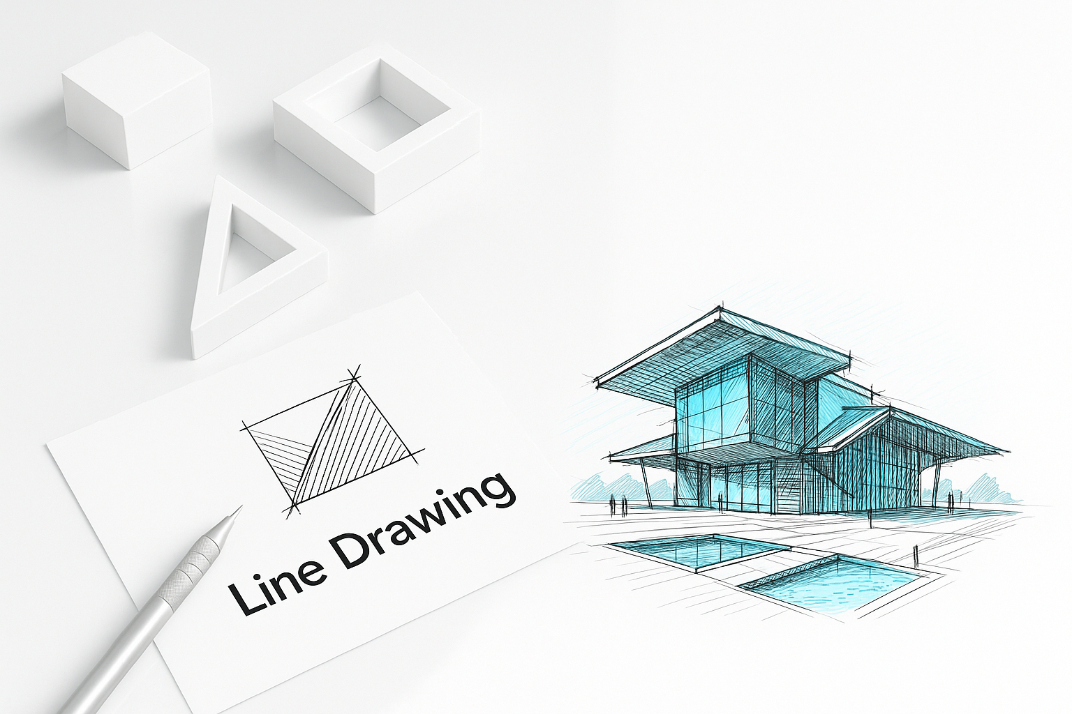
Tools
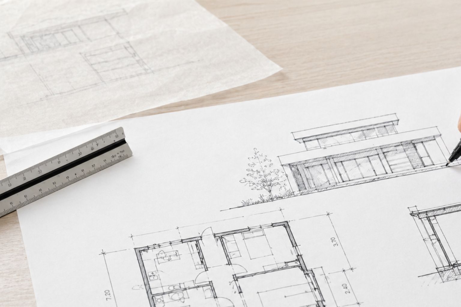
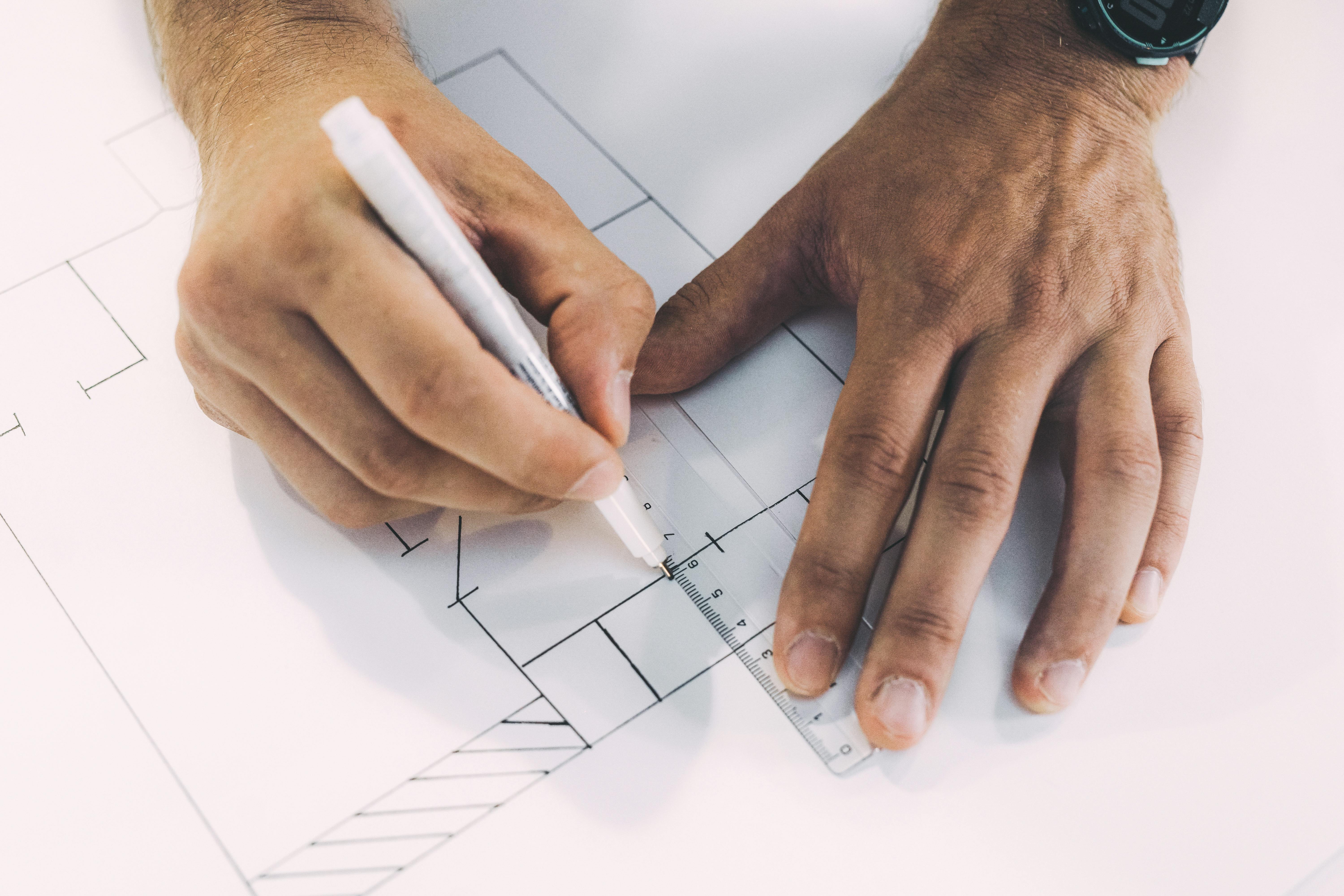
Architect sketching a building design — the core tool is still a pen and paper.
You do not need much. The tools that matter:
Pencils. Get a range from 2H to 2B. Hard pencils (H grades) make light, precise lines good for guidelines and early construction. Soft pencils (B grades) make dark lines good for emphasis and shading. HB sits in the middle and is fine for general sketching. A mechanical pencil with 0.5mm lead is worth having for consistent fine work.
Pens. Pigma Micron or Staedtler fineliner pens in 0.1, 0.3, and 0.5mm cover most needs. Waterproof ink means you can add watercolor washes later without the lines bleeding. Use pens when you want permanence — they force commitment and often produce more confident drawings than pencil for that reason.
Sketchbook. A5 or A4, hardcover. Moleskine, Leuchtturm, or Canson all work. Dot-grid or plain pages are better than lined for architectural work. Carry it everywhere for at least a month and see how it changes what you notice.
Erasers. A kneaded eraser for lightening guidelines without removing them entirely. A vinyl eraser for clean removal. You will use both.
Scale ruler. Essential once you start drawing plans. Get a triangular scale ruler with multiple ratios — 1:50, 1:100, 1:200 are the ones you will use most.
That is the complete list. The quiz buttons, AI tools, and tablet styluses come later. Start with pencil and paper and stay there until the basics are solid.
Lines

Everything in a drawing is a line. Getting control of lines before anything else is the right order. See the full breakdown in Lines in Architectural Sketches — this section covers the core ideas.
Line Types
Solid lines represent visible edges — walls, floors, the outlines of objects in view. These are your primary drawing lines.
Dashed lines represent hidden elements — a beam above ceiling height, a wall behind another wall, or the swing arc of a door. In plans, dashed lines typically mean "above the cut plane."
Thin lines for background and detail. Thick lines for primary edges and emphasis. The contrast between them creates the hierarchy that makes a drawing readable. A sketch where every line is the same weight looks flat even if the composition is correct.
Drawing Steady Lines
Move from the shoulder and elbow, not just the wrist. For long lines especially, the wrist produces wobble because the pivot point is too close to the pen tip. Rest the heel of your hand lightly on the paper and use your whole arm. Try it on a few sheets of scrap paper and the difference is immediate.
For confident straight lines: hover the pen over the paper first, move the whole stroke mentally before making it, then draw. This is called ghosting — the stroke goes where you planned it rather than where your hand wanders.
Line consistency comes from practice. Fill a page with parallel lines. Fill another with lines of varying weight by changing pressure. Do this for a week before worrying about perspective.
Shading: Hatching and Cross-Hatching
Hatching is parallel lines drawn close together to create tone. Spacing them further apart produces lighter tone; closer together produces darker. Cross-hatching adds a second set of lines at an angle over the first, producing darker tones and richer texture.
Use hatching to indicate shadow areas and material texture. The direction of hatch lines can follow the surface they represent — horizontal hatch on a horizontal surface, vertical hatch on a vertical one. This small convention makes drawings easier to read. More on applying this to architecture: Simple Line Drawing in Architectural Sketches.
Perspective
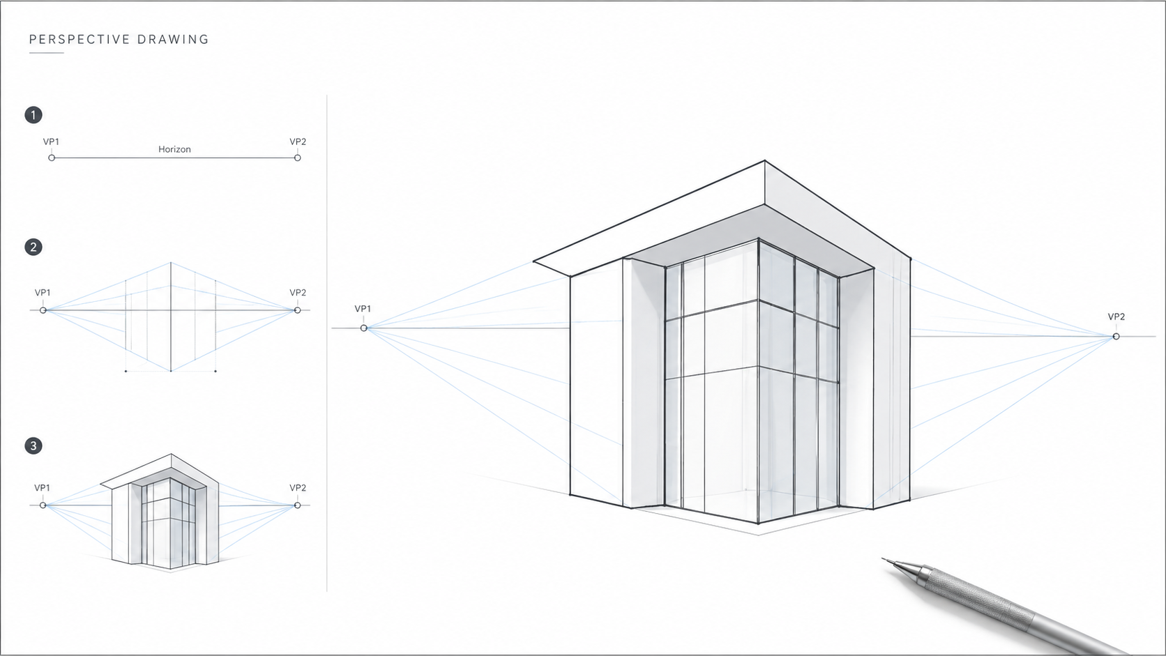
Illustration by ArchitectureCourses.org. A simple two-point perspective drawing diagram showing the horizon line, vanishing points, and how a basic architectural form is built.
Perspective drawing puts three dimensions onto a flat page. The key concept is the vanishing point — a point on the horizon line where parallel edges appear to converge. Understanding this mechanically is straightforward. Getting it to feel natural takes repetition.
One-Point Perspective
One vanishing point, on the horizon. This is the view looking straight down a corridor, street, or room. All the horizontal lines running away from you converge at that single point. Vertical lines stay vertical. Horizontal lines parallel to you stay horizontal.
Start with a box. Draw a rectangle. Pick a vanishing point on a horizontal line above or below it. Draw lines from each corner of the rectangle to the vanishing point. Add a back face by drawing another rectangle between those converging lines. You now have a box in one-point perspective.
Two-Point Perspective
Two vanishing points, both on the horizon, one left and one right. This is the view of a building corner — you can see two faces of the building at once. Neither face is parallel to you. Vertical lines still stay vertical. All horizontal edges on each face converge to their respective vanishing point.
Most exterior architectural sketches use two-point perspective. Draw a vertical line for the nearest corner of the building. From the top and bottom of that line, draw receding lines to both vanishing points. This establishes the envelope. Everything else — windows, doors, floors, roof — fits within that framework.
Three-Point Perspective
A third vanishing point above or below the horizon, used for extreme up or down views — looking up at a tall building, looking down from above a model. Vertical lines are no longer vertical; they also converge. This is used sparingly in architectural drawing because it distorts in ways that can misrepresent a building's actual proportions.
Proportion and Scale

The most consistent problem in beginner architectural sketches is wrong proportion. Ceilings too high, rooms too long, windows too small for the wall. Getting proportion right is what separates a drawing that reads as plausible from one that looks invented.
The fastest way to check proportion is the human figure. A standard ceiling height is 2.4–2.7 metres. A door is roughly 2 metres tall and 0.9 metres wide. A person standing is about 1.7 metres. If you draw a person in your sketch and they fit correctly through the door under the ceiling, your vertical proportions are roughly right. If the person looks like a giant or a child relative to those elements, something is off.
For plans and elevations, use a scale ruler from the start. Drawing at 1:50 or 1:100 and measuring actual dimensions keeps you honest about size in a way that freehand estimating does not.
The Golden Ratio — approximately 1:1.618 — shows up in proportions that tend to feel right to the eye. It is a useful reference, not a formula. A window roughly 1:1.6 in its height-to-width ratio usually looks better than a square window of the same area. It is worth being aware of, not worth calculating precisely.
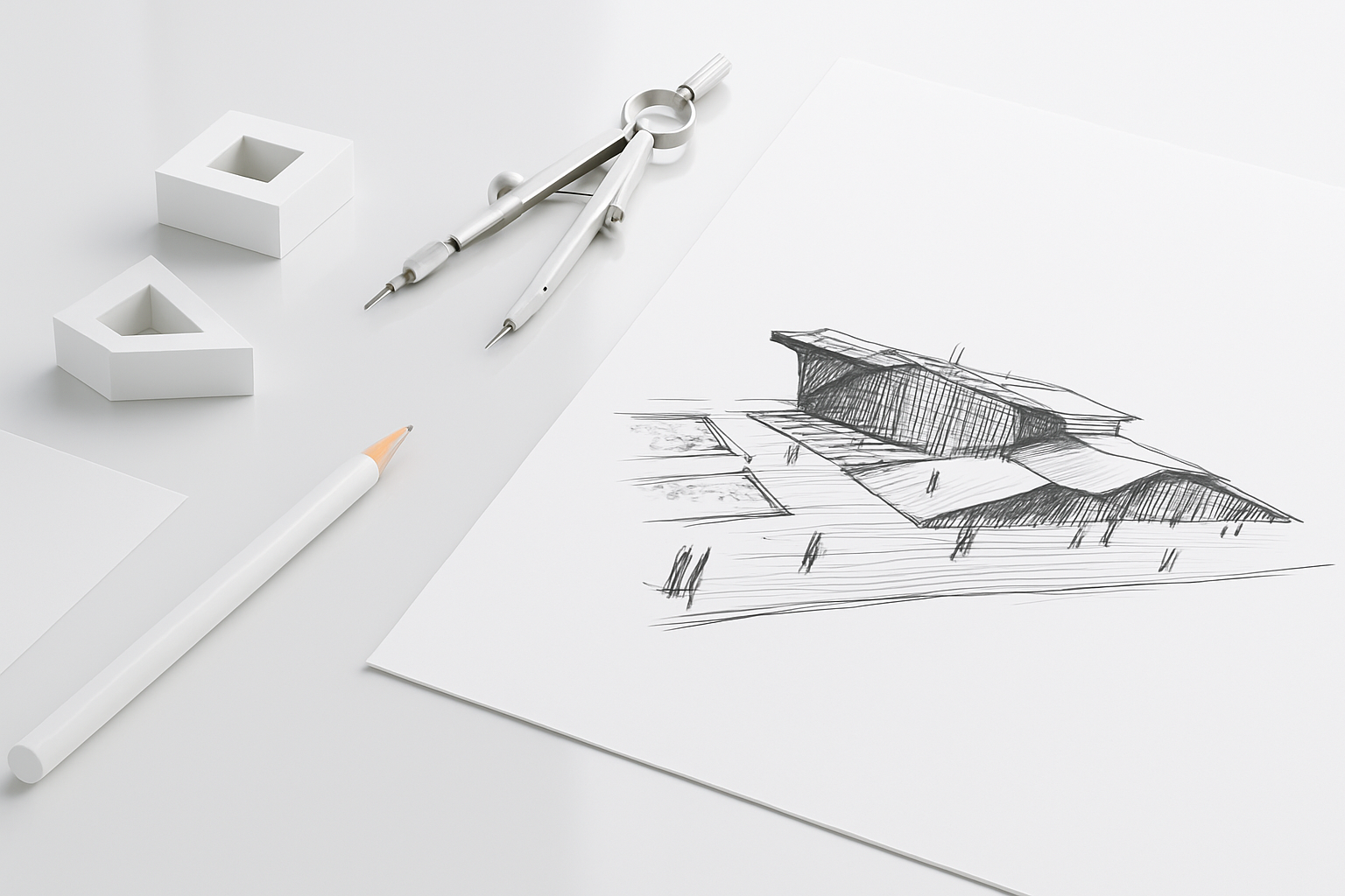
Architectural Elements to Practice
Doors and windows. These are the most common elements you will draw and the ones where proportion errors are most visible. Practice drawing a standard door — 2100mm tall by 900mm wide — until its proportions feel automatic. Windows vary more, but a starting point is a 1:1.5 height-to-width ratio for a single casement. Draw door swings with a compass or freehand arc to indicate the clearance required.
Roof types. Gable, hip, flat, shed, and mansard are the forms that come up most often. Each reads differently in elevation and section. Practice drawing each one from the front, side, and in a simple perspective view. The errors usually show up at the junction between roof and wall — the eave condition — which is worth spending time getting right.
Stairs. Stairs in section are straightforward — rise and run, consistently sized. In plan they show as a series of parallel lines cut at a diagonal. The problem most beginners have is drawing the handrail correctly. Draw the handrail last, after the treads and risers are established.
Material textures. Brick, stone, tile, and wood grain each have a graphic convention. Brick is drawn as horizontal courses with staggered vertical joints. Stone is irregular shapes with consistent joint gaps. Wood grain is parallel irregular curves. These do not need to be photorealistic — they need to read clearly as the material they represent at a glance. More detail on applying this at the building scale: Basic Techniques and Principles of Architectural Drawing.
Bad Habits That Form Early
Most sketching problems are not technique problems. They are habit problems that formed before anyone named them. These are the ones that show up most often.
Drawing too small. Students default to small drawings because small mistakes are less visible. The problem is that small drawings never develop confident lines — everything gets controlled and tight, and the hand never learns to move freely. Force yourself to draw large. A5 minimum for practice sketches. Fill the page. The errors are more obvious but you fix them faster.
Pressing too hard with the pencil early. Heavy pencil lines in the first pass of a drawing lock in mistakes before you have checked whether the composition is right. Start every drawing with light, almost invisible guidelines. Establish the main proportions, check the vanishing points, roughly place the major elements. Then darken the lines that are right and let the wrong ones disappear. This is the same as a painter blocking in before committing to color. Most beginners skip it and spend time erasing instead.
Drawing detail before proportion is right. Windows before you know the wall height is correct. Brickwork before you know the building sits right on the ground. Detail drawn in the wrong place has to be erased or ignored, which either wastes time or produces a drawing that looks confused. The sequence matters: mass and proportion first, elements second, detail last. Every time.
Not looking at the subject enough. A common pattern is drawing for thirty seconds, looking up, drawing for another thirty seconds, looking up. The ratio should be closer to the opposite — more time observing, less time with your head down. What you see when you look up should be what goes on the page, not a recalled version of it. Blind contour drawing trains this directly because it forces your eyes to stay on the subject.
Giving up on a drawing too early. Beginners tend to abandon sketches the moment something goes wrong — a line is in the wrong place, a proportion is off. Working through the problem rather than starting over is where the real learning happens. A drawing that has been corrected and worked is more instructive than a clean restart. Keep going.
Where to Start on a Blank Page
The most common question beginners do not know how to ask is: what do I actually draw first? The blank page problem is real and nobody addresses it directly. Here is the sequence that works for a standard exterior perspective sketch.
1. Horizon line. Draw a horizontal line across the page. This is the eye level — the height from which you are viewing the building. If you are standing at street level looking at a two-storey house, the horizon line sits at roughly a third of the way up the page. Everything above it will appear above your eye level. Everything below will appear below.
2. Vanishing points. Mark one or two vanishing points on the horizon line. For two-point perspective, place them well apart — wider than you think. Vanishing points that are too close together produce distorted, dramatic angles that misrepresent the building's actual proportions.
3. Main vertical. Draw a single vertical line for the nearest corner of the building. This is the tallest element in the drawing — everything recedes from it. Keep it light at this stage.
4. Major receding lines. From the top and bottom of the vertical, draw light lines to each vanishing point. These establish the roof edge and ground line of each face. You now have the basic envelope of the building.
5. Proportion check. Draw a small human figure at ground level — 1.7 metres, roughly the height of a standard door. Does the building look right relative to this figure? Is the ground floor height believable? If something is off, adjust the receding lines now before you add anything else. This is the moment to fix proportion errors, not after you have drawn sixty windows.
6. Major elements. Place the floors, the main openings, and the roofline within the established envelope. Still light lines. Still checking proportion at each step.
7. Detail and line weight. Once the composition reads correctly, commit to the lines. Thicken the primary edges. Add windows, doors, and material texture. Add shading last — determine your light source first, then hatch the shadow faces consistently.
This sequence works because each step gives you something to check before moving to the next. The alternative — starting wherever feels natural and correcting as you go — produces drawings that get worse as they get more detailed because the errors compound.
Practice Exercises That Work
Thirty-second sketches. Set a timer. Pick any object in the room. Draw it in thirty seconds. Do ten of these in a row. The constraint forces you to prioritize — you have to decide immediately what the essential lines are. This is the core skill in quick client sketches and design development work.
The five-minute redraw. Redraw a space you know well from memory, then compare. The gaps between your drawing and reality are your blind spots. Do this weekly. The accuracy improves and so does your ability to catch proportion errors in your own design work.
Copy great drawings. Pick sketches from Alvar Aalto, Carlo Scarpa, or Steven Holl and copy them by hand. Not to replicate their style — to understand their decisions. Where do they put the heavy lines? How much do they leave out? What is the minimum number of lines that makes a space legible? Copying answers these questions faster than any description.
One sketch a day for thirty days. Not complex drawings. Any object, any space, five minutes. The habit matters more than the quality of any individual drawing. By day thirty, your line confidence will be different from what it was on day one.
Blind contour drawing. Draw the outlines of an object without looking at your paper. Keep your eyes on the subject and draw continuously. The result looks wrong — distorted, disconnected — but the exercise forces you to observe carefully rather than draw what you think you see. Blind contour drawing: basics and advanced techniques covers how to use this to build observational accuracy.
Urban Sketching
Urban sketching means drawing on location — buildings, streets, public spaces. It is the fastest way to develop observational accuracy because the subject does not hold still for you. Light changes, people walk through your frame, you have to decide quickly what matters and what to leave out.
The practical setup: sketchbook, two or three pens of different weight, a small watercolor set if you want color. Find a spot where you can see your subject clearly and sit or stand comfortably. Do not bring too much — the constraint forces efficiency.
Start with the biggest shapes. The overall building mass before the windows. The roofline before the brickwork. Get the main proportions roughly right before adding detail. Most beginners go too small too fast and end up with detail in the wrong place.
Do not try to draw everything. Decide what to include and what to simplify. A building that is fifty percent drawn clearly communicates more than one that is fully drawn but muddy. Leaving things out is a decision, not a failure.
The Urban Sketchers community at urbansketchers.org is worth looking at — not for tutorials but for the volume of real work by people at every level. Seeing what others do with the same constraints is useful calibration.
Going Digital
Digital tools extend what you can do with sketching — undo, layers, color without the mess, and the ability to share files instantly. They do not replace the hand-eye coordination you develop with physical drawing. Learn traditional sketching first and you will get more from digital tools, not less.
The tools worth knowing:
Procreate on iPad. The most widely used digital sketching setup for architects and designers. Pressure-sensitive with the Apple Pencil, layering system is intuitive, and the brush library is large. The learning curve is low. Procreate.
Autodesk SketchBook. Free and available across platforms. More limited than Procreate but genuinely good for technical architectural sketching. Symmetry tools and perspective guides are useful. Autodesk SketchBook.
Adobe Photoshop. Better for post-processing hand drawings — scanning pencil work, adding color, adjusting levels — than for primary sketching. Most architects who draw digitally use it to finish work rather than to start it. Adobe Photoshop.
SketchUp. Not a drawing tool in the sketching sense, but useful as a three-dimensional reference. If you are struggling with a perspective view, building a quick SketchUp model and drawing over a screenshot is a legitimate technique. SketchUp.
The transition from traditional to digital: start by recreating something you already drew by hand. The familiarity of the subject lets you focus on learning the tools rather than figuring out the drawing at the same time.
Glossary
Line weight. The thickness of a line. Varied line weight creates depth and hierarchy in a drawing.
Vanishing point. The point on the horizon where parallel edges appear to converge in a perspective drawing.
Hatching. Closely spaced parallel lines used to create tone, shadow, or material texture.
Cross-hatching. Two sets of hatching lines at different angles, producing darker tone and richer texture than hatching alone.
Scale ruler. A ruler with multiple ratio scales printed on it, used to measure and draw objects at a consistent proportion to reality.
Elevation. A drawing showing the exterior of a building from one side — what you would see standing in front of it.
Section. A drawing showing a vertical cut through a building, exposing interior floor levels, ceiling heights, and structure.
Floor plan. A drawing showing a horizontal cut through a building at approximately 1 metre height, looking down — revealing the layout of rooms and spaces.
Contour drawing. Drawing only the outlines of a subject, without interior shading or texture.
FAQ
Do I need to be able to draw to start architectural sketching?
No. Architectural sketching is a technical skill you learn, not a talent you have. The techniques — line control, perspective construction, proportion checking — are all learnable. The main requirement is time spent practicing, not prior ability.
What is the difference between sketching and technical drawing?
Sketching is freehand, fast, and used to develop and communicate ideas. Technical drawing is precise, measured, and produced to specific standards for construction use. Both are important in architecture. You typically sketch to think and draw technically to build. The two skills reinforce each other.
How long before I get noticeably better?
Most people who sketch daily see clear improvement in line confidence within two to three weeks. Perspective accuracy takes longer — expect a month or two of regular practice before one-point and two-point perspective feel reliable. Proportion judgment takes longer still and keeps improving for years.
Should I use pen or pencil?
Both, for different purposes. Pencil for anything where you need to revise — guidelines, construction lines, early proportional work. Pen for committing to a drawing, for final lines, and for urban sketching where you want speed and contrast. Many architects sketch in pencil first and go over the final drawing in pen.
Is digital sketching better than paper?
Different, not better. Digital offers undo, layers, and ease of sharing. Paper offers tactile feedback and no distractions. Most architects who sketch well do both. Learn on paper first.
Recommended Books
Architectural Graphics by Francis D.K. Ching — the standard reference for architectural drawing conventions. Clear, thorough, and worth owning from the start of architecture school through professional practice.
The Urban Sketching Handbook: Architecture and Cityscapes by Gabriel Campanario — practical on-location sketching advice with real examples. Better for someone who has the basics and wants to develop speed and confidence in the field.
Sketching for Architecture and Interior Design by Stephanie Travis — covers both disciplines with clear step-by-step examples. Good for beginners who want worked examples to follow.
Drawing for Architects by Julia McMorrough — compact and beginner-friendly. A good first book if the others feel like too much.
Read Next
Lines in Architectural Sketches — goes deeper on line weight, line types, and how to use them to make drawings read clearly. The natural next step after working through the basics here.
Basic Techniques and Principles of Architectural Drawing — covers the technical side: how to set up a drawing, use a scale ruler, and apply the conventions that make architectural drawings readable to other architects and contractors.
Blind Contour Drawing — the single best exercise for building observational accuracy. Worth reading once you have a few weeks of regular sketching behind you.
Architectural Model Making — sketching and model making develop related spatial skills. Many architects move between the two during the design process.