Depth in a drawing is not an accident. It is the result of specific decisions about line weight, overlapping, scale, and what you leave out. Most beginners treat all lines the same — same pressure, same width, drawn from foreground to background without variation. The result is a drawing that looks flat regardless of how accurately the perspective is constructed.
Perspective construction is covered in Architectural Sketching for Beginners — this article assumes you have the basics and goes into what makes one sketch feel spatial and another feel like a flat diagram.
Line Weight
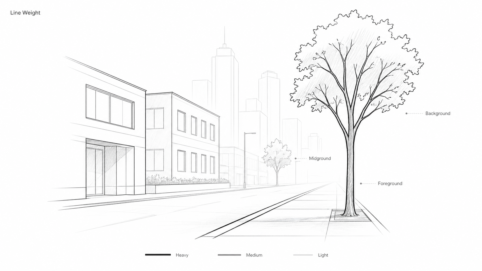
Illustration by ArchitectureCourses.org. Showing how line weight separates foreground, midground, and background in an architectural sketch.
Line weight is the single most effective depth tool in a sketch. The principle is simple: thick, dark lines read as close; thin, faint lines read as far. The contrast between them is what the eye uses to sort the drawing into layers.
In practice this means:
Foreground elements — walls, columns, and objects nearest the viewer — get the heaviest lines. For pen work, 0.5mm or heavier. For pencil, firm pressure with a B or 2B grade.
Midground elements — adjacent buildings, interior structures one plane back — drop to medium weight. 0.3mm pen or lighter pencil pressure.
Background elements — distant buildings, horizon details, far landscape — get the thinnest lines. 0.1mm or a barely-there pencil stroke. At some point, lines disappear entirely and you suggest form rather than draw it.
Beyond weight, reduce information as you recede. The background does not need windows, material texture, or hatching. The absence of detail reads as distance. A foreground wall with brick coursing and a background building with a single faint outline creates more apparent depth than two identically detailed walls drawn at different sizes.
One specific rule worth knowing: in a section drawing, the cut line — the line where the building has been sliced — should be the boldest line on the page. Everything else recedes from it. This is architectural drawing convention but it is also visually logical: the cut plane is the closest thing to the viewer.
Tools that help: Pigma Micron or equivalent technical pens in a 005, 02, and 05 set give you three distinct weights without switching pencils. Mechanical pencils with 0.3 and 0.5mm leads work the same way.
Overlapping
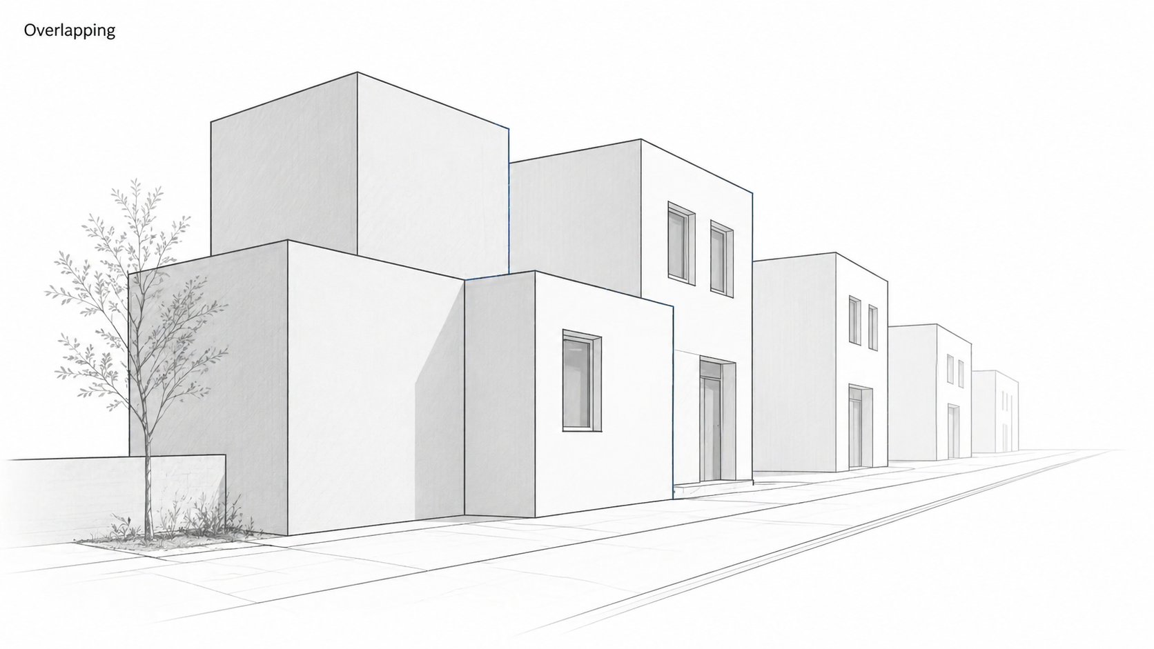
Illustration by ArchitectureCourses.org. Overlapping forms help create depth by placing one shape clearly in front of another.
Overlapping is the oldest depth cue available. When one shape partially covers another, the brain immediately reads the covering shape as closer. It works in any sketch regardless of perspective construction — even a flat diagrammatic drawing gains depth the moment one element crosses in front of another.
The technique is straightforward but the execution needs care. Overlaps should be clear intersections, not just edges touching. If two forms graze each other at a corner, the spatial relationship is ambiguous — the eye does not know which is in front. Draw through one form with the other so the overlap is unambiguous.
Used systematically, overlapping builds layers: a foreground tree in front of a building in front of a distant hill. Each overlap advances or recedes the element relative to everything else. This works at every scale, from a single building corner in front of a wall behind it to an entire urban skyline read as a series of overlapping planes.
Practice drill: sketch five identical columns along a path. Make each one overlap the next slightly. Add a horizon line. The sense of recession is immediate even without varying the size of the columns. Now add size gradation and the effect compounds.
Scale Gradation
Objects appear smaller as they recede. Used deliberately, this is one of the fastest ways to establish depth in a sketch — faster than constructing formal perspective in many cases.
The mechanics: reduce the size of repeated elements as they move deeper into the drawing. Street lights, windows, columns, trees, human figures — any element that repeats can carry this gradation. A consistent reduction of roughly 20-25% per interval of depth is a reasonable starting point. Combine this with line weight reduction and the effect is strong.
Human figures are particularly useful for scale gradation because the viewer automatically reads them as the same actual height. A figure drawn small is therefore far away, without any further explanation. Adding figures at multiple depths — large in the foreground, small in the middle distance, barely indicated at the back — does more to establish scale and depth than almost any other technique.
The error to avoid: reducing size without also reducing line weight and detail. A distant building drawn small but with the same density of linework as the foreground does not read as distant — it reads as a small building close up. All three variables need to move together: size down, line weight down, detail down.
Atmospheric Perspective
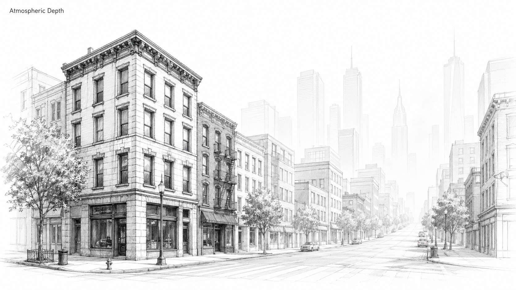
Foreground buildings are drawn with stronger line weight and detail, while distant buildings fade into the background to create atmospheric perspective. Illustration by ArchitectureCourses.org.
Atmospheric perspective is the loss of contrast, clarity, and detail that happens as objects recede into the distance. In reality it is caused by air particles and light diffusion. In a drawing it is simulated by fading lines and removing information — and it is one of the most effective depth techniques available because it mimics something the eye already understands from daily experience.
In a city sketch, the approach is: draw street-level facades in the foreground with full weight, material texture, and shadow. As buildings rise into the skyline or recede into the background, reduce everything. Ghost the outlines. Remove windows. Drop the hatching. Let the eye fill in the rest. The distant buildings should be barely there — just enough to suggest they exist.
The specific decisions that make this work:
Edges. Distant edges should be soft or incomplete, not crisp. A sharp line reads as close. A faint, interrupted, or absent edge reads as far.
Shadows. Do not add dark shadow hatching to background elements. Reserve strong contrast for the foreground. Background shadows, if shown at all, are pale and minimal.
White space. Leaving background shapes less complete lets the white of the paper read as haze. This is more effective than trying to indicate distance through tone — white space does the work without adding marks.
In watercolor or wash sketches, a light gray tone behind background elements reinforces the atmospheric effect. In pen-only work, the same result comes from restraint — knowing when to stop adding lines.
Texture Gradation
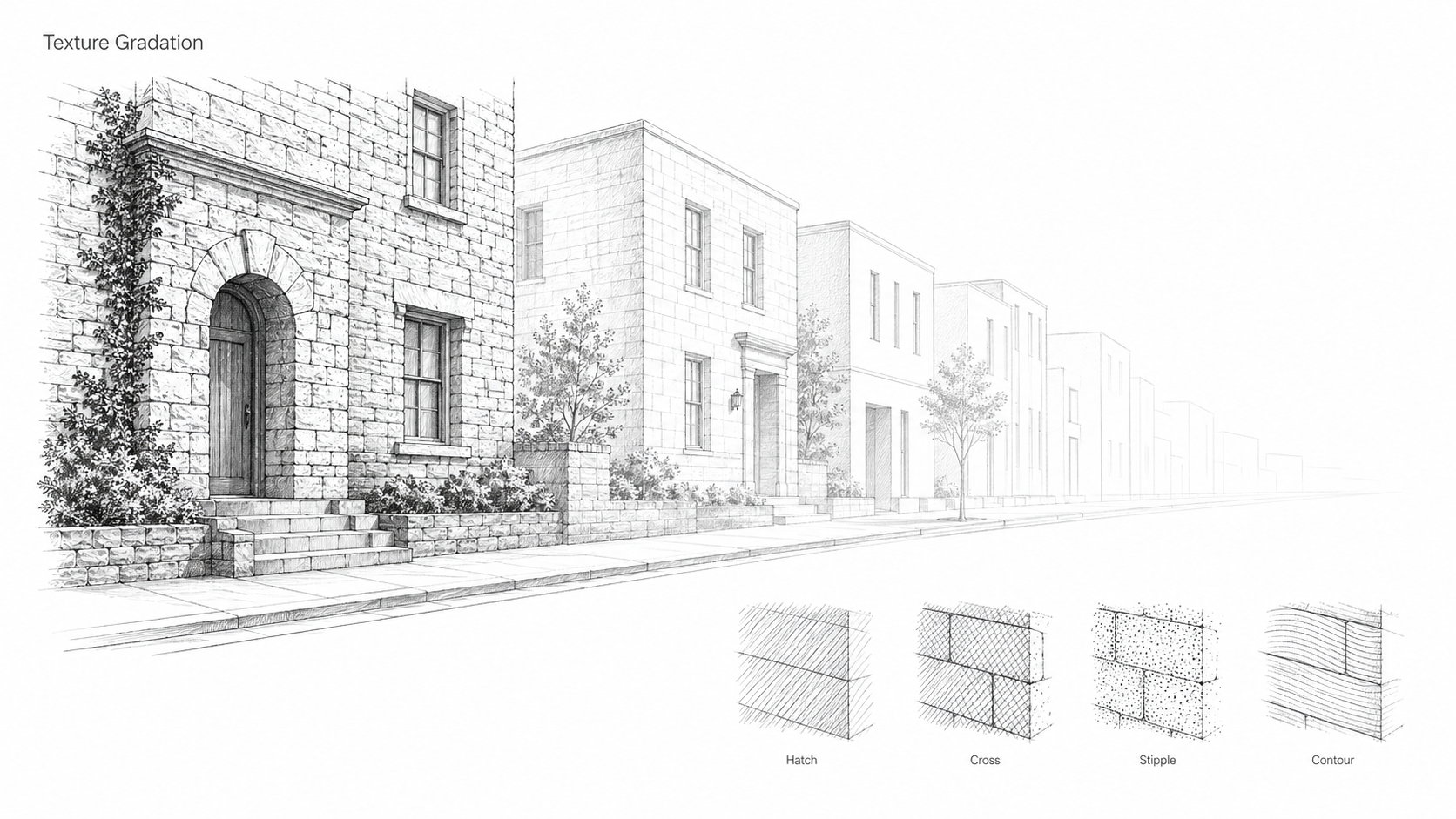
Texture helps describe both material and depth. In the foreground, linework is denser and more detailed; in the distance, texture is reduced to keep forms lighter and farther away. Illustration by ArchitectureCourses.org.
Texture in a sketch does two things: it describes the material, and it contributes to the sense of depth. These are related but distinct uses and both are worth being deliberate about.
The basic techniques:
Hatching. Parallel lines drawn close to create tone. Line spacing determines value — tight spacing produces dark tone, wider spacing produces lighter tone. The direction of hatching should follow the surface it represents: horizontal lines on a horizontal ground plane, vertical lines on a vertical wall. This reads more naturally than hatching drawn at an arbitrary angle across any surface.
Cross-hatching. A second set of hatch lines at an angle over the first, producing darker tone and richer texture. Use this for deep shadow areas and materials that are visually complex — rough stone, aged timber, dense vegetation.
Stippling. Dots rather than lines, producing soft graduated tone. Better for stone, aged plaster, and surfaces with organic texture. More time-consuming than hatching for large areas.
Contour hatching. Lines that follow the form rather than running parallel to the page axes. On a curved wall or dome, curved hatch lines describe the surface more accurately than straight ones — they carry information about form as well as tone.
For depth: use full texture in the foreground and progressively reduce it as elements recede. A brick wall in the foreground might show individual courses and shadow under each brick. The same wall type two planes back gets simplified courses. Further back still, just a faint outline. This gradation of texture density is another variable working alongside line weight and scale to push elements back.
The architects who use line texture most precisely: Carlo Scarpa's sketchbooks show how layered, dense linework can suggest material weight, history, and detail simultaneously without being decorative. Álvaro Siza uses minimal texture — a few lines suggesting brick or shadow — which is more instructive in some ways because it shows how little is needed to carry the reading.
Grids as Construction Tools
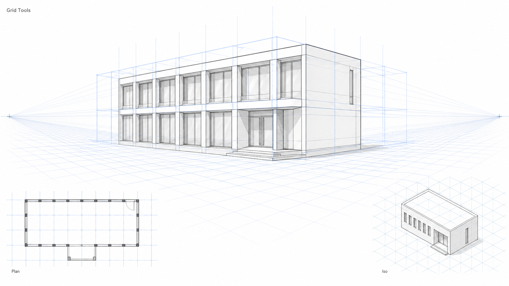
Perspective grids and guide boxes help control scale, spacing, and alignment before the final sketch is drawn. Illustration by ArchitectureCourses.org.
A perspective grid is a light underdrawing that establishes the spatial logic of the drawing before any architecture goes in. It is not part of the finished drawing — it is construction scaffolding that gets drawn over or erased. Used consistently, it prevents the most common errors in perspective sketches: angles drifting, proportions collapsing, elements that float without appearing to sit on a ground plane.
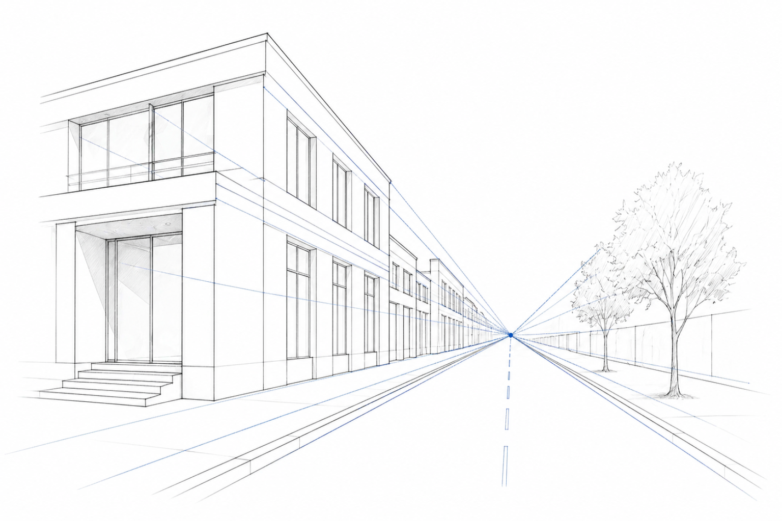
The basic grid setup for a two-point exterior sketch: draw a ground plane using the vanishing points as guides. Mark evenly spaced lines along this plane — these become the grid for checking scale and spacing as you build the drawing. Add vertical lines at key points to establish wall heights. The grid lines themselves use the lightest possible pencil stroke, typically blue pencil which does not reproduce on photocopies or scans.
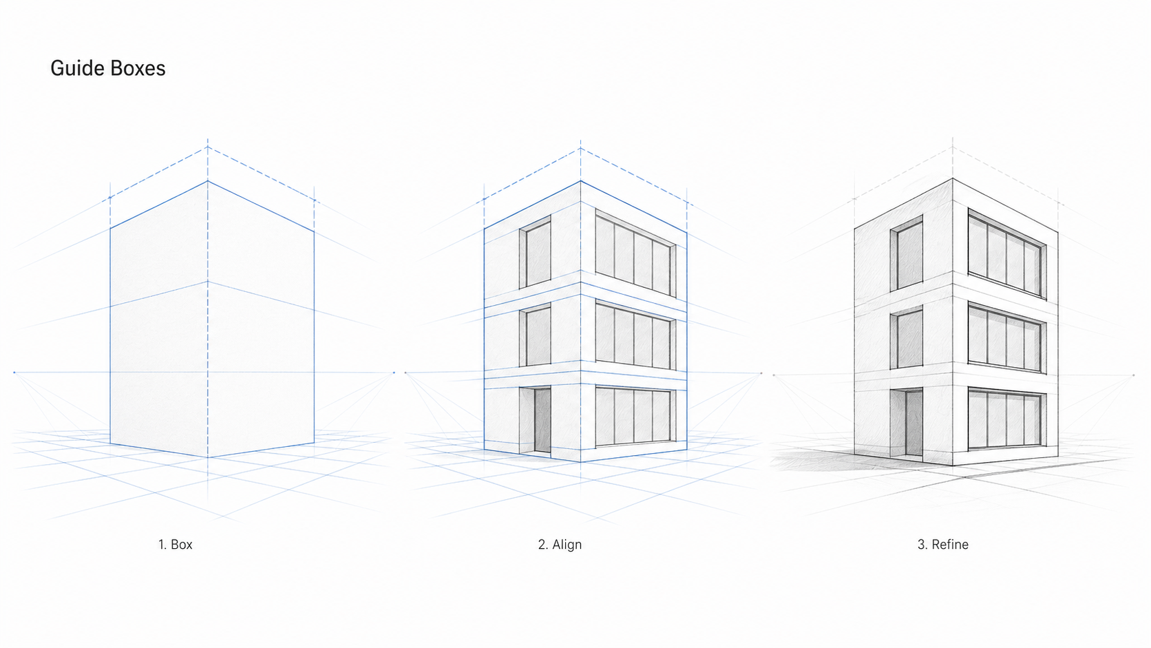
Illustration by ArchitectureCourses.org. Showing how guide boxes help control form, alignment, and perspective in an architectural sketch.
Guide boxes are a related technique — drawing a bounding box around an element (a window bay, a facade module, a doorway) before drawing the element itself. The box gives you the proportional container first and prevents the element from growing or shrinking as you add detail. This is most useful when you are drawing a repeated module — a window pattern that has to be consistent across multiple floors, for example. Draw the guide box for the first module, check the proportions, then use it as the reference for all subsequent modules.
Isometric grids are an alternative when you want a consistent technical look without vanishing point perspective. All parallel lines stay parallel in isometric — there is no convergence. This produces a slightly diagram-like result that is useful for axonometrics and exploded views but reads less naturally for exterior perspectives. A good ruler and French curve set covers most grid construction needs.
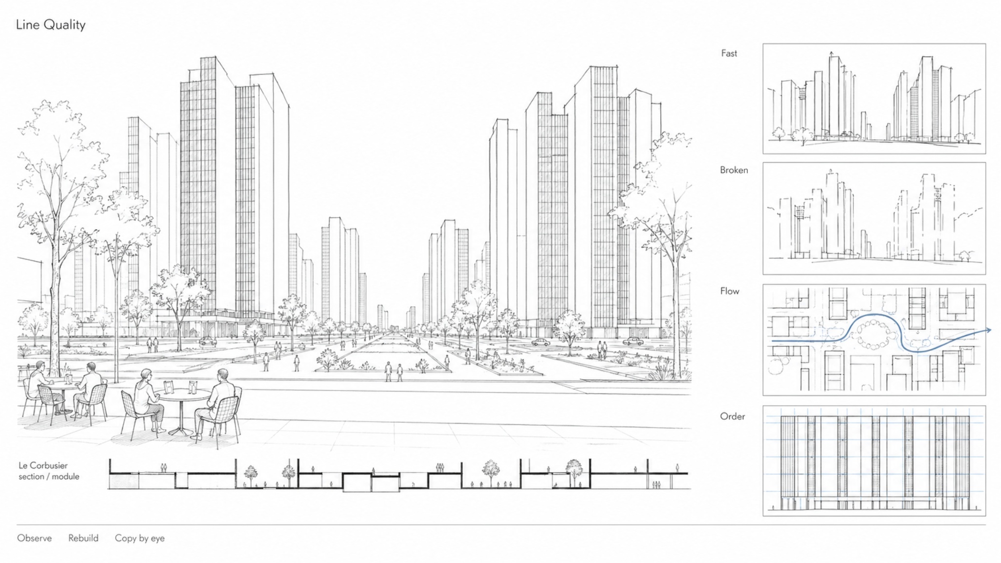
Line Quality and What It Signals
Line quality communicates things about a building beyond its shape and depth. This is worth understanding because it affects how a sketch reads in a presentation or review context.
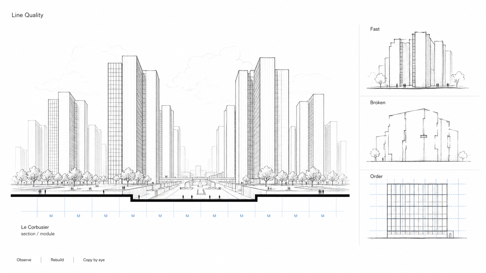
Speed of stroke. A fast, confident stroke reads as decisive. A slow, careful stroke reads as uncertain or corrected. This is not about accuracy — a fast stroke can be slightly imprecise and still read as more authoritative than a slow, "correct" one. Draw with more speed than feels comfortable. The line quality improves before the accuracy does, but the sketch reads better for it.
Broken and interrupted lines. Lines that stop and restart, or leave deliberate gaps, read as conceptual — useful for early design stages or when communicating an idea that is still being worked out. In presentation drawings this reads as unresolved. In design development it reads as honest. Know which context you are in.
Directional consistency. Circulation paths drawn with flowing, continuous lines read as movement and flow. Grid lines drawn with precise, even strokes read as structure and order. Matching the line quality to the spatial function of what you are drawing is a subtle communication tool. Scarpa understood this — his plans often shift between tight structural lines and freer material lines, which communicates the hierarchy of the building's order without labeling it.
Architects to Study
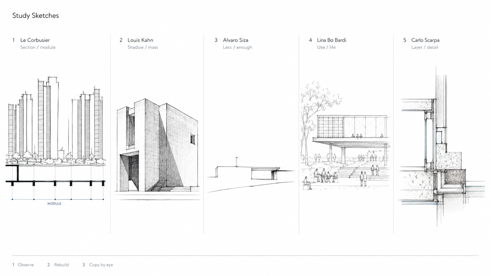
Studying strong architectural sketches helps you see what matters: section and module, shadow and mass, restraint, social use, and construction detail. Illustration by ArchitectureCourses.org.
Copying sketches by architects who draw well is one of the most efficient ways to learn these techniques. The goal is not to replicate their style — it is to understand their decisions. Where are the heavy lines? What gets left out? How much information does the minimum readable sketch contain?
Le Corbusier. Section lines and modular proportions. His sketches cut through buildings to reveal light and spatial logic. Study how he uses the section cut — always the heaviest line — to organize everything else in the drawing.
Louis Kahn. Heavy volumes, strong shadow, deliberate void. His sketches show how light direction and shadow density can carry the structural and spatial hierarchy of a building without labeling anything. The shadow is the drawing.
Álvaro Siza. Minimal lines that suggest more than they describe. A few strokes indicating a roofline, a shadow, a landscape condition. Study his drawings for the discipline of leaving out — how little line is needed before the drawing stops reading.
Lina Bo Bardi. Diagrams and drawings that blend. Her sketches communicate social intention as much as spatial form — people and activity are part of the drawing, not added as scale figures. Study her for how to make a sketch communicate what a building is for, not just what it looks like.
Carlo Scarpa. Layered linework, material texture, construction logic in the drawing itself. His sketches are dense with information but hierarchically organized. Study him for how to use texture and line weight to describe material, not just form.
The process: pick one drawing. Identify the vanishing points and horizon. Reconstruct the basic perspective structure. Then copy the drawing — not by tracing, but by drawing from observation. Stop frequently and look at what is heavy, what is light, what is absent. The copy will tell you things about the original that looking at it does not.
Shadow as a Depth Tool
Shadow does two things in a drawing: it describes tone, and it plants elements in space. The second function is underused. When an element casts a shadow onto the surface beneath it — a column onto a ground plane, a parapet onto a wall below it, a canopy onto the facade behind it — the element reads as three-dimensional and grounded. Without that shadow, the same element can look like a flat cutout sitting on the page rather than a physical object occupying space.
The discipline that makes this work is deciding on a light source direction before any shading starts, and keeping it consistent through the whole drawing. Pick a direction — upper left is the most common convention in architectural drawing, producing shadow falling to the lower right — and apply it to every element. Inconsistent shadow directions are one of the most common reasons a drawing looks confused even when the perspective is correct. The eye reads multiple light sources as multiple different drawings layered on top of each other.
Cast shadows on the ground plane are particularly effective. A wall that sits flat on a ground line looks cut out. The same wall with a cast shadow extending behind it reads as standing upright in space. The shadow defines the relationship between the vertical and horizontal planes. This is especially useful in perspective sketches where the ground plane is not explicitly drawn — a few cast shadows establish where the ground is without needing to shade the whole floor.
The depth logic of shadow follows the same gradient as line weight and atmospheric perspective: strong, crisp shadows in the foreground; softer, less defined shadows in the midground; no shadows or barely suggested ones in the background. A building in the far distance should not have the same shadow density as the wall directly in front of the viewer. Consistent application of this gradient, combined with the other depth techniques, produces drawings where the layers of space are immediately legible.
The mistake to avoid: adding shadow hatching as a texture or decoration rather than as a consequence of a specific light source. Shadow that does not correspond to a consistent light direction looks like shading applied for visual interest rather than spatial information. The viewer reads it as pattern, not depth.
Practice Drills
Street corner. Two-point perspective, vanishing points placed wide. Draw buildings fading into each side. Force yourself to reduce line weight and detail as buildings recede. Check that the horizon line passes through every human figure at eye level.
Same building, three passes. Draw a simple building facade. First pass: foreground line weight throughout, full detail. Second pass: lighten everything behind the first plane. Third pass: reduce background to barely visible outlines. Compare the three. The depth progression is usually more dramatic than expected.
Texture ladder. Take a single wall material — brick or stone. Draw it in full detail for 10cm of height. Then simplify progressively upward: reduce the courses, reduce the shadow lines, reduce everything until the top section is just a faint outline. This exercise trains the eye to know when detail can stop.
Copy and analyze. Copy a sketch by one of the architects above. After finishing, write three observations about decisions you noticed during the copy that you had not noticed when looking at the original. This almost always produces something useful.
FAQ
What is the most important line rule for depth?
Line weight. Bold for foreground, light for background, absent for the far distance. This one variable, applied consistently, creates more apparent depth than correct perspective construction with uniform line weight.
How many vanishing points should a sketch have?
One for frontal views — corridors, rooms, elevations seen straight on. Two for exterior corners and street scenes. Three for dramatic up or down views, used sparingly because it distorts proportions. Most working architectural sketches use two-point.
Can you create depth without formal perspective construction?
Yes. Overlapping, scale gradation, atmospheric perspective, and line weight variation all create depth without a ruler or vanishing point. Freehand gestural sketches that use these four techniques read as more spatial than mechanically constructed perspective drawings that ignore them.
What tools work best for line variation?
A set of Pigma Micron pens in 005, 02, and 05 covers most situations for pen work. For pencil, a range from 2H to 2B gives the full span from construction line to emphasis line. Pick one medium and learn to control it before introducing others.
How do professionals keep line drawings from looking messy?
Hierarchy. There is always a clear distinction between the heaviest lines in the drawing and the lightest. White space is used deliberately rather than filled. Lines stop when they have done their job — architectural drawings gain clarity from what is not drawn as much as from what is.
Read Next
Architectural Sketching for Beginners — if some of the perspective terms in this article were unfamiliar, this covers the foundations: tools, perspective construction, proportion, and the sequence for starting a drawing from a blank page.
Basic Techniques and Principles of Architectural Drawing — the technical conventions that make architectural drawings readable: how to set up a drawing, scale, and the standards for different drawing types.
Blind Contour Drawing — the best exercise for developing the observation skills that make depth techniques work. If your lines consistently describe what you think you see rather than what is there, this is the fix.