A 1920s room goes wrong when the decade gets treated like a box of props.
Black walls. Gold hardware. Zigzag rug. Mirrored table. Velvet chair. Chrome lamp. Each piece makes sense on its own. Pile them together and the room starts fighting itself.
The better version is tighter. A narrower palette. Better wood. Better light. One or two surfaces doing the heavy lifting, then restraint.
That is the part that matters here: which colors fit, which materials carry the look, what belongs together, and what turns a 1920s room into a costume.
This Part Matters: if you need the wider room picture first, read 1920s Interior Design Style. If you are leaning harder into the sleeker side of the decade, keep Art Deco Interior Design open too. For the bigger housing context, 1920s House Styles helps.
The Short Answer
Good 1920s color palettes and materials are built on contrast, but not chaos.
The palette often starts with one dark anchor, one light base, and one richer accent or metal. The materials do the rest: stained wood, painted trim, metal, mirror, stone, lacquer, glass, velvet, woven textiles, and patterned rugs with enough geometry to sharpen the room without taking it over.
That is why a room from this decade can feel rich without being heavy. The best rooms are not loud in every direction. They are edited.
| Element | What Fits the Decade | What Weakens It |
|---|---|---|
| Base colors | Cream, ivory, taupe, smoky gray, deep green, soft blush, black used with care | Pure white everything or too many bold colors at once |
| Wood | Walnut, mahogany tones, darker stain, visible grain | Gray-washed wood or orange stain |
| Metal | Brass, chrome, nickel, bronze in a controlled mix | Three or four competing shiny finishes |
| Stone and gloss | Marble, lacquer, mirror, glass used in key places | Glossy surfaces on every wall and table |
| Soft materials | Velvet, woven upholstery, drapery with weight | Thin polyester shine or flat builder fabrics |
1920s Color Is Wider Than Black and Gold
Black and gold get all the attention. Fair enough. That pair can work. It photographs well. It reads “Art Deco” fast. But it is only one lane inside the decade.
A broader 1920s room can also lean cream and walnut. Dusty rose and chrome. Deep green and ivory. Soft gray with black lines and one warm metal. Even pale blue and silver can land if the room has the right shapes and better surfaces under it.
The mistake is treating the decade like one fixed palette. It was not.
There were richer Deco rooms. There were softer transitional rooms. There were painted rooms with patterned drapery and dark furniture. There were sleek rooms with glass and chrome. There were also spaces that still carried older trim, older rugs, and older room planning but started pulling in newer materials.
That range matters. It gives you more room to work. A 1920s-inspired room does not need to look like a nightclub or a stage set to read right.
Color Combinations That Hold Up
These pairings are the safest starting points if the goal is a room that feels period-aware but still livable.
| Palette | What It Feels Like | Best Use |
|---|---|---|
| Black, ivory, brass | Sharper, more Deco, more contrast | Dining rooms, entries, powder rooms |
| Walnut, cream, deep green | Richer and calmer | Living rooms, libraries, bedrooms |
| Dusty rose, chrome, warm wood | Softer, still period-right | Bedrooms, dressing areas, smaller sitting rooms |
| Charcoal, marble white, antique brass | More formal, stronger edge | Bathrooms, dining rooms, foyers |
| Navy, off-white, nickel | Cooler and cleaner | Apartments, kitchens, tighter rooms |
A room goes off track when every surface tries to be the accent. One dark anchor. One light field. One richer finish or metal. That gets you farther than six statement colors fighting for space.
Related Reading: 1920s Decor Style is the broader page if you want the mood, furniture, and styling side around these palettes.
Where the Dark Color Should Go
This is one of the details that gets missed. Dark color works best when it has a job.
Use it on a cabinet. A piano. A fireplace surround. A set of chairs. A rug border. A lacquered table. A bathroom vanity. A single wall behind a bed or console. Something with shape.
What goes wrong is dark color floating everywhere with no hierarchy. Black drapes, black sofa, black rug, black lamp, black wall, gold everything. At that point the room stops feeling crisp and starts feeling heavy.
Dark color in a 1920s room needs something lighter pushing back against it. Cream walls. pale ceiling. stone top. mirrored panel. lighter rug field. That contrast is carrying the room.
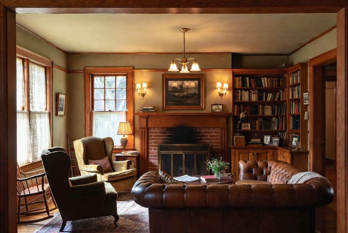
Woodwork Carries More of the Decade Than the Accessories Do
A lot of 1920s rooms get their depth from wood before anything shiny is added.
Walnut is the easiest reference point. Mahogany tones work too. Darker oak can work if the grain and shape are strong enough. Painted trim can fit the decade too, but when the room wants warmth, stained wood does more work than another metallic object ever will.
This is why so many weak “1920s” rooms fall apart. The room has glossy brass objects but no material depth underneath them.
Good wood moves:
- walnut sideboard with simple hardware
- dark-stained door frames against lighter walls
- wood dining table with cleaner lines instead of farmhouse bulk
- veneer cabinet with a curved or stepped front
- bedside tables with richer stain and less visual clutter
Bad wood moves:
- gray washed wood trying to sit beside brass and mirror
- orange stain
- distressed finish
- chunky rustic wood in a room that wants cleaner geometry
That last one matters. 1920s rooms can carry age and weight. They do not want fake rustic texture.
Chrome, Brass, Nickel, and When to Stop
Metal is where the room can get expensive fast or cheap fast.
Chrome pushes the room toward a cleaner Deco look. Brass warms it up. Nickel sits quieter in the middle. Bronze can work when the room has enough wood and stone to hold it.
The problem is not mixing metals. The problem is mixing them without a lead finish.
Pick one metal to carry the room. Let the second one show up once or twice if it helps. That is enough.
| Use This | Instead of This | Why It Holds Up Better |
|---|---|---|
| One lead metal with one small echo | Brass, chrome, nickel, black metal, and gold all competing | The room stays readable |
| Metal on lighting, hardware, and one accent piece | Metal on every edge and every object | The shine feels sharper and less cheap |
| Warmer brass with darker wood | Bright yellow fake gold on thin furniture | The finish feels grounded |
| Chrome with glass and pale colors | Chrome dropped into a heavy rustic room | The whole palette feels connected |
Thin sprayed “gold” is one of the fastest ways to kill the look. It reads fake from across the room.
Glass, Mirror, Lacquer, and Stone
This is where the room gets its edge.
Mirror matters. Not mirror everywhere. Just enough mirror to catch light and sharpen the lines. A console mirror. A cabinet panel. A tray. A bathroom mirror with a better shape. That is enough to shift the room.
Glass helps too. Ribbed glass. etched glass. heavier lamp bases. cabinet doors with some depth. It gives the room a cleaner, more exact feel.
Lacquer can work in a 1920s room when the shape is right. One lacquered cabinet, one side table, one piano-black piece. That is plenty. At room scale, lacquer is stronger than it looks in a catalog.
Stone belongs in smaller decisive spots. Fireplace surround. side table top. vanity. console top. bathroom wall. You do not need a whole room wrapped in glossy stone to get the decade across.
A room like this gets strong from a few hard surfaces bouncing light around a darker or softer base. Not from coating every surface in shine.
Fabric Has to Warm the Room Back Up
Once the room has metal, mirror, glass, and stone, something softer needs to come in and calm it down.
Velvet is the easy one. It catches light without going flat. Cut velvet or a tighter mohair-like fabric can work too. Woven upholstery works if the shape of the furniture is strong enough. Silk-like drapery can work, but only if the room is controlled enough to carry the sheen.
Good fabric choices in this lane:
- velvet chair in a deep color
- heavy curtains with soft fold and some body
- patterned rug with geometric border
- upholstered headboard with one clear line
- small touch of fringe or piping where the room can hold it
Weak choices:
- shiny polyester posing as velvet
- farmhouse linen dropped into a sharper Deco room
- too many throw pillows with different motifs
- thin curtains that do not hold their shape
The room does not need more softness than structure. It just needs enough to keep the harder materials from feeling cold.
Room by Room
Living Room
Let the wood and the rug do more of the work. A dark sideboard. A patterned rug with a clean border. One mirror. One or two warm metals. Better lamps. That gets you farther than stacking glossy accessories on every table.
Dining Room
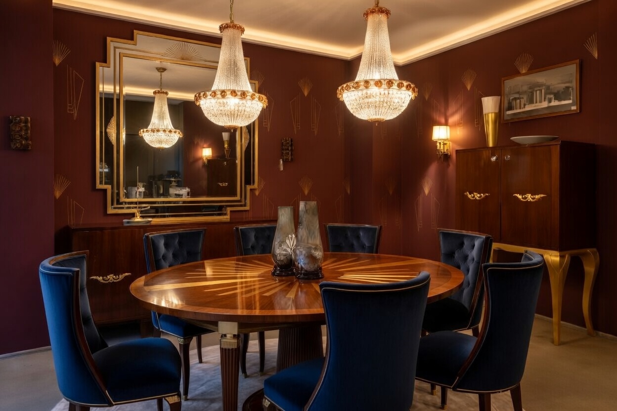
Image by ArchitectureCourses.org. An Art Deco-inspired dining room with deep red walls, a sunburst wood table, crystal chandeliers, and blue velvet seating.
This room can take the stronger palette. Darker walls if the room has enough light. Black lacquer or darker wood. Brass or chrome chandelier. Stone top on the sideboard if you want one stronger hard surface.
Bedroom
Soften the palette a bit. Dusty rose, ivory, walnut, chrome. Or cream, black, and one warm metal if the room is simpler. This room wants less contrast than the dining room and less shine than the bath.
Bathroom
This is one of the easiest rooms to tune into the decade. Better mirror. Globe or ribbed sconces. Dark vanity or stone top. Stronger hardware. One patterned floor or one sharper wall tile field. No need to throw every Deco move at it.
The Part That Gets Missed
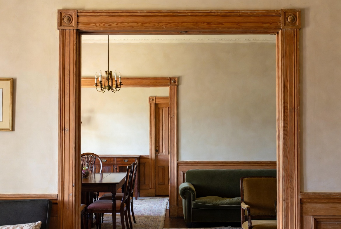
Image by ArchitectureCourses.org. Stained wood trim and framed openings help define the room-to-room sequence in a 1920s interior.
The 1920s look is not built by color alone. It is built by contrast with structure under it.
That is why a room with perfect “period colors” can still feel dead. The palette may be right, but the furniture is wrong, the lighting is flat, the mirror is too small, the metal finish is weak, and the room has no center.
Color and materials cannot rescue a room that still feels scattered.
Start with the shape of the room. Then the bigger surfaces. Then the palette. Then the accessories last. In that order, the decade starts to come through without the room trying too hard.
What To Buy First
| Spend Here | Not Here | Why |
|---|---|---|
| Good lighting | Extra decorative objects | Better light changes the whole room |
| One strong rug or hero piece | Many small “period” accessories | The room needs a center before filler |
| Better mirror or cabinet | Cheap gold finishes | Shape and reflection carry more weight than gimmicks |
| Wood finish with depth | Trend stain colors | The decade leans on richer wood tones |
| One controlled metal finish | Mixed hardware bought piece by piece | The room stays cleaner and more expensive |
FAQ
What colors fit 1920s interiors best?
Cream, ivory, black used with care, deep green, charcoal, dusty rose, navy, and metal accents like brass, chrome, or nickel all fit. The trick is keeping the palette tight.
Did every 1920s room look Art Deco?
No. Deco became a strong part of the decade, but not every room leaned hard into that sharper look. Some spaces stayed softer, more transitional, or more rooted in older planning and woodwork.
What wood finish fits the decade?
Walnut and other darker stained woods fit better than gray wash, pale driftwood finishes, or distressed rustic surfaces.
What metal should I choose?
Pick one lead finish first. Brass, chrome, nickel, or bronze can all work. The room gets weaker when too many shiny finishes compete.
Is black and gold the safest choice?
Not always. It is the most obvious choice, but not the easiest one to keep controlled. Richer neutrals with dark wood and one metal often hold up better.
What ruins the look fastest?
Cheap metallic finishes, too many motifs, weak lighting, and a room with no center.
What To Read Next
This page handles the palette and finish side of the decade. The next step depends on what you are fixing.
- 1920s Interior Design Style for the wider room layout and furniture picture.
- 1920s Decor Style for the broader decorating layer around the decade.
- Art Deco Interior Design if the room is leaning harder into the sharper Deco side.
- Art Deco Houses if you want to see how these materials and palettes work at house scale, not just room scale.