
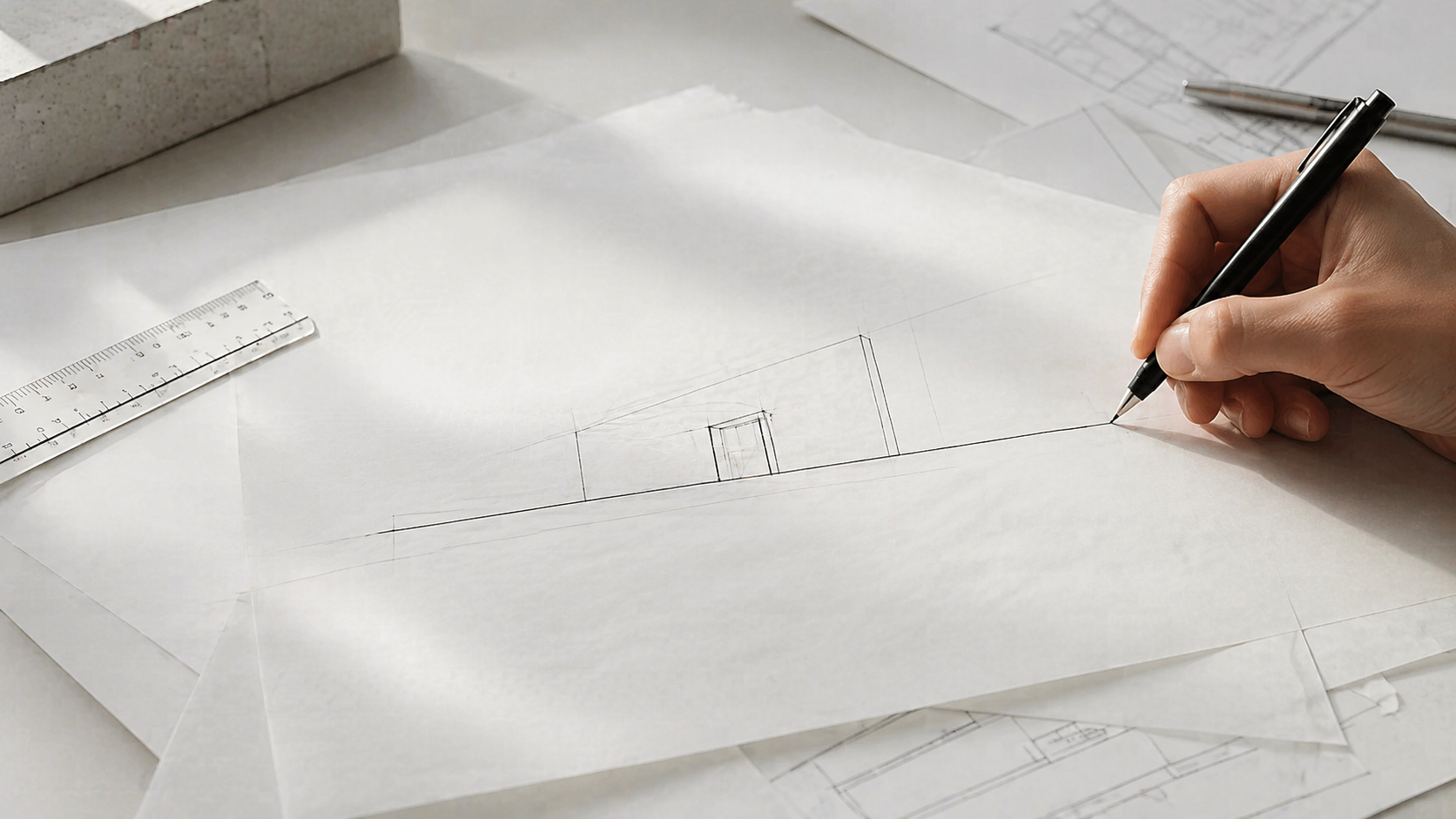
Illustration by ArchitectureCourses.org. Basic architectural drawing principles through perspective construction, proportion, and draft control.
Architectural drawing has a set of conventions that practitioners share — line types, perspective systems, proportion tools, and scale ratios. Learning these early means your drawings communicate clearly to other architects, engineers, and contractors. Skipping them means spending years unlearning habits that were never right to begin with.
This page covers the technical fundamentals: line drawing, perspective, proportions, and how to use a scale ruler. For freehand sketching and how to develop your eye, start with Architectural Sketching for Beginners. These two articles work best read together.
Line Drawing
Every drawing is built from lines. There are three types you need to know, and each one means something specific. Using the wrong one in the wrong place is not just an aesthetic error — it miscommunicates information to anyone reading the drawing.
Three Line Types
Straight lines. The most common line in architectural drawing. Used for edges, walls, structural elements, boundaries, and anything that is physically present and visible. Clean, decisive strokes. A wall is a straight line. A column is a straight line. A ceiling edge is a straight line.
The technique that makes straight lines easier: move from the shoulder and elbow rather than the wrist alone. The wrist pivot point is too close to the pen tip to control a long line accurately. Rest the heel of your hand on the paper lightly and draw the whole stroke in one movement. Do this on scrap paper a few times before any drawing session — the difference in line quality is immediate.
Curved lines. Used for arches, rounded facades, organic forms, circular windows, and landscape elements. The difficulty with freehand curves is that slow strokes produce wobbly lines. Work slightly faster than feels comfortable and use your whole arm for large arcs. For precise curves — a specific arc radius, a consistent ellipse — use a compass or French curve rather than trying to freehand something that needs to be exact. Both skills matter: freehand for concept and early design work, tools for technical accuracy.
Broken lines (dashed). Used to represent elements that exist but are not visible in the current view — a beam above a ceiling, a foundation below grade, the swing arc of a door in a plan, hidden structural members. The dashes should be uniform in length and spacing. Inconsistent dashes do not just look messy — they make the drawing harder to read. In plan drawings, the convention is that dashed lines represent elements above the cut plane (typically around 1 metre above finished floor level).
Line Weight
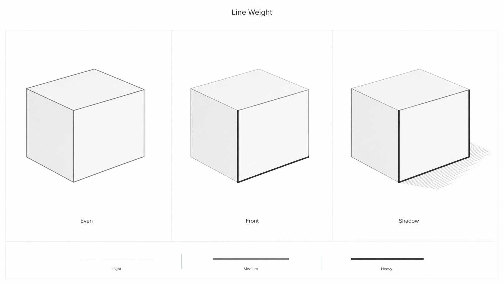
Line weight — the thickness and darkness of a line — creates hierarchy in a drawing. Heavy lines read first. Light lines read as secondary information. A drawing where every line is the same weight is difficult to read because nothing is more important than anything else.
The general hierarchy: the most important lines get the most weight. In a floor plan, the cut walls are the heaviest lines. Furniture and fittings inside the rooms are lighter. Door swings and dimension lines are lighter still. Guidelines and construction lines are the lightest of all and are often erased before final presentation.
For pencil work: harder grades (2H, H) make light lines; softer grades (B, 2B) make dark lines. Use hard pencils for guidelines and early layout work. Use soft pencils for finalizing the drawing with appropriate weight. For pen work, switching between 0.1mm, 0.3mm, and 0.5mm pens achieves the same hierarchy.
The most common mistake is drawing heavy guidelines early and then being unable to correct proportions without erasing a lot of work. Always start light. Get the layout right. Then commit to the weights.
Common Line Drawing Mistakes
Going over the same line repeatedly. A line drawn in two or three passes looks fuzzy and uncertain. One confident stroke, even if slightly imprecise, reads better than five hesitant strokes stacked on each other. Draw once, assess, correct if needed.
Inconsistent line weight throughout the drawing. Every element at the same weight means no hierarchy. The eye has no guidance about what to look at first.
Avoiding curved lines. Students who stay in their comfort zone with straight lines produce drawings that cannot represent arched elements, rounded rooms, or organic forms. Practice freehand circles and arcs specifically — they need more practice than straight lines, not less. Blind contour drawing develops the hand-eye coordination that makes curved lines more reliable.
Perspective Drawing
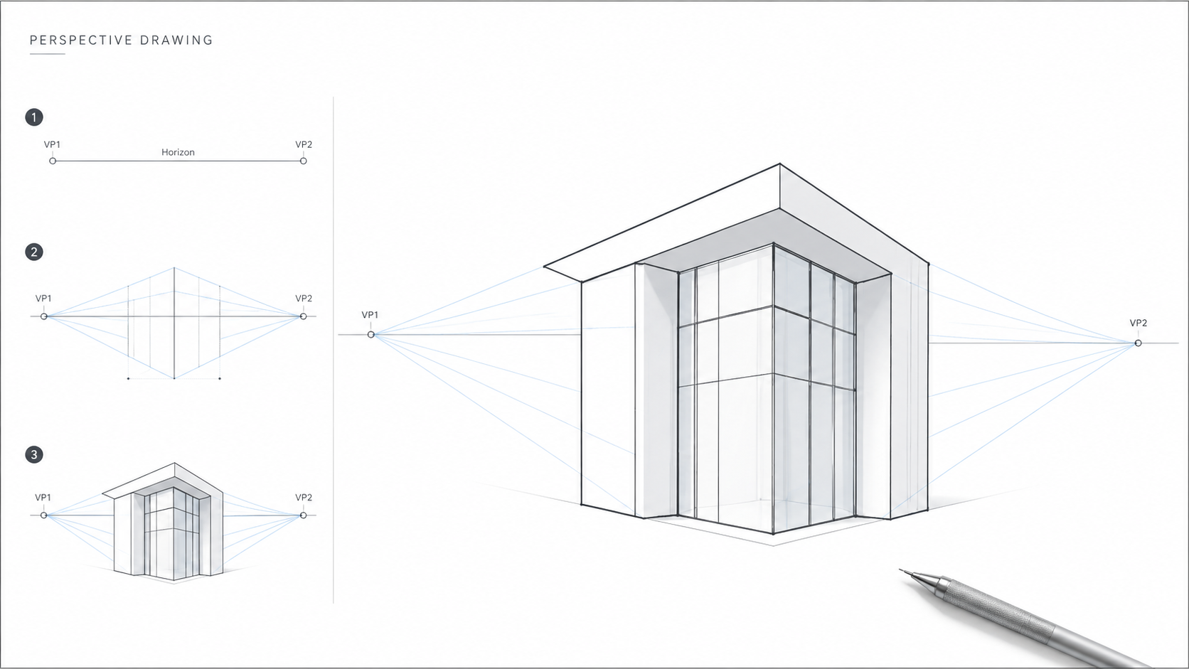
Perspective drawing represents three-dimensional space on a flat surface. The underlying principle is the vanishing point — the point on the horizon line where parallel lines appear to converge. Horizon line position represents eye level. Everything above the horizon is above eye level. Everything below is below.

One-Point Perspective
One vanishing point on the horizon. Used for views looking directly into a space — corridors, rooms seen straight on, elevations seen head-on. All lines running away from the viewer converge to that single point. Vertical lines stay vertical. Horizontal lines parallel to the viewer stay horizontal.
How to set it up: draw a horizon line across the page. Place a single vanishing point on it — usually near the center for a frontal view, off-center for a view angled slightly to one side. Draw lines from the edges of your subject to the vanishing point. These are the depth lines. Add a back face by drawing perpendiculars to complete the box.
Two-Point Perspective
Two vanishing points, both on the horizon, one on each side. Used for views of building corners, street scenes, exterior perspectives where you can see two faces of a building simultaneously. Neither face is parallel to the viewer. Vertical lines still stay vertical. Horizontal edges on each face converge to their respective vanishing point.
How to set it up: draw a vertical line for the nearest corner of the building. From the top and bottom of that line, draw lines to both vanishing points. These establish the roofline and ground line for each face. Everything else — floors, windows, doors — fits within that framework. Place vanishing points wide apart. Points placed too close together produce distorted, cramped angles.
Three-Point Perspective
A third vanishing point added above or below the horizon. Used for extreme viewpoints — looking up at tall buildings from street level, looking down from a bird's eye position. Vertical lines converge to the third point rather than staying vertical. This creates dramatic foreshortening. Use it for specific dramatic views, not for standard architectural presentation drawings, where the distortion can misrepresent a building's actual proportions.
Perspective Mistakes Worth Knowing
No horizon line established first. Without a clear horizon, everything in the drawing floats. Establish it before adding any architecture.
Vanishing points too close together. This compresses and distorts the drawing. Keep them far apart — further than feels natural when you first try it.
Proportion errors building up. Check proportions against a human figure at ground level at regular intervals as you add elements. A figure that does not fit correctly through a door or under a ceiling is a sign that something in the perspective construction has drifted.
Proportions
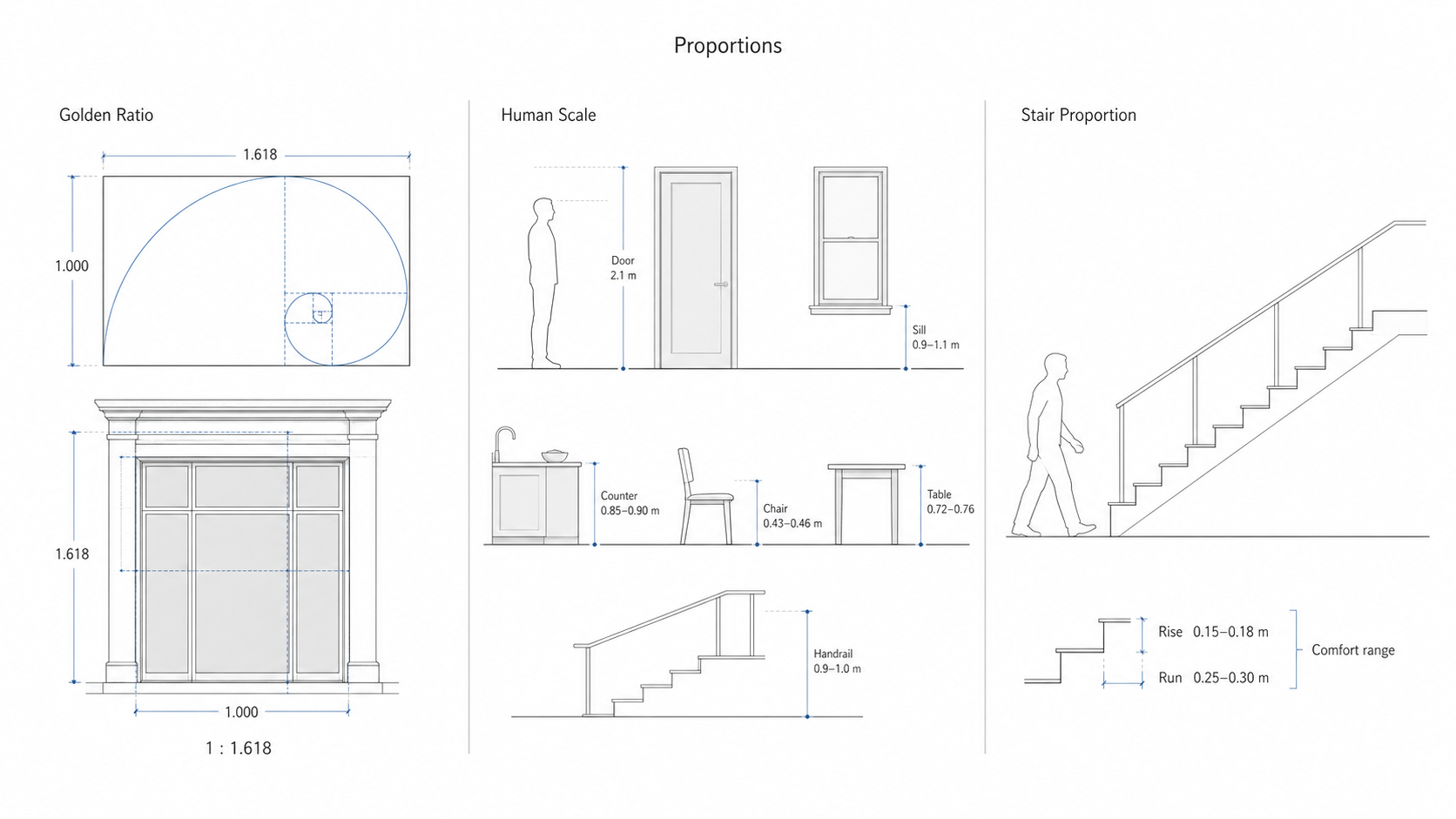
Illustration by ArchitectureCourses.org. Architectural proportions connect visual ratios, human body dimensions, and practical building elements like doors, windows, counters, tables, handrails, and stairs.
Proportions determine whether design elements feel right relative to each other and to the people using them. Two proportion frameworks come up consistently in architectural work. For a deeper treatment of how proportion operates at the building scale, see Scale and Proportion in Architectural Design.
The Golden Ratio
The Golden Ratio is approximately 1:1.618. A rectangle with sides in this ratio is one that human perception consistently finds balanced. It appears throughout architecture — the Parthenon's facade, Le Corbusier's Modulor system, many classical building proportions — not because designers imposed it but because it describes something consistent in how the eye reads form.
Applying it in practice: a facade 10 metres wide proportioned to the Golden Ratio would be approximately 16.2 metres tall. A room 5 metres wide might be proportioned at approximately 8 metres long. A door 2 metres tall proportioned to the Golden Ratio would be approximately 1.24 metres wide. These are not rules — they are reference points. When something looks slightly off and you cannot identify why, checking the ratios of the elements against 1:1.618 is a useful diagnostic step.
Human Scale
Human scale means sizing elements to the human body. This is not aesthetic — it is functional. A door that is too narrow to walk through easily, a window sill that requires bending to look out of, a stair tread that does not match the average human stride — these are failures of human scale that make buildings uncomfortable or inaccessible.
Standard reference dimensions worth knowing:
| Element | Standard Dimension | Notes |
|---|---|---|
| Door height | 2.0–2.1 m | Minimum clear opening for standard residential use |
| Door width | 0.8–1.0 m | Accessible doorways typically 0.9 m minimum |
| Window sill height | 0.9–1.1 m above FFL | FFL = finished floor level |
| Ceiling height (residential) | 2.4–2.7 m | Commercial spaces often 3.0 m or higher |
| Stair rise | 0.15–0.18 m | Consistent rise across all treads in a flight |
| Stair run (tread depth) | 0.25–0.30 m | Rise + run should total approximately 0.43–0.46 m |
| Chair seat height | 0.43–0.46 m | Relates to standard table height |
| Table height | 0.72–0.76 m | Dining and desk heights are similar |
| Kitchen counter height | 0.85–0.90 m | Higher than table to suit standing work |
| Handrail height | 0.9–1.0 m | Check local building code — varies by jurisdiction |
These dimensions are starting points. Accessible design, specialist building types, and local codes may require different standards. But knowing the defaults means you can check any drawing quickly against what a human body actually needs.
Using a Scale Ruler
A scale ruler has multiple ratio scales on it — 1:50, 1:100, 1:200, and others. Each scale represents the ratio between a measurement on the drawing and the same measurement in reality. At 1:50, one centimetre on the drawing represents 50 centimetres in the building. At 1:100, one centimetre represents one metre.
The scales you will use most often in architectural drawing:
1:50 — detailed floor plans, interior sections, close-up elevation details.
1:100 — general floor plans, building elevations, most standard presentation drawings.
1:200 — site plans, larger building footprints where 1:100 would not fit on standard paper.
1:500 and 1:1250 — site context and location plans.
Using It in Practice
Decide on your scale before you start drawing. Write it on the sheet. Check it against the paper size — a floor plan at 1:100 with a 20-metre frontage will occupy 20cm on the paper, which fits on A3. The same floor plan at 1:50 occupies 40cm and will not fit.
Converting: take the real dimension and divide by the scale denominator. A 6-metre wall at 1:100 = 6cm on the drawing. The same wall at 1:50 = 12cm. A 400cm wall at 1:200 = 2cm on the drawing (400 ÷ 200 = 2).
The scale ruler does this conversion for you — you read the measurement directly off the appropriate scale rather than calculating. Align the ruler with your drawing surface, read the marked measurement, and mark the point. No arithmetic needed once you are using the right scale side.
Common mistakes: using the wrong side of the ruler and not noticing, or switching scales mid-drawing. Both produce errors that are very hard to find later. The simplest prevention is to mark the chosen scale clearly on the sheet at the start and check the ruler side every time you pick it up.
The Main Drawing Types
Architecture uses a set of standard drawing types, each one showing the building from a specific viewpoint or cut. Knowing what each type is and when it is used is as important as knowing how to draw it.
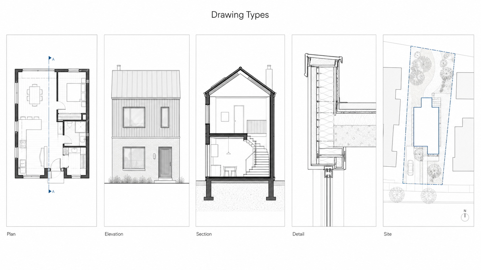
Illustration by ArchitectureCourses.org. The main architectural drawing types each show a different part of the building: layout, exterior appearance, vertical cut, construction junction, and site position.
Floor plan. A horizontal cut through the building at approximately 1 metre above the finished floor level, looking down. The cut reveals the layout of rooms, walls, doors, and windows at that level. Walls cut by the section plane are shown with the heaviest lines. Elements below the cut — floor finishes, furniture — are shown with lighter lines. Elements above the cut — high-level windows, overhead beams — are shown with dashed lines.
Elevation. The exterior of the building seen straight on from one side — north, south, east, or west. An elevation shows the external appearance: window and door positions, material changes, floor levels, and roof profile. It is not a perspective view — everything in the elevation is shown at true scale with no convergence. You label which direction you are looking from (e.g. North Elevation = the face of the building you see when looking north).
Section. A vertical cut through the building, looking in one direction. Sections reveal interior heights, floor-to-floor dimensions, ceiling conditions, structural elements, and how spaces relate vertically. The cut line — the plane where the building is sliced — carries the heaviest lines on the page. Everything behind the cut is drawn lighter. A section through a staircase, for example, shows exactly how treads and landings sit within the building volume in a way no plan or elevation can.
Detail drawing. A large-scale drawing — typically 1:5, 1:10, or 1:20 — of a specific construction junction. A window head, a parapet edge, a stair nosing, a door threshold. Details show exactly how materials meet and how the building is physically assembled. They are the drawings a contractor reads when building, and errors in details are among the most common sources of water ingress, thermal bridging, and construction defects.
Site plan. A plan view showing the building footprint in relation to its site — property boundaries, neighbouring buildings, topography, access, and landscaping. Typically drawn at 1:200 or 1:500. A site plan establishes how the building sits on the land, which is information none of the other drawing types show.
These five types work together. A client can understand the general arrangement from a floor plan and elevation. A contractor needs the sections and details to build it correctly. The site plan shows where everything is located. Any professional drawing set will include all five types, each one revealing something the others cannot.
Do's and Don'ts
Do establish a horizon line before adding any architectural elements to a perspective drawing.
Do start with light pencil lines and add weight once the composition is confirmed.
Do use varied line weights to create hierarchy — heavy for primary elements, light for secondary information.
Do practice freehand lines daily, even briefly. Line confidence builds through repetition and does not develop any other way.
Do check proportions against a human figure as you work, not just at the end.
Don't go over the same line repeatedly. One confident stroke reads better than five hesitant ones stacked on top of each other.
Don't use rulers for every line in a sketch. They produce stiff, mechanical results. Use them for elements that genuinely need precision and go freehand for everything else.
Don't ignore curved lines. They are part of architectural drawing and require specific practice — more practice than straight lines, not less.
Don't switch scales mid-drawing without noting the change clearly on the sheet.
Don't add detail before proportion is confirmed. Detailed drawings with wrong proportions have to be started over.
FAQ
What is the difference between a sketch and a technical drawing?
A sketch is freehand, fast, and used to develop and communicate ideas — proportional but not measured. A technical drawing is produced to specific scales and conventions for construction use. Both skills are needed. You sketch to think and draw technically to build.
Which perspective type should I learn first?
One-point. It is the most straightforward to construct and covers a wide range of views — interiors, corridor perspectives, frontal elevations. Get confident with one-point before moving to two-point. Three-point is specialized and comes last.
What scales do I need to know?
1:50, 1:100, and 1:200 cover most architectural work. 1:100 is the most commonly used for standard floor plans and elevations. Learn these three well before worrying about others.
How do I stop my freehand lines from being wobbly?
Move from the shoulder and elbow rather than the wrist. Rest the heel of your hand lightly on the paper. Use a single deliberate stroke rather than multiple short strokes. Practice fills of parallel lines on scrap paper before working on any drawing.
Do I need to use the Golden Ratio?
No — it is a reference point, not a rule. It is useful as a diagnostic when something looks slightly wrong and you cannot identify why. Many well-proportioned buildings never explicitly used the Golden Ratio. What they did use was careful attention to the relationships between elements, which is the underlying skill.
Read Next
Architectural Sketching for Beginners — tools, line types, perspective construction, and the step-by-step sequence for starting a drawing from a blank page. The practical companion to this article.
Lines in Architectural Sketches — goes deeper on using line weight, atmospheric perspective, overlapping, and shadow to create depth in a drawing.
Blind Contour Drawing — the most effective exercise for building hand-eye coordination and line accuracy. Worth doing for a few minutes daily once the basics in this article feel solid.
Scale and Proportion in Architectural Design — expands on the proportion section in this article with examples at the building scale.
Architectural Rulers and Scale Rulers — recommendations for specific tools if you are setting up a drawing kit.
Worth owning: Architectural Graphics by Francis D.K. Ching is the standard reference for architectural drawing conventions. It covers every drawing type, line convention, and representation technique in this article in full detail with clear diagrams. Most architecture students buy it in first year and keep using it throughout their career.