
Aesthetic Harmony in Interior Design: The Practical System That Fixes “Something Feels Off”
Color, Texture, and Layout Rules That Make a Room Feel Calm
Most “harmony” advice online sounds like a mood board. Looks pretty. Feels useless once you are standing in a real room with real furniture, messy cables, weird lighting, and a budget that does not care about your Pinterest dreams. If you need a clean baseline before you start “styling,” see how to decorate your home (beginner steps).
Please don’t think of aesthetic harmony as magic. Think of it for what it is: basic control. In other words, it’s when a space stops arguing with itself.
You walk in and nothing feels like it’s shouting. Your eyes do not bounce around looking for a place to land. Your body relaxes because the room makes sense.
Harmony is usually lost because people keep adding without a system. One more rug. One more lamp. One more accent wall. One more “statement chair.” Then the room turns into a yard sale with good intentions.
This guide is the system. Not the theory. Not the color wheel lecture.
A simple way to build a space that feels unified, calm, and still has personality.
First, what “aesthetic harmony” actually means in a real home
A room is harmonious when these four things happen at the same time:
- The palette behaves. Colors relate. Undertones are not fighting. Nothing looks random under different lighting.
- The materials make sense together. Hard meets soft in a controlled way. Shiny is not everywhere. Wood tones are not competing.
- The scale is believable. Furniture fits the room. Art is sized correctly. Lighting is not too small. Rugs are not floating like postage stamps.
- The room has one clear hierarchy. Something leads. Everything else supports. If three things are trying to be the main character, the space feels chaotic.
That’s it. That’s the whole game.
The core rule: pick your one sentence for the room

Before you choose anything, finish this sentence:
This room should feel like ______.
Examples that actually help:
- calm and warm, not trendy
- clean and bright, but not sterile
- cozy and dark, but not heavy
- airy and minimal, but not empty
- bold and playful, but still controlled
If you can’t even describe your taste yet, start with what your home decor style is and then write the one sentence from that.
This one sentence becomes the filter. If an item does not support that feeling, it is out. Even if it is nice. Even if it was on sale. Even if your cousin swears it’s “designer.”
This is how you avoid the slow death of a room.
Aesthetic measure: a simple way to score harmony fast
If you want a practical aesthetic measure you can repeat room to room, use this quick score out of 20:
Color (0 to 5)
- 5: consistent undertones, predictable contrast
- 3: mostly works, a few mismatched pieces
- 1: looks different every time the sun moves
Material mix (0 to 5)
- 5: a clear balance of hard, soft, matte, reflective
- 3: good variety, but too many special finishes
- 1: everything is shiny, or everything is busy
Scale and spacing (0 to 5)
- 5: furniture fits, walkways feel natural, rug sizes make sense
- 3: one or two pieces are wrong size
- 1: cramped, awkward gaps, tiny art, tiny rug
Hierarchy (0 to 5)
- 5: one focal point, supports are quiet
- 3: two focal points, mild competition
- 1: four focal points fighting for attention
If the room scores under 14, it will feel off even if everything is expensive.
Color harmony in interior design without the fake designer talk
Color harmony is about controlling undertone and contrast.
1) Undertone is the part everyone ignores
You can have two whites that look identical in the store and totally different at home. One pulls pink. One pulls green. Under warm light they behave differently. Under daylight they behave differently.
The simplest approach:
- Choose one base neutral (warm or cool).
- Keep everything else inside that temperature.
Warm neutral family: creamy whites, warm greige, sandy beige, warm taupe
Cool neutral family: crisp whites, cool gray, blue gray, charcoal
You can mix warm and cool, but you need a reason and you need restraint. Most homes do not have the lighting discipline for it.
2) Use a 70 20 10 palette as a control tool
This is not a law. It is a steering wheel.
- 70 percent base (walls, big furniture, large rugs)
- 20 percent secondary (curtains, chairs, casework, medium elements)
- 10 percent accent (art, small decor, cushions, one bold item)
If your accents become 30 percent because you keep buying cute things, the room turns noisy.
3) Contrast is what makes harmony feel intentional
A room with zero contrast feels flat. A room with extreme contrast everywhere feels anxious. Pick one main contrast strategy:
- light walls, dark furniture
- dark walls, light furniture
- neutral room with one deep color anchor
- tonal room (same family, different values)
Then repeat it in small ways so it looks planned.
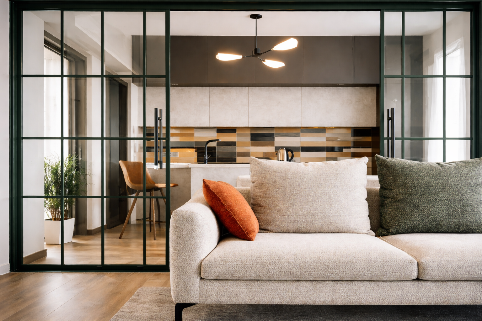
Texture harmony: the missing half of interior aesthetic harmony
Most people think harmony is color. It is not. It is texture and sheen.
A room with perfect colors can still feel wrong if everything has the same texture.
The texture triangle that works in almost every room
You want three texture types present:
- Soft and absorbent rugs, curtains, upholstery, throws
- Hard and grounded wood, stone, tile, plaster, concrete
- Reflective or crisp metal, glass, lacquer, glazed surfaces
If you are missing one corner, the room feels incomplete.
Sheen discipline
Too many glossy surfaces make a room look like a showroom. Too many matte surfaces can feel dusty and heavy.
Simple rule: Keep most surfaces matte or low sheen. Use reflective finishes as accents only.
That means your shiny should show up in small deliberate places: a lamp base, a frame, hardware, maybe one table.
Harmony starts at the floor
Flooring is the largest surface in most rooms, and it quietly controls everything. This is where a lot of people ruin a space without realizing it.
1) Pick one floor story across connected spaces
Open plan homes look best when the main flooring is consistent. Too many transitions create visual fragmentation.
If you must change flooring:
- make the change feel purposeful (wet area, entry zone)
- use clean transitions
- avoid tiny strips of different materials just because you can
2) Watch the wood undertone
Wood tones can be warm honey, orange red, neutral brown, or cool gray brown.
Mixing wood tones can look high end, but only if undertones relate. If one wood pulls orange and another pulls gray, it will look accidental.
3) Rugs are not decoration. Rugs are zoning tools.
A rug does three jobs:
- anchors furniture
- controls echo and hardness
- sets the color and pattern volume for the whole room
Common failure: rug too small, furniture floating, room feels disconnected.
If you want harmony, size the rug so at least the front legs of major seating sit on it. In many living rooms, that means bigger than people expect.
The real secret: hierarchy and unity in interior design
Harmony is not everything matches. That gives you a furniture catalog, not a home.
Harmony is unity with controlled difference.
Hierarchy is how you decide what gets attention.
A simple hierarchy model
In each room, define:
- Primary anchor one thing
- Secondary supports two to four things
- Background elements everything else
Primary anchor examples:
- a fireplace wall
- a large artwork
- a big window with great curtains
- a sofa in a strong color
- a statement light
Secondary supports examples:
- side chairs
- rug pattern
- shelving
- coffee table
- a second artwork grouping
If you treat everything as a primary anchor, you get chaos. If you treat nothing as primary, you get bland.
Layout harmony: the room has to work before it looks good
If circulation is bad, the room never feels calm.
Three rules that solve most layout problems
- Create a clear path. You should be able to walk through without zig zagging around chairs.
- Group furniture by function. Seating for talking goes together. Reading corner is separate. Dining is separate.
- Align key edges. Align the sofa with the rug. Align the coffee table with the sofa. Align art to furniture, not to the ceiling.
Alignment is visual calm.
Lighting harmony: the easiest way to make a nice room look wrong at night
Daylight hides mistakes. Night exposes everything.
The three layer approach
- Ambient: general light (ceiling lights, recessed, surface mounts)
- Task: where you work (reading lamps, under cabinet lights, vanity lighting)
- Accent: mood and focus (wall washers, picture lights, small uplights)
Most homes have ambient only. That gives you a flat, harsh room.
Keep your light color consistent
If one bulb is cold and another is warm, your room will look sick. Pick one direction and stick with it. Also, avoid mixing different bulb brands and temperatures in the same sightline if you can.
For more on lighting that works in real rooms, see our Lighting Design: How to Match Fixtures to Function and Style.
Pattern harmony: how to use it without making the room loud
Pattern is where people panic.
Simple method:
- Pick one hero pattern (rug, curtains, or one big piece).
- Everything else uses solid colors, subtle texture, or small scale pattern that does not compete.
- Repeat a color from your hero pattern in at least two other places.
If you use three medium scale patterns, it becomes visual static.
Harmonious colour scheme interior design: fast formulas that work
Option A: Warm neutral base + black accents + one muted color
- Walls: warm white or warm greige
- Anchors: black frames, black hardware
- Accent: muted green, clay, dusty blue
This reads clean and mature without trying.
Option B: Tonal room
- Pick one color family (blue, green, beige, gray)
- Use 3 to 5 values from light to dark
- Add natural materials for warmth
This feels calm and expensive when done right.
Option C: Neutral base + wood + soft contrast
- Walls: neutral white
- Floor: wood tone that feels natural
- Contrast: charcoal, navy, or deep olive in one main piece
This is the safest good looking home formula.
Room by room harmony that holds up in real life
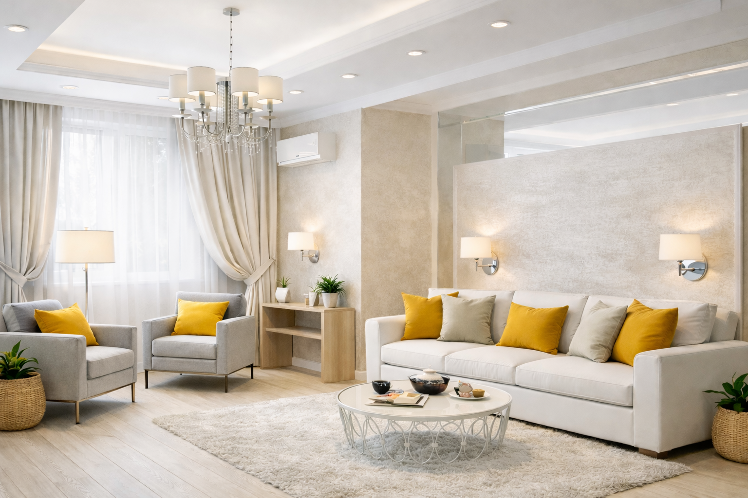
Living room harmony
Common mistake: too many small decor pieces. Fix: fewer objects, bigger impact.
- One main anchor (sofa or rug or fireplace wall)
- Two support chairs, not five random seats
- One large art piece or a tight gallery wall, not scattered frames
- Lighting: at least two lamps plus ambient
If your living room feels messy, it is usually not style. It is too many small items and no hierarchy.
Bedroom harmony
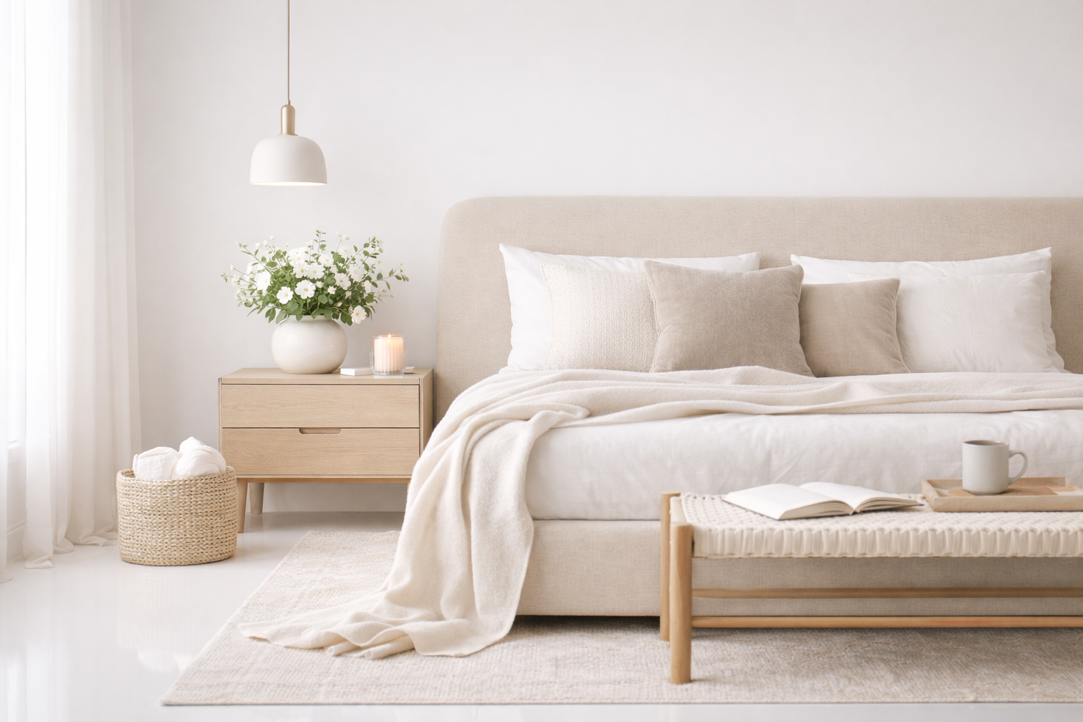
A bedroom needs calm. This is not where you test five bold colors.
- keep the palette tight
- make the bed the anchor
- use matching or related bedside lighting
- avoid clutter surfaces (nightstands are clutter magnets)
If you want hotel calm, reduce contrast and reduce pattern.
Kitchen harmony
Kitchens fail visually when finishes do not relate.
- pick one dominant metal finish, then repeat it
- avoid mixing too many cabinet door styles
- keep countertops and backsplash in the same temperature
Also, kitchens need functional lighting. A beautiful kitchen with bad light feels cheap.
Bathroom harmony
Bathrooms become chaotic fast because they combine tile, fixtures, mirrors, lighting, paint, and storage.
- one tile type as the main field
- one accent tile only if you need it
- one metal finish for fixtures and hardware
Open plan harmony
Open plan is where harmony matters because everything is visible at once.
- unify flooring
- unify wall color
- repeat the same two to three materials across zones
- keep accents consistent so each zone does not become its own universe
How to fix a space that feels off without ripping everything out
Most people do not need a renovation. They need editing.
Step 1: Remove 30 percent of the small stuff
This is the fastest fix. Clear surfaces. Remove extra pillows. Remove random decor. Put everything in a box and only return what you truly miss. A room often becomes harmonious by subtraction.
Step 2: Identify the one mismatch that’s poisoning everything
It is usually one of these:
- wrong rug undertone
- wrong bulb temperature
- one furniture piece too small or too big
- art hung too high
- curtains too short
Fix that one thing and the room suddenly works.
Step 3: Repeat one material and one color
If the room feels random, repetition creates unity.
- repeat a black accent (frames, hardware, lamp)
- repeat a wood tone
- repeat one textile color in two places
Step 4: Tighten the palette
If you have six colors, cut to three plus neutrals. Most busy rooms are just color sprawl.
Harmony designs furniture and interiors: what to look for when buying pieces
If you are shopping and you want harmony, judge pieces by three filters:
- Does it match the room’s one sentence? If the room should feel calm and warm, neon acrylic is a hard no.
- Does it belong to the palette? If it introduces a new undertone, it will start a chain reaction.
- Is it the right scale? A beautiful piece in the wrong size creates awkwardness you cannot style your way out of.
Do not shop a room in one day. That is how you get a set. Let the room grow with discipline.
Harmony home interiors: keeping it harmonious when life is messy
Real homes are not staged. Kids exist. Cables exist. Coats exist. Amazon boxes exist.
The key is to give mess a place to go.
- closed storage beats open shelves if you want calm
- baskets are not a style choice, they are a containment strategy
- entry zones need hooks and a landing surface or chaos will spread
A harmonious home is not the one with no stuff. It is the one where the stuff has a system.
Interior aesthetic harmony and unity without making everything match
If your room looks too matched, it feels fake. Like a model home. If you’re trying to blend old and new without the room turning into a fight, use modern traditional living room balance as your reference point.
Unity is created by repeating a few core decisions, not by buying a set. If you lean traditional but want it cleaner and less dusty, see how to make traditional decor feel fresh again.
What to repeat:
- one metal finish
- one wood tone family
- one primary neutral
- one contrast level
Then add personality through:
- art
- books
- one weird object
- one bold textile
Harmony does not mean boring. It means controlled.
Rhythm in Interior Design: Why Some Rooms Feel Calm Before You Even Notice Why
Harmony explains why a room stops fighting itself.
Rhythm explains how your eyes move once the fight is over.
Most people never think about rhythm in interiors, but they feel it instantly. It’s the difference between a room that feels settled and one that feels jumpy. You’re not uncomfortable exactly—you just keep looking around without resting anywhere.
That’s a rhythm problem.
Rhythm in interior design is about controlled repetition and spacing. It’s how elements show up again and again in a way that feels intentional instead of random. When rhythm is working, your eyes move through the room smoothly. When it’s not, your attention keeps tripping.
Here’s the part most guides miss:
Rhythm is not decoration. It’s structure.
You already use rhythm without realizing it:
-
evenly spaced windows along a wall
-
repeated cabinet lines in a kitchen
-
a series of pendant lights over an island
-
vertical slats, wall panels, or shelves marching in sequence
When those repeats are consistent, the room feels ordered. When they’re broken for no reason, the room feels restless.
This is why some spaces feel calm even before you add color or art. The rhythm is already doing the heavy lifting.
If harmony is about agreement, rhythm is about flow.
And if you want the deep breakdown—types of rhythm, real rooms, and how to fix rhythm without redesigning everything—the full explanation lives in Rhythm in Interior Design: How Designers Create Visual Flow. This section is just enough to help you recognize when rhythm is missing.
FAQ
-
What is aesthetic harmony in interior design?
-
Aesthetic harmony is when colors, materials, scale, and layout work together so a space feels unified and calm. Nothing feels random, and the room has one clear visual hierarchy.
-
What is the difference between harmony and unity in interior design?
-
Unity is the sense that everything belongs together. Harmony is how you get there, through balanced color, texture, proportion, repetition, and hierarchy. Unity is the result. Harmony is the method.
-
How do I create color harmony in interior design?
-
Pick a base neutral temperature (warm or cool), keep undertones consistent, use a controlled palette (like 70 20 10), and repeat colors in multiple places so they feel intentional.
-
Why does my room look good in daylight but bad at night?
-
Lighting. Mixed bulb temperatures, harsh overhead only lighting, and lack of layered lighting make rooms feel flat or ugly at night. Add task and accent lighting and keep light color consistent.
-
What is the biggest mistake that destroys interior harmony?
-
Too many competing focal points and too many small items. People keep adding without editing. The room becomes noisy and visually tiring.
-
How do I make mixed styles look harmonious?
-
Pick one dominant style and let the other be a small accent. Then unify through palette and materials. Mixed style works when there is a shared backbone, not when every piece is from a different world.
-
How important is flooring for interior harmony?
-
Very. Flooring is the largest visual surface in many homes. Wrong undertone, too many transitions, or clashing wood tones can make a whole house feel off.
-
What is an aesthetic measure for harmony?
-
Score a room on color, materials, scale, and hierarchy (out of 20). If the score is low, fix the weakest category first instead of buying more decor.
-
Does minimalism automatically create harmony?
-
Not automatically. You can have a minimal room that feels cold, flat, or poorly scaled. Harmony still needs good lighting, correct proportions, and material warmth. If you want the “minimal, calm” version that doesn’t feel empty, start with minimalist home design basics.
-
Why do my decor items look cluttered even if they are nice?
-
Because they do not have hierarchy. Too many small objects at the same visual level reads as clutter. Fewer objects, grouped tighter, with more empty space around them reads as intentional.
-
Are Harmony Aesthetics clinics related to interior aesthetic harmony?
-
No. Harmony Aesthetics search terms usually refer to medical aesthetics clinics, centers, or devices. Interior aesthetic harmony is a design concept about spaces and visual unity.