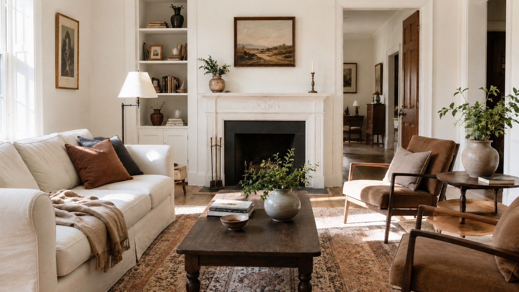
Image by ArchitectureCourses.org. A modern traditional living room works when older architectural bones, wood furniture, patterned rugs, and framed art are balanced with cleaner chairs, lighter colors, open space, and natural daylight.
A modern traditional living room goes wrong when the room gets decorated before it gets organized.
Nice lamp. Nice chair. Nice rug. Then the room still feels off. The center is weak, the trim is speaking one language, the furniture another, and the lighting is flattering the coffee table more than the people sitting there.
The better version is calmer. Keep the bones traditional. Make a few cleaner edits. Let one or two modern moves wake the room up without changing its character.
Before you pick a fabric or a coffee table, read the shell you already have. A quick pass through home styles helps if you need fast orientation. If you want the bigger traditional family first, traditional home styles is the better companion page.
What modern traditional means here
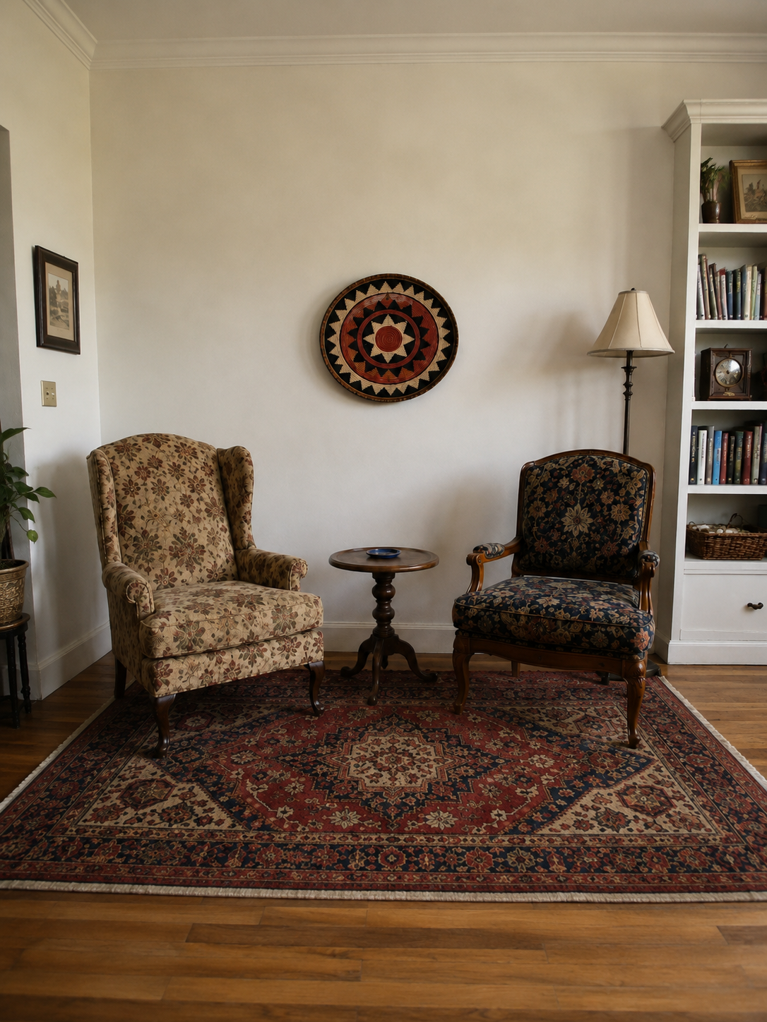
Image by ArchitectureCourses.org. Traditional interior design depends less on matching furniture sets and more on layered materials: patterned upholstery, wood furniture, rugs, lamps, books, framed art, and rooms that feel collected over time.
Modern traditional is not a costume and it is not a white-box room with one antique table dropped into it.
It is order with warmth. The plan reads clearly. The trim still matters. The furniture is comfortable enough to use every day. One modern move per view is usually enough: a cleaner coffee table, one larger abstract piece, a leaner pendant, a less fussy lamp shape.
That is the balance. The envelope holds the history. The edits bring the room into the present.
Read the room’s bones before you place a chair
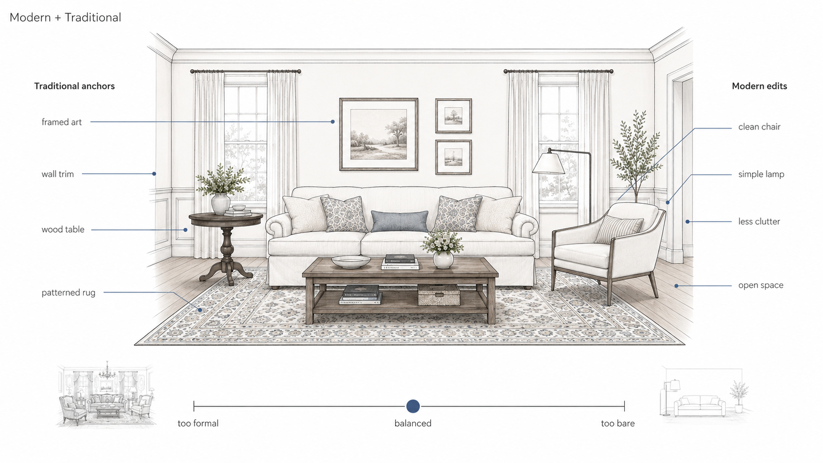
Illustration by ArchitectureCourses.org. A modern traditional living room works when traditional anchors add warmth and structure, while modern edits keep the room from becoming heavy, cluttered, or too formal.
Every living room needs a believable center. If you have a fireplace, respect it. If the best window or the best view is clearly doing the work, let that lead. If neither one helps, build a borrowed center with a low cabinet, a quiet mantel, or centered art on the wall people actually face.
Once the center is set, the rest gets easier. Conversation distance stops drifting. Traffic stops cutting through the middle of the group. The room starts reading as one thought instead of separate purchases.
Trim and openings matter too. Base, casing, crown, and any paneling need to belong to the same house. If you need a quick reality check on that logic, home exterior design is more useful than another styling roundup because it forces you to think in lines and relationships, not accessories.
Layout that feels calm right away
Pull the seating inward. The rug belongs to the whole group, not the coffee table by itself. At minimum, front legs should land on fabric so the arrangement reads as one zone instead of scattered pieces on a floor.
Keep conversation distance honest. Chairs parked too far from the sofa make rooms that photograph well and live badly. If people have to lean forward or raise their voice, the layout is wrong.
When a room feels stuck, go back to function before finish. Talk, read, host, watch, work, nap. Decide what the room is supposed to do, then place the furniture around that job. Space planning and layout for interior design is the right support page here because it keeps the decisions practical.
Trim and materials: keep the bones traditional
Traditional rooms get their strength from repetition. Repeat base and casing sizes. Keep head heights consistent. Let the crown fit the ceiling height instead of trying to impress it.
If your ceiling is low, heavy crown can make the room feel compressed. A quieter two-piece build-up with more shadow and less ornament usually works better. The room still feels finished, but not squeezed.
Materials should tell the truth. Wood should look like wood. Linen should feel like cloth. Leather should accept a little wear and look better for it. Once the room starts relying on shiny look-alikes, it loses age and gravity fast.
When you are unsure what belongs, check the wider family first at types houses and home styles. The shell usually tells you more than the shopping cart does.
Light for people, not just surfaces
Traditional rooms feel kind at dusk because the light is kind to people. One ceiling fixture to declare the center. Lamps at seating height. Sconces only where the wall wants lifting. That mix settles a room faster than another paint sample.
Use real-life heights. Dining fixtures usually land lower than people expect. Sconces should flatter faces, not the ceiling. Table lamp shades should sit near seated eye level so the room glows instead of glaring.
Pick one metal family and repeat it. Aged brass, polished nickel, painted iron. Scatter every finish in the room and it starts reading like three different houses arguing.
Color you will not regret in a year
Build the palette like a recipe. Quiet base first. One deeper note after that.
North rooms want warmth. South rooms can carry calmer whites if the wood and fabric bring enough tone back in. If you need a fast refresher on why some rooms feel settled and others feel cold, color psychology is the right quick read.
If your living room opens to the kitchen, keep the temperature of both spaces related. Trouble starts when the era changes at the island. kitchen color combinations is useful here because it helps you keep the handoff between rooms quiet.
Mixing modern without losing the thread
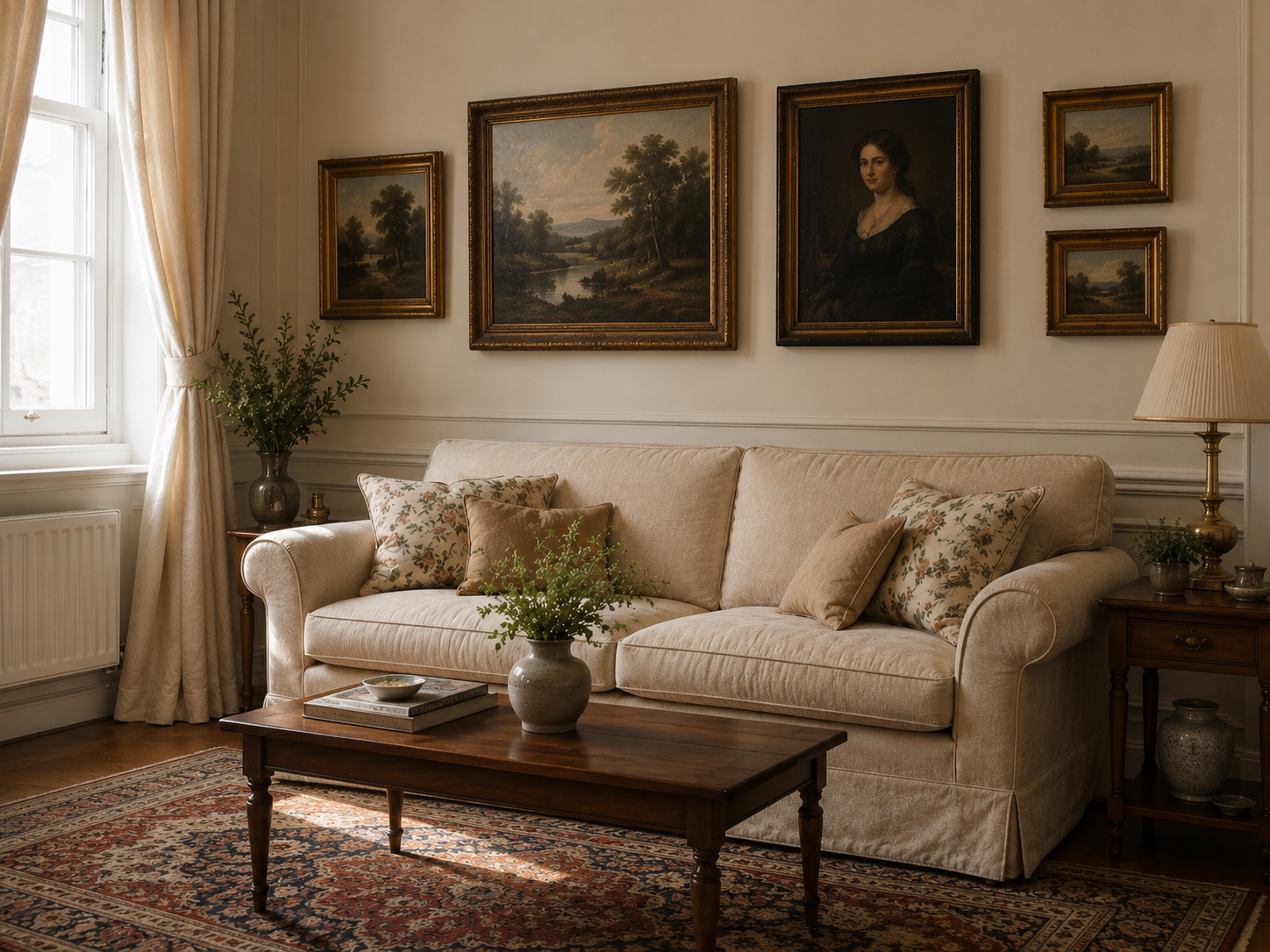
Image by ArchitectureCourses.org. Traditional interior design works best when the room feels layered rather than matched: framed art, drapery, wood furniture, patterned rugs, soft upholstery, and small details that make the space feel collected over time.
Keep the envelope traditional. Edit the objects.
That usually means classic trim, clear wall logic, and honest materials first. Then one cleaner coffee table, one abstract piece over the mantel, one simpler pendant, or one sharper chair profile. Because the shell is steady, the modern move reads like emphasis instead of noise.
Hide the tech where you can. Do not let a television become the best-composed thing in the room. Chargers can live in drawers. Wires can disappear into a calmer cabinet or wall panel. The house can run on modern systems without looking like a showroom.
The expensive mistake nobody prices first
This is the part most living-room articles skip.
The room can get expensive and still feel wrong because the money went into visible objects before the room logic was fixed. Oversized rug bought too small. Fancy sofa floating with no anchor. New lamps with no plan for where people sit. Custom drapery hung too low. Decorative millwork added on top of casing and base that already disagree.
That is how money disappears in this type of room. Not in one disaster. In ten “nice” purchases that never join up.
| Spend here first | What it fixes | What happens if you skip it |
|---|---|---|
| Believable center | Gives the room hierarchy | Furniture placement keeps drifting |
| Correct rug size | Pulls the group together | The room feels scattered and smaller |
| Layered lighting plan | Makes faces and materials read well | The room stays flat or too bright overhead |
| Trim consistency | Makes the shell feel intentional | Even expensive furniture looks temporary |
| One anchor piece | Gives the room weight | You keep buying accents because the room still feels thin |
The better move is less exciting at first. Fix the center. Fix the light. Fix the trim language. Buy the rug once. Then let the furniture and art follow a room that already knows what it is.
Small living rooms, big calm
Small rooms do not need more personality. They need more control.
Use slimmer arms, taller legs, and one generous rug instead of two small ones. Hang the drapery high enough to lift the wall. Repeat only a few things: one stripe, one figure, one quiet solid. That is enough rhythm. More than that and the room starts buzzing.
If you need a quick small-room companion, stylish living room ideas is the better click for mood, and space-efficient apartments is the better click for restraint.
Borrowed symmetry helps here too. If the builder gave you an off-center window or a long blank wall, build the balance with drapery, lamps, or a centered backdrop. The room stops apologizing and starts feeling deliberate.
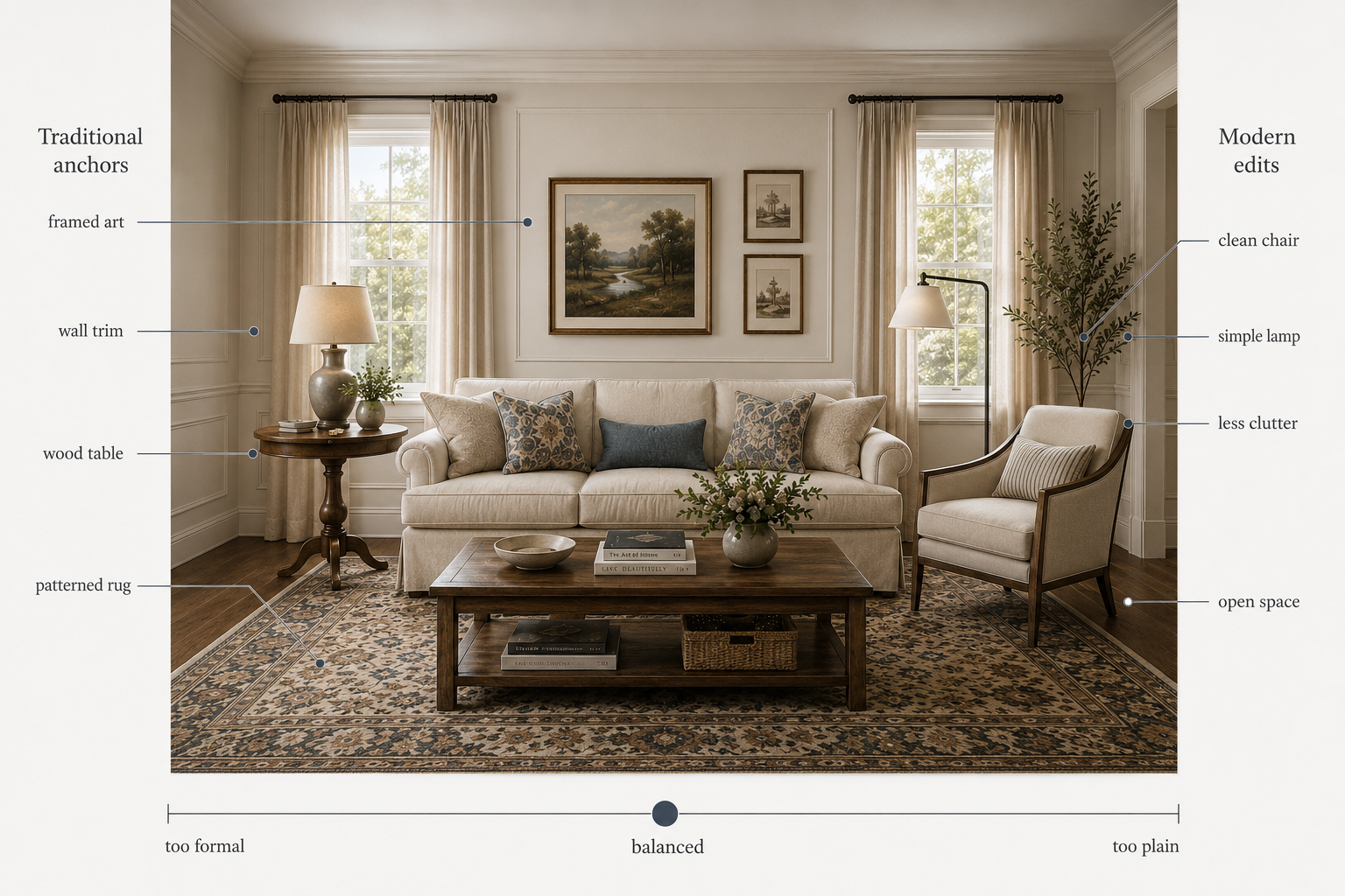
Illustration by ArchitectureCourses.org. A modern traditional living room works when traditional anchors give the space warmth and structure, while modern edits keep it from feeling too formal, cluttered, or plain.
Regional dialects inside the traditional family
Keep the envelope faithful to one family. Let art and furniture borrow lightly from others.
American traditional rooms usually want centered anchors, measured trim, and calm palettes. For the bigger house language behind that, use traditional home styles.
French-leaning rooms breathe more. Lighter woods. Linen. A little softness in the profile. English rooms can carry deeper upholstery, wool, leather, and warmer shadow. Italian influence usually shows up best through materials, not clutter: plaster, stone, iron, and earth tones that feel like place.
The goal is not a passport stamp on every wall. The goal is a room that still sounds like one voice.
Fronts, thresholds, and the first read
The entry tells the truth about the house before the living room gets a chance.
If the front door sits in view from the room, it has to carry its weight. One readable axis. A console sized to the wall. A mirror that returns the light. A pair of lamps if the space can take them. For the outside layer, front door design and home exterior design are the right support pages here.
Kitchens, dining, and the adjacent story
The edge between kitchen and living room is where this style either lands or falls apart.
Let the kitchen be the handshake, not the interruption. Framed doors. Quieter hardware. Counters that belong to the house. Panel the big appliances if the sightlines ask for it. Keep outlet heights aligned so the backsplash does not read like a billboard.
Dining should run on scale and light, not fuss. Center the table under the fixture. Let the chairs sit comfortably against any wainscot or wall line. The best dining rooms still look used the next morning.
Project sequence you can actually follow
Walk the shell. Confirm the center, trim language, and what stays.
Rough the light. Choose the ceiling fixture, lamp locations, and any sconces before paint and fabric start distracting you.
Finish the base first. Floor, wall color, and trim before textiles.
Place anchors, then edit once. Sofa, chairs, rug, main tables. Live with it. Adjust once. Then add drapery, pillows, and art.
That one pause saves a lot of wasted buying.
Common mistakes and simple fixes
Do not rip out millwork because it looks old. Replace what is wrong for the house, not what has simply aged.
Do not buy the small rug to save money. You usually buy twice.
Do not rely on ceiling cans and call the room finished. Lamps are part of the architecture here.
Do not let one showpiece chair decide the room if nobody wants to sit in it.
Do not stack five unrelated patterns and call it layered. Shared tone and repeated scale work better than visual bravado.
FAQ
What defines a modern traditional living room?
A classic shell, honest materials, a believable center, flattering light, and a few cleaner modern edits that do not overpower the room.
How do I blend modern pieces without clashing?
Keep the architecture steady and limit the modern moves. One cleaner piece per view is usually enough.
Where should I spend first?
Spend on the room logic first: rug size, center, trim consistency, lighting, and one anchor piece.
Can this work in a small apartment?
Yes. Small rooms usually do better with stronger control, not more decoration.
Is traditional outdated now?
No. Traditional still works because proportion, rhythm, flattering light, and durable materials still work.
Read this next
For fast orientation on the shell, go back to home styles.
For the bigger traditional family, read traditional home styles.
If the room is fighting you on layout, space planning and layout for interior design is the right next page.