You learn color through walls, not textbooks. Through plaster that dries lighter than you expected. Through a room that looks perfect on paper but feels wrong at dusk.
Over years moving between sites and cities, you start to see color as architecture’s quietest engineer. It decides how a space breathes — and sometimes it even affects safety.
Color in Architecture: Lessons from the Field
A white lobby in a modern house project that looked cold until you warmed it by one tint. A museum wall that killed an entire exhibition because the curator wanted “pure white.” These aren’t tidy theories about color psychology. They’re the mistakes you live through — the ones that teach you what good architecture pays attention to: human emotion, comfort, and well-being.
If you want the fundamentals first, start with our basic color psychology page, then use this page for the real-world moves.
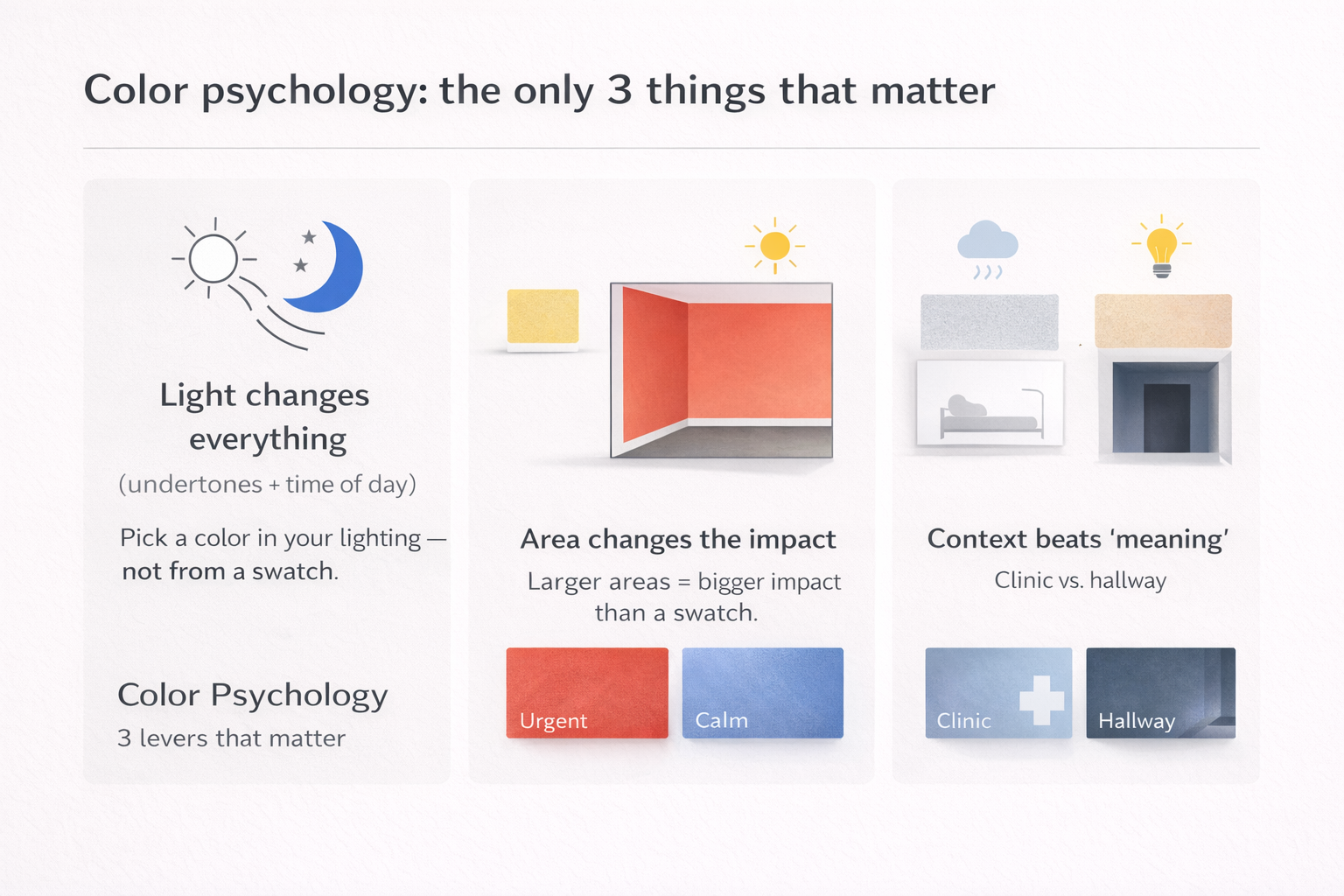
The Science of Color Psychology: Insights into Human Emotion and Design
Color as Structure
People treat color like decoration. But once paint hits a surface, proportion changes. Dark ceilings read lower. Bright end walls pull you forward. Low-contrast palettes make corridors feel longer (sometimes in a good way, sometimes in a dead way). Color isn’t separate from form; it edits form.
This comes up constantly in lighting-heavy spaces. A plan can be solid, but a poor value jump will wreck rhythm. If you’re already in that situation, the fastest “fix” is often a value correction, not a new palette. A related note if you’re troubleshooting daylight behavior: natural lighting redesign basics.
When Palettes Fail
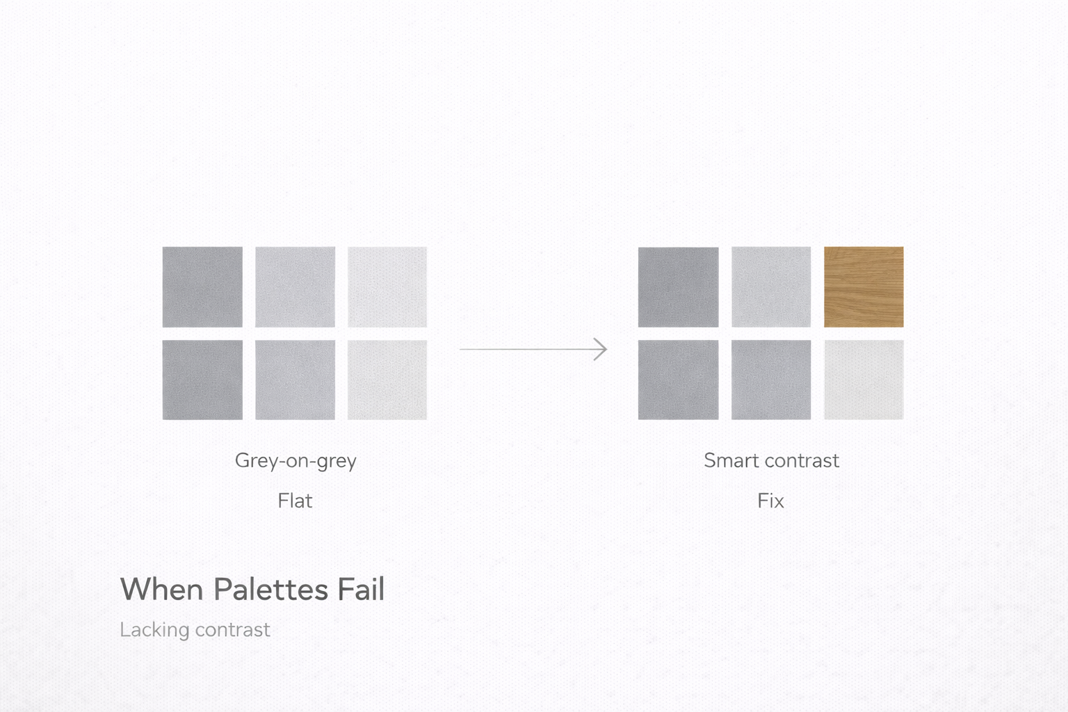
Most palette failures aren’t dramatic. They’re slow. The classic example: grey-on-grey done without contrast or texture. It looks “safe” on a board. Then people live in it and it feels tired. No bounce. No depth. No relief. The space doesn’t feel calm; it feels flat.
The correction is usually surgical: add one real anchor tone, increase contrast in one zone, or bring warmth back through material. Often the fix is not “more color.” It’s smarter contrast.
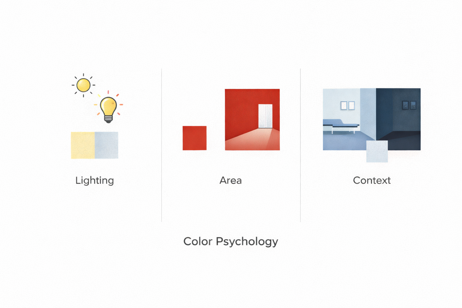
Testing by Light
Color shifts hourly. A paint that feels balanced at noon can turn green by late afternoon, then go muddy under warm LEDs at night. Approving color under studio lighting is how people end up repainting.
The reliable method is boring: tape large samples (not tiny chips), place them on multiple walls, and check them morning / afternoon / night under the actual bulbs.
This matters even more in older construction where plaster and porous substrates absorb pigment differently. If you’re working in that kind of envelope, see heritage townhouse notes for why “the same paint” doesn’t behave the same.
Quick reality check: north light pulls blue from everything. South light brings gold. Nearby brick throws warmth. Grass throws green. Any “universal palette” ignores this and pays for it later.
What Works Indoors
Indoors is less about “pretty colors” and more about forgiveness. Kitchens get hard light and glare, so the paint needs to survive reflection. Bedrooms need low contrast and low visual noise. Living spaces usually do best with a calm shell and one confident tone, instead of a full trend palette.
Old brick and stone are the easiest way to keep a room honest. Painting them bright white often kills their warmth and makes the room feel staged. If you’re balancing natural materials, this helps: stone and plaster finishes.
MUST READ
The Timeless Way of Building — useful for thinking about “rightness” in form, material, and the way color sits on it.
Working Outdoors
Exterior color is more sky and dust than pigment. Morning light can make a color feel perfect, then sunset turns it loud. Salt air, road grime, and vegetation reflections all shift what you think you painted.
Outdoors, context beats swatches. Grass will tint white walls green. Nearby red brick will warm neutral plaster. For climate notes and testing habits, keep this handy: coastal architecture palettes.
Failures That Teach
The expensive mistakes are usually “flatness” mistakes: a trendy beige that wipes out depth, a saturated ceiling that tires staff, a neutral that clashes with fixed materials (stone, tile, millwork) and makes everything look wrong by comparison.
A good rule: strong hues belong in energy zones, not work zones. You can love a color and still admit it’s exhausting at scale.
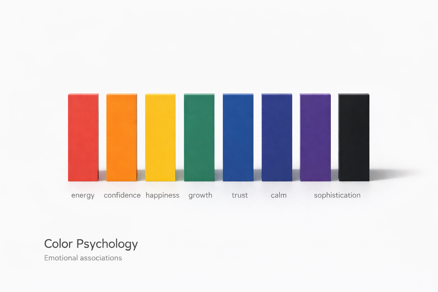
Color and Psychology
People argue about whether blue calms or isolates. The honest answer: context decides. Cold blue in a sunny atrium can feel crisp. The same hue in a small basement reads lonely. Don’t chase fixed meanings. Learn response patterns, then test them in the actual light.
For the underlying “why,” the quickest reference is color psychology basics (especially how proportion and lighting change the same hue).
Material Color
Paint isn’t the only carrier of hue. Concrete has its own tone. Wood shifts with oil and age. Metals change under oxidation. In minimalist interiors, texture becomes “color” because shadow depth does the work.
If you’re designing with restraint, details matter more than palette. Rough lime plaster gives depth even when nearly monochrome. That logic shows up often in our piece on minimalist detailing.
How Clients Perceive Color
Clients remember feeling, not codes. They say “warm,” “clean,” “bright,” “calm.” Translating that into value, undertone, and reflectance is the job. When the palette is right, people stop talking about color and start talking about the space.
Modern Trends and Their Traps
Every decade invents a “new neutral.” Grey, beige, greige — same cycle. Trends aren’t evil; untested trends are. The safest colors are the ones that stay honest under daylight and under your night lighting. If it looks good at dawn and dusk, it usually survives the year.
MUST READ
Color Psychology and Color Therapy — still one of the clearer explanations of how color interacts with perception in real spaces.
Digital and Rendered Color
Renderings lie. They compress light, hide texture, and make cheap color look expensive. If you’ve ever installed a “perfect neutral” that turned pink or green, you’ve seen monitor bias in action.
The best practice is physical sampling and real-light review. If you want the rendering-side habits that reduce surprises, see our rendering realism guide.
Learning from Masters
The useful lesson from “master” examples isn’t copying a palette. It’s noticing the sequence: form first, light second, color last. When that order flips, color turns into a patch instead of a system.
What to Remember
Good color is almost invisible. It supports proportion, guides movement, and sets mood without demanding attention. The fastest way to get better is simple: stop choosing on chips, start choosing in time.
FAQ
Does color really change how a building feels?
Yes. It changes perceived proportion (ceiling height, depth, width) and it changes comfort (glare, warmth, “clean vs cold”). Same plan, different value/undertone, totally different experience. If you want a fast example of light-driven shifts, walk a mid-century modern house near sunset and watch surfaces flip as the light cools.
Is there such a thing as a universal palette?
No. Climate, orientation, materials, and lighting decide the result. A “perfect” warm neutral in one latitude can look dirty or dead in another. If you’re trying to adapt palettes to place, start with climate responsive design.
Do digital renders ever show real color?
Rarely. Screens exaggerate contrast and flatten texture. Always test large samples in the real space, in day and night lighting. If you’re training your eye on interaction and contrast, Interaction of Color is still the cleanest discipline builder.
What color mistakes cost the most to fix?
Wrong undertones across fixed materials. Walls can be repainted. Stone, tile, counters, and millwork can’t (not cheaply). Always test paint next to the permanent finishes, under the actual bulbs you’ll live with.
How do you talk color with clients who can’t visualize?
Use physical references and finished examples, not theory. Show two real samples under the real light and ask, “Which one feels warmer / cleaner / calmer?” People are good at feeling. They’re bad at predicting from chips. If you need a language bridge, traditional interiors is a useful reference set because color, light, and material cues stay legible.
Is it ever safe to follow trends?
Yes—if the trend color survives real lighting and respects your materials. The unsafe part is copying a “look” from photos without testing it on the actual surfaces, in the actual orientation, with the actual bulbs.
Should architects lead color, or leave it to decorators?
Architects should lead the architectural tone (value, reflectance, major surfaces, material color). Decorators can refine the last 10% (soft goods, art, objects). If the base tone is wrong, no styling saves it.