
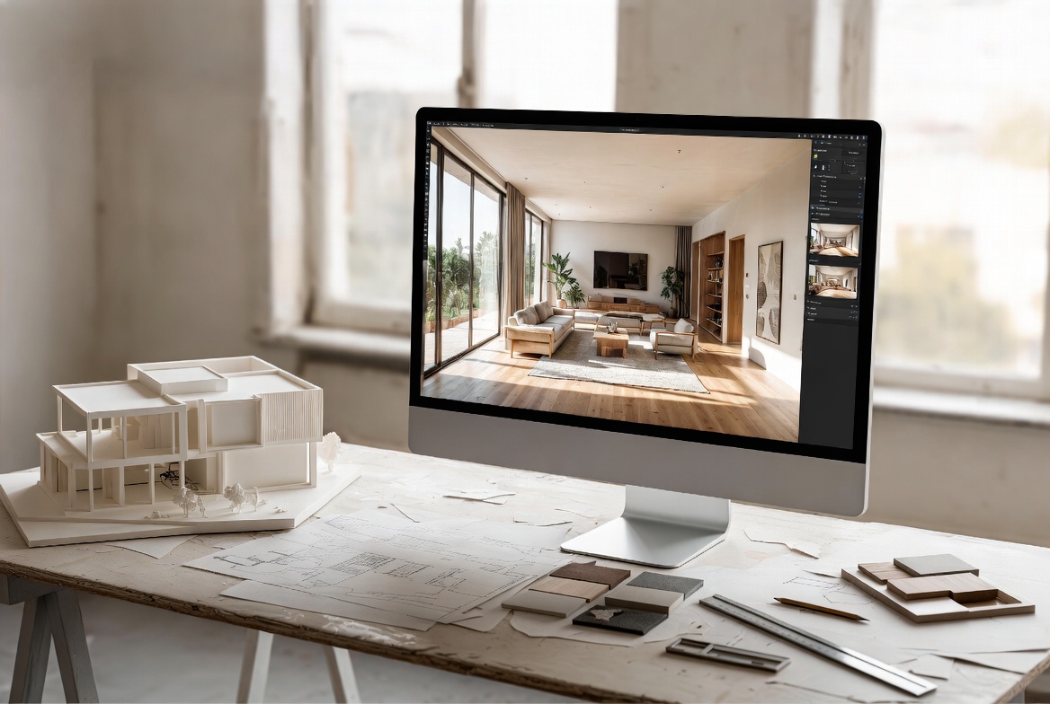
A presentation fails when the design is still hard to read.
Drawings, boards, and renderings should help someone understand the project fast: the idea, the space, the light, and how the building works. In studio, client meetings, or reviews, clear presentation does more than polished effects. It shows the project, exposes weak spots, and gives other people something they can read without guesswork.
If your base drawings are weak, start with Architectural Drawing Basics Every Architect Must Know. If the rendering side is the real problem, go next to Architecture Rendering for Students.
What a Good Presentation Has to Do
A good presentation does four things in order:
| Job | What the viewer needs | What usually goes wrong |
|---|---|---|
| Show the main idea | One clear concept diagram or opening image | Too many “hero” images fighting each other |
| Show how the project works | Plan, section, circulation, and basic structure | Pretty views with weak technical clarity |
| Show how it feels | One or two strong renders or spatial views | Too many mood shots and no real explanation |
| Show what matters most | Hierarchy, sequence, and breathing room | Everything made the same size |
That is the whole page in one table. If the viewer gets lost, the set is failing.
Start With Sequence, Not Effects
Most weak presentation boards have the same problem. The order is wrong.
They jump straight into a render before the viewer even knows the site, the plan, or the main move. That makes the project feel vague, even when the image is polished.
A stronger sequence usually looks like this:
- site or context
- main design idea
- plan that shows entry and circulation
- section that explains light, height, and structure
- one detail or assembly if needed
- one or two views that show the space clearly
This is not a rigid formula. It is just a cleaner reading path. The viewer should not have to hunt for the project logic.
The Board Should Read From Across the Room
This is the fast test a lot of people skip.
Stand back. Can you still tell:
- what the project is
- where to start reading
- which drawing matters most
- what the main spatial move is
If not, the board is too flat or too crowded.
Good hierarchy usually means:
- one main image or diagram
- supporting drawings clearly smaller
- short captions only where needed
- consistent spacing and margins
- enough blank space for the eye to rest
A board that reads fast at a distance usually reads better up close too.
Use Diagrams for Thinking, Renders for Feeling
One reason architecture presentations go soft is that people use the wrong image for the wrong job.
| Use this | When it helps most | Do not expect it to do |
|---|---|---|
| Diagram | Explain concept, circulation, site, structure | Carry atmosphere on its own |
| Plan and section | Prove the building works | Create drama by themselves |
| Render | Show light, material mood, and scale | Fix a weak plan |
| Model photo or axon | Show massing and part-to-whole relationships | Replace all technical drawings |
That is why a clean black-and-white diagram can sometimes do more work than a glossy render. It depends on the question.
One Good Render Beats Five Average Ones
A lot of students still over-render. Too many views. Too many materials. Too much entourage. Too much sky drama.
A better move is to make one or two renders do clear work.
- One exterior or context view that explains the form and entry
- One interior or section-perspective that explains light and space
That is usually enough for a student project. More only helps when each image explains something new.
The render should answer a question:
- How does the building meet the ground?
- How does light enter?
- How does the main room feel?
- How do people move through the project?
If the image does not answer anything, it is decoration.
What Makes a Render Useful
You do not need movie-level realism. You need legibility.
- Light: believable sun, believable shadows, readable openings
- Scale: a few people, a few trees, just enough context
- Materials: a small palette shown clearly
- Camera: one angle that explains the project instead of distorting it
- Restraint: no effects trying to rescue weak design
If your rendering workflow is still messy, pair this page with Architecture Rendering for Students: Make the Design Easy to Read. That page can carry the deeper rendering lane so this one stays focused on presentation.
Keep the Tool Stack Small
The internet is full of software lists. Most people do not need another giant software list. They need a simple stack they can run without panic.
One modeling tool. One rendering tool. One layout tool.
That is enough for a lot of work.
- Modeling: SketchUp, Revit, Rhino, or similar
- Rendering: Enscape, Twinmotion, V-Ray, Blender, or similar
- Layout: InDesign, Illustrator, Photoshop, or another clean layout workflow
The point is not which brand wins. The point is speed, clarity, and a workflow you can repeat.
For software-specific help, use Top Software Every New Architecture Student Should Learn, AutoCAD Basics for Architects and Engineers, and Revit Introduction: Modeling in 3D.
A Better Workflow From Sketch to Board
Here is the workflow that holds up better than the usual rush:
- Sketch the main idea fast.
- Build a clean model with believable proportions.
- Test plan and section before polishing views.
- Make low-pressure test renders or clay views.
- Choose one or two final images only.
- Lay out the board around the reading order, not around random images.
- Print or export a rough version and check it from a distance.
That order saves time because it catches weak decisions early. It also stops you from polishing the wrong thing.
If deadlines are part of the problem, pair this with Architecture Coursework: Tips for Success and Time Management for Architecture Students.
Where Presentations Usually Fail
The same mistakes keep showing up.
| Problem | Better move |
|---|---|
| Too many images | Cut down to the drawings and views that do real work |
| No clear hierarchy | Make one image or diagram lead the board |
| Render before solving the model | Fix plan, section, and massing first |
| Too much text | Use short captions and let the drawings explain more |
| Too many effects | Use light, material restraint, and cleaner composition |
| Weak scale cues | Add consistent people, trees, furniture, or known dimensions |
One clean set with a strong sequence usually beats a louder set trying to impress from every angle.
Freehand Still Helps
Even if the final work is digital, freehand still matters.
Quick sketching helps with:
- finding the main view
- testing composition
- understanding form faster
- explaining the idea in a review
A hand sketch does not need to be precious. It just needs to think clearly.
This connects naturally to Basic Techniques and Principles of Architectural Drawing and Basic Drawing Tools for Architects: Top Picks and Personal Favorites.
FAQ
What matters more in an architecture presentation: render quality or board layout?
Board layout usually matters more first. A polished render inside a confusing board still reads badly.
How many renders should I show?
One to three strong images are enough for many projects. More only helps when each one explains something different.
Do I need photorealistic rendering for every project?
No. Many projects read better with clear diagrams, plans, sections, and one restrained render instead of full photorealism everywhere.
What should come first on a presentation board?
Usually the site or context, then the main idea, then the plan and section, then the supporting views.
What is the biggest presentation mistake students make?
Trying to show everything at once. The result is usually noise, weak hierarchy, and a design that still feels hard to read.
What To Read Next
- Architectural Drawing Basics Every Architect Must Know if the base drawings are still weak.
- Architecture Rendering for Students if the rendering workflow is the main problem.
- Architectural Model Making if the model is falling apart before presentation starts.
- Top Software Every New Architecture Student Should Learn if you need a cleaner digital setup.
- Architecture Coursework: Tips for Success if the real issue is deadlines, not graphics.
A strong presentation does not make a weak design better. It makes the real design easier to see.