Kitchen Color Combinations That Actually Work
Most DIY kitchens go wrong before the paint dries. People chase trends, grab random advice off Pinterest, and end up staring at a room they already hate. I’ve seen it happen. Beige walls clashing with cherry cabinets. Neon backsplashes that looked “fun” online but feel like a mistake in real life.
Picking colors is not about copying what you scroll past. It’s about two things: what you actually like, and what your house can carry. Miss either one and the whole space feels off. I once walked into a 1920s bungalow where the owners forced in glossy black cabinets. Looked like a nightclub jammed into grandma’s parlor. Wrong match, instant regret.
Your kitchen is the hardest-working room in the house. It needs to feel like yours but also sit in line with the rest of the home. That balance is where most people stumble. This guide strips it down: how to read your taste, how to match it to your house, and how to avoid the mistakes that leave you repainting in six months.
Forget the generic “top 10 trendy colors” lists. You’ll get field-tested rules, examples that work, and blunt warnings about what doesn’t.
History of Kitchen Colors
The Kitchen Colors Our Homes Cannot Forget
Kitchens started plain. In the early 1900s, it was white tiles and cream cabinets. Clean, sterile, like a hospital.
Avocado, Beige, and Beyond in Kitchen Design

By the 1930s, people wanted cheer. Mint green and pale yellow showed up, cheap paint that made a difference.
The 1940s went practical. My grandmother’s kitchen had linoleum floors you could mop twice a day and they still looked dull.
When Kitchen Colors Turned Turquoise and Pink
Then the 1950s blew it open. Turquoise fridges, cherry red stoves, yellow cabinets that almost glowed.
The 1960s doubled down on avocado green. Everyone had it, even if most people hated it.
By the 1970s and 1980s, color fatigue hit. Beige, brown, wood grain everywhere.
Kitchen Colors in the Minimalist Era
The 1990s and 2000s stripped it bare. Whites and greys, Ikea minimalism, a borrowed Scandinavian calm.
Kitchen Colors Today
Now it is a blend. Neutrals stay, but people mix in personal splashes like green islands and brass hardware, anything that cuts the sameness.
See also: What is My Home Decor Style?
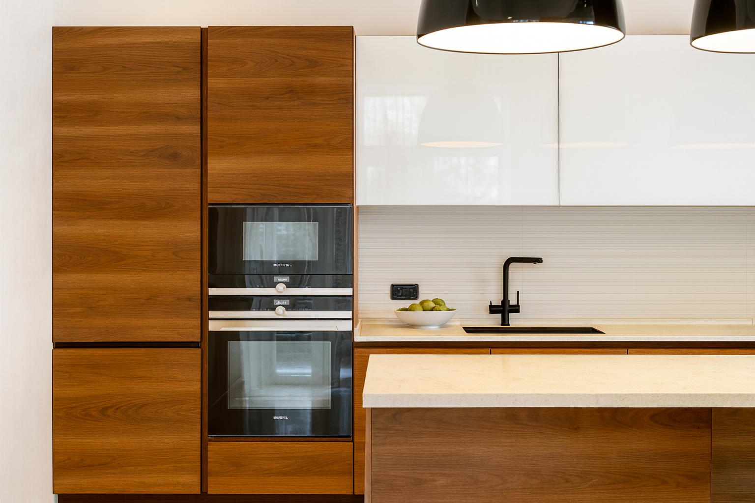
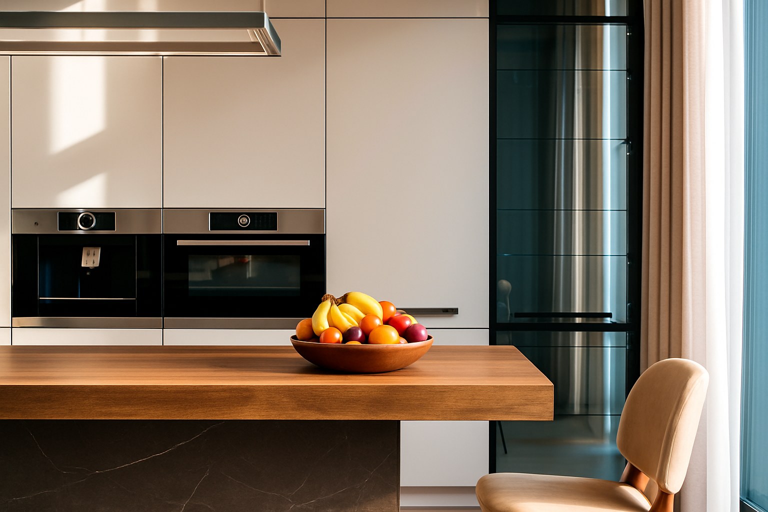
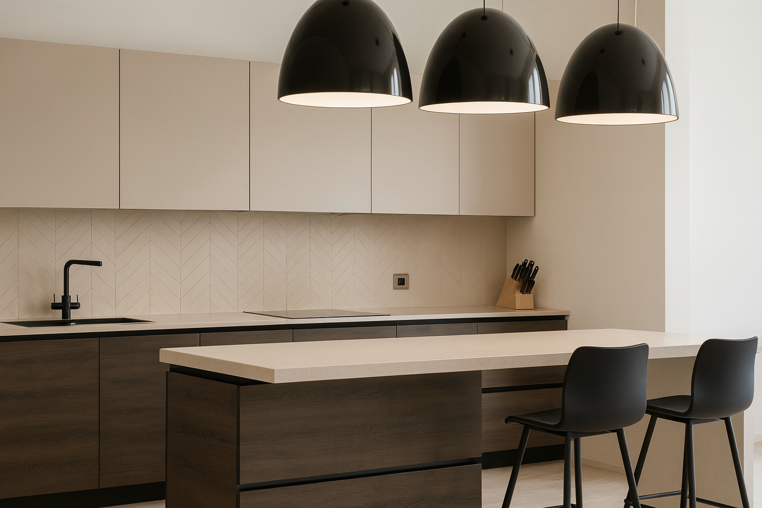
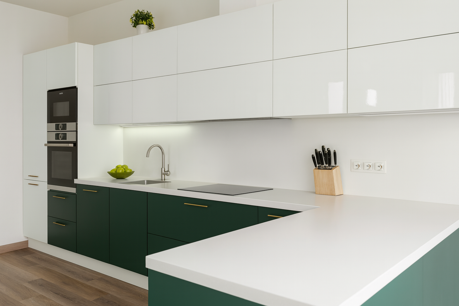
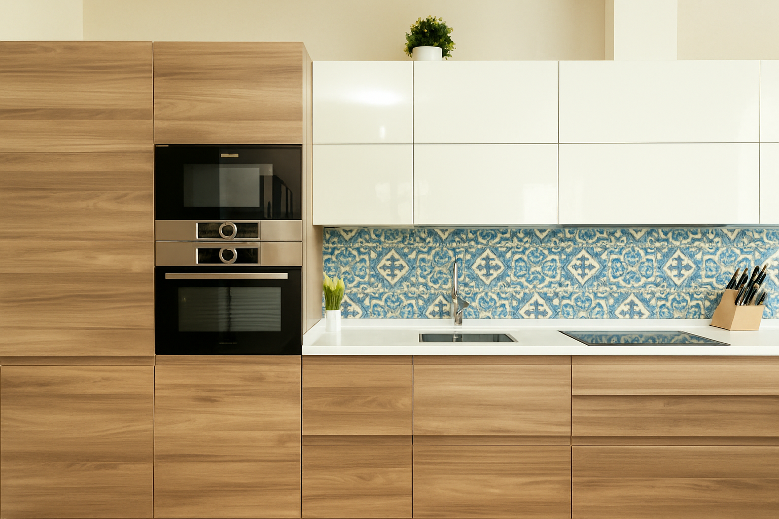
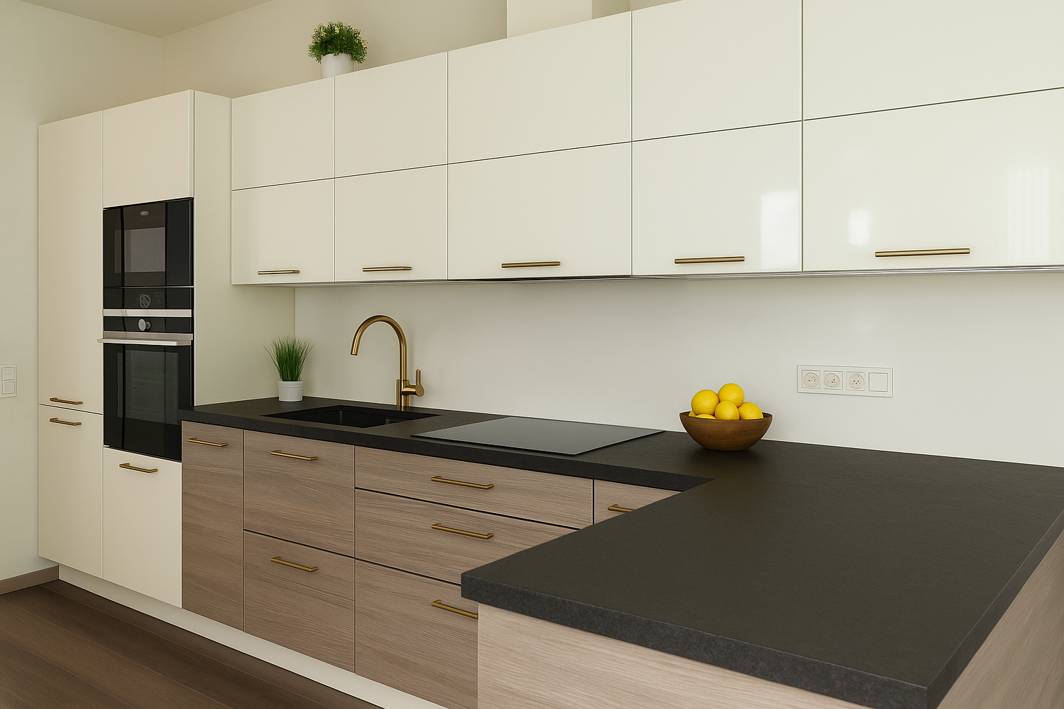
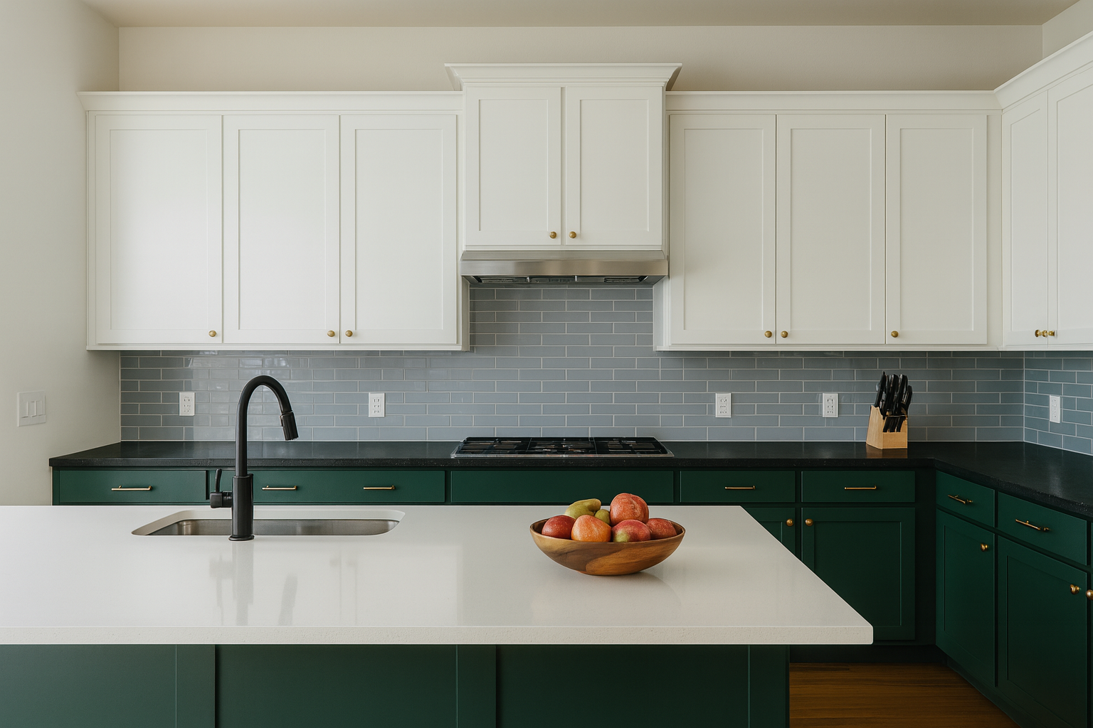
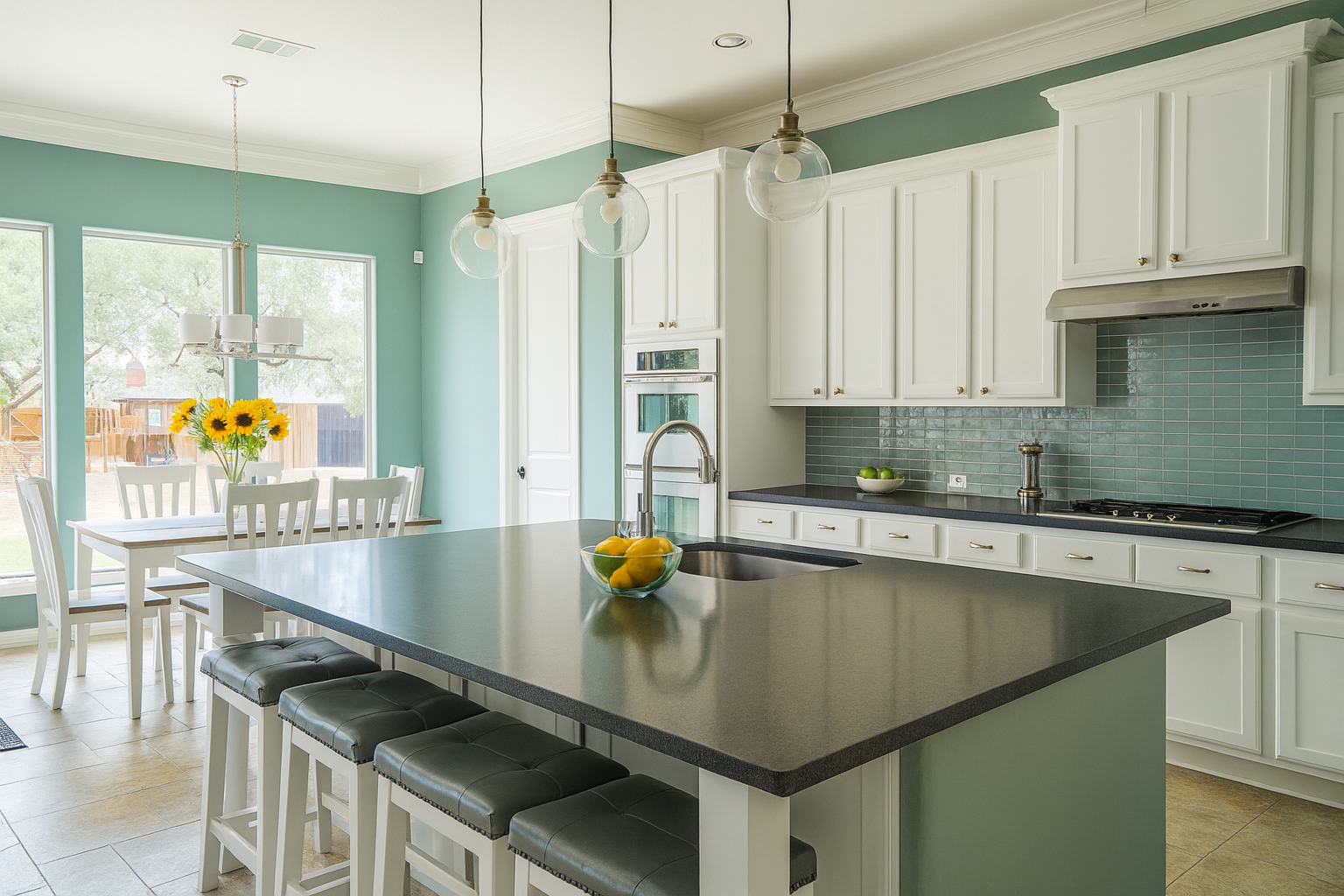
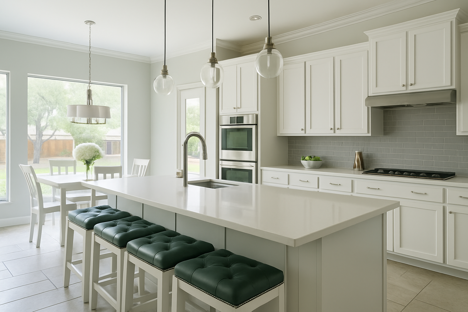
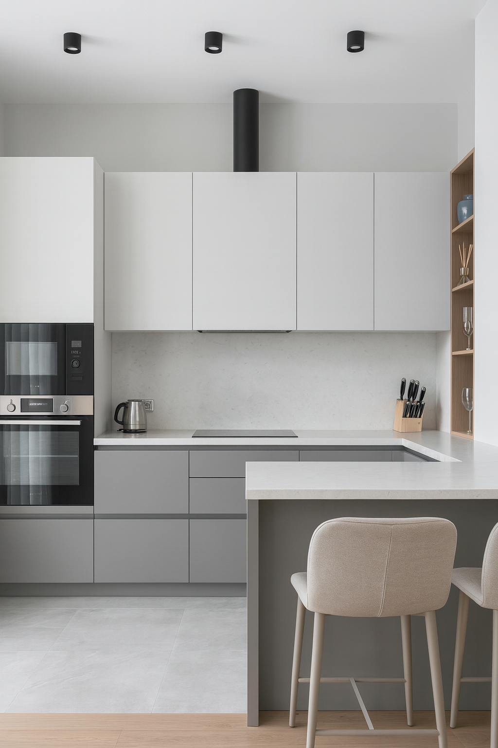
Kitchen Cabinets Color Combination Pictures
See the full gallery of kitchen cabinet color combinations with real photos. Each set comes with clear breakdowns of what works, what fails, and how to adapt the palette in your own home.
From classic wood with white uppers to bold navy and brass, every combination is paired with real examples so you can see the effect before you commit.
Kitchen Color Combinations That Actually Work
Start with undertones
Every mistake I see in kitchens ties back to undertones. People think they’re picking “grey” or “white,” but really they’re picking blue-grey, green-grey, or pink-beige. Mix families and the whole room feels wrong. I once walked into a client’s place where the quartz counters leaned pink-beige but the paint was a cool blue-grey. Looked like two strangers fighting. The fix was simple: repaint in a greige with the same warm undertone as the counters. Suddenly the room clicked.
Lighting is the silent killer
That “perfect” paint chip you loved at the store will betray you at home if your bulbs don’t match. Warm bulbs (2700K–3000K) bring out yellows. Cool bulbs (4000K–5000K) make things read blue or green. North-facing light cools everything; west-facing light can turn beige walls peach at sunset. Always test samples in your actual kitchen under your actual bulbs. No exceptions.
One focal move, not five
Every kitchen can handle one bold move: an island, a backsplash, or a wall. Not all three. I’ve seen too many kitchens collapse under triple accents—navy island, emerald backsplash, and red stools. It stops looking designed and starts looking like a paint aisle exploded. Pick your hero and let the rest play backup.
See also: How Color Theory Shapes Space in Architecture and Interior Design
Two-Color Kitchen Plans
Upper vs lower cabinets
This is the safest way to get contrast without chaos. White uppers with navy lowers still work. Same with soft grey uppers and deep green bases. The mistake people make is flipping it: dark uppers and light lowers. It looks heavy and top-loaded unless the room has 10-foot ceilings.
Islands as anchors
If you want a color move, put it on the island. It’s the natural centerpiece. A client once painted her island forest green in an otherwise white kitchen. Looked bold but balanced. She told me later it was the only thing guests commented on, in a good way.
Backsplashes as wildcards
Tile is smaller scale, so you can afford more risk. But go pattern-light if your counters are busy. I’ve seen people regret geometric tile behind a heavily veined quartz—looked like TV static. Keep one surface calm.
What dates fast
Two-tones are timeless if the colors are muted. What dies fast are candy reds, glossy blacks, and cheap painted laminates. I’ve had to repaint more “fun” glossy lower cabinets than I care to admit. Stick to deep muted tones (navy, sage, charcoal) if you want longevity.
See also: Kitchen Colour Ideas That Don’t Age Badly
Cabinet and Countertop Pairings
Light cabinets, dark counters
This has survived decades for a reason. White or cream uppers with black or charcoal stone reads crisp, clean, and balanced. Add warm metal hardware (brass, bronze) to keep it from feeling sterile.
Dark cabinets, light stone
Flip it for drama. Deep blue or espresso lowers with white quartz or marble on top. The trick here is lighting—without strong task lights, the dark cabinetry will swallow the room. I learned this the hard way in a client’s north-facing kitchen. Looked moody at noon, gloomy by dinner. We added under-cabinet LEDs and it came alive.
Wood and stone harmony
Natural oak with soft grey or cream stone is back. The warmth of wood kills the “clinic” feel people hate in all-white kitchens. One client ripped out her glossy white cabinets after just four years because the space felt dead. We replaced with white uppers, oak lowers, and honed marble counters. Same footprint, completely different soul.
Metals tie it together
Don’t underestimate hardware and fixtures. Brushed nickel cools the palette. Brass warms it. Black grounds it. If the room feels “off” and you can’t figure out why, check the metal finish. I’ve fixed kitchens just by swapping stainless handles for aged brass.
See also: Neutral Color Palettes to Match Any Style
Walls and Cabinets Together
Walls carry more weight than people think
Most homeowners obsess over cabinet colors and then slap any “neutral” on the wall. Big mistake. The wall color is your backdrop. If it fights the cabinets, nothing looks right. I walked into a remodel where the owners picked crisp white shaker cabinets and then painted the walls a buttery cream. Under kitchen lighting, the walls made the cabinets look dingy and dirty. We repainted in a soft cool white that matched the cabinet undertone. Suddenly the room felt fresh instead of yellowed.
Three safe families
-
Clean whites: Best with cool stone counters, stainless, and modern hardware.
-
Greige and taupe: Workhorses that bridge warm wood and cool surfaces. If you’ve got oak floors and quartz counters, this family holds it together.
-
Soft greens or blues: Calm, forgiving, and easy to live with. A sage or dusty blue wall behind white cabinets reads timeless.
Light direction rules again
-
North light skews blue. Warm walls (cream, greige) save it.
-
South light flatters almost everything but can make bold colors look harsher.
-
West light is orange at night. That “safe” beige can turn peach.
-
East light shifts all day, so pick a mid-tone that doesn’t rely on consistency.
What walls can hide
I had a client with older cabinets that weren’t in the budget to replace. We painted the walls a deep navy, left the cabinets white, and suddenly the eye went to the bold backdrop instead of the cabinet dings. Walls can redirect attention if you play them right.
Small Kitchen Color Rules
Go light, but not flat
Everyone’s first instinct is to paint a small kitchen all white. It helps with space, sure, but too much white makes it read like a rental. Layer tone instead. White cabinets with a soft grey wall or pale blue backsplash add dimension without shrinking the room.
Low-contrast edges expand space
One trick I use is painting trim, walls, and even ceilings in the same shade. It erases boundaries so the eye doesn’t stop at each surface. Did this in a galley kitchen once—owners thought we added square footage.
Gloss isn’t your friend
I’ve seen people pick high-gloss finishes thinking it’ll bounce light and make the room look bigger. Instead, every fingerprint and smudge shows up, and the glare feels harsh. Stick to satin or matte sheens. They diffuse light better.
Mirror and metal cheats
In one downtown condo, the kitchen was barely 8 feet wide. We added a mirrored backsplash behind open shelving and brass hardware on pale cabinets. The reflections made the room double itself visually, and the warm metal kept it from feeling cold. Client said it was the first time they didn’t feel boxed in.
Don’t cram every trend
The fastest way to make a small kitchen feel smaller is to stack too many trendy moves: patterned tile, bold cabinets, flashy hardware. Pick one, maybe two. Keep the rest quiet. That way the kitchen feels deliberate, not desperate.
Style Tracks
Minimal kitchens
Minimal doesn’t mean empty. It means every surface earns its place. I did one loft where the client wanted pure white cabinets, white counters, white walls. Looked like a lab. We fixed it by swapping the counters to a soft grey quartz and adding black pulls. Still minimal, but with edges that made the white feel deliberate instead of sterile. Rule of thumb: keep your palette to two neutrals and one accent, max.
Classic kitchens
Classic color always leans warm. Cream cabinets, soft taupe walls, wood floors. It ages better than stark white because it hides wear. I once worked in a 1920s house where we kept the original oak floors and built around them: cream cabinetry, beige counters, brass hardware. The owners thanked me later because the room still looked “fresh” even after a year of heavy cooking. Classic survives because it forgives.
Eclectic kitchens
This is where people get lost. They mix everything they love and end up with chaos. The key is to anchor it. One client had teal cabinets, patterned tile, and wanted bright red stools. Too much. We kept the teal lowers, painted the uppers white, and let the tile be the only loud surface. The stools went neutral. Still eclectic, still personal, but not dizzying. If you want to go bold, keep one major element quiet.
Farmhouse kitchens
Real farmhouse is about texture more than color. Soft whites, wood counters, matte black hardware. I’ve seen too many “modern farmhouse” kitchens with every surface screaming—shiplap walls, distressed cabinets, faux-rustic beams. It feels like a stage set. The farmhouse jobs that work use restraint: one or two rustic notes against a calm backdrop. In one rural remodel we painted cabinets sage green, left the butcher block natural, and stopped there. Simple, warm, real.
Contemporary kitchens
Contemporary isn’t one color: it’s contrast. Sleek dark cabinets with white stone. Or glossy grey with a bold backsplash. One downtown condo had matte charcoal cabinets, pure white counters, and a copper backsplash. It looked sharp but we almost lost it on lighting; without under-cabinet LEDs the copper looked muddy. Contemporary needs light discipline. If you skip that, it slides from sharp to gloomy fast.
By Color: What Works, What Fails
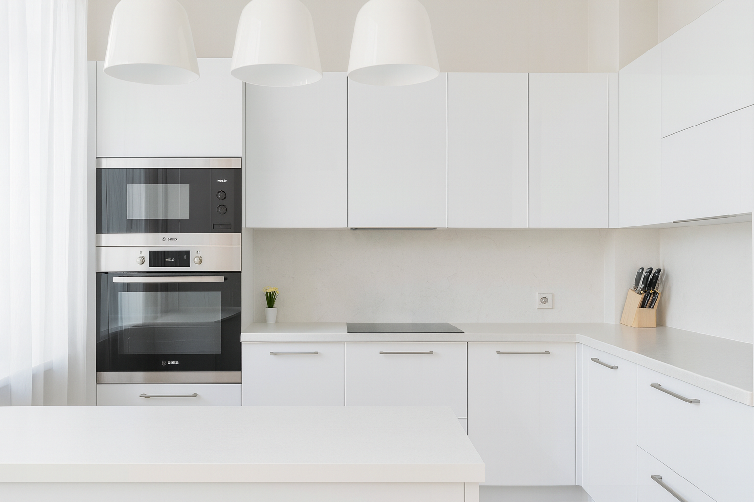
White
Works: White cabinets with warm wood or stone never go out. They bounce light and keep kitchens fresh. I did a bungalow where white uppers with walnut lowers carried the whole remodel. Clean, balanced, livable.
Fails: All-white everything. Clients think it’s “timeless” until they’re scrubbing fingerprints off glossy doors. Without texture—wood, stone, metal—it feels like a clinic.
Grey
Works: Soft greys with blue undertones pair well with marble, stainless, or navy accents. I’ve seen grey lowers with white uppers hold up beautifully for a decade.
Fails: Cold, flat greys. A client once picked a cool grey paint to match their counters but under LED light the room looked dead. Too cold. Always check undertones against your lighting.
Blue
Works: Navy lowers with white uppers are still the safest bold move. Add brass hardware and it feels tailored. Light blue backsplashes can also freshen a small space.
Fails: Overdoing it. A client painted all their cabinets bright royal blue. Within weeks they admitted it felt like living in a school locker room. Blues need balance.
Green
Works: Sage or olive greens are the sweet spot. They tie kitchens to nature and soften the edges of stone and wood. I once painted an island dark green against white cabinets—guests couldn’t stop talking about it.
Fails: Neon or avocado throwbacks. Avocado reads retro (and not in a good way) unless you’re restoring a period kitchen. Neon shades fade fast and look cheap.
Brown
Works: Rich walnut or espresso cabinets with cream counters can feel warm and classic. Wood grain grounds a space in a way paint can’t.
Fails: Overload. Dark brown cabinets with beige walls and brown tile floor—yes, I’ve seen it—look like a cave. If you go dark, break it up with light stone or paint.
Beige
Works: Greige walls that bridge warm wood floors and cool stone counters. They’re quiet but essential.
Fails: Old-school yellow-beige. In one remodel, beige walls clashed with modern grey counters, making everything look dirty. Undertones matter more than the label “beige.”
Yellow
Works: Soft butter or pale yellow walls can make a kitchen feel cheerful, especially in north-facing homes that need warmth.
Fails: Bold or mustard yellows on cabinets. A couple once tried this and called me back two months later to repaint. Too harsh under artificial light.
Pink
Works: Blush accents, like bar stools or a soft backsplash, add character without overwhelming. I’ve seen it work beautifully against grey cabinets.
Fails: Full pink cabinetry. It photographs fun but ages badly. Clients almost always regret it once the novelty wears off.
Orange
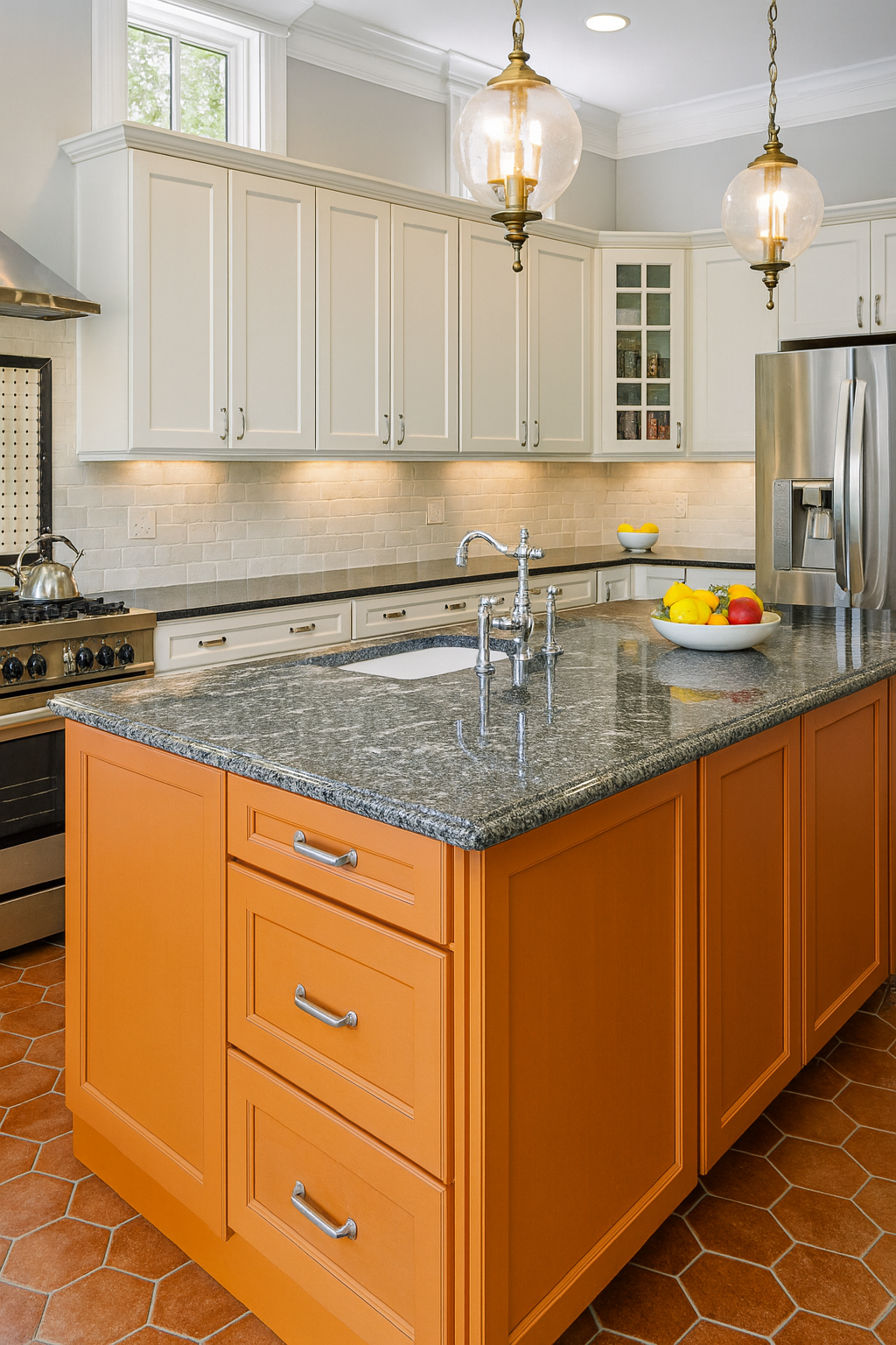
Works: Terracotta tile or muted burnt orange accents warm up neutrals. One client’s terracotta floor with cream cabinets felt timeless.
Fails: Glossy orange cabinets. They look trendy for a minute, then read like a fast-food chain.
Purple
Works: Deep eggplant or plum as an accent wall or island can feel rich when paired with white or grey. I’ve seen it used sparingly in contemporary kitchens with real success.
Fails: Light lavender cabinetry. It tends to wash out under kitchen lighting, looking more like nursery paint than sophistication.
See also: Kitchen Colour Ideas That Don’t Age Badly
Real-World Mistakes and Fixes
The glossy regret
A young couple insisted on high-gloss white cabinets because they looked “modern” in the showroom. Within a month they were texting me photos of fingerprints and smudges after every meal. The shine made every flaw scream. We ended up repainting in a satin finish—same white, less glare. Suddenly it felt calm instead of chaotic.
Counter and cabinet clash
One remodel had quartz counters with a pink undertone and freshly painted cool-grey cabinets. Looked fine under contractor lights, but in daylight it clashed like bad makeup. We fixed it by repainting in a greige with matching undertones. Lesson: always pull large samples into your actual kitchen before committing. Small chips lie.
Too many heroes
I saw one kitchen where the island was navy, the backsplash was emerald green tile, and the stools were cherry red. Each element looked great on its own, but together it felt like a carnival. We repainted the stools black and swapped the backsplash for a neutral subway tile. The island stayed navy and carried the room. The owners admitted it was the first time the space felt “finished.”
Lighting sabotage
In a downtown condo, the owners picked deep blue cabinets with brass hardware. Looked sharp during the day, but at night under cool LED strips the blue turned muddy and the brass looked cheap. We swapped the bulbs for warm 3000K LEDs and suddenly the cabinets glowed again. The design wasn’t the problem—the lighting was.
Overconfidence in trends
A client fell hard for blush-pink cabinets after seeing them online. For a few weeks it felt “fun,” but by the time we finished the backsplash, she admitted it felt more like a toy kitchen than a real one. We repainted the lowers grey and kept a single pink accent wall. It still had personality, but grounded.
The too-dark trap
One couple painted every surface espresso brown: cabinets, trim, even the island. The space was already small, and it turned into a cave. We saved it by repainting the uppers cream, leaving the lowers dark, and adding a lighter counter. Same footprint, but the kitchen gained breathing room.
Floors ignored until too late
I’ve walked into countless kitchens where owners pick wall and cabinet colors without ever looking at the floor. One job had bright white cabinets against an orange-toned oak floor—it clashed badly. A simple rug helped at first, but in the end they refinished the floor to a cooler walnut. Always check your palette against the floor you’re stuck with.
Practical Tips: How to Choose
Start with undertones, not names
Paint stores love to sell you “greys” and “whites,” but the secret is undertones. Is that grey blue, green, or purple? Is that white warm or cool? I’ve walked into too many kitchens where cabinets looked dirty against the counters because the undertones fought. Always line up your samples side by side under your own lights.
Test in real light, not the store
Paint chips under fluorescent store lighting are useless. Bring samples home. Put them on poster board. Look at them morning, afternoon, and night. I’ve seen beige walls turn peach at sunset and “pure white” turn icy blue under LEDs. If you don’t test, you gamble.
Match the permanent first
Countertops and floors are expensive to replace. Paint is cheap. Always build your palette around the immovable surfaces first. I once had a client choose paint before her quartz arrived. The undertones clashed so badly we had to repaint the whole kitchen. Lesson learned: lock the big pieces, then pick paint.
Limit your heroes
Every kitchen can handle one bold move: the island, the backsplash, or the wall. Not all three. I’ve seen projects collapse under too many accents. Choose your hero, let the rest play support.
Mind the sheen
Glossy finishes show fingerprints and glare. Matte hides but can scuff. Satin is the safe middle ground for cabinets and walls. I once had to repaint an entire set of glossy lowers because the family couldn’t keep up with smudge marks. It’s not just about color—it’s about finish.
Hardware is part of the palette
Don’t treat knobs and pulls as afterthoughts. Metals steer the whole kitchen. Brushed nickel cools. Brass warms. Black grounds. I’ve seen rooms “click” after nothing more than a hardware swap.
Use the 60-30-10 rule
Designers lean on it for balance:
-
60% dominant (usually cabinets and walls)
-
30% secondary (counters, backsplash, large surfaces)
-
10% accent (hardware, lighting, stools, small pops)
It works because it keeps the room from feeling overstuffed.
Sit with it before committing
This is the part most people skip. Tape up your samples and live with them a few days. Cook dinner. Walk through at night. If it still feels right after a week, go for it. I’ve had clients change their minds after seeing how the color shifted under their everyday life. That pause saved them thousands in repaints.
Field rules that don’t fail
-
Match undertones first. Counters, floors, cabinets. Paint comes last.
-
Light can kill a “perfect” color. Test it morning to night under your own bulbs.
-
One bold move only. Hero island, hero backsplash, or hero wall. Pick.
-
Don’t chase Pinterest trends. They date fast and cost twice when you repaint.
-
Hardware is part of the palette, not an afterthought.
-
Sheen matters as much as shade. Satin saves kitchens.
-
Live with samples before you commit. A week of seeing them beats a year of regret.
The truth
Every client I’ve worked with who slowed down, tested in their own light, and picked one hero element ended up happy. The ones who rushed, copied a photo, or ignored undertones always circled back to fix mistakes. Sometimes months later. Sometimes years.
Closing note
Colors don’t just dress your kitchen. They set the mood for the hardest-working room in your house. If you want it to feel right, treat color like structure: slow, tested, grounded in the space you actually live in. That’s how you get a kitchen that doesn’t just look good in photos but feels right every time you walk in.
FAQs
Kitchen Color Questions People Ask Most
General Basics
1. What is the most timeless kitchen color combination?
White cabinets with wood accents and stone counters. It has lasted decades because it balances warmth and brightness.
2. Are all-white kitchens going out of style?
Not exactly, but flat all-white kitchens feel sterile. Add wood, stone, or metal to keep them alive.
3. Which colors make a small kitchen feel bigger?
Light tones—soft whites, pale blues, greiges—reflect light. Avoid too many bold surfaces unless you’ll test under your bulbs.
4. Can you paint a small kitchen dark and still make it work?
Yes—only if it’s flooded with natural light or used as a moody jewel box. Without brightness, dark shades feel cramped.
5. What color combinations are safest?
White + wood + stone. Navy + white. Sage + cream. Blue + brown. They’ve lasted for decades and still look fresh.
6. Which colors are considered outdated?
Navy (overdone), mint green, honey oak, cherry red, mustard yellow, stark white. Not all dead forever, but trending down.
7. White cabinets—sterile or timeless?
They’re timeless only if paired with texture—wood, stone, warm hardware. Otherwise they read like a lab.
8. What colors work well with wood countertops?
Greige, pale gray, blush pink, pale yellow, olive greens, navy. The trick is to pick a shade that lets the wood feel warm and natural.
Undertones, Lighting & Testing
9. Does bulb temperature really affect color?
Big time. 2700K bulbs shift colors warm; 4000K+ push them cooler. Always test paint at night under your actual lights.
10. Why do paint samples look different in my home?
Store lights are flat. Your kitchen has natural cycles and mixed bulbs. Roll half a sheet of poster board and live with it for a week.
11. How do I match cabinets to stone counters?
Treat the stone as “boss finish.” Pull undertones, hold samples side by side under real light, then pick cabinets and paint to suit.
12. What are undertones and why do they matter?
White isn’t always white. It may lean pink, blue, or yellow. Grey can skew green or purple. Mix undertones and the room feels off.
13. Is matching cabinets and walls important?
Yes. If walls clash with cabinets, no matter the paint name, the room looks wrong. A fresh coat in the right undertone fixes it fast.
Design Rules & Combos
14. What is the 60-30-10 rule?
Designers swear by it: 60 % dominant (cabinets, floors, walls), 30 % secondary (backsplash, counters), 10 % accent (hardware, lighting, stools).
15. Are two-tone cabinet schemes timeless?
If you use muted tones (like white + navy, cream + sage), yes. Bright candy colors date fast.
16. Where’s the safe place to go bold?
Your island. Tile backsplash. Accent wall. Pick one—not all. Most kitchens crash under three focal points.
17. How do hardware finishes affect color?
Hardware is part of the color story. Brass warms; nickel cools; black grounds. A handle swap can rebalance the whole palette.
18. Should I use high-gloss paint in kitchens?
Not usually. Fingerprints, flare, glare. Satin is kinder. Matte hides well. I’ve repainted kitchens for clients who couldn’t stop wiping glossy surfaces.
Color by Room & Use Case
19. Best colors for different styles?
Country: beige, olive, warm yellow, glazed wood. Modern: white, grey, black, stainless. Retro: aqua, butter yellow, teal, chrome.
20. Which colors play better with open floor plans?
Stay in the same undertone family used across rooms. Keep contrast subtle between cooking zones and living zones for flow.
21. What colors work in farmhouse kitchens?
Soft whites, sage green, warm wood, black matte hardware. Texture over noise wins every time.
22. Good palette for Scandinavian kitchens?
Crisp greys, off-whites, natural wood, minimal contrast. Airy, light, calm.
23. Playful palettes that age well?
Emerald lowers with cream uppers. Sage with white. Navy island in a white kitchen. Clay tones with wood.
Regrets & Red Flags
24. What paint mistakes do people regret most?
Undertone mismatches. Gloss finishes. Too many “hero” elements. Not testing under real light.
25. Why do avocado or mint cabinets look cheap?
They reek of ‘70s kitchens and feel gimmicky unless used in a tonal, period-appropriate design. Most clients hate it within a year.
26. Are dark kitchens a bad idea?
Not if you have strong natural or layered artificial light. In dim kitchens they swallow space and kill mood.
27. Why does pink cabinet paint turn tacky fast?
Blush or clay accent is okay. Full pink cabinetry often ends up feeling dated or toy-like after a season.
28. Does backsplash pattern matter when pairing colors?
Yes—overly busy patterns next to veined stone create chaos. Keep one surface calm to avoid clash.
29. Can bold cabinet color drop resale value?
If it’s too personal (like hot pink), yes. But jewel-tone sage, navy, or charcoal are widely accepted if balanced.
Durability & Finishes
30. What paint holds up best on cabinets?
Urethane or acrylic-alkyd enamel. Proper prep and cure time matter more than the name on the can.
31. Does sheen affect color perception?
Absolutely. Gloss sharpens undertones. Matte softens. Satin is forgiving.
32. What finish works best in high-touch kitchens?
Satin and eggshell. Matte hides flaws but scratches. Gloss looks slick but shows every insult.
33. Do hardware finishes affect wall and cabinet colors?
Yes—if your cabinet paint reads blue-grey, warm brass will temper it; stainless cools it. Swap hardware if the room feels wrong.
Timeline & Testing
34. How long should I live with color samples?
At least 3–5 days. Morning light, midday glare, evening bulbs. Real cycles show undertone fights.
35. When should I apply paint in the build sequence?
After counters and floors are installed. Always paint at the end so scuffs don’t ruin surfaces.
36. Can I sample more than one color?
Yes—but test no more than three options side by side. Too many choices confuse you under shifting light.
37. Does kitchen direction matter for color?
Yes. North faces benefit from warm tone walls. West-facing rooms show peachiness at sunset. East shifts all day—go with neutral mid-tones.
Maintenance & Longevity
38. Which colors fade or get tired quickly?
Bright primaries, neon shades, glossy candy colors—they date in 2–3 years. Jewel tones and soft neutrals last longer visually.
39. How often should I repaint?
With good paint and prep: white cabinets every 5–7 years. Accent islands or bold walls every 3–5 years.
40. Do dark cabinets show wear faster than light ones?
They show dust more than scratches. Light cabinets show grime around handles. Both need regular wipe-downs.
Related
- White Kitchen Cabinets with Brown Granite Countertops: The Style, The Trend, and The How-To configuration options
- Grey and White Combination Modular Kitchen: The Ultimate Guide to a Grey and White Combination Modular Kitchen
- Grey Modular Kitchen Colour Combination: Discover the Latest Trendy Kitchen Colors | Your Guide to a Stylish and Functional Space
- Kitchen Colour Schemes: 10 of the Best: The Architect's Top 10 Kitchen Colour Combinations | No Random Stuff
- Kitchen Colour Schemes with Cream Cabinets: 10 Perfect Combinations
- Kitchen Colour Combination with Red Platform: Red Platform Kitchen Style | 10 Stunning and Harmonious Design Ideas You'll Love
- Black Cabinets and White Countertops: The Ultimate Black Cabinets and White Countertops | Kitchen Style Guide
Coming Soon
Best Kitchen Color Combinations
Latest Kitchen Color Combinations
Fresh palettes designers are using right now, from soft greens to bold jewel tones.
Kitchen Color Palette
How to build a palette that feels cohesive instead of random.
Good Kitchen Color Combinations
Reliable pairings that don’t go out of style.
Unique Kitchen Color Schemes
Unexpected mixes that make a kitchen stand out.
Fun Kitchen Color Schemes
Playful ideas that add energy without going overboard.
Grey Kitchen Colour Schemes
Grey Kitchen Colour Combination
Pairing grey with shades that add warmth or contrast.
Grey Modular Kitchen Colour Combination
Modern layouts where grey anchors the design.
Grey and White Combination Kitchen
A timeless duo that balances light and depth.
Grey Kitchen Cabinets Color Combination
Cabinet color ideas that make grey feel fresh.
Grey Kitchen Combination
Ways to integrate grey across counters, walls, and furniture.
Two Colour Combinations for Kitchens
Two Colour Combination for Kitchen Laminates
Durable laminate pairings that keep surfaces stylish.
Two Colour Combination for Modular Kitchen
Clean contrasts that highlight modular layouts.
Two Colour Combination Kitchen Cabinets
Upper–lower cabinet combos that actually work.
Sunmica Two Colour Combination for Kitchen Laminates
Affordable two-tone looks using simple finishes.
Kitchen Cabinets Color Combination Ideas
Kitchen Cabinets and Countertop Color Combinations
Balancing the two most dominant surfaces in the room.
Kitchen Cabinet Combination Colors
Cabinet pairings that add character.
Kitchen Cabinet and Floor Color Combinations
How to tie flooring into the cabinet scheme.
Countertop and Cabinet Color Combinations
Mixes that feel seamless in both tone and texture.
Best Cabinet Countertop Color Combination
Field-tested pairings that stay practical and stylish.
Kitchen Interior Design Color
Interior Kitchen Color Schemes
From minimalist to eclectic, how colors shift the mood.
Kitchen Interior Color Ideas
Simple inspirations to refresh any kitchen style.
Interior Design Color Schemes for Kitchens
Designer-backed tips for palettes that feel professional.
Color Combinations for Kitchen Walls and Cabinets
Color Combination for Kitchen Wall
Bold or neutral wall shades that set the backdrop.
Color Combination for Kitchen Furniture
Matching tables, chairs, and stools with the room’s palette.
Kitchen Wall Colour Combination Images
Visual inspiration for mixing walls with cabinets.
Color Combinations for Kitchen Walls and Cabinets
Practical rules for harmony across major surfaces.
Color Combination for Small Kitchen
Tricks that make tight spaces feel open.
Diverse Kitchen Color Options
Brown Kitchen Colour Combination
Warm, grounding tones that make kitchens feel cozy.
Beige Color Combination Kitchen
Soft neutrals that blend easily with most finishes.
Blue Kitchen Colour Combination
Cool shades that calm and brighten.
Green Color Combination for Kitchen
Natural hues that add freshness.
Orange Color Combination for Kitchen
Bold moves that bring energy.
Pink Kitchen Color Combination
Playful touches that stay livable.
Purple Colour Combination for Kitchen
Rich tones for a more dramatic space.
Yellow Kitchen Color Combinations
Sunny palettes that spark energy.
White Kitchen Color Combinations
Clean, timeless options that always work.
White and Brown Kitchen Combination
A balance of brightness and warmth.
White Grey Combination Kitchen
Modern, sleek, and versatile.
Home Kitchen Color Ideas
Personalized picks inspired by real homes.
Home Kitchen Colour Combination
Custom mixes that reflect taste and lifestyle.