Applying Color Theory in Home Design and Building Projects
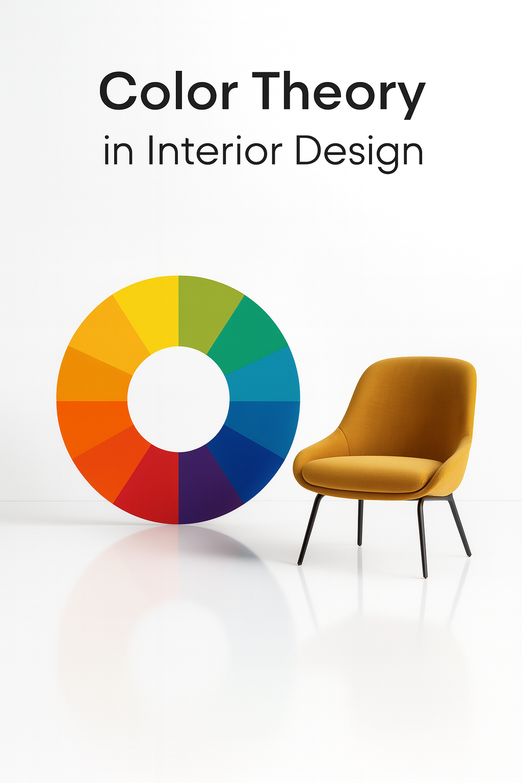
Color Theory in Interior Design: How to Choose Palettes That Work
The Role of Color in Design
Color shapes how people feel in a space, how light works with materials, and how surfaces connect. Bad choices make a room feel flat or chaotic. Good choices create balance, focus, and mood.
What Color Theory Explains
Color theory shows how colors mix, contrast, and interact. It also explains why certain combinations feel balanced while others feel jarring. For architecture and interiors, this means smarter palettes that work with materials and lighting.
Where Color Choices Matter Most

-
Walls and surface finishes
-
Furniture and material palettes
-
Natural vs artificial lighting
-
Accent colors that guide movement and attention
FIELD PICK
Color in Architecture: Design Methods for Buildings and Interiors – Harold Linton
Practical breakdown of how architects use color systems in real projects.
→ Buy on Amazon
Why Color Theory Gets Misused in Design
Most designers learn the color wheel, memorize “warm vs cool,” and then stop there. That’s why so many interiors look either generic or chaotic. The real mistake isn’t picking the “wrong” color—it’s ignoring how color reacts to light, material, and scale.
The Truth About Light
Paint chips lie. A wall that looks beige under a store’s fluorescent light can look green under daylight and orange under warm LEDs. Architects and designers who skip testing colors on-site almost always regret it.
Materials Change the Story
Color on concrete doesn’t behave like color on drywall or wood. Concrete absorbs and mutes, wood warms and shifts undertones, glass reflects. A designer who ignores the material ends up with spaces that fight themselves.
Scale Makes or Breaks It
A tiny color swatch in your hand is not the same as a full wall or a façade. A safe neutral can become oppressive when it covers 500 square feet. Bright accents that look bold in a sample can overwhelm in a large atrium.
What to Focus On Instead
-
Always test color in real light, not under store bulbs.
-
Look at samples on the actual material—wood, concrete, brick, steel.
-
Judge color at scale. A 2-inch swatch never tells the whole story.
-
Design for how the space is used, not just how it photographs.
Lesson from the Field: A new office lobby was painted with a “light gray” chosen from a swatch. Under the building’s glass façade, it turned cold blue. The client hated it, and the entire lobby had to be repainted. A simple test board under natural light would have saved tens of thousands.
How Color Shapes Space
Color doesn’t just sit on a wall. It changes how a room feels, how people act, and even how long they want to stay there. Same layout, different palette, and the architecture tells a different story.
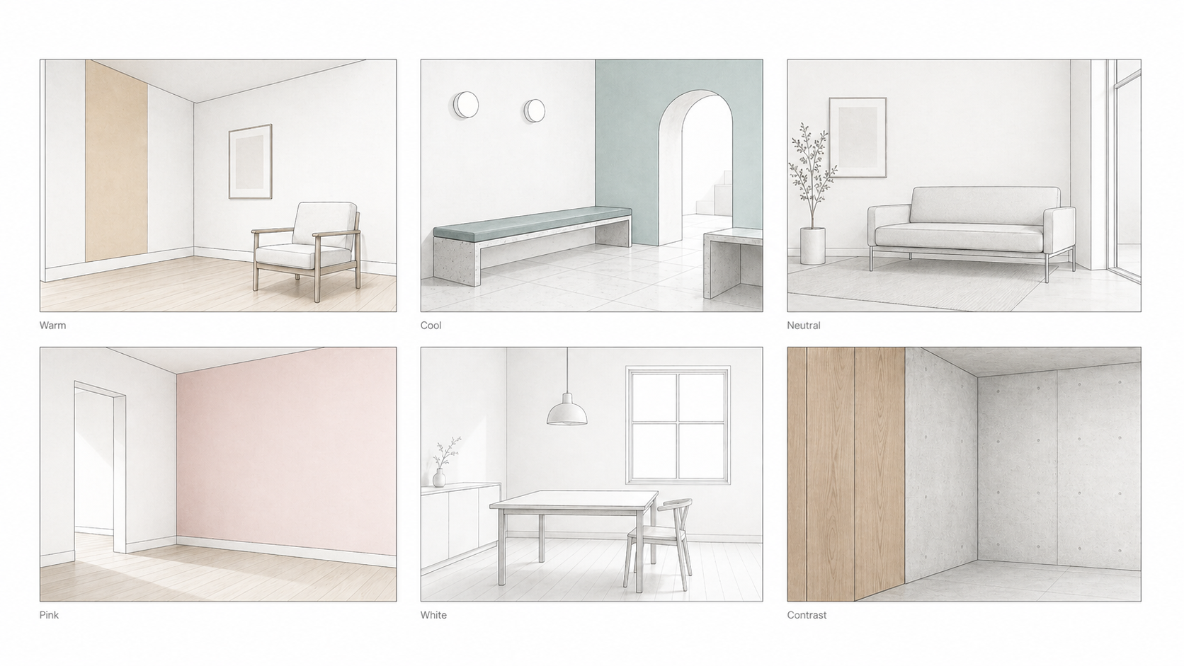
Warm Interiors
Reds and oranges shrink space visually. They make rooms feel closer, louder, more intimate. Useful in dining rooms, risky in workspaces.
Cool Spaces
Blues and greens stretch a room. They slow people down, drop tension, and keep focus. That’s why hospitals and airports lean on them.
Neutral Minimalism
Gray and beige strip away distraction. They highlight form and furniture. Clean when layered with texture, but flat and lifeless if left alone.
Bold Accent Walls
A single saturated wall dominates the design. It stops being background and becomes the feature. Best when you want impact, worst when you need balance.
All-White Rooms
White maximizes light and shadow. It makes lines sharp and photos perfect. In real life, it feels sterile unless you add wood, fabric, or detail.
Material Contrast
Color and material can’t be separated. Wood next to concrete isn’t just warm vs cold—it’s texture, weight, and mood fighting in the same frame.
Key point: Change the color, and you change the architecture.
Understanding the Color Wheel

The Core Idea
The color wheel is a simple diagram that shows how colors connect. It’s divided into three groups: primary, secondary, and tertiary. Every palette starts here.
Primary Colors
Red, blue, and yellow. These are the base pigments. They cannot be made by mixing other colors.
Secondary Colors
Green, orange, and purple. Each comes from mixing two primaries:
-
Red + Blue = Purple
-
Blue + Yellow = Green
-
Red + Yellow = Orange
Tertiary Colors
Made by mixing a primary with a neighboring secondary. Examples include red-orange, yellow-green, and blue-violet. These fill out the wheel and give designers more range.
FIELD PICK
Interaction of Color – Josef Albers
Classic guide on how colors actually behave in practice, not just theory. Essential for architects and designers.
→ Buy on Amazon
Complementary Colors
Opposite Colors That Pop in Architecture and Interiors
The Power of Opposite Colors in Design
What They Are
Complementary colors sit opposite each other on the color wheel. Pairs like red and green, blue and orange, or yellow and purple create strong contrast. Used well, they make each other stand out.
Why They Work
The eye sees opposites as maximum contrast. That sharp difference makes them perfect for highlights, focal points, or designs that need impact. This is why you see blue and orange in movie posters, or red and green in seasonal displays.
How to Use Opposite Colors in Design
Balance the Ratio
Too much of both can clash. Use one as the main color and the other as an accent.
Work with Backgrounds
Neutrals like white, gray, or black help complementary colors pop without looking messy.
Adjust the Intensity
You don’t have to use the pure hues. A muted orange with navy, or a soft lavender with yellow, often works better than loud primaries.
Real Applications
-
Sports uniforms: High-contrast combinations make players stand out on the field.
-
Posters and ads: Blue and orange dominate cinema marketing because the contrast grabs attention instantly.
-
Interiors: A muted green wall with red-toned wood flooring creates balance without looking cartoonish.
FIELD PICK
Color Harmony Compendium – Terry Marks
Practical examples of complementary, split-complementary, and triadic schemes with visual references for real design work.
→ Buy on Amazon
Analogous Colors
Analogous colors are groups of three colors that are next to each other on the color wheel. They usually match well and create serene and comfortable designs. Examples include blue, blue-green, and green.
Overview
Analogous colors are like the harmonious family members of the color wheel. These colors sit next to each other, creating a soothing and pleasing visual effect. They are often found in nature, which is why they are so appealing and easy on the eyes. Imagine a beautiful sunset with shades of orange, yellow, and red blending seamlessly – that’s the magic of analogous colors in action.
Why Analogous Colors Work
The secret to the success of analogous colors is their similarity. Because these colors are closely related, they blend together harmoniously without creating a jarring contrast. This makes them perfect for creating cohesive and visually appealing designs. They are great for projects where you want a unified look, such as in home decor, fashion, and branding.
Tips for Using Analogous Colors
- Create a Focal Point: While analogous colors are harmonious, adding a contrasting color as an accent can help create a focal point. For example, if your analogous color scheme includes blue, blue-green, and green, you could add a touch of red to draw attention to a specific area.
- Use in Gradients: Analogous colors work beautifully in gradients, transitioning smoothly from one color to the next. This can add depth and interest to your designs.
- Stick to One Dominant Color: Choose one color to dominate and use the other two as accents. This helps maintain balance and prevents the design from becoming too monotonous.
Fun Facts About Analogous Colors
- Natural Harmony: Many color schemes found in nature are analogous. Think of a forest with its range of greens, or a beach scene with blues and blue-greens.
- Calm and Comfort: Because they are so harmonious, analogous colors are often used in environments where calm and relaxation are desired, such as spas and bedrooms.
- Historical Use: Artists and designers have long used analogous colors to create mood and atmosphere. For example, Vincent van Gogh often used analogous colors to evoke emotion in his paintings.
Hacks for Using Analogous Colors
- Mix Textures: When using analogous colors, incorporating different textures can add interest and prevent the design from looking flat. For example, a blue-green velvet sofa paired with a green silk cushion.
- Lighting Matters: The way colors look can change dramatically under different lighting conditions. Experiment with lighting to see how your analogous color scheme looks in different settings.
- Accessorize Smartly: Use accessories in analogous colors to tie a room together. Think of throw pillows, rugs, and artwork that match your chosen color scheme.
Triadic Colors
A triadic color scheme uses three colors that are evenly spaced around the color wheel. This scheme offers strong visual contrast while retaining balance and color richness. An example is the combination of red, yellow, and blue.
Detailed Overview
Triadic color schemes are like the power trio of the color world. Imagine your favorite superhero team where each member has a unique strength, but together they are unstoppable. Triadic colors bring that same energy to your designs. By using three colors spaced evenly around the color wheel, you get a vibrant and balanced look that’s full of life. Think of red, yellow, and blue – they’re the primary colors and together, they can make anything pop!
Why Triadic Colors Work
The beauty of a triadic color scheme lies in its ability to maintain harmony while providing plenty of contrast. Because the colors are evenly spaced on the color wheel, they balance each other out perfectly. This makes them a fantastic choice for projects that need to be both eye-catching and cohesive. Whether you’re designing a website, a poster, or a living room, triadic colors can help you create a vibrant and engaging look.
Tips for Using Triadic Colors
- Choose a Dominant Color: To prevent your design from becoming too chaotic, select one color to dominate and use the other two as accents. For example, in a red, yellow, and blue scheme, you might choose red as the main color with yellow and blue as supporting colors.
- Balance is Key: Triadic color schemes are bold, so balance is crucial. Make sure to distribute the colors evenly and avoid using all three in equal amounts.
- Use Neutral Backgrounds: To let your triadic colors shine, pair them with neutral backgrounds. This allows the colors to stand out without overwhelming the viewer.
Fun Facts About Triadic Colors
- Primary Power: The most famous triadic color scheme is red, yellow, and blue – the primary colors. These colors are the foundation of all other colors and are often used in art and design to create bold and dynamic looks.
- Historical Use: Many famous artists, including Piet Mondrian, have used triadic color schemes to create striking and memorable works of art. Mondrian’s use of red, yellow, and blue is iconic and continues to inspire designers today.
- Versatile and Vibrant: Triadic color schemes are incredibly versatile. By adjusting the shades and tints of the colors, you can create a wide range of moods and effects, from playful and energetic to sophisticated and elegant.
Hacks for Using Triadic Colors
- Use One Color for the Main Elements: Choose one color for the main elements of your design, such as the background or large areas, and use the other two for accents. This keeps the design focused and prevents it from looking too busy.
- Experiment with Shades and Tints: Don’t be afraid to play with different shades and tints of your triadic colors. Lighter and darker variations can add depth and interest to your design.
- Combine with Neutrals: Adding neutral colors like black, white, or gray can help balance the vibrancy of triadic colors and make your design more sophisticated.
Monochromatic Colors
A monochromatic color scheme uses variations in lightness and saturation of a single color. This scheme creates a cohesive and elegant look, often used in minimalist designs.
Overview
Monochromatic color schemes are the epitome of simplicity and elegance. By using different shades, tints, and tones of a single color, you can create a design that is both cohesive and visually appealing. Imagine a room decorated entirely in varying shades of blue, from the lightest sky blue to the deepest navy – it’s like a symphony of one color, creating harmony and sophistication.
Why Monochromatic Colors Work
The strength of monochromatic color schemes lies in their simplicity. Because the colors are all derived from a single hue, they naturally complement each other. This creates a unified and harmonious look that is easy on the eyes. Monochromatic schemes are perfect for creating a sense of calm and order, making them ideal for minimalist designs, branding, and any project where you want to convey elegance and simplicity.
Tips for Using Monochromatic Colors
- Play with Light and Dark: Use a range of light and dark shades to add depth and interest to your design. This prevents the scheme from looking flat and monotonous.
- Texture is Your Friend: Incorporating different textures can enhance a monochromatic scheme. For example, a matte paint finish combined with glossy accents can create a sophisticated look.
- Focus on Form: With color taking a back seat, the form and structure of your design elements become more important. Pay extra attention to shapes, lines, and composition.
Fun Facts About Monochromatic Colors
- Endless Possibilities: Monochromatic schemes are incredibly versatile. By adjusting the lightness and saturation of your chosen color, you can create a variety of looks, from soft and soothing to bold and dramatic.
- Historical Use: Monochromatic color schemes have been used throughout history in art and design. Artists like Pablo Picasso and designers like Coco Chanel have utilized this approach to create iconic works.
- Psychological Impact: Different shades of a single color can evoke a wide range of emotions. For example, a room in various shades of blue can feel calming and serene, while a space decorated in reds might feel energizing and dynamic.
Hacks for Using Monochromatic Colors
- Accent with Neutrals: While sticking to one color, incorporating neutral accents like white, black, or gray can add balance and sophistication to your design.
- Use Patterns Wisely: Patterns in the same color family can add interest without disrupting the monochromatic harmony. Think subtle stripes or geometric shapes.
- Lighting Effects: Experiment with lighting to highlight different shades and add dimension to your monochromatic scheme. Soft lighting can enhance the elegance, while spotlighting can create drama.
Warm and Cool Colors
Colors can be categorized as warm (reds, oranges, and yellows) or cool (blues, greens, and purples). Warm colors are associated with energy, brightness, and action, while cool colors are often associated with calm, peace, and serenity.
Overview
Warm and cool colors are like the Yin and Yang of the color wheel. Warm colors, such as reds, oranges, and yellows, evoke feelings of warmth and excitement. They are the colors of fire, sunlight, and autumn leaves. On the other hand, cool colors, like blues, greens, and purples, bring a sense of calm and tranquility. They remind us of the ocean, the sky, and lush greenery. This duality can be used effectively in design to create the desired emotional response.
Why Warm and Cool Colors Work
The psychological impact of color is profound. Warm colors can stimulate and energize, making them perfect for spaces where activity and social interaction are encouraged, like living rooms and kitchens. Cool colors, however, are soothing and can help to create a relaxing environment, ideal for bedrooms and bathrooms. Understanding how warm and cool colors affect mood and perception can help you make more informed design choices.
Tips for Using Warm and Cool Colors
- Balance is Key: While warm and cool colors can each stand alone beautifully, combining them in a balanced way can create dynamic and engaging spaces. For instance, a cool blue room with warm orange accents can be both calming and invigorating.
- Consider the Space: Think about the function of the space when choosing warm or cool colors. Use warm colors in areas meant for socializing and cool colors in places designed for relaxation.
- Light Matters: The way a color looks can change dramatically with different lighting. Warm colors can make a space feel cozy in low light, while cool colors can keep a space feeling fresh and open in bright light.
Fun Facts About Warm and Cool Colors
- Seasonal Vibes: Warm colors are often associated with summer and fall, while cool colors are linked to winter and spring. This is why seasonal decorations typically follow these color patterns.
- Historical Significance: Throughout history, warm colors have been used to signify power and importance. Think of royal red robes and golden crowns. Cool colors have been used to represent tranquility and introspection, like the blue tones in many Renaissance paintings.
- Cultural Meanings: Different cultures associate colors with different meanings. In many Asian cultures, red is a color of luck and prosperity, while in Western cultures, blue often represents trust and stability.
Hacks for Using Warm and Cool Colors
- Transitioning Spaces: Use warm colors in transition areas like hallways and entryways to create a welcoming atmosphere. Cool colors can be used in more private areas to promote relaxation.
- Accents and Accessories: Incorporate warm or cool colors through accessories like pillows, rugs, and artwork. This allows you to change the mood of a room without a complete overhaul.
- Nature Inspiration: Look to nature for inspiration. Warm colors can mimic a beautiful sunset, while cool colors can reflect the tranquility of a forest or ocean.
Warm and cool colors are powerful tools in your design arsenal. By understanding their effects and how to use them, you can create spaces that not only look great but also feel just right. Keep experimenting and enjoy the process of bringing warmth and coolness into your designs!
The Psychology of Color
Colors can affect our emotions and behaviors in fascinating ways. Here’s a fun and detailed rundown of what each color can do to our minds and moods:
Red
Excitement, Passion, Danger
Red is the color of fire and blood, making it incredibly stimulating. It can boost your energy levels and increase adrenaline. No wonder red sports cars are considered fast and fiery! It's also the color of love and passion, hence the iconic red roses on Valentine’s Day. But beware, red can also signal danger and warning, like stop signs and traffic lights.
- Use in Design: Add red to your dining room to stimulate appetite or in a home gym to boost energy.
- Fun Fact: Wearing red can actually boost your confidence. Channel your inner superhero with a splash of red!
Blue
Calm, Trust, Sadness
Blue is the color of the sky and the ocean, bringing a sense of peace and tranquility. It's no coincidence that many social media platforms, like Facebook and Twitter, use blue in their logos – it builds trust and reliability. However, too much blue can feel cold or even lead to feelings of sadness (hence the term "feeling blue").
- Use in Design: Perfect for bedrooms or bathrooms where relaxation is key. Blue can also enhance productivity, making it a great choice for a home office.
- Fun Fact: Blue is often used in corporate settings because it is associated with professionalism and trust.
Yellow
Happiness, Energy, Caution
Yellow is like a burst of sunshine. It can lift your spirits and energize your mind. Think of smiley faces and sunflowers – they radiate joy. But yellow is also a cautionary color, often used in road signs and warnings. It’s a bright color that demands attention.
- Use in Design: Great for kitchens or playrooms where you want to create a cheerful and lively atmosphere.
- Fun Fact: Yellow can be an eye-catching accent color. Try a bold yellow chair or a statement wall to brighten up a space.
Green
Nature, Tranquility, Envy
Green is the color of nature, symbolizing growth and renewal. It’s calming and refreshing, making you feel connected to the environment. On the flip side, green is also associated with envy and jealousy (ever heard of the “green-eyed monster”?). But mostly, green is great for creating a serene atmosphere.
- Use in Design: Ideal for any room where you want to bring in a touch of nature. Think plants, green walls, or even a green sofa for a refreshing vibe.
- Fun Fact: Green is often used in hospitals because it is calming and can help reduce anxiety.
Purple
Royalty, Luxury, Mystery
Purple has long been associated with royalty and luxury. Historically, purple dye was rare and expensive, making it a color reserved for the wealthy and powerful. Today, it still carries a sense of luxury and mystery. Purple can stimulate creativity and evoke a sense of spirituality.
- Use in Design: Perfect for creating a luxurious and dramatic look in living rooms or bedrooms. Pair it with gold or silver accents for an extra touch of elegance.
- Fun Fact: Purple is often used in branding for products that want to convey a sense of sophistication and quality.
Orange
Enthusiasm, Creativity, Warmth
Orange is a vibrant and energetic color that combines the happiness of yellow with the excitement of red. It’s friendly and inviting, often associated with creativity and enthusiasm. Think of autumn leaves and pumpkins – orange is warm and comforting.
- Use in Design: Great for social spaces like living rooms and kitchens. It can stimulate conversation and make people feel welcome.
- Fun Fact: Orange is often used in marketing to draw attention and encourage action. Think of sale signs and call-to-action buttons.
Black
Power, Elegance, Mourning
Black is the color of sophistication and elegance. It’s timeless and can add a touch of luxury to any design. However, it’s also the color of mourning and can feel heavy or oppressive if overused. Black is powerful and commanding, often used to convey authority.
- Use in Design: Use black to add contrast and drama. It works well in modern designs and can make other colors pop. Just be careful not to overdo it.
- Fun Fact: In fashion, black is a staple. It’s slimming, versatile, and always in style – the little black dress is a classic for a reason!
White
Purity, Simplicity, Cleanliness
White represents purity and simplicity. It’s clean and fresh, often used to create a sense of space and brightness. White can make a room feel larger and more open, and it pairs well with any other color. However, too much white can feel sterile or cold.
- Use in Design: Perfect for creating a minimalist look. Use white as a backdrop to make other colors and design elements stand out.
- Fun Fact: White is the color of choice for weddings in many cultures, symbolizing new beginnings and purity.
Colors are more than just visual stimuli; they have the power to influence our emotions, perceptions, and actions. By understanding the psychology of color, you can make more informed choices in your designs, creating spaces and products that resonate with people on a deeper level. So, go ahead and play with colors – you might be surprised at the impact they can have!
Color Harmony
Color Harmony Color harmony refers to the pleasing arrangement of colors. Harmony in colors ensures a pleasing and balanced design. It can be achieved through various schemes like complementary, analogous, triadic, and monochromatic.
Overview
Color harmony is like the secret sauce in your favorite dish – it’s what makes everything come together beautifully. When colors harmonize, they create a sense of balance and order that is naturally pleasing to the eye. This is why some designs just feel right, while others might seem chaotic or off-putting. By understanding the principles of color harmony, you can create stunning visuals that captivate and delight.
Complementary Color Harmony
Complementary colors are directly opposite each other on the color wheel, such as red and green or blue and orange. This high-contrast combination is perfect for making elements stand out.
- Use in Design: Use complementary colors to create focal points and highlight important information. This scheme is great for logos, buttons, and calls to action.
- Fun Fact: Complementary colors can make each other appear brighter and more vibrant when placed next to each other. Think of a vibrant sunset with oranges and blues blending together beautifully.
Analogous Color Harmony
Analogous colors are next to each other on the color wheel, such as blue, blue-green, and green. This scheme creates a serene and comfortable design due to their close relationship.
- Use in Design: Use analogous colors for a harmonious and soothing look. Ideal for interior design, nature-themed designs, and any project where you want to evoke calm and unity.
- Fun Fact: Analogous color schemes are commonly found in nature, which is why they feel so naturally pleasing. Think of a lush green forest with various shades of green.
Triadic Color Harmony
Triadic color schemes use three colors evenly spaced around the color wheel, like red, yellow, and blue. This scheme offers strong visual contrast while retaining balance and color richness.
- Use in Design: Use triadic colors to create vibrant and dynamic designs. This scheme is great for creating engaging and colorful layouts without overwhelming the viewer.
- Fun Fact: The primary colors (red, yellow, and blue) form a classic triadic scheme that’s been used in art and design for centuries.
Monochromatic Color Harmony
Monochromatic color schemes use variations in lightness and saturation of a single color. This scheme creates a cohesive and elegant look, often used in minimalist designs.
- Use in Design: Use monochromatic schemes to create sophisticated and clean designs. Ideal for creating depth and texture through different shades and tints of one color.
- Fun Fact: Monochromatic designs can be very effective in photography and branding, where a single color theme can create a strong visual identity.
Tips for Achieving Color Harmony
- Understand the Color Wheel: Familiarize yourself with the color wheel and the relationships between colors. This is the foundation of creating harmonious color schemes.
- Experiment with Proportions: Play with the proportions of each color in your scheme to find the right balance. Sometimes a small pop of a complementary color can make all the difference.
- Use Neutrals Wisely: Incorporate neutral colors like white, black, and gray to help balance your design and make your harmonious colors stand out.
Fun Facts About Color Harmony
- Universal Appeal: Color harmony principles are used in everything from fashion and interior design to branding and advertising. It’s a universal concept that transcends industries.
- Psychological Impact: Harmonious colors can evoke specific emotions and create a desired atmosphere. For example, a harmonious blue-green scheme can make a space feel calm and relaxing.
- Historical Usage: Artists like Claude Monet and Johannes Vermeer used color harmony principles to create their masterpieces, demonstrating the timeless nature of these concepts.
Hacks for Perfect Color Harmony
- Start with Nature: Nature is a great inspiration for color harmony. Observe how colors in a sunset, a forest, or a beach naturally blend together.
- Use Color Palettes: Tools like color palette generators can help you quickly find harmonious color schemes. Sites like Coolors or Adobe Color are great for inspiration.
- Trust Your Instincts: While tools and theories are helpful, your instincts play a crucial role. If a color scheme feels right to you, it’s likely harmonious.
Understanding and applying color harmony can transform your designs from good to great. Whether you’re decorating a room, designing a website, or creating art, harmonious colors will make your work visually appealing and emotionally impactful. So dive into the world of color harmony and let your creativity shine!
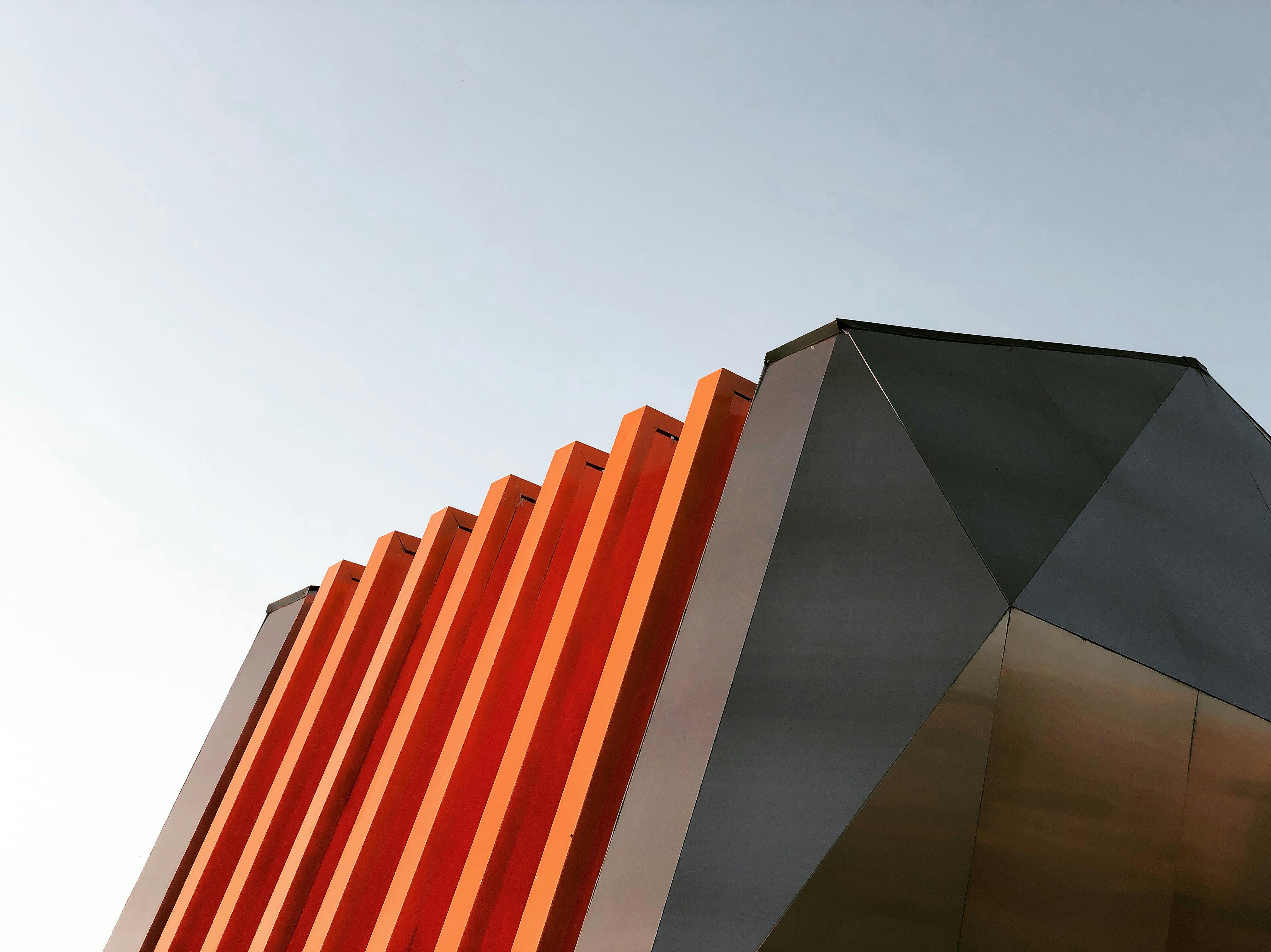
Color in Architecture
Color in Architecture In architecture, color can define spaces, create focal points, and evoke emotions. It plays a crucial role in the functionality and aesthetics of a building.
Overview
Color in architecture is more than just a visual choice; it’s a powerful tool that can shape experiences and influence emotions. From the calming blues of a coastal retreat to the vibrant reds of a bustling restaurant, color helps create the atmosphere and identity of a space. It can guide the flow of movement, highlight architectural features, and even impact the perceived size of a room. Architects and designers use color strategically to enhance both the functionality and aesthetics of their projects.
The Role of Color in Defining Spaces
Color can define and differentiate spaces within a building. Different colors can be used to create distinct zones in open-plan areas, such as using warm tones for communal spaces like living rooms and cool tones for private areas like bedrooms. Color can also indicate the purpose of a space, such as bright, stimulating colors in a creative workspace versus calm, neutral tones in a meditation room.
- Example: In a modern office, bold colors like orange and yellow might be used in collaborative areas to boost creativity and energy, while meeting rooms might feature calming blues to promote focus and calm.
Creating Focal Points with Color
Color can be used to draw attention to specific architectural features or elements within a space. By using contrasting or bold colors, architects can highlight important areas such as entrances, staircases, or artwork. This not only enhances the visual interest but also guides people through the space.
- Example: A vibrant red door can act as a striking focal point in a minimalist white façade, making it clear where the entrance is.
Evoking Emotions Through Color
Different colors can evoke different emotions and set the tone for a space. Warm colors like red, orange, and yellow can create a sense of warmth and excitement, while cool colors like blue, green, and purple can instill calmness and relaxation. Neutral colors like white, gray, and beige can provide a balanced backdrop that enhances the other elements in a space.
- Example: A spa might use soft greens and blues to create a serene environment, helping clients feel relaxed and rejuvenated.
Color and Building Functionality
Color can also affect the functionality of a building. Light colors can make spaces feel larger and more open, which is useful in small rooms or areas with limited natural light. Dark colors can create a cozy, intimate atmosphere, making large spaces feel more welcoming. Reflective surfaces and light colors can enhance natural light, reducing the need for artificial lighting during the day.
- Example: In a compact apartment, using light colors like white or pale yellow can make the space feel more expansive and airy.
Tips for Using Color in Architecture
- Consider the Purpose: Think about the function of the space and the mood you want to create. Use colors that align with these goals.
- Balance Bold and Neutral: Use bold colors for accents and focal points, while keeping the overall palette balanced with neutrals.
- Test in Natural Light: Always test colors in the actual space and under different lighting conditions to see how they truly appear.
- Use Color Psychology: Be aware of the psychological effects of colors and use them to enhance the desired emotional response.
Fun Facts About Color in Architecture
- Historical Significance: Many historical buildings use color to signify importance or function. For example, ancient temples often used rich colors to symbolize wealth and divine presence.
- Modern Trends: Modern architecture often plays with bold color contrasts and unique color combinations to create visually striking buildings.
- Cultural Influence: Different cultures have different associations with colors, influencing how they are used in architecture. For example, red is a color of luck and prosperity in many Asian cultures.
Hacks for Using Color in Architecture
- Accent Walls: Use a bold color on one wall to create a focal point without overwhelming the space.
- Natural Elements: Incorporate natural materials with inherent colors, such as wood and stone, to add warmth and texture.
- Layering Colors: Layer different shades of the same color to add depth and sophistication to a design.
- Color Blocking: Use color blocking to divide spaces and create visual interest without adding physical barriers.
Color is a powerful tool in architecture, capable of transforming spaces and influencing how we feel and interact within them. By understanding and strategically using color, architects and designers can create environments that are not only beautiful but also functional and emotionally resonant. Dive into the world of color in architecture and see how it can elevate your designs to new heights!
Practical Applications in Interior Design
Practical Applications in Interior Design Color plays a significant role in interior design, influencing the mood and functionality of each room. Here are some practical tips for applying color in different areas of your home.
Living Rooms
Living room color schemes can range from bold accent walls to subtle neutral tones. Popular choices include warm colors for a cozy feel or cool tones for a modern look.
- Bold Accent Walls: Choose a single wall to paint in a bold color like deep red or navy blue. This creates a focal point without overwhelming the space.
- Warm and Cozy: Use warm colors like terracotta, burnt orange, and golden yellows to make your living room feel inviting and snug.
- Cool and Modern: Opt for cool tones like grays, blues, and greens to give your living room a sleek, contemporary vibe. Pair with minimalist furniture for a clean look.
- Neutral Foundations: Start with neutral colors like beige, taupe, or white for the walls and larger furniture pieces. Then, add pops of color with accessories like throw pillows, rugs, and artwork.
Bedrooms
Bedroom color schemes are selected to create a relaxing and comfortable environment. Popular choices include soft pastels, warm neutrals, and calming shades like blue and green.
- Soft Pastels: Colors like light pink, lavender, and baby blue can create a serene and soothing bedroom. These shades are perfect for promoting relaxation and restful sleep.
- Warm Neutrals: Warm neutrals like beige, taupe, and soft gray provide a cozy and inviting atmosphere. They also serve as a versatile backdrop for various decor styles.
- Calming Blues and Greens: Shades of blue and green are known for their calming effects. Consider using these colors on the walls or bedding to create a tranquil retreat.
- Dark and Moody: For a dramatic touch, deep shades like navy or charcoal can add sophistication and intimacy to a bedroom. Balance with lighter accents to avoid a heavy feel.
Kitchens
Kitchen color ideas involve choosing a color scheme that complements the overall design of the kitchen. This can include cabinet colors, wall paint, and backsplash tiles.
- Cabinet Colors: Painted cabinets in colors like navy blue, forest green, or classic white can set the tone for the entire kitchen. Consider two-tone cabinets for added interest.
- Wall Paint: Light, neutral walls like soft gray or warm white can make the kitchen feel open and airy. Add a splash of color with a feature wall in a brighter shade.
- Backsplash Tiles: Use colorful backsplash tiles to create a focal point. Patterns and bold colors can add personality and flair to your kitchen design.
- Accent Colors: Incorporate accent colors through small appliances, kitchenware, and decor. Bright red kettles or teal utensils can add pops of color without overwhelming the space.
Bathrooms
Bathroom paint ideas often focus on creating a spa-like atmosphere. Light colors like white, beige, and soft blues are popular choices, as they make the space feel clean and airy.
- Spa-Like Whites: Crisp white walls can make a bathroom feel clean and refreshing. Pair with natural materials like wood and stone for a spa-like retreat.
- Soft Blues and Greens: Light shades of blue and green can evoke a sense of calm and tranquility, perfect for a relaxing bathroom environment.
- Warm Neutrals: Colors like beige and soft gray can create a warm and inviting bathroom. These shades work well with various styles, from modern to traditional.
- Bold and Dramatic: For a unique twist, consider dark colors like charcoal or deep teal for a dramatic and luxurious bathroom. Balance with plenty of light to avoid a cave-like feel.
By carefully selecting colors for different rooms, you can create a home that is not only beautiful but also functional and tailored to your lifestyle. Whether you prefer bold and vibrant or soft and serene, there’s a color scheme that can help you achieve the perfect look and feel for each space.
Choosing Exterior Paint Colors
The exterior sets the tone before anyone steps inside. The right paint scheme can lift curb appeal, highlight structure, and make the building feel finished.
Neutral Palettes That Work
● White: Clean but high-maintenance. Best with contrasting trim.
● Gray: Flexible from soft silvers to stormy charcoals.
● Beige and Taupe: Warm, steady choices that suit most settings.
● Accents: Use navy, forest green, or brick red on doors and trim for character.
Bold Color Moves
● Red: Eye-catching on colonial and barn styles, risky on modern boxes.
● Blue: Navy brings elegance, turquoise feels coastal.
● Yellow: Inviting on smaller homes, overwhelming on large ones.
● Green: Olive blends with landscape, lime screams unless used sparingly.
Monochrome and Modern Schemes
● Black and Charcoal: Striking but demanding, needs texture to avoid flatness.
● White Variations: Minimal, sharp, but benefits from wood or stone breaks.
● Layered Grays: Calm, architectural, pairs well with metal details.
● Earth Browns: Natural tie-in with timber frames and stone foundations.
Rules for Picking Exterior Colors
● Match shades to architecture style.
● Test samples in different daylight conditions.
● Highlight details with contrasting trim.
● Think about long-term maintenance and fading.
Climate and Performance
● Light colors reflect heat and stay cooler.
● Dark shades absorb warmth and suit colder areas.
● Smart choices can raise curb appeal and resale value.
Where Color Decisions Actually Go Wrong
Most architects don’t fail at color because they lack theory. They fail because they don’t test.
Problem 1: Choosing from a screen
A render looks clean, but digital light is perfect and controlled. Real walls catch dust, reflections, and shadows. The blue-gray you pick on a laptop becomes cheap office gray under winter light.
Problem 2: Forgetting context
A color doesn’t live alone. A white facade in Greece sings against stone and sky. The same white in London looks moldy after six months of rain. Color is always tied to climate and street texture.
Problem 3: Designing for photos, not people
Too many interiors are built for Instagram shots. All-white kitchens. Neon accent walls. They work for a picture, but not for a family living inside the space every day. The camera lies about comfort.
Problem 4: Ignoring maintenance
Dark matte paint hides in renders. In reality, it shows every fingerprint, scuff, and smudge. Bright colors fade fastest if exposed to sun. Real projects live or die on upkeep, not just palette.
Problem 5: Fear of boldness
Architects retreat into beige and gray because they don’t want risk. But safe color can drain life from a building. A single bold decision, if grounded in the right context, often makes the difference between forgettable and iconic.
What This Means for You
If you’re picking colors—student, homeowner, or architect—don’t trust theory charts alone. Test in light. Walk the neighborhood. Think about five years of weather and wear, not five seconds of a render.
Final Takeaway
Color theory only matters when it’s tested in real spaces. Charts and wheels are just starting points. What counts is how paint looks under morning light, how a facade weathers after two winters, and how a color scheme holds up when people actually live with it.
Good use of color can hold a building together. Bad choices can ruin proportions, drain atmosphere, or make a space feel flat and lifeless. If you work with color, don’t trust rules blindly. Test, adjust, and let context drive the palette.
That is the difference between design that looks good on a screen and design that survives in the real world.
FAQs
Basics of Color in Design
What is color theory in architecture?
It’s the logic behind how colors interact in space—how they shift mood, scale, and function.
Why do architects care about color?
Because color decides whether a space feels open or tight, calm or chaotic.
What’s the difference between warm and cool colors in interiors?
Warm (reds, oranges, yellows) pull walls closer. Cool (blues, greens) push space outward.
Can white be considered a color in design?
Yes. It’s the strongest background. It reflects light, shapes shadows, and defines edges.
What’s the role of neutral colors in modern buildings?
They strip away noise, letting materials, light, and form dominate.
Do architects follow strict color rules?
No. They use color as a tool, not a formula. Rules are guides, not limits.
Psychology of Color
How does color affect human behavior in a room?
Warm tones energize. Cool tones calm. Neutrals focus attention on shape and detail.
Why do hospitals use so much blue and green?
They lower anxiety and feel clean without being sterile.
Why are fast-food chains often red or yellow?
These colors trigger appetite and urgency—people eat fast, then leave.
Can color reduce stress?
Yes. Blues and greens in particular slow heart rates and lower tension.
Do cultural meanings of color matter in design?
Always. Red can mean luck in one culture, danger in another.
Can color make a space feel more expensive?
Deep, layered palettes with contrast often feel richer than flat, single-tone schemes.
Practical Use in Architecture
How do architects choose colors for facades?
They balance climate, light, and context. A color in Dubai looks different in Copenhagen.
Do building codes limit color choices?
Some cities regulate exterior colors to match historic or local character.
What’s the role of color in wayfinding?
Contrasting colors guide movement—like colored lines in airports or hospitals.
How do colors interact with materials?
Wood warms concrete. Metal sharpens glass. Paint overpowers texture if misused.
Can color save a bad floor plan?
It can’t fix structure, but it can redirect attention and mood.
Does sunlight change color choice?
Yes. Natural light shifts tones hourly. Designers test swatches at different times of day.
Interiors and Living Spaces
What’s the safest color palette for small apartments?
Light neutrals with one bold accent to avoid feeling flat.
Do darker colors always make rooms smaller?
Not always. They can create intimacy and focus if used correctly.
What’s the problem with all-white interiors?
They look great in photos, but in real life they feel cold unless layered with textures.
How do colors affect kids’ rooms?
Bright tones stimulate. Softer shades calm. Balance depends on age and activity.
Why do Scandinavian interiors use so much white?
It maximizes daylight in dark winters.
What’s a timeless color scheme?
Earth tones mixed with natural materials. They don’t age as fast as bold trends.
Mistakes and Misuse
What’s the biggest color mistake in architecture?
Using trendy palettes without testing them in real light.
Why do some modern buildings feel lifeless?
Overuse of gray without contrast or texture.
Can mixing too many colors ruin a design?
Yes. Competing palettes confuse the eye and weaken the architecture.
Why do accent walls often fail?
Because people pick bold colors without balancing the rest of the room.
Can bad color choices lower property value?
Absolutely. Buyers avoid spaces that feel cramped, dark, or dated.
Is beige always boring?
No. It works if layered with wood, fabric, or stone. Flat beige everywhere kills energy.
Trends and Future Thinking
Are bold colors coming back in architecture?
Yes. After decades of gray minimalism, bright palettes are reappearing in public and residential projects.
What’s driving new color choices?
Climate change, cultural identity, and digital rendering tools.
Do digital tools change how architects use color?
Yes. Software shows instant palette shifts, but real-world testing is still essential.
Is sustainable color a real thing?
Yes. Pigments, finishes, and reflective values all tie into energy use and material health.
How does color impact smart home design?
Lighting systems now let users change moods with a button—color is no longer fixed.
Will neutral palettes ever die?
No. They’ll always anchor design. Trends swing, but gray and white remain useful.
Learning and Application
How can students train their eye for color in architecture?
Sketch buildings in different palettes. Compare how mood shifts.
What’s the best book on color in interiors?
Josef Albers’ Interaction of Color—not about trends, but about how color relationships work.
Do architects need to study fashion and art for color sense?
Yes. Fashion, film, and painting teach more about color than most architecture textbooks.
What’s a quick way to test a palette in real life?
Paint a sample board, place it in the actual space, and watch it through a day.
Is color more powerful than material?
In perception, yes. A cheap material in the right color can outperform an expensive one in the wrong tone.
How can homeowners avoid mistakes?
Stick to three main tones max: a base, a secondary, and one accent.
The Power of Color in Architecture: A List of Subject-Related Articles
Colors significantly influence architectural design, impacting mood, perception, and the overall aesthetics of spaces. This section categorizes key concepts and terminologies related to color theory and its application in architecture and interior design.
Color Theory Articles
- Color Wheel
The color wheel is a circular diagram that displays colors based on their chromatic relationships. Primary colors (red, blue, yellow) are spaced evenly, with secondary (green, orange, purple) and tertiary colors in between. It is a fundamental tool for understanding color theory and creating harmonious color schemes. - Complementary Colors
Complementary colors are pairs of colors that, when combined, create a neutral color (like white or black). When placed next to each other, they create a strong contrast and enhance each other. Examples include red and green, blue and orange, and yellow and purple. - Primary Color Wheel
The primary color wheel shows the three primary colors: red, blue, and yellow. These colors cannot be created by mixing other colors and are the foundation for creating all other colors. - Tertiary Colors
Tertiary colors are created by mixing a primary color with a secondary color. They are located between primary and secondary colors on the color wheel. Examples include red-orange, yellow-green, and blue-violet. - Analogous Colors
Analogous colors are groups of three colors that are next to each other on the color wheel. They usually match well and create serene and comfortable designs. Examples include blue, blue-green, and green. - Monochromatic Scheme
A monochromatic color scheme uses variations in lightness and saturation of a single color. This scheme creates a cohesive and elegant look, often used in minimalist designs. - Triadic Color Scheme
A triadic color scheme uses three colors that are evenly spaced around the color wheel. This scheme offers strong visual contrast while retaining balance and color richness. An example is the combination of red, yellow, and blue. - Color Theory
Color theory encompasses the principles and guidelines for creating harmonious color combinations. It includes understanding the color wheel, complementary and analogous colors, and the psychological effects of colors. - Color Theory and Color Wheel
The combination of color theory and the color wheel helps designers create balanced and visually appealing color schemes. Understanding the relationships between colors is essential for effective design. - Color Wheel Chart
A color wheel chart visually represents the color wheel and shows the relationships between primary, secondary, and tertiary colors. It helps designers select harmonious color schemes. - Chromatic Wheel
The chromatic wheel is another term for the color wheel, emphasizing the arrangement of colors based on their chromatic relationships. - Adobe Color Wheel
The Adobe color wheel is an online tool provided by Adobe that allows designers to experiment with and create color schemes. It is useful for ensuring color harmony in digital and print designs. - Color Wheel Picker
A color wheel picker is an online tool that helps designers select colors from a color wheel. It often includes options for creating complementary, analogous, and triadic color schemes. - Complementary Color Wheel
The complementary color wheel highlights pairs of colors that are opposite each other on the color wheel. These pairs create the strongest contrast and are used to create vibrant designs. - Color Knowledge
Color knowledge involves understanding the principles of color theory, the color wheel, and how colors interact with each other. It is essential for creating effective and harmonious designs. - Analog Color Scheme
An analog color scheme uses colors that are next to each other on the color wheel. These colors usually match well and create serene and comfortable designs. Examples include blue, blue-green, and green. - Color Scheme Triadic
A color scheme triadic uses three colors that are evenly spaced around the color wheel. This scheme offers strong visual contrast while retaining balance and color richness. An example is the combination of red, yellow, and blue. - Colorful Design
Colorful design involves using vibrant and varied colors to create a lively and engaging aesthetic. This can be applied in various fields, including interior design, graphic design, and fashion. - Mixing Color Chart
A mixing color chart shows how different colors can be combined to create new colors. It is a useful tool for artists and designers who need to mix paints or select color combinations. - Complementary Color Scheme
A complementary color scheme involves using pairs of colors that are opposite each other on the color wheel. These pairs create the strongest contrast and are used to create vibrant designs. - Analogous Color Combination
Analogous color combinations involve using colors that are next to each other on the color wheel. These combinations create harmonious and serene designs. - Triadic Color Combinations
Triadic color combinations use three colors that are evenly spaced around the color wheel. These combinations offer strong visual contrast while retaining balance and color richness. An example is the combination of red, yellow, and blue.
Color Practical Applications Articles
- Color Theory and Application in Interior Design
- Living Rooms
- Living Room Paint Ideas
Living room paint ideas can range from bold accent walls to subtle neutral tones. Popular choices include warm colors for a cozy feel or cool tones for a modern look. - Living Room Colour Ideas
Living room color ideas include choosing a color scheme that reflects personal style and enhances the room’s function. Popular choices include neutral tones for a sophisticated look or bold colors for a more vibrant feel. - Living Room Colour Schemes
Living room color schemes involve choosing a palette of colors that create a cohesive and pleasing aesthetic. Popular choices include neutral tones for a sophisticated look or bold colors for a more vibrant feel. - Living Room Colour Combination
Choosing the right color combination for a living room can create a cohesive and pleasing aesthetic. Common combinations include complementary colors or monochromatic schemes.
- Living Room Paint Ideas
- Bedrooms and Colors Articles
- Bedroom Paint Ideas
Bedroom paint ideas focus on creating a restful and inviting space. Soft, muted colors are often chosen for their calming effect, but bold colors can also be used to create a dramatic look. - Bedroom Colour Design
Bedroom color design focuses on creating a restful and inviting space. Soft, muted colors are often chosen for their calming effect, but bold colors can also be used to create a dramatic look. - Bed Room Colour
Bedroom color schemes are selected to create a relaxing and comfortable environment. Popular choices include soft pastels, warm neutrals, and calming shades like blue and green. - Bed Room Colour Combination
Choosing the right color combination for a bedroom can create a restful and inviting space. Common combinations include complementary colors or monochromatic schemes. - Best Bedroom Colour Combination
Choosing the best color combination for a bedroom can create a cohesive and pleasing aesthetic. Common combinations include complementary colors or monochromatic schemes. - Best Colour for Bedroom
The best color for a bedroom depends on personal preference and the desired atmosphere. Popular choices include soft pastels, warm neutrals, and calming shades like blue and green. - Bedroom Paint Design Ideas
Bedroom paint design ideas include choosing colors and techniques that create a restful and inviting space. This can involve using soft, muted colors or bold colors for an accent wall. - Gray Bedroom Decor
Gray bedrooms are known for their sleek and modern appearance. Design ideas include combining different shades of gray, adding texture with furnishings, and incorporating pops of color through accessories. - Bedroom Colour Combination for Walls
Choosing the right color combination for bedroom walls can create a cohesive and pleasing aesthetic. Common combinations include complementary colors like blue and orange or monochromatic schemes in shades of green. - Neutral Bedroom Ideas
Neutral bedroom ideas focus on using a palette of whites, beiges, and grays to create a serene and versatile space. These colors can be paired with different textures and patterns to add interest.
- Bedroom Paint Ideas
- Kitchens and Colors Articles
- Kitchen Colour
Explore the latest trends and timeless choices for kitchen colors, ensuring your space is both stylish and inviting. - Kitchen Paint Ideas
Kitchen paint ideas include selecting colors that create a welcoming and functional space. Popular choices are bright colors like yellow for a cheerful atmosphere or neutral tones like gray for a contemporary look. - Kitchen Colour Ideas
Kitchen color ideas involve choosing a color scheme that complements the overall design of the kitchen. This can include cabinet colors, wall paint, and backsplash tiles. - Kitchen Colours for Walls
Choosing the right colors for kitchen walls can create a warm and inviting space. Popular choices include bright colors like yellow, neutral tones like gray, and classic white. - Kitchen Cabinet Color Ideas
Choosing the right color for kitchen cabinets can transform the look of the kitchen. Popular colors include classic white, modern gray, and bold colors like navy blue or green. - White Kitchen Ideas
White kitchens are popular for their clean and timeless look. Design ideas include using different shades of white, adding texture with tiles or countertops, and incorporating pops of color through accessories. - Grey Kitchen Ideas
Grey kitchens are known for their sleek and modern appearance. Design ideas include combining different shades of grey, adding metallic accents, and using textures like matte or glossy finishes. - Green Kitchen Ideas
Green kitchen ideas involve using various shades of green to create a harmonious and natural look. This can include combining different shades of green, adding texture with tiles or countertops, and incorporating pops of color through accessories. - Modern Kitchen Colors
Modern kitchen colors often include neutral tones like white, gray, and black, as well as bold colors like navy blue or green for accent. These colors create a sleek and contemporary look.
- Kitchen Colour
- Bathrooms and Colors Articles
- Bathroom Paint Ideas
Bathroom paint ideas often focus on creating a spa-like atmosphere. Light colors like white, beige, and soft blues are popular choices, as they make the space feel clean and airy. - Small Bathroom Paint Ideas
Small bathroom paint ideas involve choosing colors that make the space feel larger and more open. Light colors like white, beige, and pastel shades are popular choices. - Neutral Bathroom Ideas
Neutral bathroom ideas focus on using a palette of whites, beiges, and grays to create a serene and versatile space. These colors can be paired with different textures and patterns to add interest. - Beige Bathroom Ideas
Beige bathrooms create a warm and inviting space. Design ideas include combining different shades of beige, adding texture with tiles or countertops, and incorporating pops of color through accessories.
- Bathroom Paint Ideas
Miscellaneous Colors Articles
- Wall Paint Ideas
Wall paint ideas involve choosing colors and patterns for painting walls to enhance the aesthetic appeal of a room. This can include solid colors, stripes, or more complex designs like murals or stencils. - Painted Wall Designs
Painted wall designs include various techniques and patterns used to add visual interest to walls. This can range from simple stripes to intricate murals. - Wall Paint Design for Bedroom
Wall paint design for the bedroom can include choosing colors and patterns that create a restful and inviting space. This can involve using soft, muted colors or bold colors for an accent wall. - Wall Painting Ideas at Home
Wall painting ideas at home involve choosing colors and patterns for painting walls to enhance the aesthetic appeal of a room. This can include solid colors, stripes, or more complex designs like murals or stencils. - Room Wall Paint Design
Room wall paint design includes choosing colors and techniques to paint walls in a way that enhances the aesthetic appeal of a room. This can include feature walls, color blocking, or intricate designs. - Wall Paint Design for Living Room
Wall paint design for the living room can include choosing colors and patterns that create a cohesive and pleasing aesthetic. This can involve using bold colors for an accent wall or creating patterns with stencils or tapes. - Room Paint Design
Room paint design involves selecting colors and techniques to paint a room in a way that enhances its aesthetic appeal. This can include feature walls, color blocking, or intricate designs. - Home Painting Ideas
Home painting ideas include various techniques and color schemes for painting different areas of the home. This can range from exterior paint choices to interior wall colors and accent walls. - Room Color Ideas
Room color ideas involve selecting colors that enhance the function and aesthetic of a room. This can include using bright colors to energize a space or soft colors to create a calming environment. - Interior Design Color Schemes
Interior design color schemes involve selecting a palette of colors that create a cohesive and aesthetically pleasing look. This can include complementary, analogous, and monochromatic color schemes. - Room Colour Combination
Room color combinations are chosen to create a cohesive and harmonious look. This can involve using complementary, analogous, or monochromatic color schemes. - Room Colour Paint
Choosing the right color for a room can enhance its overall look and feel. Popular choices include bright colors for energizing a space, soft colors for creating a calming environment, and neutral tones for a sophisticated look. - Drawing Room Colour Paint
Choosing the right colors for the drawing room can create a sophisticated and welcoming space. Popular choices include neutral tones for a classic look or bold colors for a more contemporary feel. - Sitting Room Colour Combination
Choosing the right color combination for the sitting room can create a warm and inviting space. Common combinations include complementary colors or monochromatic schemes. - Wall Paint Design for Drawing Room
Wall paint design for the drawing room can include choosing colors and patterns that create a sophisticated and welcoming space. This can involve using bold colors for an accent wall or creating patterns with stencils or tapes. - Wall Paint Design for Hall
Wall paint design for the hall can include choosing colors and patterns that create a cohesive and pleasing aesthetic. This can involve using bold colors for an accent wall or creating patterns with stencils or tapes. - Interior Painting Design
Interior painting design involves selecting colors and techniques to paint the interior of a home in a way that enhances its aesthetic appeal. This can include feature walls, color blocking, or intricate designs. - Interior Color for Home
Choosing the right interior colors for a home can enhance its overall look and feel. Popular choices include neutral tones, bold colors for accent walls, and calming shades for bedrooms. - Bedroom Color Schemes
Bedroom color schemes are selected to create a relaxing and comfortable environment. Popular choices include soft pastels, warm neutrals, and calming shades like blue and green. - Colors for Living Room
Choosing the right colors for the living room can create a warm and inviting space. Popular choices include neutral tones for a sophisticated look or bold colors for a more vibrant feel. - House Paint Color Ideas
House paint color ideas include selecting colors and patterns for both the interior and exterior of a house. This can involve traditional schemes or more contemporary and bold choices. - Master Bedroom Paint Ideas
Master bedroom paint ideas focus on creating a restful and inviting space. Soft, muted colors are often chosen for their calming effect, but bold colors can also be used to create a dramatic look. - Hallway Paint Ideas
Hallway paint ideas can range from bold accent walls to subtle neutral tones. Popular choices include warm colors for a cozy feel or cool tones for a modern look.
Exterior Design and Colors Articles
- Exterior Paint Ideas
Exterior paint ideas focus on choosing colors that enhance the curb appeal of a home. This can include classic color schemes or more modern and bold choices. - House Painting Design
House painting design includes selecting colors and patterns for both the interior and exterior of a house. This can involve traditional schemes or more contemporary and bold choices. - House Painting Ideas
House painting ideas can range from selecting the right exterior paint colors to choosing interior wall colors that create the desired atmosphere in each room. - Home Exterior Paint Ideas
Home exterior paint ideas focus on choosing colors that enhance the curb appeal of a home. This can include classic color schemes or more modern and bold choices . - Exterior House Paint Ideas
Choosing the right exterior paint colors can enhance the curb appeal of a home. Popular choices include classic neutrals, bold colors, and modern monochromatic schemes. - Outdoor House Paint Ideas
Outdoor house paint ideas focus on choosing colors that enhance the curb appeal of a home. This can include classic color schemes or more modern and bold choices. - House Paint Design Outside
House paint design outside includes selecting colors and patterns for painting the exterior of a house. This can involve traditional schemes or more contemporary and bold choices. - Exterior Paint Design
Exterior paint design includes selecting colors and patterns for painting the outside of a house. This can involve traditional schemes or more contemporary and bold choices. - Outside House Paint Ideas
Choosing the right exterior paint colors can enhance the curb appeal of a home. Popular choices include classic neutrals, bold colors, and modern monochromatic schemes. - Home Color Design Outside
Home color design outside includes selecting colors and patterns for painting the exterior of a home. This can involve using traditional schemes or more contemporary and bold choices.
Home Styles and Colors Articles
- Neutral Bedroom Ideas
Neutral bedroom ideas focus on using a palette of whites, beiges, and grays to create a serene and versatile space. These colors can be paired with different textures and patterns to add interest. - Gray Living Room
A gray living room creates a modern and sophisticated look. This can involve using different shades of gray, adding texture with furnishings, and incorporating pops of color through accessories. - Blue Bedroom Design
A blue bedroom design uses various shades of blue to create a calming and serene look. This can include using different textures and patterns to add interest. - Green Kitchen Ideas
Green kitchen ideas involve using various shades of green to create a harmonious and natural look. This can include combining different shades of green, adding texture with tiles or countertops, and incorporating pops of color through accessories. - Beige Bedroom Ideas
Beige bedrooms create a warm and inviting space. Design ideas include combining different shades of beige, adding texture with furnishings, and incorporating pops of color through accessories. - Modern Kitchen Colors
Modern kitchen colors often include neutral tones like white, gray, and black, as well as bold colors like navy blue or green for accent. These colors create a sleek and contemporary look.
Colors and Palettes Articles
- Green Color Palette
A green color palette involves using various shades of green to create a harmonious and natural look. This can be used in both interior and exterior designs. - Blue Color Palette
A blue color palette involves using various shades of blue to create a calming and serene look. This can be used in both interior and exterior designs. - Yellow Color Palette
A yellow color palette involves using various shades of yellow to create a bright and cheerful look. This can be used in both interior and exterior designs. - Navy Blue Color Palette
A navy blue color palette involves using various shades of navy blue to create a sophisticated and calming look. This can be used in both interior and exterior designs. - Orange Color Palette
An orange color palette involves using various shades of orange to create a warm and energetic look. This can be used in both interior and exterior designs. - Red Color Palette
A red color palette involves using various shades of red to create a bold and vibrant look. This can be used in both interior and exterior designs. - Pink Color Palettes
Pink color palettes involve using various shades of pink to create a soft and feminine look. This can be used in both interior and exterior designs. - Purple Color Palettes
Purple color palettes involve using various shades of purple to create a luxurious and elegant look. This can be used in both interior and exterior designs.