Renaissance architecture is not just columns and round arches.
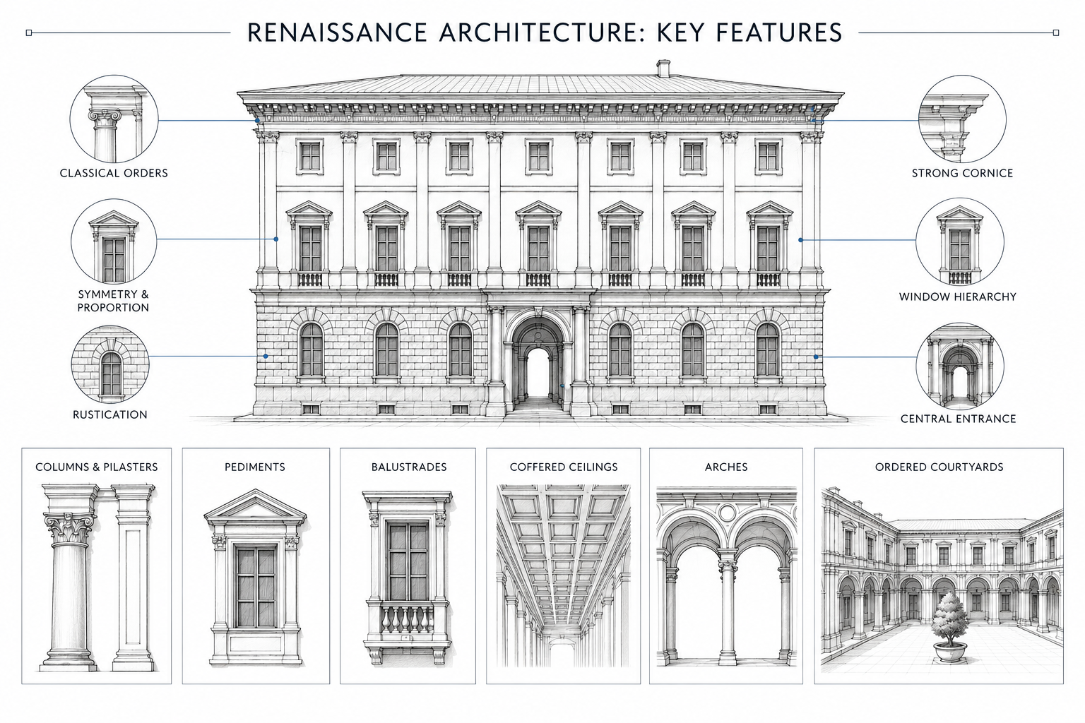
It is a way of making a building look controlled. The windows line up. The base feels heavy. The main floor gets more attention. The cornice gives the wall a clear top. Courtyards bring light into deep city blocks. Stairs, rooms, doors, and façades are arranged so the building feels ordered instead of accidental.
That order was not neutral. In a Renaissance city, a palace façade could make a powerful family look stable, rich, and permanent. A courtyard could control who entered, where they waited, and how they moved inside. A villa could turn land, view, and status into geometry.
The useful lesson is simple: Renaissance architecture used proportion, hierarchy, wall depth, rhythm, and classical details to make buildings easier to read.
The Main Shift
Renaissance architecture made buildings feel measured.
That reading depends on hierarchy in architecture: what feels heavy, what leads the eye, and what stays quiet.
The base, middle, top, windows, door, cornice, courtyard, stair, and main room all had to feel related. Nothing was supposed to look random.
Earlier medieval buildings often grew through additions, repairs, local habits, and vertical drama. Renaissance architects wanted a different effect. Openings lined up. Floors were marked. The main level was emphasized. The cornice ended the façade with authority.
The best Renaissance buildings do not feel calm because they are plain. They feel calm because each part knows where it belongs.
| Design issue | Renaissance move | What changed |
|---|---|---|
| Messy street fronts | Ordered façades and window rhythm | The building read as one controlled public face. |
| Unclear social hierarchy | Strong base, main floor, upper floors | The façade showed which spaces mattered most. |
| Loose proportions | Measured ratios and classical orders | Parts felt connected instead of assembled by habit. |
| Dark interior planning | Courtyards, galleries, and aligned rooms | Light, movement, and status worked together. |
| Flat decoration | Wall depth, stone texture, cornices, pilasters | Detail gave shadow and structure, not surface pattern alone. |
Where It Started
The architectural Renaissance began in early 15th-century Florence and spread across Italy and Europe.
Florence matters because it was dense, wealthy, political, and competitive. This was not a style born in empty space. It grew in tight streets, family rivalries, civic institutions, merchant wealth, workshops, and construction problems.
A palace façade could announce discipline. A courtyard could organize private life. A hospital arcade could make public care look calm and rational. A villa could turn land, view, and status into geometry.
The Renaissance did not erase the past. It edited it.
Ancient Roman architecture and Ancient Greek architecture supplied many forms: columns, pilasters, round arches, vaults, orders, cornices, and proportional systems. Renaissance architects adapted those ideas to early modern streets, homes, institutions, and villas.
That is why Renaissance architecture sits between history and design. It is old, but it reads like a method.
Palaces Made The Style Public
The Renaissance palace is one of the best places to study the style because it had to work on the street.
A city palace was not just a large house. It was a family’s public face. The wall had to suggest wealth, discipline, stability, taste, and control without shouting.
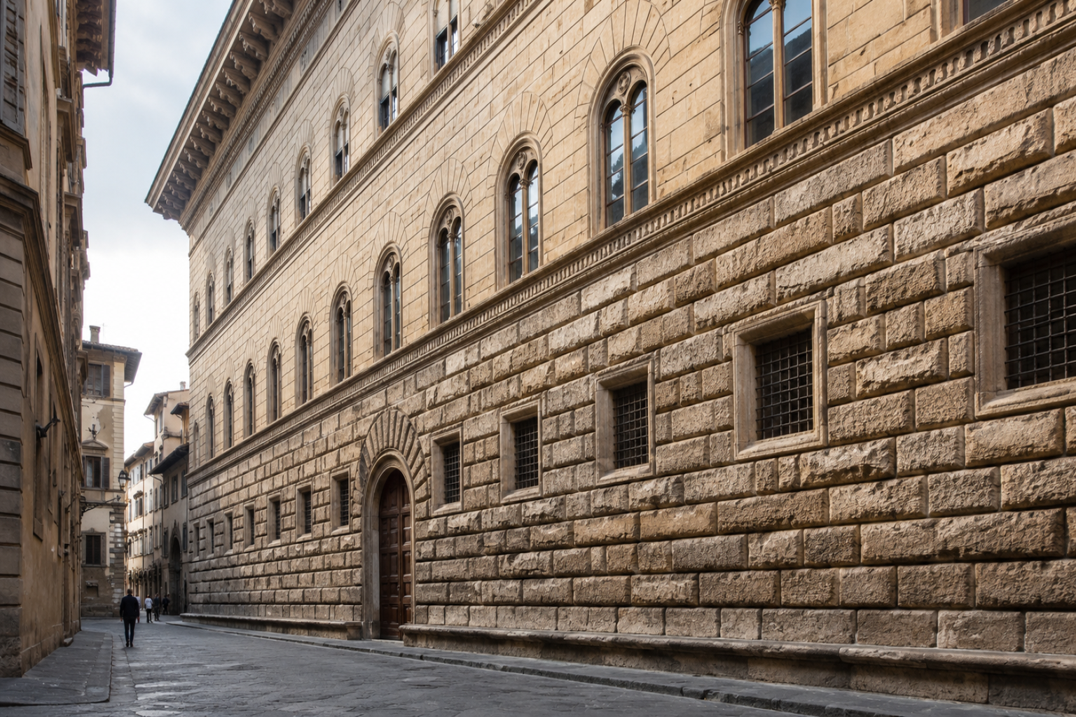
Look at Palazzo Medici Riccardi or Palazzo Rucellai. The lower level feels heavier. The upper levels become more refined. Windows line up. Horizontal bands control the elevation. The cornice gives the building a strong finish.
The façade turns the private life behind the wall into one public image.
That public image was not harmless. It helped powerful families look permanent.
How The Façade Works
A Renaissance façade usually starts with hierarchy.
The base carries weight. It may be rougher, darker, or visually stronger. Above it, the main formal level receives more attention. Upper floors become lighter or simpler. The cornice finishes the wall and gives the building a readable top.
Pilasters and classical orders often help organize the wall. They do not always carry the structure in the literal sense. Their job is visual structure. They divide the façade into bays, set rhythm, and help the eye measure the building.
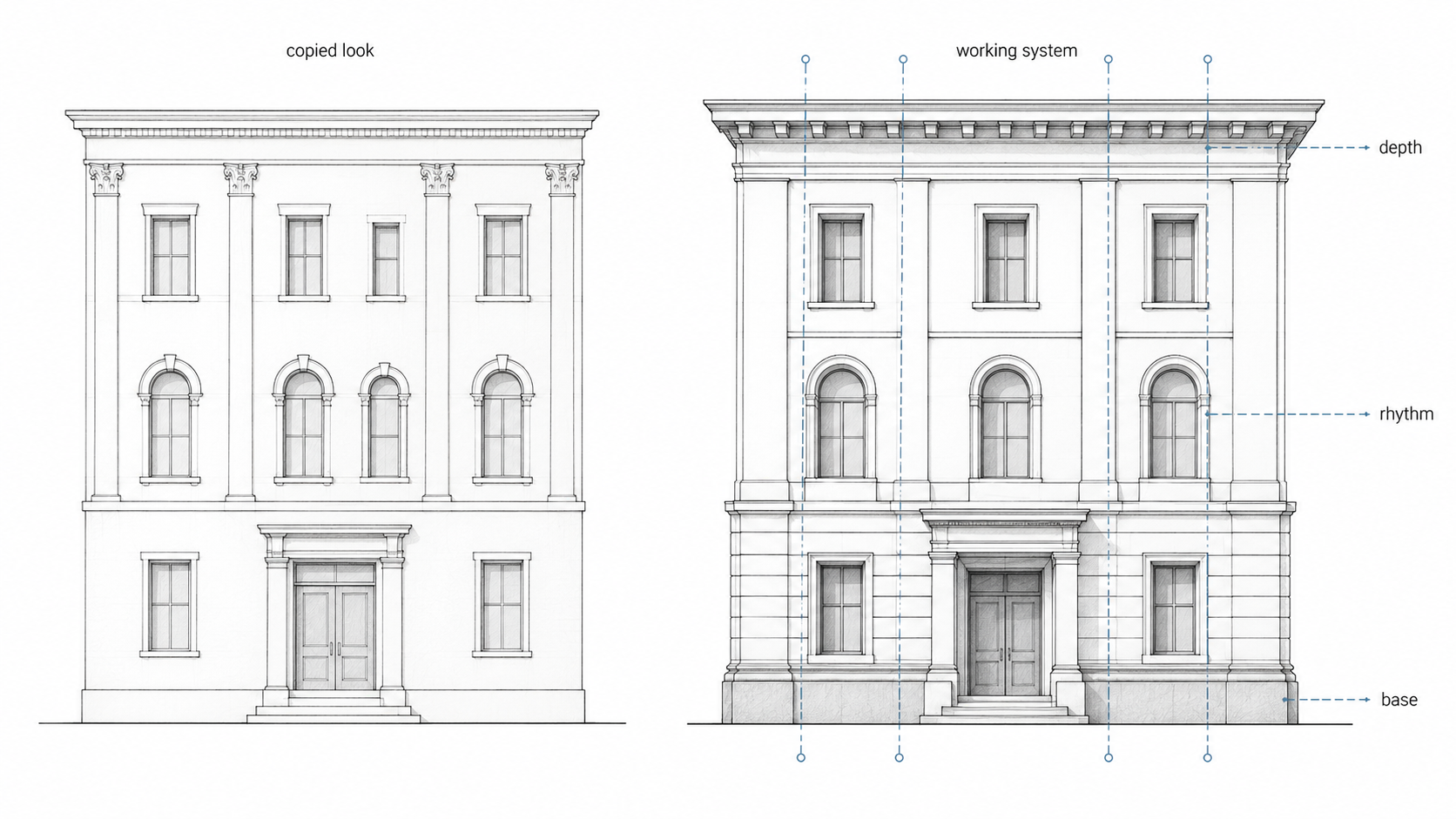
That is why shallow modern copies often fail. They copy a pilaster but not the wall depth. They copy symmetry but not hierarchy. They copy a cornice but make it too thin to cast a useful shadow.
Good Renaissance façades rely on depth, not pattern alone.
When The Façade Hides The Mess
A Renaissance façade can look perfectly calm while hiding a difficult plan behind it.
Old property lines, joined houses, awkward rooms, service spaces, family politics, and uneven construction could sit behind one carefully ordered street wall. The façade made the building look more rational than the life behind it.
Rustication, aligned windows, pilasters, stringcourses, and cornices were tools of public control. They made a family, institution, or civic building look stable from the street.
This is why Renaissance architecture is easy to copy badly. A designer sees symmetry and adds a centered door. They see columns and add thin pilasters. They see a cornice and add trim. But the original power came from hierarchy, thickness, shadow, proportion, and urban presence.
The useful lesson is not “make it symmetrical.” The lesson is to decide what the public face must organize: entry, status, scale, shade, wall depth, and the way the building meets the street.
Courtyards Controlled Light And Movement
The courtyard was not leftover space.
In a dense city, a courtyard could bring light into the building, organize movement, separate public and private zones, and create a controlled path from street to interior life.
The entry sequence mattered: street, doorway, vestibule, courtyard, stair, main room.
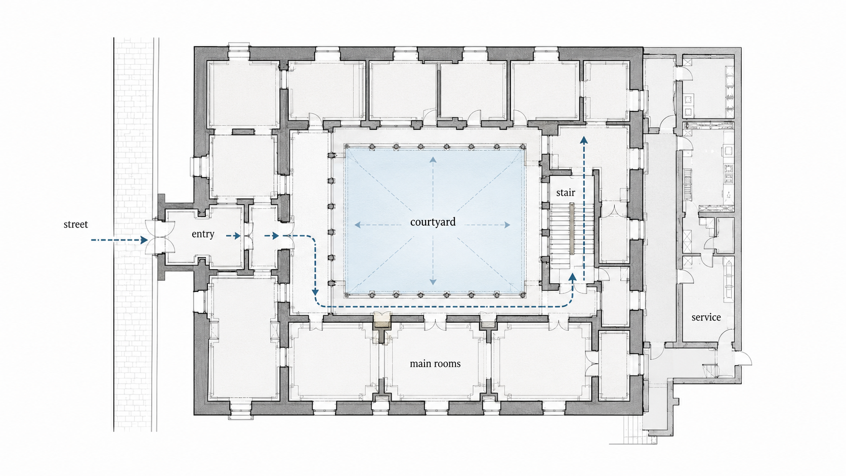
That sequence told visitors how to behave before anyone said a word.
Courtyards also solved practical problems. They improved light. They made circulation clearer. They let visitors, servants, deliveries, and family movement stay separated without turning the building into a maze.
The outside made power readable. The courtyard made daily use manageable.
Villas Turned Geometry Into Lifestyle
The villa changed the problem.
In the city, architecture had to deal with streets, neighbors, and public status. In the countryside, it could organize land, view, approach, and leisure.
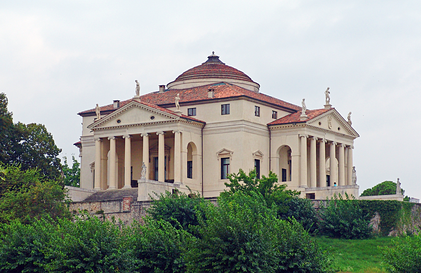
Andrea Palladio pushed this further than almost anyone. Villa Rotonda is famous because it looks almost impossibly ordered: central plan, four fronts, porticoes, and a strong relationship to the landscape. The building is not trying to hide its logic. It is the logic.
That made Palladio powerful later. His work was easy to study, draw, publish, and reuse. Villas became diagrams of proportion that could travel across countries and centuries.
The weak copies came later too. A portico, a central room, and symmetry are not enough. The good versions understand landscape and approach. The weak versions borrow only the front.
Perspective Changed The Room
Renaissance architects cared about how space was seen.
Linear perspective changed drawing, but it also changed architectural judgment. Floors, ceilings, galleries, arches, stairs, and openings could be arranged to pull the eye through space. A corridor could become a measured view. A stair could become a controlled event. A courtyard could become geometry you walk through.
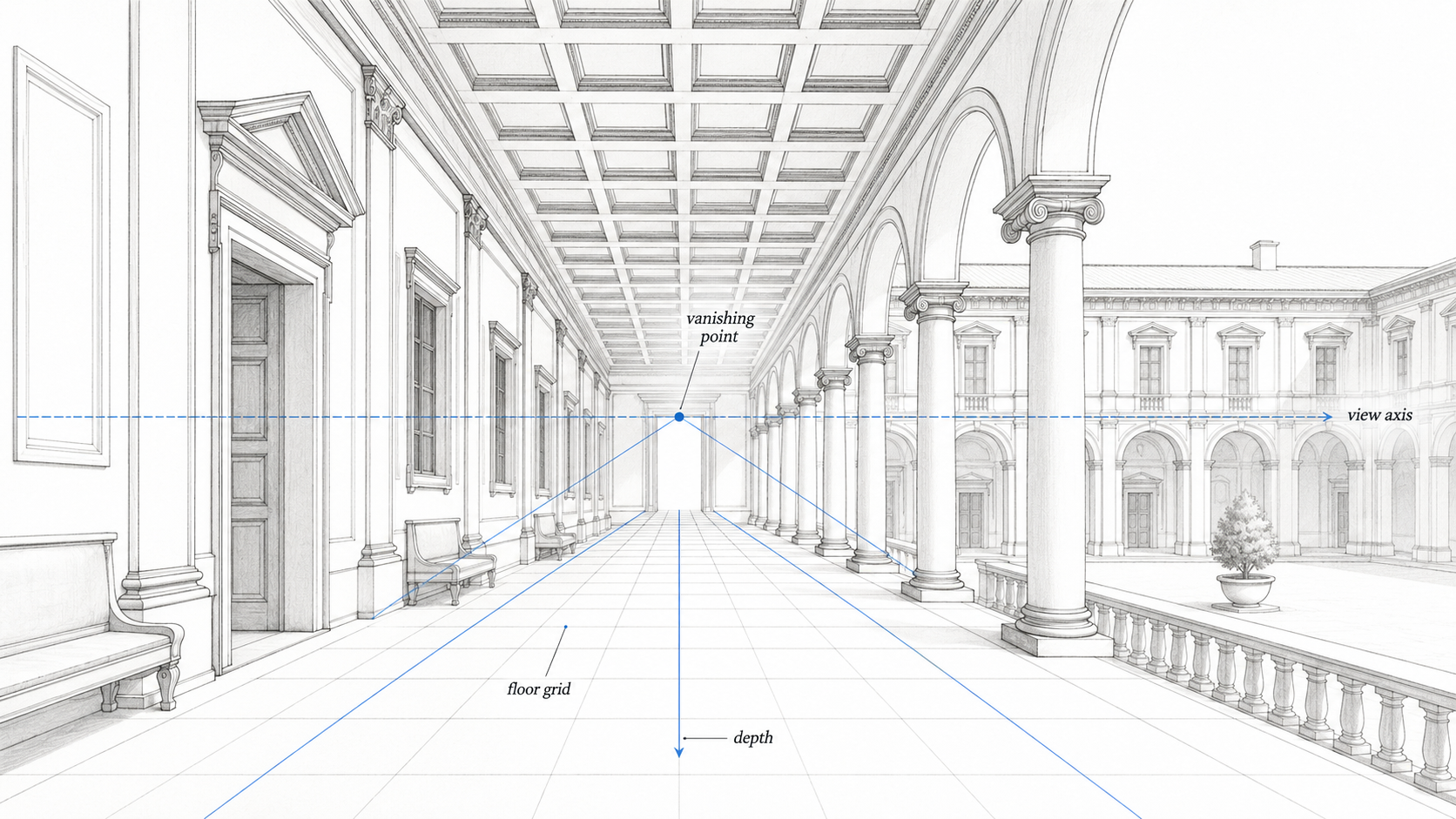
The Laurentian Library is a good example because the stair and vestibule turn movement into pressure. The room is controlled, but tense. That tension points toward Mannerism, where architects began bending the rules after mastering them.
Renaissance architecture did not stay frozen. Once the rules were strong enough, later architects started testing them.
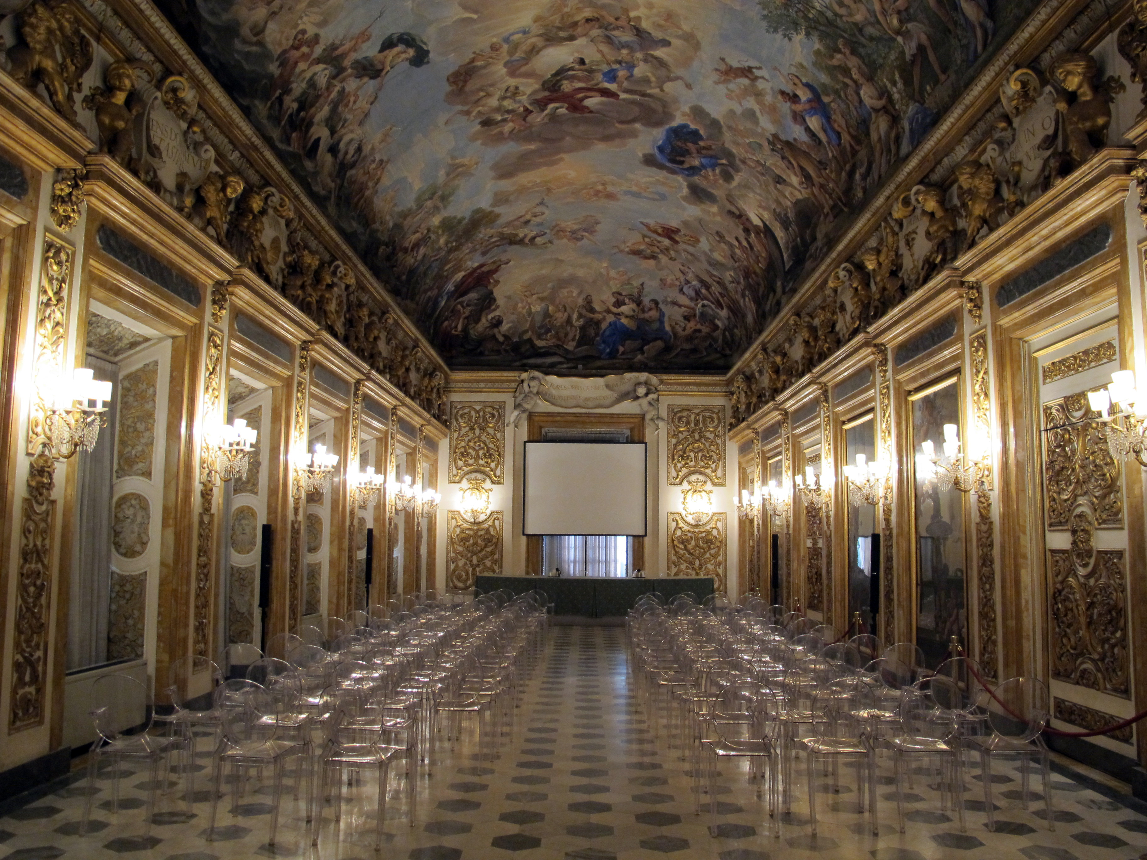
Interiors Were Controlled Too
Renaissance interior design was not only furniture, paintings, or decoration. The strongest interiors were architectural before they were decorative.
Ceiling rhythm, floor pattern, wall panels, stair shape, window placement, and room sequence all helped control how a person moved and looked. This is why space planning matters even in a historical style article.
A coffered ceiling could make a room feel measured. A stone floor could pull the eye toward a door or view. A stair could slow the visitor down before the main room.
Modern “Renaissance style” interiors often miss this. They borrow heavy furniture, gold trim, arches, and classical motifs, then forget the room itself. The ceiling is too flat. The windows do not line up. The wall has no depth. The furniture fights the architecture.
A better Renaissance interior starts with proportion and sequence. Where does the eye go first? Where does the room feel too low, too wide, too empty, or too busy? The style works only when the room has order before decoration arrives.
What Changed Over Time
Renaissance architecture was not one fixed look.
| Phase | What to notice | Good secular examples |
|---|---|---|
| Early Renaissance | Clear geometry, measured arcades, calm façades, human scale | Ospedale degli Innocenti, Palazzo Medici Riccardi |
| High Renaissance | Tighter symmetry, stronger central planning, idealized proportion | Palazzo Farnese, early villa planning, mature urban palaces |
| Late Renaissance / Mannerism | Rules stretched, distorted, exaggerated, or made more theatrical | Laurentian Library, Palazzo Te |
| Palladian influence | Villa logic, porticoes, published proportions, repeatable design systems | Villa Rotonda, Villa Barbaro, later Palladian houses |
Early work feels like a correction. Later work feels like confidence. Mannerist work feels like someone testing the limits of the system.
That is more useful than memorizing dates alone.
Buildings That Explain The Style
The best Renaissance buildings are not always the biggest ones. The clearest examples are the ones where the system is easy to read: base, wall, windows, courtyard, stair, cornice, and plan.
| Building | What to study | Why it helps |
|---|---|---|
| Palazzo Medici Riccardi | Rusticated base, courtyard, street power | Shows how a private family palace became a public urban statement. |
| Palazzo Rucellai | Pilasters, bay rhythm, proportion | Shows how classical order could be laid onto a city façade. |
| Palazzo Farnese | Scale, cornice, window hierarchy | Shows Renaissance restraint at a larger civic scale. |
| Ospedale degli Innocenti | Arcade, module, human scale | Shows how public architecture could feel calm, useful, and measured. |
| Villa Rotonda | Central plan, symmetry, landscape | Shows how Palladio turned proportion into a complete villa system. |
| Laurentian Library | Stair pressure, wall depth, spatial tension | Shows how Michelangelo stretched Renaissance rules into something more intense. |
| Uffizi | Long urban space, administrative order, perspective | Shows how architecture could organize government, movement, and city views. |
| Palazzo Te | Broken rules, playful distortion, Mannerist detail | Shows what happened when architects knew the rules well enough to bend them. |
Ask what each building controls: street presence, social rank, light, movement, view, or proportion.
Regional Differences
The Renaissance did not look the same everywhere.
Italy stayed closest to the classical source: palaces, villas, ordered façades, courtyards, and urban rooms. France absorbed the language into châteaux, steep roofs, tall silhouettes, and royal display. Spain moved between rich surface detail and severe geometry. England adopted the language later, often through houses, halls, brickwork, large windows, and formal plans.
The rules traveled, but local materials and habits changed the result.
| Region | Typical direction | What changes |
|---|---|---|
| Italy | Clear classical revival | Palaces, villas, courtyards, proportion, measured façades |
| France | Renaissance detail on château forms | Steeper roofs, taller massing, royal scale |
| Spain | Surface richness or severe geometry | Plateresque detail on one side, Herrerian restraint on the other |
| England | Late adoption through houses and civic rooms | Brickwork, large windows, formal plans, tall chimneys |
| Low Countries | Classical details mixed with local civic façades | Gables, town halls, guild buildings, decorative stonework |
The shared language was proportion and order. The local results were messier, which makes them more useful to study.
Brunelleschi, Palladio, And Michelangelo
Three names help explain the shift.
Brunelleschi changed how architects thought about measured space, perspective, modular design, and construction method. His importance is not one famous dome alone. It is the shift toward architecture as calculation, drawing, sequence, and built control.
Palladio made Renaissance architecture portable. His villas and books turned proportion into a system other architects could study and reuse.
Michelangelo showed what happened when the rules started to bend. His architecture keeps classical parts, but gives them pressure. Stairs swell. Walls push. Openings feel tense. The work points toward Mannerism because it no longer treats balance as the only goal.
Brunelleschi clarifies the system. Palladio publishes and repeats it. Michelangelo strains it.
Other Architects Who Changed The System
Leon Battista Alberti turned architecture into written theory and urban performance. Palazzo Rucellai is the key example: a city façade made rational through pilasters, bays, and proportion.
Michelozzo gave the urban palace a strong early model in Palazzo Medici Riccardi. The rusticated base, courtyard, and controlled exterior helped define what a powerful family residence could look like.
Giulio Romano pushed late Renaissance design toward Mannerism. Palazzo Te is useful because it looks disciplined at first, then starts playing games with the rules.
Giorgio Vasari shaped architecture and architectural memory. The Uffizi shows how administration, street space, and long perspective could work together.
Renaissance Revival Is Different
Renaissance Revival and Neo-Renaissance architecture are later reuses of Renaissance language. They belong to the afterlife of the style, not the original movement.
The difference matters. Original Renaissance architecture grew out of early modern Italian and European city life: palaces, villas, courtyards, theory, proportion, and patronage.
Renaissance Revival came later, when architects borrowed that language for banks, hotels, apartment blocks, civic buildings, and wealthy houses.
That later work often kept the big signals: rusticated base, arched windows, heavy cornice, symmetrical façade, stone trim, and formal entry. But it did not always keep the original plan logic. Sometimes the revival façade was a public costume placed over a modern floor plan.
What Modern Copies Get Wrong
Renaissance architecture gets copied badly because it looks easier than it is.
The common mistake is copying details before understanding the system. Add a cornice. Add pilasters. Center the door. Space the windows evenly. The drawing starts to look “Renaissance,” but the building still feels thin.
The problem is usually depth. The wall has no weight. Window reveals are too shallow. The base does not feel grounded. The cornice casts no shadow. The main floor has no hierarchy. The façade is symmetrical, but it has no authority.
Good Renaissance-inspired design is not about pasting classical parts onto a box. It is about hierarchy, mass, openings, material depth, and the way the building meets the street or landscape. The same rule applies to basic architectural design: the system has to work before the style can help.
Copy the system first. The details can come later.
What Still Works
Several Renaissance lessons still hold up.
- Start with scale and proportion. If the bay rhythm is wrong, ornament will not fix the building.
- Give the base weight. A public building needs to meet the ground with more than a thin wall and a decorative door.
- Use windows as rhythm. Openings are not holes. They set scale, hierarchy, and pace.
- Let courtyards organize the plan. Light, air, privacy, and movement can work together when the plan is clear.
- Do not flatten the wall. Shadow is part of the architecture.
Renaissance architecture still has value because it teaches order without forcing sameness.
Renaissance Architecture In Simple Terms
Renaissance architecture began in early 15th-century Italy. It revived ancient Greek and Roman design ideas through proportion, symmetry, classical orders, round arches, domes, courtyards, and human-scaled planning.
The best examples show how buildings can make public life, private status, geometry, and visual order work together.
For the broader timeline, read Architectural History and Theory and Architecture Complete History. For the older proportional language, use Greek Architecture and Roman Architecture Style. For the style that came after Renaissance restraint, use Baroque Architecture.
FAQ
What is Renaissance architecture?
Renaissance architecture is the architectural movement that began in early 15th-century Italy and revived classical design through proportion, symmetry, round arches, columns, domes, courtyards, and human-scaled planning.
What are the main features of Renaissance architecture?
The main features are symmetry, proportion, classical orders, round arches, cornices, pilasters, rusticated bases, courtyards, central planning, and measured façades.
How do you identify Renaissance architecture?
Look for a clear base-middle-top façade, aligned windows, strong cornice, classical details, balanced proportions, and a controlled street or courtyard relationship.
What makes Renaissance architecture different from medieval architecture?
Renaissance architecture usually reads as more horizontal, measured, and rational. It uses classical orders, round arches, proportion, and symmetry instead of relying on vertical drama and dense medieval detail.
Who were the main Renaissance architects?
Brunelleschi, Alberti, Michelozzo, Michelangelo, Palladio, Giulio Romano, and Vasari are among the key figures, depending on whether the focus is early Renaissance, High Renaissance, Mannerism, or Palladian influence.
Why is Palazzo Rucellai important?
Palazzo Rucellai shows how a city façade could use pilasters, bays, and proportion to turn a group of urban rooms into one controlled public face.
Why is Villa Rotonda important?
Villa Rotonda shows how Renaissance villa design used symmetry, central planning, porticoes, and landscape views to organize a building.
Is Renaissance architecture still used today?
Yes, but the best modern use is not copying details. It is using proportion, hierarchy, window rhythm, wall depth, and clear planning in a way that still fits the site and use.