Image by ArchitectureCourses.org. Space planning starts with the parts of a room people feel first: movement, light, furniture, storage, and where daily life lands.
A room can look clean on paper and still fail in use.
The door hits a chair. The desk sits in glare. The bed blocks the closet. The dining table fits, but the chairs cannot pull out. The room has enough square footage, but the path through it feels tight.
Space planning catches those problems early.
It decides where people enter, walk, sit, work, store things, open doors, and use the room before finishes and decoration take over.
For the larger idea, start with spatial design. For the full planning process, use spatial planning and design. This page is the simple checklist version.
What Space Planning Is
Space planning is the arrangement of rooms, zones, furniture, openings, storage, and circulation so a space works for the people using it.
In a room, that usually means solving five things:
- what needs to happen in the space;
- where people enter and move;
- which activities need privacy, quiet, light, or storage;
- how furniture fits without blocking daily use;
- how the room feels once people, bags, chairs, doors, and clutter are added.
A good layout does not need a long explanation. The path is clear. The main use is obvious. Storage is near where it is needed. The room feels calm because the hard decisions were made before the styling started.
Start With Use, Not With Walls
The first move is not drawing rooms. It is understanding what the space has to do.
Ask plain questions early:
- Who uses this space?
- What do they do first, second, and last?
- What needs quiet?
- What needs privacy?
- What needs storage?
- What needs daylight?
- What path gets used most?
A home office, bedroom, café, studio, classroom, and living room all answer those questions differently. Many weak plans start as generic “nice layouts” instead of layouts tied to real use.
If the project still feels loose, parti in architecture can help clarify the main idea before the plan fills up with disconnected moves.
Movement Usually Decides Whether the Plan Works

Illustration by ArchitectureCourses.org. Circulation has to be planned before furniture, storage, and doors start stealing the path.
Bad circulation ruins good-looking rooms.
People should not need to cut through a private area to reach a shared one. A door should not fight a chair. A desk should not sit in the main walking path. A plan should not feel like a maze because the diagram looked interesting.
Most spaces need some version of these zones:
- Public zones such as living, waiting, dining, reception, or gathering areas.
- Private zones such as bedrooms, focused work areas, study rooms, or retreat spaces.
- Service zones such as bathrooms, kitchens, storage, laundry, back-of-house space, or mechanical areas.
- Transition zones such as entries, hallways, landings, doorways, and pause points.
The point is not to separate everything rigidly. The point is to know when overlap helps and when it creates friction.
The Basic Space Planning Checks
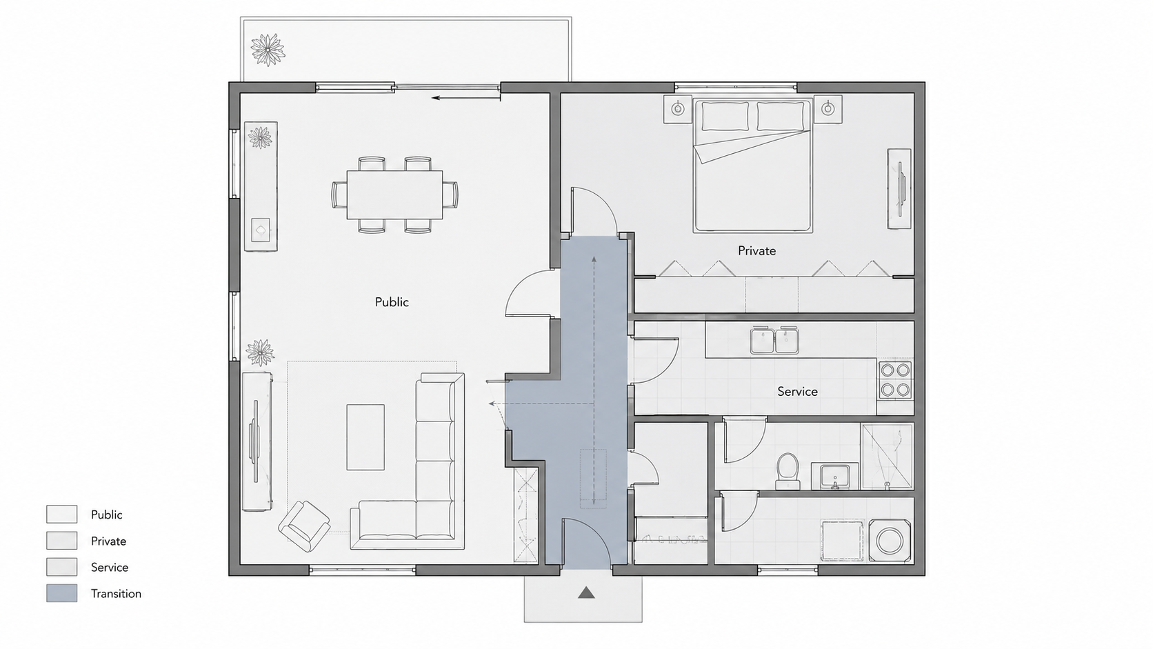
Illustration by ArchitectureCourses.org. Public, private, service, and transition zones help beginners see how a plan starts to organize itself before furniture or finishes are added.
Before a layout gets polished, check the parts that usually break first.
| Check | What to look for | Common failure |
|---|---|---|
| Entry | Where people arrive, stop, remove shoes, drop bags, or orient themselves. | The entry opens straight into clutter or a blocked path. |
| Circulation | The main walking route through the room. | Furniture steals the path after the room is furnished. |
| Furniture clearance | Door swings, chair pullback, drawers, cabinets, and walkways. | The furniture fits on paper but fails in use. |
| Light | Where daylight helps, where glare hurts, and what needs a view. | The best work or seating zone lands in bad light. |
| Storage | Where daily items actually land. | Storage is too far from the activity it supports. |
| Quiet | Which areas need privacy or less noise. | Quiet work or sleep is placed beside the busiest route. |
Scale and Proportion Are Not Decoration
A room can meet the size requirement and still feel wrong.
A corridor can be technically wide enough and still feel tight. A bedroom can fit a bed and still fail because the closet cannot open properly. A living room can have enough area but feel unsettled because the rug, sofa, table, and walkway do not agree.
Work with the body. Check turning space. Check door swings. Check chair pullback. Check whether someone can stop, pass, sit, open, store, and move without colliding with something else.
For a deeper explanation, see scale and proportion in architectural design.
Light, Air, and Orientation Change the Plan
Windows are not just symbols on a plan.
Put the activities people use longest where the light helps them. Living areas, desks, dining spaces, studios, and reading corners usually need better daylight and glare control. Storage, short hallways, and utility functions can often tolerate less.
Ventilation matters too. Cross-breezes, heat gain, glare, and solar exposure affect whether a room feels usable or tiring.
A common mistake is drawing a nice plan first and adding windows later. Reverse that. Light and orientation should shape the plan early.
For more on this, use natural lighting in architectural design.
What Goes Wrong After the Room Is Used
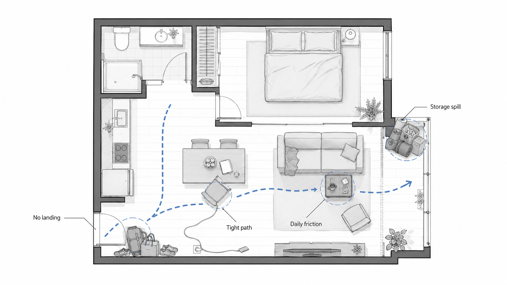
Illustration by ArchitectureCourses.org. A layout is not proven when empty. It is proven after bags, chairs, chargers, storage, doors, and daily movement start using the room.
Empty rooms make weak layouts look better than they are.
The real test starts after people use the space. Bags pile near the door because there is no landing zone. Chargers cross the walkway. A dining chair hits the wall. A desk becomes useless in afternoon glare. The storage cabinet fits, but the door cannot open fully. The sofa blocks the only clean path through the room.
This is where money gets wasted. Furniture gets ordered before the path is tested. Built-ins lock in a bad layout. Rugs arrive too small. A room gets styled for the photo but still feels awkward every day.
Tape the big pieces on the floor before buying. Walk the route. Pull out chairs. Open doors. Check drawers, closets, outlets, lamps, vents, radiators, and cleaning access. A room that only works when empty is not ready.
A Simple Process That Holds Up

Illustration by ArchitectureCourses.org. A strong plan moves from use, to relationships, to circulation, to fixed conditions, before it gets drawn cleanly.
You do not need a complicated method. You need one you can repeat.
- Write the use plainly. List who uses the space and what has to happen there.
- Mark the fixed points. Doors, windows, plumbing, structure, stairs, built-ins, vents, outlets, and awkward corners.
- Map relationships. Decide what should be close, separate, quiet, public, private, or shared.
- Draw rough zones. Keep the plan loose long enough to test options.
- Trace circulation. Draw the main paths before locking furniture or walls.
- Add furniture at real size. Include chair pullback, drawers, doors, and walking clearance.
- Test the room in use. Imagine sitting, reaching, opening, storing, cleaning, and passing another person.
- Redraw it cleanly. Clean drawings expose bad decisions quickly.
This process is basic because it works. The larger process page is spatial planning and design.
A Worked Example: Small Café Plan
A small café is a useful exercise because it punishes vague planning immediately.
Customers enter, pause, queue, order, wait, collect, sit, visit the restroom, and leave. Staff enter differently, work differently, store differently, clean differently, and move behind the counter under pressure.
A common mistake is pushing the counter to the back because it looks balanced. Then the queue cuts through seating, pickup blocks the entry, and staff lose a clean work zone.
A stronger plan makes the entry easy to understand, keeps the queue readable, separates pickup from the doorway, gives staff a clear work path, and lets seating include both quick stops and longer stays.
Use first. Style after.
How To Make a Plan Feel Better Without Making It Bigger
A weak plan does not always need more space.
Often it needs better organization.
- reduce unnecessary corridor length;
- align openings so movement feels clearer;
- borrow light from adjacent spaces;
- tighten oversized dead corners;
- combine functions that naturally support each other;
- separate noisy and quiet zones more clearly;
- give one space priority instead of making every room compete.
Bigger is not always better. A smaller plan with clear relationships often works better than a larger plan with confused movement.
What Students and Beginners Usually Miss
The same mistakes keep showing up.
- They draw rooms before relationships. The plan fills up, but the logic never settles.
- They treat circulation as leftover space. It is not.
- They overtrust open plans. Open is not the same as useful.
- They place furniture symbols instead of testing furniture use. A bed, chair, desk, or table icon is not proof the room works.
- They ignore storage until too late. Then daily life spills into the circulation path.
- They force symmetry where the room does not want it. Order is useful. Forced order can make the plan worse.
Most fixes come from asking better questions, not from adding more shapes.
Why Clear Drawings Matter
A messy plan can hide a bad layout. A clear plan exposes it.
This is why drawing matters in space planning. A plan is not only a presentation image. It is a test. It should show doors, openings, furniture, storage, circulation, fixed points, and where the body actually moves.
If three people hesitate at the same point in your plan, that spot needs work. If nobody understands where to enter, wait, sit, store, or move, the problem is not only graphic. It is spatial.
For drawing basics, use architectural drawings.
FAQ
What are space planning essentials?
The essentials are use, circulation, zoning, scale, light, privacy, storage, furniture clearance, and fixed points such as doors, windows, stairs, plumbing, and structure.
What is the first step in space planning?
Start with use. Write what has to happen in the room, who uses it, what needs privacy or quiet, and which path gets used most.
How do I know if a room layout is wrong?
The room usually creates friction. People turn sideways, furniture blocks openings, chairs cannot pull out, storage is too far away, or the room feels crowded before much is added.
Why does circulation matter?
Circulation decides how people move through a space. If the path is unclear or blocked, the room feels cramped even when the size looks fine on paper.
What matters most in a small room?
A small room needs fewer priorities, clear circulation, furniture scaled correctly, and storage that does not eat the main path.
Can furniture fit and still be wrong?
Yes. Furniture can fit on a plan but still fail when chairs pull out, drawers open, doors swing, people pass, or storage gets used.
Is space planning only for interior design?
No. It matters in interiors, architecture, landscape design, classrooms, cafés, offices, studios, and public spaces. Anywhere people move and use space, planning matters.
Read This Next
For the broader idea behind this checklist, read spatial design.
For the deeper process of zones, paths, adjacency, and fixed points, go to spatial planning and design.
For room-level layout and furniture decisions, use space planning and layout in interior design.
If you are studying interiors as a field or building a portfolio, read interior and spatial design.