Hierarchy is one of those words that sounds like theory until you watch a real project fall apart.
A client can’t find the front door in a “beautiful” concept. A contractor can’t tell what wall is structural because the drawing weight is flat. A reviewer flips through a permit set and misses the one detail that actually controls water at the roof edge. Same problem, different stage.
Hierarchy is the system that decides what gets seen first, what gets understood second, and what gets ignored until it becomes expensive.
In architecture, hierarchy is not a “style.” It’s not “make the lobby bigger.” It’s not “use contrast.” It’s a discipline: you’re choosing what matters most, then making that choice obvious in space, form, and information.
If you’re early in learning this stuff, it helps to understand what architecture really is before you try to “design.” Because hierarchy is basically architecture doing its job: turning chaos into readable decisions.
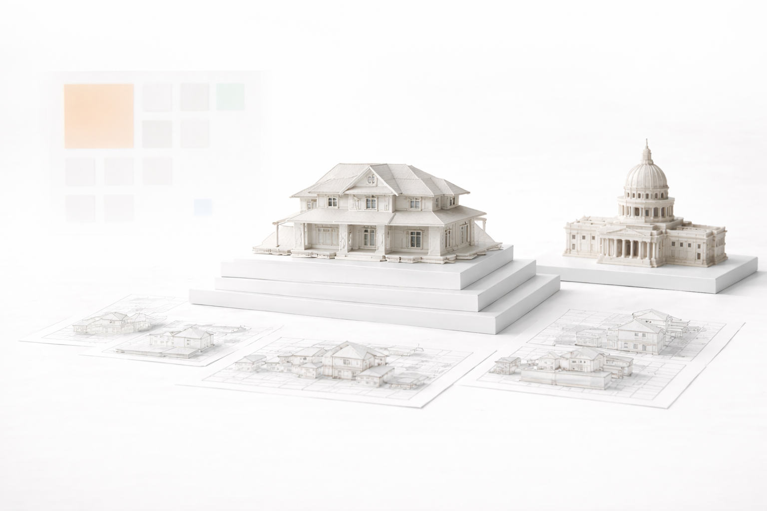
Hierarchy in Architectural Drawings: The Difference Between Clear and Confusing Sets
What Hierarchy Actually Means (In Plain Language)

Hierarchy is priority made visible.
It shows up as:
- Spatial hierarchy: what rooms feel important, what routes feel obvious, what zones feel private.
- Formal hierarchy: what mass reads first, what volumes support it, what details stay quiet.
- Information hierarchy: what a drawing communicates immediately, what it explains with notes, what it leaves out because it does not matter.
People confuse hierarchy with “big vs small.” That’s part of it, but it’s not the whole thing.
A tiny space can be the most important space if the building is organized around it. A narrow corridor can be a main spine if it clearly connects everything that matters. A simple line on a plan can carry more authority than a fancy rendered texture, if that line is the load-bearing wall or the property line.
Hierarchy is also not about making one thing loud and everything else boring. It’s about making the whole system readable. Most projects fail at hierarchy because everything is trying to be a “main character” at the same time.
If you want a clean mental model for how designers organize priorities, the concept of parti is a good place to start. Not because it’s a magic trick, but because it forces you to say: “What is the big idea, really?”
Hierarchy in Plan: Movement Beats Decoration
The fastest place to spot bad hierarchy is a plan. You can feel it even if you’re not trained. People hesitate. They don’t know where to go. They don’t know what belongs together.
Good plan hierarchy usually has three things working together:
- Clear entry logic: you arrive, you orient, you move. No guessing.
- Primary route: one main circulation spine that makes sense without arrows.
- Zones: public, semi-private, private. Loud vs quiet. Service vs served.
Here’s the part most students learn the hard way: adjacency is not hierarchy. A room can be “near” the kitchen and still feel wrong if the path to it is confusing or the thresholds are weak. Hierarchy is about how people experience sequence, not just geometry.
You see this on site too. When a plan has weak hierarchy, trades improvise. They route things where they fit, not where you intended. Then you’re fighting the building as it’s being built.
A simple practice that helps: take your plan and do a “one marker test.” One thick line for the main route. One medium line for secondary routes. Everything else stays light. If you can’t do that without feeling like you’re lying, your plan hierarchy isn’t real yet.
If you want a practical framework for this, keep space planning basics close. Not the fluffy version. The version that forces circulation and clearances to be honest.
Hierarchy in Massing: The Building Should Read in One Glance
Massing hierarchy is the difference between a building that looks intentional and a building that looks like a pile of decisions.
A clean way to think about it:
- Primary mass: the main volume that carries the concept.
- Secondary masses: volumes that support the primary mass (wings, service bars, courtyards).
- Tertiary elements: entries, canopies, stairs, small projections, shading devices.
When hierarchy is missing, the façade gets noisy because the massing is noisy. People try to “fix” it with materials, patterns, or random articulation. That’s makeup. It doesn’t solve the underlying issue.
A real hierarchy move is when the building can be reduced to three volumes and it still makes sense. That’s the “big read.” If your big read fails, you don’t need more detail. You need less.
This is where scale and proportion stop being academic and start being brutal. If you keep making the “important” spaces too small, or your main mass reads weaker than the garage volume, the project will always feel off.
If this is the part you struggle with, lock in scale and proportion fundamentals. It’s one of the few topics that improves almost everything else once it clicks.
Hierarchy in Section: Vertical Logic Is Where Projects Get Real
Plans can lie. Sections expose reality.
Hierarchy in section is mostly about what the building is actually made of and how it holds together:
- Primary: structure and major levels (slabs, beams, roof build-up, bearing lines).
- Secondary: envelope layers (insulation thickness, air/vapour control, drainage plane, cladding system).
- Tertiary: interior finishes, trims, small details that should not hijack the drawing.
This matters because vertical problems are the ones that turn into site pain. Ceiling heights get compromised. Ducts collide with structure. Window heads drift. Roof-to-wall junctions become a “figure it out in the field” moment, which is basically code for “you’re paying for confusion.”
In practice, the section is where hierarchy becomes responsibility. If your section is unclear about what is primary, you are handing risk to someone else. And that risk comes back as RFIs, change orders, delays, and arguments.
Even if you’re not doing structural design, you need basic structural instincts so your hierarchy isn’t fantasy. If your projects sit in seismic regions, or if you just want your thinking to be less naive, read seismic design basics as a design mindset tool. It teaches you to respect stability and load paths, which quietly upgrades your sections.
Hierarchy in Details: The “Money Drawings” Are Never About Beauty
Details are where hierarchy gets expensive fast.
A lot of details fail because they treat everything as equal. They show ten lines with no priority, no explanation, and no logic for sequencing. The result is a drawing that looks “technical” but doesn’t actually help anyone build.
A working detail usually has one main job:
- Stop water, or manage where water goes.
- Carry load and transfer forces properly.
- Control movement (thermal expansion, differential settlement, deflection).
- Make sequencing obvious so the thing can actually be installed.
Hierarchy in details means the primary layers are unmistakable. For example: structure is not a thin line. Waterproofing is not a vague squiggle. Flashing is not optional. If the drawing doesn’t clearly show what is critical, someone will treat it as non-critical.
And this is where people overdo texture. They hatch everything, shade everything, pattern everything. The drawing becomes a carpet. The actual junction disappears.
Texture should be a cue, not a performance. If you want a solid, restrained approach, use texture and pattern basics as a reminder: signal material, don’t drown the detail.
Hierarchy in Drawings: Line Weight Is a Decision, Not a Preference
When people say “my drawings look amateur,” they usually think they need better perspective or better rendering.
Most of the time, they need hierarchy.
Hierarchy in drawings is how a stranger reads your work in five seconds:
- What’s cut reads first.
- What’s primary reads second.
- What’s background stays quiet.
This is why line weight is not decoration. It’s the language of importance. If everything is the same weight, your drawing is saying: “Everything matters equally.” That’s never true.
The same goes for annotation. If you have paragraphs of notes to explain something that should be obvious in geometry, you’re using text to compensate for unclear drawing hierarchy.
If you want the clean technical side of this, see architectural drawing techniques. And for symbols and conventions that keep your sets readable under pressure, keep architectural symbols explained bookmarked.
The Original Problem Nobody Names: Hierarchy Debt
Here’s the most honest way to describe what happens when you ignore hierarchy early: you create hierarchy debt.
Hierarchy debt is the mess you carry forward when you refuse to choose what matters.
It starts small:
- You don’t commit to the main circulation.
- You keep “options” alive too long.
- You don’t decide what the primary mass really is.
- You treat every room as equally important.
Then it compounds:
- The model gets more detailed, but the concept stays fuzzy.
- Consultants ask basic questions you should have settled weeks ago.
- The drawing set grows, but clarity doesn’t.
- Revisions increase because nobody knows what is allowed to change and what is sacred.
This is why some projects feel like they “get worse” as they develop. It’s not the added detail. It’s the fact that detail is being poured onto an undecided hierarchy. You’re decorating confusion.
The fix is not more work. It’s earlier discipline.
A useful rule: at every phase, you should be able to name the top three priorities in one sentence. Not ten priorities. Three. If you can’t do that, you are still in the fog, and the fog is expensive.
If you’re in school, hierarchy debt shows up as all-nighters and endless redraws. If you’re in practice, it shows up as scope creep and coordination pain. Either way, the cure is the same: commit to hierarchy before you commit to polish.
A Practical Hierarchy Ladder (What to Decide First, Second, Third)
This is the order that usually holds up in real work. Not because it’s academic, but because it matches how buildings get built and reviewed.
1) Big intent
- What is the project really doing?
- What is the main organizing move?
- What must not change?
2) Plan hierarchy
- Entry and orientation
- Main circulation
- Public vs private zoning
3) Section hierarchy
- Levels and heights that make the building believable
- Structure that makes spans and openings realistic
- Envelope thickness that isn’t fantasy
4) Massing hierarchy
- Primary volume
- Secondary volumes
- Tertiary elements
5) Detail hierarchy
- Water management first
- Load path second
- Movement and tolerance third
6) Visual hierarchy
- Material choices
- Openings rhythm
- Texture cues
If you reverse this ladder, you get the classic beginner result: pretty images with weak decisions. If you follow it, your project gets calmer as it develops.
The “Five-Second Read” Test (Hierarchy You Can Actually Measure)
Hierarchy sounds subjective until you test it.
Try this:
- Show your plan to someone for five seconds, then hide it.
- Ask them: “Where’s the entry?” “Where’s the main route?” “What space feels primary?”
If they can’t answer, it’s not their fault. It’s your hierarchy.
Do the same with a façade. Ask: “What is the main volume?” If they say “I don’t know, everything looks the same,” you have a massing hierarchy issue.
Do the same with a section. Ask: “What’s the structure?” If they can’t tell what’s load-bearing vs partition, your section hierarchy is unclear.
This test works because it mirrors how drawings get used. People don’t study your work like a museum piece. They scan it under pressure.
If you want a strong workflow mindset for surviving that pressure without burning out, use coursework and studio habits as a practical companion. Hierarchy discipline is easier when your process isn’t pure panic.
Hierarchy in Real Buildings: The Quiet Stuff That Separates Good Work From Noise
A lot of hierarchy is not loud. It’s quiet control.
You see it in how openings line up. How datums stay consistent. How one material change marks a real shift in function or mass. How the “important” edge is clean and the secondary edges don’t fight it.
You also see it in what’s missing. Good architects leave things out on purpose. They don’t add five extra moves because they can. They keep the system legible.
This is why “design basics” are not beginner fluff. They’re the foundation that keeps hierarchy from collapsing into decoration. If you need a no-nonsense refresh, keep core design basics in rotation while you work.
Common Hierarchy Mistakes (The Ones That Keep Showing Up)
- Everything is emphasized. Every feature is special. The result is visual noise.
- Circulation is accidental. The route is not designed, it’s leftover space.
- Facade “moves” don’t match function. The exterior is busy, but the plan is basic.
- Detail drawings don’t declare priorities. Waterproofing, structure, and tolerance are not clearly shown.
- Line weight is flat. Drawings become unreadable under real-world speed.
- Too much texture. Material cues become a pattern contest and bury the junction.
Most of these mistakes come from the same root: refusing to choose what matters most.
How to Build Hierarchy Skill Without Turning It Into a Theory Class
Hierarchy is a skill. You train it like anything else.
Here are three practices that actually transfer to real work:
1) Draw the project at three “resolution levels”
- Low resolution: bubbles and arrows (pure hierarchy of program and movement).
- Medium resolution: plan with walls and openings (hierarchy of spaces and routes).
- High resolution: one section and one detail (hierarchy of structure and envelope).
If the low-resolution version is unclear, the high-resolution version will not save you.
2) Force one sentence
Write one sentence that describes the primary hierarchy move. If it turns into a paragraph, you’re still undecided.
3) Redline your own drawings like a contractor
Pretend you’re tired, rushed, and standing on site. Circle the information you’d need in 30 seconds. If you can’t find it, neither can anyone else.
Closing Thought: Hierarchy Is Respect
Hierarchy is respect for the people who use your spaces, review your drawings, and build your work.
It’s respect for the reality that attention is limited. Budgets are limited. Time is limited. So you choose what matters, and you make it obvious.
That’s the job.