Image: Bright, modern kitchen interior combining cream cabinetry with soft-toned walls for a warm, open feel.
How to Style Cream Cabinets in Your Kitchen: Real Homes, Real Ideas
Cream-Colored Kitchen Cabinets: What Works and What Doesn’t
Cream cabinets are back—learn how to pair them with floors, counters, and walls for a warm, fresh look.
Cream Kitchen Cabinets & Interior Design: Timeless Looks, Modern Ideas, and Real Color Pairings
Discover how to design around cream kitchen cabinets with real color combos, layout tips, and ideas from modern homes.
🔹 Quick Summary
Cream cabinets are everywhere—and for good reason. They’re soft, versatile, and work with almost any style. But if you’re not pairing them right—with wall colors, countertops, or layout—you might end up with something that looks bland or dated.
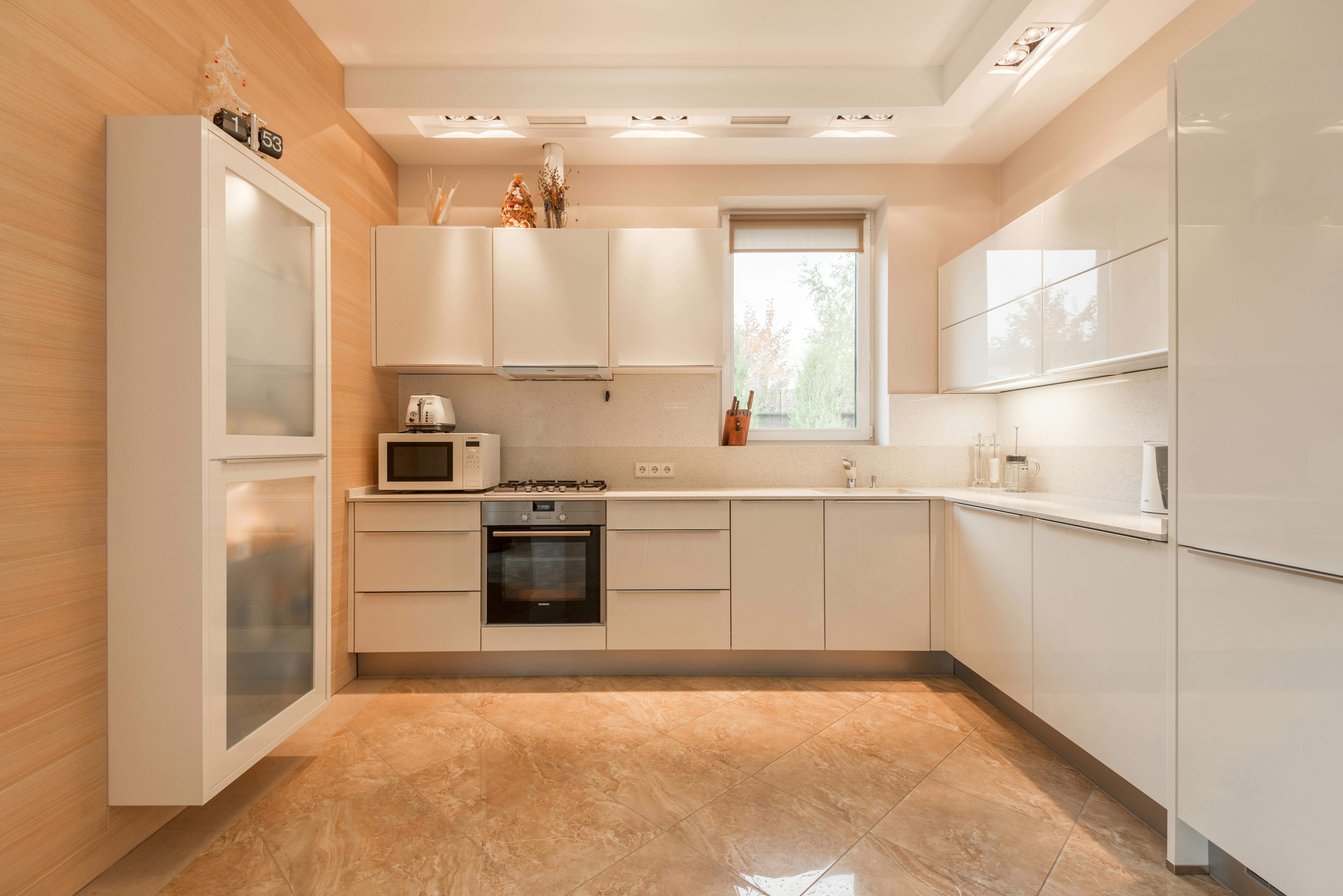
Image: A modern, minimalist kitchen with glossy cream cabinets, showcasing a clean, streamlined design for a sleek and functional cooking space.
Below, we'll break down how to actually make cream cabinets work. We’ll cover cabinet styles, layout ideas, color matches, real product options, and design examples that do NOT look like every Pinterest board from 2010.
Why Cream Cabinets Are Still a Top Choice
Cream cabinets have refused to fade away—and here’s why they keep popping up in both classic and cutting-edge kitchen designs:
-
Soft alternative to stark white:
Instead of that clinical, ultra-bright look, cream offers a gentle glow. It reflects enough light to keep the room feeling open, but without the harsh glare you get from pure white. The result? A space that feels bright and comfortable. -
Warmer, more welcoming than gray:
Gray can come across as cool or even a touch austere. Cream’s subtle yellow-beige undertones instantly cozy up the room. Think family breakfasts, relaxed dinners, and a kitchen that feels like home the moment you walk in. -
Works in every style:
Whether you’re into sleek, handle-less modern cabinets, handcrafted Shaker doors, or reclaimed-wood farmhouse vibes, cream adapts. It plays well with marble counters, butcher-block islands, black hardware—whatever your design leanings. -
Hides everyday wear better than white:
Fingerprints, dust, and tiny scuffs vanish more easily on cream than on bright white. That means fewer cleans, fewer touch-ups, and a kitchen that looks fresh for longer without nonstop maintenance. -
Timeless, not trendy:
Cream has been a design favorite for decades—and it keeps evolving with new color pairings and finishes. You won’t feel like your kitchen is stuck in a moment; cream grows with each new trend, maintaining its effortless appeal.
Recommended Reading:
-
Kitchen Think by Nancy Hiller – Honest, expert advice on real-world kitchen design. Focuses on practical, timeless style—including cream palettes.
-
House Beautiful Colors for Your Home – A bestseller packed with real paint combinations and how to pull off warm tones like cream without it looking “blah.”
Cream Kitchen Cabinet Ideas That Actually Work in Today’s Homes
Smart Interior Design with Cream Cabinets: Color Pairings and Layouts
1. Most Popular Styles of Cream Cabinets
Image: Bright, real-life modern kitchen featuring chic cream cabinets, clean lines, and elegant contemporary decor.
Today’s top cream-cabinet looks and fresh pairings—so you can nail a style that’s uniquely yours.
-
Shaker-Style Cabinets
Straight-edge, recessed panels for a clean, timeless look. Pairs perfectly with subway-tile backsplashes or a butcher-block island in modern-farmhouse kitchens. -
Gloss vs. Matte Finishes
-
Gloss: Light-reflecting, sleek, great in small or dim spaces—just watch for fingerprints.
-
Matte/Satin: Soft, hides scuffs, feels cozy—ideal if your cabinet doors show grain or wear.
-
-
Painted vs. Glazed Wood
-
Fully Painted: Uniform cream surface—perfect for minimalist, seamless designs.
-
Cream-Glazed: Let oak or maple grain peek through a gentle cream wash for warmth and texture.
-
-
Vintage & Antique Styles
Distressed edges, glazed accents, ornate moldings. Team with oil-rubbed bronze or antiqued brass hardware for an old-world feel. -
Farmhouse & French Country
Beadboard panels or open shelving add rustic charm. Finish with reclaimed-wood floors, apron-front sinks, and soft brass pulls. -
Modern Minimalist
Flat-front panels, hidden handles, touch-latch doors. Accent with matte-black or stainless fixtures for stark, uncluttered style. -
Bold Accent Pairings
-
Bright Cream + Vibrant Yellow Backsplash: Fresh and playful—perfect for a modern pop.
-

Image: Modern kitchen sketch featuring bright cream cabinets paired with a vibrant yellow backsplash for a fresh, stylish look
-
Cream + Teal/Aqua: Coastal vibes—add marble counters and rattan stools.
-
Cream + Burnt Orange: Retro warmth—pair with copper hardware.
-
Cream + Navy or Charcoal: Timeless two-tone—cream tops with deep bases.
-
Cream + Blush Pink: Soft romance—ideal for cottage or vintage kitchens.
-
Cream + Emerald Green: Luxe drama—combine with gold accents.
-
Cream + Mustard Yellow: ’70s revival—modernized with sleek hardware.
-
Cream + Soft Lilac: Subtle pastel twist—best in bright, airy spaces.
-
Cream + Slate Gray & Copper: Industrial warmth—slate floors, copper fixtures.
-
Cream + Terrazzo Mosaic: Statement island or backsplash for high-end flair.
Expert Tips:
-
Two-Tone Depth: Cream uppers + bold lowers (navy, charcoal, wood-tone) add instant interest.
-
Sample First: Paint one door and view in your kitchen light—finishes shift in real rooms.
-
Finish Match: Grainy doors suit matte; flawless doors shine in gloss.
Pro tip: Benjamin Moore’s Natural Cream is a balanced warm neutral, while Gentle Cream makes a gorgeous translucent glaze over wood grain.
Recommended Books:
-
The Perfect Kitchen by Barbara Sallick – Goes deep on cabinetry styles, finishes, and design pairings. Great for anyone building or remodeling.
-
Old House Journal's New Old House – Perfect if you’re going for a vintage, antique, or French country cream vibe.
Related: Kitchen Colour Schemes with Cream Cabinets: 10 Perfect Combinations
Best Wall and Counter Colors for Cream Cabinets
Designing with Cream Cabinets: Real-Life Color Combos and Layout Advice
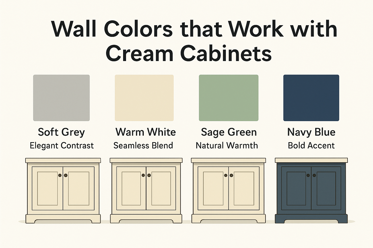
2. Cream Cabinets and Wall Colors: What Actually Works
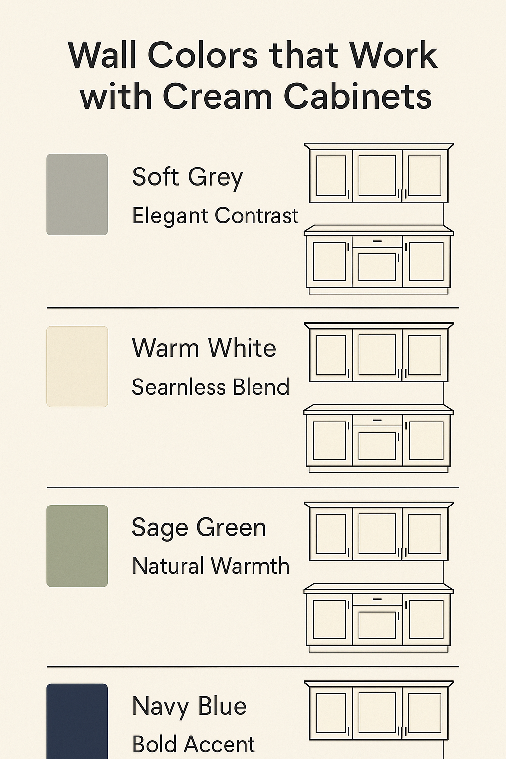
Image: Infographic illustrating four wall color ideas—soft grey, warm white, sage green, and navy blue—paired with cream cabinets for stylish contrast and harmony.
What’s covered here:
The wall color you choose can completely change the feel of a kitchen with cream cabinets—for better or worse. In this section, we break down the wall colors that actually complement cream tones (and point out a few that clash badly), using real designer-approved examples you can easily copy.
Best Wall Paint Colors for Cream Cabinets:
-
Soft greys (like "Agreeable Gray") – adds a subtle contrast without making the room feel cold or sterile.
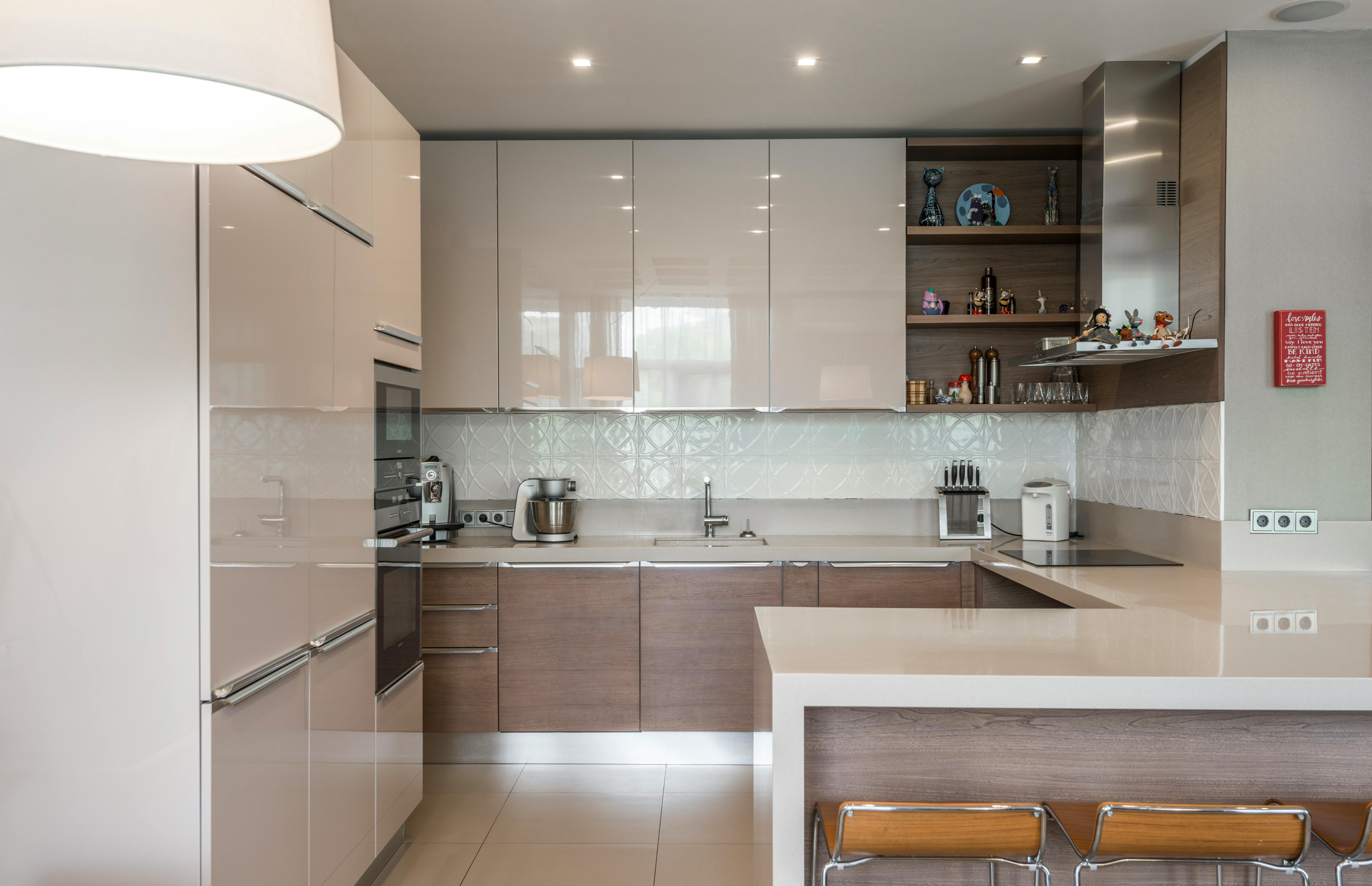
Image: Contemporary kitchen featuring cream cabinetry paired with subtle grey walls, creating a balanced and stylish atmosphere.
-
Sage green – brings a touch of warmth and a calm, natural vibe.
-
Warm whites – perfect for a soft, tone-on-tone look that feels fresh but not stark.
What to Avoid:
-
Pure, bright whites – they make cream cabinets look dingy instead of soft and elegant.
-
Harsh cool tones (like icy blues and cold greys) – they clash with the natural warmth of cream and create an off-balance look.
Real-Life Color Combinations That Work:
-
Cream cabinets + soft grey walls – for a balanced, sophisticated feel.
-
Cream cabinets + warm white walls – keeps the look light, airy, and cohesive.
-
Cream cabinets + navy walls – bold but still warm, giving strong contrast without feeling harsh.
-
Cream cabinets + muted sage green walls – a cozy, earthy combination that’s very livable.
Quick Tips for Picking Wall Colors:
-
Always test paint samples right next to the cabinets, not just on an empty wall.
-
Check colors in both natural and artificial light—cream can shift dramatically.
-
Match undertones: Cream cabinets with warm undertones pair best with warm-toned paints.
Pro Designer Trick:
If you're stuck between a few colors, pick a wall shade that's two tones lighter or two tones darker than the undertone of your cream cabinets.
This trick guarantees a layered, intentional look without needing a full design plan.
Wall Colors that Work with Cream Cabinets
Not Ready to Commit to Navy Blue Walls? Try This Instead.
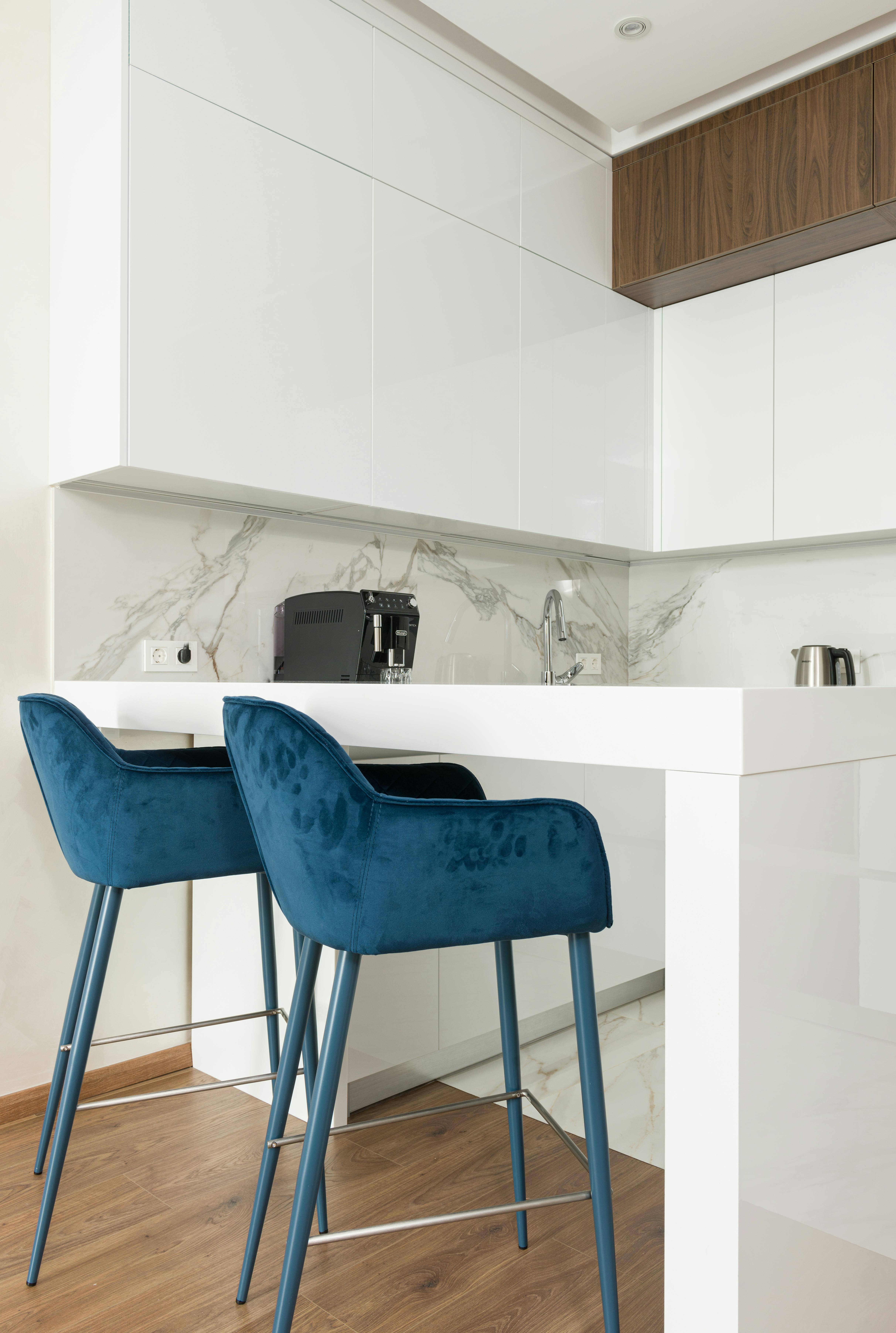
Image: Navy blue stools paired with cream kitchen cabinets.
Look, not everyone’s ready to splash navy blue all over their kitchen walls—and that's fine. If you’re feeling a little nervous, you don’t have to go big to make it work.
Start Small:
Instead of diving headfirst, bring in navy blue kitchen stools, chairs, or even a navy island runner. It’s like dipping your toes into the pool instead of cannonballing into the deep end.
Powerful, Not Overpowering:
Navy blue chairs against cream cabinets? That’s a serious look. It brings in richness and depth without making the space feel dark or heavy. Plus, it’s easy to switch out if you change your mind later.
Reality Check:
Honestly, navy blue isn't that risky—especially with cream. It’s one of those color combos that almost always looks sharp, grounded, and stylish. People often think it’s riskier than it really is. In reality, it’s one of the safest bold moves you can make.
Pro Tip:
Pick chairs or stools with soft upholstery or a matte finish—this makes the navy feel warmer and easier to blend into the room.
Choosing the right wall color is just one part of creating a kitchen that feels pulled together—next, let's look at how flooring, countertops, and other surfaces can either enhance or fight against your cream cabinets.
Recommended Reading:
-
Made for Living by Amber Lewis – Top-selling design book filled with color pairings, real rooms, and designer tips.
-
Elements of Style by Erin Gates – Talks through warm vs cool wall tones with photos that actually show cream cabinet setups.
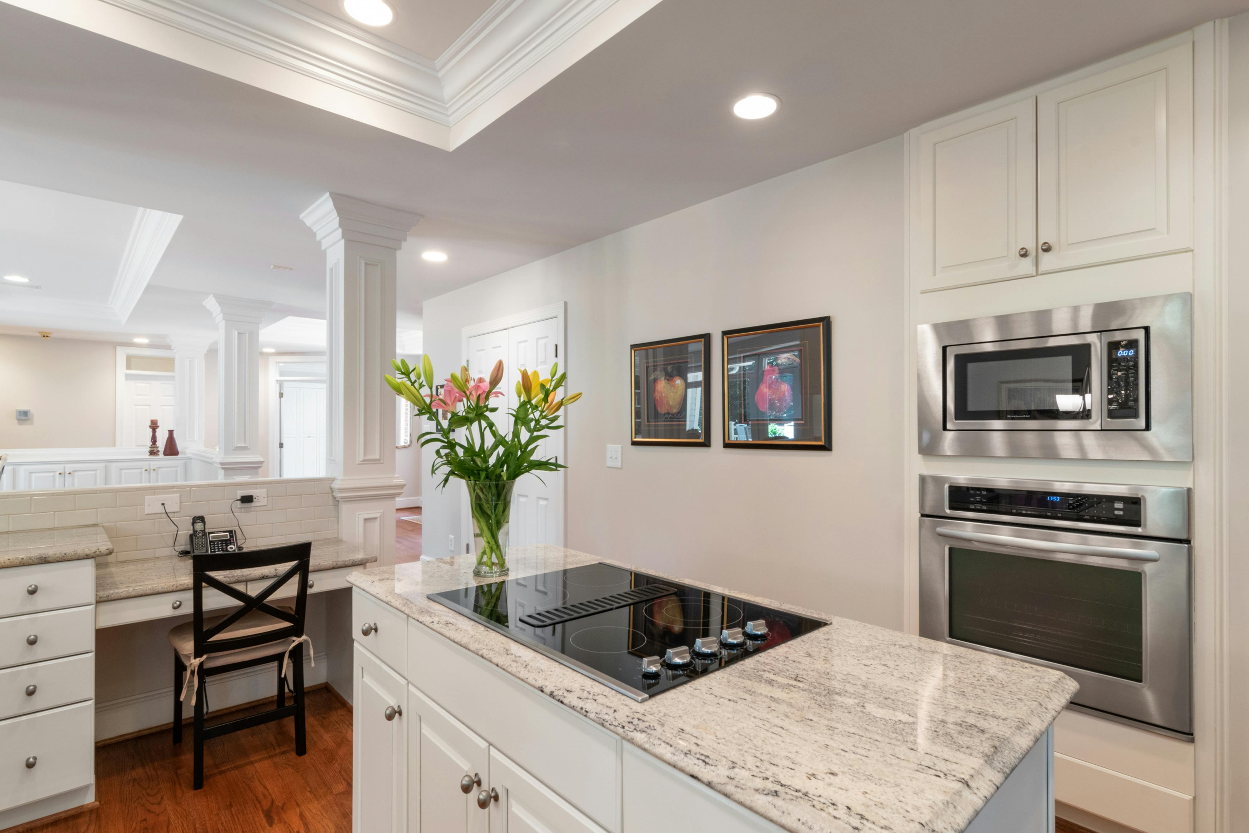
3. What Countertops Go with Cream Cabinets?
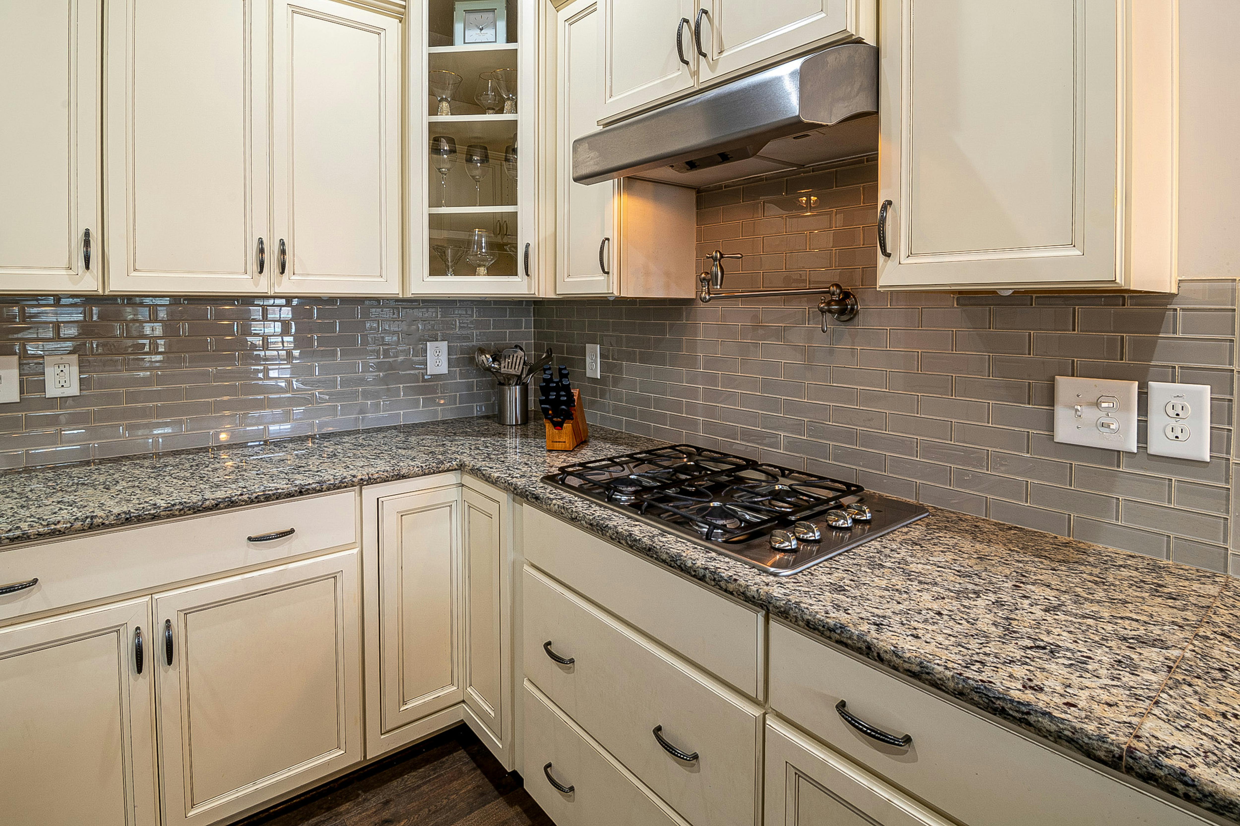
Image: Real kitchen photo featuring cream-colored Shaker cabinets in a modern yet classic design, complemented by a stainless steel faucet.
What’s inside this section:
Choosing the wrong countertop with cream cabinets is a fast way to ruin the whole vibe. We’ll talk about what actually pairs well—including quartz, butcher block, and granite—and what to avoid.
-
✅ Quartz: White, marble-effect, or warm beige tones
-
✅ Butcher block: For rustic or farmhouse vibes
-
✅ Granite: Look for soft brown or gold flecks
-
✅ Avoid: cool-toned blue/gray speckled granite (clashes with warmth)
Pairings people love:
-
Cream cabinets + black countertops (classic contrast)
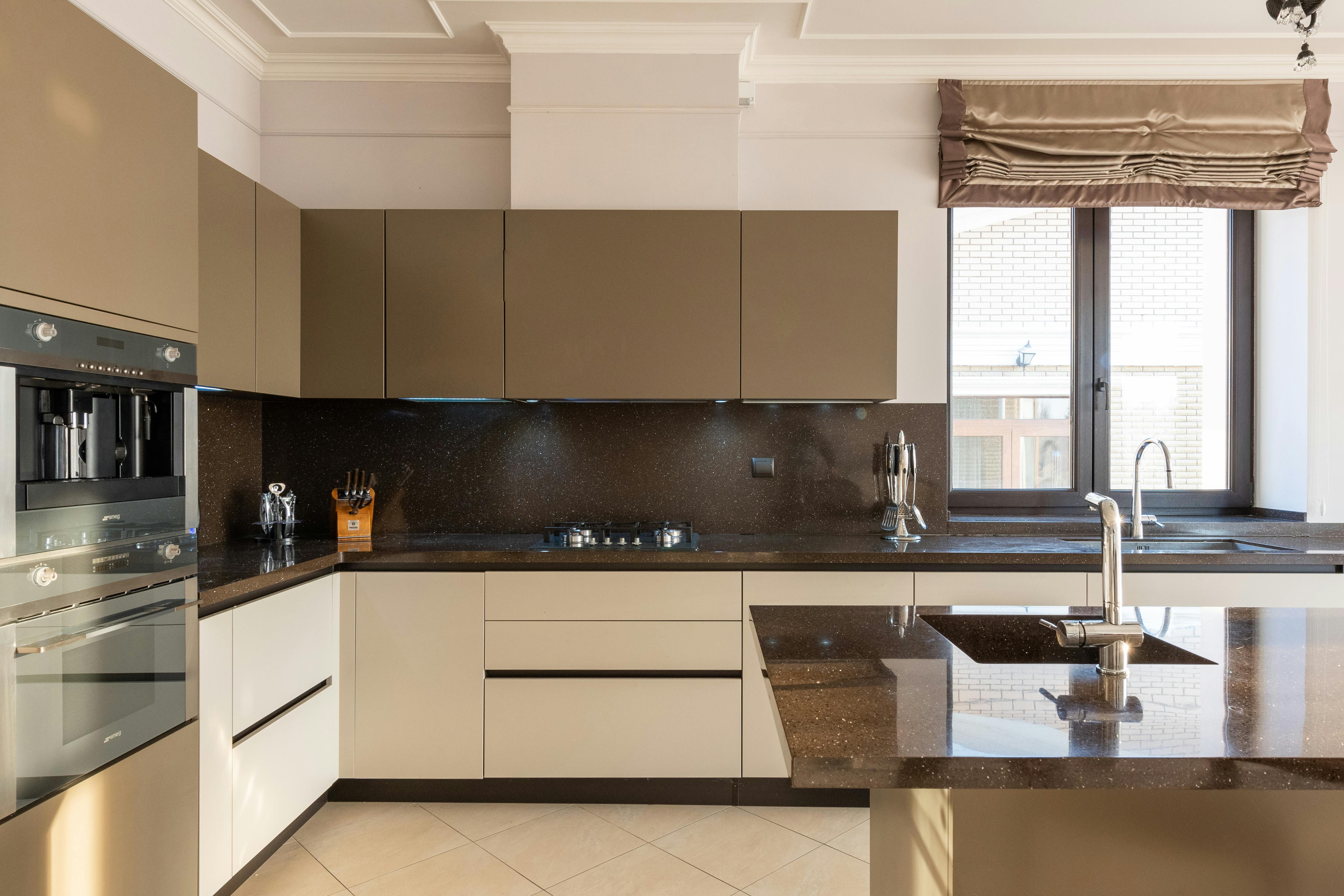
Image: A modern kitchen featuring cream cabinets paired with black countertops, offering a timeless and stylish contrast for a sleek, functional space.
-
Cream cabinets + white quartz countertops
-
Cream cabinets + dark wood tops
Recommended Books:
-
Kitchen Idea Book (Taunton Home Idea Books) by Joanne Kellar Bouknight – Covers counters, surfaces, and pro tips for choosing what actually works.
-
Remodelista: The Organized Home – Great for people looking to create balance between cabinetry, counters, and layout.
4. Two-Tone Layout Ideas with Cream
What’s inside this section:
One of the best ways to make cream cabinets feel fresh is to use them as part of a two-tone scheme. This section breaks down the most popular cream-based combinations and how to make them feel cohesive.
-
Cream upper cabinets + darker lower cabinets (brown, navy, charcoal)
-
Cream island with wood-tone perimeter
Image: A modern cream kitchen island featuring a built-in stove and sink, offering a seamless blend of design and practicality for a contemporary kitchen layout.
-
Cream and grey or cream and black combos
-
Soft “two-tone” look using subtle contrast—cream + off-white, or cream + pale beige
Recommended Reading:
-
Design the Home You Love by Lee Mayer – Shows you how to mix tones, not match them—perfect for modern cream layouts.
-
The New Design Rules by Emily Henderson – Includes real visual examples of two-tone kitchens done right.
5. Flooring Options That Match Cream Cabinets
What’s inside this section:
Your cabinets can’t shine without the right floors beneath them. This section explores flooring ideas that either complement cream cabinets or offer stylish contrast—without throwing off the whole room.
-
Light oak or natural wood for harmony
Warm, inviting, and classic. Light oak floors enhance the softness of cream cabinets while keeping the whole space grounded and airy. Best for farmhouse, Scandinavian, or coastal kitchens. -
Grey tile or stone for contrast
Adds a cool edge to warm-toned cabinetry. Go for slate, honed limestone, or large-format grey porcelain tile. Great for modern or transitional designs where you want a little drama but not too much. -
Black tile for dramatic farmhouse look
Matte black tile (like slate or concrete-look porcelain) delivers high contrast. It works best with white or butcher block countertops and gold/brass hardware to keep the palette rich—not cold. -
Creamy travertine or beige vinyl for a seamless match
Perfect for classic kitchens or open layouts where you want color continuity. Travertine tile or luxury vinyl in beige tones flows effortlessly with cream cabinetry and makes the space feel cohesive.
Recommended Books:
-
The New Kitchen Idea Book by Heather J. Paper – Real-world photos, including how floors interact with cabinets.
-
Domino: The Book of Decorating – Great for understanding color, tone, and flow between cabinetry and flooring.
6. Appliances & Hardware That Work with Cream
What’s inside this section:
Appliances and hardware can make or break your cream kitchen. Want something modern? Elegant? Minimal? We cover the most popular options and what styles they best complement.
-
Black appliances = timeless contrast
Black adds definition and works especially well with cream and white quartz or black countertops. It’s a safe bet for modern farmhouse or transitional styles. -
Stainless steel = modern and clean
The go-to for contemporary kitchens. Stainless appliances paired with cream cabinets feel light, sleek, and timeless. -
Gold/brass hardware = warm and elegant
This is the golden combo—literally. Brushed brass pulls or gold knobs can elevate cream cabinets into something high-end. Works beautifully with light wood or marble counters. -
Matte black handles = minimal, high-contrast option
Bold without being flashy. Black handles add sharp lines and work well in two-tone or Scandi-modern kitchens.
Recommended Reading:
-
Homebody by Joanna Gaines – A visual dive into mixing finishes and modernizing traditional elements like cream cabinets.
7. Best Paint Shades for Cream Cabinets (If You're Repainting)
What’s inside this section:
Repainting cabinets is cheaper than replacing—but it only works if you choose the right color. Here are the most loved cream shades and a few that pros avoid.
-
Benjamin Moore Natural Cream
Warm, light, and balanced—ideal for almost any kitchen style. -
Benjamin Moore Gentle Cream
Slightly richer, great for vintage or traditional kitchens. -
Farrow & Ball “String” or “New White”
British classics—these tones feel creamy, elegant, and timeless. -
Behr “Swiss Coffee”
Technically an off-white, but it has enough warmth to pass for soft cream in most lights. -
❌ Avoid yellow-heavy tones
They might look creamy at first but often age poorly, especially under LED or daylight bulbs.
Recommended Books:
-
Paint by Number by Jesse Carrier & Mara Miller – A color-focused guide that helps explain undertones in real spaces.
-
Farrow & Ball: Recipes for Decorating – Includes visual examples of each recommended shade in action.
8. Room Types That Work With Cream Cabinets
What’s inside this section:
Cream cabinetry works far beyond the kitchen. It’s one of the most flexible neutrals for built-ins, storage, and small-space cabinetry.
-
Kitchens (of course)
Works in almost every layout—U-shaped, galley, open plan, or L-shaped. -
Laundry rooms
Makes these utility spaces feel warmer and brighter without looking clinical. -
Mudrooms with built-in storage
Cream-painted wood bench seating and cubbies look cozy and classic. -
Bathrooms with wood or marble countertops
Cream adds softness and elegance without going full “white-on-white.” -
Open-plan living/kitchen spaces
Helps visually tie together shared areas, especially when walls and cabinets stay in the same warm range.
Recommended Books:
-
The Finer Things by Christiane Lemieux – A deep dive into materials and finishes across multiple rooms.
-
Live Beautiful by Athena Calderone – Real-life use of cream tones in kitchens, bathrooms, and storage units.
9. What Color Backsplash Goes with Cream Cabinets?
What’s inside this section:
Backsplashes should pull your look together, not compete with it. These are designer-approved picks that work beautifully with cream tones.
-
White subway tile = safe and timeless
Works with any countertop or hardware. Avoid bright, icy whites—go for a warm white instead. -
Soft green glass tile = adds depth
Sage and muted greens create a fresh, organic feel—great with cream and wood. -
Light marble with beige veining = polished, high-end look
Choose real or faux Carrara or Calacatta with warm veins. Adds elegance without stealing the show. -
Terracotta or natural stone = rustic balance
Perfect for farmhouse or country kitchens with wood beams or vintage hardware. -
❌ Avoid blue or cool gray tile
They clash with the warmth in cream and make it look yellow or dirty.
Recommended Reading:
-
Styled by Emily Henderson – Has an entire section on tile + cabinet combinations.
-
Kitchen & Bath Design Guide by Better Homes & Gardens – A practical reference for tile sizing, placement, and matching.
Before-and-After: Does Painting Cabinets Cream Actually Work?
Thinking of painting your cabinets cream? It’s one of the easiest ways to transform a tired kitchen—but only if you do it right. Here’s what actually happens, where people mess up, and how to get a smooth, durable finish that lasts.
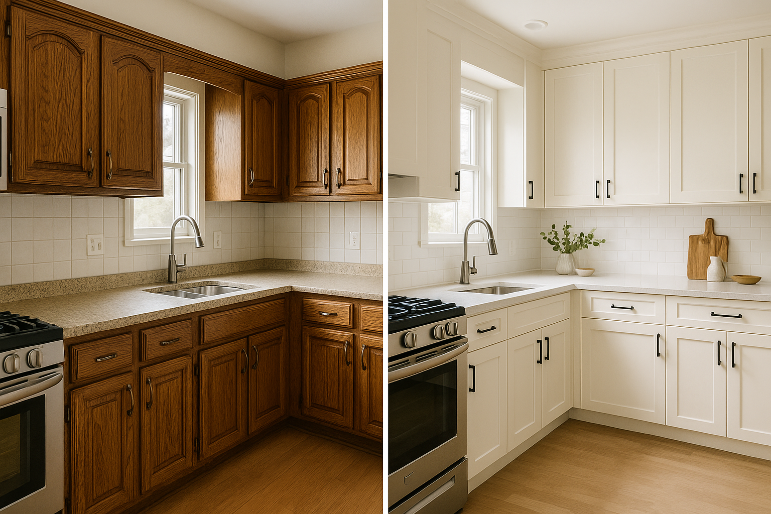
Image: Showing kitchen transformation from dark oak to modern cream Shaker cabinets with quartz countertops and subway tile.
-
Before (left): Dark oak raised-panel cabinets, speckled laminate countertops, standard hardware
-
After (right): Fresh cream Shaker-style cabinets, white quartz countertops, matte black pulls, subway tile backsplash
What to Expect
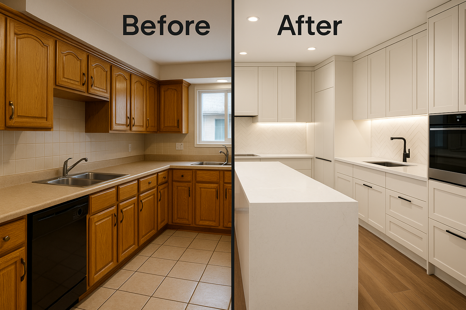
Image: Comparing old golden oak cabinets and beige counters with a modern upgrade featuring cream shaker cabinets, waterfall island, and warm wood floors.
-
Before (left): Outdated golden oak cabinets, beige laminate counters, basic tile floor
-
After (right): Sleek shaker-style cream cabinets, white quartz island with waterfall edge, minimalist black hardware, herringbone tile backsplash, warm wood flooring
Painting cabinets isn’t a weekend slap-on job. It takes prep, patience, and knowing your materials. Here’s what you’re in for:
-
You’ll need to clean, degrease, sand, prime, and apply 2–3 coats of paint.
-
You’ll probably want to remove doors and label them—makes it way easier to get a clean finish.
-
Dry time matters—don’t rush it or your paint will smudge or peel.
Common Mistakes
-
Wrong primer: Use a bonding primer designed for slick surfaces like melamine or varnished wood.
-
Skipping prep: Even new cabinets need to be degreased and lightly sanded.
-
Wrong paint finish: High gloss may look flashy but shows every flaw. Flat paint gets grimy fast.
Lighting Changes Everything
Warm LED light can make cream paint look buttery and soft. Cool white bulbs or strong daylight? They can wash it out or make it look yellow. Always test a swatch in the actual room—don’t trust how it looks in the can.
Real-Life Examples
-
Oak to Cream: Dated grain becomes subtle, modern. Works best if you fill the grain before painting.
-
Cherry to Cream: Big payoff—cherry is dark and heavy, but cream lifts and opens the space dramatically.
-
Pro tip: If you're painting cherry or maple, use a stain-blocking primer to prevent red bleed-through.
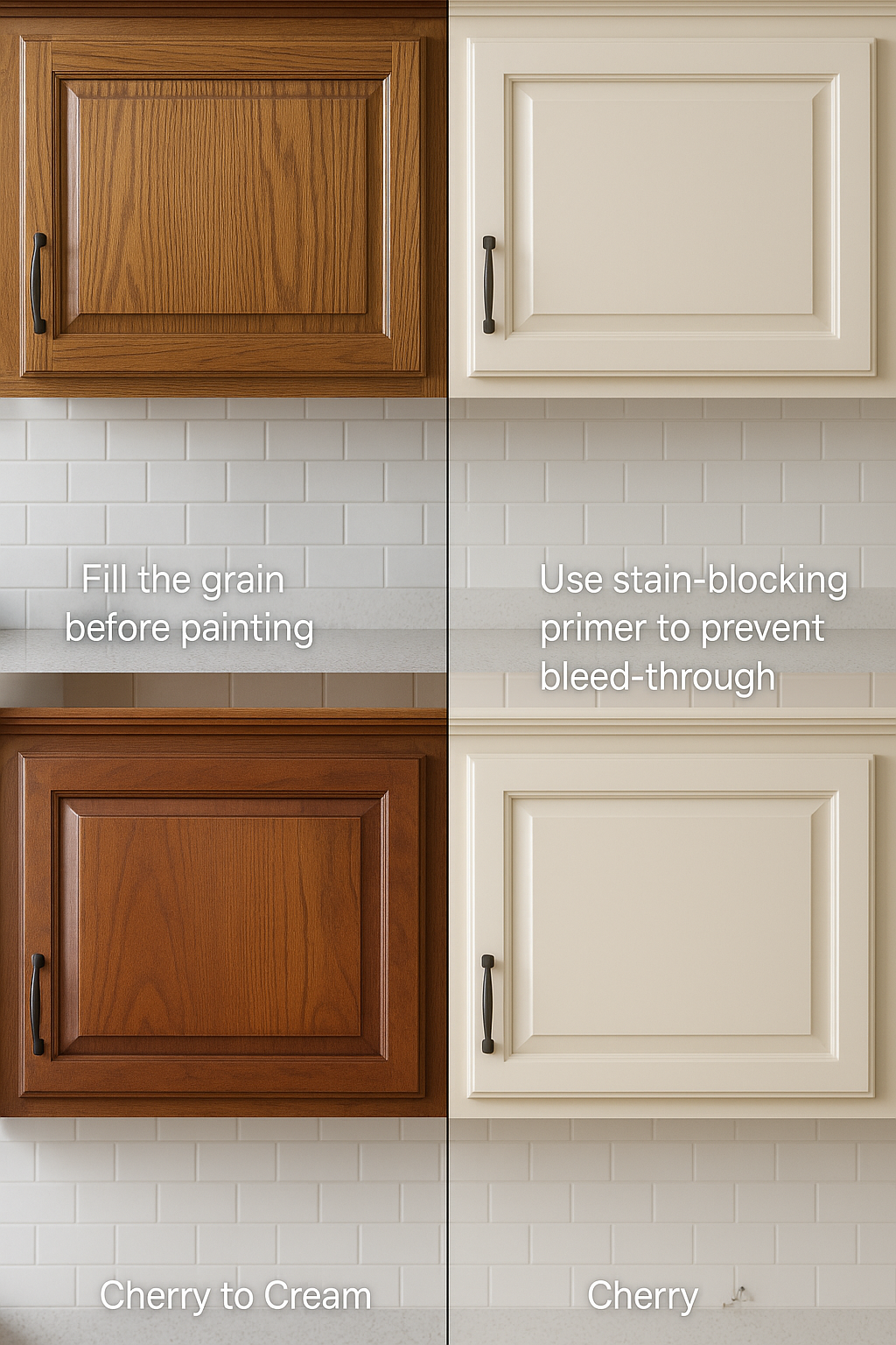
Image: Popular cream kitchen cabinet styles with finish comparisons and design tips.
Satin vs. Semi-Gloss
-
Satin: More muted, soft finish. Ideal for a classic or rustic look. Easier to touch up.
-
Semi-gloss: More durable, easier to clean. Best if you’ve got kids or heavy kitchen traffic.
-
Skip gloss unless your cabinets are perfectly prepped—it shows every brush mark and flaw.
Recommended Books:
-
Cabinets: A Sunset Design Guide – Excellent visual and step-by-step references.
-
The Little Book of Living Small – Real homes, real updates—including cream-painted transformations.
Cream Cabinet Trends for 2025 and Beyond
Cream isn’t stuck in the past—it’s evolving fast. These are the styles, finishes, and combos gaining traction in both custom homes and smart remodels.
Cream + Sage Green
Sage brings in nature, cream keeps it soft. This combo feels earthy, clean, and modern all at once. Works well with brass, natural wood, and matte black accents.
Cream + Natural Wood
Scandi meets farmhouse. Use natural oak or ash for islands, open shelving, or lower cabinets paired with cream uppers. This look is warm, minimal, and timeless.
Cream + Black (Two-Tone)
Clean, dramatic, and balanced. Popular in transitional homes where you want warmth but need contrast. Try black lower cabinets or a black island with cream perimeter cabinets.
Matte Over Gloss
Gloss is fading—literally and figuratively. Matte cream finishes look modern, feel soft, and don’t show fingerprints as much. Expect more low-sheen options from brands like Farrow & Ball, Benjamin Moore, and Behr.
Eco-Friendly Pairings
Cream goes great with natural or recycled materials:
-
Bamboo counters
-
Cork flooring
-
Recycled quartz
-
Limewash backsplashes
Cream keeps the look grounded and calm while these newer materials do the heavy lifting for sustainability.
Recommended Books:
-
Design the Home You Love – Practical, modern, and full of visuals that reflect these current trends.
-
Remodelista: The Low-Impact Home – A favorite for blending natural materials with timeless design choices like cream.
Common Mistakes with Cream Cabinets—and How to Avoid Them
Cream cabinets are forgiving—but not foolproof. These are the most common mistakes we’ve seen in real kitchens (and how to fix or prevent them).
❌ Mixing with the Wrong Whites
Cool whites (like bright or bluish tones) make cream look dirty or yellowed. Stick with warm whites, warm greys, or soft earth tones nearby.
❌ Using Outdated Hardware
Hardware trends have moved on. Avoid 90s brushed nickel unless you’re restoring a vintage look. Go with matte black, brushed brass, or textured bronze for a modern twist.
❌ Choosing the Wrong Wall Color or Lighting
Lighting changes everything. Warm LED or halogen lights are your friend. And paint your walls a color that enhances cream—like greige, sage, or warm white. Skip anything icy or blue-toned.
❌ Not Testing First
Paint swatches are essential. Test your cabinet paint and wall color in your lighting, not just at the store. What looks creamy in one room can look sour in another.
❌ Overcomplicating the Layout
Cream works best when it’s simple. Don’t overload your kitchen with patterns, finishes, and accents. Let the cabinetry breathe and be the calming base it’s meant to be.
Recommended Books:
-
The New Design Rules – Direct, visual, and packed with lessons learned from real design mistakes.
-
The Nesting Place – Encourages smart decorating without obsessing over perfection—great for real-life kitchens.
Cabinet Creams & Cleaners That Won’t Ruin Finish
Got your cream cabinets looking fresh? Great—now keep them that way. These products will clean and condition your cabinets without stripping paint or dulling finishes.
Best Cabinet Creams
-
Parker & Bailey Kitchen Cabinet Cream
Loved by pro finishers and homeowners. Gently cleans grease, fingerprints, and grime. Doesn’t leave residue. -
Thomasville Cabinet Cream (12 oz)
A go-to for painted and stained cabinets. Conditions while it cleans, great for dry or aging finishes.
❌ What to Avoid
-
Harsh degreasers (like oven cleaners or bleach sprays)
-
Ammonia or vinegar-based sprays
-
Abrasive scrubbers or steel wool
These will strip paint, scratch surface coatings, and degrade your cabinets over time.
What to Use Instead
-
Soft microfiber cloths
-
Warm water + gentle dish soap for everyday cleanups
-
Dedicated wood or painted cabinet cleaners like the ones above
Recommended Reads & Resources:
-
Clean My Space by Melissa Maker – Super practical and backed by science. Great for cabinet-safe cleaning.
-
Martha Stewart’s Homekeeping Handbook – Covers cleaning methods for every surface, including cabinetry.
In Focus: Smart Cabinet Finishes
What’s inside this section: Beyond paint and stain, a new wave of finishes gives cream cabinets extra punch—without changing their color.
-
Anti-microbial coatings: Kill bacteria on handles and doors, ideal if you cook and grab cabinets all day.
-
Scratch-resistant clear coats: Protect your cream finish from dings and utensil scrapes—no more constant touch-ups.
-
UV-stable finishes: Prevent cream paint from yellowing in sunlit kitchens, so your cabinets stay soft, not sunburned.
These advances mean your cream cabinetry looks fresh longer—and stays hygienic without harsh cleaners.
Recommended Reads:
-
Smart Surface Materials by Anna Nikolaidou – Covers these next-gen coatings in simple terms.
-
Clean My Space by Melissa Maker – Practical tips on maintaining high-tech finishes safely.
The Power of Color Knowledge & Psychology
What’s inside this section: Choosing cream is more than “I like that color.” Here’s how undertones and light affect mood, appetite, and energy in your kitchen.
-
Warm undertones (yellow/beige) spark comfort and appetite—perfect for cozy family kitchens.
-
Cool undertones (grey-leaning cream) feel calm and focused—great if you bake or prep for hours.
-
Accent psychology: Pair cream with sage green for relaxation, or with navy for confidence and sophistication.
Knowing your undertones and the lighting in your kitchen prevents surprise shifts—cream can look buttery at night and chalky by day if you’re not careful.
Related: Psychology of Architecture: How Design Shapes Our Emotions
Recommended Reads:
-
Color Psychology Today by June McLeod – Explains how shades influence behavior in real rooms.
-
The Secret Language of Color by Joann & Arielle Eckstut – A friendly dive into why certain palettes feel good.
DIY vs. Hiring a Professional: What Works for Your Cream Cabinets
What’s inside this section: You can save money by tackling cream cabinets yourself—but only up to a point. Here’s where DIY shines and where pros earn their fees.
-
DIY Wins
• Simple repaint projects with flat-panel doors and minimal trim.
• Swapping hardware (handles, knobs) and adding peel-and-stick backsplash.
• Budget refinishing: sanding, priming, and two coats of quality cream paint. -
When to Hire Pros
• Complex profiles (beadboard, inset doors) or two-tone looks.
• Glazing, distressing, or highly polished finishes.
• Major layout changes—moving cabinets, counters, or plumbing.
If you love hands-on projects and have a weekend to spare, DIY can work wonders. But for flawless, lasting results—especially with intricate finishes or large kitchens—professional spray-painting and installation pay off in time saved and quality.
Recommended Reads:
- Building Kitchen Cabinets: Taunton's BLP: Expert Advice from Start to Finish by Udo Schmidt
- A must-have guide for DIY enthusiasts and woodworkers, offering expert advice on creating custom kitchen cabinets that match your style and needs."
-
Home Improvement 1-2-3 by Home Depot – All the step-by-step basics.
-
Renovation by Michael Litchfield – Expert guidelines on when to call in pros.
Timeless Cream: Colors That Never Date
What’s inside this section: Trends come and go, but some cream tones are forever. These are the neutrals you can paint once and not think about for decades.
-
“Alabaster” Cream: Soft, almost white with a whisper of warmth. Feels fresh in any light.
-
“Ivory Lace”: A touch deeper—creates a cozy, classic backdrop without leaning yellow.
-
“Greige Cream”: Balanced blend of grey and beige, perfect if you switch accent colors often.
-
“Warm Taupe”: Earthy and rich, pairs beautifully with wood floors and black hardware.
Choosing one of these four favorites means your kitchen stays in style—even when everything else changes around it.
Recommended Reads:
-
The Big Book of Color by Catherine Simard – Timeless palettes explained simply.
-
The Perfect Palette by Farrow & Ball – Gorgeous photography showing these neutrals in real homes.
FAQs
Design & Styling
-
Are cream kitchen cabinets a good idea?
Cream cabinets lend warmth and softness compared to stark white. They work in almost any style—modern, farmhouse, traditional—and hide scratches and wear better than pure white. -
What wall colors go with cream cabinets?
• Warm whites or greiges (e.g. BM “Creamy White,” SW “Agreeable Gray”)
• Soft greens (sage, olive)
• Subtle tans or pale taupes
Avoid icy whites or cool grays—they clash with cream’s warmth. -
What countertops pair nicely with cream cabinets?
• White quartz—bright and low-contrast
• Warm beige or gold-flecked granite—echoes the cream tone
• Natural wood butcher block—adds texture and farmhouse charm
• Black or charcoal—for a bold, modern look -
Which backsplash works best behind cream cabinets?
• White subway tile with warm grout
• Light marble with beige veins
• Terracotta or natural stone for rustic kitchens
• Soft green glass tile for a fresh splash of color
Skip blue/gray tiles—they make cream look off. -
What flooring compliments cream cabinets?
• Light oak or natural wood for seamless harmony
• Gray porcelain or slate tile for cool contrast
• Matte black tile in modern-farmhouse schemes
• Beige travertine or luxury vinyl for a cohesive, neutral base -
Should I choose a gloss or matte finish on cream cabinets?
• Matte (satin) hides imperfections and feels modern.
• Semi-gloss stands up to scrubbing but shows flaws if prep isn’t perfect. -
Cream cabinets vs. white cabinets—what are the pros and cons?
-
Cream Pros: warmer, hides dust/scratches, more forgiving with aging.
-
Cream Cons: can look yellow without proper lighting or undertone.
-
White Pros: crisp, bright, contemporary.
-
White Cons: shows dirt/smudges easily, can feel cold.
-
Painting & Maintenance
-
How do I update or modernize existing cream cabinets?
• Swap out dated hardware for matte black, brass, or brushed steel.
• Add a sleek subway-tile backsplash.
• Replace heavy moldings with slim shaker door profiles. -
Does painting cabinets cream actually work?
Yes—if you prep properly: clean, sand, prime with a bonding primer, then apply 2–3 coats of quality cabinet paint. Expect several days of work to get a smooth, durable finish. -
How many coats of paint do cabinets typically need?
Plan on 2–3 topcoats over primer. One coat rarely hides the original color or wood grain, especially on dark or cherry cabinets. -
Which paint sheen is best for kitchen cabinets?
• Satin (low-sheen) for a soft, traditional look and easy touch-ups.
• Semi-gloss for maximum durability and wipe-down ability. -
How do I keep cream cabinets clean?
• Wipe spills immediately with a damp cloth and mild dish soap.
• Use a cabinet-safe cleaner (Parker & Bailey or Thomasville Cabinet Cream).
• Avoid abrasive pads, bleach, or harsh degreasers. -
Are cream cabinets hard to maintain?
Not if you choose the right finish. Satin or semi-gloss cleans up well. Darker hardware and simple shaker profiles hide fingerprints and smudges.
Materials & Pairings
-
What is the best cream paint color for cabinets?
• Benjamin Moore Natural Cream—balanced warmth
• Benjamin Moore Gentle Cream—richer, vintage vibe
• Farrow & Ball String/New White—subtle, timeless
• Behr Swiss Coffee—budget-friendly, warm off-white -
Which hardware styles suit cream cabinets?
• Matte black pulls for modern contrast
• Brushed brass or gold knobs for a luxe, warm accent
• Stainless-steel bar pulls for a sleek, contemporary look -
What appliances work best with cream cabinets?
• Black stainless for modern warmth
• Stainless steel for a clean, timeless feel
• Panel-ready integrated to keep the focus on cabinetry
Trends & Costs
-
How much does it cost to paint kitchen cabinets cream?
• DIY: ~$200–$500 for paint, primer, supplies.
• Pro painter: $2,000–$7,000 depending on size, prep, and finish. -
What are the top cream cabinet trends for 2025?
• Cream + sage green combos
• Two-tone cream & black or wood
• Matte cream finishes over gloss
• Eco-materials (bamboo, cork, recycled quartz) -
Are cream cabinets more expensive than white?
Paint-cost-wise, no. But specialty cream glazes or custom finishes can add 10–20% to your budget compared to standard white. -
Can cream cabinets be used in other rooms besides kitchens?
Absolutely—cream works beautifully in bathrooms, laundry rooms, mudrooms, and built-in living room units to create a warm, cohesive home palette.
Further Reading
Design Guides & Inspiration
-
Heather J. Paper, The New Kitchen Idea Book, Wexford House, 2016.
-
Barbara Sallick, The Perfect Kitchen, Cool Springs Press, 2017.
-
Better Homes & Gardens, Kitchen & Bath Design Guide, Meredith Books, 2019.
-
Emily Henderson, Styled, Clarkson Potter, 2020.
-
Joanna Gaines, Homebody, HarperCollins, 2018.
-
Domino Magazine, The Book of Decorating, Artisan, 2018.
Color Psychology & Theory
-
June McLeod, Color Psychology Today, Independently published, 2017.
-
Joann Eckstut & Arielle Eckstut, The Secret Language of Color, Black Dog & Leventhal, 2017.
DIY & Professional Advice
-
Home Depot, Home Improvement 1-2-3, Taunton Press, 2019.
-
Michael Litchfield, Renovation: A Complete Guide, Sterling Publishing, 2017.
Maintenance & Cleaning
-
Melissa Maker, Clean My Space, White Cap Publishing, 2020.
-
Martha Stewart, Homekeeping Handbook, Clarkson Potter, 2017.
Sustainable & Smart Finishes
-
Anna Nikolaidou, Smart Surface Materials, Elsevier, 2021.
-
Lydia Kallipoliti, Sustainable Futures, MIT Press, 2021.
Related
- Are Cream Kitchen Cabinets Still in Style?
- Kitchen Colour Schemes with Cream Cabinets: 10 Perfect Combinations
- Are Antique Cream Kitchen Cabinets Still a Good Idea?
- Dark Cream Kitchen Cabinets: Why Go Darker?
- Shaker-Style Cabinets: Styles, Finishes, and Design Tips That Work
- Cream Cabinets with Black Hardware: Why This Combo Still Works
References
Paint & Color Information
-
Benjamin Moore – Official color selector and technical details for Natural Cream, Gentle Cream, Swiss Coffee, and more.
https://www.benjaminmoore.com -
Farrow & Ball – Full recipes and undertone information for classic neutrals like String and New White.
https://www.farrow-ball.com -
Behr – “Swiss Coffee” and other off-white options, with user reviews and application tips.
https://www.behr.com