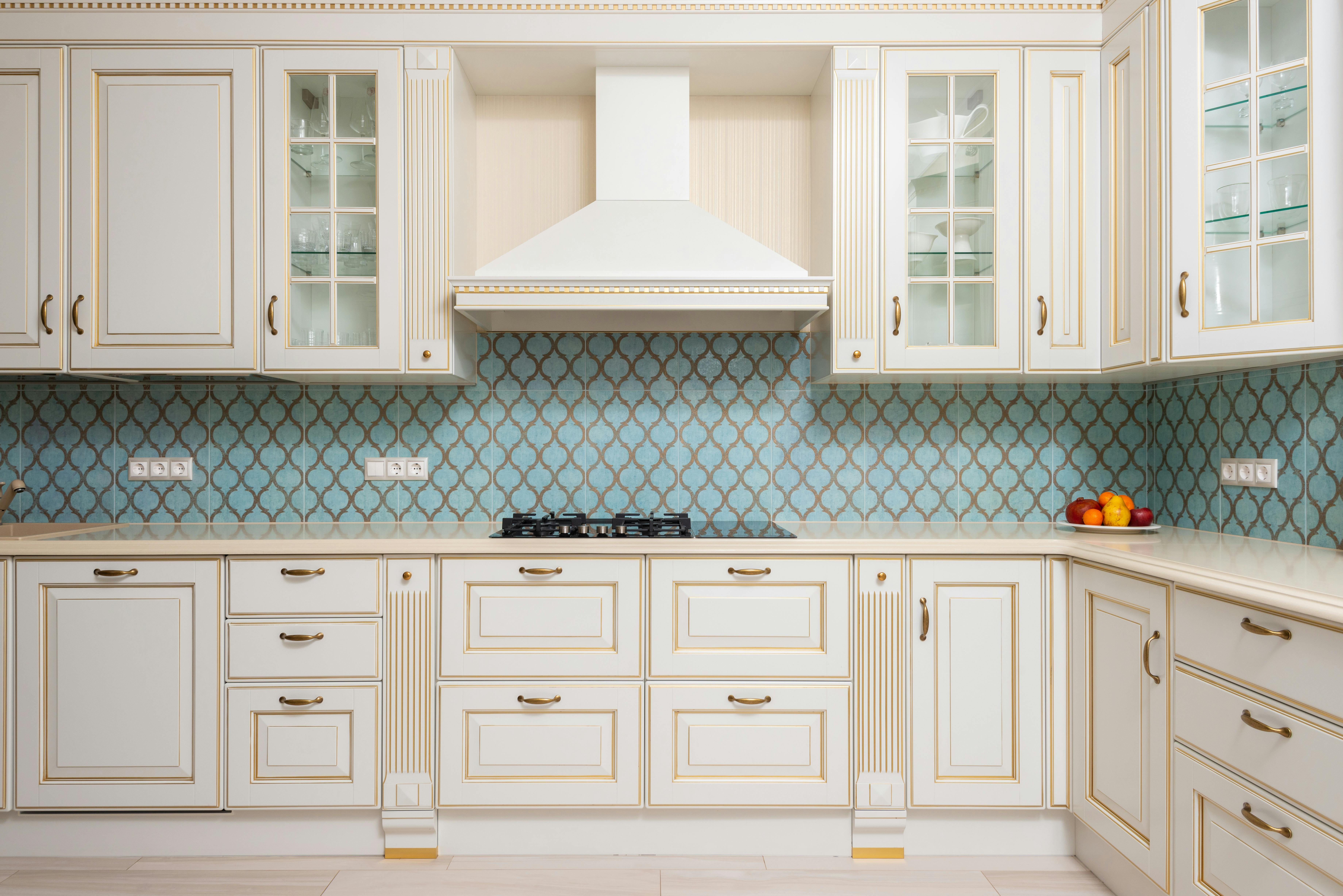
Image: A kitchen with antique cream cabinets, showcasing detailed craftsmanship and a timeless, classic design that adds elegance to the space.
How to Style a Kitchen with Antique Cream Cabinets
Best Wall and Counter Colors for Antique Cream Kitchens
Antique cream cabinets aren’t just for traditional kitchens. See real-life examples, color pairings, and tips to create a kitchen that lasts.
Antique cream kitchen cabinets aren’t just for farmhouse kitchens or French cottages.
They still work today — if you do it right.
Below, we’ll break down what makes them work, where they go wrong, and simple, real-world ways to style them without making your kitchen look stuck in the past.
Real Homes That Make Antique Cream Cabinets Look Great
How to Style a Kitchen with Antique Cream Cabinets
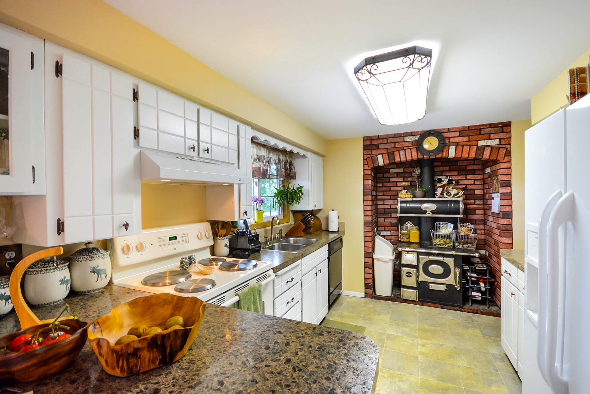
Image: A vintage kitchen featuring antique cream cabinets, combining old-world charm with refined craftsmanship for an elegant, timeless design.
Getting antique cream right is easier than you think. But you’ve got to think about the whole room — not just the cabinets.
Here’s the basics:
▪ Wall Color Matters:
Pick something that feels soft and warm.
✔ Good choices: pale sage green, muted beige, dusty blue, warm light gray.
✖ Bad idea: bright white walls (they’ll make cream look dirty).
▪ Countertops Should Flow:
Stay away from super pure whites. Look for stone with light tan or gold veining.
▪ Floors Anchor the Space:
Natural wood floors (like oak or walnut) keep the kitchen feeling grounded.
▪ Hardware Finishes Count:
Brushed nickel, bronze, or simple black hardware works way better than shiny chrome.
Real Tip:
Always test your samples together — cabinets, wall paint, countertops, and flooring. They all shift colors in real light.
Real Homes That Make Antique Cream Cabinets Look Great
Let’s get out of theory. Here’s real examples you could actually copy:
1. Soft Farmhouse Cream Kitchen
⬜ Pale sage green walls
⬜ Warm oak hardwood floors
⬜ Butcher block island
⬜ Black iron pulls and handles
⬜ Cream shaker-style cabinets
Why it works:
The wood and green keep it earthy, not fake-rustic.
2. French-Inspired Cream Kitchen
⬜ Stone tile floor (beige and soft brown mix)
⬜ Carved cream cabinets with light distressing
⬜ Warm beige walls
⬜ Marble countertops with subtle gold veins
⬜ Bronze vintage-style light fixtures
Why it works:
The textures — stone, wood, aged paint — layer naturally without looking overdone.
3. Light Modern Traditional Kitchen
⬜ Flat-front antique cream cabinets
⬜ Light warm-gray walls
⬜ White oak wide-plank floors
⬜ Simple brushed nickel hardware
⬜ Soft-pattern quartz counters
Why it works:
The modern hardware and clean floors pull the cream into today’s style.
4. Rustic Cream Kitchen with Beams
⬜ Distressed antique cream cabinets
⬜ Exposed wood beams (natural finish)
⬜ Slate floors (matte, dark gray)
⬜ Stone veneer backsplash
⬜ Vintage-style black handles
Why it works:
The heavy textures balance the softness of the cream.
Real-World Examples: Antique Cream Kitchen Cabinets with Photos
Below are real layout ideas that actually work, based on real kitchens we've seen —
not showroom setups that only look good in perfect lighting.
● Example 1: Warm Traditional Kitchen with Natural Light
Look:
Antique cream cabinets + butcher block counters + light oak floors + big windows.
Why It Works:
▫ Antique cream + natural wood = a calm, homey feel.
▫ Butcher block warms up the cream without making it yellow.
▫ Big windows bounce soft light across the cabinets, making them glow.
Bonus Tip:
If you have a lot of natural light, you can even use slightly darker floors and it still feels bright.
● Example 2: Small Galley Kitchen That Feels Twice as Big
Look:
Tight layout + antique cream cabinets + light gray walls + stainless steel appliances.
Why It Works:
▫ Cream reflects light, making the narrow space feel bigger.
▫ Stainless steel appliances modernize the look without clashing.
▫ Light gray walls stop the kitchen from feeling washed-out.
Bonus Tip:
Keep cabinet hardware simple — small black or brushed nickel pulls work best here.
● Example 3: Farmhouse-Modern Mix
Look:
Antique cream shaker cabinets + apron-front sink + rustic wood beams + matte black fixtures.
Why It Works:
▫ Antique cream softens the heavy farmhouse materials.
▫ Matte black pulls and faucet give just enough contrast.
▫ Shaker style keeps the whole thing grounded and clean.
Bonus Tip:
If you don’t have real wood beams, add faux ones — they’re lighter, cheaper, and easy to install.
● Example 4: Cozy Cottage Vibe
Look:
Antique cream beadboard cabinets + pastel green backsplash + terracotta tile floors.
Why It Works:
▫ Beadboard texture brings old-school charm without feeling fussy.
▫ Soft pastel green plays nicely with cream (instead of fighting it).
▫ Terracotta tiles ground the kitchen and add a subtle handmade feel.
Bonus Tip:
Use small-scale tiles for the backsplash if your kitchen is tiny — big tiles can overpower the space.
● Example 5: Elegant Open Concept Kitchen
Look:
Antique cream full-overlay cabinets + marble-look quartz counters + gold hardware + engineered hardwood floors.
Why It Works:
▫ Full-overlay cabinets make everything look clean and seamless.
▫ Gold hardware adds subtle luxury without making it too flashy.
▫ Marble-look counters echo the soft veins found in the cream cabinets.
Bonus Tip:
Stick with satin or brushed gold finishes — shiny gold feels too trendy and can clash with cream.
Quick Checklist: How to Get This Look Without Regrets
Before you order anything, double-check:
☑ Cabinet sample under YOUR home’s lighting (day + night)
☑ Wall color samples painted on multiple walls, not just one spot
☑ Countertop picked against the cabinet, not separately
☑ Hardware and faucets picked together — finishes matter
☑ Flooring chosen based on how much light you actually get (not just what looks good online)
Final Real-World Reminder
Antique cream kitchens aren’t about showing off.
They’re about building a space you actually want to live in — soft, warm, real.
The trick?
▫ Don’t force contrast that doesn’t belong.
▫ Don’t copy trends blindly.
▫ Don’t overthink matching every single element.
If it feels welcoming when you walk in — you did it right.
✅ That’s what real kitchen design is about.
What Goes Wrong When You Pick the Wrong Cream Shade?
Antique Cream Cabinets: Easy Ways to Make Them Feel Modern
Best Wall Colors for Antique Cream Kitchens
If your walls are wrong, the whole kitchen will feel weird.
Here’s what actually works:
● Warm light gray
● Muted sage green
● Dusty blue-gray
● Pale taupe
● Soft sand beige
Tip:
Test the paint next to your cream cabinet sample — not in isolation.
Colors shift based on what they’re next to.
Easy Color Pairings That Always Work (Real Combos)
You don’t need a designer. These combos work 99% of the time with antique cream:
🔲 Cabinets: Antique cream
🔲 Walls: Soft warm gray
🔲 Counters: Light quartz with gold flecks
🔲 Floor: White oak
OR
🔲 Cabinets: Antique cream
🔲 Walls: Muted sage green
🔲 Counters: Butcher block
🔲 Floor: Dark walnut
OR
🔲 Cabinets: Antique cream
🔲 Walls: Pale dusty blue
🔲 Counters: Soapstone or honed granite
🔲 Floor: Natural slate tile
Real Tip:
When in doubt, pick fewer textures, not more.
Too many materials = chaos.
Best Countertops to Pair with Antique Cream
Countertops can either make or break the look.
Good Choices:
● Butcher block — cozy, casual, and real
● Light granite — look for soft golds, browns, or light creams
● Soft-pattern quartz — subtle veins, nothing wild
● Soapstone — if you want contrast (dark but earthy)
Bad Choices:
Pure white quartz or sharp black granite (too stark next to cream).
Flooring That Works with Antique Cream Cabinets
The right floor finishes everything off.
Smart options:
● Oak hardwood — warm, classic, fits almost anything
● Natural slate — rustic but clean
● Terracotta tile — warm and old-world (especially in Mediterranean designs)
● Light walnut — richer brown for deeper contrast
How to Avoid Common Mistakes with Antique Cream Kitchen Designs
Antique cream kitchen cabinets add warmth and flexibility to real homes. Learn smart design tips, color matches, and what to watch out for.
Common Mistakes to Avoid with Antique Cream Cabinets
Here’s where people mess up:
✖ Picking a cream shade that’s too yellow
✖ Using bright white walls and making the cream look dingy
✖ Overloading the room with decor (makes it look cluttered fast)
✖ Cheap shiny hardware that clashes with the soft finish
✖ Glossy floors that fight the natural feel
Why Most Antique Cream Kitchens Fail
It’s not the cabinets that fail.
It’s everything else around them.
People pick antique cream, then:
-
Add super bright white counters
-
Choose glossy gray tile floors
-
Install high-shine chrome handles
Result?
It doesn’t feel warm. It feels mismatched and fake.
Real Tip:
The materials around the cream matter more than the cabinets themselves.
In Focus: Modern Cream Kitchens Are Trending (Again)
Not vintage, not farmhouse.
Modern traditional kitchens are bringing cream back — without fake distressing or heavy trims.
✔ Flat-front cream cabinets
✔ Light neutral walls (pale gray, muted beige)
✔ Matte black or brushed gold hardware
✔ Natural wide-plank wood floors
✔ Soft linen window treatments
It’s cleaner, simpler, and a lot more flexible than the old farmhouse look.
In Focus: Satin Finish > Glossy for Cream Cabinets
If you want antique cream to last and look real:
Pick satin or matte finishes, not gloss.
Why?
-
Gloss makes cream look plastic and fake.
-
Satin hides small dings and scratches better.
-
Matte brings out the softness in cream tones.
Glossy = showroom fake.
Satin = real home comfort.
Always pick satin unless you love polishing fingerprints daily.
Common Mistakes People Regret Later (Insider List)
Nobody talks about these. But they wreck kitchens all the time:
✖ Picking cream that turns yellow in real light:
You must test paint or cabinet samples in your kitchen's lighting — both day and night.
✖ Forgetting the undertones:
Some creams have green, pink, or yellow bases. Match carefully to walls and counters.
✖ Going heavy on ornate details:
Unless you're restoring a French castle... keep trims and moldings simple.
✖ Using cool grays everywhere:
Cool grays next to cream make everything feel muddy and tired.
✖ Buying cheap cabinet paint finishes:
Antique cream shows flaws fast if the paint quality sucks.
What to Ask Your Contractor (Before You Regret It)
Talking to your contractor?
Here’s what you should ask upfront:
✅ "Will you use a high-quality primer and topcoat for the cabinets?" (Don’t assume!)
✅ "Can I see samples in daylight and indoor lighting first?" (Color shifts happen.)
✅ "What’s the cabinet material under the paint?" (Solid wood? MDF? Big difference.)
✅ "Are you caulking seams properly?" (Bad seams = cracking later.)
Real Tip:
A good painter will show you a cabinet sample — not just describe it.
Do’s and Don’ts for Antique Cream Kitchens
✔ DO: Test paint samples next to your cabinets
✔ DO: Keep textures natural (wood, stone)
✔ DO: Pick warm floors, not icy gray ones
✔ DO: Use simple, classic hardware
✖ DON’T: Assume any cream works — undertones matter
✖ DON’T: Over-decorate — it crowds the warmth
✖ DON’T: Force ultra-modern light fixtures with old-style cream
Real Layout Templates That Work with Antique Cream Cabinets
Picking antique cream is smart.
But if your kitchen layout fights the look, it won’t feel right.
Here’s what layouts match best:
▪ Galley Kitchens:
Simple, practical, perfect for small or narrow spaces.
Cream brightens tight spots without making them feel cramped.
▪ U-Shaped Kitchens:
Cream brings softness to the heavy walls of cabinets.
Especially good when you add a light-colored backsplash.
▪ L-Shaped + Island:
Great for open-plan spaces.
Cream cabinets on the walls + a natural wood island = real balance.
▪ Classic Peninsula Layout:
If you don't have room for a full island, cream lowers visual weight.
It keeps everything feeling open and easy.
Real Tip:
If your kitchen is dark naturally (few windows), antique cream cabinets + plenty of under-cabinet lighting is a must.
Shocking But True: Antique Cream Looks Better Over Time (If Done Right)
Here’s the thing nobody says:
Antique cream gets better with a little wear.
-
Small scuffs warm it up.
-
Minor aging makes it feel natural, not showroom-fake.
-
Kitchens that look perfect often feel cold. Slight imperfections make a space feel lived-in and human.
BUT:
Only if you start with good-quality cabinets and durable paint.
Cheap cream finishes just peel, scratch, and look sad fast.
Quick Comparison Table: Best Materials to Pair
| Element | Best Option | Worst Option |
|---|---|---|
| Wall Color | Soft warm gray | Bright stark white |
| Countertops | Butcher block / Light veined quartz | Pure white quartz |
| Flooring | Natural oak / Slate | High-gloss tile |
| Hardware | Brushed nickel, bronze, black iron | High-shine chrome |
Quick Facts About Antique Cream Cabinets
⚪ Antique cream is easier to maintain than bright white
⚪ Works across farmhouse, French country, and modern traditional styles
⚪ Needs warm surroundings (walls, floors, counters) to look its best
⚪ Sample all elements together before finalizing anything
⚪ Small glazing (optional) adds vintage depth but isn't mandatory
FAQ
Q: Are cream cabinets out of style?
A: No. They’re classic. They just need the right surroundings to stay fresh.
Q: Can I glaze cream cabinets?
A: Yes, but glaze carefully. Light touch only — heavy glazing can make it feel dated fast.
Q: Is antique cream better for resale than pure white?
A: In cozy, family-style homes — yes. Buyers often prefer softer tones to harsh whites.
Q: Will antique cream cabinets look yellow over time?
A: Only if you picked a shade with too much yellow to start. Good-quality paints stay stable.
Q: Can I DIY-paint my cabinets antique cream?
A: Yes — but prep is 90% of success. Sand, prime, good paint. Rush it and you’ll regret it.
Q: What’s the best backsplash with cream cabinets?
A: Light natural stone, soft subway tile, or handmade-look tiles. Skip shiny glass tiles — too cold.
Wrap-Up
If you’re going with antique cream cabinets, you’re picking something that actually lasts — in looks and in feel.
Stick to simple materials, warm color partners, and quality finishes.
Skip the trends, trust real-world textures, and focus on balance instead of trying to "wow" everybody.
At the end of the day? Your kitchen isn’t for Instagram.
It’s for you.
Make it feel right.