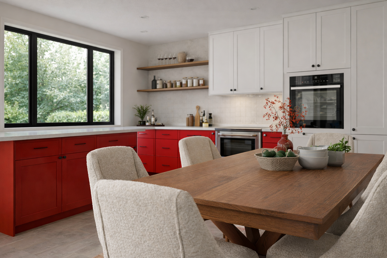
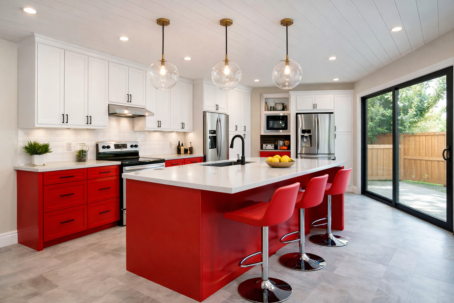
Red is loud. In a good way. It gives a kitchen a “point of view” fast.
But it’s also the colour that shows mistakes the quickest. Wrong white looks pink. Wrong grey looks muddy. Too many warm finishes and the whole thing starts feeling like a diner.
This is a real-world guide to making a red platform work (toe-kick, island base, plinth, feature panel—whatever your version is) without turning the kitchen into a theme.
- How to pick the right red (undertone matters more than people think)
- 10 colour combinations that actually balance red
- What usually goes wrong (and how to avoid the expensive do-over)
- A quick checklist + FAQ based on the questions people keep asking
Before the colour schemes: figure out what “red” you bought
Most people choose red on a screen, then wonder why it looks different at home. That’s not bad luck. That’s lighting + undertone.
- Orange-leaning red (tomato, coral): warmer, friendlier, easier with wood and cream.
- Blue-leaning red (crimson, cherry): sharper, “cleaner,” can go harsh with cool whites.
- Deep red (oxblood, wine): looks premium, but it eats light and shows dust/scuffs on the platform.
Do this once, properly: put your red sample next to your cabinet finish, your countertop sample, and one “real white” (not off-white). Look at it in morning light and night light.
Red as an accent (the low-regret way to use it)
If full red cabinetry feels like a commitment you might regret, keep the red as the “moveable” part: stools, small appliances, lighting, textiles. It still hits, but you can swap it later.
- Stools or one chair at the island: easiest, cheapest, and you can change your mind.
- Small appliances (mixer, kettle, coffee machine): enough colour without repainting anything.
- Pendants over the island: red up high keeps the base calmer.
- Runners / towels: good if you want “red energy” but not “red forever.”
One practical note: if your red platform is at toe-kick height, treat it like a car bumper. It will get scuffed. Matte hides it better than high gloss.
Kitchen colour schemes with red platforms: 10 combinations that work
These aren’t trend-board combos. They’re “this still looks good when the dishes are out” combos.
1) White + red (clean, classic, easy to update later)
- Best for: bright kitchens, smaller spaces, modern or classic cabinetry.
- Use it like this: white cabinets, simple warm-white backsplash, red platform as the punch.
- What bites later: ultra-bright cool whites can make some reds look pink. Test first.
2) Warm white (eggshell) + red (softer than pure white)
- Best for: homes that feel a bit cold, north-facing kitchens, “cozy but still clean.”
- Use it like this: warm white cabinets or walls, red platform, brass or champagne hardware.
- What bites later: too much cream can start reading beige fast. Keep counters/backsplash lighter and quieter.
3) Charcoal / matte black + red (high contrast, but control it)
- Best for: modern kitchens where you want graphic contrast.
- Use it like this: red platform + charcoal/black on one “anchor” element (island, tall pantry run, or hardware), then keep the rest light.
- What bites later: black counters show dust and water spots. No romance here. You wipe.
4) Light grey + red (neutral backdrop, but pick the undertone)
- Best for: people who want calm, not a circus.
- Use it like this: light warm grey walls, red platform, white/cream backsplash, oak accents.
- What bites later: cool grey + cool lighting can make red feel harsh. Warm the lighting and the “white.”
5) Greige + red (the cheat code if you hate “cold” kitchens)
- Best for: mixed lighting, open-plan rooms, anyone worried about grey turning blue.
- Use it like this: greige cabinets, warm-white backsplash, red platform as the only bold colour.
- What bites later: muddy greige happens when everything is mid-tone. Add contrast (lighter top, darker hardware, or a clearer counter).
6) Navy + red (classic, deeper, and less harsh than black)
- Best for: people who like moody colours but still want warmth.
- Use it like this: navy lowers, red platform, light counters, warm metal accents (brass/copper).
- What bites later: navy + red can feel heavy if the room is dark. Add more light or lighten the walls.
7) Sage / olive green + red (earthy, calm, surprisingly natural)
- Best for: timber floors, natural textures, kitchens that need softness.
- Use it like this: sage walls or cabinets, red platform, warm stone or wood, off-white backsplash.
- What bites later: avoid bright “Christmas” green. Keep the green dusty/earthy and the red deeper or slightly muted.
8) Terracotta + red (warm on warm, but keep it disciplined)
- Best for: Mediterranean feel, clay tile floors, warm woods, bronze/brass details.
- Use it like this: terracotta floor or backsplash, red platform, cream walls, warm metals.
- What bites later: too much warm colour can feel busy. Keep cabinets simple and counters quiet.
9) Soft blush / dusty pink + red (yes, but do it grown-up)
- Best for: modern kitchens where the red is deep (wine/oxblood) and you want softer surrounding colour.
- Use it like this: blush backsplash tile, warm white cabinets, red platform, brushed brass.
- What bites later: bright red + pink can look accidental. This works better with deeper reds and muted pinks.
10) Natural wood + red (the “human” combination)
- Best for: almost everyone. It’s the quickest way to make red feel intentional.
- Use it like this: red platform + oak/walnut shelves or panels + warm white walls.
- What bites later: matching wood tones poorly (too orange, too many species) makes things feel messy. Pick one dominant wood tone.
The secret to getting colours right with a red platform
Red is the feature. Everything else is support.
- Keep your “big surfaces” boring. Cabinets, walls, counters. Let red be the loud part.
- Pick your white before your grey. White controls how every other colour reads.
- Don’t go “matchy.” One red feature is strong. Five red accents is a costume.
- Texture saves you. If the palette is simple, add texture: handmade tile, wood grain, matte finishes.
- Lighting is half the colour. Cool bulbs can make red feel aggressive. Warm-to-neutral light usually makes it look richer.
If you’re building out your colour planning, keep this as your “bigger map” page: kitchen colour combinations.
Common mistakes (the ones that cause the do-over)
- Choosing everything mid-tone. Red platform + mid-grey cabinets + mid-grey floor = flat. Add contrast.
- Ignoring the countertop movement. Busy granite + patterned backsplash + red platform is how kitchens get noisy fast.
- Assuming paint/store lighting is your home lighting. It isn’t. Sample it in your kitchen. Morning and night.
- Forgetting scuff zones. Toe-kicks take damage. Pick finishes that forgive it.
Checklist (print this before you buy anything)
- Have you confirmed whether your red is warm-leaning or cool-leaning?
- Did you test the red next to your cabinet finish and a “real white”?
- Are your cabinets/walls/counters neutral enough to let red be the feature?
- Did you avoid pairing busy counters with a busy backsplash?
- Do you have at least one warm material (wood, warm tile, brass) if the scheme feels cold?
- Is your red in a scuff zone (toe-kick)? If yes, did you pick a forgiving finish?
- Did you check the palette under your actual night lighting?
FAQ
Will a red platform make my kitchen look smaller?
Not by itself. What makes kitchens feel smaller is dark cabinets, dark counters, and poor lighting. A red platform with light cabinets can actually add depth.
What’s the safest cabinet colour with a red platform?
Warm white, soft white, or a light warm grey. They keep the room calm and let red be the point.
Can I do black with a red platform?
Yes. Just keep black limited (hardware, one feature run, or one counter) and make sure the kitchen has enough light. Black shows dust and water spots, so be honest about your cleaning tolerance.
What countertop works best with red?
Simple works best: warm white quartz, light stone, or a quiet wood tone. If your countertop is heavily patterned, keep the rest of the kitchen quieter.
How do I stop red from feeling too “in your face”?
Reduce the number of other strong colours. Use red once, then support it with neutrals and texture. Wood and warm metals make red feel more “designed” and less “shouty.”
Is red bad for resale?
Full red cabinetry can scare buyers. A red platform or removable red accents usually won’t. It reads like a design detail, not a permanent commitment.
MUST READ
Kitchen design pocket reference (layouts + specs)
Useful for checking clearances and basic planning before you lock in cabinet drawings.
More guides: