
Kitchen Colour Schemes: 10 of the Best
Why Colour is the First Place Kitchens Go Wrong
I have walked into remodels where the counters cost more than a car and the cabinets were fresh out of the shop, and the room still felt off. The issue was not money or materials. It was colour. Undertones clashed. Lighting flipped shades. Or somebody forced in a trend they saw online and regretted it before the grout dried.
Designers and homeowners say the same thing in forums and magazines. The fastest way to date your kitchen is with the wrong colour. Avocado in the seventies. Burgundy in the nineties. Glossy black in the early two thousands. They all looked bold in the moment. Now they stamp the decade in an instant.
10 kitchen colour combinations that age well. Practical advice from the field—tested in real homes, not just on mood boards.
These ten schemes are what I have seen hold up. They balance undertones, adapt to light, and sit comfortably with the bones of the house.
10 Kitchen Colour Schemes That Look Good for Years
Kitchen Colour Rules Every Homeowner Learns the Hard Way
Kitchen colour schemes that actually last. 10 combinations designers use, the mistakes homeowners regret, and how to choose colours you won’t repaint in a year.
1. Classic White With Warmth
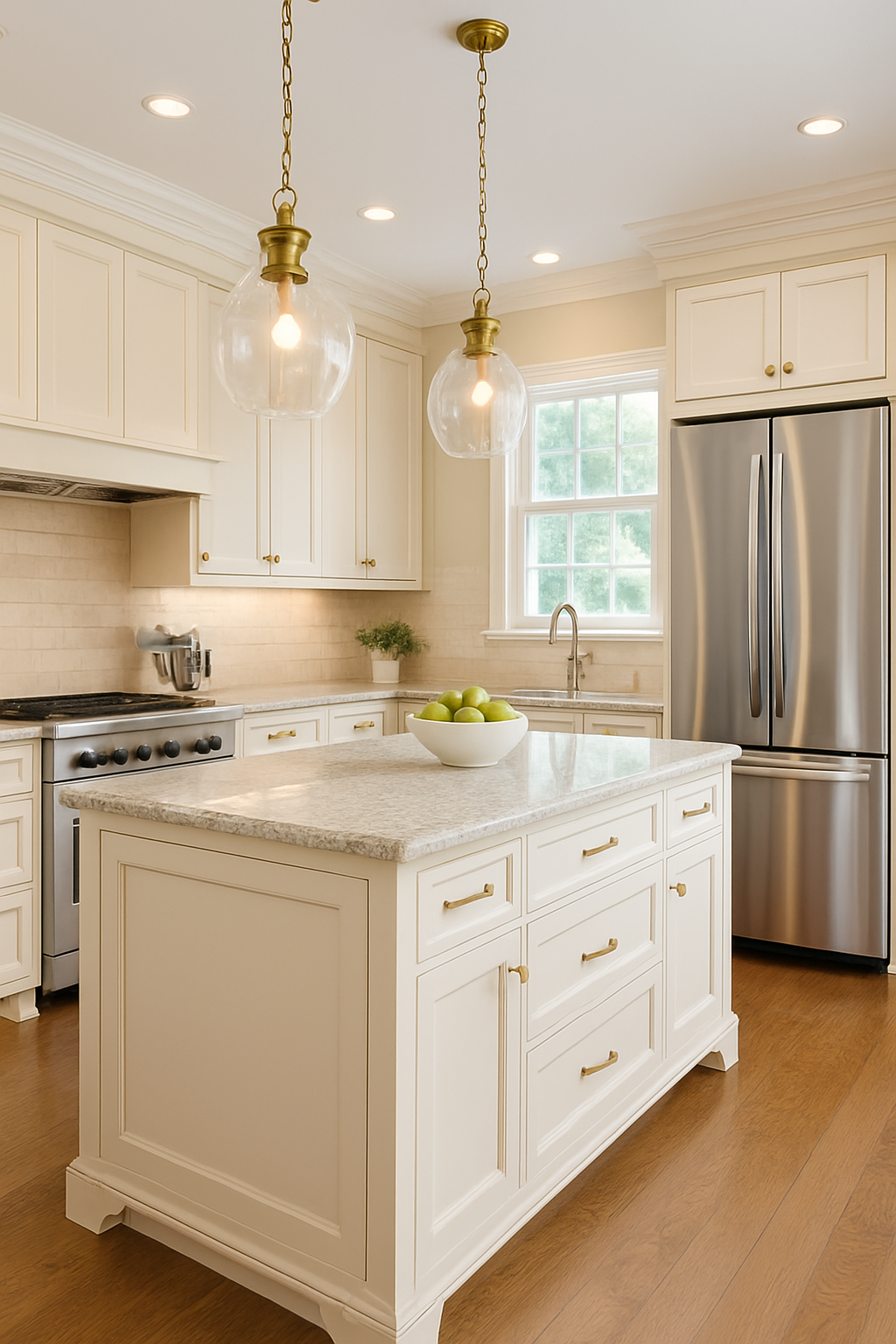
White never leaves style, but the wrong white will sink a kitchen. Stark bright white under cool bulbs turns sterile. Warm whites such as ivory, linen, and eggshell stay clean without looking clinical.
What I have seen: A family in Boston paired cream cabinets with oak floors and brass pulls. Ten years later it still feels current. Another homeowner used bright contractor white under cool bulbs and hated it by month three.
Why it lasts: It reflects light, works with almost any counter, and lets you change accents later.
Mistake to avoid: Skipping samples. Whites shift more than any other colour under light. Always test them at home.
2. Greige and Taupe
Greige is the bridge colour, part grey and part beige. It pulls together wood floors, quartz counters, and stainless appliances without looking flat.
What I have seen: In a 1920s bungalow, taupe walls sat behind sage cabinets. The palette carried vintage charm but still felt modern.
Why it lasts: It does not fight undertones. Warm woods and cool stones can share the same room when greige holds them together.
Mistake to avoid: Picking the wrong side of greige. If your floors are red oak, lean warm. If your counters are icy quartz, lean cooler.
3. Sage and Muted Greens
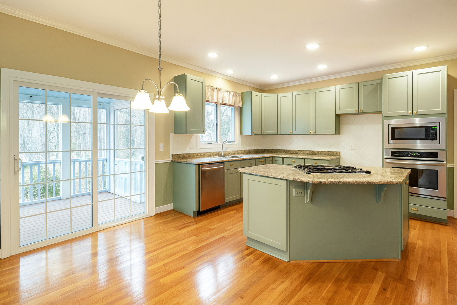
Green has returned to kitchens, but only muted shades survive the trend cycle. Sage, olive, and moss act more like neutrals than statements.
What I have seen: A client swore sage looked like a hospital wall. Six months later she called back and admitted it was her favourite room. Another homeowner went bold with emerald lowers and regretted it once the novelty wore off.
Why it lasts: It brings calm, connects to nature, and pairs well with wood and brass.
Mistake to avoid: Going too bright. Neon or glossy greens date instantly.
4. Navy or Charcoal Accents
Dark kitchens age fast unless handled with restraint. A navy island or charcoal lowers under light uppers still feels sharp a decade later.
What I have seen: A Norfolk kitchen with a navy island in an otherwise white space. Styles in the rest of the house changed twice, but the island kept earning compliments.
Why it lasts: It gives depth without swallowing the room.
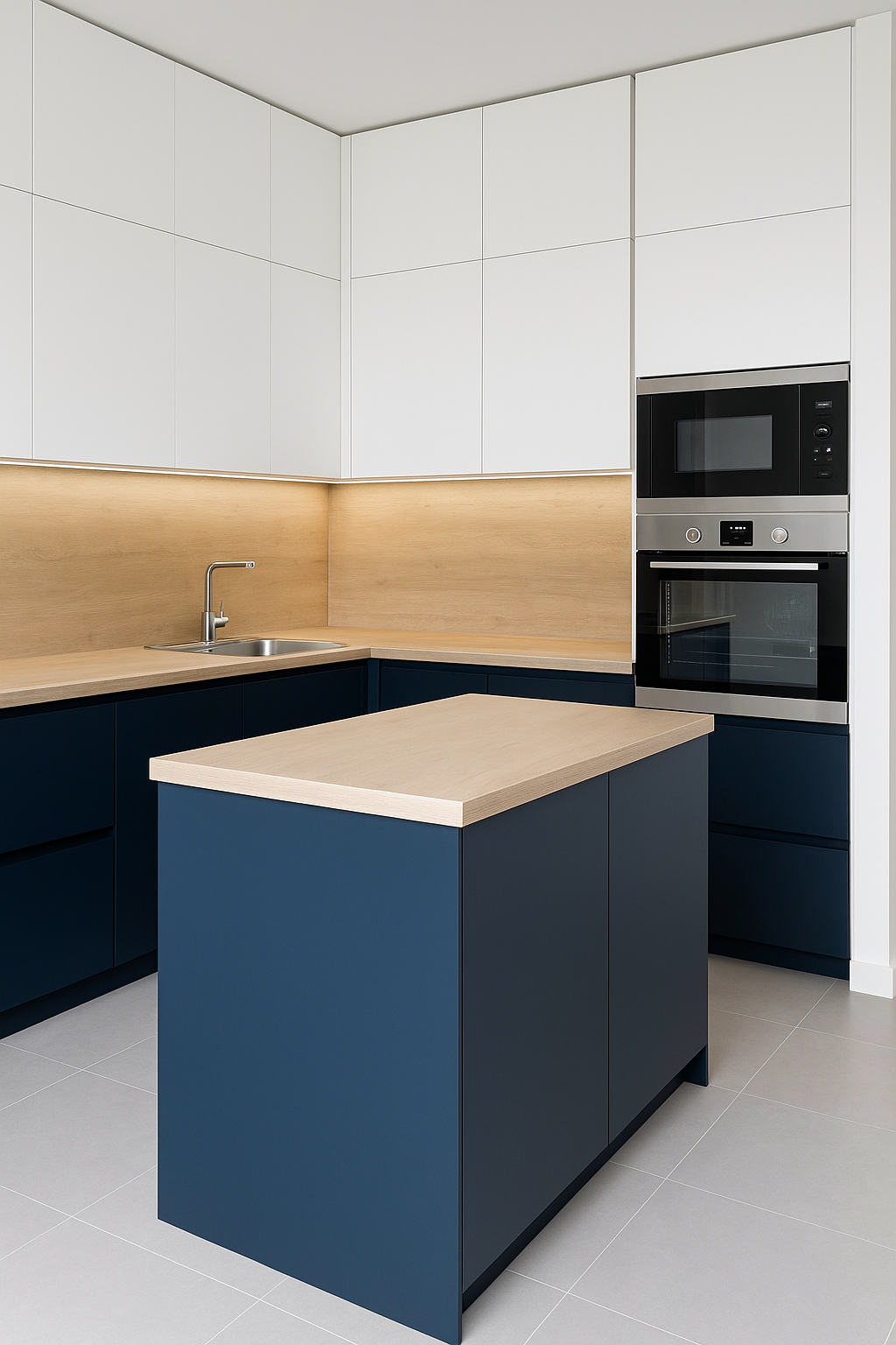
Mistake to avoid: Painting all the uppers dark. Unless you have high ceilings and plenty of natural light, the room feels top heavy.
5. Natural Wood With Soft Neutrals
Natural wood never really leaves style. Oak or walnut paired with greige walls and a soft stone counter hits the balance of warmth and brightness.
What I have seen: A couple ripped out their glossy white cabinets after four years because the kitchen felt lifeless. We swapped in oak lowers, white uppers, and honed marble. Same layout, completely different feel.
Why it lasts: Wood adds soul. Neutral paint holds the palette steady. Stone keeps it bright.
Mistake to avoid: Over lacquered finishes. Plastic looking wood kills the effect.
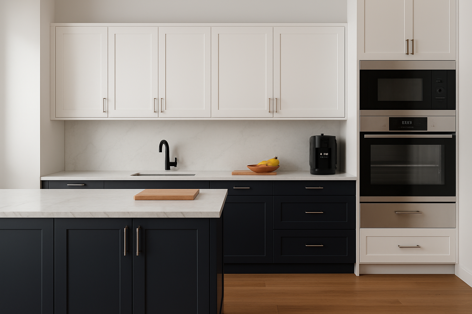
6. Black Done Carefully
Black is tempting but tricky. A full black kitchen almost always feels heavy and regret comes fast. Matte black lowers with white uppers and strong task lighting can feel modern and grounded without crossing into cave territory.
What I have seen: A young couple tried full gloss black cabinets. Within a year they admitted the room felt claustrophobic. We repainted the uppers in white, kept the lowers matte black, and added brass pulls. The space opened up instantly.
Why it lasts: Used in moderation, black gives weight and authority. Balanced with light and warm metals, it stays sharp instead of overwhelming.
Mistake to avoid: Thinking black hides dirt. It shows fingerprints and dust more than white.
7. Sunny Yellow Accents
Yellow works when it is cheerful but not blinding. A backsplash or single wall in pastel yellow can lift the entire room. Cover every cabinet in it and you risk overload.
What I have seen: In a narrow galley kitchen, a pale yellow backsplash broke the monotony of white cabinets. The owners said it felt like morning light even in the dead of winter.
Why it lasts: In small doses it warms the room and sparks energy without feeling dated.
Mistake to avoid: Choosing the wrong shade. Neon or mustard yellows turn tiresome quickly. Stick to soft butter tones.
8. Terracotta and Earth Tones
Terracotta tiles and soft cream cabinets create warmth that feels rooted. Earth tones age with texture instead of chasing trends.
What I have seen: A renovation in Arizona used terracotta flooring with off white cabinets and bronze fixtures. Fifteen years later the kitchen still looks authentic instead of dated.
Why it lasts: It connects to natural materials and reads classic across decades.
Mistake to avoid: Pairing terracotta with high gloss finishes. The earthy charm is lost if everything else screams synthetic.
9. Mint and Pastel Blues
Mint and dusty blues hold a quiet charm. They freshen a space without pushing it into nursery territory.
What I have seen: In a city condo, pale blue cabinets with butcher block counters gave the small kitchen a clean and airy feel. Five years later the owners still love it.
Why it lasts: Muted pastels act like neutrals. They give color without overwhelming and pair easily with natural wood or stone.
Mistake to avoid: Going bright. Bold turquoise or aqua ages fast. Keep the tones soft and low key.
10. Mix Carefully, Not Randomly
Two tone kitchens can look elegant when balanced. Light uppers with darker lowers work. A single bold island works. One statement wall works. Stack too many accents together and it starts looking like a paint aisle exploded.
What I have seen: A client once tried navy lowers, emerald backsplash, and red stools. The room felt chaotic. We scaled back to one bold move on the island and the rest neutral. Suddenly the kitchen made sense.
Why it lasts: Careful restraint keeps the space looking designed rather than desperate.
Mistake to avoid: Thinking more accents mean more personality. A single hero piece is enough.
You might like: Kitchen Color Combinations Every Designer Actually Uses
Mistakes People Regret
I have lost count of how many kitchens I have walked into where the money was spent but the colour ruined the outcome. The regrets are almost always the same.
High gloss candy colours
They look fun on Instagram. In real kitchens they glare, scratch, and age badly. Owners end up sanding and repainting within a year.
Too many colour moves at once
A navy island, patterned backsplash, and bright stools do not add up to personality. They add up to noise. One strong accent is memorable. Three compete until nothing works.
Cold grey everywhere
The all grey trend swept through fast. Without wood or brass to soften it, the result feels lifeless. I have seen people beg to repaint within months because the room felt like an office instead of a home.
Forcing a bold trend into the wrong house
A glossy black cabinet set in a 1920s bungalow. Neon green in a cottage kitchen. It jars against the bones of the house and never feels right.
Ignoring undertones
This is the silent killer. A counter that leans warm beige next to a cool grey wall will always clash. It does not matter how expensive the stone was. The room will feel wrong until one surface is repainted.
See also: Kitchen Colour Ideas That Don’t Age Badly
Renovating a Kitchen and Choosing Colour Schemes
Renovation is where most people blow the budget and still end up unhappy with colours. Cabinets get replaced, counters cost five figures, and the paint is picked last. That is backwards. Colour has to be part of the renovation plan from day one.
When I work with homeowners, I always start by asking how the kitchen connects to the rest of the house. A Victorian terrace in Boston should not suddenly sprout neon cabinets. A mid century ranch in California should not get ornate cherry crown moulding. The architecture sets boundaries, and colours have to respect them.
What Works in a Renovation
Pick a base finish before shopping
If you know you want oak floors, every colour decision follows that. If you know you want white quartz, undertones need to match it. Renovations collapse when people pick pieces one by one without a master palette.
Use colour to bridge old and new
In historic houses, you do not have to copy the past, but you cannot fight it either. Soft greens, creams, or warm greys can modernize a Victorian kitchen while keeping it rooted in its bones. If that is your project, see our guide on Victorian Kitchen Remodeling: A Step by Step Guide to Achieving Classic Style.
Respect the stress points
Renovations are messy, and colour regrets pile on top of dust and delays. Always paint large test boards and lean them against the new counters and cabinets before committing. Never trust a tiny chip under fluorescent lights at the hardware store.
Anchor with something natural
Stone, wood, and brass fixtures carry a room longer than trendy paints. They can make even a risky colour move last ten years instead of two.
Case Example
I once worked on a Victorian townhouse kitchen where the owners wanted to go bold. Their first idea was black lacquer cabinets with a marble waterfall island. Beautiful in isolation, but the second floor was full of original trim, cream plaster walls, and pine floors. The black box of a kitchen would have looked like a nightclub stapled onto a historic house.
We shifted to sage green cabinets, cream walls, and honed marble counters. Brass hardware tied it all back to the period details, and the sage acted like a neutral. Soft enough to keep the balance, distinct enough to feel intentional. Years later, the owners still say it is their favourite room. The lesson was simple: pick colours that respect the house, not just the latest Pinterest board.