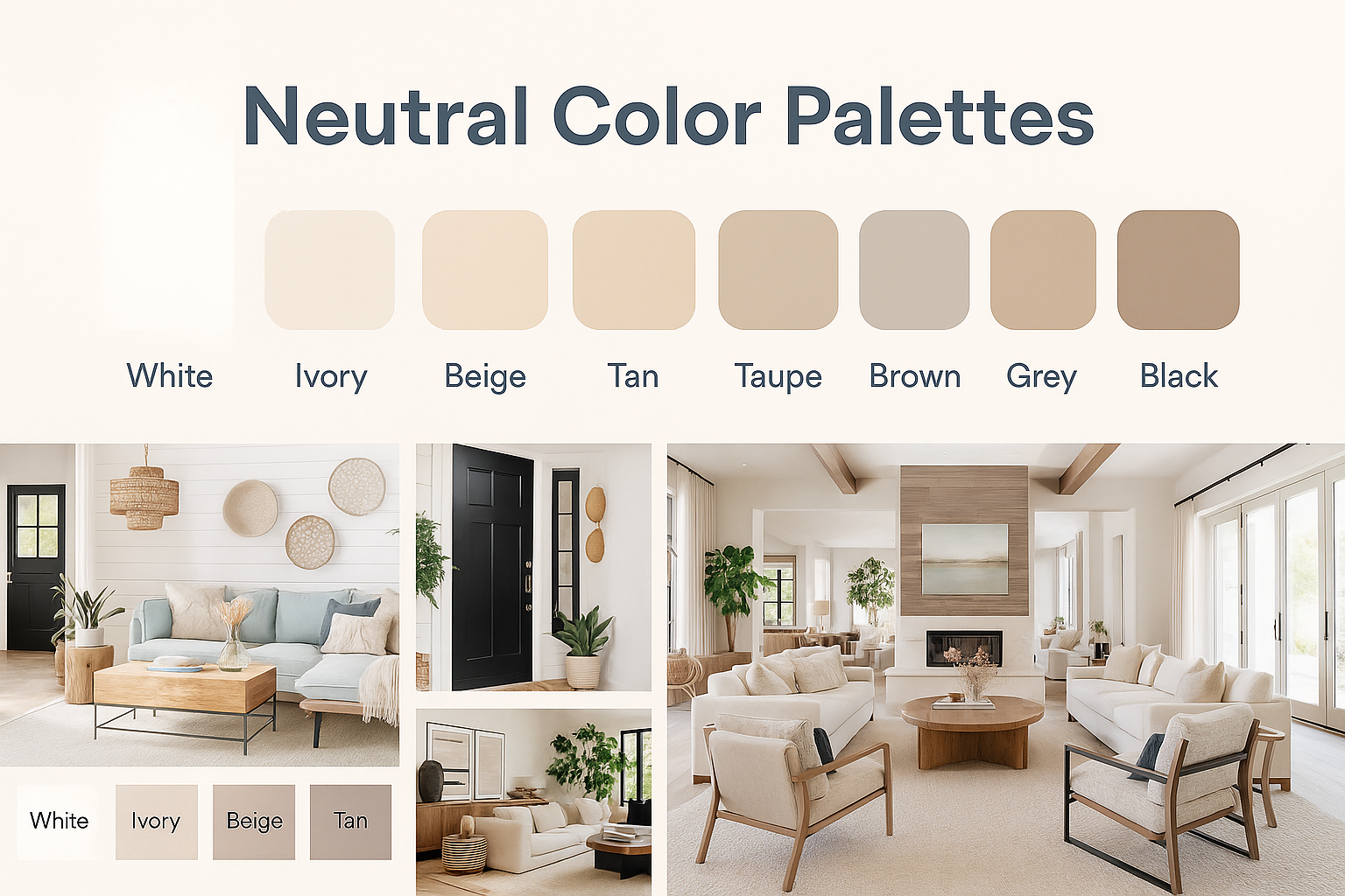
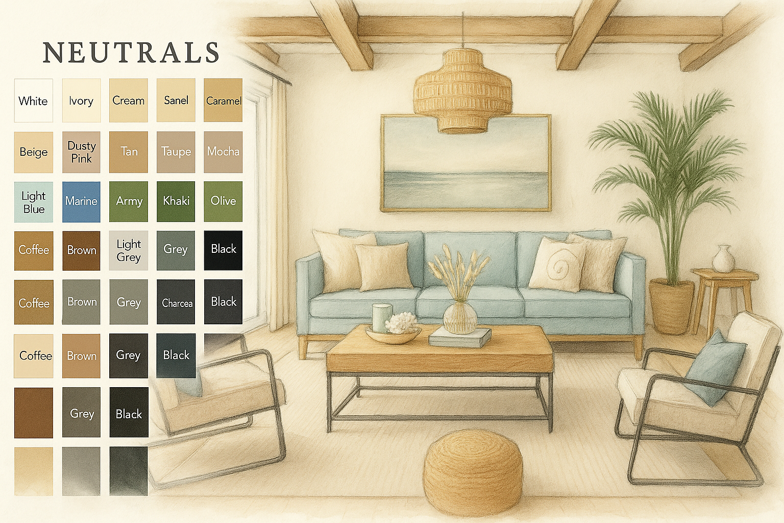
Neutral Color Palettes That Create Calm Spaces
Why Warm Neutrals Are the Hottest Colors Right Now
Calm. Easy. Always in Style.
In a loud, fast world, warm neutral colors are the reset button.
- They calm your space.
- They go with everything.
- They never go out of style.
That’s why designers, homeowners, and even big brands are obsessed.
What Makes Neutrals So Powerful?
They Make Rooms Feel Good
Warm neutrals like soft beige, tan, and creamy greige make a space feel:
- cozy
- clean
- not overwhelming
→ They relax your eyes and your mind.
→ Perfect for homes, studios, cafés, and anywhere you want peace.
They Work With Every Style
Warm neutrals are the chameleons of design. They fit in anywhere:
- Modern → clean lines, warm whites, soft woods
- Rustic → stone, clay tones, natural textures
- Minimalist → tone-on-tone palettes
- Transitional → classic meets current
→ You won’t have to repaint in 2 years because the trend changed.
They Rule Instagram and Branding
Scroll any modern design feed—it’s all beige, bone, and warm taupe.
- Glossier
- Muji
- Kinfolk
- Zara Home
→ These brands use warm neutrals to feel high-end, calm, and quietly confident.
→ It makes their products pop. Their vibe: intentional, clean, timeless.
They Help You Avoid Expensive Mistakes
Picking trendy colors? You might regret it.
But warm neutrals?
- Always safe
- Always fresh
- Easy to pair with any accent color or furniture
→ They boost home value and buyer appeal.
→ Real estate agents love them for staging.
Bottom Line: Neutrals Just Work
They feel natural.
They look expensive.
And they let you change up furniture, art, or mood—without starting over.
Warm neutrals aren’t plain.
They’re powerful.
Editor’s Picks
Books Worth Displaying & Reading
For the Love of White by Chrissie Rucker
→ A timeless favorite for clean, layered neutrals. Beautiful enough for a coffee table, inspiring enough for a mood board.
The Ultimate Guide to Warm and Neutral Color Palettes
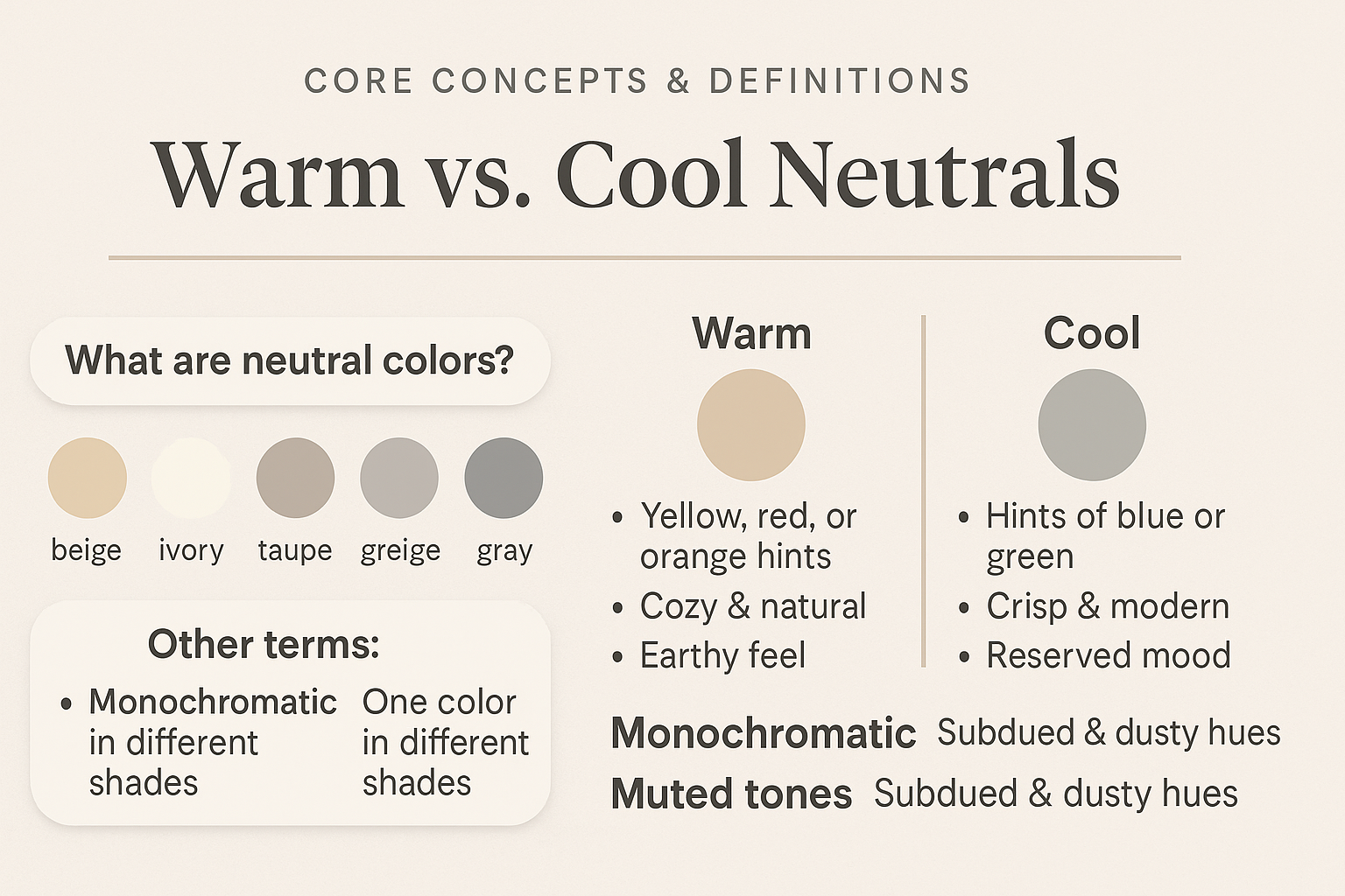
Core Concepts & Definitions
Core Color Basics: What Warm & Neutral Really Mean
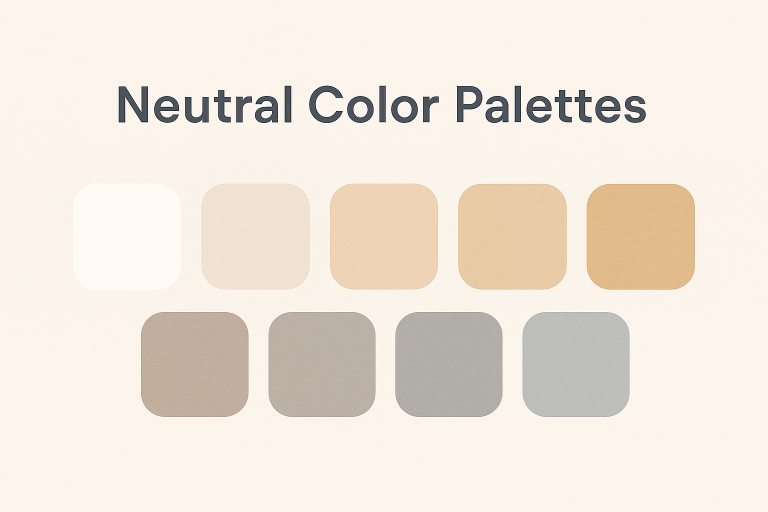
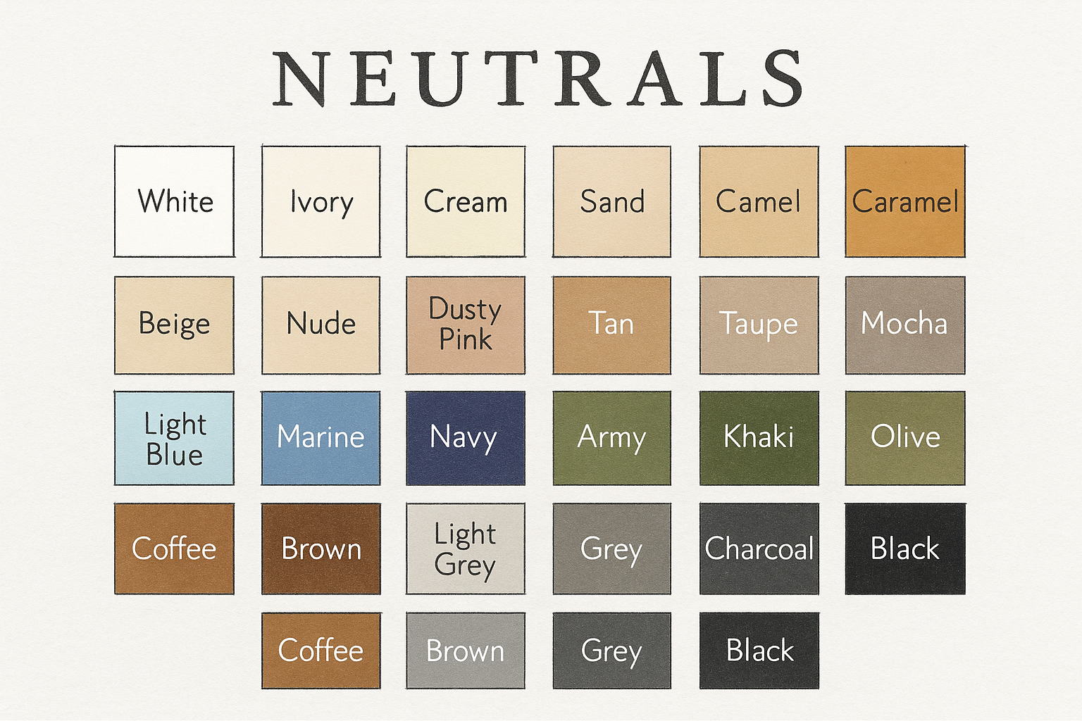
What Counts as a Neutral Color?
Neutrals are the quiet powerhouses of design. They’re the shades that don’t fight for attention—but still set the entire tone of a space.
● Most common neutrals:
→ Beige
→ Taupe
→ Ivory
→ Greige (gray + beige)
→ Pure gray
These colors don’t sit on the color wheel like blue or red. That’s why they’re so easy to mix and match.
Warm vs. Cool: The Key Difference
Here’s where neutrals really split:
Warm neutrals
● Hints of yellow, red, or orange
● Think creamy whites, sandy tans, clay tones
● Feels cozy, earthy, inviting
Cool neutrals
● Subtle blue or green undertones
● Think slate gray, cool stone, pale silver
● Feels crisp, modern, more formal
→ Real tip: Want warmth and depth? Go warm. Want sleek and clean? Go cool.
Monochromatic, Muted, and More
You’ll also hear words like “monochromatic” and “muted” thrown around. Here’s how to keep them straight:
Monochromatic
● One color, many shades
● Example: Light gray walls + charcoal couch + slate rug
● It’s all about tone, not variety
Muted
● Any color with the saturation dialed down
● Looks soft, powdery, dusty
● Works great with warm neutrals (nothing too loud)
Quick Visual Recap
| Style | Vibe | Best Use |
|---|---|---|
| Warm Neutral | Cozy, grounded | Living rooms, bedrooms, kitchens |
| Cool Neutral | Sleek, airy | Bathrooms, modern interiors |
| Monochromatic | Calm, layered | Minimalist or tonal interiors |
| Muted | Subtle, soft | Rustic, Scandinavian, boho, transitional |
Neutral Color Palettes for Modern Minimalism
Neutral Color Palettes: Warm vs. Cool Tones
✦ Editor’s Picks
Made for Living by Amber Lewis
→ Amber’s relaxed neutral style is iconic. Think cozy linen, aged woods, and sun-washed palettes.
The Best Warm Neutral Paint Colors by Brand
Real picks. Real-world advice. Zero guesswork.
Warm neutrals are tricky—they shift in tone depending on lighting, room direction, and surrounding colors.
That’s why we’ve gathered only the best-performing colors from trusted paint brands, based on real-life experience, designer picks, and common success stories.
This is not a huge list of options. It's a smart shortlist to save you time.
How to Use This Section
● If you want a safe whole-house palette, start with Sherwin-Williams or Benjamin Moore.
● Need a cozy living room or bedroom update? Look into Behr’s rich creams and soft greiges.
● On a budget or outside North America? Valspar and Dulux give excellent value and coverage.
→ Tip: Always paint large swatches in at least two lighting conditions before choosing.
Sherwin-Williams Top Warm Neutrals
Tried-and-true in modern homes.
-
Accessible Beige → Subtle and soft; goes greige in north light, beige in warm light.
-
Shoji White → Not a pure white; creamy with warm undertones—great on trim or cabinets.
-
Wool Skein → Mid-tone khaki-beige; works with wood floors and warmer fabrics.
-
Canvas Tan → Light, sandy tone. Great for minimalist or Japandi interiors.
Where It Works Best: Open floor plans, base walls, paired with matte black or bronze.
Benjamin Moore Warm Neutrals
Classic designer staples.
-
Edgecomb Gray → A light greige with a soft, balanced warmth. A favorite for resale.
-
Revere Pewter → Earthy greige with cool undertones—pairs well with blues and greens.
-
Manchester Tan → Soft tan with golden undertones. Perfect for traditional homes.
-
Natural Cream → Creamy neutral with slight yellow-beige base. Elegant and versatile.
Where It Works Best: Heritage-style homes, kitchens with natural wood, soft lighting.
Behr’s Cozy & Affordable Picks
Warmer and richer tones for real-life rooms.
-
Toasty Gray → A true greige with depth. Works especially well in north-facing rooms.
-
Aged Beige → Muted beige with a whisper of pink warmth—great in living rooms.
-
Swiss Coffee → Classic off-white with a warm glow. Best-selling for a reason.
-
Almond Wisp → Subtle, earthy tone that’s easy on the eyes.
Where It Works Best: Budget-friendly makeovers, rentals, bedrooms, and trim.
Valspar & Dulux Picks
Ideal for UK, Canada, or global markets.
-
Warm Putty (Valspar) → Mid-tone greige that works well in open-concept spaces.
-
Egyptian Cotton (Dulux) → Soft warm neutral, like clay mixed with linen. Understated but rich.
Where It Works Best: Whole-house neutral schemes or grounding accent walls.
Pro Tips from Experience
▪ Always paint 2x2 ft swatches in the actual room—colors shift dramatically based on natural and artificial light.
▪ Compare colors at different times: morning, midday, evening. One color can look like three.
▪ Don’t pair warm neutrals with cool white trim. Instead, use soft whites like BM Simply White or SW Alabaster.
▪ Want modern contrast? Add matte black handles, charcoal fabrics, or walnut wood tones.
Let your walls work for you, not fight your lighting.
These are the colors professionals actually reuse again and again—because they just work. No trendy gimmicks. Just warmth, calm, and subtle depth in every room.
Tip: Always test large swatches on-site. Lighting changes color perception throughout the day.
MUST READ Homebody by Joanna Gaines
→ A warm farmhouse look with plenty of neutral palette inspiration that works in real homes, not just showrooms.
Real-World Warm + Neutral Color Combinations (And When to Use Them)
Color Palette Combinations
Not every warm-neutral combo works in every room. It’s about how the colors interact with light, space, and mood. Here's how to pair them like a pro—and avoid the common mistakes.
Best Warm + Neutral Combos That Actually Work
● Beige + Soft Olive
→ Great for earthy kitchens, cozy living rooms
→ Why: Beige is grounding; olive adds a natural, organic accent
→ When not to use: Avoid in very dim rooms—it can look muddy
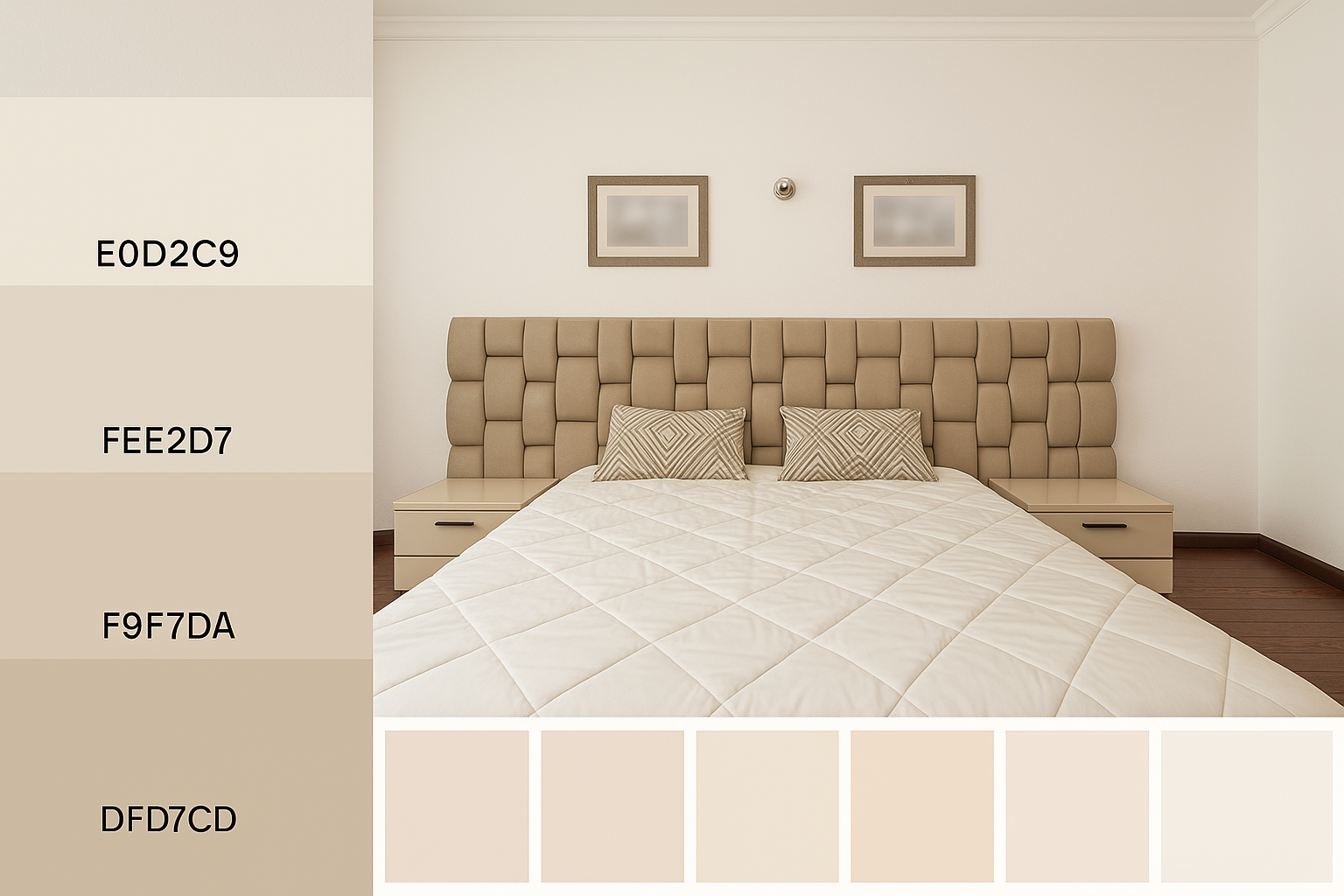
IMAGE: Modern bedroom with neutral color palette, featuring a tufted beige headboard, geometric pillows, and simple nightstands for a clean, calming aesthetic.
● Clay + Cream
→ Ideal for Mediterranean or rustic interiors
→ Why: Clay has red undertones that pop against soft white
→ Use this in: Kitchens with wood + stone; small bathrooms for warmth
→ Pro tip: Add brass or copper fixtures to complete the tone
● Warm Gray + Dusty Blue
→ Works in modern, transitional, and coastal homes
→ Why: It’s calm but not cold. Dusty blue adds subtle contrast
→ Avoid pairing with pure whites—it flattens the warmth
→ Use this for: Bedrooms, home offices, or reading nooks
● Greige + Wood Tones
→ Best for whole-house continuity
→ Why: Greige plays well with oak, walnut, and even pine
→ Good for: Scandinavian or Japandi styles
→ Use it where? Living room walls, wood floors, kitchen cabinets
● Blush + Taupe
→ Romantic, gentle, not overly feminine
→ Use in: Guest bedrooms, bathrooms, minimalist homes
→ When to avoid: In north-facing rooms—can look dull if lighting is too cool
→ Tip: Layer with soft textures (linen, velvet, wool)
● Mustard + Bone
→ Eye-catching but grounded
→ Perfect for: Entryways, stairwells, accent walls
→ Why it works: Bone is the soft anchor; mustard adds design “intelligence”
→ Use with restraint: A little mustard goes a long way
● Ivory + Mocha
→ Luxe, timeless, and rich
→ Use in: Formal dining rooms, libraries, or homes with darker furniture
→ Don't use in: Bright modern homes—it can feel too traditional
→ Best matched with: Soft golds, velvet, and heavy drapes
Design Tips From the Field
▪ Want drama at the front door?
→ Go with high contrast: try a dark door (like mocha) on a pale stucco or greige exterior. That one switch makes the whole house feel curated.
▪ Need calm in a bedroom or studio?
→ Use tone-on-tone: Blush walls with taupe bedding, or soft beige with clay accents. The effect is peaceful without being boring.
▪ Avoid "too close" tones:
→ Taupe walls + brown trim = muddy. Always aim for at least 2–3 steps of contrast on the value scale (light-medium-dark).
▪ Natural light changes everything
→ A combo that looks great in the showroom might fall flat in your space. Always sample at home, and check how it feels at morning, noon, and night.
Neutral Color Palettes for Cozy Living Rooms
Neutral Color Palettes to Enhance Natural Light
Room-by-Room Guide
Warm Neutral Living Room Ideas
Room-by-Room Guide: How to Use Warm Neutrals the Right Way
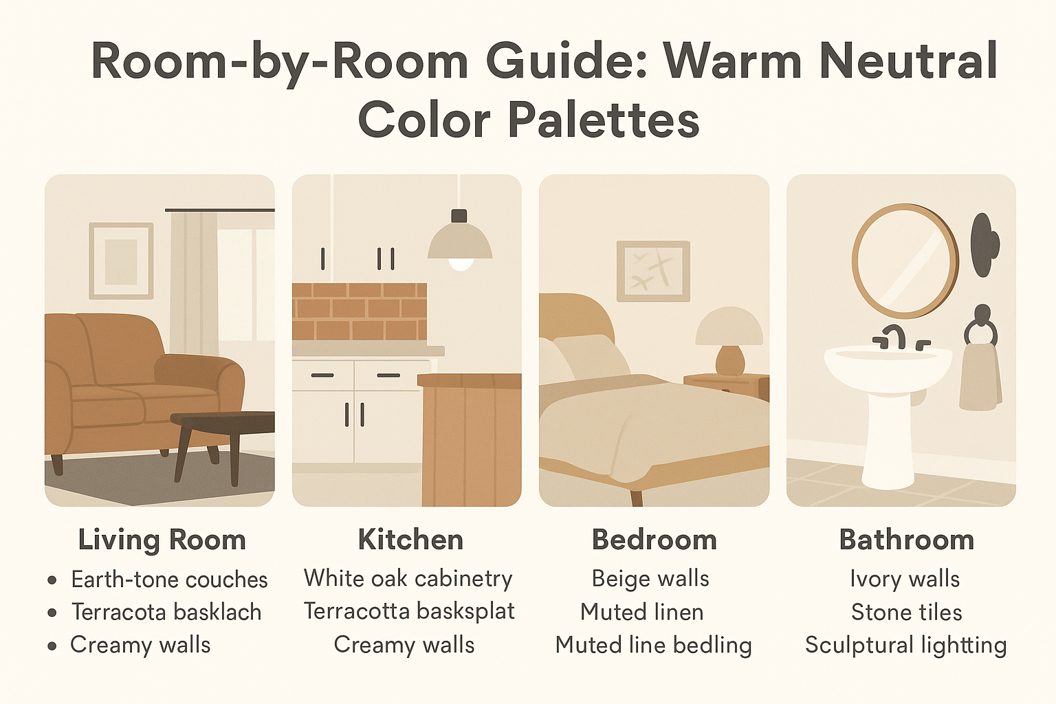
Not all warm neutrals work the same in every room. What flatters your living room can make your bathroom feel drab—or vice versa.
Here's a room-by-room breakdown that shows what works, what doesn’t, and how to bring warmth without going beige-overload.
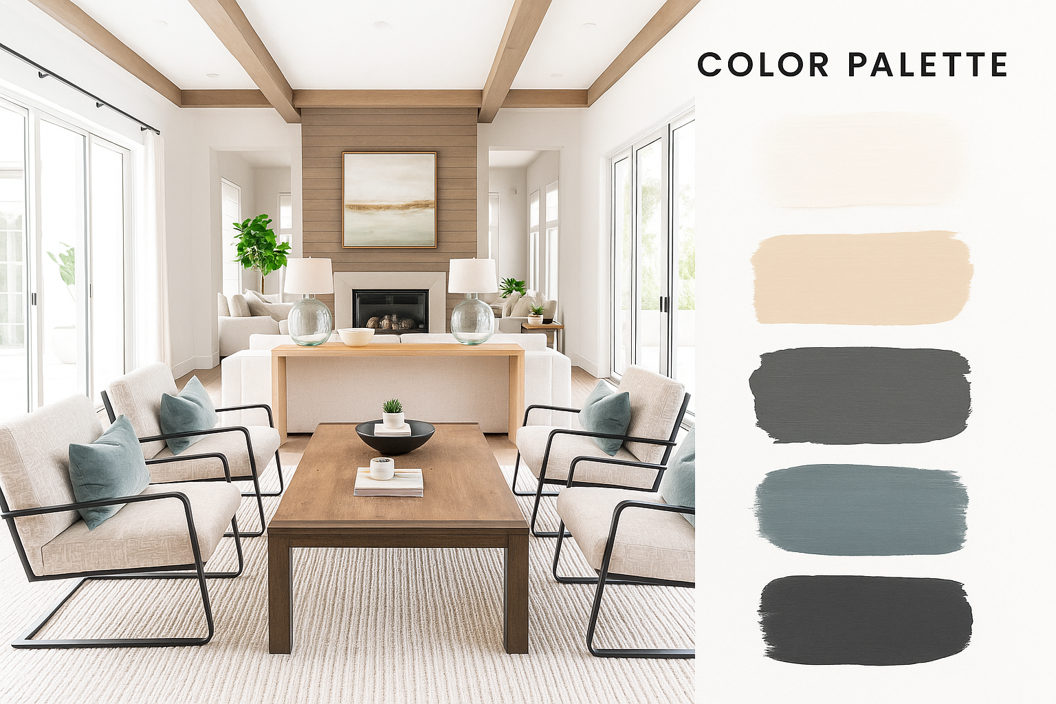
Living Room: Layered, Not Flat
Why it matters: This is usually your largest, most visible space—so neutral layering must look intentional, not bland.
What works:
● Walls: Soft warm gray or creamy greige
● Furniture: Earth-toned sofas (camel, cocoa, rust)
● Curtains: Light, breathable linen (white, flax, or oatmeal)
Pro Move: Use the 3-value layering trick
→ Light walls + medium furniture + darker floor or accents (like an espresso wood coffee table or black metal lamp)
Don’t do this: Matching everything in the same tone—it flattens the room and kills depth.
When to go bold: If your space gets tons of light, try a bold warm contrast—like a tan wall with a charcoal velvet couch. The key is balance.
Kitchen: Warm Without Looking Yellow
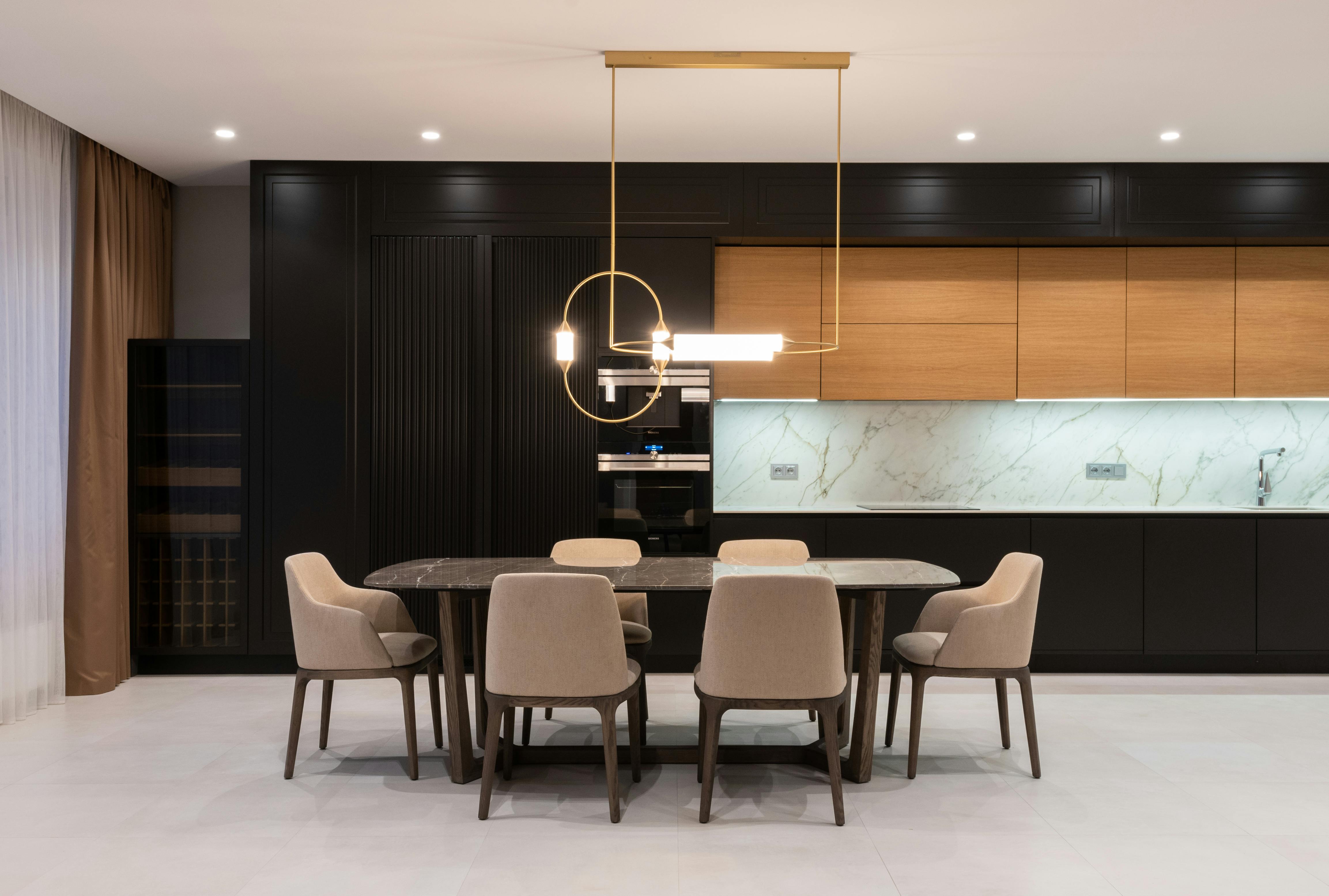
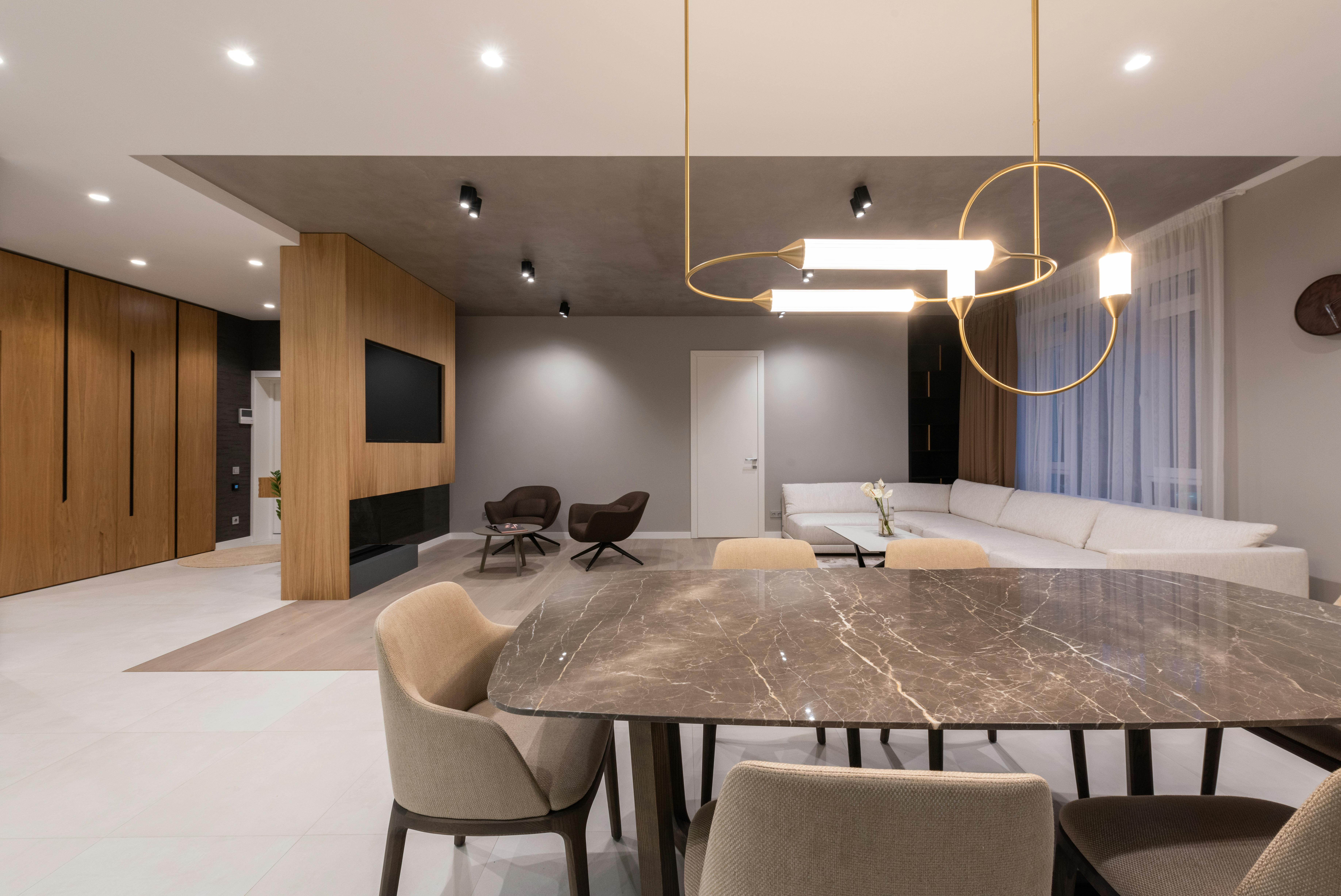
IMAGE: Dining room designed with a modern aesthetic, featuring natural calming colors and minimal furnishings to create a warm and relaxed atmosphere.
Why it matters: Kitchens have hard surfaces—tile, metal, cabinets—so warmth must be added consciously, not just assumed.
What works:
● Cabinetry: White oak or light walnut = timeless
● Backsplash: Terracotta, clay, or zellige tile = warm texture
● Walls: Creamy white, never stark
● Hardware: Matte black, antique brass, or even dark bronze
Design Tip: Warm metals help tie the space together and break the “too white” look that many modern kitchens suffer from.
Avoid: Overusing beige in a kitchen—it can read as dated if not layered with texture and contrast.
Pro Trick: Use a paint with a yellow undertone but zero shine. Semi-gloss finishes on warm colors can make them look plastic.
Bedroom: Calm, Cozy, Layered
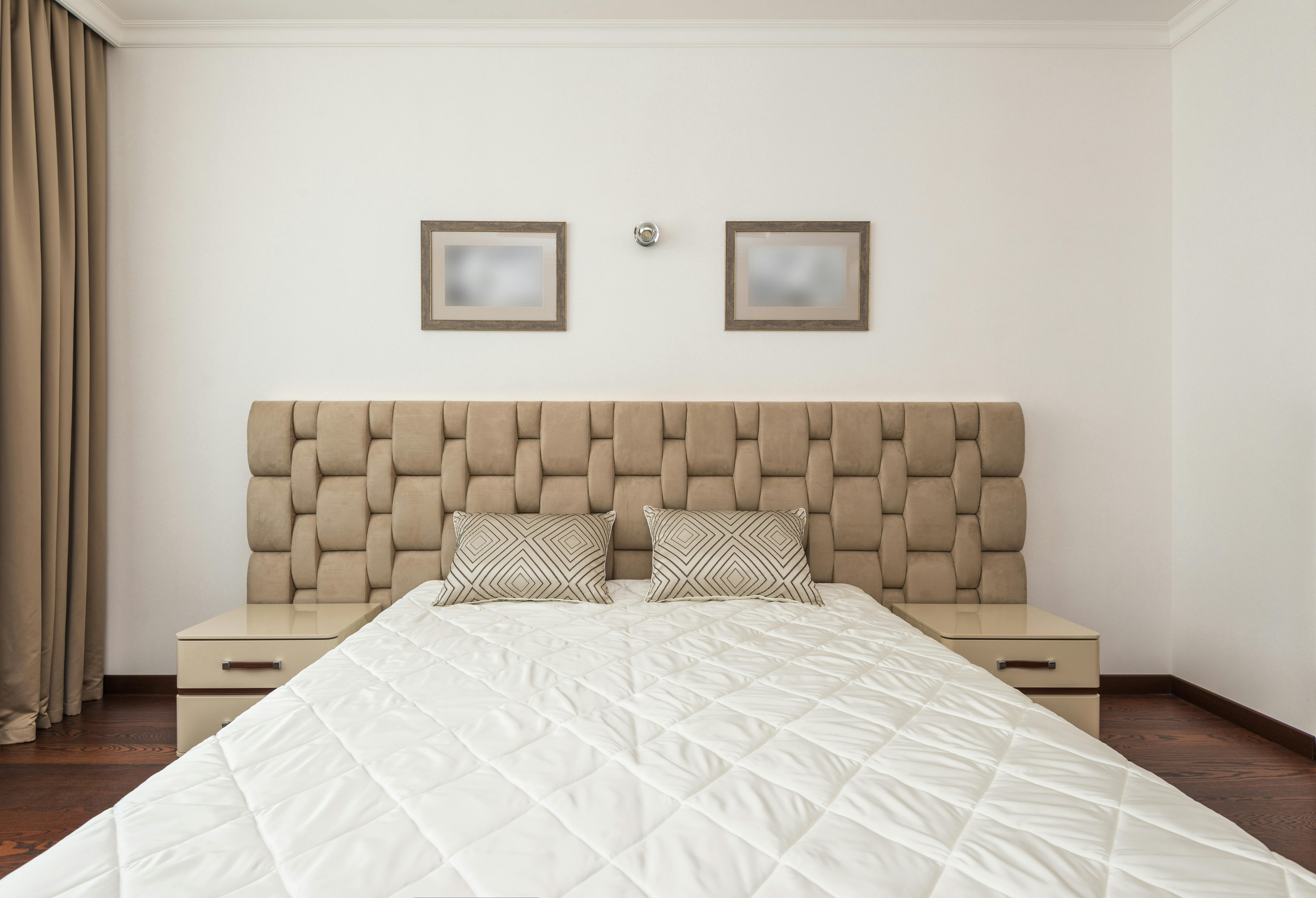
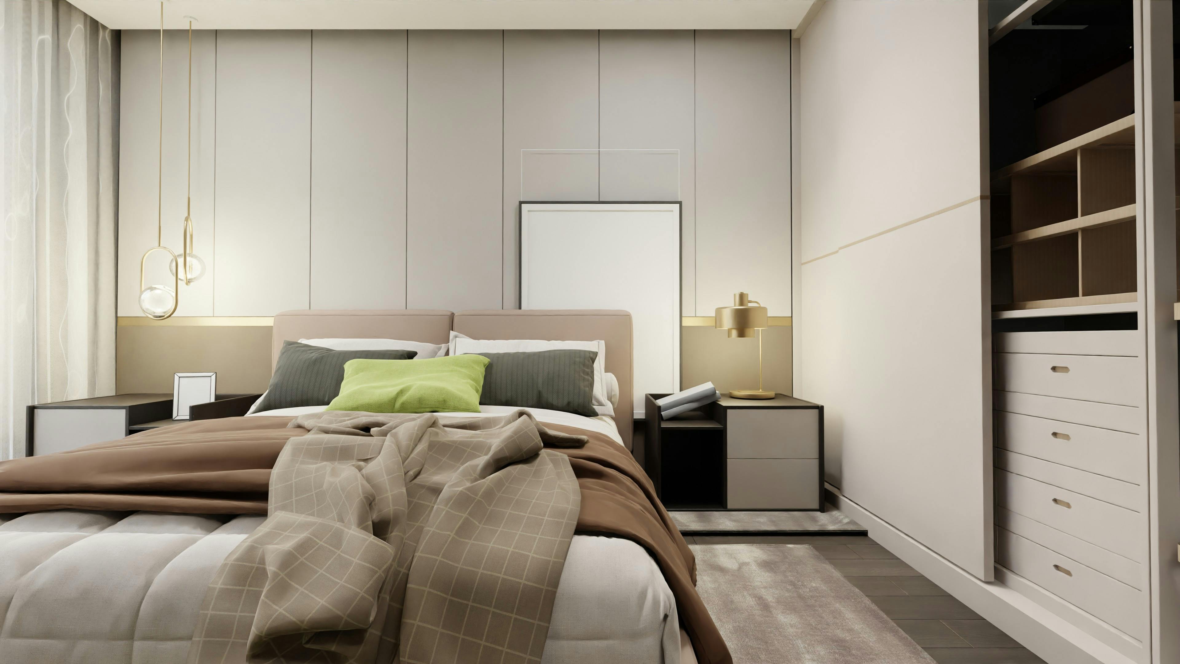
IMAGE: Stylish bedroom showcasing a neutral color scheme with soft textures and minimalist decor, designed for a peaceful and comfortable living space.
Why it matters: This is your retreat zone. Warm neutrals should feel comforting—not cold, busy, or too trendy.
What works:
● Walls: Taupe, mushroom gray, soft beige
● Bedframe: Walnut or oak with a natural grain
● Bedding: Linen, cotton, or gauze in stone, flax, or dusty rose
Textile Layering 101:
✓ Use soft-to-touch fabrics (bouclé, wool, jute)
✓ Blend tones (don’t match beige-on-beige—use blush, sand, taupe)
✓ Add a contrast item (like a charcoal knit throw or rust accent pillow)
Avoid: Glossy or cold textures. Warm neutral bedrooms die quickly if you throw in shiny plastics, cheap “faux” anything, or mismatched wood tones.
Bathroom: Neutral ≠ Boring
Why it matters: Bathrooms are often tiled and sterile. You need contrast and texture to warm them up.
What works:
● Wall Color: Ivory or warm white
● Tiles: Natural stone (limestone, travertine, sandstone)
● Fixtures: Matte black or brushed brass
● Extras: Woven baskets, sculptural mirror, stone soap trays
Use this combo for spa-vibes: Ivory walls + stone-look tile + curved mirror + single striking fixture (like a brass sconce or wood stool)
Pro Insight: Avoid sterile greys or high-gloss whites unless you balance them with something earthy—wood stool, clay vase, or even eucalyptus bundles.
Design Styles That Work Best with Warm Neutrals
Not every color works in every style. But warm neutrals? They adapt. Here’s where they shine—and how to pull it off.
Best Design Styles for Warm Neutral Palettes
1. Minimalist
Why it works:
Warm neutrals soften the hard edges of minimalist spaces. They prevent that cold, sterile vibe some minimal designs give off.
Do this:
▪ Use creamy whites or soft greige on walls
▪ Add texture: linen sofas, jute rugs, matte finishes
▪ Stick to 2–3 colors max for clean consistency
When to avoid:
If you need high visual contrast—this palette is more about calm than drama.
2. Japandi (Japanese + Scandinavian)
Why it works:
Japandi thrives on balance—between function and beauty. Warm neutrals add natural depth and bring calm to this highly curated style.
Pro touches:
▪ Choose oak, ash, and bamboo woods
▪ Pair warm taupes with matte black fixtures
▪ Keep silhouettes low, natural, and organic
3. Boho
Why it works:
Boho is layered, lived-in, and expressive. Warm neutrals create a base that lets colors, patterns, and textures shine without overwhelming the room.
Real-world trick:
▪ Start with a clay or beige wall
▪ Add vintage rugs, rattan chairs, and macramé
▪ Mix in warm metallics like brass or copper
4. Transitional
Why it works:
Transitional design is the sweet spot between traditional and modern. Warm neutrals support both ends—classic shapes and clean lines.
Tips:
▪ Use neutral upholstered furniture with modern silhouettes
▪ Mix soft beiges with dark woods or black trim
▪ Layer lighting: sconces, pendants, and floor lamps
5. Modern Farmhouse
Why it works:
Farmhouse used to be all whites and shiplap. Now, it’s evolving—warm neutrals modernize the look without losing the charm.
Execution tips:
▪ Choose creamy whites like Benjamin Moore’s Swiss Coffee
▪ Combine rustic wood beams with greige cabinets
▪ Add warmth through copper, leather, and textured linens
6. Mediterranean
Why it works:
This style is rich, earthy, and time-tested. Warm neutrals reflect natural materials—plaster walls, terracotta floors, sun-washed stone.
Focus here:
▪ Pair soft sand tones with deep olive or burnt sienna
▪ Use stucco, arched forms, and organic textures
▪ Mix neutrals with hand-crafted tiles or ceramics
Real-World Inspiration to Learn From
▪ Athena Calderone (Eyeswoon): Uses layered warm neutrals with modern, sculptural furniture—elegant but grounded.
▪ Studio McGee – “New Neutrals” Collection: Great for transitional homes—soft palettes with timeless structure.
▪ Muji-Inspired Interiors (Japan): Minimalist, neutral spaces with lots of raw wood, linen, and natural light.
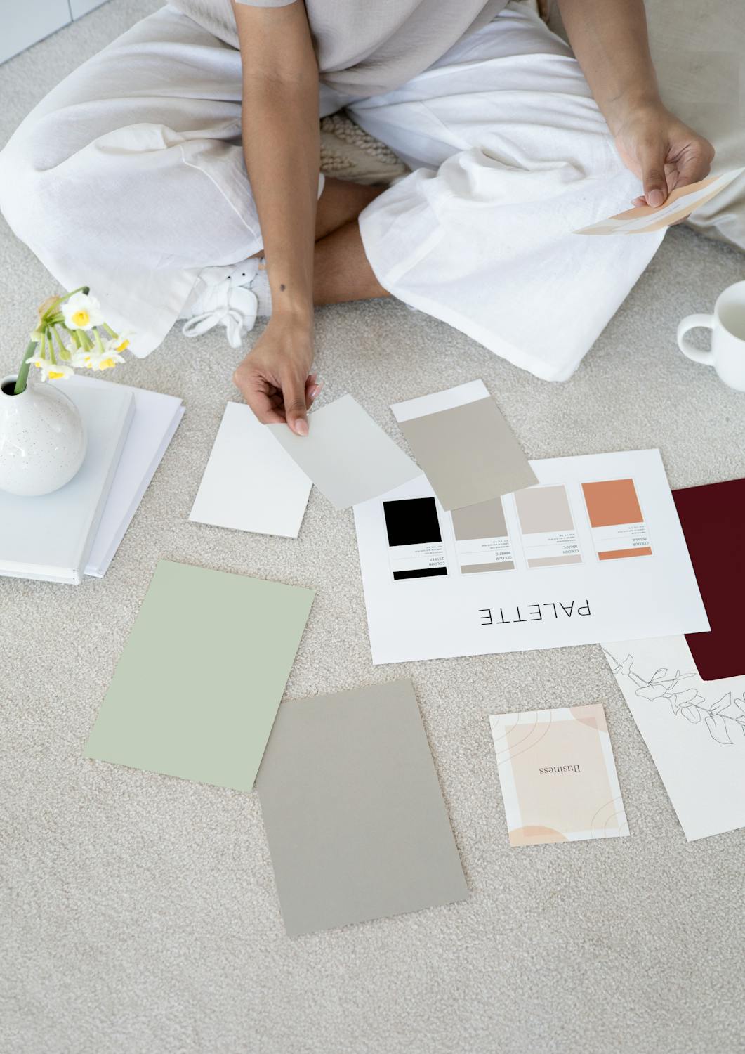
Pro Tip: Before committing to a full redesign, build a small sample board with materials, paint chips, and textures to see how warm neutrals behave under your home’s real light.
Branding & Digital Use
Why it works:
Warm neutrals are subtle yet elegant—perfect for brands aiming for a grounded, calming, and upscale look without overwhelming the viewer.
Where it fits:
-
Minimalist e-commerce stores (like Everlane or Glossier)
-
Lifestyle branding (interiors, skincare, wellness)
-
Wellness apps and coaching platforms
Tactical Tips:
-
Use low-contrast backgrounds for clean UIs
-
Pair with serif or soft sans-serif fonts
-
Stick to warm beiges, soft blushes, or muted clay for modern packaging
Design Tools to Try:
-
Canva's "Warm Neutrals" palette
-
Procreate’s neutral brushes + swatches
Exterior and Whole-House Color Schemes
Real Combos That Work:
-
● Revere Pewter siding + matte black windows (modern classic)
-
● Soft tan stucco + white trim (sun-friendly and timeless)
-
● Greige brick + muted green front door (earthy, grounded vibe)
-
● Ivory board-and-batten + natural wood deck (clean & coastal)
What to Focus On:
-
Contrast between siding and trim → keeps things fresh
-
Subtle warmth under daylight → test paint in AM, noon, PM
-
Balance with landscaping: native plants, wood tones, and natural stone
Common Mistakes to Avoid
✕ Don’t Do This:
-
Matching wall and trim colors exactly = flat and lifeless
-
Yellow-heavy neutrals all over = dated 2000s look
-
Beige overload = bland unless broken up
✓ Do This Instead:
-
Mix materials: rough stone, matte metals, raw wood
-
Break the space: light walls + darker trim or vice versa
-
Layer values: think light (walls), mid (furniture), dark (accents)
Pro Tip: Use at least 3 textures in one room (linen, boucle, cane) to avoid that flat, ‘builder basic’ look.
The Psychology of Warm Neutrals
Warm neutrals have a calming, stabilizing effect. Here's what they do:
-
Boost emotional warmth → perfect for living and dining rooms
-
Increase feelings of coziness and safety → ideal for bedrooms
-
Promote focus without overstimulation → great for home offices
Real Experience: Therapists and wellness brands often use warm beige or soft greige backgrounds in their offices and websites for this very reason—people stay longer, feel safer, and engage more.
Tools, Swatches & Free Resources
Take your warm neutral journey further with these free tools:
Try These:
-
Sherwin-Williams ColorSnap® Visualizer (upload your room photo)
-
Benjamin Moore Personal Color Viewer
-
Canva Hex-Neutral Generator for digital design palettes
-
Free Download: "Top 20 Warm Neutrals by Room" (PDF)
-
Printable Room Planner (PDF) → assign tones and textures room by room
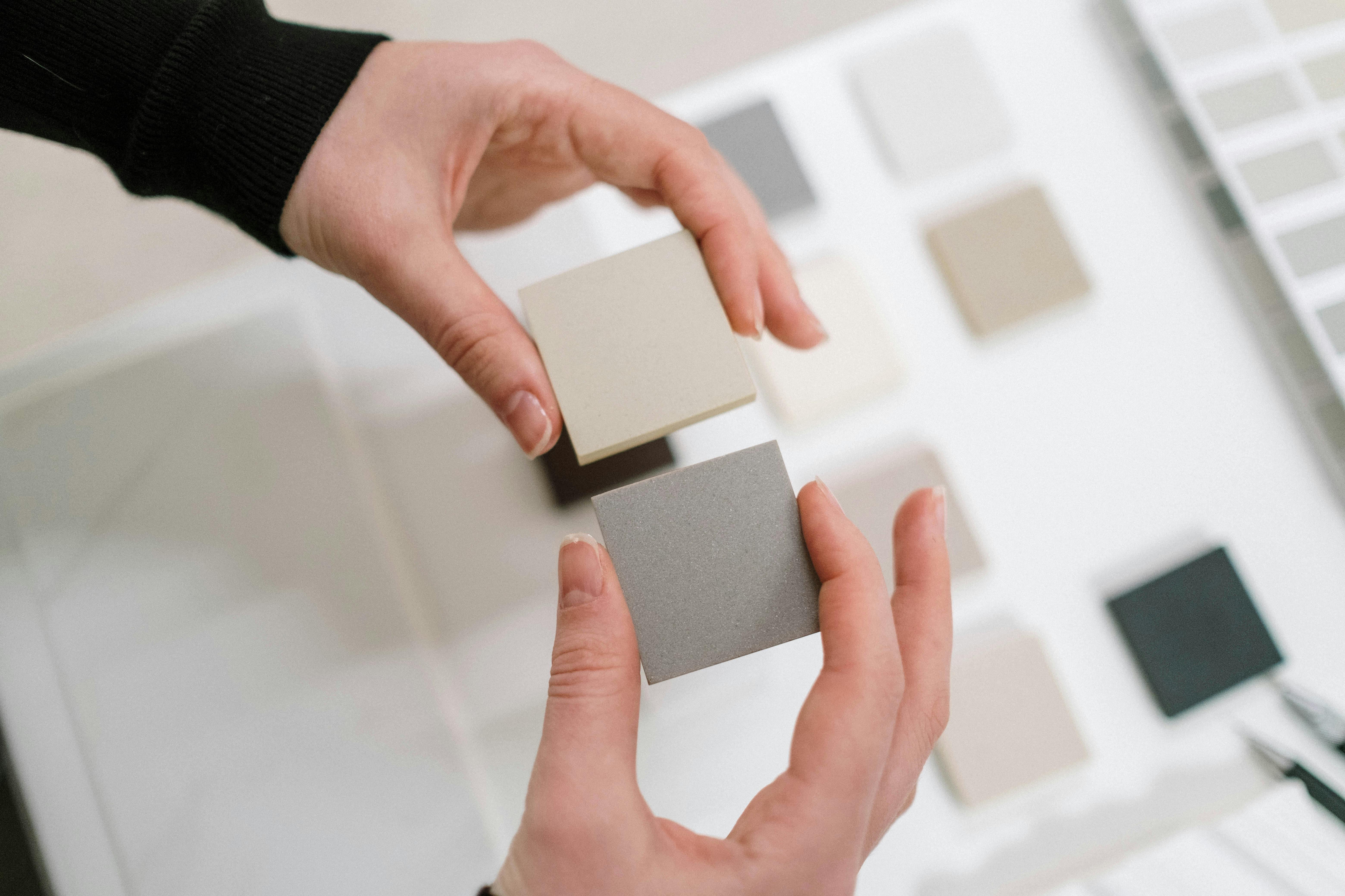
Bonus Tool: Use a peel-and-stick swatch from Samplize before committing to any wall color.
Bonuses
A Brief History of Neutral Colors
Neutral colors have quietly shaped architecture and interior design for centuries. They weren’t just aesthetic choices—they were practical, timeless, and culturally relevant.
● Ancient Rome: Neutrals appeared in limewashed stucco and clay walls. Shades of beige, off-white, and tan helped reflect light in sun-drenched villas.
● Renaissance Europe: Plaster interiors and warm ivory tones allowed frescoes and woodwork to stand out. Neutral backgrounds were used to elevate art.
● Mid-Century Movement: Architects like Le Corbusier favored neutral walls to calm the radical new forms of modernist furniture and layout. Beige and gray became symbols of restraint and clarity.
● 1990s Resurgence: Beige made a strong comeback with minimalist trends. Brands like Calvin Klein used it as a visual language for sleek, quiet luxury.
● 2020s Return: In today’s post-pandemic interiors, warm neutrals offer grounding, emotional calm. Think: earthy beiges, greige, and soft oatmeal tones.
Hex Codes and Color Swatches (Top Warm-Neutral Picks)
Here are some universally loved hex codes designers frequently turn to for digital and print use:
- #F5F5DC → Beige
- #D3D3D3 → Light Gray
- #A9A9A9 → Dark Gray
- #FAF0E6 → Linen
- #E6D8AD → Warm Tan
Pro Tip: These are great starting points for web design palettes, mood boards, or cross-brand consistency.
Specialized Neutral Palettes
Warm and neutral tones can be fine-tuned based on your goals:
● Beige Neutrals
Soft, sandy tones perfect for coastal, traditional, and minimalist interiors.
● Cool Neutrals
Great for modern and tech-forward designs. Use in spaces with lots of natural light.
● Earthy Neutrals
Rich in clay, tan, olive, and brown undertones. Ideal for rustic or Mediterranean themes.
● Gender-Neutral Palettes
Blends of taupe, oatmeal, soft gray, and sage. Often used in nurseries, branding, and public space design.
● Brown Neutrals
Chocolate, mocha, and espresso tones. Grounding and bold—excellent for contrast walls or masculine interiors.
● Dark Neutrals
Charcoal, deep greige, stormy brown. Use carefully to add drama without overwhelming.
Design Scenarios & What to Focus On
When to Choose Warm Neutrals:
- In rooms where you want comfort and a lived-in vibe
- To balance out cooler materials like metal, concrete, or glass
- When you’re layering multiple textures (jute, linen, boucle, wood)
- In older homes needing updates without losing character
When Not To:
- In north-facing rooms with little natural light (some warm neutrals may appear dingy)
- If you already have dominant warm tones in flooring (avoid overly yellow beiges)
- When seeking high-contrast or ultra-modern stark looks
Designers Known for This Style
These are designers and studios who have mastered warm neutral palettes:
● Studio McGee
Known for blending layered textures with modern farmhouse design using creamy whites, warm taupe, and natural oak.
● Jeremiah Brent
His interiors lean soft, minimal, emotional. Uses greige, sandy tones, and organic textiles.
● Amber Lewis
Famous for cozy, upscale California cool. Often combines warm whites, clay tones, and vintage elements.
● Norm Architects (Copenhagen)
Masters of Japandi fusion. Think beige walls, tactile textures, and quiet visual warmth.
Best Room Use Cases
● Bedrooms
Use oatmeal paint, layered bedding, and warm woods for calm and rest.
● Living Rooms
Greige walls, linen sofas, natural rugs. Anchor the space with earthy accents.
● Kitchens
Best in kitchens with a lot of natural light. Combine white oak, matte beige walls, and brushed brass fixtures.
● Mudrooms & Transitional Spaces
Durable, soft neutrals like greige or tan make these hardworking areas feel welcoming and clean.
Final Tip
Neutrals are not boring when treated with intention. They become powerful when layered with texture, varied tones, and the right contrast.
✦ Editor’s Picks: Books & Decor That Pair Beautifully with Warm Neutrals
A little texture, tone, or insight can take your neutral palette to the next level. Here’s what we personally love to keep the vibe grounded, cozy, and layered.
Books Worth Displaying & Reading
1. For the Love of White by Chrissie Rucker
→ A timeless favorite for clean, layered neutrals. Beautiful enough for a coffee table, inspiring enough for a mood board.
2. Made for Living by Amber Lewis
→ Amber’s relaxed neutral style is iconic. Think cozy linen, aged woods, and sun-washed palettes.
3. Homebody by Joanna Gaines
→ A warm farmhouse look with plenty of neutral palette inspiration that works in real homes, not just showrooms.
4. The New Mediterranean by Gestalten
→ For lovers of clay tones, olive wood, and raw natural textures—great for adding earthy neutrals to your space.
5. Pacific Natural by Jenni Kayne
→ Calm, nature-inspired interiors with tone-on-tone elegance—perfect for a minimalist warm-neutral home.
Decor Finds That Blend In Beautifully
• Linen Throw Pillow Covers (Set of 2)
→ Subtle texture in beige, taupe, or oatmeal. Elevates even the simplest sofa.
• Reclaimed Wood Floating Shelves
→ Add visual warmth and real materiality—especially effective against white or greige walls.
• Ribbed Ceramic Vases (Neutral Set)
→ Clean lines, soft shapes. Perfect for a console table or minimal centerpiece.
• Cotton-Linen Curtains in Warm White
→ A game-changer in rooms that feel too flat. Let the light filter through.
• Sculptural Table Lamp in Matte Clay
→ Doubles as art and lighting. Pairs best with ivory or soft tan walls.
✤ How to Make These Work
-
Stick to 2–3 material types per room: linen + wood + ceramic = magic
-
Pair each “find” with a purpose: Lighting? Texture? Height? Don’t overdo it.
-
Curate, don’t clutter: Warm neutrals shine with fewer, better pieces.
All items available on Amazon. We only recommend what we’d style with ourselves.
(As an Amazon Associate, we may earn from qualifying purchases.)
FAQ
Q: Are warm neutrals good for small spaces?
A: Yes, especially creamy tones or greige. Avoid stark cool grays.
Q: Best warm neutrals to pair with navy blue?
A: Try Revere Pewter, Soft Taupe, or Natural Cream.
Q: Trending warm neutrals for 2025?
A: Sherwin: Persimmon • Behr: Blank Canvas • BM: White Dove
Q: Should ceilings match the wall?
A: No. Use 1–2 shades lighter for soft separation.
