Minimalist home design gets oversimplified fast.
People reduce it to white walls, one chair, one vase, no mess. That is the version that photographs well and ages badly.
Good minimalism is not about making a house look empty. It is about making the house feel calm because the layout is clear, the storage is quiet, the light is doing work, and nothing in the room is fighting for attention.
That is the part worth keeping. Not the performance of owning less. Not the cold showroom look. The deeper idea: a home can feel lighter when the plan is smarter, the materials are more disciplined, and the furniture has enough reason to be there.
This is where the article stays. What minimalist home design is, what most people get wrong, which versions still hold up, and how to make a minimalist house feel settled instead of underfurnished.
The Main Misunderstanding
Most bad minimalist interiors are not minimalist. They are just ordinary rooms with half the furniture removed.
That is why so many of them feel unfinished. The layout is still weak. The storage is still missing. The lighting is still generic. The proportions are still off. The room only looks sparse because people took things out.
Minimalism works when subtraction is supported by design discipline. The plan has to carry more. The joinery has to carry more. The materials have to carry more. The light has to carry more. If those parts are not doing their job, the room just feels underdressed.
What Minimalist Home Design Is Trying to Do
At its best, minimalist design is not trying to impress you with emptiness. It is trying to remove friction.
- Less visual noise. Fewer competing shapes, colors, finishes, and objects.
- Clearer movement. Rooms that are easier to walk through and easier to use.
- Better emphasis. One window, one wall, one table, one material transition doing the heavy lifting.
- Calmer maintenance. Fewer surfaces collecting clutter, fewer bad storage habits, fewer decorative decisions to manage.
- Longer visual life. A room that does not depend on trend pieces to stay interesting.
In practice, minimalist homes are usually strongest when they are built around proportion, storage, light, and material restraint rather than around a shopping list.
Storage, Not Furniture, Is the Real Luxury
This is the part people miss.
The best minimalist homes do not look calm because the owners magically own nothing. They look calm because the house knows where things go.
That means full-height wardrobes that do not waste corners. Entry storage that catches bags, coats, shoes, and mail before they spread. Kitchen storage that hides the small appliances people use every day. Bathroom storage that keeps counters from becoming a pharmacy shelf. Built-in millwork that turns dead wall length into quiet capacity.
Without that, minimalism becomes a chore. You spend your life putting things away in a house that never planned for real living.
That is why storage is the more serious minimalist move than buying a sculptural chair. A clean room is often a planning victory, not a styling victory.
What Makes a Minimalist Home Feel Good Instead of Cold
The rooms that hold up usually share the same ingredients.
| Element | What Helps | What Usually Goes Wrong |
|---|---|---|
| Layout | Clear circulation, sensible furniture spacing, one readable focal point | Too much open space with no hierarchy |
| Storage | Built-ins, concealed utility, entry and bedroom capacity | Trying to look minimal without enough places to put things |
| Light | Natural light, soft artificial lighting, layered control | One harsh ceiling fixture doing everything |
| Materials | Few finishes, honest textures, controlled contrast | Flat white surfaces with no depth or warmth |
| Furniture | Fewer pieces, better scale, cleaner silhouettes | Removing too much and leaving the room unresolved |
| Decor | Selective, purposeful, quieter objects | Either no personality at all or one trendy object in every corner |
Minimalist House Types That Still Make Sense
Minimalism is not one look. It shifts depending on climate, materials, and how much warmth you want in the room.
Japanese-leaning minimalism
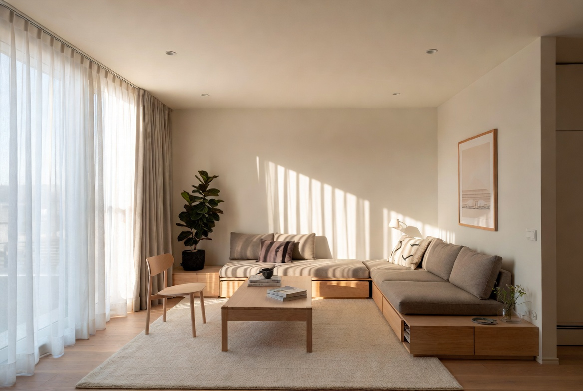
This is the version most people picture first. Quiet rooms. low furniture. natural wood. careful emptiness. strong relationship between inside and outside. It works best when the architecture is disciplined enough to support it.
It fails when people copy only the emptiness and miss the craft, proportion, and material richness underneath.
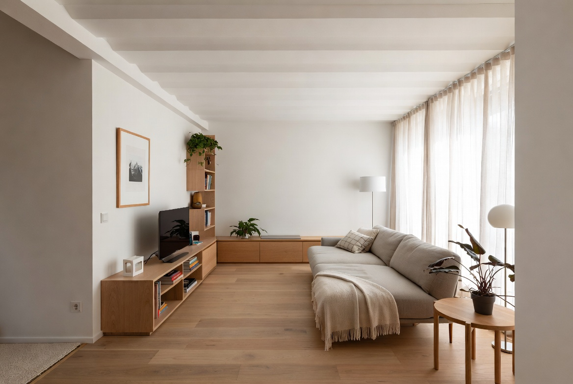
Warm minimalist design
Usually the most livable version. Soft neutrals, pale oak, plastery walls, linen, wool, fewer hard contrasts. This is the minimalist language that feels calm without becoming severe.
Industrial minimalism
More contrast. More steel, concrete, darker lines, and sharper edges. It can look excellent when the shell has enough character to support it. It can also turn stiff very quickly if every finish tries to look tough at the same time.
Worth Knowing. If that sharper direction is what you are after, Scandinavian industrial minimalism is a better reference point than the usual all-black loft clichés.
Tropical or climate-open minimalism
This works through shade, ventilation, larger openings, lighter materials, and an easier indoor-outdoor relationship. In hot climates, minimalism often looks better when it feels breathable rather than sealed and gallery-like.
Minimalist Interiors Start With Space Planning, Not Decor
If the plan is clumsy, minimal decor will not rescue it.
That is why minimalist interiors are usually strongest when they begin with movement, furniture scale, and zoning before anyone picks a pendant or a chair.
- Leave honest circulation. Do not fill the room just because you own the floor area.
- Anchor one zone properly. A conversation area should read as one composition, not as chairs drifting around a coffee table.
- Respect wall length. One well-scaled cabinet or sofa usually does more than several smaller pieces.
- Use rugs correctly. A rug that is too small makes a minimalist room look cheaper, not cleaner.
- Let one element lead. The window, fireplace, long view, dining table, or built-in should usually organize the room.
This Part Matters. For the deeper layout side of this, Space Planning Essentials for Functional Design is the better companion read.
The Best Minimalist Idea Is Not a Product
It is restraint with a reason.
Minimalist rooms fall apart when every decision is made one item at a time. One trendy chair. One neutral rug. One sculptural lamp. One expensive faucet. That approach creates a room full of individually tasteful things that still do not belong to each other.
The better move is to choose a small number of rules and let them control the room:
- one main wood tone
- one quiet wall color family
- one dominant metal finish, or at most two
- fewer furniture legs and profiles competing in view
- closed storage wherever daily mess tends to spread
That is how minimalism starts to feel architectural instead of decorative.
How to Make Minimalism Feel Warm
Minimalism does not need more objects. It usually needs better texture.
This is where a lot of minimalist homes go flat. Everything is pale, but nothing has depth. Everything is clean, but nothing has touch.
Warm minimalist rooms usually rely on a few quiet moves:
- matte walls instead of glossy ones
- wood with visible grain instead of plastic-smooth imitation
- linen, wool, boucle, or cotton where the room needs softness
- stone or ceramic with some natural variation
- lighting at more than one height
Minimalism feels harsh when every surface reflects the same way and every edge is equally hard. It feels good when roughness and smoothness are balanced.
Exterior Minimalism Is Harder Than It Looks
A minimalist exterior can look calm and expensive. It can also look like an unfinished developer box.
The difference usually comes down to proportion, openings, and material control.
- Rooflines need discipline. Simple roofs are unforgiving when the massing is awkward.
- Windows need rhythm. Minimal exteriors depend heavily on how openings are aligned and sized.
- Materials need restraint. Two or three strong exterior materials are usually enough.
- Entries matter more. If the facade is simple, the front door, threshold, and approach do more visual work.
- Landscape is part of the composition. Minimalist houses often rely on planting and hardscape to keep the exterior from feeling blank.
When minimalist exteriors fail, they usually fail because the design removed detail without replacing it with better proportion.
Small Minimalist Homes Need More Discipline, Not More Purity
Small apartments and compact houses often benefit from minimalist thinking more than large homes do.
But small-space minimalism is not about pretending you live with three objects. It is about making every square foot work harder.
- Use furniture that earns its footprint. Storage beds, benches with compartments, extendable dining tables, integrated desks.
- Keep visual continuity. Too many small material changes make a compact home feel tighter.
- Build upward. Tall storage usually beats wider storage.
- Keep floors clearer. Wall-mounted pieces and floating millwork help small rooms breathe.
- Let one thing disappear. In small spaces, the smartest minimalist move is often hiding the ugliest daily-use item.
One More Thing. The overlap between minimalism and better day-to-day function is clearest in creating beautiful and functional spaces, because the rooms that feel simplest are usually the ones that were planned hardest.
What to Buy Less Of
A lot of minimalist advice tells people what to buy. The better advice is often what to stop buying.
- tiny accent furniture that never quite belongs anywhere
- decor whose only job is filling a shelf
- multiple wood tones in the same sightline
- furniture sets that flatten the room
- storage baskets bought to compensate for no proper storage plan
- overscaled lighting in rooms that want calm
- trend pieces chosen because the room still feels unfinished
Minimalism gets easier when the room no longer has to digest so many weak decisions.
FAQ
What is the biggest mistake in minimalist home design?
Treating minimalism like an object count instead of a design strategy. Most failures come from weak planning, weak storage, and weak material decisions, not from owning too much.
Can a minimalist home still feel cozy?
Yes. In many cases it feels better once texture, lighting, and scale are handled properly. Warmth usually comes from materials and proportion, not from adding more accessories.
What colors work best in minimalist interiors?
Usually restrained ones. Off-whites, warm grays, stone tones, muted browns, natural wood, soft black, and desaturated greens all work well. Pure white everywhere is often harder to live with than people expect.
Is minimalism only for large houses?
No. Smaller homes often benefit more from it. But they need better storage, better zoning, and better furniture choices for it to work.
What is more important in minimalism: furniture or storage?
Storage. Good minimalist rooms usually feel calm because they can absorb daily life without showing all of it.
Does minimalist design increase resale appeal?
Often yes, when it is done with warmth and restraint. But sterile rooms and underfurnished rooms can feel unfinished rather than desirable.
Bottom Line
The best minimalist homes are not empty. They are edited with conviction.
They know where things go. They know what matters in the room. They do not ask decor to rescue a weak plan. They do not confuse less furniture with better design.
That is why the strongest minimalist idea is not a sofa, a color, or a famous house reference. It is quieter than that. Build in more storage. simplify the layout. reduce the material noise. let the light do more.
Then the room stops looking minimal and starts feeling easy. That is the version worth keeping.