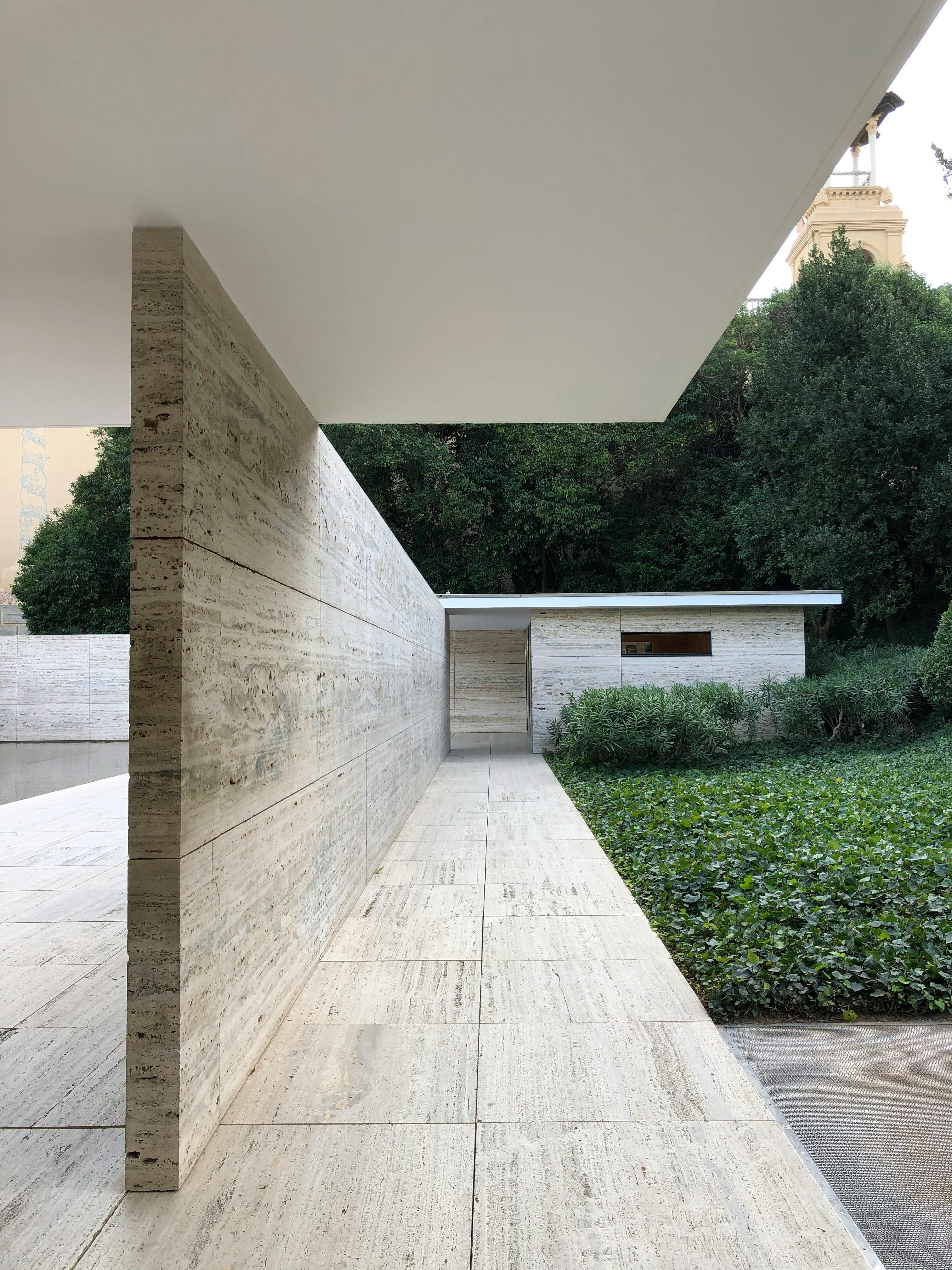
Image: Barcelona Pavilion in Spain, designed by Ludwig Mies van der Rohe, emphasizing linear forms with long horizontal lines and a minimalist structure that creates a sense of openness.
Architectural Form in Real Design: What It Is, Why It Matters, and How It Works in and out of Buildings
Quick Overview:
Form isn’t just how a building looks—it’s what it feels like, how it functions, and how it fits into the world around it. Below, we’re talking real examples, both exterior and interior, that show how form shapes everything from bold modern facades to subtle, cozy spaces.
Most people think “architectural form” just means the outside shape of a building. But that’s only part of the story. Form is about how space flows, how light moves, and how structure supports both style and function. It’s not decoration—it’s design with purpose.
I’ve worked on everything from compact homes to large commercial projects, and the same truth always holds: when the form is off, everything else struggles. When it works? The space just feels right.

Below, we’ll break down:
-
What architectural form actually means in practical terms
-
How it works across both exterior and interior design
-
The evolution of form (and why it still matters today)
-
Real examples from classic and modern buildings that nailed it
-
Common mistakes (and how to avoid them)
Let’s get into the stuff that actually helps you build better spaces—starting with what form is really all about.
Key Architectural Forms and Examples
Architectural form isn’t just visual—it shapes how a space works, how it feels, and how people move through it. Think of it like this: every shape has a purpose. When used well, form solves problems and creates moments. When used wrong? It just takes up space and budget.
Key Architectural Forms: What Works, Where, and Why It Matters
Below, we’re not just listing types—we’re breaking down how these forms behave in real projects and where they actually make sense to use.
1. Geometric Forms
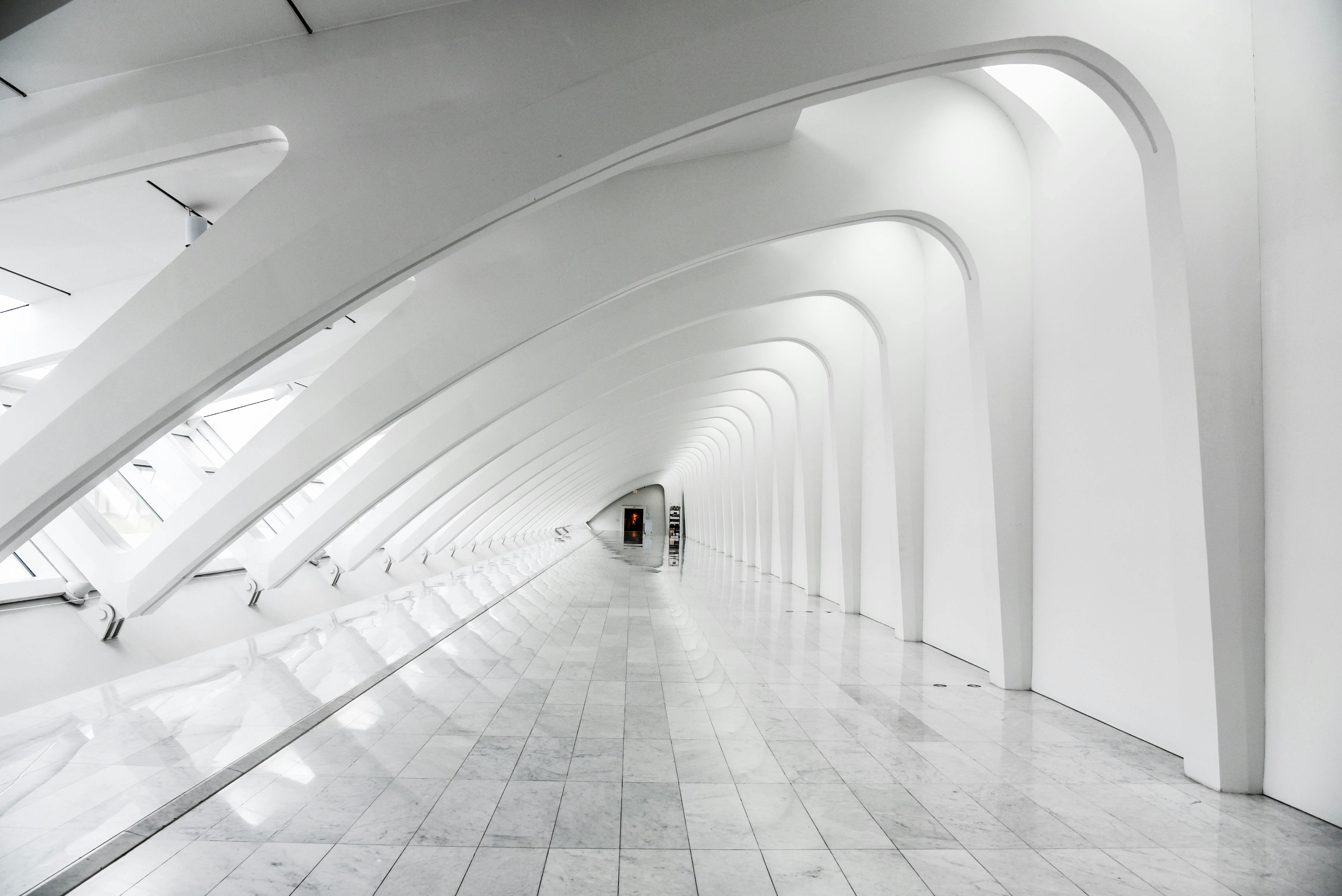
Image: White dome interior in Milwaukee captured with long exposure, showing how geometric form enhances function through open space, symmetry, and natural light flow.
When to Use Them: When you need clarity, balance, or modular repetition.
Why They Work: Simple shapes = simple construction. Clean lines = clean design.
Real-World Example:
Frank Lloyd Wright’s Fallingwater.
The stacked rectangles mirror the rock ledges of the site. The result? A home that feels like it grew out of the landscape instead of sitting on top of it.
Pro Insight:
▪ Great for homes, office buildings, minimalist interiors.
▪ Easy to plan, build, and furnish around.
▪ Works well with passive solar strategies—sun loves straight edges.
2. Organic Forms
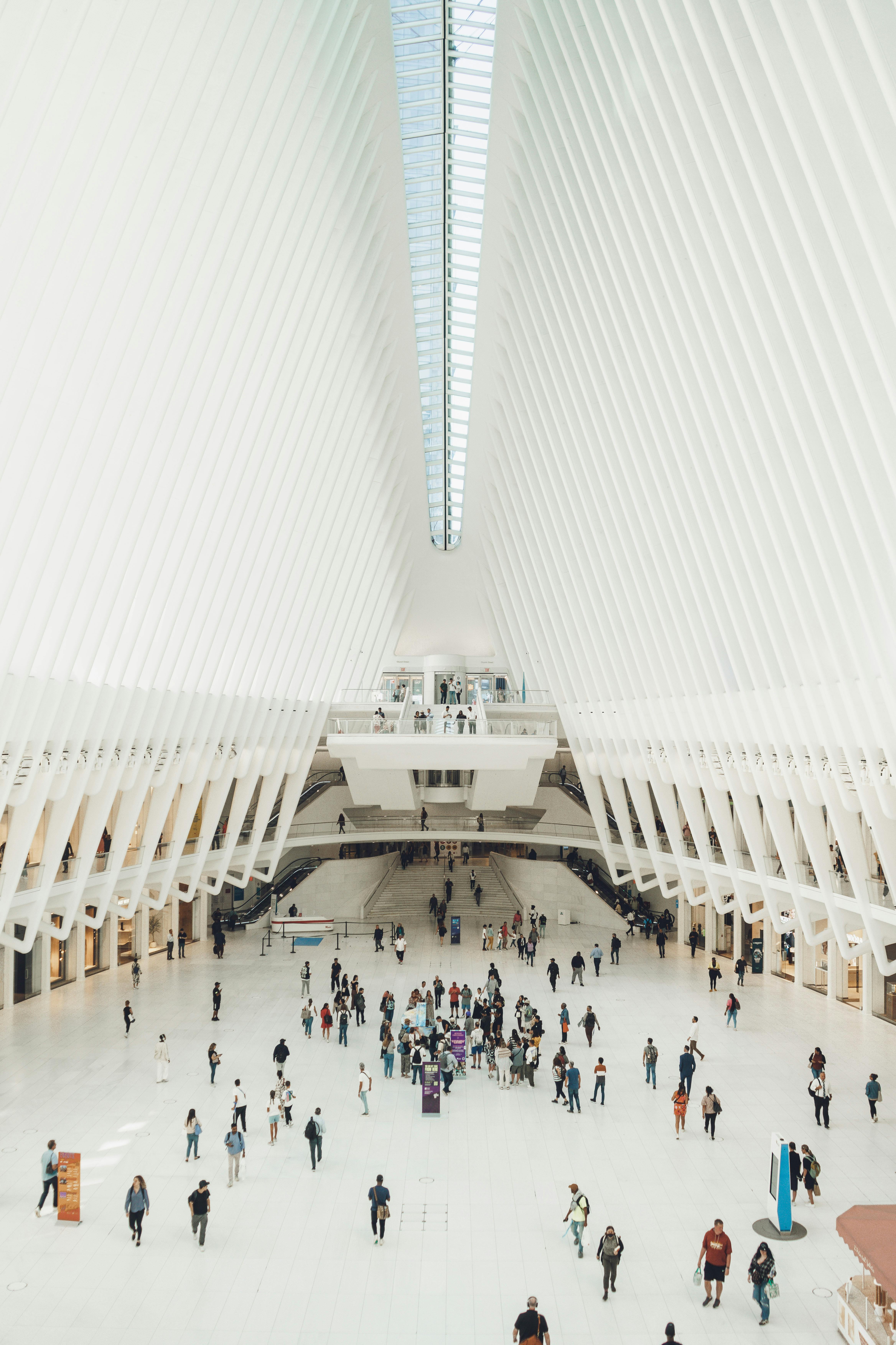
Image: Interior of the Oculus in New York, featuring its organic, curved design, demonstrating how form enhances the flow of space and light in a public environment.
When to Use Them: If you want emotion, movement, or something that feels alive.
Why They Work: Curves create flow. Asymmetry brings surprise. It’s about how the building feels, not just how it looks.
Real-World Example:
Gaudí’s Casa Batlló in Barcelona.
The facade ripples like ocean waves, with details that echo coral, bones, and fish scales. It’s weird, yes—but in the best way.
Pro Insight:
▪ Perfect for museums, cultural buildings, creative studios.
▪ Not cheap—organic forms are tricky to engineer and build.
▪ Materials matter: plaster, wood, clay, and 3D-printed composites work better than rigid steel or flat paneling.
3. Free-Form Structures
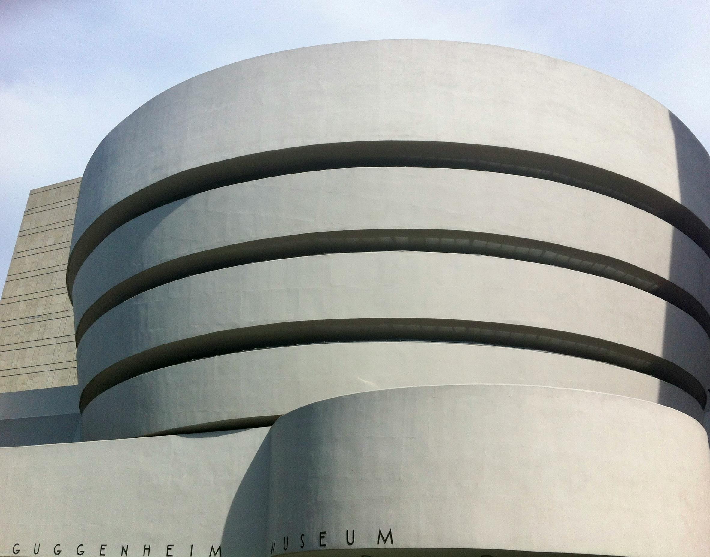
Image: Facade of the Guggenheim Museum in New York, featuring its iconic free-form design with organic, curving lines and asymmetrical shapes that challenge traditional architectural forms.
When to Use Them: When rules don’t apply. You’re making a statement—or rethinking structure from scratch.
Why They Work: They push design forward. Sometimes chaotic, sometimes genius, always bold.
Real-World Example:
Frank Gehry’s Guggenheim Museum Bilbao.
It’s metallic chaos—but with purpose. It changed how we think about museums. It also helped turn around Bilbao’s entire economy.
Pro Insight:
▪ Great for branding, iconic structures, or once-in-a-lifetime builds.
▪ Not budget-friendly. Not beginner-friendly.
▪ Requires smart material strategy—composites, steel skins, or glass fiber systems.
4. Clustered Forms
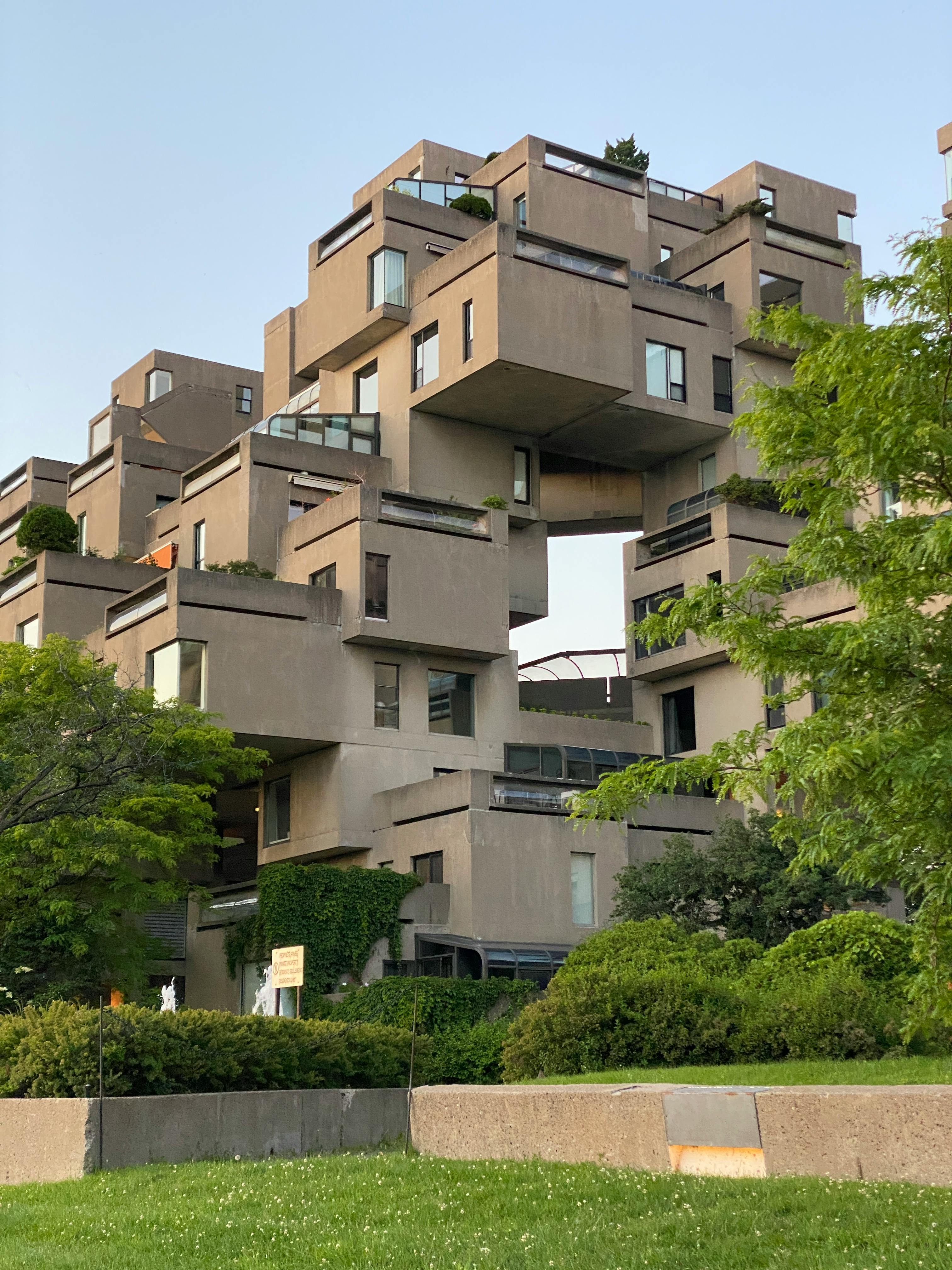
Image: Habitat 67 residential building in Montreal, showcasing clustered forms with modular units arranged in an innovative, interlocking design to create a unique urban structure.
When to Use Them: To break down big volumes into human-scale units.
Why They Work: Feels dense without feeling overwhelming. Creates interesting transitions between indoor and outdoor space.
Real-World Example:
Habitat 67 in Montreal.
Architect Moshe Safdie took prefab concrete units and stacked them like Legos. The result? A housing complex that feels like a village instead of a monolith.
Pro Insight:
▪ Ideal for modular builds, affordable housing, co-living setups.
▪ Can feel chaotic if the logic isn’t clear.
▪ Circulation (hallways, stairwells) becomes critical—don’t let it become a maze.
5. Linear Forms
When to Use Them: When you want visual flow or need to stretch a project across a narrow site.
Why They Work: Long lines feel intentional and directional. They help orient people and let natural light in.
Real-World Example:
Le Corbusier’s Villa Savoye.
It’s all about horizontal lines—creating rhythm and openness. It’s light, it’s airy, and it’s functional.
Pro Insight:
▪ Great for corridors, galleries, narrow lots.
▪ Can feel cold or sterile if not balanced with warm materials.
▪ Lighting strategy is key—linear forms love light strips, clerestories, and elongated openings.
Want to Make Forms Work? Here’s What to Focus On:
▪ Context: Start with the site. Urban? Rural? Sloped? Flat? Let the form respond.
▪ Function: Don't just pick a shape because it looks cool. What will happen in that space?
▪ Materials: Your form needs to match what your materials can actually do. Don’t fight physics.
▪ Flow: Good form guides movement. It invites people in. It tells a story.
Why Form Actually Matters
How the Shape of a Building Shapes Everything Else
Let’s cut to it: form isn’t just what a building looks like from the outside. It controls how people move through it, how it functions, and how it feels to actually use.
You’re not just designing a box — you’re setting up an experience.
● A centralized form makes sense for spaces where you want people to easily find their way, like offices or hospitals.
● A clustered form is better when you’re working with different zones, like schools, museums, or community centers.
Real Project: Cultural Center with Mixed Use
On one of our past builds, we were asked to design a cultural center that could handle both big events and quiet workshops. We didn’t want one function overpowering the other.
So what did we do?
We went for a clustered layout — smaller workshop rooms branching off from a central atrium. The form naturally guided people where they needed to go, without signage overload or awkward transitions.
Each room had its own identity, but the entire space still felt connected. That’s form working quietly in the background, holding everything together.
How Form Evolves with Design Thinking
Architectural form isn’t stuck in the past. Here's how it's shifted:
▪ Classical Forms → Symmetrical, geometric, predictable. Think Greek temples or Renaissance cathedrals.
▪ Modern Forms → Clean lines, function-first. Example: Fallingwater by Frank Lloyd Wright.
▪ Free-Form & Organic → Curves, complexity, digital fluidity. Example: Guggenheim Bilbao by Frank Gehry.
Each shift wasn’t random—it came from new materials, new needs, and new tech. The same will keep happening.
So Why Should You Care?
Because form shapes experience. If it’s done right, people don’t even notice—it just feels good. But when it’s off, everything feels wrong, even if they can’t say why.
Good form doesn’t scream for attention. It quietly guides, balances, and elevates everything else.
Related: Introduction to Architecture: A Beginner’s Guide to Building Design
How Technology is Redefining Form

Image: Heydar Aliyev Center in Baku, Azerbaijan, designed by Zaha Hadid, showcasing her signature fluid, organic forms with sweeping curves that defy traditional architectural styles
How Tech Is Changing the Way We Shape Buildings
Here’s the thing—technology didn’t just speed things up, it completely changed how we think about form. Back in the day, we were limited by what we could draw, what we could build, and what materials could handle. Now? Not so much.
Today, we can design forms that twist, float, bend, even grow—without guessing if it’ll work. Let’s talk through what that actually looks like in real projects.
BIM: Like X-Ray Vision for Your Building
BIM (Building Information Modeling) isn’t just some fancy software. It’s like a full 3D brain for your project. You get to see everything—from walls and plumbing to light angles and material stress—before anything gets built.
Here’s why that matters:
▪ You want to curve a ceiling into a wall? BIM tells you if it’ll collapse or work like a charm.
▪ You want to push a kitchen wall by 12 inches? BIM shows if the structure still stands.
▪ You forgot the HVAC duct needs to pass through? BIM catches it before you pour concrete.
We once caught a duct system that would’ve gone straight through a skylight—before the drywall even got ordered. That’s the kind of stuff BIM saves you from.
Parametric Design: You Set the Rules, the Shape Follows
Think of it like this: instead of drawing a shape, you teach the computer what matters—light, views, slope, space—and it plays with the form until everything clicks.
Let’s say:
-
You want the building to catch morning sun ✔
-
You need to fit 3 apartments per floor ✔
-
You don’t want the hallway to feel like a tunnel ✔
You tell the computer all that, and it adjusts the shape automatically—curving walls, shifting windows, sloping roofs. It’s like design chess, but with the computer as your assistant.
Zaha Hadid’s team does this all the time. That swoopy, wave-looking Heydar Aliyev Center? That shape isn’t just cool—it’s optimized for how people move, where sun hits, and how the roof drains.
3D Printing Buildings? Yep, It’s Real
You’ve probably heard of 3D printing a model. But now we’re printing actual bridges, walls, even entire homes.
One standout is the MX3D Bridge in Amsterdam—a fully 3D-printed steel bridge made by robots. No traditional construction. No scaffolding. Just layers of metal being printed in mid-air.
So what’s cool about this?
▪ No mold, no waste, no mess
▪ Crazy forms that would cost a fortune the old way
▪ You can “draw” the shape in air—literally—and print it
This changes everything. Think curved garden walls, organic benches, complex panels—you can design them on Monday and print them by Friday.
What It Means for You (or Anyone Designing Today)
Before all this? You had to play it safe or spend a fortune testing wild ideas. Now?
● You can actually test those wild ideas before a single brick is laid
● You get to see the whole thing in 3D—structure, systems, sunlight—before committing
● You can let tech handle the calculations while you focus on the vibe and layout
And honestly? It makes design way more fun. You’re not stuck with flat walls and boring boxes. You get to experiment. Try things. And know you’re not building a disaster.
Tech Doesn’t Replace You
You still need taste. You still need good instincts. The software won’t tell you if your entrance feels cold, or if your living room is awkward to move through. That’s on you.
But what it does do is take the pressure off—so you can be bolder, smarter, and more creative with your forms.
Examples: What We Sketched vs. What Tech Actually Made Happen

You ever sketch something that looks great on paper—balanced, bold, clean—but then as soon as you try to build it, everything falls apart?
Yeah. We’ve all been there.
The truth is, designing with tech isn’t about replacing sketching—it’s about turning those ideas into buildable, optimized forms that actually make sense in the real world.
Let me show you a few real examples.
● Sketch: A Clean Arched Entrance
We had this classic Mediterranean sketch—rounded arch, simple plaster finish, nice proportions. Looked great on paper. But when we ran it through BIM?
Surprise:
That arch would’ve caused a weird shadow pattern at 4 PM that made the entryway look like a cave. Also, the drainage line sat right in the middle of the support column.
What Tech Fixed:
We adjusted the curve using parametric software to soften the angle, repositioned the drainage, and added recessed lighting directly above the arch. The final result kept the same vibe—but it actually worked.
● Sketch: Curved Roof Overhang
You know those gently sloping eaves that look amazing in sketches? We did one with layered wood strips—meant to blend into a hillside landscape.
But in 3D modeling:
The wind load calculations made it a nightmare. The curve would catch too much wind and potentially warp without a $20K structural frame.
What Tech Made Possible:
We re-formed the shape to include micro-notches that reduced drag (yeah, basically like spoilers on a race car). Same look, way less stress. Even added solar panels on top without changing the form.
● Sketch: Freeform Garden Pavilion
This one was meant to be purely organic—twisting roof, floating walkway, irregular stone wall. Looked like something out of a fantasy movie.
Reality check:
Sketch said “freedom.” Construction said “how are we supposed to build that?”
What Tech Did:
We used Rhino + Grasshopper to model each connection point. The walkway curves were broken into repeatable, CNC-cut pieces. The stone wall became a 3D scan-based cladding system. We kept the vibe, just gave it bones.
● Sketch: Minimalist Cube Home
This one was pure geometry. A big, brutalist box with perfect proportions. Every window and door had to align. The kind of thing that looks great... until the real-life measurements start messing it up.
Where It Fell Apart:
Plumbing, HVAC, structural walls—all were just 3 inches off. And those 3 inches? They ruined the symmetry.
What Tech Saved:
BIM helped us shift systems without touching the aesthetics. We nested vents into ceiling cavities, pushed a wall by 2 inches, and used a thinner insulation spec to stay on grid. Final home? Looked like the sketch. Lived even better.
So, What’s the Big Takeaway?
Sketching is where you dream.
Tech is where you troubleshoot.
Together, they make the kind of architecture that doesn’t just look good—it works, it lasts, and people actually enjoy being inside it.
Here’s what to remember:
▪ Don’t stop sketching—but know it’s just the start
▪ Let BIM and parametric tools show you the hidden problems before they cost you
▪ Use 3D tools to test proportions, light, heat, water flow, acoustics—all of it
Design’s a craft. Tech just gives you better tools.
When to Use Additive vs. Subtractive Form (and Why It Matters)
In architecture, form isn’t just what something looks like—it’s how it’s put together. And depending on what you're building, you’ll either add parts to shape your design, or carve away from a larger mass to reveal it.
Let’s break that down in plain English.
● Additive Form
This is all about stacking or connecting smaller pieces to make something bigger. Think of it like Legos for grown-ups. It works great when you need flexibility, repetition, or room to grow.
When it makes sense:
-
Phased construction (schools, campuses, hospitals)
-
Projects where future expansion is expected
-
Modular or prefabricated builds
Example from real life:
On a university campus project, we designed the core admin building first—then left room for classrooms and labs to be added later. It kept the upfront cost low and let the school grow without knocking anything down.
Where it works best:
-
Housing developments (modular)
-
Cultural centers
-
Mixed-use complexes
✔ Famous case: Via 57 West in NYC by Bjarke Ingels. It’s a great example of using modular volumes to shape a larger, dramatic form that still feels flexible and livable.
● Subtractive Form
This is the opposite approach—you start with a big block, then cut away or carve to find the space inside. It’s about control, sculpting, and drama.
When to use it:
-
Monumental, solid buildings
-
Sculptural designs
-
Places where material presence matters (museums, public landmarks)
Example from the field:
We once designed a public library where the client wanted a sense of “solidity and shelter.” So we started with a box, then carved out openings, voids, and light wells. It gave the building weight, but also made it feel human and approachable.
Where it works best:
-
Museums
-
Cultural buildings
-
Churches or spiritual spaces
✔ Famous case: National Museum of Qatar by Jean Nouvel. Inspired by desert rose crystals, it feels like something chiseled out of the landscape, not placed on top of it. You don’t walk into it—you enter through it.
So, Which One Should You Use?
Here’s a quick cheat sheet:
▪ Use additive form when you need growth, modularity, or flexible spaces
▪ Use subtractive form when you want drama, mass, or sculptural impact
▪ Or mix both—for contrast, rhythm, or solving layout challenges
In real projects, you’re rarely using just one. But knowing when to lead with each method can help your concept actually work in construction—not just look good in renderings.
How Additive Architecture Works in the Real World (And Where It’s Headed)
Additive design isn’t just trendy—it’s practical. More and more architects are using modular and prefabricated forms to build smarter in tight, urban environments. And honestly? It makes a lot of sense.
In one housing project we worked on in Toronto, we stacked modular units on a sloped lot. Didn’t need custom concrete pours, didn’t need major delays. Just plug, place, connect. The result? A clean layout, fast build, and happy client.
Here’s why additive architecture is winning:
▪ Scalable: Need 12 units now, but space for 18 later? Easy.
▪ Low waste: Prefab means fewer mistakes, fewer offcuts.
▪ Faster: Speeds up timelines dramatically—especially in cities with strict build seasons.
▪ Greener: Less material waste = less strain on the planet.
What to watch for:
The future of additive form is heading toward reusable architecture. We’re talking homes or offices you can take apart, move, or even resell by the module. It’s like Lego, but for real life.
What Happens When AI Starts Designing Form?
Let’s be clear—AI’s not replacing architects, but it’s definitely making us sharper.
Instead of just drawing up a shape and hoping it works, you can now plug in real-world data and let AI help you shape forms that actually perform.
Wind tunnels? Done in minutes.
Sun angles? Calculated instantly.
Building mass that adjusts based on heat gain? Easy.
Take Al Bahar Towers in Abu Dhabi. Their outer shell is basically a giant mechanical skin. It opens and closes depending on how intense the sun is. No guesswork—AI handles it all based on live conditions.
That’s form as function in its most literal sense. And yeah—it’s weird and futuristic, but also kind of amazing.
🟢 What this means for you:
Start learning parametric tools now. Grasshopper, Rhino, Revit, whatever you like. Because soon, buildings will respond to environments like living systems, and the ones who understand that tech will lead the charge.
Form in Architecture: Where It’s All Going
We used to think of form as just how a building looked. But now? It’s about how buildings behave.
The tech is there:
▪ AI for optimization
▪ BIM for collaboration
▪ Parametrics for custom structures
▪ 3D printing for one-of-a-kind components
And we’re finally using it not to be flashy—but to solve real problems.
From low-income housing that adapts to population shifts, to museums that breathe with the climate, form is no longer just aesthetic—it’s a tool to meet human needs.
So if you’re still treating form as just “the look,” it’s time to zoom out. Think systems. Think adaptability. That’s where form is headed.
Do & Don’t List for Modern Architectural Form
Examples of common form mistakes in modern design, plus how we fixed them on-site. These aren’t theoretical “rules”—these are field-tested lessons that actually help you get it right.
✔ DO
▪ Use form to solve problems, not just show off.
Form should make the space work better—circulation, light, flow. Want to play with curves? Great. But make sure they actually improve something.
▪ Start with context.
Look at the site, the surroundings, the people using the space. Your form should respond to real needs—not just look cool in renderings.
▪ Test it early.
Sketch it, model it, walk it in VR if you can. Form looks different when you experience it spatially. A shape that’s great on screen might feel totally off in real life.
▪ Let structure inform shape.
Don’t make your engineer cry. Work with natural spans and load paths. Some of the best forms come from respecting the logic of structure.
▪ Work with light.
This is huge. Form affects shadow, glare, comfort, and atmosphere. Consider how your volumes shape daylight—it’s a game changer.
🚫 DON’T
▪ Force symmetry just for the sake of balance.
It can kill flow. Asymmetry done right often feels more dynamic, more real.
▪ Overcomplicate curves.
Complex geometry looks good on paper—until someone has to build it. Or clean it. Keep fabrication and maintenance in mind.
▪ Ignore materials.
That floating concrete box idea might not work if your client’s budget only covers stucco. Let materials shape what’s realistic.
▪ Go straight to 3D software.
Start with sketching. Feel the massing. Understand the spatial relationships first.
▪ Forget the people using the space.
If the form looks amazing but creates wind tunnels, glare, or no privacy, it’s not working. Design for experience, not just appearance.
Big Mistakes We’ve Seen (and Fixed)
Mistake #1: Prioritizing a "Sculptural Look" Without Function
We had a client who came in with a Pinterest board full of swooping roofs and free-form blobs. None of it worked with their site, budget, or actual program.
Fix: We kept the visual flow but simplified the form into a more buildable shape that worked with natural ventilation and daylight. The client still got that “wow” moment—without needing to triple their budget.
Mistake #2: Ignoring Local Climate
One design looked amazing with all-glass south-facing walls. Then came the summer. It turned into a greenhouse.
Fix: Same volume, better materials and shading strategy. We reshaped overhangs and added operable elements. Still looked sharp—now it was livable, too.
Mistake #3: Overengineering the Details Too Early
We’ve seen people obsess over how the mullions will look before even locking down the basic shape.
Fix: Lock form first, refine the rest after. Let the form lead the details, not the other way around.
Real Facts + Stats About Form Mistakes and Costs
Bad form isn’t just an eyesore—it’s expensive.
Let’s break it down with actual numbers and real lessons from the field.
● Mistake #1: Ignoring Flow
Cost impact: $5K–$15K+ in retrofits
You’d be shocked how many new builds end up with awkward circulation—too many dead-end hallways, weirdly tight entry zones, or clunky transitions between rooms.
What happens?
Clients realize it only after they’ve moved in. Suddenly, they’re paying to move walls, rebuild closets, or install expensive fixes like pocket doors just to make the place usable.
Real Project:
A client added a big arched entry from their kitchen to the dining room—but forgot about how the dining chairs would swing out. $8,200 later, the arch had to be reframed wider.
● Mistake #2: Going Too Complex with No Budget
Cost impact: 30–50% of the design budget blown on just one feature
Everyone wants a sculptural staircase or a floating curved ceiling until the GC hands them the quote.
Reality check:
▪ Complex forms = custom framing
▪ Custom = time + labor
▪ Time + labor = budget burn
Example:
A client asked for a double-curve vaulted archway in their 12-foot hallway. Beautiful? Sure. But it required specialty framing, multiple drywall passes, and custom trim. Final cost? $11,000+
They thought it’d be a “$2,000 decorative detail.”
● Mistake #3: No Structural Check
Cost impact: Risky builds and $20K+ in post-inspection changes
Too many people fall for Pinterest-level inspiration without checking if it’s even structurally sound.
▪ Load-bearing walls cut for curved entries
▪ Unsupported overhangs in open-concept homes
▪ Staircases wrapped around form features with no handrail or guardrail plan
Real-World Fix:
We had a client who hired a GC to open a huge arched pass-through between kitchen and living without running it by an engineer. Turns out, the wall was partially load-bearing. Reinforcing it added $23,000 to the project and delayed move-in by 2 months.
● Mistake #4: Forgetting Light When Designing Form
Cost impact: Constant discomfort + thousands in extra fixtures
You’ve heard us say this before: Lighting makes or breaks form.
And when it’s an afterthought? The space either feels dead or gets flooded with unnecessary lighting upgrades.
▪ Fixing bad lighting = expensive
▪ Retrofitting LED strips or recessed cans post-finish? Not fun.
Quick stat:
According to a 2023 interior construction report, retrofit lighting is the #3 most common mid-project cost overrun, especially in projects with curves, arches, and specialty ceiling shapes.
● Mistake #5: Cheap Materials That Can’t Handle the Form
Cost impact: Redoing work = wasted materials + labor
Small arches done with cheap MDF or unsealed drywall? Expect cracking, warping, or soft edges within a year.
▪ Some materials look fine at first—until the seasonal humidity hits.
▪ Others just can’t take the shaping tools or pressure needed for tight curves.
Pro Tip:
Always test your materials before shaping, and seal everything if you’re working in kitchens or bathrooms.
Case:
A $4K bathroom alcove had to be redone entirely because the installer used cheap bendy board that warped in humid air. They tried to paint over the damage—didn’t work. Total redo cost: $6,500.
Quick Recap: How to Avoid These Costs
▪ ✔ Map out flow before you sketch the form
▪ ✔ Run structural checks on any altered or curved openings
▪ ✔ Coordinate lighting early—especially around curves and depth
▪ ✔ Stick to quality materials for any custom work
▪ ✔ Be honest about what your budget can support
How to Teach This to Students (or Clients)
Teaching architectural form is tricky—because it’s not just about what looks good. It’s about how space works, feels, and responds.
For Students:
▪ Use real case studies. Show both successes and failures. Students learn best when they see what didn’t work and why.
▪ Let them sketch bad ideas. Seriously. Let them mess up. The fastest way to understand form is to try it, feel what’s wrong, and fix it.
▪ Make it physical. Have them build massing models—even with cardboard. It teaches scale, proportion, and spatial relationships way better than digital-only work.
▪ Talk about light early. Most students focus on shape. Get them to think about how that shape interacts with sun, shadow, and atmosphere.
For Clients:
▪ Show, don’t tell. Use visuals, quick models, or AR. Explaining form with words is hard—showing it is 10x easier.
▪ Relate form to their real life. “This curve isn’t just for show—it opens the view to your garden and pulls light into your kitchen in the morning.” That lands.
▪ Keep the focus on function. Clients often get hung up on style. Bring the conversation back to how the form improves comfort, usability, and long-term value.
▪ Be honest about limits. Sometimes a dramatic shape means higher cost, longer build, or energy trade-offs. Be real about it.
Bad Form Decisions Clients Love to Make
And How to Gently Pull Them Back from the Edge
If you’ve been in architecture long enough, you already know—some form decisions aren’t coming from logic, they’re coming from Pinterest boards, TikTok trends, or a client’s childhood dream of a spiral staircase to nowhere.
So here’s what actually happens on real projects—and how we’ve learned to manage it.
1. “Let’s Make Everything Open!” (No Walls. None.)
Sounds modern. Feels like a nightmare.
● Kitchens flood the whole house with smell and noise.
● There’s no acoustic privacy for remote work or study.
● HVAC systems struggle to manage temps consistently.
Fix it:
Explain how form doesn’t mean fewer walls, it means smarter transitions. Use partial dividers, archways, or dropped ceilings to create zones without closing things off completely.
2. “I Want a Grand Staircase—Right in the Middle!”
They’re picturing Home Alone. You’re picturing structural hell and dead space.
● It breaks circulation.
● It eats up valuable usable square footage.
● It becomes an awkward centerpiece no one actually uses.
Fix it:
Show them options where the stairs still feel like a feature but work with the layout, not against it. Side entries, split-levels, or tucked-open risers can all feel airy without dominating the space.
3. “Let’s Go with Curves—Lots of Curves”
We love curves. Done right, they’re gorgeous. Done wrong, they’re a budget bomb and a construction headache.
● Not all contractors know how to build them.
● Curves mess with standard materials (drywall, trim, flooring).
● You lose usable corners, which matters in tight spaces.
Fix it:
Suggest using curves strategically—like in thresholds, arches, or furniture—instead of trying to bend every wall in the house. Less drama, more impact.
4. “Let’s Make a Statement… with 50 Things”
A curved wall, floating staircase, glass floor, built-in waterfall, AND a skylight? All in one room?
● Competing forms cancel each other out.
● It’s expensive, chaotic, and hard to live in.
● There’s no visual rest.
Fix it:
Pull out the hierarchy card: “Which one of these do you want to be the hero?” When they pick their favorite, you can strip the rest and finally breathe.
5. “Why Don’t We Just Move the Bathroom Here?”
This one’s less about looks, more about misunderstanding what form can’t ignore—plumbing, structure, logic.
● Chopping up layout flow just to squeeze in a guest bath near the kitchen = no.
● Form needs to work with function, not fight it.
Fix it:
Redesign with a “form-first” layout, then show two options: one with clean, logical flow… and one that reflects their bathroom idea jammed into place. Let the comparison speak for itself.
Pro Tip:
Always show the “bad version” first in renderings. Let them see why it doesn’t work. Then show the fix. It saves hours of back-and-forth and helps clients feel like they chose the better solution.
Lighting + Form = Magic
How to Actually Pull It Off (Without Killing the Vibe or the Budget)
You can spend weeks crafting the perfect form—curves, lines, proportions—but if your lighting is off, it all falls flat. Or worse, it turns into a gloomy cave, a sterile box, or a space that looks great at 3 PM and awful the rest of the day.
So let’s talk about the real stuff:
How to use light and form together to make your space feel good, look right, and actually work in real life.
● Use Form to Guide the Light
A space’s shape tells light where to go.
▪ Coved ceilings and arches catch soft indirect light beautifully.
▪ Tall vertical forms (like hallways or reading nooks) love pendants or linear lights that echo their shape.
▪ Deep curves or alcoves become visual statements when you tuck in a warm spotlight or a low-level LED strip.
Quick Win:
Got an arch? Run soft lighting along the inner edge (LED rope or concealed fixtures). It’ll glow like it was built for drama—and it was.
● Natural Light: Best Friend or Blinding Foe?
We love big windows—until 2 PM when the entire room feels like a tanning bed.
Smart pairings:
▪ Free-form spaces → need controlled, diffuse daylight. Think clerestory windows or angled openings.
▪ Geometric layouts → love strong daylight lines. Just make sure to balance them with softer interior lighting to keep contrast low.
Real Talk:
One client had a beautiful arched living room window… and zero plan for window treatments. Bright mornings = blinding breakfast. We fixed it with custom top-down sheers that kept the arch visible but made the space actually livable.
● Highlight the Form—Don’t Fight It
Lighting should follow your forms—not ignore them.
☑ Run strip lighting inside recessed lines (think under stair treads, beneath floating benches, or under kitchen overhangs).
☑ Use wall washers to graze a curved surface—it makes texture pop without being harsh.
☑ Avoid spotlights pointing across arches or curves. It flattens everything out.
Pro Tip:
Try triangulating light sources—ambient + task + highlight. You’ll get the best depth, especially in rooms with dramatic shapes.
● What About Tiny Spaces?
If you’re working in a narrow hallway or small dining area, form and lighting have to be even smarter.
▪ Mirror the curve of an arched opening with a round pendant or globe light. It visually repeats the shape without clutter.
▪ Use wall sconces at staggered heights to echo curved lines—especially in narrow vertical forms.
Mini Case:
In a 3m-wide dining room, we installed a segmental arch over the entryway and used a curved track light to echo that shape over the table. The space felt bigger and instantly more cohesive.
Lighting Tricks That Cost Almost Nothing
☑ LED strips behind crown molding
☑ Wall-mounted up-lights near curves
☑ Warm dimmers for flexible mood shifts
☑ Reflective paint or surface finishes to bounce light around without adding more fixtures
Why It Works
Architectural form gives shape to space.
Lighting gives that shape life.
When they work together, even a plain room feels layered, warm, and well-designed.
You don’t need ten light sources or custom fixtures—just a smart understanding of how light will move across your space.
How Form Works Inside: The Forgotten Power of Interior Shape
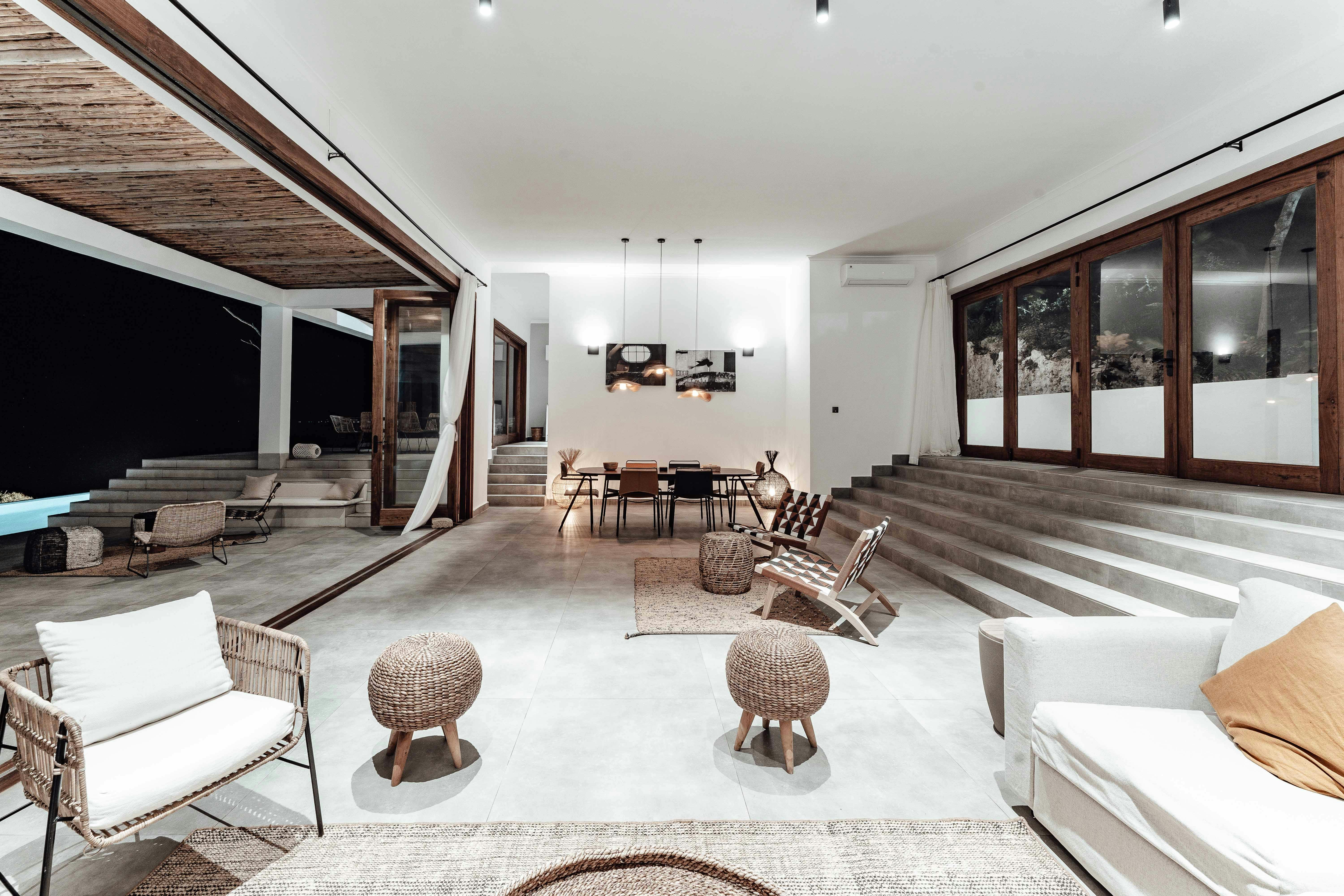
Image: Spacious modern apartment with African-inspired decor, highlighting how architectural forms and shapes enhance the space’s function and flow.
People often think architectural form is just for big exteriors—massive buildings, complex facades, dramatic curves. But that’s only half the story.
Inside your home or any building, form still rules—just more subtly.
Think about it:
-
That arched hallway you love? That’s form shaping experience.
-
A low ceiling in a lounge? That’s deliberate compression—used to make a space feel cozy.
-
A floating staircase? Pure form, balancing sculptural impact with movement.
Let’s break it down.
Interior Form = Volume + Flow + Feel
In interior design, form isn’t just visual—it’s spatial. It’s the shape of the room, how you move through it, and how everything interacts.
It’s not just the furniture you put inside. It’s the shape that holds it all together.
Here’s how form works in real interior spaces:
▪ Open Floor Plan?
That’s a form decision. You’ve eliminated dividing walls to create continuity.
▪ Vaulted Ceiling?
That’s vertical form creating airiness and light—making small rooms feel big.
▪ Curved Walls or Niches?
Those guide movement, soften transitions, and change how sound and light behave.
Real Example: Why That Living Room Feels Wrong
We once helped redesign a client’s living room that “felt weird”—even though the furniture was beautiful. Turns out, the ceiling slope was too sharp, creating an awkward compression. The entry form didn’t match the space function.
Solution?
We redefined the ceiling line, shifted a wall by just 12 inches, and added a shallow arch between the hallway and lounge. Same square footage—totally different feel. Light traveled better. Sound softened. The room finally felt comfortable.
That’s the power of form.
Why Interior Designers Should Care About Architectural Form
Good interior design starts with understanding volume.
Before you choose fabrics, finishes, or colors—you need to understand how the space moves.
Here’s what to focus on:
▪ Proportions – Tall vs. wide walls change mood.
▪ Openings – How arches, windows, or doors shape flow and light.
▪ Ceiling lines – Flat vs. vaulted vs. exposed beam all shape vibe.
▪ Geometry – Soft curves vs. sharp angles totally shift how a room feels.
So... Is There "Form" in Interior Design?
Absolutely.
It might not always be about dramatic gestures, but every interior space has a form—and the best designers shape it with intention.
If your space feels off, cluttered, or sterile—don’t just rearrange furniture. Check the bones. Check the shape.
Because once you understand how interior form works? Everything else starts to click into place.
Final Word: Why Form Still Matters
Good form isn’t about showing off. It’s about making space feel right.
It affects how we move, how we see, and how we connect to what’s around us.
▪ Use it smartly, and you create meaning.
▪ Use it poorly, and you confuse or isolate people.
▪ Use it intentionally, and you solve problems before they show up.
That’s what separates architecture from sculpture. It’s art you live inside.
Related: Fundamental Design Elements: The Secrets to Successful Design
Want to Learn More? Here’s What We Recommend:
Top Architecture Books on Form:
-
"Form, Space, and Order” by Francis D.K. Ching
Classic. Covers everything from spatial hierarchy to shape psychology. -
“The Function of Form” by Farshid Moussavi
Modern take on how construction influences form—great for advanced learners. -
“The Eyes of the Skin” by Juhani Pallasmaa
Why architecture isn’t just visual—how it feels, smells, sounds, and more.
FAQs
- What is architectural form?
Architectural form refers to the shape and appearance of a building, influencing how it interacts with its surroundings and functions. - Why is form important in architecture?
Form balances aesthetics and function, impacting how a building serves its purpose and how people experience it. - How has technology influenced form in architecture?
3D printing and BIM have allowed architects to create more complex and experimental forms. - What’s an example of organic architectural form?
Casa Batlló by Antoni Gaudí is a prime example, with flowing, natural shapes inspired by marine life. - Can form evolve over time in a building?
Yes, especially with additive form, where new elements can be added as needs change.
Resources & References:
● American Institute of Architects (AIA)
● BuildingSmart Alliance – BIM Standards
● MIT’s Architecture & Design Computation Group
● Zaha Hadid Architects – Parametric Projects
● NCARB – Licensure Resources