What Makes a Design Feel Right
How Architects Use Balance to Build Calm and Order
You can tell when a space feels right. The walls carry the eye instead of stopping it. The weight of materials feels even. That quiet sense of order is balance. Most designers talk about it. Few build it.
Some chase balance to please a client. Others look for it while sketching their own house. Some reach for it through interiors or small renovations. No matter the scale, the same rule holds. Balance decides how the work sits, how it breathes, and how long it stays interesting.
After years in practice and teaching, I keep seeing the same mistake. People know the idea of balance but not how to apply it. They mirror things instead of judging weight. They think equal means calm. It doesn’t.
Nature shows what real balance looks like. No tree stands the same, no branch repeats, yet the whole forest feels stable. That kind of quiet structure is what good architecture aims for. It’s not perfection. It’s control.
Balance in Design: Why Some Buildings Just Work
Simple field guide to balance in architecture. How light, form, and structure work together to create harmony without symmetry.
Why Balance and Other Principles Shape Better Design
Architectural Balance That Holds the Eye and Feels Still
Strong work reads calm. Parts sit where they should. Balance is the quiet rule that keeps the eye from drifting and helps a wall, a column, and a window feel related.
Balance is not the same as symmetry. It grows from proportion, scale, and light. Learn how these basics connect in Basic Design and Architecture and Scale and Proportion in Architectural Design.
Nature shows the logic. A forest holds many sizes and tones, yet the scene rests. Differences build the balance when rhythm and light are tuned. Buildings work the same way.
Understanding and Applying Balance in Architecture
Balance in architecture is often mentioned but rarely practiced well. It is not about symmetry or matching sides. It is about how space feels when form, light, and proportion hold each other steady.
Good balance is what makes a space feel natural. You can see it, but more importantly, you can sense it when standing inside. The structure feels calm. The air moves evenly. The room holds itself together without effort.
Think of a living room where all the furniture is pressed against one wall. The design looks off because the weight sits in one place. Move a sofa toward the center, shift a chair toward light, and the whole room begins to breathe. That is balance at work.
What Balance Really Means
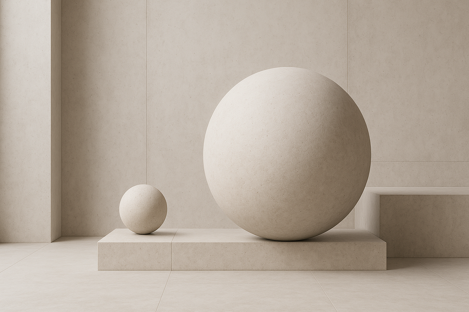
Balance is the measured distribution of visual and structural weight. Lines, materials, colors, and textures carry their own gravity. The goal is to let them settle into quiet order so the space feels composed, not forced.
It is why a tall, narrow window can offset a solid wall or why a dark stone base can ground a glass volume. Balance is the logic that ties visual weight to structural intent.
Forms of Balance in Design
Balance appears in several ways. The best designers shift between them depending on context.
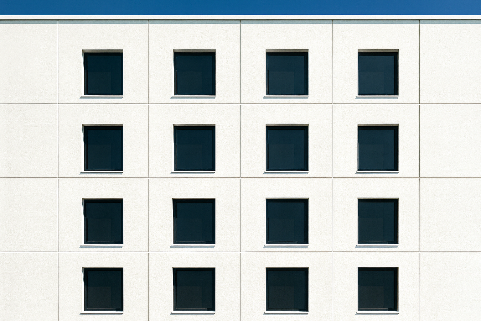
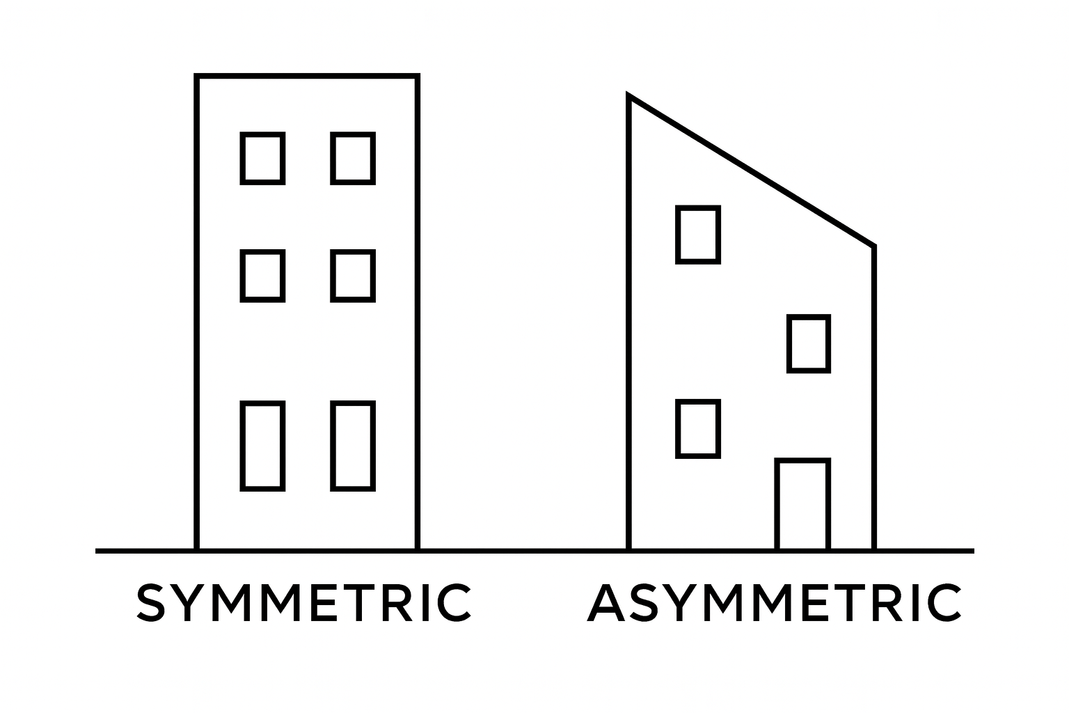
Symmetrical: Equal parts across an axis, like the front of the Parthenon. It feels solid and formal.
Asymmetrical: Unequal parts that still feel even. A large volume can balance a cluster of smaller ones when light and proportion agree.
Radial: Elements radiate from a center. Seen in courtyards, rotundas, and plazas where all movement leads to one calm point.
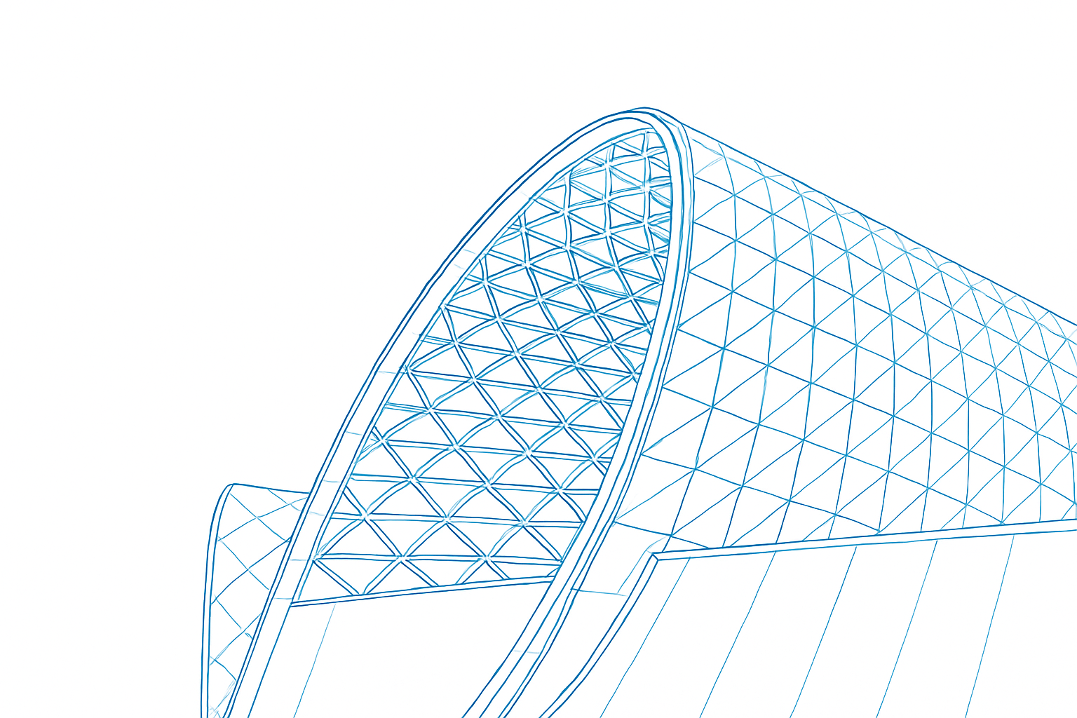
Dynamic: Movement balanced by pause. Angled lines, texture, and open edges that still sit in control.
Why Balance Matters
Balanced design works better. It flows. It uses energy efficiently. It keeps the user at ease without knowing why. A space that feels balanced holds attention and trust.
Learn how proportion supports balance in Scale and Proportion in Architectural Design.
How to Apply Balance
Use contrast in small amounts. Light and dark, rough and smooth, open and closed keep the design alive.
Match visual weight. A heavy beam needs open space below it. A tall window needs a base that can hold it.
Start simple. Find a central rhythm before adding layers. Once the proportion feels right, small adjustments guide the rest.
Test by stepping back. If one side pulls harder than the other, move mass or color until it calms.
Field Example
A small house renovation in a brick suburb used this rule. The old elevation was heavy at the base and empty above. Adding one vertical window near the corner and lowering the parapet line balanced mass and light. The house suddenly felt taller, lighter, and complete without changing the footprint.
FIELD PICK
The Elements of Visual Harmony by David Hornung
Clear examples on how color, form, and balance work across scales. Simple visual exercises worth repeating during design studies.
Good design never shows off..
When balance is right, the space feels complete without needing to explain itself.
Balance in Nature: Learning from Forests
Nature understands balance without drawings or plans. A forest looks irregular, yet every height, color, and texture finds its place. Nothing repeats, but nothing feels out of control. The system holds because each element carries its share of light, shade, and weight.
Walk through a forest and the scene feels dense. Step back or look from higher ground and the structure becomes clear. Tall trees form a canopy that breaks wind and filters sun. Smaller plants live below in the calm of that shade. The pattern shifts constantly but stays in order. That quiet tension between difference and unity is real balance.
What Architects Can Learn
Forests teach that order does not need repetition. Variety can build stability when the parts respond to one another. Architecture works the same way. Balance comes from how materials, openings, and structure share purpose.
Diversity Builds Depth: A wall that mixes stone, glass, and timber reads richer than one material alone. The shift in weight and texture keeps the surface alive while staying composed.
Adaptation to Site: Trees follow sun and soil. Buildings should follow light and climate. Shape openings for real sunlight, not just symmetry. Let local stone or wood guide tone and color.
Layering for Calm: Forests have canopy, understory, and ground cover. Architecture can mirror this through massing and interior scale. Each layer supports another so the space feels complete.
Architectural Examples
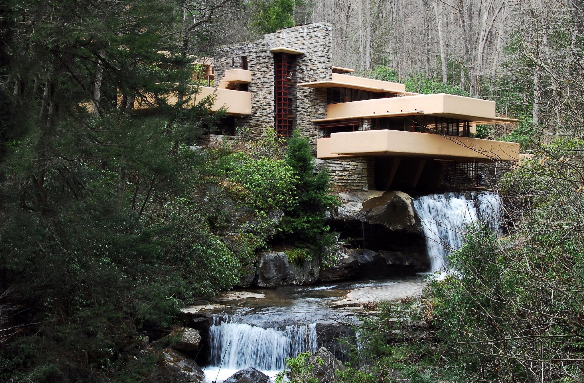
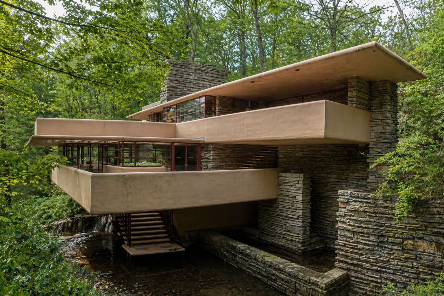
Fallingwater by Frank Lloyd Wright shows natural balance through alignment, not imitation. Terraces hover like ledges, stone walls grow from rock below, and water moves through the center. The composition feels inevitable, as if it always belonged there.
Bosco Verticale in Milan, designed by Stefano Boeri, brings forest logic into the city. Trees climb the towers, softening light, filtering air, and shifting color through the year. Structure and vegetation share the same vertical rhythm.
Finding Inspiration
To study balance, start with nature. Walk, watch, and draw. Look at how trunks frame space, how shadows cross, how one color settles the next. These small observations build instinct. Balance is not a rule to copy from nature but a logic to apply through proportion, material, and light.
Nature’s balance is never perfect, and that is what makes it work. Every tree adjusts, every surface shifts. Architecture finds its calm in that same movement: steady, imperfect, and alive.
To study how nature applies these same lessons, see How Nature Teaches Balance: A Guide for Architects and Designers.
MUST READ
Design With Nature by Ian McHarg
A timeless field guide on reading landforms, water, and vegetation to shape better design decisions. Still one of the clearest connections between ecology and architecture.
Types of Balance in Architecture
Balance decides how a space holds together. It is not a style or decoration; it is structure, rhythm, and visual weight working as one. Every project carries one of these four balances, sometimes mixed, sometimes pure. Knowing which one drives the form changes how you design walls, openings, and movement.
1. Symmetrical Balance
Symmetry builds calm and order. When the two sides of a plan, façade, or elevation mirror each other, the eye rests. It feels formal and stable.
Built Example: The Parthenon’s columns line up in even rhythm, giving the sense of a frame that cannot shift. Many civic buildings still use that same logic to signal trust and authority.
Use It When: The space needs clarity, discipline, or ceremony: courthouses, schools, main halls. Add minor material or lighting variation to avoid stiffness.
2. Asymmetrical Balance

Asymmetry works by feel, not mirroring. You set a heavy mass against a lighter one, or a tall void beside a low solid. When it feels even, the space holds tension without chaos.
Built Example: At Fallingwater, the long concrete slabs pull one way while the stone core anchors the other. The eye moves, yet nothing collapses.
Use It When: The design needs movement or informality. Check visual weight, not geometry. Scale, texture, and shadow all count as mass.
3. Radial Balance
Radial balance grows from a center. Elements circle or radiate around one point, guiding all views back to it. It works well when you want focus or gathering.
Built Example: The Pantheon in Rome pulls everything to its oculus. Every stone and coffer serves that center. In courtyards or plazas, radial layouts invite people inward the same way.
Use It When: The project has one heart — a dome, fountain, or meeting space. Keep geometry clean. Radial order breaks easily if one part pulls too hard.
4. Dynamic Balance
Dynamic balance handles motion. It sets up lines and forms that push and pull but still resolve. The aim is energy without confusion.
Built Example: Zaha Hadid’s Heydar Aliyev Center bends and lifts like fabric, yet each curve leads somewhere. The structure feels alive but grounded.
Use It When: You want flow — galleries, transport hubs, creative studios. Curves, diagonals, or level changes can carry energy, as long as weight and light remain steady.
Choosing What Fits
No project uses all types well. A single choice defines how users feel. Symmetry brings calm, asymmetry brings life, radial form brings unity, and dynamic order brings motion. The craft lies in knowing which emotion suits the purpose of the place.
MUST READ
The Architecture of Happiness by Alain de Botton
Clear writing on how proportion and balance shape emotion in spaces. A good reminder that visual order changes how we live inside buildings.
Balance in Muslim, Chinese, and Japanese Architecture
Balance is what keeps a building from feeling restless. In different cultures, the idea takes different forms. In Muslim, Chinese, and Japanese architecture, balance is not a style or a formula. It is a quiet logic that links structure, nature, and the human body.
Muslim Architecture: Order with Purpose
In Islamic design, balance reflects unity and precision. The rhythm of walls, arches, and courtyards follows a clear geometry that feels spiritual rather than decorative.
Symmetry and Structure: Most mosques organize space around a courtyard or dome. Every line aligns toward a single center, giving order and peace. The symmetry is less about looks and more about orientation—everything points toward purpose.
Pattern as Discipline: Geometric motifs, tilework, and calligraphy follow strict mathematical rules. They repeat without monotony, turning ornament into structure. It is visual balance made through logic.
Water and Air: Fountains and shaded gardens add movement to still courtyards. At the Alhambra, reflection pools calm the stone surfaces, showing how soft and hard elements keep each other in check.
Balance here is not decoration. It is a form of order that reflects faith and precision.
Chinese Architecture: Balance with the Land
In Chinese design, architecture sits inside nature, not against it. Every axis, courtyard, and roofline responds to land, wind, and water.
Symmetry as Structure: Palaces and temples, like the Forbidden City, stretch along a central axis. The order comes from the earth’s orientation—north to south, heaven to ground.
Feng Shui Logic: Every wall, path, and window placement responds to energy and movement. The goal is flow, not perfection. When it works, you feel air and light moving through the space instead of being trapped.
Courtyards and Gardens: The balance between open voids and solid walls forms the core of Chinese domestic design. Rocks, ponds, and trees are placed as carefully as beams or tiles. Nothing is random, yet nothing feels rigid.
Here, balance means living within nature’s rhythm instead of controlling it.
Japanese Architecture: Balance through Restraint
Japanese architecture achieves balance by removing excess. It is about what is left empty, not what is filled.
Ma, or Negative Space: Empty areas give shape to everything else. The calm between objects and walls creates rhythm. This silence in form is what makes a space feel alive.
Connection to Nature: Elements like the engawa—a covered wooden edge between house and garden—soften transitions. The outside and inside trade light and air instead of shutting each other out.
Natural Materials: Wood, stone, and paper are used in their raw state. As they age, they shift color and texture, keeping the architecture honest and balanced over time.
Balance here is not about matching sides. It is about rhythm, patience, and silence built into the structure itself.
Shared Lessons
Across all three traditions, balance comes from intention. Muslim design uses order to express unity. Chinese design aligns with nature to create flow. Japanese design removes distraction to find calm.
Modern architecture often rediscovers what these systems never forgot. Ideas like minimalism, passive cooling, and spatial flow are not new. They have existed for centuries, refined through culture and climate.
To see these principles in practice, study projects like Islamic Architecture: Key Characteristics and Design Logic, Chinese Architecture and Its Spatial Philosophy.
Balance, in the end, is care. It is how architecture listens to what surrounds it and answers with quiet precision.
Balance in Practice: Materials, Spaces, and Light
Balance isn’t decoration. It’s how a building holds itself together visually and physically. In real projects, balance shows up in proportion, material, light, and the way spaces connect. When it’s off, you feel it immediately — even if you can’t explain why.
Balancing Materials and Proportion
A good façade reads like a conversation between textures. The Louvre Pyramid works because it sets glass against stone — the weight of history next to the lightness of modern structure. The proportions align, so one doesn’t overpower the other.
Field Logic: When combining materials, think in ratios, not just finishes. If brick dominates, let metal or glass handle smaller planes. Keep sightlines consistent — one horizontal misstep can make a clean wall feel confused.
In one residential project, we paired rough limestone with warm, polished wood. The textures were opposite, but we matched proportions. The balance came not from symmetry, but from restraint.
For more on how materials shape visual order, see Materials and Sensory Design.
FIELD PICK
Architectural Material & Detail Structures by Thomas Herzog
Real-world studies on proportion and material rhythm — the kind of reference that improves how you see texture and balance on site.
Balance Inside: Furniture, Light, and Color
Interior balance is quiet. It comes from how weight and light distribute. A large sectional sofa feels stable only if something grounds it across the room — a tall bookcase, a sculptural lamp, or art that draws the eye upward.
Visual Weight: If one side of a space feels heavy, shift your attention to light. A rug, soft texture, or mirror can balance scale faster than moving walls. Use light furniture or reflective surfaces opposite solid masses.
Color and Texture: Strong hues need space to breathe. A deep green wall softens when offset by pale linen, wood, or stone. Smooth surfaces benefit from nearby texture — fabric, plants, matte finishes — that absorb light instead of bouncing it.
Layering light also helps: ceiling fixtures for structure, sconces for rhythm, and floor lamps for depth. Each adds another layer of balance between bright and dim.
Balance in Landscape and Exterior Space
Outdoor design tests balance at scale. It’s where hard surfaces and soft elements have to coexist without competition.
Layering the Ground Plane: Tall trees, mid shrubs, and low groundcovers repeat the logic of a forest. Each height gives context to the next. Straight paths read as formal; curved ones create movement and calm.
In one garden, a narrow stone path wound toward a small koi pond. The curve itself balanced the vertical rhythm of nearby trees — the human path playing against nature’s pattern.
Formal landscapes use symmetry; naturalistic ones rely on flow. Either works if the proportions read clearly.
Where Balance Fails — and Why
Balance breaks down in two main ways: too much symmetry or ignored visual weight. Over-symmetry feels staged, like a set piece that forgot how people move. Pure asymmetry without logic feels nervous.
Fixing Over-Symmetry: Shift one element off axis — a light fixture, a window, a plant. Small irregularities make large spaces breathe.
Fixing Uneven Weight: Anchor large pieces with smaller counterweights. A heavy dining table finds balance with open chairs and a pendant light overhead.
Function Over Form: A balanced room must also work. Test sightlines, walking routes, and use patterns before finalizing layout.
Field Techniques for Spotting Imbalance
Architects train their eyes by stepping back. Photograph your layout or mirror the image — imbalance shows instantly. If one side dominates, break it with texture or tone, not clutter.
Contrast: Pair opposites. Light next to dark, smooth next to rough. In one kitchen project, glossy white cabinets were grounded by a reclaimed-wood island — the tactile contrast balanced the glare of polished finishes.
Repetition: Use recurring materials or lines to calm variety. The same wood tone used on both floor and furniture ties the space into a single field.
Old Meets New: Balancing History and Modernity
Restorations test judgment more than new builds. A 1920s home we opened up for modern living had exposed timber beams. We kept them as the anchor, then introduced minimalist cabinetry and pale walls. The beams carried the visual weight; the rest of the room gave them air.
Balance between eras happens when one language respects the other — when modern details echo, not erase, the old ones.
For more renovation insight, see 1930s House Renovation Guide.
Architectural Case Studies
Zaha Hadid’s Heydar Aliyev Center in Baku shows how movement can replace symmetry. The sweeping forms balance by flow — no straight lines, yet full stability.

Bosco Verticale in Milan balances urban mass with living systems. The green façades carry equal visual weight to the towers themselves.
Tadao Ando’s Row House in Sumiyoshi relies on light instead of ornament. Openings are precise, each balancing darkness with clarity.
Common Oversights
Balance Isn’t Perfection: Real spaces breathe through small differences. A slightly uneven picture wall can feel more alive than a perfect grid.
Subtle Imbalance Adds Depth: Intentional variation draws the eye. One mismatched chair in a dining set can give character and stop repetition from dulling the scene.
Frank Lloyd Wright once said, “Study nature, love nature, stay close to nature. It will never fail you.”
Tadao Ando added, “In architecture, light is as important as structure.”
Try It Yourself
Draw three quick versions of one room: one symmetrical, one asymmetrical, and one dynamic. Then look at which feels natural. That exercise will teach more about balance than any theory.
FAQ
Understanding Balance in Design
What’s the difference between balance and symmetry?
Symmetry is one kind of balance, but not the only one. Balance includes visual weight, proportion, and rhythm — even when sides don’t match.
Can balance exist in chaotic or irregular designs?
Yes. Dynamic balance thrives in movement and contrast. It’s the balance of flow, not mirrors.
How does balance affect usability?
Balanced spaces guide movement naturally. They make circulation easier and environments more comfortable to stay in.
What’s the simplest way to test balance at home?
Take a quick phone photo. If one side feels heavier or more cluttered, redistribute height or texture until both sides rest evenly to the eye.
Can asymmetry still feel calm?
Yes. Asymmetry works when elements share visual weight — through tone, texture, or spacing.
How does lighting change balance?
Light shifts perception of mass. Shadows can ground a space as much as color or structure. Architects use light to correct imbalance without changing layout.
Is perfect balance always the goal?
No. Slight imbalance creates tension — the kind that keeps a design alive. Aim for coherence, not perfection.