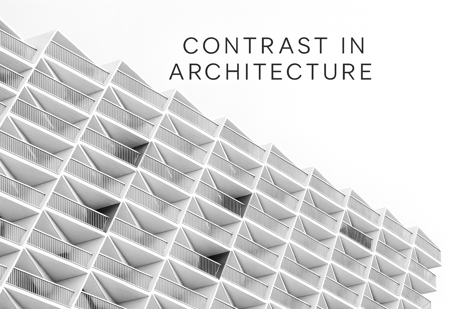
Contrast in Architecture: Making Opposites Speak
Real Ways to Apply Contrast in Buildings
Architecture without contrast is safe but flat. Contrast gives character, hierarchy, and life. Contrast is more than “black vs white.” It’s tension between light and dark, rough and smooth, large and small. It’s the space between forms, the depth of shadows, the surprise of texture. When done with care, contrast helps you read the building. When ignored, it makes everything blend and lose meaning.
Designing with Contrast: Light, Material, and Scale
A practical guide to contrast in architecture. How light, material, texture, and scale work together to create clear, readable design.
Contrast gives a building its voice. It is the quiet tension between light and shade, rough and smooth, tall and low. Used well, it sets a clear path to the door, frames views, and helps a visitor understand what matters. Used poorly, it turns a project into noise. The goal is simple. Make opposites speak without fighting each other.
Start by naming what should lead. The main volume, the entry, the stair, a tall window, a courtyard. Then support that choice with contrast. Brightness around the entry. A rough base beneath a light wall. A calm rhythm of small openings, then one large pane where the view deserves it.
If you are building fundamentals, skim Design Elements in Architecture. For case studies that tie form to use, see Architectural Form Examples.
Simple Rules for Using Contrast in Architecture and Design
Contrast explained in plain language. When to use it, where it fails, and how to get strong results in homes and public buildings.
How Architects Use Contrast to Guide the Eye
Contrast builds hierarchy. It tells the eye where to rest and where to move next. On a street in Charleston, a deep porch casts strong shade against bright stucco and pulls you toward the door. In a Minneapolis renovation, a dark metal stair rises out of pale oak floors and becomes the clear anchor of the room. These are small moves with large effect.
- Clarity: Strong differences make routes and priorities readable.
- Depth: Shadows from recesses and overhangs give dimension to flat planes.
- Emotion: Heavy against light, warm against cool. The building gains character without extra ornament.
Keep contrast tied to purpose. Brighten the threshold, not the corner that does nothing. Use rough texture where hands and feet meet the building. Save the strongest moves for the moments that matter.
MUST READ
The Elements of Visual Harmony
Clear exercises that sharpen judgment on contrast, proportion, and rhythm. A solid desk reference for fast design studies.
For a deeper look at how proportion supports contrast decisions, review Scale and Proportion in Architectural Design.
Contrast in Materials, Forms, and Light
Types of Contrast You Can Control
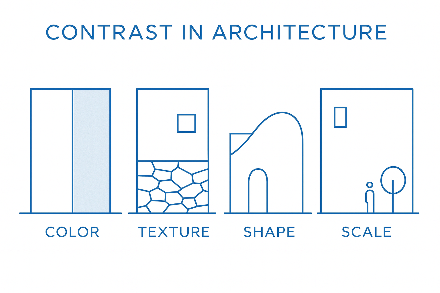
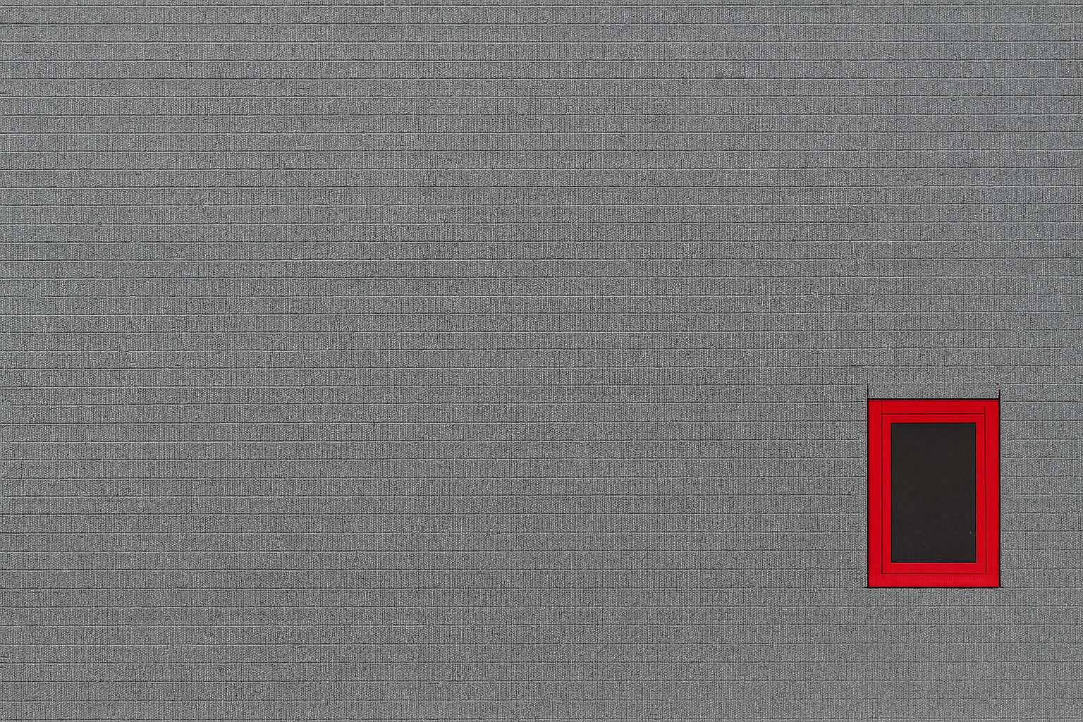
Color and Tone
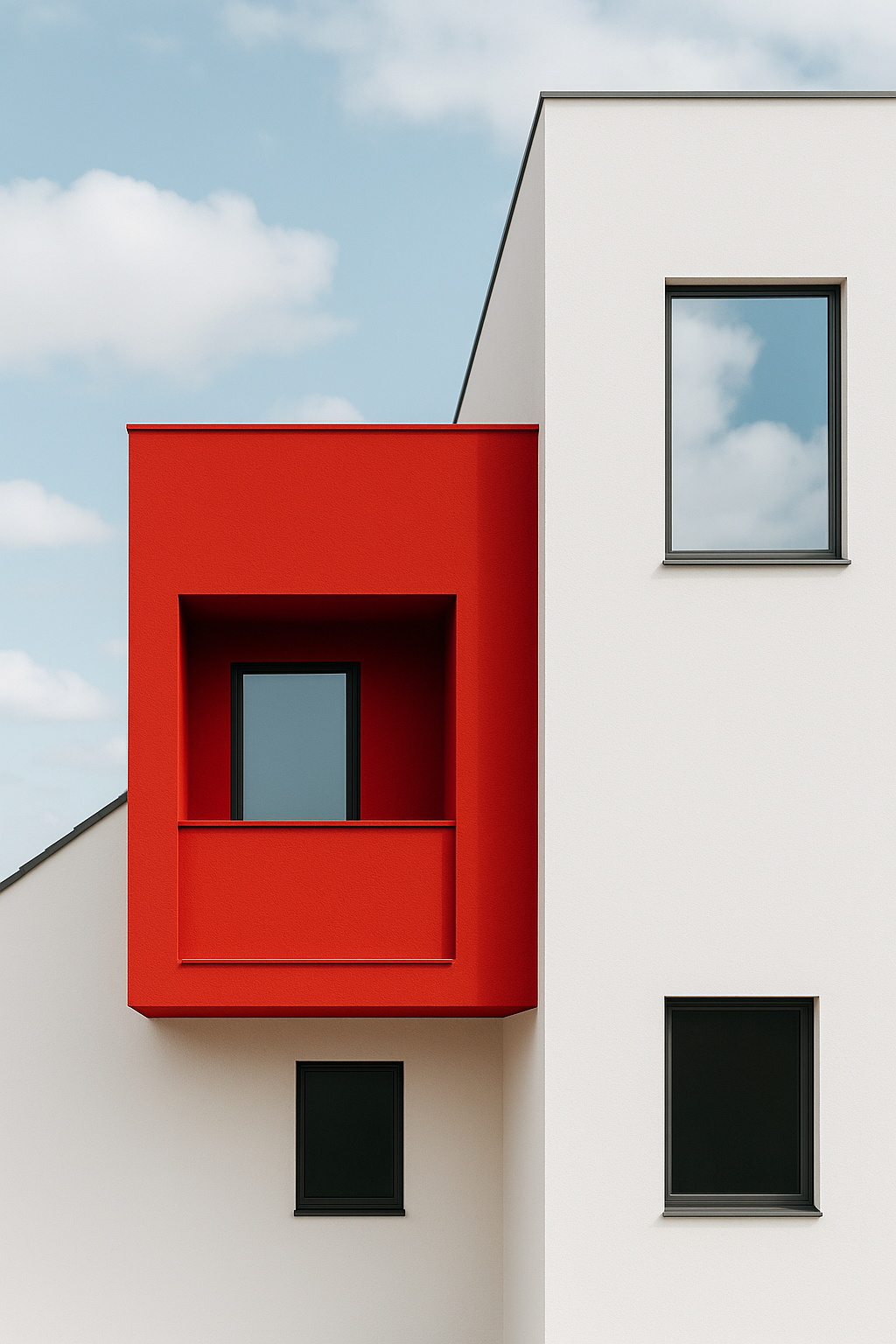
Light walls with dark frames read crisp. Dark walls with light reveals feel carved. Test schemes in grayscale first. If the plan reads in three tones — light, mid, dark — it will hold in real light. Use one strong move instead of many weak ones. A single dark window band on a light façade can lead the whole composition.
Material and Texture
Pair smooth glass with a rough base. Set tight metal against warm wood. The join matters most. Keep seams clean with a shadow reveal or a steady trim depth so contrast feels intentional, not accidental. In renovations, reclaimed brick with slender steel works if the connection is simple and buildable.
Light and Shadow
Depth creates stronger contrast than paint. A two inch recess around a window throws shade that shifts through the day. In Sun Belt cities, overhangs cool walls and draw sharp lines that guide the eye along the façade. Model shadows at morning, noon, and late afternoon to confirm the effect.
Scale and Size
Let one element lead. A large opening can balance a field of small windows when head and sill heights align. In compact homes, a single tall slot window can carry more weight than several medium panes that compete. Big over small sets hierarchy the moment you step onto the site.
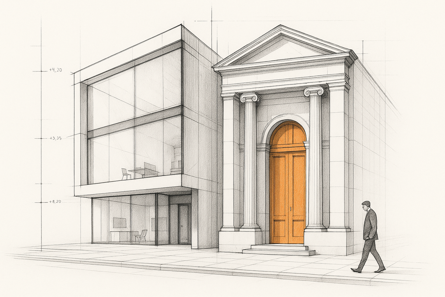
Form and Shape
A calm box can accept one curved stair without losing order. Keep the background simple and let the special form be rare. Straight beside curved, solid beside void. The contrast works when the base form stays quiet.
Rhythm and Repetition
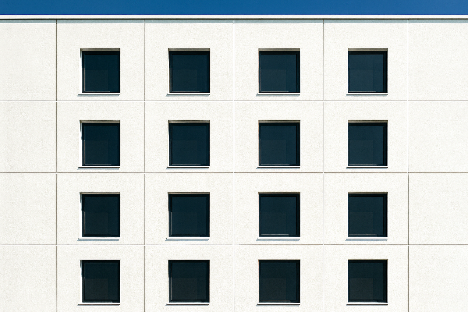
Repetition builds comfort. A planned break creates focus. A row of equal windows with one larger pane at a view can set the story of the elevation. Do not add breaks everywhere. One pause in the rhythm is enough to lead the eye.
For pairing materials without clutter, see Materials and Sensory Design. For texture logic that supports contrast, review Texture and Pattern.
Case Studies: How Contrast Defines Character
Fallingwater, Pennsylvania
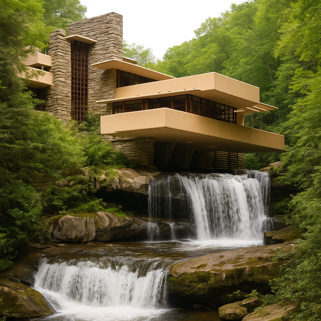
Frank Lloyd Wright used tension instead of decoration. The stone walls feel rooted; the cantilevered slabs push out over water. Heavy and light coexist. Contrast here is not color but gravity — the weight of rock against the floating decks above it. Wright didn’t hide structure; he let contrast tell the story of force and flow.
Robie House, Chicago
Horizontal planes dominate, yet vertical brick piers punch through, grounding the light roof. Glass ribbons run along the edges, contrasting transparency with mass. The result: a balanced field of motion, where structure and openness never compete. Contrast carries rhythm more than ornament.
Vanna Venturi House, Philadelphia
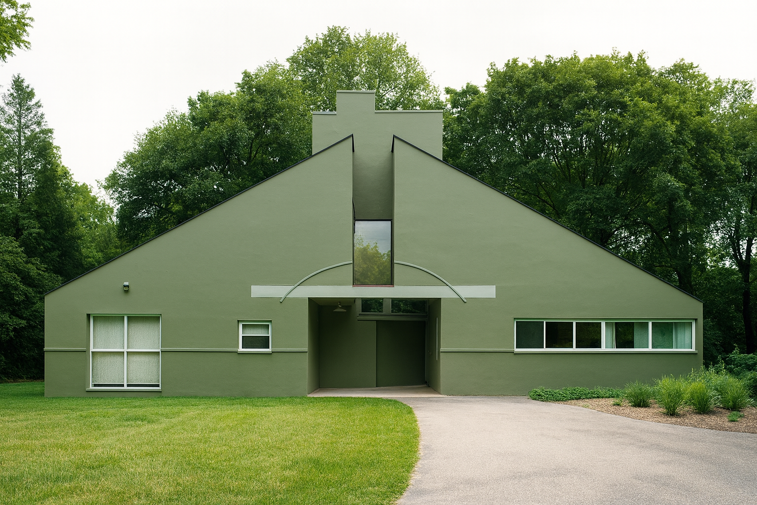
Robert Venturi’s house flips expectations. The gable is too big, the window too small, the void off-center. It shouldn’t work, but the contrast makes it read human. This house shows how breaking balance carefully can make a design memorable.
Alan I. W. Frank House (Pittsburgh, U.S.)
Gropius and Breuer introduced contrast between natural stone and warmer wood, open glass walls and solid volume. The materials oppose and support.
It’s a total work, in which contrast is part of the structure.
To understand how scale, proportion, and symmetry interact with contrast, see Scale and Proportion in Architectural Design or revisit Symmetrical Balance in Architecture.
Using Contrast in Real Projects
When contrast works, it reads instantly. The viewer doesn’t analyze; they feel clarity. In practice, contrast is managed through sequence — entry, space, light, and surface. Here’s how to apply it without overthinking.
1. Pick the Anchor
Decide what leads: the mass, the light, or the path. Let everything else respond. For example, on a school project in Ottawa, we used a dark brick volume for the gym against pale limestone classrooms. The contrast made the heavy block feel deliberate, not random.
2. Keep Joins Honest
Contrast fails when two materials meet poorly. A clean reveal or overlap line can save a bad joint. Builders respect drawings that show how the contrast ends. It’s the physical seam that makes visual logic believable.
3. Test at Scale
Small models and renderings lie. Go outside, tape outlines on walls, or build a mock corner. You’ll learn how light changes color and texture in real daylight. Most bad contrast decisions die at mock-up stage — that’s a good thing.
RECOMMENDED TOOL
Lux Meter Light Meter
Handheld device for checking daylight contrast and glare across surfaces. Works fast for interior and exterior tests.
For step-by-step guidance on composition and visual flow, visit Parti in Architecture.
Contrast Across Cultures
Japanese Architecture
Japanese design finds contrast in silence and texture. Shoji screens glow beside dark timber frames. Shadowed verandas open to bright gardens. The play is subtle but intentional — contrast through restraint. Tadao Ando’s concrete work continues that lineage, pairing cold material with light so sharp it feels warm.
Islamic and Middle Eastern Architecture
Here, contrast lies in pattern and light. The mashrabiya screen filters glare into soft geometry. Courtyards alternate between dark shade and reflected brightness. It’s both functional and symbolic — a rhythm between shelter and openness.
Western Modernism
In mid-century modern work, contrast became structural honesty. Exposed beams, raw materials, and open glass made the differences visible. Le Corbusier and Louis Kahn both used contrast to reveal logic — heavy cores, light spans, rough base, smooth shell.
To learn how cultural logic shapes balance and contrast, see Form in Architecture or Basic Design and Architecture.
When Contrast Fails
Too Many Focal Points
Every surface can’t lead. Pick one gesture and let the rest stay quiet. A dark frame on a pale wall works because the eye lands once and rests. Add ten of them and the whole façade shouts.
Forgetting the Street
Context is the first constraint. A black box in a pastel row feels hostile. A glass cube in brick heritage can work, but only if proportions echo the neighbors. Study what surrounds before choosing how far to push contrast.
Bad Joins
Where materials meet, contrast either looks smart or sloppy. If seams drift, you lose the logic. Draw every joint. Align reveals. It’s the one rule that separates confident design from accident.
Copying What’s Trending
High contrast isn’t a style; it’s a tool. Black frames, white façades — played out. Instead, find a structural or environmental reason for difference. Let function drive it. The rest will age better.
For applied detail logic, check Façade Details and Material Joints.
FIELD PICK
Architectural Graphics by Francis D.K. Ching
Still the clearest visual guide to line weight, tone, and shade. Good for training your eye to see contrast as structure, not style.
Field Tests That Sharpen the Eye
Light Walk
Pick a single street corner. Photograph it at dawn, noon, and sunset. Notice how texture reverses when light shifts. That’s contrast at work — not color, but time.
Material Pairs
Lay out two samples side by side: concrete and wood, metal and brick, glass and stone. Look at them in daylight and shade. One pairing will always read clearer. That’s your lead combination.
Monochrome Check
Desaturate your render or sketch it in pencil. If the form still reads, the contrast is structural. If it collapses, you’re relying on paint, not shape.
Night Pass
Contrast doesn’t end at sunset. Stand outside at dusk and see which surfaces glow, which disappear. Good design reads in both light and dark.
For form and rhythm drills, see Architectural Shapes and Forms.
Closing Thoughts
Contrast is the silent dialogue in architecture. It’s where you invite the eye, where you guide movement, where you speak with space. If your façade, plan, or interior lacks contrast, it reads like background noise. With it, your work sings.
When you design next time, ask: what wants to oppose? What needs to share weight? What reveals will shape shadow? Then put those contrasts in conversation, not in conflict.
FAQ
Where should I start?
Start with light. Once you understand where light falls and fades, material and tone follow naturally. You can’t fake daylight.
Does contrast make things feel modern?
Not necessarily. A white porch against red brick or deep eaves over pale plaster — that’s contrast too. It’s timeless because it’s honest.
Can small spaces handle strong contrast?
Yes, but with restraint. One dark wall or one textured volume can anchor a small plan. Don’t multiply it; focus it.
How do I stop it from feeling fake?
Keep logic visible. Every change in color, material, or shape should trace back to structure or climate. If it’s just for looks, it’ll read as decoration.
How can I test contrast on site?
Use a light meter or even a phone camera in black and white mode. Step back and see where your eye lands first — that’s your balance point.
Does neutral mean no contrast?
Never. Whites, grays, and natural woods have their own dialogue. Texture, sheen, and shadow still build depth. The quieter the palette, the more subtle your work must be.
See also Balance in Architecture and Basic Design and Architecture for how contrast ties into spatial order.