Symmetrical Balance in Architecture
Symmetry is one of the clearest ways to make a building feel calm and legible. When two sides reflect across an axis, the mind reads the whole in a single glance. Entrances become obvious. Hierarchy becomes clear. The space feels settled. This article walks through how symmetrical balance works in plan, section, and elevation, where it succeeds, where it fails, and how to use it with intent on real projects.
Use this as a field guide. You will find plain rules and working examples. When you want deeper background on proportion and scale, keep Scale and Proportion in Architectural Design close. For the fundamentals that sit underneath these ideas, review Basic Design and Architecture.
What Symmetrical Balance Means
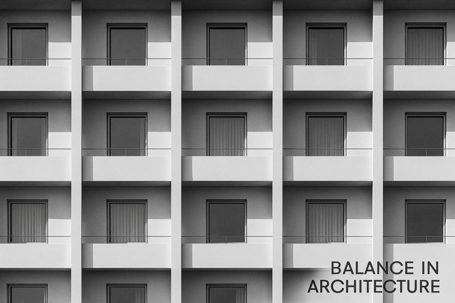
Symmetrical balance is reflection across an axis. In buildings, that axis is often vertical through a façade or longitudinal through a plan. If you fold the drawing along that line, major parts align. Columns, openings, cornices, and steps match in position and weight.
Good symmetry is more than copying parts. It is the steady distribution of mass and void. Solid reads equal to solid. Open reads equal to open. Light and shade fall in patterns that feel even. When the rhythm holds, the composition rests and the user can navigate without strain.
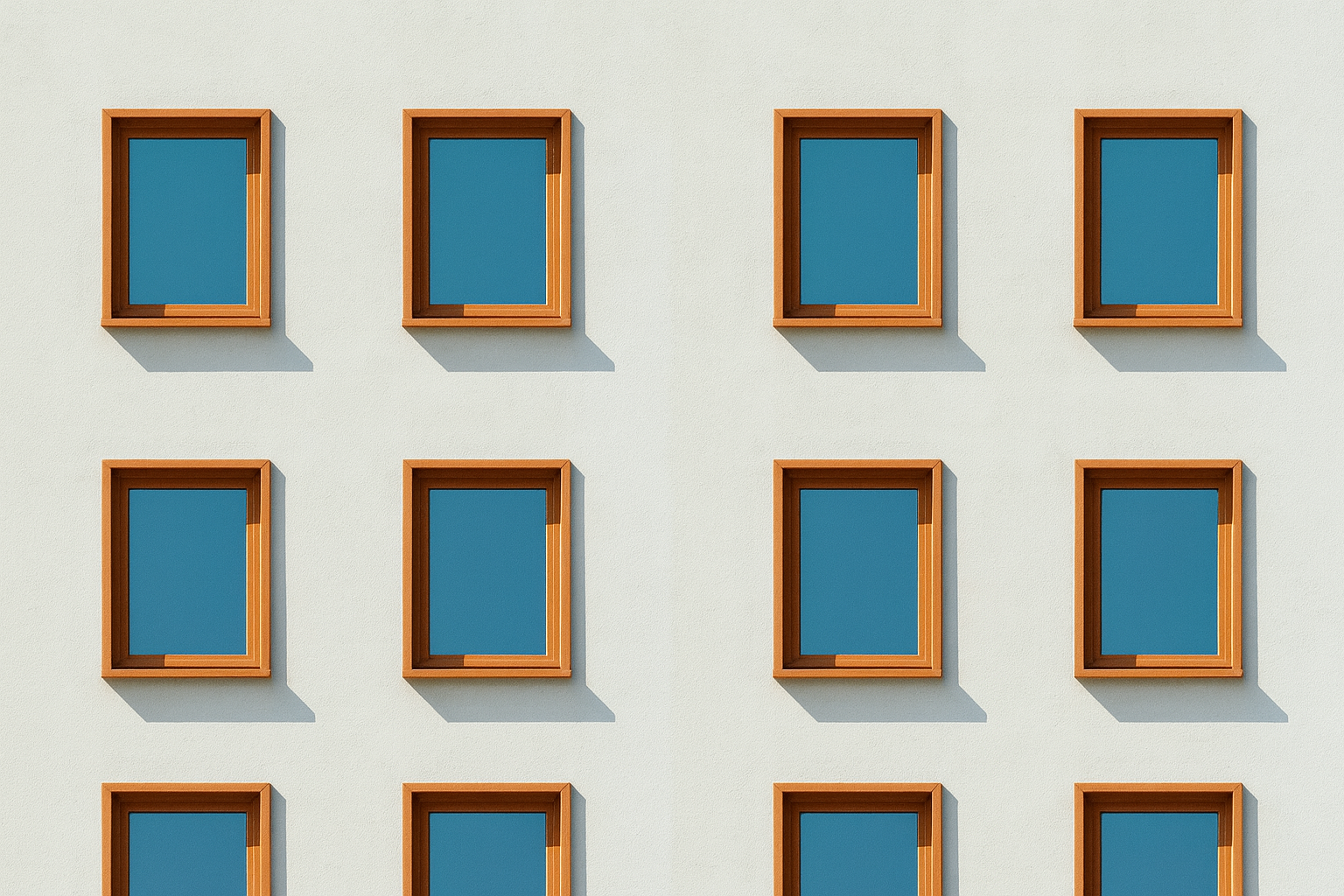
- Bilateral symmetry: Left and right mirror across a single line. Most formal façades use this form.
- Axial symmetry in plan: Spaces and circulation mirror across a corridor or central hall.
- Rotational symmetry: Parts repeat around a center, as in rotundas or radial courts.
To link symmetry with the rest of your design toolkit, see Design Elements in Architecture.
Why Use Symmetry

Symmetry delivers clarity. It communicates authority without words. It helps first time visitors find the door and understand what is primary. It reduces noise in complex programs because repetitive parts become easier to control. These are practical advantages, not style choices.
- Legibility: The path to entry and the hierarchy of space become obvious.
- Permanence: Balanced masses feel durable. Institutions use this to signal trust.
- Control: Mirrored detail reduces variation. Contractors can repeat assemblies with fewer errors.
FIELD PICK
Classicist No. 17: On Symmetry and Proportion
Short essays and measured drawings that sharpen judgment on axes, bays, and modules. Good for desk review before you lock a façade.
Anatomy of a Symmetrical Composition
Axis and Focal Point
Every symmetrical design needs a clear axis and something at its heart. The focal element can be a door, a portico, a dome, a stair, or even a framed view. This anchor tells the eye where to start and how to read the rest.
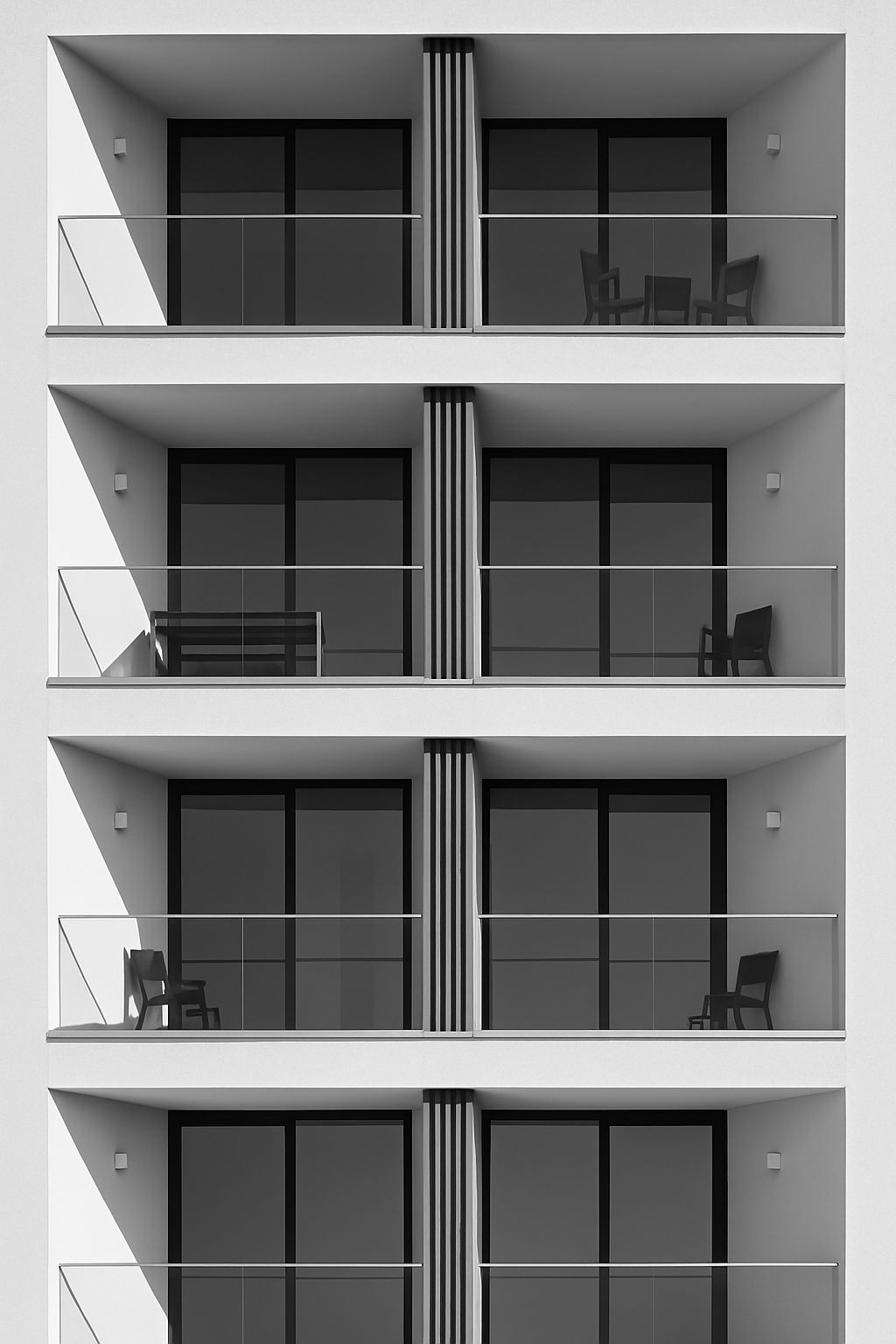
Mass and Void
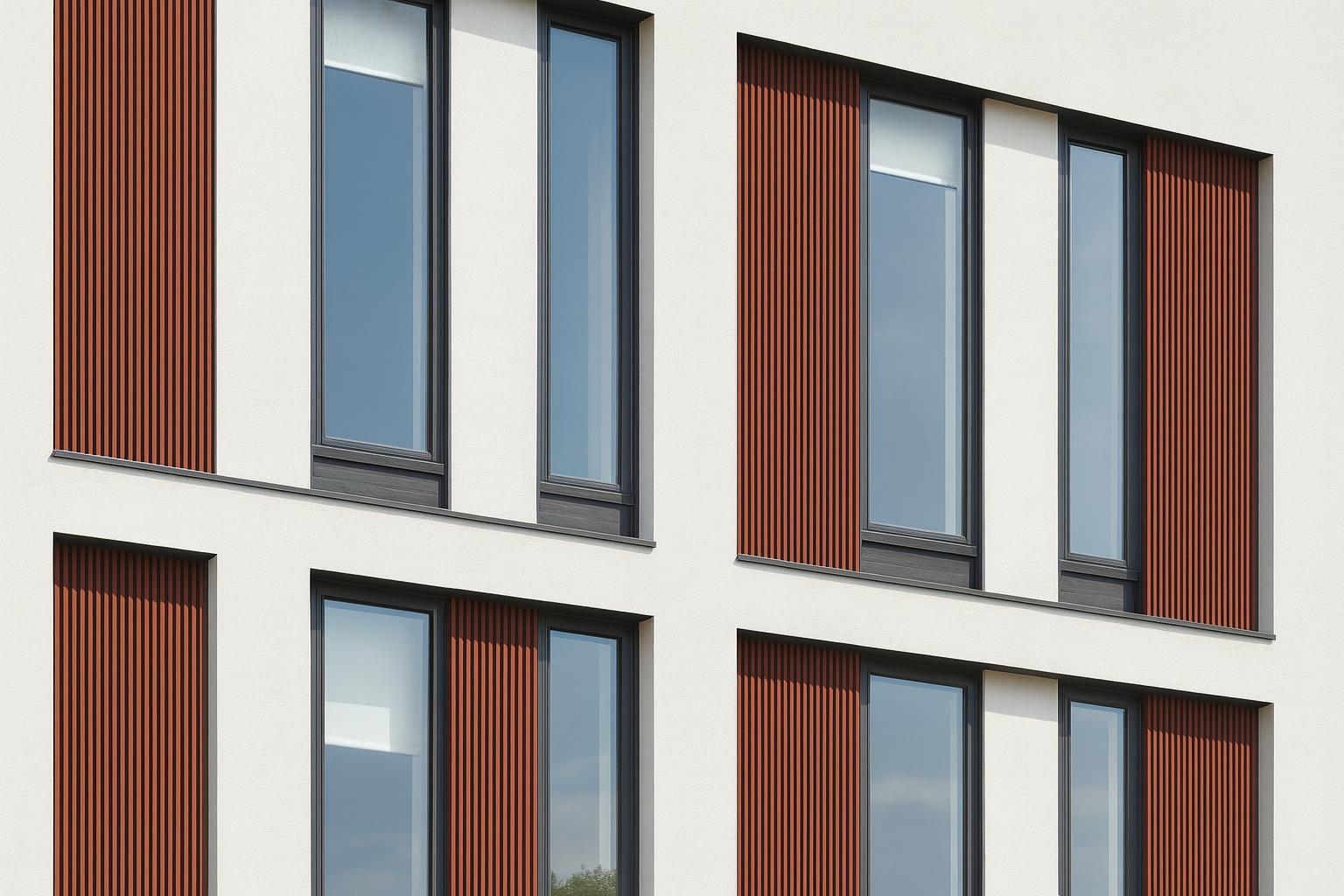
Balance the weight of walls and the lightness of openings. Two windows can offset one arch if size, depth, and shadow match in perceived weight. Recesses add weight. Projecting frames add weight. Glass lowers it. Adjust until both sides feel equal.
Hierarchy and Module
One bay sets the beat. Repeat it. Major beats carry doors and large windows. Minor beats carry panels or smaller openings. The module is your metronome. Keep it steady from base to cornice so the design does not drift.
For methods that tie module to human scale, review Proportion and Scale.
Classic Cases Where Symmetry Leads
Classical Fronts and Porticos
Early civic and academic buildings used columned fronts to teach mirrored order. Columns divide the façade into equal bays. A central doorway marks the axis. The rhythm is calm, readable, and precise. Many government halls, libraries, and universities still follow this logic because it communicates structure and permanence.
Cour d’Honneur and Palaces
The court of honor places a main block at the center and wing buildings on each side. The approach, the forecourt, and the entry stair all reinforce the axis. The visitor moves along a line that feels inevitable.
Bridging to Landscape
Formal landscapes mirror paths, water, and planting beds across the same line. Even when species vary, massing and height match so the garden reads as one field.
Measured analysis of villas and palazzi. Clear drawings that reveal how axis, court, and room sequences create calm order.
Modern Uses of Symmetry

Contemporary buildings still lean on symmetry when they need clarity. The materials may shift to glass and steel. The plan may open up. The logic remains. Repeat a bay. Hold a clean center. Keep sightlines straight so the space feels anchored even when details are minimal.
- Campus buildings: Mirrored wings with a central atrium make wayfinding easy for first time visitors.
- Transport halls: Platforms and canopies mirror so loads and flows read instantly.
- Housing blocks: Repeated modules create even rhythms that control budget and schedule.
For examples that balance symmetry with contemporary detailing, see Architectural Form Examples.
Symmetry Inside Rooms
Interior symmetry works through furniture, openings, lighting, and volume. Two tall cases can balance a fireplace. Paired pendants can balance a dining table. Even a small room feels calm when the major masses mirror. If the room still feels stiff, loosen with texture or a single off center piece that does not break the main order.
Ceilings and Floors
Ceiling coffers and floor patterns should support the axis. If the floor grid drifts, the walls lose authority. Keep the center line visible from entry to view so movement feels guided, not forced.
How to Design Symmetry in Practice
1. Fix the Axis Early
Place the axis where circulation and view agree. If the approach and the main room pull in different directions, pick the path that users walk first. A clear axis with a secondary cross axis is better than two competing centers.
2. Set a Module and Keep It
Choose a bay size that works with structure, windows, and interior spans. Repeat it. Let details fall on that beat. When in doubt, simplify. Complexity breaks symmetry more than restrained variation.
3. Tune Mass and Void
Mock up the façade in grayscale. Adjust openings until both halves hold equal weight. Then add depth, frames, and reveals to fine tune. If one side still feels heavier, add a shallow recess or a shade element to quiet it.
4. Align Interior with Exterior
Door swings, stair starts, and corridor centers should respect the exterior axis. A perfect façade with a misaligned plan reads false the moment you step inside.
For a refresher on tying form to function, see Parti in Architecture.
Case Study: A Small Symmetrical House
Lot width is forty feet. The plan places a central hall with rooms mirrored on each side. The façade carries a centered door, paired windows, and a simple gable. Trim, sill heights, and lintels line up. The porch posts mirror across the steps. Inside, the stair rises on the axis with a skylight that marks center.
To avoid stiffness, material shifts are subtle. The base course is a darker brick that grounds the wall. The upper field is lighter. The door carries a deeper recess to anchor the entry. Plantings mirror in type but vary in size so growth seasons do not create forced sameness.
Where Symmetry Fails
Over Symmetry
Too much identical repetition feels lifeless. A small offset in material, a change in texture, or a shift in planting can keep the design human without breaking order.
False Symmetry
A façade can look mirrored while the plan behind it fights the axis. Doors open into walls. Stairs start off center. The eye senses the mismatch. Fix the plan first, then the face.
Ignoring Visual Weight
Dark materials read heavier. Deep shadows read heavier. Two identical windows can still feel uneven if one side sits under a deep overhang. Adjust with light, not just geometry.
To correct these problems, return to modules and proportion. A quick scan of Scale and Proportion helps reset judgment when a scheme starts to drift.
Symmetry in Streets and Landscape
At urban scale, symmetry guides movement. A central boulevard with paired trees and consistent building heights calms traffic and frames views. Plazas with mirrored seating, lighting, and stairs invite crowds to gather without confusion. Water features can sit on axis to pull the eye forward and anchor the space.
Garden Symmetry and Growth
Living systems do not grow evenly. Plan symmetry with species that age at different rates. Keep structure and path lines mirrored. Allow plants to vary within set bounds so maintenance stays realistic and the composition stays legible through seasons.
LANDSCAPE DESK
Landscape Graphics by Grant W. Reid
Clear diagrams for axial gardens, courts, and terraces. Useful for tuning symmetry with planting and grading.
Materials, Light, and Perceived Balance
Symmetry on paper is not enough. Perception changes with light and finish. Dark stone bases pull weight downward. Satin metals reflect and feel lighter than they weigh. Deep reveals add gravity. Shallow trims lift the reading. A design can be geometrically symmetrical and still feel uneven if the two sides treat light differently.
- Use shade to correct: A small canopy or deeper jamb can balance a bright side without changing window size.
- Mind gloss levels: High gloss reads louder than matte. When mirroring materials, match sheen as well as color.
- Control joint lines: If joints shift on one side, the mind reads broken order. Align them from base to head.
For a broader primer on how elements read together, see Design Elements in Architecture.
Symmetry and Asymmetry Working Together
Many strong projects use symmetrical massing with local asymmetries that respond to function. A centered entrance can lead to a plan that opens more on the garden side. A mirrored façade can carry varied balcony patterns for shade and privacy. The frame stays stable. The details adapt to use.
When you mix the two, protect the main axis. Keep the heavy parts aligned. Place smaller variations at the edges where they do not confuse entry or structure.
HISTORIC STUDY
The Architecture of the City by Aldo Rossi
Useful for understanding urban order. Helps you see how symmetric types hold streets and squares over long spans of time.
Testing Symmetry on a Live Project
Photo Mirror Test
Photograph the elevation. Draw the axis. Flip one side over the other in your editor. Where shapes disagree, decide if the mismatch helps function or if it breaks the reading. Adjust openings before you adjust trim.
Grayscale Weight Test
Strip color. Render in three values: light, mid, dark. Two sides should read equal in mass. Fix weight with depth and shade, not only with size.
Circulation Test
Walk the plan from approach to exit. Does the axis carry all the way through. Do stairs and doors respect it. If movement breaks, the mind loses the calm that symmetry is supposed to provide.
For visual drills that train the eye, a quick pass through Architectural Sketching for Beginners helps. Sketching forces you to see rhythm and weight instead of labels.
Quick Checklist for Symmetrical Design
- Axis placed where approach and use agree
- Clear focal element at center
- Module set and repeated from base to top
- Heads and sills aligned across the face
- Mass and void balanced by depth and shade
- Interior doors, stairs, and sightlines respect the axis
- Edges allowed small variation to avoid stiffness
- Light levels matched on both sides through canopy or reveal
If all points check, the elevation should read calm from a distance and honest up close. For more structured study, link back to Balance in Architecture.
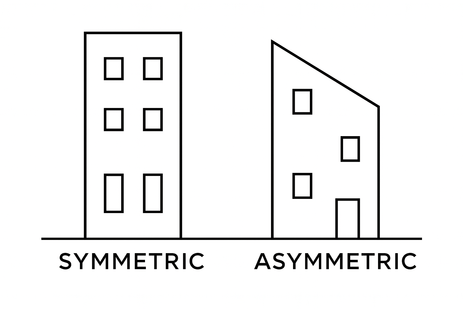
Symmetrical vs Asymmetrical Balance in Architecture
Symmetrical and asymmetrical balance serve the same goal, visual harmony, but they reach it through different means. Symmetry uses reflection and order. Asymmetry relies on contrast and weight. Both can produce calm, readable spaces when handled with control.
Symmetrical Balance
Symmetrical balance mirrors forms across a central axis. It brings formality, clarity, and permanence. Government buildings, museums, and historic campuses use it to project stability and hierarchy. The geometry makes navigation intuitive, the eye always finds the center.
Asymmetrical Balance

Asymmetrical balance trades mirror order for visual weight. Instead of matching elements, the designer balances large forms against small ones, or dark materials against light. The result feels more natural and modern, often matching irregular sites or open interior plans.
When to Use Each
- Symmetry: When clarity, tradition, or ceremony matter. Best for façades, courtyards, and formal public buildings.
- Asymmetry: When flexibility, movement, or connection to context drives design. Works well for homes, cultural spaces, and landscapes.
Blending the Two
Many strong projects combine both. A building might use a symmetrical mass for stability but add asymmetric glazing or canopies to adapt to site and light. The key is hierarchy — keep the dominant order clear and let smaller elements adjust naturally.
For deeper study of how these approaches meet in real projects, see Balance in Architecture and Architectural Form Examples.
FIELD PICK
Design Basics by David A. Lauer and Stephen Pentak
Clear visuals showing how symmetrical and asymmetrical balance work across architecture and design. A reliable desk reference.
Closing Notes
Symmetrical balance is not a style. It is a method for creating stillness and clarity. When the axis is clear, the module is steady, and light is matched, the building stops arguing with itself. People find the door. Rooms feel centered. Movement makes sense. Use symmetry when the purpose calls for calm and order. Mix it with measured variation so the work stays alive.
When you need to teach the eye, go back to simple fronts and radial courts. Sketch them. Walk historic streets that keep to a line. Then bring that discipline into new materials and new programs. The language changes. The logic endures.
FAQ
Is symmetry always the best choice
No. Use it when clarity and ceremony matter, or when the site and program align along one strong axis. When context is irregular or the plan needs flexibility, asymmetry may serve better.
How do I avoid stiffness
Keep the main order. Add variation through depth, texture, or planting. Small differences at edges keep a large composition from feeling staged.
Can interiors be symmetrical if the shell is not
Yes. Local symmetry inside rooms calms use even when the exterior breaks the mirror. Keep door centers, fixture pairs, and furniture weights balanced within each room.
What breaks symmetry fastest
Misaligned heads and sills. Inconsistent joint lines. Unequal light on mirrored parts. Fix those before you change size.
Does symmetry increase cost
It can lower cost through repetition if details share modules. It can increase cost if you force structure to match a façade that fights the plan. Align structure with the axis early to avoid rework.
MUST READ
Building Construction Illustrated by Francis D. K. Ching
Clear drawings that connect façade order to section and detail. Helpful when aligning interior logic with a symmetrical shell.