Applying Design Principles for Students, Architects, and Designers
Applying design principles is about system, not checklists. See how open and closed spaces, balance, and unity change design.
Why Principles Aren’t Just Theory
Practical Design Principles Every Architect Uses
Design education often breaks principles into neat definitions. Balance. Rhythm. Contrast. But real projects don’t split them up. They overlap, bleed into each other, and shape how spaces feel. You notice it the moment you step into a room that’s open, light-filled, and calm compared to one that’s boxed, contained, and private.
This is about using principles as working tools. Think of them as gears in a system. One gear shifts, the others move with it.
Architecture and interiors shaped by design principles. Balance, movement, contrast, and unity explained with real-world examples.
Hidden Forces: What People Feel Before They Notice
Design the eye and it hits the body and brain before logic kicks in. You step into a room and know in seconds if it feels right, even before noticing color or furniture. That’s the hidden side of principles.
● Weight of Space
High ceilings lift mood. Low ceilings press it down. A hallway with narrowing walls speeds your pace. Designers use proportion to steer emotion without a word.
● Light as Structure
Light shapes movement as much as walls. A bright corner pulls you across the room. A shadowed niche slows you down. Rhythm exists in brightness just as much as in columns.
● Noise and Privacy
An open-plan kitchen carries every clatter. A partitioned office muffles sound. Balance here isn’t visual. It’s social comfort.
● Memory in Material
Stone feels permanent. Wood feels warm. Glass feels open. Unity doesn’t come only from matching finishes. It comes from shared memory and association.
● Tension That Works
Perfect balance calms. Imperfect balance excites. A tilted plane, a staircase off-center, a sudden contrast of scale—designers use these to spark energy on purpose.
The point is simple: principles don’t live on the page. They live in how people walk, breathe, and behave in space. That’s where design becomes more than arrangement: it becomes experience.
See: How to Choose the Right Wood for Your Project
The Principles
Balance and Proportion: Building the Base
Balance is the anchor. Proportion gives scale. Together they prevent a room from feeling lopsided.
● Symmetry creates calm.
● Asymmetry creates energy.
● Proportion ties object size to human use and room scale.
Example: A long dining table centered under a pendant light balances the room. Proportion ensures chairs aren’t too small for the table.
Contrast and Emphasis: Where Eyes Go
Contrast directs attention. Without it, spaces feel flat.
Example: A white gallery wall punctuated by a single bold artwork. The contrast of color and scale draws the eye.
Pro Tip: Too much contrast creates chaos. Anchor it with unity.
Rhythm and Unity: Keeping Flow Intact
Rhythm repeats elements. Unity holds them together. Without rhythm, spaces feel disconnected. Without unity, rhythm becomes clutter.
Example: A retail store repeating lighting fixtures in a line, pulling the eye toward the display. Unity comes from consistent material finishes.
Proportion and Movement: Making Spaces Work
Proportion ensures function. Movement shapes how people use space.
Example: Wright’s Robie House uses horizontal lines to stretch sightlines, making the house feel longer. Movement is guided by ceiling height and floor levels.
Same Principles, Different Worlds: Interior vs Exterior
Balance
● Indoors: Balance often comes from furniture placement, ceiling height, and light distribution. Example: a heavy sofa balanced with tall bookshelves.
● Outdoors: Balance is shaped by massing and landscape. A tall building balanced with a plaza, or a row of trees softening a facade.
Rhythm
● Indoors: Rhythm comes from repeating lights, beams, or wall panels. Example: downlights guiding you through a hallway.
● Outdoors: Rhythm comes from windows, arches, or façade modules repeating across elevation. Example: the arched colonnade of the Doge’s Palace in Venice.
Contrast
● Indoors: Contrast is often tactile and close-range. Smooth marble against a rough rug. Dark wall against a pale ceiling.
● Outdoors: Contrast works at scale. Glass tower rising from brick warehouses. A metal canopy against greenery.
Unity
● Indoors: Unity comes from materials and finishes tying rooms together. Example: wood trim running consistently across an open-plan home.
● Outdoors: Unity ties architecture to context. Example: adobe walls blending with desert terrain, or stone facades matching local geology.
Proportion
● Indoors: Proportion is human-scale. A door too tall feels intimidating, a chair too small feels awkward.
● Outdoors: Proportion is civic-scale. A plaza that’s too wide feels empty, a tower too squat feels heavy.
Applying Design Principles as a System
Case Study: Interior
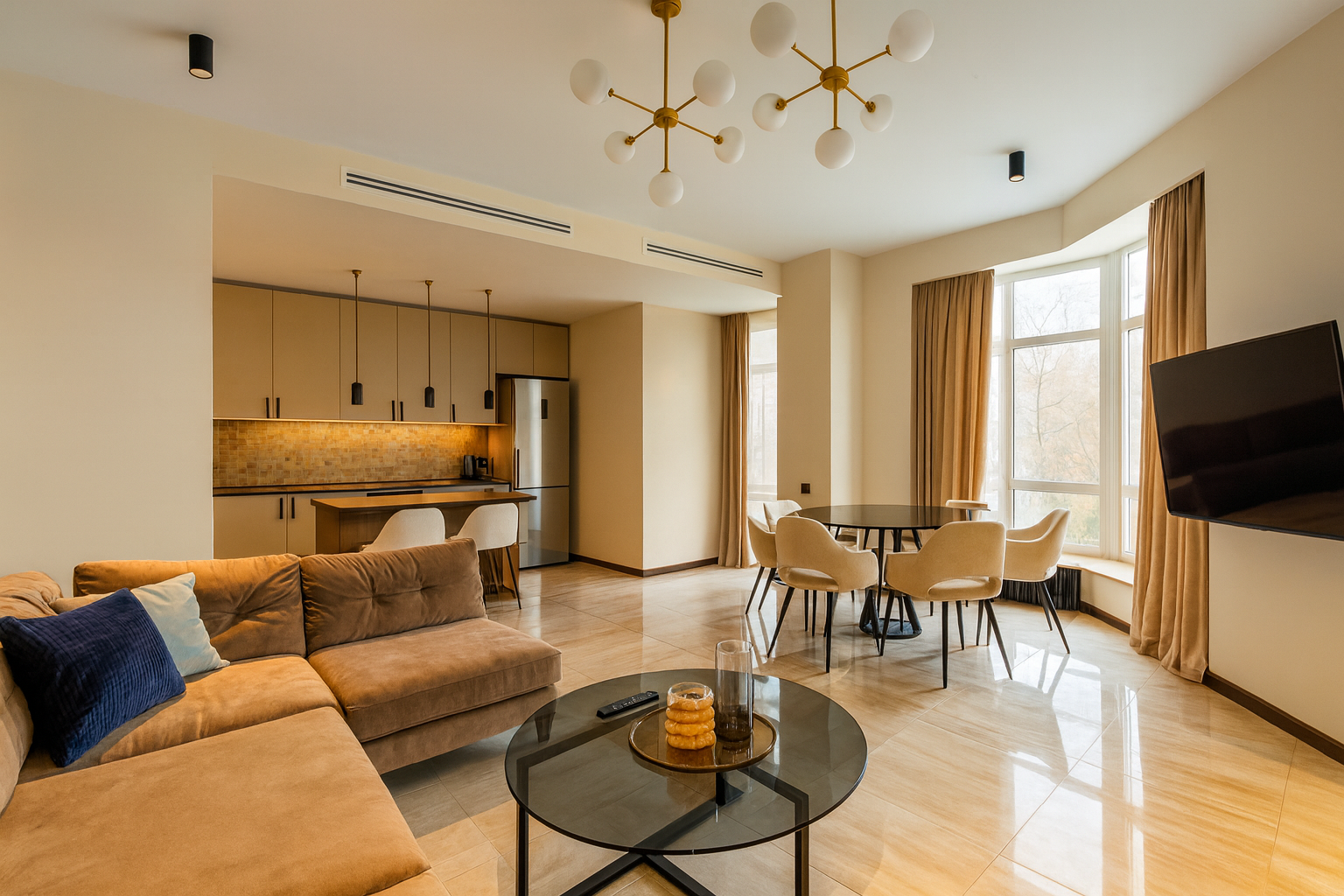
Open Space: Breathing Room
Open interiors create flow, scale, and flexibility. They let daylight reach deeper into the room and make gatherings easier.
Example (Interior): A loft apartment with kitchen, dining, and living area combined into one volume. Instead of walls, light travels across polished concrete floors and reflects off tall windows. People can move between cooking and sitting without barriers.
Before: Walls and bulky cabinets cut off light and chop the space into small boxes.
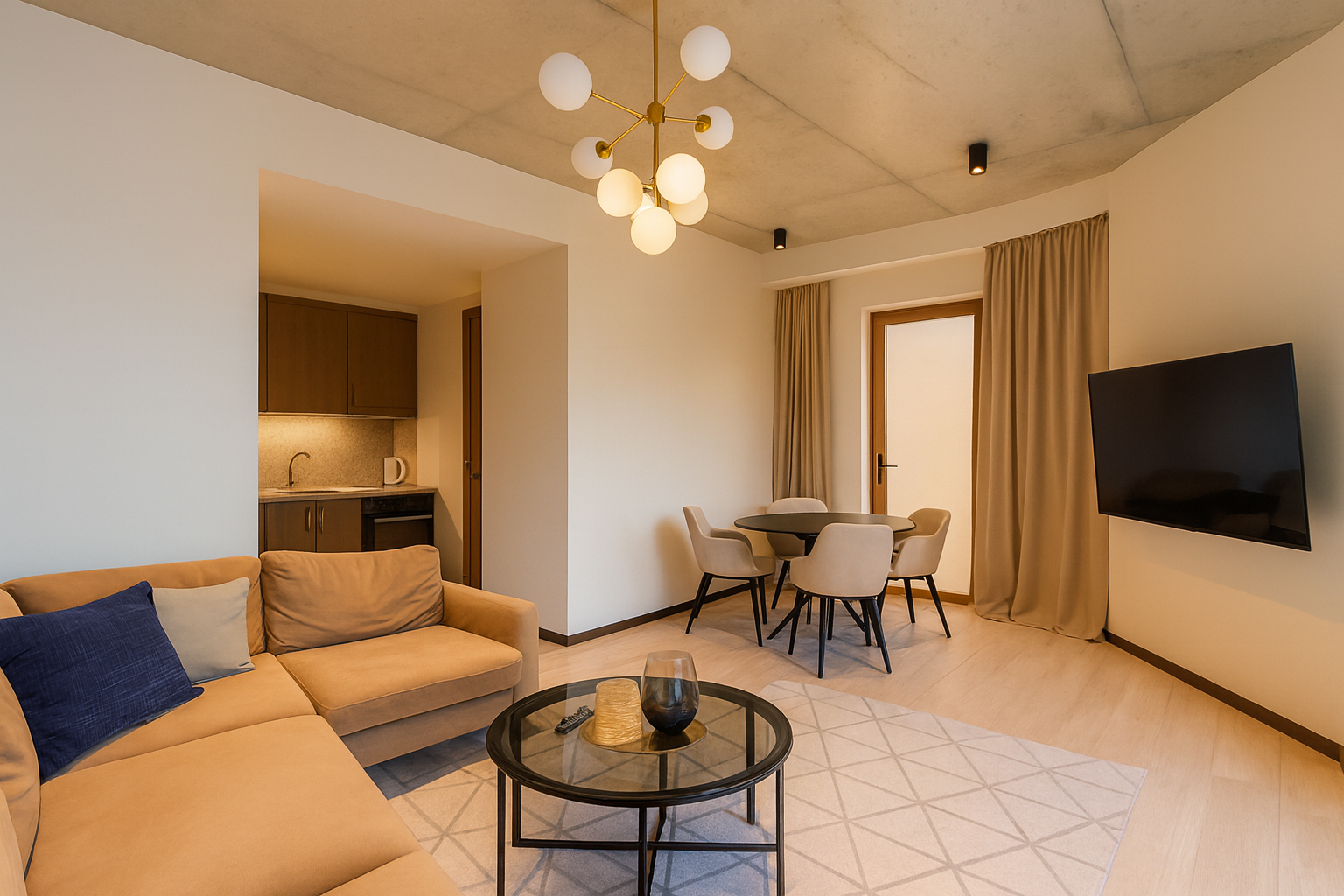
After: Open-plan interior with kitchen, dining, and living in one connected zone. Daylight and movement link the functions together.
Closed Space: Definition and Control
Closed interiors use partitions, half-walls, or furniture arrangements to create smaller zones. This brings privacy, concentration, and intimacy.
Example (Interior): A corner reading nook in a townhouse, shaped by tall bookshelves and a low ceiling beam. Even though it’s part of a bigger open floor, the defined enclosure makes it feel like a retreat.
Image Caption Before: Furniture scattered without order, offering no sense of boundary.
Image Caption After: Shelves and seating frame a quiet interior corner designed for reading and calm.
Balance Between the Two
Strong interiors rarely go fully open or fully closed. Good design blends both. Social areas like living rooms and kitchens benefit from openness. Workspaces, bedrooms, or study corners need enclosure.
Case Study (Interior): Japanese homes. Sliding shoji screens connect living and dining during the day. At night, the same screens close off sections to give privacy. The system adapts — open flow when needed, controlled closure when desired.
Case Study Exterior: Sydney Opera House
The Opera House isn’t iconic just for its sails. It layers principles.
● Balance: shells offset by podium.
● Rhythm: repetition of shell forms.
● Unity: consistent material palette.
● Movement: steps rising toward the harbor.
It shows principles don’t sit apart. They work as one.
Holistic Design: Intent Over Checklist
A design that’s just “balanced” isn’t enough. Intent matters. You balance to guide. You contrast to focus. You proportion to fit human scale.
That’s when principles stop being vocabulary and start being practice.
Where Principles Fail
Most designers learn principles as rules. The real breakthrough comes when you see them fail.
Think of a grand hotel lobby that feels impressive but cold. Balance? Perfect. Proportion? Impeccable. But no rhythm, no intimacy. Guests feel overwhelmed.
Or the opposite: a home packed with unified colors, textures, and proportions. Technically correct. But flat. No contrast. Nothing catches the eye.
Failure shows that principles aren’t goals in themselves. They’re levers. Use them wrong, and a space dies. Use them right, and even a small room comes alive.
MUST READ
📘 The Architecture of Happiness – Alain de Botton
Sharp insights on how design impacts mood. Not a manual, but a perspective shifter.
→ Buy on Amazon
FAQs
Applying Design Principles
Basics of Principles
What are the core design principles?
Balance, proportion, rhythm, unity, contrast, emphasis, and movement. These are the skeleton every design rests on.
Are principles the same in interiors and architecture?
Yes. Scale changes, but the logic is the same. A chair needs balance just like a building facade.
Do professionals actually think about them?
Not as words. They use them instinctively. Years of practice makes “balance” second nature.
Why do schools still teach them as vocabulary?
Because beginners need names to notice them. But real use goes beyond definitions.
Open vs Closed Spaces
Why do open layouts feel bigger?
The eye doesn’t hit barriers. Light spreads. Walls don’t chop sightlines.
What’s the risk of open layouts?
Noise and lack of privacy. Not every activity belongs in one shared room.
Why use closed spaces?
They define zones. They control sound. They create intimacy.
Can you mix both?
Yes. The best homes do. Living room open, bedroom closed.
What culture balanced it best?
Traditional Japanese interiors. Sliding panels let one room shift between open and closed.
Balance and Proportion
What happens if balance fails?
Spaces feel off. You can’t always name it, but you sense imbalance immediately.
Is symmetry always good?
No. Too much symmetry feels static. Asymmetry adds movement.
What’s bad proportion in design?
A couch too large for a studio. Tiny windows on a tall wall. Anything that dwarfs or shrinks use.
How do designers fix proportion?
By comparing to human scale. A doorknob feels right because it matches hand height.
Does proportion change by culture?
Yes. Japanese tea houses have low ceilings. Gothic cathedrals chase height. Both are proportioned to purpose.
Contrast and Emphasis
What’s the simplest way to add contrast?
Change light and dark. White wall, black frame.
Why do some rooms look flat?
Because everything blends. No object or surface grabs attention.
Can contrast be subtle?
Yes. Even matte vs glossy creates layers.
When does contrast fail?
When every surface screams. The eye has nowhere to rest.
What’s emphasis in design?
The focal point. A fireplace. An altar. A staircase. Every strong design has one.
Rhythm and Unity
How does rhythm show up in architecture?
Repetition of windows, columns, or beams. Your eye follows the beat.
Can rhythm exist in interiors?
Yes. Chairs lined along a table. Lighting fixtures in a row.
Why does unity matter?
Without it, repetition feels random. Unity ties the elements into a whole.
How do you keep unity without boredom?
Use consistent materials but shift form. Brick walls with changing patterns.
What breaks unity fast?
Mixing styles without reason. A Gothic arch next to a glass cube with no bridge.
Movement and Flow
What controls movement in design?
Pathways, stairs, ceilings, and light. They guide the body and the eye.
Can movement exist in small rooms?
Yes. Even angled furniture creates direction.
Why do some hallways feel endless?
Because rhythm and lighting repeat without variation. Add a break to reset the eye.
How does movement apply in landscape design?
Paths, hedges, and sightlines pull people through gardens.
Can movement be vertical?
Yes. Spiral staircases, atriums, and towers pull the eye up.
Case Studies
Which building shows balance best?
The Parthenon. Its symmetry is textbook.
Which building shows proportion best?
Villa Rotonda by Palladio. Every room fits human scale with precision.
Which shows rhythm?
Mosques with arcades. Repeated arches create steady flow.
Which shows unity?
Barcelona Pavilion. Materials shift but stay in one palette.
Which shows movement?
Fallingwater. The stream, terraces, and paths all guide the body.
Where Principles Fail
Can a perfect building still fail?
Yes. A lobby with balance and proportion but no intimacy feels cold.
What does too much unity cause?
Monotony. Nothing stands out.
What does too much contrast cause?
Chaos. The eye burns out.
What’s the danger of chasing proportion too strictly?
Sterility. Spaces feel lifeless if math outweighs mood.
When does balance kill design?
When it removes tension. Sometimes imbalance creates energy.
Application for Designers
How do students overuse principles?
By forcing them as checklists. Real design is layered, not step-by-step.
How do pros use them?
By testing options. Models, sketches, simulations.
Do digital tools help?
Yes. Programs like Rhino or Revit test rhythm, proportion, and flow fast.
What’s the fastest principle to fix a space?
Balance. Move furniture, add lighting, or adjust weight.
What’s the hardest principle to master?
Proportion. It requires instinct shaped by years of looking and building.
Conclusion
Design principles aren’t theory. They’re working tools. Open and closed. Balance and proportion. Contrast and unity. They shape how we feel in spaces and how we use them. When you stop treating them as vocabulary and start applying them with intent, design shifts from decent to alive.