Texture is the part of a building you notice after the first look is over.
You see the shape first. You see the color next. Then the surface starts doing its work. A wall catches light. A floor feels slippery. A brick joint throws a small shadow. A rough base collects dirt near the entry. A glossy tile makes the room brighter, or makes it glare.
That is texture in architecture. It is not decoration sprinkled on at the end. It changes how a building feels, how it ages, how safe it is underfoot, how much cleaning it needs, and whether the material still looks good after weather and people get to it.
What Texture Means in Architecture
Texture is the surface quality of a material. It can be something you feel with your hand, something you read with your eye, or both.
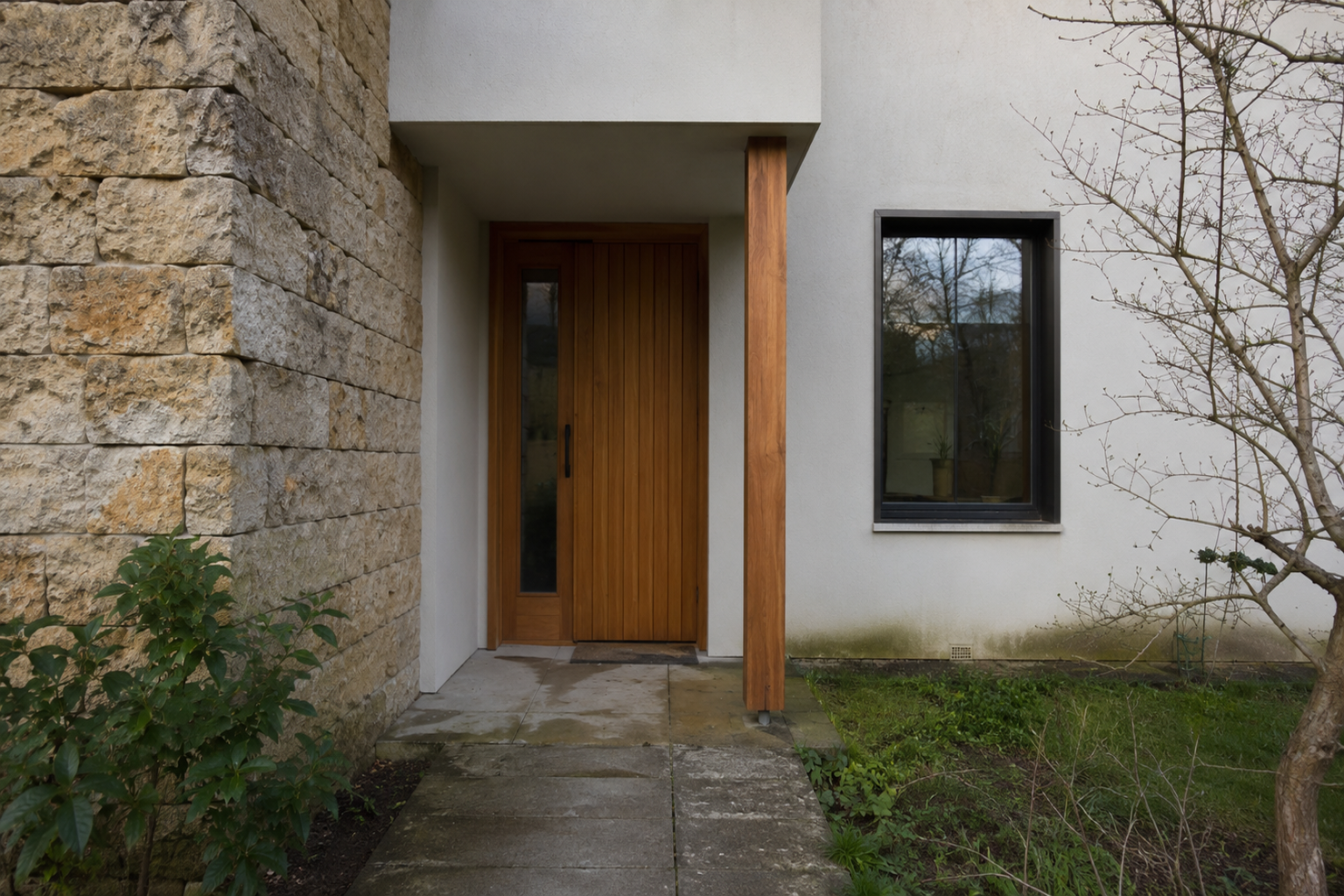
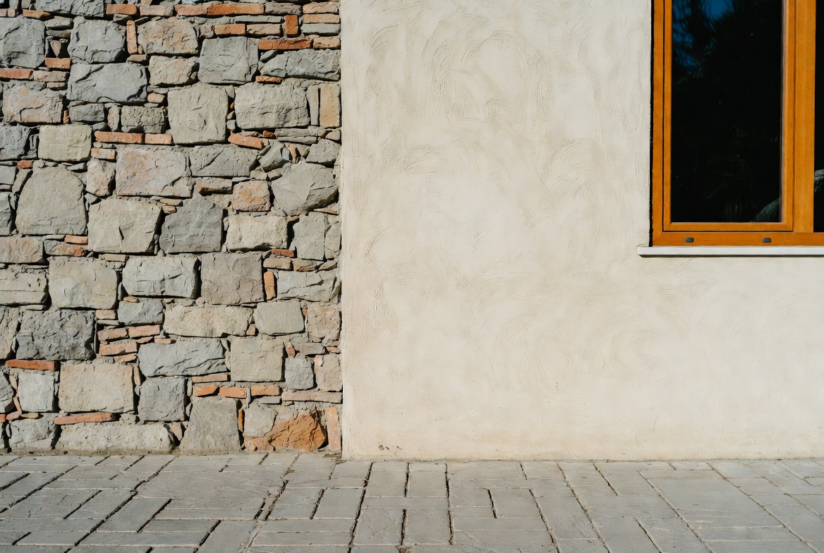
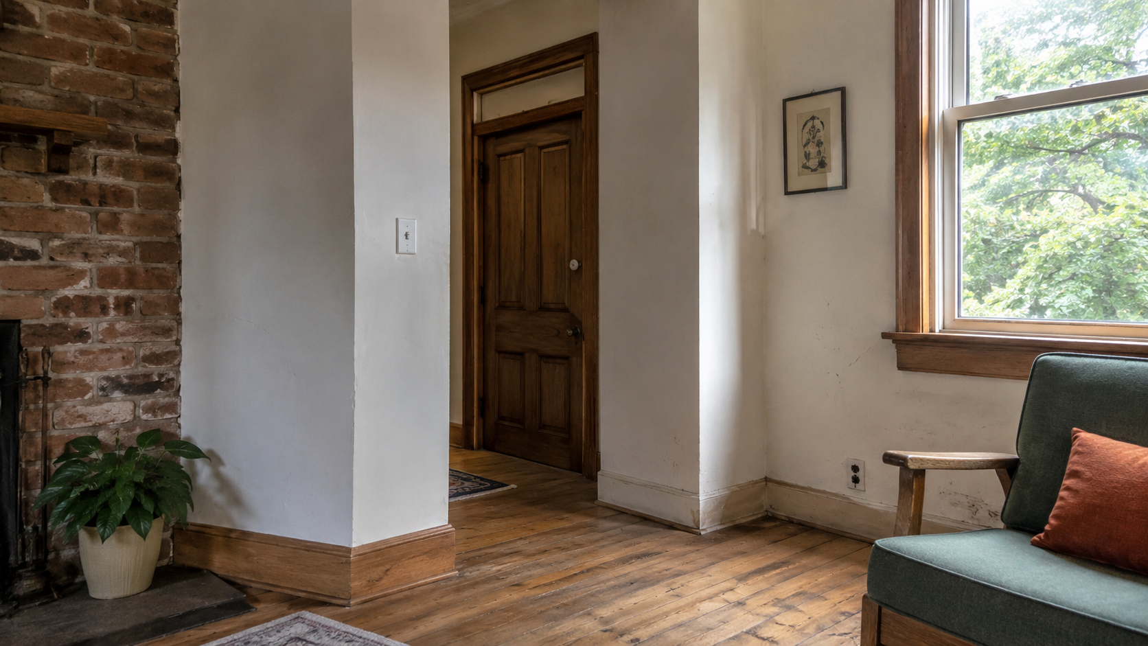
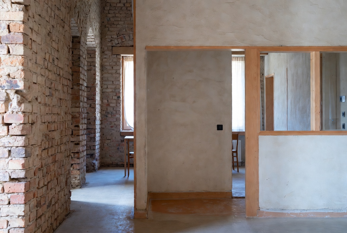
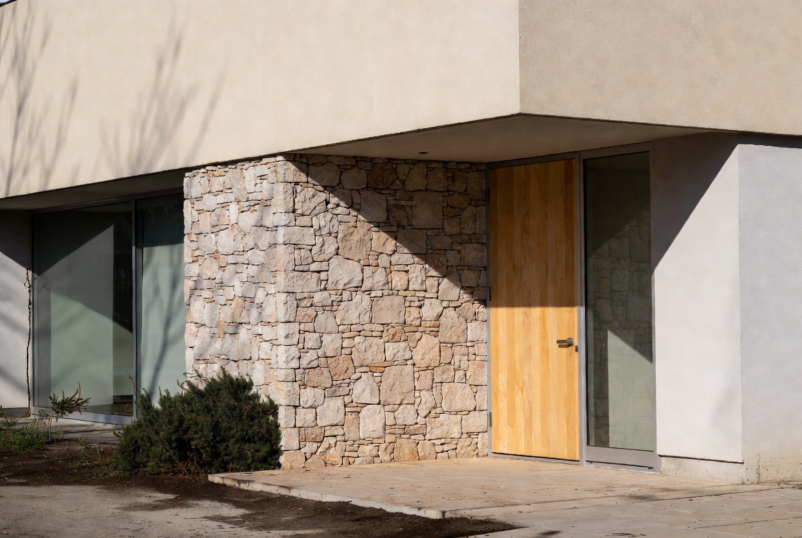
Brick feels different from painted drywall. Ribbed concrete catches light differently from smooth concrete. Wood grain, stone joints, brushed metal, glass, fabric, tile, stucco, and paving all change the way a building is read up close.
The mistake is treating texture like a finish choice only. Buildings are not flat images. People lean on walls, grab handrails, drag chairs, clean floors, walk in with wet shoes, and watch daylight move across the room. A texture that looks good in a rendering can be rough in the wrong place, glare in the sun, hold dirt by the door, or make a small room feel busy.
So texture belongs with the big design decisions. Form gives the building its mass. Scale and proportion control how the parts relate. Color sets mood and visibility. Texture decides what the surface does when the building is actually used.
Tactile Texture and Visual Texture
Tactile texture is the one your hand understands. Rough stone. Brushed wood. Ribbed concrete. Woven fabric. Slip-resistant tile.
Visual texture is what the eye reads from a distance. A brick pattern. A matte wall. A repeated joint. A soft plaster mark. A reflection in glass. The surface may feel smooth, but it still looks active because light is moving across it.
Good buildings use both. A brick wall has real touch and visual rhythm. A plaster wall may feel smooth but still show the hand of the trowel. Glass feels smooth and cold, but reflections give it movement and depth.
Texture Is Really a Light Problem
Texture changes most when light hits it from the side.
A flat wall can look dead at noon and beautiful late in the day. A ribbed wall can make a small facade feel taller. Rough stone breaks sunlight into little shadows. Glossy tile can brighten a dark room, but it can also throw glare back into your eyes.
This is the part students miss. Texture is not only a material choice. It is also a light choice.
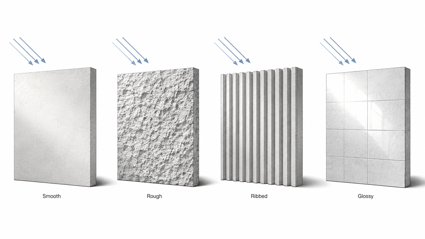
A rough surface makes small shadows. A smooth matte surface quiets them. A glossy surface reflects light back. A deep joint creates rhythm. A shallow joint may disappear unless the light is right.
On a house, this affects curb appeal. On a school, library, office, or public building, it affects human scale. A large blank wall can feel dead. Add brick coursing, reveals, ribs, joints, or shadow gaps, and the same wall gives the eye something to measure.
Where Texture Starts to Fail
Texture looks harmless on a sample board.
The trouble starts after people use it.
A rough wall near a front door catches dirt from hands, bags, and wet jackets. A grooved floor looks rich in a showroom and then holds grime at the entry. A glossy tile looks clean until the sun hits it sideways. A textured exterior panel may hide small dents, but it can also hold dust, moss, or moisture depending on the climate and the wall direction.
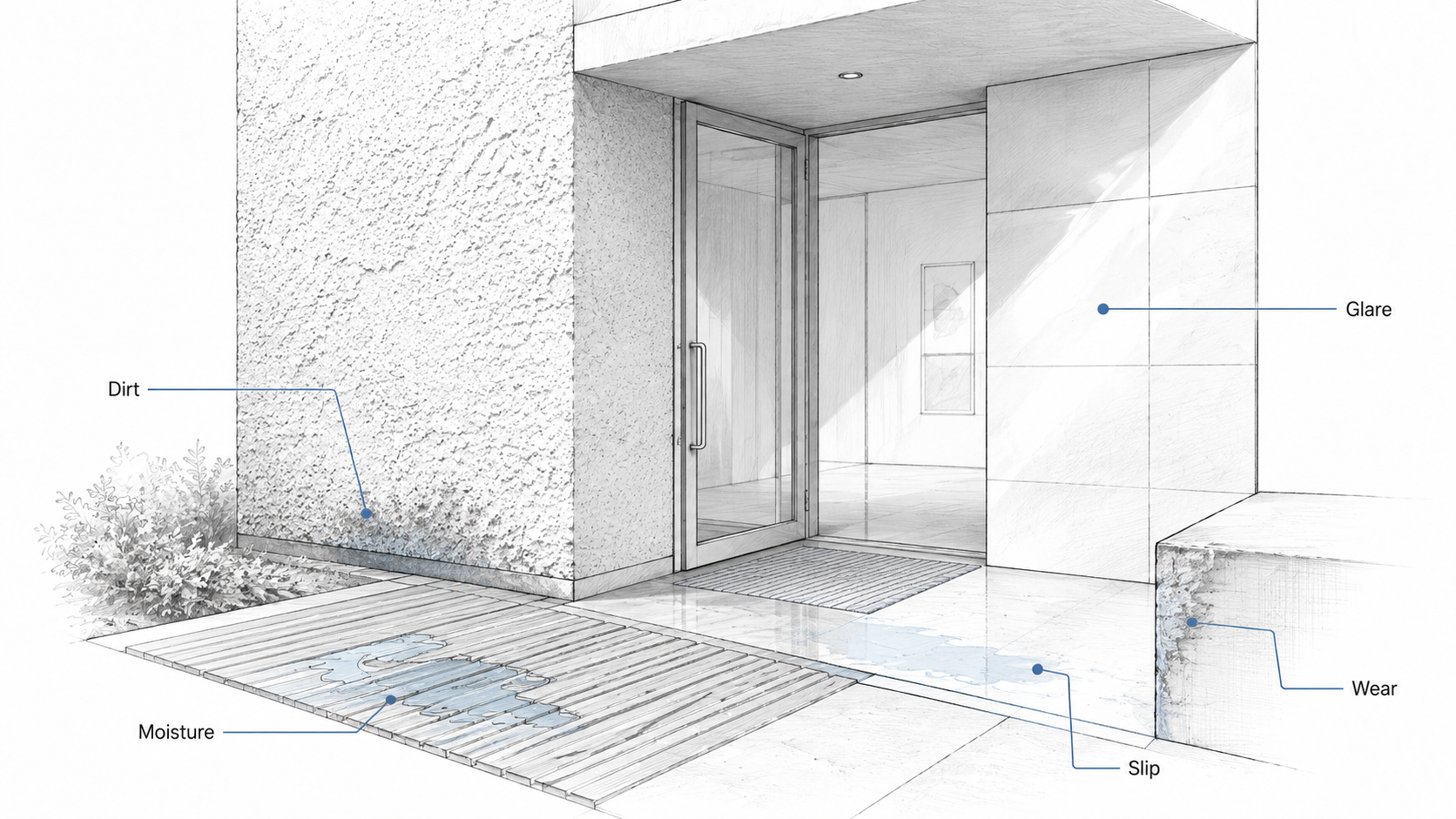
That is why texture should be chosen by location, not just by mood. High-touch areas need cleanable surfaces. Wet areas need grip. Exterior textures need drainage and drying. Sunlit walls need glare control. A beautiful texture in the wrong place becomes a cleaning problem, a safety problem, or a callback.
Rough, Smooth, Warm, and Cool Surfaces
A room feels better when its surfaces are not all doing the same job.
Rough texture gives weight. Smooth texture gives calm. Warm texture, like wood or fabric, softens a room. Cool texture, like glass, stone, metal, or polished concrete, can make a space feel cleaner and sharper.
The problem starts when every surface tries to be the feature.
For most homes and small buildings, one strong texture is enough. A brick wall can carry the room. A wood ceiling can warm it. A stone fireplace can anchor it. A textured floor can define it.
But if the wall, floor, ceiling, furniture, lighting, and trim all fight for attention, the room starts to feel noisy. Not rich. Noisy.
Common Textures and What They Get You
| Texture | What It Does Well | What Can Go Wrong |
|---|---|---|
| Rough stone | Adds weight, age, shadow, and a grounded feeling. | Can trap dirt, collect moisture, or feel heavy in a small room. |
| Smooth plaster or drywall | Keeps rooms calm and lets light, art, openings, or furniture stand out. | Can feel flat if every surface is the same. |
| Brick | Gives rhythm, scale, warmth, and visible construction logic. | Can look fake or busy if used as thin decoration without good edges. |
| Wood | Adds warmth, grain, touch, and human scale. | Needs the right finish, ventilation, and protection from water or sun. |
| Concrete | Can feel solid, quiet, modern, and structural. | Shows stains, cracks, formwork mistakes, and bad patching. |
| Glass and polished surfaces | Reflect light and make spaces feel brighter or larger. | Can create glare, fingerprints, heat gain, and cleaning issues. |
| Fabric and acoustic surfaces | Soften sound, touch, and visual hardness. | Can stain, wear, fade, or collect dust in the wrong location. |
Texture Can Organize a Room
Texture can do work that furniture and decoration often get blamed for.
Exposed brick can mark the old part of a building. Smooth plaster can calm the background. A concrete floor can ground the room. Wood trim can warm the edge of an opening. Daylight can pull all of those surfaces together.
This is useful for homeowners because it stops the project from turning into a shopping list. The question is not, “What finish can I add?” The better question is, “Which surface should do the work?”
If the floor is already strong, keep the walls quieter. If the wall is textured, keep the trim simple. If the furniture is soft and busy, calm down the surfaces around it. This is basic balance, but texture makes the balance physical.
Where Texture Belongs on a Building
Texture works best when it is tied to use.
- Put tougher texture at the base, where water, shoes, snow, mud, and cleaning hit.
- Put tactile texture at entries, handrails, benches, doors, and places people touch.
- Put quieter texture on large wall fields so the building does not feel restless.
- Put shadow-making texture where the sun can actually reveal it.
This is where architecture is different from surface decoration. Texture should explain the building. The base can feel durable. The entry can feel warm. The main wall can feel calm. The paving can guide movement. The roof edge can cast shadow.
Exterior Texture Has to Take Weather
Exterior texture has a harder job than interior texture. It has to look good, shed water, dry after rain, handle sun, resist impact, and keep its edges from looking cheap.
Rough texture can hide small stains and dents, but it may hold dust, moss, or water. Smooth texture can look clean, but it shows cracks, waves, bad patching, and dirt streaks. Wood can warm a facade, but it needs the right species, finish, flashing, ventilation, and maintenance plan. Metal can be crisp, but dents, glare, oil-canning, and bad panel joints can ruin the whole effect.
Climate changes the answer. A finish that behaves in a dry climate may age badly in freeze-thaw, coastal salt air, heavy rain, or strong sun. On exterior walls, texture is never only visual. It becomes part of the weathering strategy.
For related material thinking, see natural building materials, stone architecture, concrete architecture, wood in architecture, metal architecture, and glass architecture.
Interior Texture Has to Take People
Interior texture fails in quieter ways.
It gets shiny where hands touch it. It stains behind chairs. It catches dust on shelves and ribs. It chips at corners. It makes a room echo or absorb sound. It can make a space feel warm, calm, heavy, cheap, soft, or cold.
In homes, texture has to handle daily life. In schools, restaurants, clinics, offices, and public buildings, it has to handle many more hands and much more cleaning. A finish that looks refined in a sample tray may not survive a hallway, restroom, lobby, kitchen, or stair.
Use smooth cleanable surfaces where cleaning matters. Use softer texture where sound and comfort matter. Use rougher texture where touch and durability make sense. Do not put a delicate texture where bags, shoes, water, chairs, and carts will beat it up.
Texture Mistakes That Make Buildings Feel Cheap
Texture can make a building feel richer. It can also make it feel fake very quickly.
- Too many textures: stone, brick, wood, metal, tile, glass, and patterned panels all fighting on one elevation.
- Thin texture: fake stone, printed wood, or shallow panels that fall apart at corners, edges, and openings.
- Wrong scale: tiny busy texture on a large wall, or huge rough texture in a small room.
- No edge plan: the surface looks fine in the middle but fails at corners, base, trim, windows, and rooflines.
The edge is where texture tells the truth. A brick wall has to turn a corner. A stone veneer has to meet a window. A wood panel has to stop at a floor. A textured plaster wall has to meet baseboard, outlet, and ceiling. If the edge is bad, the texture reads as decoration instead of architecture.
Texture, Pattern, and Contrast Are Different Jobs
Texture is surface behavior. Pattern is repetition. Contrast is the difference between two things.
They often work together, but they are not the same decision.
A brick wall has texture because of its surface and joints. It has pattern because the bricks repeat. It creates contrast when it sits beside smooth plaster, glass, or metal.
Mix those up and the design gets messy. You may add pattern when the room only needed shadow. You may add a rough surface when the real problem was weak contrast. Used with care, texture supports contrast without making the building feel busy.
Simple Texture Checks Before You Choose a Finish
Before choosing a textured surface, test it against ordinary use.
- Will people touch it often?
- Will it get wet, dirty, greasy, dusty, or scratched?
- Will sunlight create glare or useful shadow?
- Can it be cleaned without damaging the finish?
- Does the texture fit the scale of the wall, room, or facade?
- What happens at corners, joints, windows, doors, baseboards, and roof edges?
These checks are plain, but they prevent most texture mistakes. If the surface cannot survive its location, it does not matter how good it looks on day one.
Read This Next
For the broader design basics behind this page, read Basic Design and Architecture and Design Elements. For the architecture-specific version, read Design Elements in Architecture.
Texture also connects to form in architecture, balance in architecture, contrast in architecture, color in architecture, and scale and proportion.
FAQ
What is texture in architecture?
Texture is the surface quality of a material or building element. It includes how a surface feels, how it looks under light, how it ages, and how it affects the experience of a room, facade, entry, floor, or wall.
What is the difference between tactile texture and visual texture?
Tactile texture is what you physically feel, such as rough stone or brushed wood. Visual texture is what the eye reads, such as shadow, pattern, reflection, or printed grain.
Why does texture matter in architecture?
Texture changes light, shadow, scale, touch, mood, safety, cleaning, weathering, and maintenance. It can make a building feel grounded, warm, calm, heavy, sharp, soft, or cheap depending on where and how it is used.
What textures work best for house exteriors?
Durable textures such as brick, stone, stucco, concrete, wood siding, and metal panels can work well, but the best choice depends on climate, drainage, sun exposure, maintenance, and how the material is detailed at edges and openings.
Can too much texture make a room look bad?
Yes. Too many strong textures can make a room feel busy and unsettled. A safer approach is to let one surface carry the main texture, then keep the surrounding surfaces calmer.
What texture mistakes should homeowners avoid?
Avoid rough surfaces where cleaning is difficult, glossy surfaces where glare is a problem, slippery textures in wet areas, fake materials that fail at corners, and exterior textures that trap moisture or dirt.
How should students use texture in architecture projects?
Students should show why the texture belongs in that location. Connect it to light, touch, weather, sound, structure, or use. Do not add texture only to make a drawing look finished.