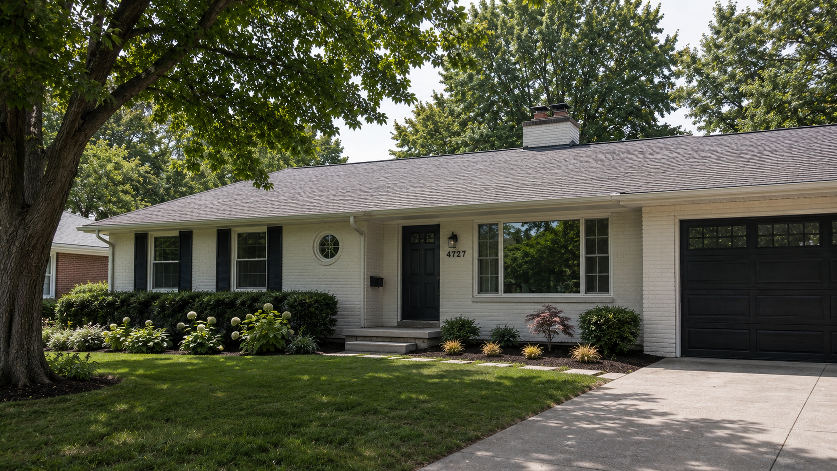
A ranch is a horizontal idea. Most remodels forget that.
Almost every bad ranch remodel goes wrong the same way. Somebody treated the house as a collection of separate problems — the windows over here, the entry over there, the garage being its own thing, the siding handled like a paint job — when the house was actually one continuous horizontal form that needed to stay calm. Each individual upgrade looks fine in a mood board. Stacked together on a real elevation, they fight.
Ranches respond well to restraint, which is unfortunate, because restraint is the hardest move to sell to a homeowner who wants their tired postwar box to feel like something new.
A Ranch Is a Horizontal Idea
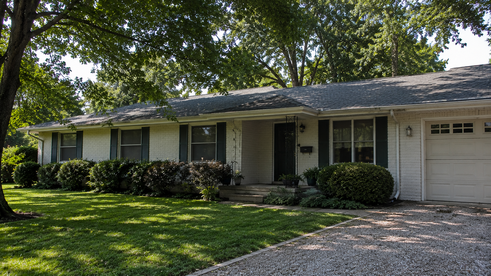
The original ranch was drawn long and low for a reason. Wide overhang. Continuous siding plane. Windows running in a band. Roofline reading as one straight horizontal line across the street.
Any vertical move on that house — a steep gable, a tall portico, a board-and-batten accent strip, a two-tone color split — is a vertical move added to a horizontal idea. Sometimes one vertical move is fine. It can become the entry marker, the one place the eye lands. But pile up three or four of them and the elevation gets nervous. The house stops reading as one calm form and starts reading as a parts catalog.
The test: after every proposed change, look at the front from the street and ask whether the house still reads as one thing. If it now reads as several things stuck together, the change is wrong even if every piece is well-made.
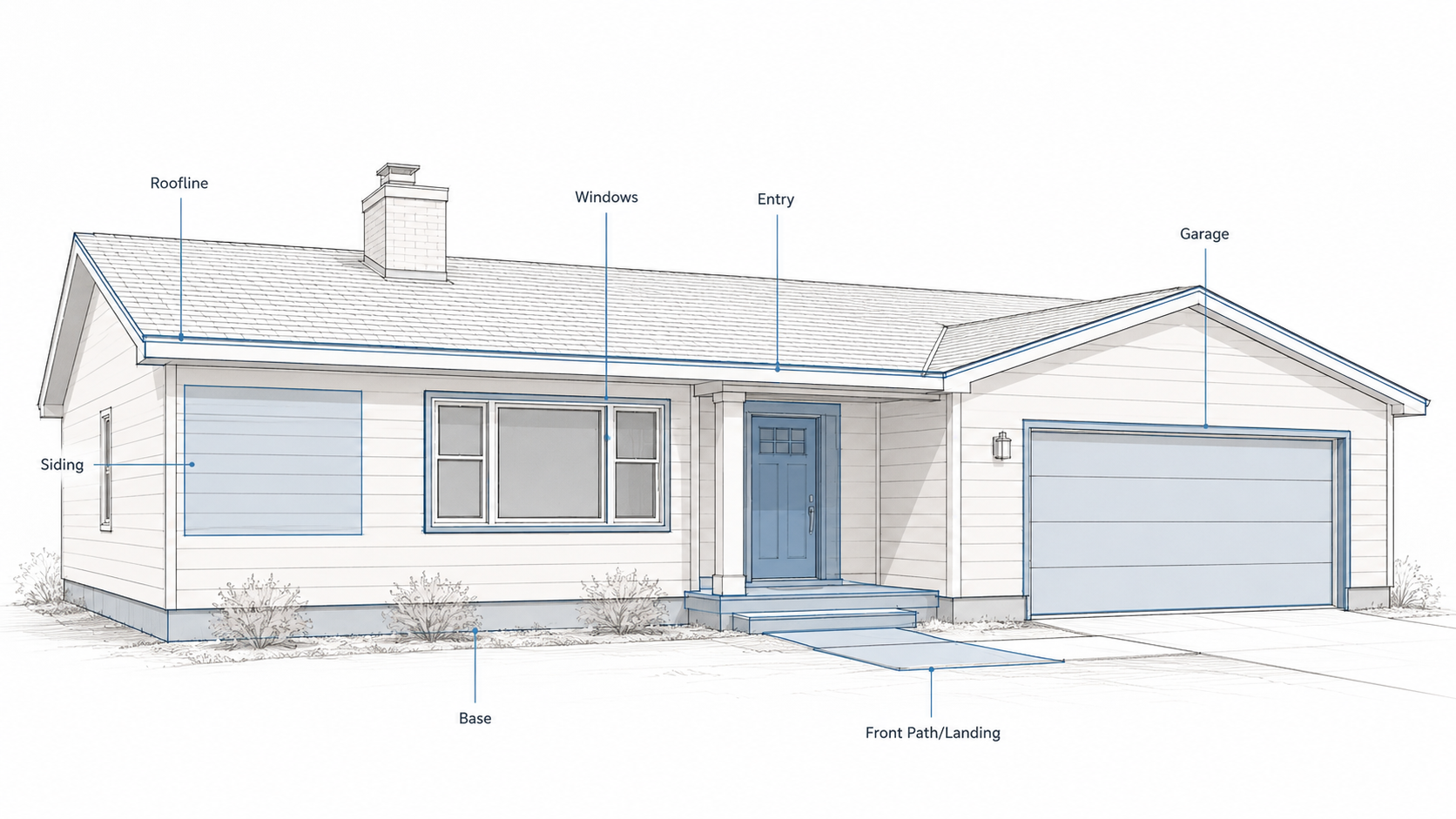
The Garage Problem Usually Cannot Be Solved, Only Managed
Most ranch fronts are garage-heavy.
The garage door is wider than the front door, sits closer to the street, and reads as the dominant object on the elevation. Nothing about a remodel is going to change that fact, short of moving the garage — which nobody wants to do because it costs more than the rest of the project combined.
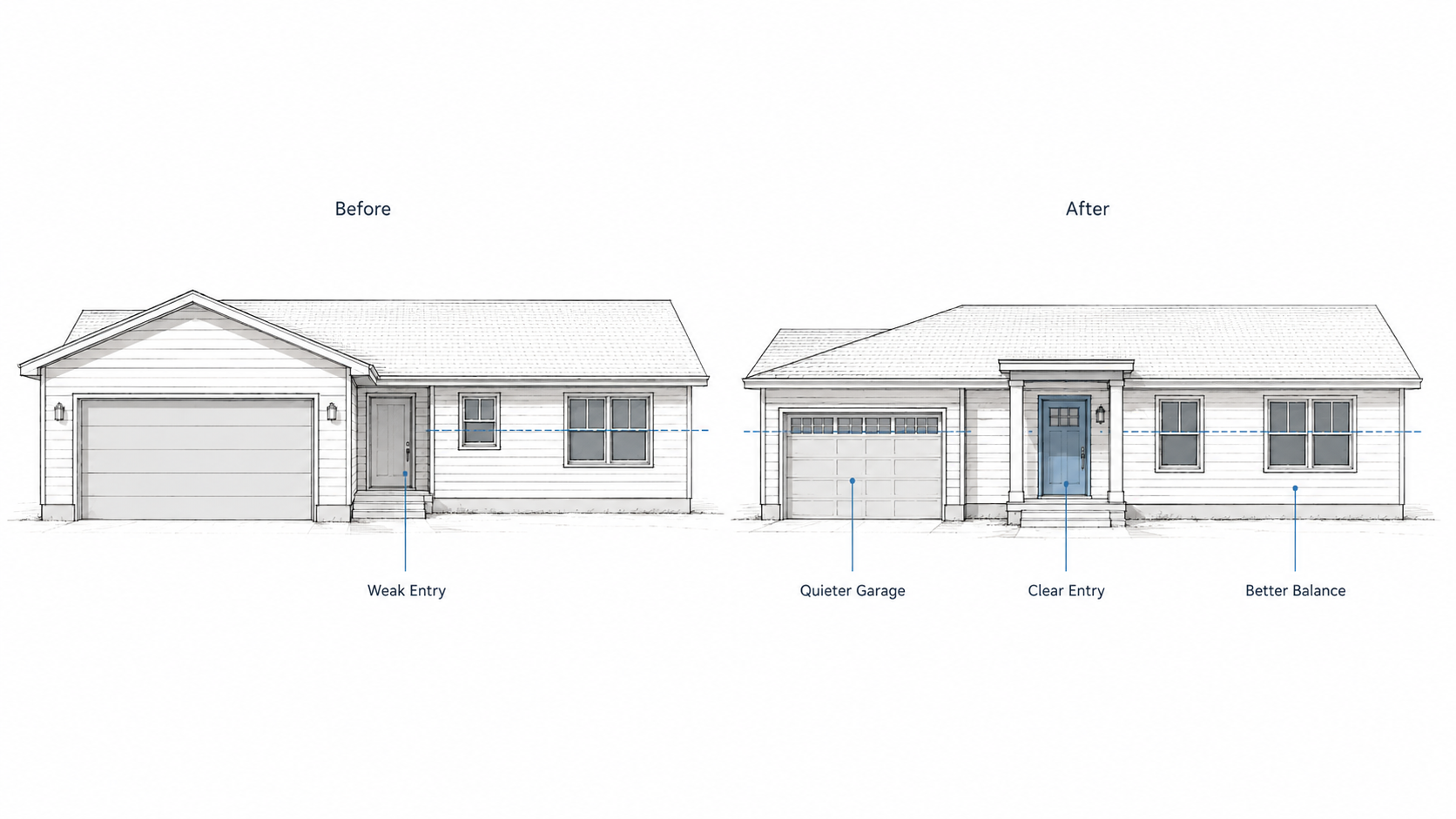
So the question stops being "how do I make the front door more important than the garage" and becomes "how do I make the garage less loud." Those are two different design problems. The first one almost always fails. The second one almost always works.
The mistake is the fake gable. Someone decides the garage needs to be hidden or balanced, and the answer is a peaked roof over the garage door with a little gable end and maybe some trim. This never helps. The gable is a vertical move on a horizontal house. It draws the eye exactly where you wanted the eye to stop going. It turns the garage from a flat horizontal element into a tall vertical event with a triangle on top. The garage is now louder than before, and the house has a piece of architectural costume stuck to it.
The moves that actually work are quieter. Paint the garage door close to the body color of the house so it stops shouting. Skip the panel-glass-window upgrade if it adds visual weight. Make the front door slightly more present by giving it a small canopy, better lighting, a clear path from the sidewalk, and a color that holds its own without yelling. The garage will still be bigger than the entry. The eye will still register the garage first. But the front door will no longer feel like an apology, and the elevation will breathe.
That is the honest result. Not a transformed facade. A calmer one.
Window Alignment Is Where Most Replacements Go Wrong
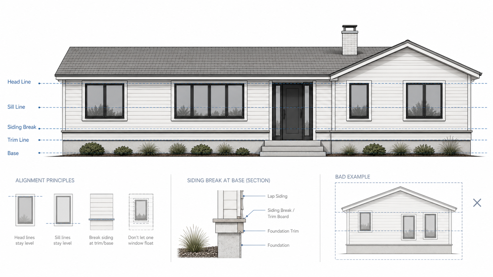
The original windows on a ranch were usually drawn with intent. Head heights lined up. Sills lined up. Proportions related to each other across the front. The replacement windows are usually picked from a catalog.
That is the gap that ruins ranch elevations. A window installer arrives with a window that is technically the right rough opening but the wrong proportion. The new sash is taller and narrower than the original because that is what came off the truck. One window gets replaced this year. Two more get replaced next year. By the time the project is done, the front of the house has four different window proportions on the same wall and nobody is sure why the house looks worse than before.
Before any window order goes in, check the head line and the sill line of every window on the front. They should be at the same heights, or at clearly related heights, the way the original drawings had them. Pick one window style for the whole front and repeat it. Picture window plus flanking double-hungs is a common ranch pattern that still works. Mixing a casement, two double-hungs, and a sliding window across one elevation will not.
One quiet window system repeated well beats three clever ones fighting each other.
The single best reference for thinking about windows, entry scale, and overall proportion on a small house is Marianne Cusato's Get Your House Right. It will not give you trendy ideas. It will give you the proportional rules that make those trendy ideas not embarrass the house.
Rooflines: Keep One Dominant Idea
If a ranch remodel feels wrong from the street and you cannot figure out why, look at the roof first.
Extra gables. Steep porch roofs added to a low main roof. Additions that bring in a second pitch at a steeper angle. Dormer attempts on houses that never had dormers. Each can work in isolation. Stacked on one elevation, they turn the roof into a committee.
Pick one dominant roof idea and let everything else stay subordinate to it. An addition can tie in with a matching slope. A small entry canopy can sit below the main eave without competing. What does not work is putting a new roof feature at the same scale and pitch as the original main roof. Now there are two main roofs, and the house has no spine.
The Entry Should Be Clearer, Not Bigger
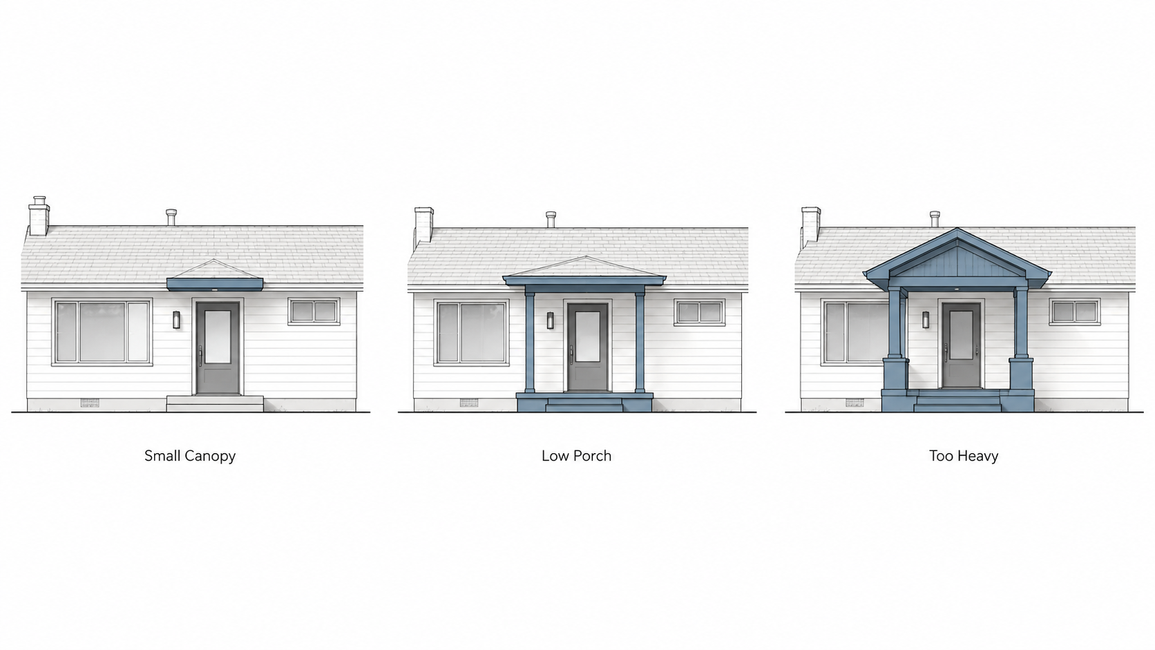
Most ranch houses need a stronger entry. Almost none of them need a big porch.
The instinct is to add presence by adding mass. A two-story portico. A wraparound porch. A peaked roof element over the front door. The result is a small house wearing a costume it cannot afford. The roofline gets disrupted, the proportions get top-heavy, and the original ranch shape gets lost behind the new "front."
The smaller move usually works better. A clean canopy at the original eave height. A landing that gives the door room to breathe. A path from the driveway or sidewalk that does not require guessing. Decent lighting on both sides of the door. A door color that holds attention without shouting. Done together, that package solves the actual entry problem — the door was hard to find and felt like an afterthought — without rebuilding the house.
If the original facade can carry a real porch, fine. Most ranches cannot. Their eaves are too low. Their bays are too narrow. Their proportions were never drawn for vertical front elements.
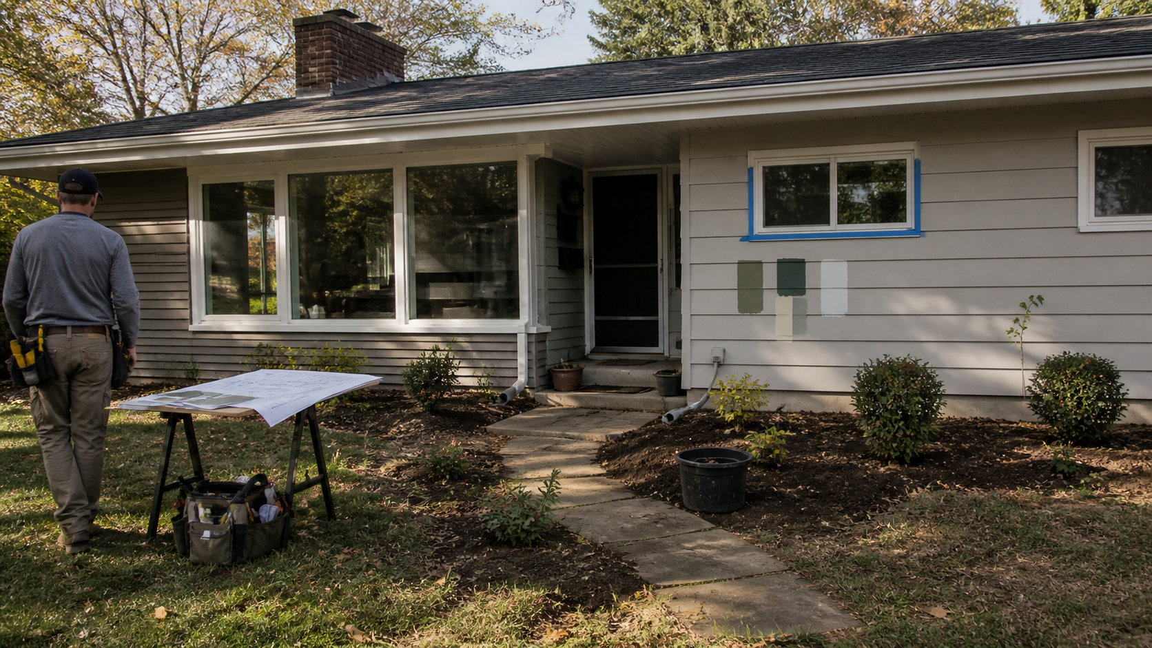
Siding Restraint Beats Siding Variety
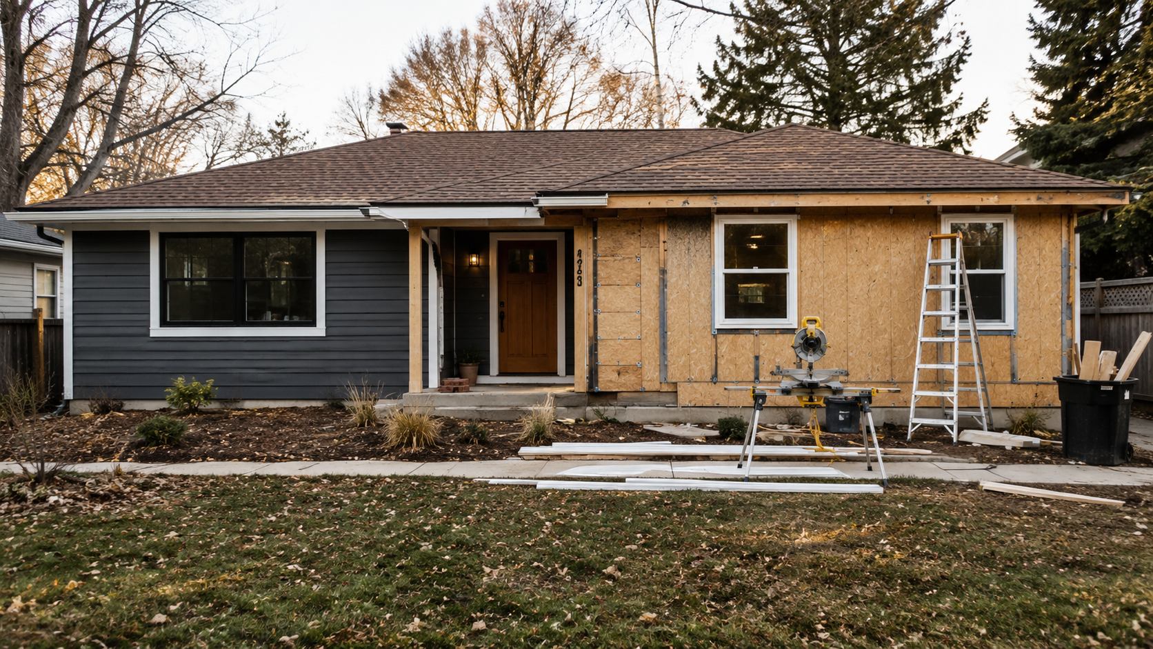
Look at any current ranch remodel listing and count the siding materials. Three is common. Four happens. Horizontal lap on the main field, stone veneer wainscot along the base, a board-and-batten panel under the front gable, and a wood-look accent on the garage face. Each material was probably picked thoughtfully. Together they make the elevation look like a sample board.
The honest version is one main siding material handled well, one restrained accent if any, and consistent trim everywhere. Pick a color that fits the climate, the neighborhood, and the brick or stone that is already on the house. Skip the contrasting accent strip. Skip the stone veneer wainscot. The house was calmer than the catalog imagines.
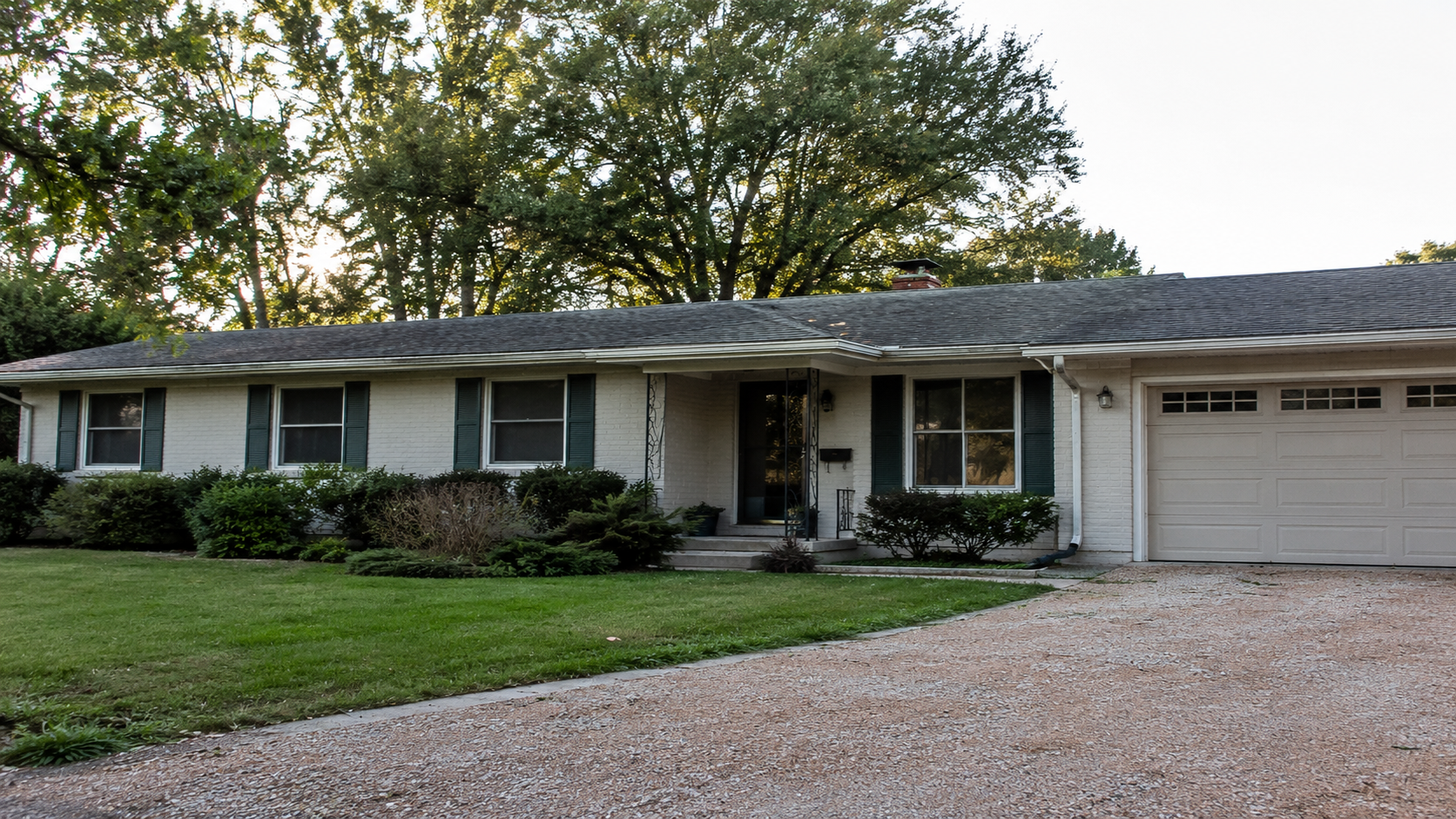
If the brick is still in good shape, the cheapest meaningful improvement is usually to leave the brick alone. Brick was the original quiet material on these houses. Painting it white is a one-way decision that almost always looks dated within a decade, and it removes the one thing the elevation already had going for it.
What to Leave Alone
Not every original feature is a problem.
The low roofline. The long horizontal shape. The continuous siding plane. The modest entry scale. Original brick that is still sound. Picture-window-plus-flankers compositions that still align cleanly. Plain trim that is not failing.
Those are the parts of the ranch that were doing the work all along. Replacing them with louder versions is the most reliable way to make the house worse and call it an improvement.
The Modern Farmhouse Overlay Is the Wrong Costume for a Ranch
This is the era's worst remodel template, and it is being applied to ranch houses everywhere right now.
The package is recognizable from two blocks away. Black-framed windows on white lap siding. A board-and-batten accent panel under a newly-added gabled entry portico. A horizontal black trim band somewhere. Stone veneer wainscot along the base. A black garage door to match the windows. Maybe a single gas lantern. Done.
Every one of those moves is a vertical move added to a horizontal house. The board-and-batten reads vertical. The entry gable reads vertical. The high-contrast color split reads vertical. The stone wainscot draws a horizontal line right where the eye least needs one, which somehow ends up making the wall above it look taller and more squeezed instead of calmer. So a quiet horizontal building gets packed with vertical signals, and then nobody can explain why the elevation feels nervous. The house was restful before. Now it is busy without being interesting.
The deeper problem is that the modern farmhouse template was developed for a different kind of house. Two-story rural builds. Tall vertical bays. Steep gables that already existed. Houses with the vertical proportion the package needs. Bolting that vocabulary onto a one-story ranch leaves the new vertical elements with nothing to attach to. They sit on top of the house rather than belonging to it.
Most of these remodels would look better if half the moves got cut. Keep the new windows but match the existing window proportions. Skip the gable entry. Skip the board-and-batten panel. Skip the wainscot. Pick one accent move and let it be the only accent move. The house can absorb that. It cannot absorb all of them at once.
None of this is an argument against updating ranch houses. It is an argument against pretending they are a different kind of house in order to update them.
Where the Money Usually Goes Wrong
| What People Spend On | What Would Have Helped More |
|---|---|
| Gabled entry portico | Quiet canopy at the existing eave height, better lighting, better landing |
| Stone veneer wainscot | Cleaning up the existing siding and trim line |
| Three siding materials on the front | One siding material handled well |
| Random window replacements as they fail | Replacing all front windows at once with one matched proportion |
| Painting good brick white | Leaving the brick alone, updating trim and door |
| Fake gable over the garage | Garage door color closer to body color, stronger front door treatment |
| Oversized porch | Small canopy with proportions the house can carry |
The right-hand column is almost always cheaper. That is the part homeowners do not expect.
Four or Five Small Moves, Done Together
The honest version of a ranch exterior remodel is usually four or five small moves done together.
Paint. Landscape. Front door. Lighting. Window proportions kept consistent across the front. A walkway that does not embarrass itself.
None of that photographs as a transformation. Done together, it makes the house look resolved instead of remodeled.
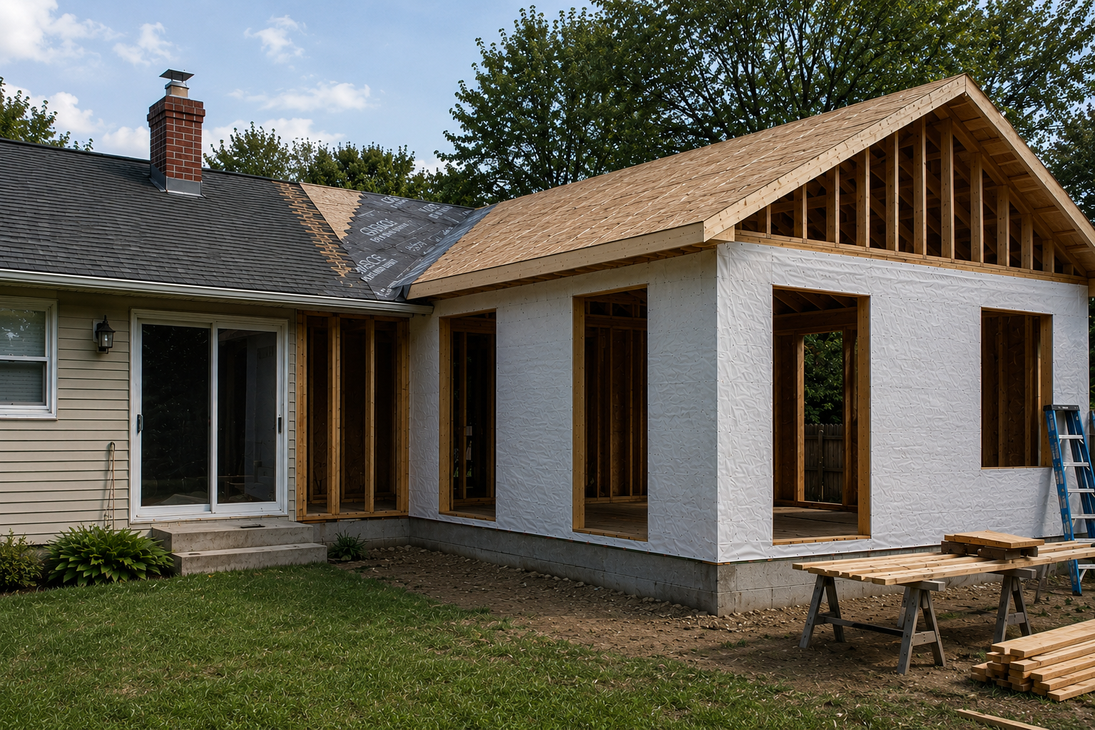
Better windows and bigger rear openings will do more for interior daylight than any front-elevation upgrade. The street gets calmer at the same time. For the interior side of the same problem, see how to brighten a dark ranch house without opening every wall and open floor plan ranch house.
Read Next
How to make a low ceiling ranch house feel taller. The interior version of the same proportional discipline.
Ranch house kitchen layout problems and better fixes — where most ranch interiors actually need the work.
Thinking about adding on? Modern addition to a ranch house covers the cases where the house genuinely needs more square footage.
Raised ranch remodel ideas. Same principles, harder elevation to manage.
For the broader question of what to keep and what to change on a postwar house, the 1950s ranch home remodel guide is the wider-angle companion to this article.