Elegant Decor Ideas That Work in Real Homes
What working designers really do first
They don’t start with mood boards or paint chips. They start with friction: where your day actually gets stuck—shoes with no landing spot in a Philadelphia rowhouse entry, a too-bright living room in Phoenix that nukes TV glare at 5 p.m., a narrow Chicago hallway that kills sofa options. Pros map those frictions and fix them in the layout before they try to make anything pretty.
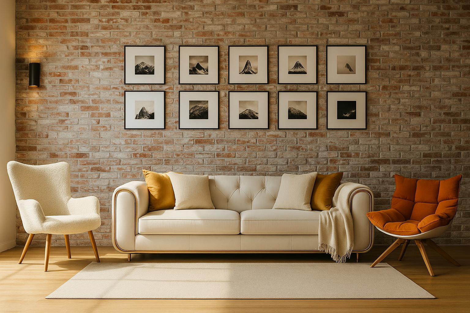
They measure like accountants. Every outlet, sill height, radiator projection, door swing, and the exact space a dishwasher needs to open in a tight New York galley kitchen. They build a simple “bubble plan”: zones for conversation, reading, dining, and traffic. The rule they quietly follow: a clean 30–36 inches for walking paths, 18 inches from coffee table edge to seating, and a reach of 24 inches from seated position to a side table. Those numbers keep rooms feeling calm even when you add personality later.
They set a power triangle for light. One overhead or tall arc, one eye-level lamp, one accent or picture light. Then they put all three on dimmers, because New Orleans dusk and Seattle December are not the same room. Good lighting makes mid-priced furniture read expensive; bad lighting makes heirloom pieces look cheap.
They lock a palette to the light you actually have, not the one you wish you had. North-facing room in Minneapolis? They’ll warm the walls a half-step (think creamy neutrals) and add brass or walnut to catch what little light exists. Blazing afternoon sun in Austin? They’ll lean into cooler undertones and lots of matte texture so glare has something to land on.
If you want a quick primer before you map your own home, this straightforward piece on getting started with decorating covers the basics, and this page on elegant décor shows how restraint and texture do most of the heavy lifting.
FIELD PICK
Trinity Arc Floor Lamp — Three sources from one footprint; the fastest “finished” cue. Check current price.
Elegant Decor Explained by a Designer Who Builds for Simplicity
Elegant Decor and What It Really Means in Design
Invisible Upgrades: tiny moves pros make that change everything
Here’s a brand-new toolkit I use when a space “almost” works but still fights daily life. None of this is flashy. It’s the boring, surgical stuff that separates a good room from one you don’t think about—because it just behaves. Borrow what fits and ignore the rest.
1) The Pathline Audit (map where friction actually happens)
Take painter’s tape and draw arrows on the floor for your real routes: door → bag drop → kitchen; sofa → snack → sink; bed → bath → closet. Any place two arrows cross and you need to dodge furniture, you have a design bug. Fixes are tiny: slide the console 4", swap a square side table for a round one, move a plant that pinches the passage, or push a rug so its corner doesn’t snag socks. You’re aiming for unconscious movement. If you want a quick reset on fundamentals before you tape, this plain-English decorate-your-home primer gives you the layout basics, then come back and mark the routes you actually use.
2) The Five-Point Touch Test (how to pick finishes that feel expensive)
Touch these five things in this order: door handle → light switch → sofa arm → coffee table edge → drapery hem. If any one feels flimsy, the whole room reads cheaper. Pros upgrade those five first because hands notice quality faster than eyes. Swap a hollow knob for weighty hardware, add a fabric wrap to a switch plate, choose a tighter upholstery weave on the arm people grab, ease a sharp coffee-table edge, and hem drapes so they just kiss the floor (no puddles, no high-water).
3) The 60-Second Thumbnail Check (scale and clutter in a single photo)
Stand in the doorway, take one phone pic, and view it as a tiny thumbnail. If you can still identify the main shapes (sofa, table, art) without squinting, scale is right. If the room turns into confetti, remove three smalls from each surface and let one object “own” the spot. This beats rearranging for an hour and wondering why it still looks busy.
4) “Two-Seat Echo” Color Rule (sightlines that feel intentional)
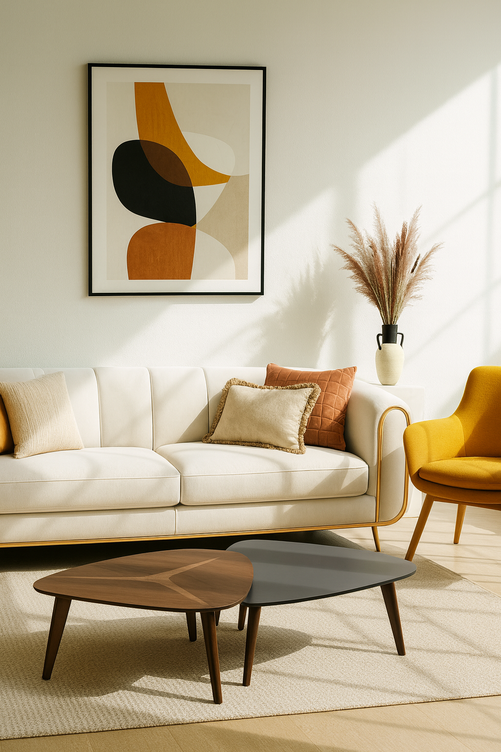
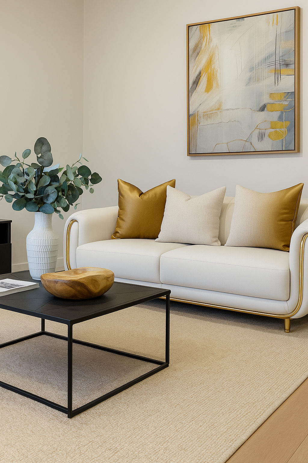
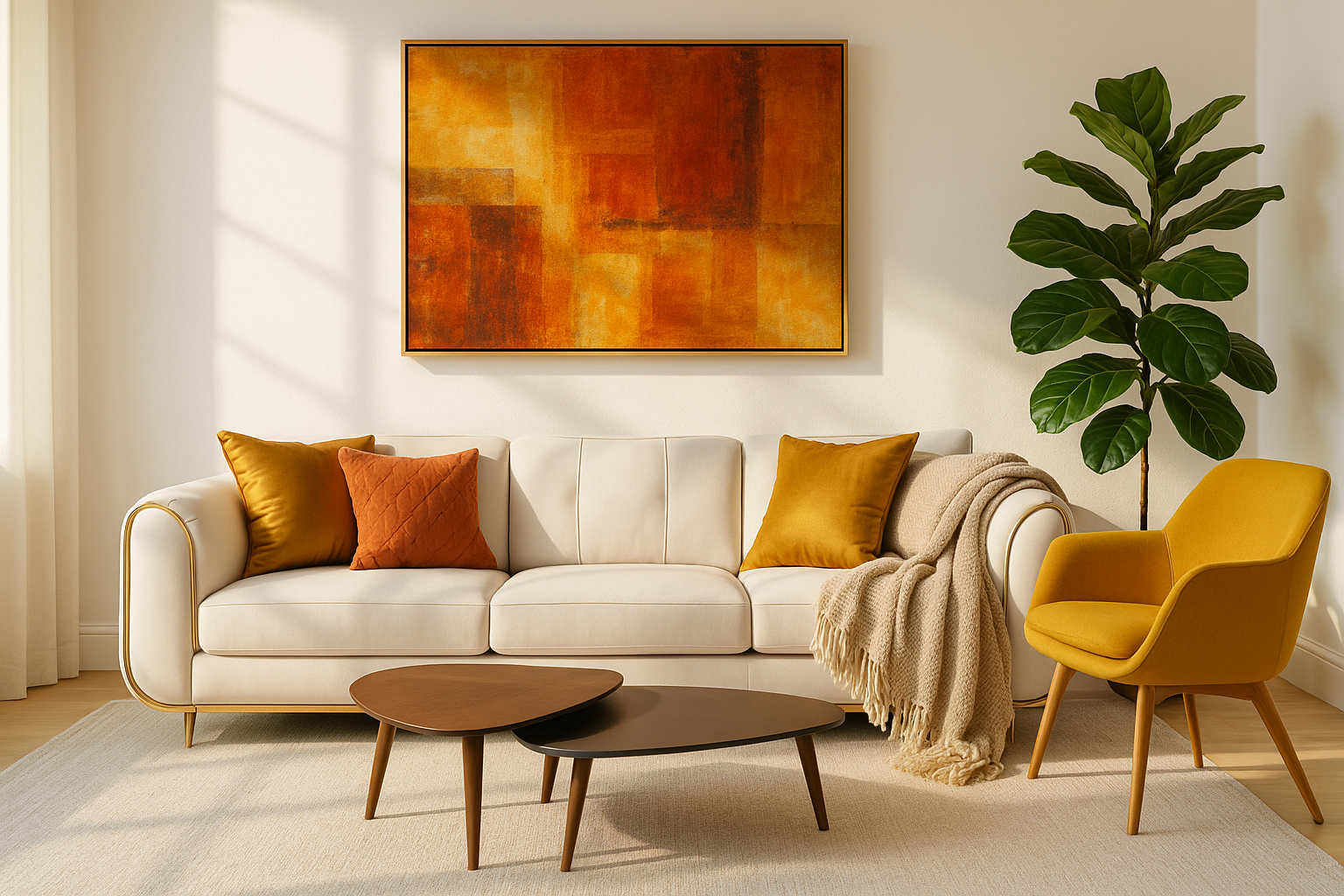
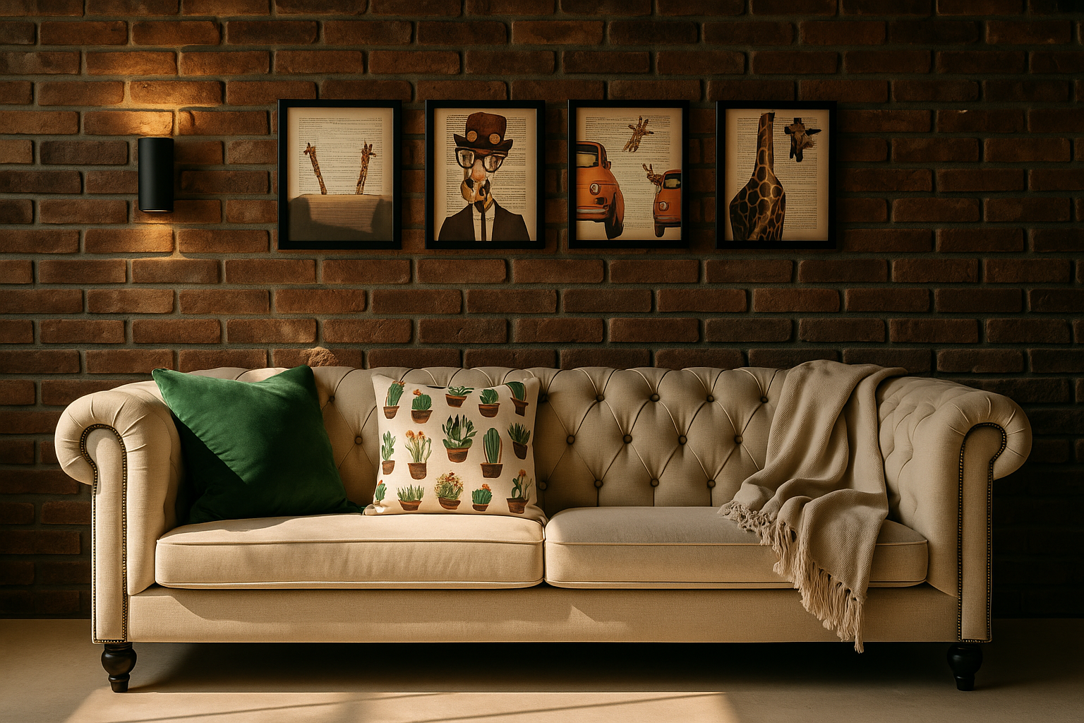
Any color strong enough to spot from the entry must repeat on at least two seats you can actually sit in—throw on the sofa, piping on a chair, or a lumbar pillow on a bench. Rooms with one loud color that never repeats feel accidental; two echoes make it a decision, not a fluke.
5) Light Scenes Cookbook (four presets that make mid-price look luxe)
- AM Reset: overhead + one table lamp, shades open 50%. Wakes the house without glare.
- Heads-Down: overhead off, task lamps on, window sheers drawn. Cuts eye fatigue and screen reflections from Phoenix to Seattle.
- Dinner: pendant at 30–36" above tabletop, all other lights at 30% with warm bulbs (2700–3000K).
- Wind-Down: only low lamps on dimmers, sheers closed, picture lights at 10–15% to make art glow, not shout.
Save these as muscle memory. The furniture didn’t change—your room just learned new tricks. For a refresher on restraint and texture as the “expensive” signal, skim the quick page on small things.
6) Surface Debt Protocol (how to stop clutter creep for good)
Give every horizontal surface a “debt ceiling.” Coffee table: three items max (stack, vessel, natural element). Console: five (lamp counts as one). Dining table: zero by default; center bowl when not in use. Once a week, do a two-minute sweep: anything exceeding the limit gets binned or rehomed. If you can’t stick to it, the surface is trying to do too many jobs—add a tray, add a basket, or add a hook within arm’s reach of where the mess starts.
7) The Quarter-Turn Rule (micro-angles that calm a room)
Angle only one freestanding piece per view—usually a chair—and keep everything else square to the walls. Two or more angles per sightline reads chaotic on camera and in person. A single quarter-turn softens the box without making the room look like musical chairs.
8) Landing Gear for Real Life (cheap hardware, huge quality of life)
Install five quiet helpers where friction lives:
- Two low hooks behind the entry door for bags and umbrellas.
- A 3-outlet floor cord under the sofa edge so lamps and chargers don’t snake across walk paths.
- A slim tray inside the TV cabinet for remotes, game controllers, and batteries.
- Adhesive cable clips under the console to tame laptop cords.
- Felt dots under every small object on stone or glass to stop the “clink” and protect surfaces.
9) Delivery-Day Choreography (how pros avoid returns and tantrums)
- Path clear: doors tied back, rugs rolled, pets contained.
- Camera ready: snap every box before unsealing; photo any crush points.
- Float test: place the piece where it breathes—then commit to felt pads. If it feels off, it is; slide first, protect later.
- Box amnesty: keep packaging 72 hours. Hidden defects show up on day two, not delivery day.
10) The 3-3-3 Styling Grid (fast, repeatable, not fussy)
For shelves, style in threes on three shelves with three shared traits (shape, finish, or color). Example: black frames, rounded vessels, and linen-covered books appear somewhere in each trio. Stop there. The negative space is part of the design.
11) The Sound + Scent Layer (the secret third dimension)
Rooms don’t feel finished until they sound and smell calm. Add one soft absorber per hard zone (wool runner by the galley, thick throw by leather seating, fabric shade near stone). Pick a scent with a base note that matches your materials: cedar with oak, vetiver with stone, amber with brass. Keep diffusers below seated head height so the room smells of something, not like it’s wearing perfume.
12) Sun Discipline (how to beat UV without living in a cave)
In Austin, Phoenix, and Miami, UV is the silent furniture killer. Use a dual layer: sheer during day + lined drape at night. If the window wall is gorgeous, add a clear UV film; your art and fabrics will thank you. Rotate cushions seasonally so one side doesn’t fade faster.
13) The Dinner-Plate Test (instant scale check for small rooms)
Cut a 10.5" circle from cardboard. That’s a dinner plate. Now walk the room: anywhere that plate can’t land flat within arm’s reach of a seat, you’re under-tabled. Add a narrow drink table (even 8–10" wide) so every seat has a spot—no coasters on the floor, no gymnastic reaches.
14) One-Week Lag (buy slower, regret less)
Work in two passes: shape first, finish later. Choose the form (sofa silhouette, table size, lamp height) and live with the temporary stand-ins for one week. Only then pick the final fabric, wood tone, or metal. Your light will tell you what works. If you want a crash course in the “why” behind classic decisions you see in magazine rooms, this straight-shooting overview of traditional design basics explains the proportion logic you’re feeling here.
RECOMMENDED TOOL
Bosch GLM 20 Laser Measure
One-button accuracy for your Pathline Audit and delivery-day checks. Quick look.
15) Micro-Habits That Keep Rooms “Set”
- Two-minute tray reset every night: toss keys, earbuds, and receipts into the entry tray, not the counter.
- Lamp first, overhead last: when you enter a room after dark, train your hand to hit a lamp switch, not the ceiling can. The room will always feel calmer.
- Swap don’t stack: if a new object comes in, an old one leaves that category (book for book, bowl for bowl). Zero net clutter.
- Sunday lens wipe: wipe mirrors, frames, and lamp shades. Invisible dust = visible dullness; clean glass looks like an upgrade.
Mini case flashes (where these moves win fast)
- Philadelphia rowhouse entry: two behind-door hooks + narrow tray + felt under the plant stand stopped the daily bag pile and scuffed walls. Five minutes, permanent behavior change.
- Chicago long living room: one quarter-turned chair and an 8×10 shifted 6" forward made the space read wider in photos—and feel wider walking through.
- Phoenix TV glare: sheer-by-day + linen shade on the lamp + dimmer brought the early-evening “nuke hour” under control without blackout drapes.
Steal-this checklist (print and tape to the fridge)
- Map pathlines with painter’s tape; fix the pinch points.
- Upgrade your five touch points; hem drapes to just kiss the floor.
- Set four light scenes; install dimmers on the two most-used lamps.
- Apply the surface debt ceiling; do a two-minute nightly reset.
- Run the dinner-plate test; add one drink table if needed.
- Photograph, thumbnail check, remove three smalls per surface.
- Schedule a one-week lag between choosing shape and finish.
The Three-Color Room: a hands-on exercise (fun, fast, zero mess)
Imagine a plain, empty, colorless living room. Four blank walls, white sofa, white chairs, white rug, white art. No personality—just a clean slate.
Your mission: bring it to life using exactly three colors. Not four. Not “neutrals don’t count.” Three. You’ll do it on paper first, then try a quick, low-risk test in the room. It’s part puzzle, part art class, and it teaches your eye to make confident choices instead of buying random stuff and hoping it works.
Game rules (read once, then play)
- Three colors only. White/cream in the photo is the canvas and does not count as one of your three.
- Give each color a job. One is the “supporting” color (about 20% of what you see), one is the “accent” (about 10%). Start with 70/20/10. You can nudge later.
- Repeat to make it real. Each chosen color must appear at least three times in the same view (even tiny repeats count—book spine, frame mat, lamp finial).
- Materials count as color. Wood tones and metals are colors in a white room. If you pick walnut and aged brass, those are two of your three—treat them like paint.
- Timer is your friend. Each round is quick. Momentum beats perfection.
What you need (from a junk drawer)
- Three colored papers (or three markers)—pick any hues you love
- Scissors + tape (painter’s tape if you’ll test on walls)
- One sheet of plain paper (your “room board”)
- Phone with camera (for the thumbnail + grayscale checks)
Round 1 — set the scene (2 minutes)
- On the plain paper, draw a rectangle for the room. Sketch a sofa, two chairs, coffee table, rug, big art rectangle. Keep it boxy and fast—stick-figure furniture is perfect.
- Write the light direction at the top: north, south, east, west (guess if you’re not sure). This matters in Round 5.
Round 2 — pick your three (3 minutes)
- Choose your trio: one quiet structural hue (often a wood tone or muted color), one charge hue (deeper or brighter), and one metal/wood finish (optional but recommended). Examples: camel + graphite + pale oak or olive + aged brass + white oak or ink navy + walnut + blackened steel.
- Cut three small squares from your colored papers (about 1½″ each). Label them on the back so you don’t mix them up.
Round 3 — place the 20% color (4 minutes)
- Decide: will your 20% live in soft stuff (rug/drapery/pillows) or hard stuff (tables/frames/lamps)? Pick one zone; don’t split yet.
- Tape your 20% color squares onto the rug, drapery, and one pillow or onto the coffee table, picture frame, and floor lamp on your sketch. You’re assigning territory, not details.
- Check: do you see that 20% color in three places at three heights (floor, mid, eye)? If not, move a square until you do.
Round 4 — place the 10% accent (3 minutes)
- Drop your accent onto two pillows and one small object (bowl or book stack) or onto the art frame, a lamp, and a small side table. Keep it punchy but sparse.
- Say the sentence out loud: “My accent shows up here, here, and here.” If you can’t point to three, you don’t have an accent—you have clutter. Re-place.
Round 5 — light check (3 minutes)
- If your room faces north, nudge one choice warmer (camel vs. gray, brass vs. chrome). If it faces south/west, pick matte textures for your brightest color (linen vs. satin) so glare has something to land on.
- Mark three light sources on your sketch: overhead/arc, table lamp, picture/accent light. Your colors should touch at least one of these light pools so they glow at night.
Round 6 — thumbnail & grayscale (2 minutes)
- Take a phone photo of your sketch. Look at it as a tiny thumbnail. Can you still “read” your two added colors? Great. If not, your placements are either too small or too scattered.
- Turn the photo to black & white. If the shapes still read (light/mid/dark), you’ve got value balance. If it becomes mush, make one element darker (frame, lamp stem) or lighter (drapery) using your existing three colors.
Round 7 — five-minute real-world test
- Grab painter’s tape and your three papers. Cut three 2×8-inch strips of each color.
- Stick your 20% color where it would live: along rug edges (on the floor), on the wall where drapery would hang, or on top of the table—whatever you assigned in Round 3.
- Stick your 10% accent in its three spots (pillow corner, frame edge, lamp base).
- Turn on a lamp. Step back to the doorway. If your eye takes a calm lap around the room—nailed it. If your eye ping-pongs, pull one strip. Edit is part of the drill.
Round 8 — name it (1 minute)
Give the palette a name that describes the mood, not the color words: Quiet Library, Salt & Sun, Evening Porch. Naming locks intent and makes future shopping easier.
Round 9 — swap and replay (6 minutes)
- Keep the same three colors but trade jobs. Move the 20% to the other zone (if it was soft, make it hard). Promote your accent to a frame or a lamp, demote it from pillows, or vice versa.
- Do the thumbnail + grayscale tests again. Notice how the same colors feel different just by changing territory. That’s the lesson.
What this teaches (so it sticks)
- Placement beats quantity. The same color looks intentional or random depending on where it lands.
- Ratios calm chaos. 70/20/10 is training wheels for your eye. Adjust later; start here.
- Light is the real filter. Colors aren’t “good” or “bad.” They’re good or bad in your light. That’s why you test with paper under lamps.
- Materials = color. Wood and metal are not neutral bystanders. Treat them like paint and you’ll stop mixing five finishes by accident.
Common traps (and the fix)
- “Neutrals don’t count.” They do. If you add walnut and brass, that’s two colors already—pick only one more.
- All the color in pillows. It looks temporary. Put some color in a frame edge, lamp stem, or rug border so the room feels built, not staged.
- One loud wall, no echo. Repeat your accent at least twice more in the same view or the wall feels random.
Print-and-play mini worksheet
- My three colors are: __________ / __________ / __________
- They are: structural 20%, accent 10%, finish (wood/metal)
- I will repeat each color here, here, and here: _________________________________
- Light direction: __________ | Lamps: ☐ overhead/arc ☐ table ☐ picture light
- Palette name: ____________________________________________
If you want a short warm-up on scale and spacing before you run the drill, this very plain guide on how to decorate your home is a quick refresher. For texture ideas that keep a three-color room elegant, skim this page on elegant décor and come right back to the exercise.
First Try, Honest Take
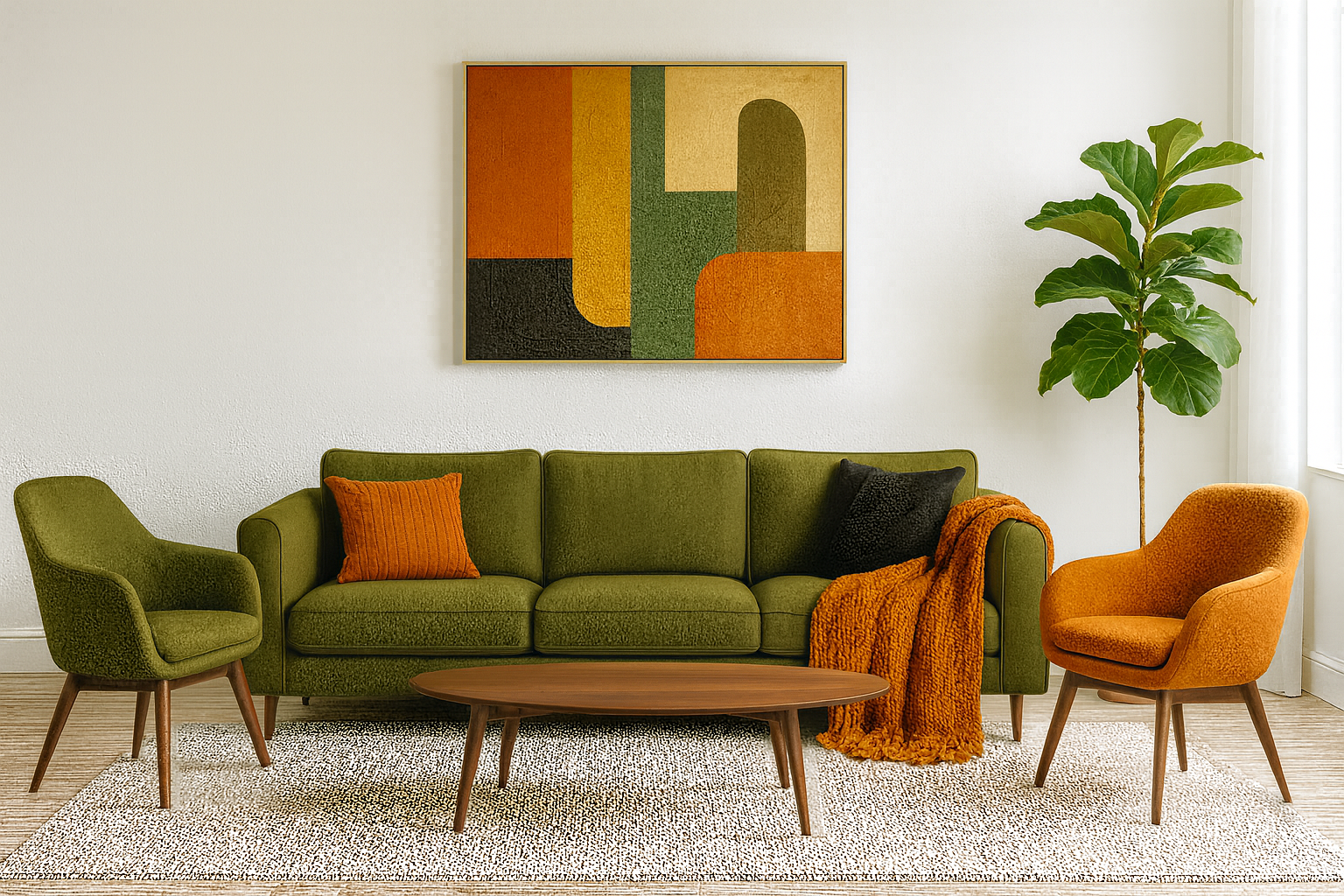
The second phase of a color-picking exercise for interior design, demonstrating three bold colors applied in a living room. This example shows how some combinations can be too intense, non-complementary, or visually uncomfortable, helping learners understand color harmony.
Most people go heavy on bold color, think olive sofa, orange accents, walnut wood, and art that mirrors the same hues. It’s cohesive, but it skews retro because everything lives in the warm lane. Modern rooms balance temperature (warm + cool) and value (light and dark), not just hue. Keep one warm anchor, add a cool counter-note, and set a clear light and dark backbone, then layer color, don’t theme the whole room with it.
What works
- Solid 70/20/10 balance (olive/rust/dark).
- Clean silhouettes against light walls.
- Good texture in the seating/throw.
Why it reads dated
- Art repeats the palette exactly—feels “matched set.”
- All seating is saturated—no mid-tone breather.
- Warm-on-warm stack (walnut + olive + orange).
- Busy small-scale rug under textured pieces.
Fix it fast
- Swap the orange throw for camel/oatmeal; move orange to one chair, add a flax/cream lumbar on the sofa.
- Reframe art in pale oak or matte black, or choose a piece with one palette color plus black/cream linework.
- Calm the rug (larger low-contrast flatweave or simple loop pile).
- Add one cool material—blackened-steel lamp or smoked glass.
Weekend upgrades
- Make one chair neutral (cream/taupe).
- Shift tables to light oak; or trade fuzzy orange for terracotta leather.
- Add a dark picture light to sharpen the composition.
Modern palette paths
- Olive + camel + blackened steel (warm, tailored).
- Olive + sand + inky navy (cools without going gray).
Want the logic behind “bold but elegant”? See our quick take on refined décor. Curious why this combo tilts vintage so quickly? Skim the overview of 1960s color choices and apply the tweaks above.
What people try that fails (and what to do instead)
The undersized rug mistake. It’s the number-one amateur tell from Los Angeles bungalows to Atlanta new-builds. When furniture floats, the room looks skimpy. Fix: size up so at least the front legs of sofas and chairs sit on the rug; bedrooms look finished when a rug runs 18–24 inches beyond the sides and foot of the bed.
The lighting desert. One overhead fixture trying to do every job puts everything in harsh top light. Fix: three sources minimum, at different heights. An arc floor lamp plus two shaded table lamps is the fastest “finished” cue in a Denver living room.
Matchy-matchy furniture sets. A five-piece living room set seems safe online and looks like a lobby on arrival. Fix: buy a sofa for comfort and scale first, then add chairs with a different leg profile or fabric hand. Tie the group with a repeated finish (blackened metal, aged brass) in a couple of spots.
High-gloss walls in regular rooms. In Houston humidity or Boston winters, gloss shows every roller mark and drywall ripple. Fix: reserve higher sheen for trim and baths; choose quality matte or eggshell on field walls and let texture do the talking.
Accent walls that don’t lead anywhere. A single dark wall behind a TV with no echo elsewhere feels random. Fix: when you use a deeper color, repeat it once more—on a console, in a rug border, or with frames—so the eye connects the dots.
Too many smalls. Twenty tiny frames and a dozen little vases look cluttered even if each one is charming. Fix: group by type and scale, then edit. One larger mirror, one vessel, one stack of books. Leave breathing room.
Ignoring sightlines. In San Francisco Edwardians, you often see three rooms from the entry. If you throw a bright red throw in the back room and nowhere else, it pulls the eye off-balance. Fix: repeat a color note you can glimpse from the door at least twice on that path.
MUST READ
Styled — Emily Henderson — Turns paralysis into action with repeatable vignette rules. See the book.
What pros do differently with paint, light, and color
They don’t chase paint names; they test. Four big brush-outs per wall, right up to corners and trim, and they live with them for 48 hours. They consider direction (north-cool, south-warm), view (green trees can make grays read purple), and flooring undertone (your orange oak can turn the “perfect greige” muddy).
They choose sheen by traffic and texture. In Chicago family rooms with kids and a dog, pros pick a durable matte or scrubbable eggshell so walls look soft but clean up well. Ceiling stays flat to hide waves. Trim gets a semi-gloss bump so it frames the room without yelling.
They layer light to make mid-price look luxe. A $150 brass pharmacy lamp can rescue a $700 sofa. A $40 dimmer makes $20 bulbs feel like candlelight. Picture lights make thrifted art feel gallery-worthy. In Miami, filtered window light plus linen shades save you from squinting through noon glare.
MUST READ
Farrow & Ball: How to Decorate — Real-world paint behavior and sheen. Get the guide.
Materials that actually live well
Sofas. Track-arm silhouettes (not floppy pillow arms) hold shape and photograph well, from Dallas to Portland. Performance linen-blends hide wear; full-on velvet looks glam for one season and attracts lint unless you’re prepared to maintain it. If you’ve got sun exposure in Phoenix, UV will chew through cheaper poly weaves—use lined drapery or a UV film.
Rugs. Printed vintage-look rugs (think Turkish-style prints) are forgiving in open-plan Atlanta homes. Shag looks cozy but mats and sheds under traffic; keep it in a low-use bedroom if you must. Natural fiber brings texture but can be rough under bare feet—layer a flatweave on top for comfort.
Tables. Real wood tops patina in nice ways; high-gloss lacquers chip at corners. Stone is quiet luxury, but in Chicago winters it reads cold—pair with wool or velvet nearby so the room doesn’t feel sterile.
Drapery. Lined, floor-skimming panels elevate any space. Hang high and wide to make windows feel larger in narrow Brooklyn rooms. Eyelet grommets read casual; pinch pleat reads finished without being fussy.
Metal finishes. Aged brass and blackened steel mix seamlessly; shiny chrome plus oil-rubbed bronze fight. Pick one dominant, one supporting, then repeat each two or three times so it feels intentional.
RECOMMENDED TOOL
Bosch GLM 20 Laser Measure — One-button accuracy that prevents returns. See specs.
The procurement habits that separate amateurs from pros
They buy the anchor pieces first. A New York co-op living room starts with the sofa, the rug, and a light. Everything else is scale-matching after that. They plan lead times backward from real dates (holidays, move-in, guests), and they have a Plan B for every item: if the bench is backordered, the ottoman can pinch-hit.
They order finish samples and fabric memos, not just stare at screens. Oak can run red, ash can run green; brass can read yellow or brown. They build a tray with the floor sample, cabinet chip, hardware finish, drapery fabric, and rug corner and see them all together under the room’s light.
They budget for delivery stairs and elevators. In Boston walk-ups, a one-piece 90-inch sofa turns into a disaster on the third-floor turn. Solution: split sofas or apartment-size frames with removable legs. In suburban Nashville with easy entries, go deeper and lower for comfort.
They negotiate returns and damages right up front. Ask how long you have to inspect. Photograph boxes before you open. Report problems same day. You’ll get faster credits and avoid restocking fights.
Layout sequences that make any room feel composed
Living rooms. Place the largest piece along the longest visual line; float it off the wall if you can. Angle seating to talk to humans, not just face a TV. Coffee table at two thirds of the sofa length, 14–18 inches away. Side tables within a forearm reach. If you must put a TV over the fireplace in a Dallas spec home, mount it lower than you think and use a non-glare screen.
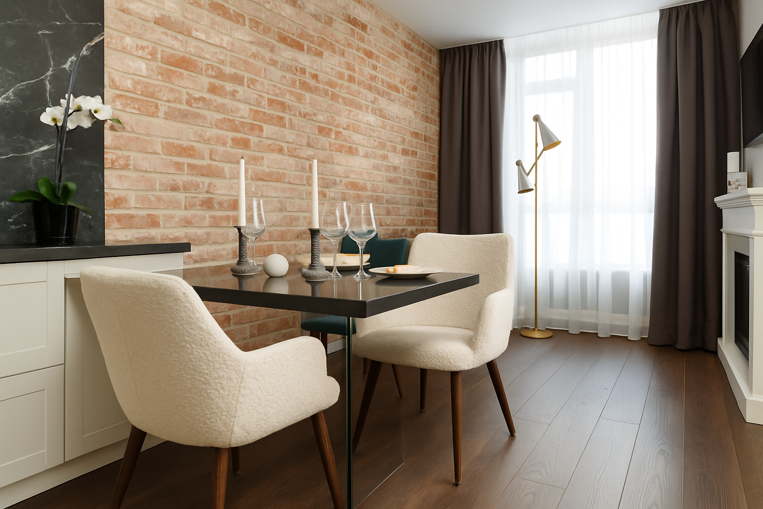
Dining rooms. Leave 36 inches of clearance around the table. Chandeliers hang 30–36 inches above the tabletop. Round pedestals soften traffic in tight Los Angeles bungalows; rectangular tables suit long Chicago rooms with built-ins.
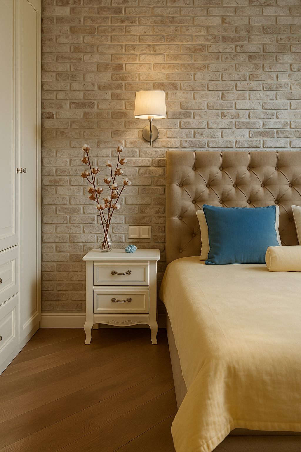
Bedrooms. Headboard wide enough to visually hold the nightstands; lamps at shoulder height when sitting in bed. One chair or bench so tomorrow’s outfit doesn’t land on your duvet. A washable rug saves sanity in pet households in Denver and Raleigh.
If you’re curious how to balance clean lines with traditional warmth, this piece on a modern-traditional living room walks through the trade-offs, and this simple primer on minimalist living room décor shows how to edit without going sterile.
City-specific quirks and how pros handle them
New York City. Co-ops mean elevators, freight hours, and fussy superintendents. Measure the elevator cab, not just your room. Split sofas, modular sectionals, and knock-down bookshelves keep installs painless. Small dining rooms crave round tables with a pedestal—legs add visual clutter.
San Francisco. Narrow Victorians have amazing light and tricky proportions. Use pale walls and deep window treatments to soften bay windows; keep bulky case goods off the long hall walls so sightlines remain elegant. Moist marine air means unlacquered brass will patina quickly—either embrace it or pick a sealed finish.
Chicago. Winter darkness wants layered, warm light; summer sun bounces off the lake and turns cool gray walls icy. Shift paint a half-step warmer than the swatch suggests. Use heavy rugs to cut floor echo in those beautiful old flats with tall ceilings.
Phoenix and Las Vegas. Afternoon sun is brutal. UV films and lined drapes protect fabric. Cool stone is your friend underfoot; add wool throws and textured pillows so rooms don’t feel like galleries.
Miami. High humidity makes cheap MDF swell. Spend a bit more on solid wood or high-quality veneer for anything near windows or sliders. Sheers plus solar shades tame glare but keep the ocean view.
Seattle and Portland. Overcast light is honest; it shows undertones. Swatch big, choose warmer whites, and lean into tactile materials: oak, linen, wool. Plants do well—use tall, architectural greens to add life.
Austin and Dallas. Open plans everywhere. Create zones with rugs and pendants; don’t rely on drywall to define space. In fast-growth neighborhoods, builder lighting is often an afterthought—swap quickly for fixtures with diffusers and add dimmers.
New Orleans. Moisture changes everything. Marble etches faster; unlacquered metals patina almost overnight. Use sealed stones in kitchens and baths, and if you love brass, be ready to polish or enjoy the living finish.
Boston and Providence. Historic woodwork looks best when walls are calm and trim gets a subtle sheen jump. Resist trendy two-tone walls that fight with centuries-old proportions. If you want drama, do it with art and textiles.
Styling that reads expensive even on a normal budget
Books, bowls, branches. That trio can finish almost any surface. Stack a large-format book, add one sculptural vessel, place one natural element (branch, coral, stone). Adjust spacing until there’s breathing room.
Mirrors that bounce light without duplicating clutter. An arched full-length mirror in a dark Detroit rental changes a room instantly. Angle it toward windows, not at a sofa full of blankets.
Art height that respects people. Center at 57–60 inches from the floor. Grid walls look sharp when your margins match—measure, don’t eyeball.
Drapery that looks built-in. Hang rods a few inches below the ceiling, extend beyond the window casing so panels don’t block daylight, and hem with a small break at the floor. Cheap panels look expensive when they fit.
Coffee tables that feel curated, not busy. One book stack, one bowl, one low floral. If you have kids in Minneapolis, swap the bowl for a handsome lidded box that hides remotes and crayons.
FIELD PICK
Gallery Wall Kit — Matched frames, clean symmetry, zero guesswork. Make it look intentional.
The budget order that avoids rework
- Fix the envelope: paint, floors, window coverings, and lighting.
- Buy the anchor pieces: sofa, rug, primary light.
- Add storage that hides daily life: closed media cabinet, baskets, a tray.
- Finish with textiles: drapes, pillows, throws.
- Then sprinkle art and objects slowly.
If you splurge once, make it the piece your body actually uses: the sofa in a Chicago family room, the mattress in a Nashville bedroom, the dining chairs in a Houston open plan. Save on side tables, throw pillows, and smaller décor—those are easy to swap as your taste sharpens.
Project flow that saves headaches
Create a one-page project sheet: room goal, colors, item list with dimensions, lead times, return windows, and a delivery plan. Tape it to the fridge. When a truck shows up in Boston in a sleet storm, you’ll be glad everything’s in one place.
Photograph every item the day it lands. Keep boxes until you’re sure. Do a weekly 20-minute “punch list walk” where you note scuffs, missing hardware, crooked frames, and burnouts. Fix two or three each week rather than letting the list haunt you.
Use painter’s tape for instant mockups. Mark sofa length on the floor. Tape where drapery will fall. Outline the height of art. Visualize before you buy and you’ll return less.
Mini case files from the field
Brooklyn one-bedroom, pre-war bones. Problem: shallow living room with a radiator cutout. What didn’t work: deep sectional plus tiny rug—it looked like a mattress in a hallway. Fix: 80-inch track-arm sofa, two open-base chairs to keep sightlines airy, a vintage-look 8×10 rug under all front legs, arc lamp to avoid drilling into plaster for overheads, and lined drapery to tame street light. Instant calm.
Houston townhouse with high ceilings. Problem: echo and glare. What didn’t work: metal-and-glass everything. Fix: wool rug, linen drapery, one leather chair for warmth, picture lights for art, and warmer bulbs on dimmers. The same furniture read 20% more expensive.
Minneapolis basement family room. Problem: low ceilings and winter gloom. What didn’t work: dark sectional and gray walls. Fix: creamy matte walls, low wide sofa to keep sightlines open, two floor lamps with linen shades, oversized art to fake scale, and a lighter patterned rug. The room felt taller without touching the ceiling.
Santa Monica dining nook. Problem: tiny footprint, heavy legs everywhere. What didn’t work: rectangular table plus four armed chairs. Fix: round pedestal to smooth traffic, armless upholstered chairs, plug-in pendant swagged to center over the new layout. Dinner became a thing again.
If you want to go deeper into core style logic, this straight-shooting guide to traditional design basics explains why proportion and trim matter, and this quick read on how building forms evolved helps you spot which shapes make rooms easier to furnish.
Micro playbooks pros reuse constantly
Finish the sofa wall. Sofa, large art (or a clean grid), two lamps at chair height, a plant to break the corner, and a rug that connects it all. Done in any city.
Make a quiet entry. Mirror to bounce light, slim console with a drawer, two baskets for shoes and scarves, tray for keys, and a short lamp. You’ll feel organized before you take off your coat.
Give the bedroom a hotel moment. Two matching lamps, a fully upholstered headboard, linen duvet with a quilted coverlet at the foot, washable rug for the step out of bed, and a bench to save the duvet from becoming a laundry rack.
Upgrade the rental bath. Plug-in sconce if hardwiring isn’t an option, framed mirror, cotton shower curtain (not plastic), and two pieces of framed art hung low. Switch to warm bulbs. It’s shockingly effective in Providence, Portland, anywhere.
What looks cool online and disappoints in real life
Wall-to-wall gallery of tiny frames. It turns into visual noise. Do one clean grid with generous margins or one properly scaled piece. Quiet beats busy in homes where people actually live.
All-black everything. Without texture and light, it photographs dramatically and feels like a cave by Thursday. If you crave moody, add velvet, wool, brushed metal, and lots of lamps.
Ultra-glossy lacquer furniture in high traffic. It will chip by month three in a busy Atlanta household. If you love shine, use it as an accent—trays, small tables—where hands land less.
Open shelving everywhere. It’s gorgeous on a styled day, punishing to maintain. Use some, but let most storage close so Tuesday night dishes don’t judge you.
Simple, original heuristics you can steal
- If three items share one trait—finish, shape, or color—the room reads intentional.
- If you can’t find a place to set a drink from every seat, you’re under-tabled.
- If you can see a bold color from the entry, repeat it once more before the hallway ends.
- If the rug feels small, it is. Size up or layer a larger flatweave under what you have.
- If a room looks good in grayscale, your values are balanced—color is easier after that.
A quick way to start today
- Pick one room.
- Fix the envelope: move bulbs to warm white and add dimmers; clear surfaces by 30%.
- Place the biggest piece first and center your rug under it.
- Add two lamps and a single mirror.
- Finish with one branch, one bowl, one stack of books.
- Live with it for a week before buying anything else.
If you want a calm, practical walk-through of fundamentals after this deep dive, skim this very plain-English how to decorate guide, then come back and make the layout decisions that actually change how your home feels.
FAQ
How do I figure out my layout before I buy anything?
Work the plan on the floor. Use painter’s tape to map sofa length, coffee-table footprint, dining clearances, and door swings. Keep 30–36 inches for main walk paths, 18 inches from seating to the coffee table, and a comfortable 24-inch reach from each seat to a side table. If you want a step-by-step warm-up first, skim this plain-English primer on getting started with decorating and then tape out your zones.
RECOMMENDED TOOL
Bosch GLM 20 Laser Measure — Fast, accurate room checks so your tape lines match reality. See details.
What rug size actually looks right under a sofa or bed?
Under a living-room sofa, let at least the front legs of all major pieces rest on the rug. That usually means 8×10 for smaller rooms and 9×12 for open plans. In bedrooms, extend 18–24 inches beyond the bed’s sides and foot (a 8×10 for a queen, 9×12 for a king). If your rental in Boston or Philly won’t fit one large rug, layer: a big flatweave as the base, a smaller patterned piece on top to anchor the seating.
How many light sources do I need in one room?
Three, minimum, at different heights: one overhead or tall arc, one eye-level lamp by seating, one accent (picture light or sconce). Put them on dimmers to handle Austin afternoons versus Seattle Decembers. Good light makes mid-priced furniture read premium.
Matte, eggshell, or gloss — which paint sheen goes where?
Field walls: quality matte or scrubbable eggshell (hides texture, still cleanable). Ceilings: flat (kills waves). Trim and doors: satin or semi-gloss (adds definition). Reserve high gloss for small, contained areas (powder rooms, lacquered cabinets). For an easy color sanity check, test big swatches and read them at morning, noon, and night; if it looks good in grayscale on your phone, your light/dark balance is solid. For more tactics on restraint and finish, see the quick guide to elegant décor.
What’s the fastest way to make a basic builder room feel intentional?
Fix the envelope first (warm bulbs + dimmers, correct rug, drapery hung high and wide). Then finish the sofa wall: a single large artwork or a neat grid, two lamps at chair height, plant in the corner, and a coffee table that’s roughly two-thirds the sofa length. Done in an afternoon, anywhere from Denver to Miami.
Open plan in Dallas — how do I create zones without new walls?
Use rugs to define conversation and dining, pendants to mark the table, and a slim console or open shelf as a soft “divider.” Keep clear walk paths between zones (30–36 inches). Repeat one finish (aged brass, blackened steel) two or three times across the space so it reads as one story.
Small NYC living room — sectional or sofa + chairs?
Sofa + two airy, open-base chairs wins most New York pre-wars. You’ll keep sightlines open, flex seating for guests, and make delivery easier. If you crave a sectional, pick an apartment-scale frame with tight backs and removable legs; measure the elevator cab, not just the room.
Do accent walls still work?
Yes, if they “echo.” A single dark wall with no repetition looks random. Carry that tone once more (in a console, frames, or rug border) so the eye connects the dots. Or skip paint and do a texture move: grasscloth, board-and-batten, or linen-look wallpaper behind the bed.
Best fabric for a family sofa with pets?
Performance linen-blends and tight weaves beat chenille and loose velvets. Patterns (even subtle ones) hide life better than flats. In Phoenix or Las Vegas, add lined drapery or a UV film to protect fibers from scorchy sun. Slipcovers help if you love pale upholstery—wash, don’t worry.
How high should I hang art?
Center at 57–60 inches from the floor. Over a sofa, leave 6–8 inches from the top of the back to the frame bottom; width of the art or grouping should be ~60–70% of the sofa. Grids look sharp when the spacing is consistent—measure, don’t eyeball.
What mirror actually makes a dark room feel brighter?
An arched full-length mirror angled toward a window (not at a pile of blankets) bounces useful light and adds height. In narrow hallways from Chicago to San Francisco, a leaner mirror opens the sightline without adding clutter.
How do I mix metals without it looking messy?
Pick one lead (e.g., aged brass), one support (e.g., blackened steel). Repeat each two or three times. Avoid mixing shiny chrome with oil-rubbed bronze unless you bridge them with a neutral texture (stone, wood) and keep the chrome restrained.
What’s a realistic first-week plan if I’m overwhelmed?
- Pick one room and clear surfaces by 30%.
- Swap bulbs to warm white (2700–3000K) and add dimmers.
- Center the biggest piece; set the rug so front legs sit on it.
- Add two lamps and a single mirror to bounce light.
- Style one surface: book stack, one bowl, one natural branch.
Then live with it for a week. When you’re ready to balance modern lines with warmth, this walkthrough of a modern-traditional living room shows the trade-offs without the gimmicks.
Why does my “perfect gray” paint look purple at home?
Context. North light is cool, trees outside bounce green, and orange oak floors push undertones. Brush out large samples on each wall, right up to the trim, and check morning/noon/night. Shift warmer or earthier to counter the cast, or change what’s reflecting (rugs, drapery).
How do pros avoid return headaches?
They build a one-page spec: dimensions, finishes, lead times, return windows, delivery plan. They photo boxes on arrival, keep packaging until inspection, and report issues same day. They also order finish samples—wood, fabric, metal—so what shows up matches what you imagined.
What’s the simplest décor formula for shelves?
Think “peaks and valleys.” Mix verticals (tall vases, framed art), mediums (stacked books), and lows (bowls), leaving negative space so each object can breathe. Repeat one trait—finish, shape, or color—three times across the shelf for cohesion.
Will a round dining table really fit better in a tight space?
Often, yes. Pedestal rounds ease traffic in Los Angeles bungalows and Brooklyn nooks. Leave 36 inches from tabletop edge to the nearest obstruction; hang the chandelier 30–36 inches above the table and center it over the seating, not the room if they differ.
What looks great online but disappoints in real homes?
Wall-to-wall tiny frames (visual noise), all-black rooms without texture (cave by Thursday), ultra-gloss lacquer in high-traffic Atlanta households (chips fast), and endless open shelving (high maintenance). Use quieter, larger art; add lamps and tactile materials; keep most storage closed.
How do I make a rental bathroom feel upgraded without drilling?
Plug-in vanity sconce, framed mirror hung on existing anchors, cotton shower curtain (not plastic), two small art pieces hung low, and warmer bulbs. It reads “intentional” in Providence, Portland—anywhere.
What’s one splurge that actually pays off daily?
The piece your body uses: sofa in a Chicago family room, mattress in a Nashville bedroom, dining chairs in a Houston open plan. Save on pillows, side tables, and small accessories; they’re easy to swap as your taste sharpens.