
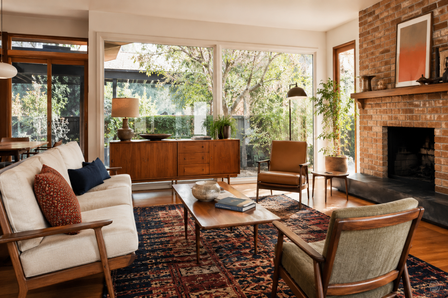
A 1960s room goes bad when everything shouts.
Orange wall. Shag rug. Globe light. Plastic chair. Busy wallpaper. Do all of it at once and the room turns into a set.
Most good 1960s rooms were calmer than that — one strong color, a low sofa, warm wood, a clean lamp, pattern in one place instead of on every surface, and enough open floor that people can actually sit, talk, and move. Start with the room itself first: the windows, the floor, the fireplace, the built-ins, the ceiling height, the traffic path. Then add the 1960s pieces on top.
The Room Should Not Look Like a Costume
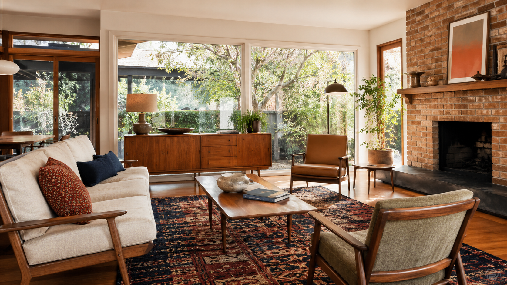
The fake 1960s look usually comes from stacking too many period signals at once. One orange chair can work. Orange chair plus orange wall plus orange rug plus orange lamp plus a fake retro sign plus a plastic table plus three clashing patterns usually does not — the room stops feeling designed and starts feeling labeled.
The livable version is quieter. It uses one strong color, one warm wood tone, one real pattern, one or two good lamps, and enough plain surface to let those pieces breathe.
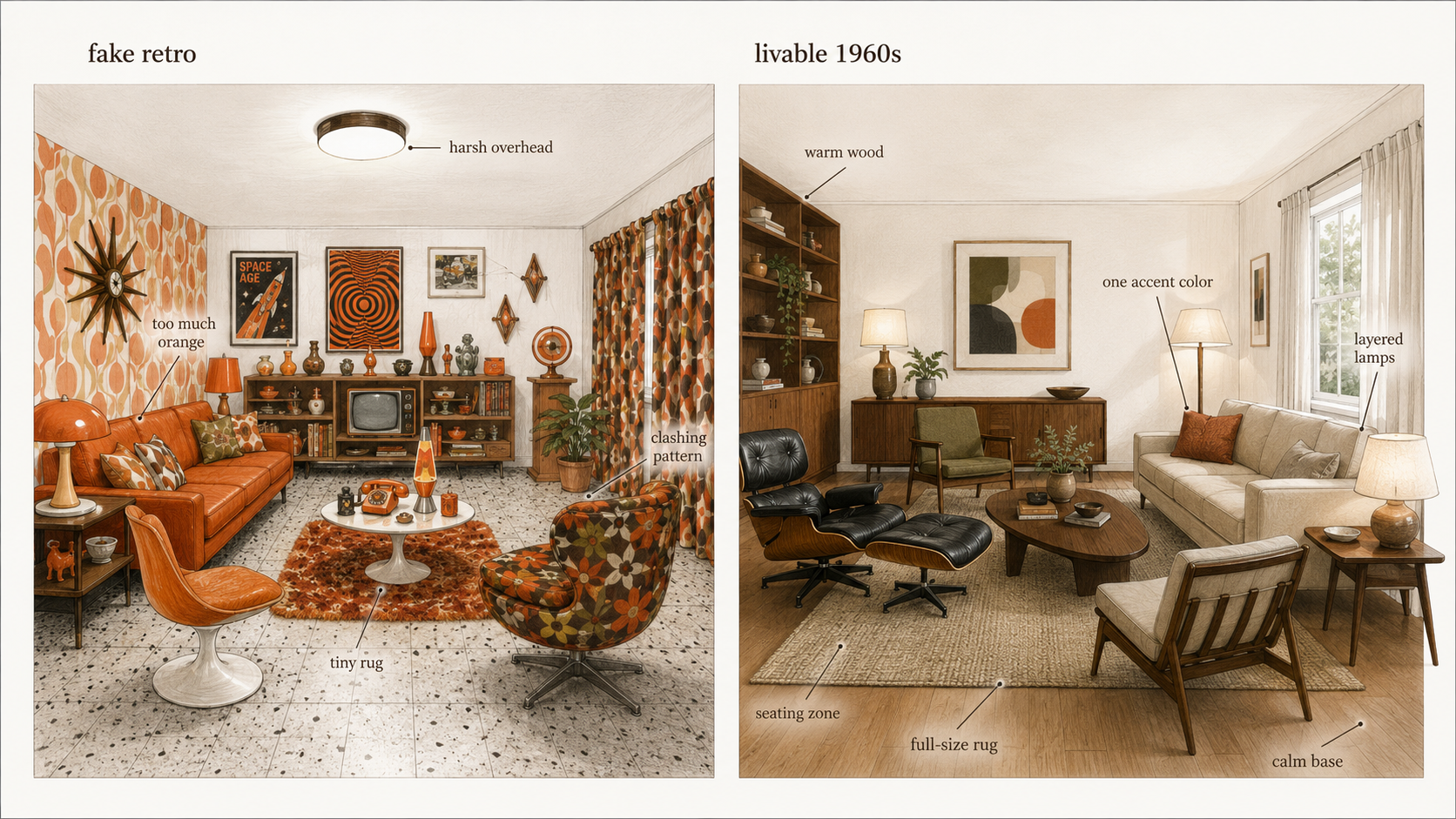
A good 1960s room should make a visitor feel the decade before they can name a single object in it.
Fix First, Keep, Skip
Before you buy anything or pick a color, sort what the room already has into three piles. Most of the budget people waste on a 1960s room goes to the wrong pile — repainting before fixing the light, or tearing out the one thing that was actually worth keeping.
| Fix first | Keep | Skip the effort |
|---|---|---|
| One cold overhead light doing all the work | A sound brick fireplace or stone wall | Chasing every period color at once |
| A rug too small to anchor the seating | Real wood built-ins and solid cabinet boxes | Repainting everything before the light is fixed |
| A walkway blocked by the coffee table or a chair | Good window proportions and long sightlines | Ripping out sound wood just because it reads dark |
| Dark, tired finishes swallowing the daylight | Original tile that is dry, intact, and clean | Novelty retro pieces and fake signage |
None of that is about spending more. It is about not spending on the wrong third of the room. The first thing I would change in most original 1960s rooms is not the color at all — it is the single cold ceiling fixture trying to light the whole space by itself.
What 1960s Decorating Style Looks Like
1960s decorating sat between two moods as the decade moved. Early on, a lot of rooms still carried 1950s restraint — cleaner lines, lighter woods, modest upholstery, compact furniture, softer colors. By the later 1960s the interiors got louder: color deepened, pattern grew, furniture dropped lower and turned heavier, rounder, more sculptural, and lighting became part of the room instead of a single fixture on the ceiling. That drift is why a 1960s room can read calm in one house and bold in the next.
| Element | Common 1960s Look | What Goes Wrong Today |
|---|---|---|
| Color | Avocado, gold, orange, brown, cream, olive, teal, rust | Using every color at once |
| Furniture | Low sofas, wood case goods, tapered legs, sculptural chairs | Buying novelty pieces that do not fit the room |
| Materials | Wood, brick, stone, vinyl, laminate, glass, chrome, brass, textured fabric | Mixing too many shiny replacements |
| Pattern | Geometric prints, florals, stripes, textured wallpaper | Making every surface compete |
| Lighting | Globes, pendants, shaded lamps, swag lights, wall lights | Relying on one overhead fixture |
There Were Two 1960s, and They Don't Mix Well
This is the part most 1960s decorating advice skips, and it is the one that quietly causes the costume problem.
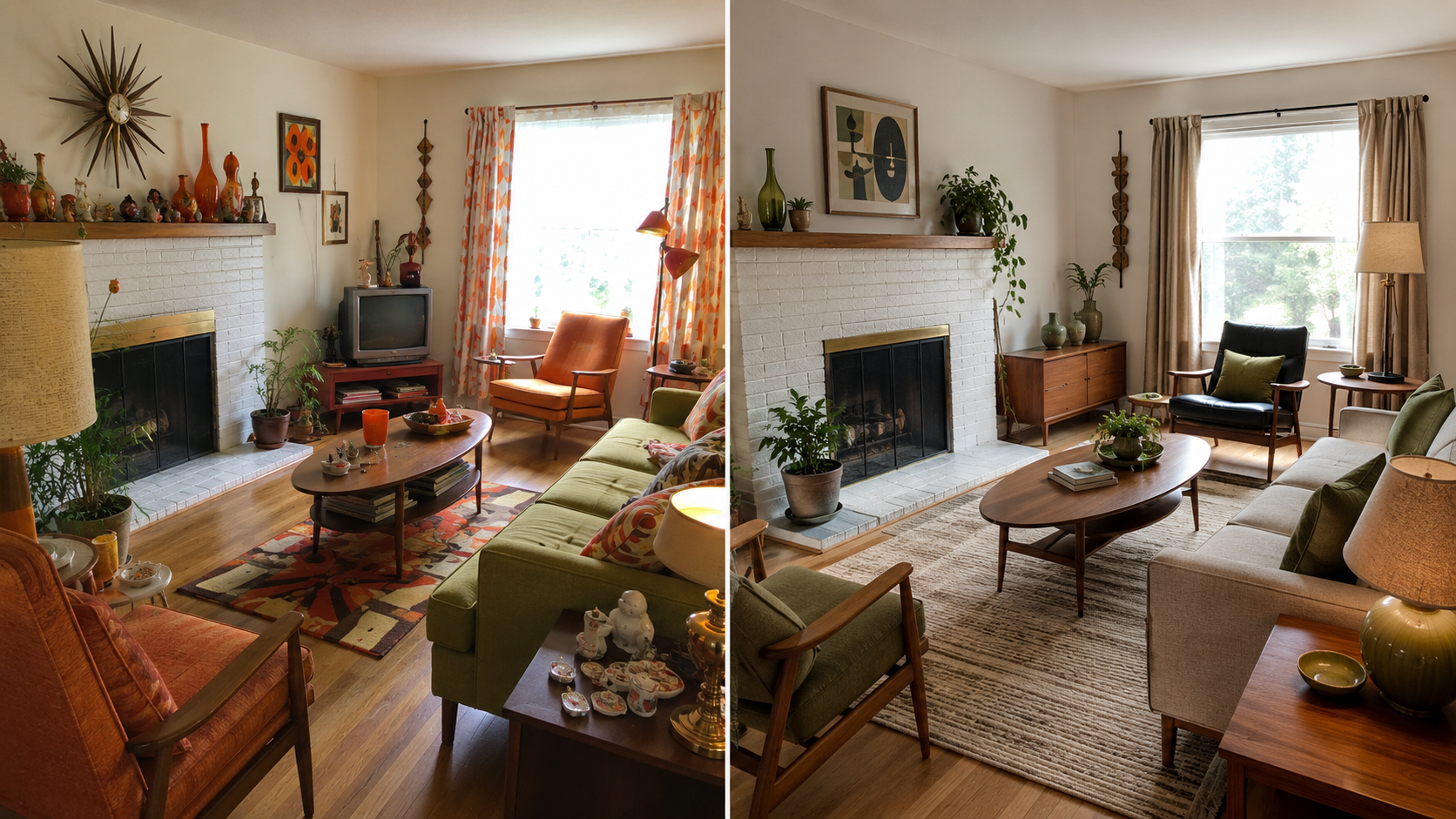
The decade ran on two different visual streams. One is warm and earthy — walnut and teak, brick, brass, grasscloth and wool, avocado, gold, and rust, with low grounded furniture and a Scandinavian calm underneath it. The other is the Space Age side — white, chrome, molded plastic and fiberglass, glossy surfaces, sculptural curves, and brighter pops of teal, red, and orange. Both are completely, correctly 1960s. They just do not belong in the same room.
The rooms that read as costume to me are almost always the ones trying to be both at once — a warm walnut credenza and a brick fireplace, and then a white plastic shell chair and a chrome arc lamp dropped in beside them. Each piece is period-correct. Together they cancel out, because the room never decides which 1960s it is.
So pick the lane the house already leans toward. A brick-fireplace ranch with wood built-ins wants the warm, earthy version. A glassy post-and-beam house with white walls can carry the cleaner Space Age edge. You can borrow one piece from the other side as a spark — a single sculptural lamp in an otherwise earthy room — but the room as a whole should clearly belong to one of them. Commit, and the retro feeling stops looking like fancy dress.
The Color Palette Has to Be Controlled
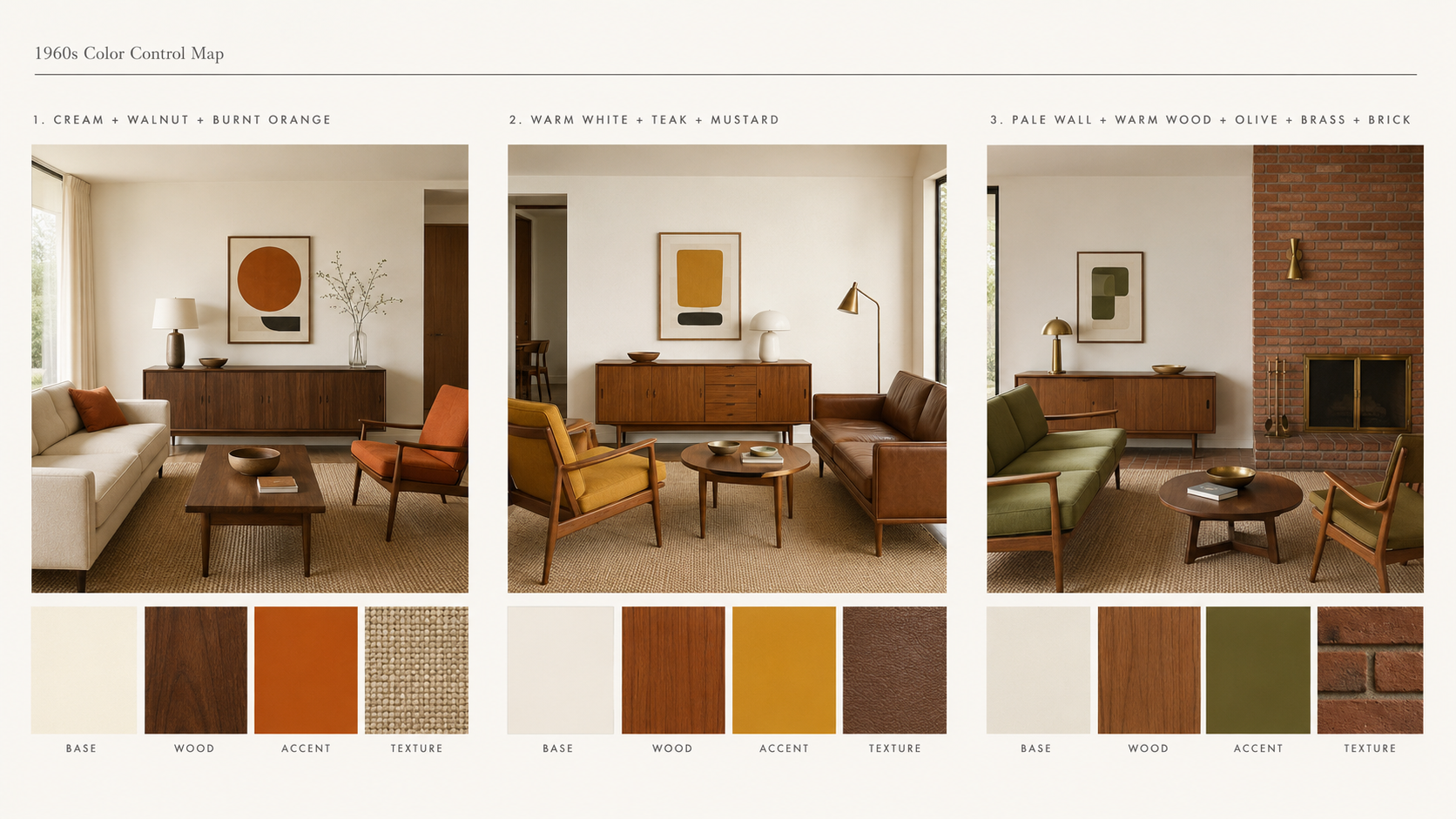
Color is the fastest way to make a room feel 1960s, and the fastest way to wreck it. A strong palette usually works on one dominant base, one warm accent, and one grounding material — cream walls, walnut furniture, orange textiles; or olive upholstery, warm wood, brass lighting; or white walls, teak, a mustard rug. Three strong color decisions in one small living room is plenty. Four or five and it tips into theme-restaurant.
| Palette Type | Good Use | Use Carefully |
|---|---|---|
| Warm 1960s | Cream, walnut, rust, burnt orange | Too much orange on walls and upholstery |
| Earthy 1960s | Olive, tan, brown, brass, brick | Dark rooms with no contrast |
| Bright 1960s | White, teal, yellow, chrome, graphic art | Plastic-looking finishes and flat lighting |
| Modern 60s Decor | White walls, wood, one bold chair or rug | Rooms that become too plain to read as 1960s |
If the room already has brick, wood paneling, terrazzo, tile, or a strong fireplace, count that as part of the palette. Old materials are not neutral just because they have been there a while.
Furniture Should Sit Low, Not Small
1960s living room furniture often sits lower than traditional furniture, but low is not the same as tiny. A good room usually has broad, grounded pieces — a low sofa, a lounge chair, a wood coffee table, a long credenza, simple side tables on clean legs. The mistake is filling the room with small retro pieces that all share the same tapered-leg silhouette. One sofa, one chair, one credenza, and one good lamp say more than eight little mid-century things elbowing each other.
Keep the seating usable. A sofa seat height around 16 to 18 inches is still comfortable for most people; go much lower and the room looks stylish in photos and punishes knees every evening. Wood matters too — walnut, teak, oak, and warm-stained birch all work, but they should not all compete in one room. Pick a main wood tone and let the rest fall in behind it.
1960s Living Room Decor Starts With the Conversation Area
A 1960s living room should not be arranged only around the TV. The best rooms from the decade build a conversation area first — sofa, chairs, table, lamp, fireplace, window, and art working together. The TV can be there; it just should not own every wall unless that is genuinely how the household lives.
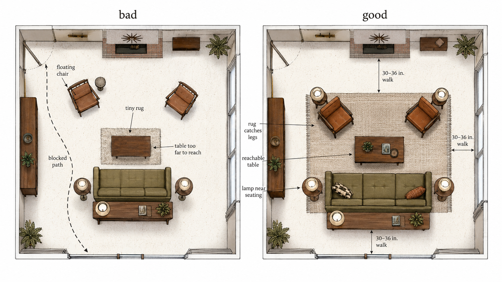
Start from the largest fixed feature, which is usually the fireplace, a broad window, the built-ins, or one long uninterrupted wall, and place the sofa so the room has a clear sitting zone. Keep the walkway through the room around 30 to 36 inches. That one measurement quietly decides everything: if a coffee table, lounge chair, or media cabinet blocks the route, the room can photograph beautifully and fail every night of the week.
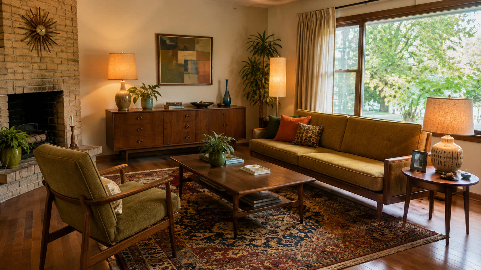
For the period feeling, lean on one major move rather than all of them at once:
- A strong sofa color with quieter walls and wood furniture.
- A patterned rug with calmer upholstery.
- A sculptural lamp with simpler furniture.
- A long credenza under art, books, or a low media setup.
Do not run all four at full volume in the same small room.
Pattern Should Have a Job
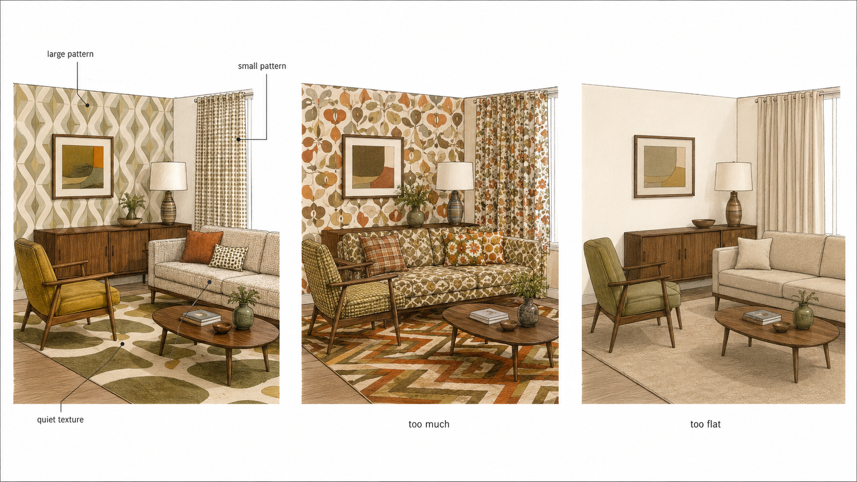
Pattern was not shy in the 1960s — geometric prints, large florals, stripes, textured wallpaper, abstract art, graphic rugs all belong. The only real question is where it goes. A patterned rug can hold a seating area together. Wallpaper can make a dining nook or an entry feel intentional. A bold chair can wake a quiet room. Curtains can soften a wall of glass.
It goes wrong when pattern shows up everywhere at the same scale — big rug, big wallpaper, big pillows, big art, heavy drapery — and the room flattens into noise. One large pattern, one small pattern, one quiet texture. That is usually the whole recipe.
Lighting Makes the Style Believable
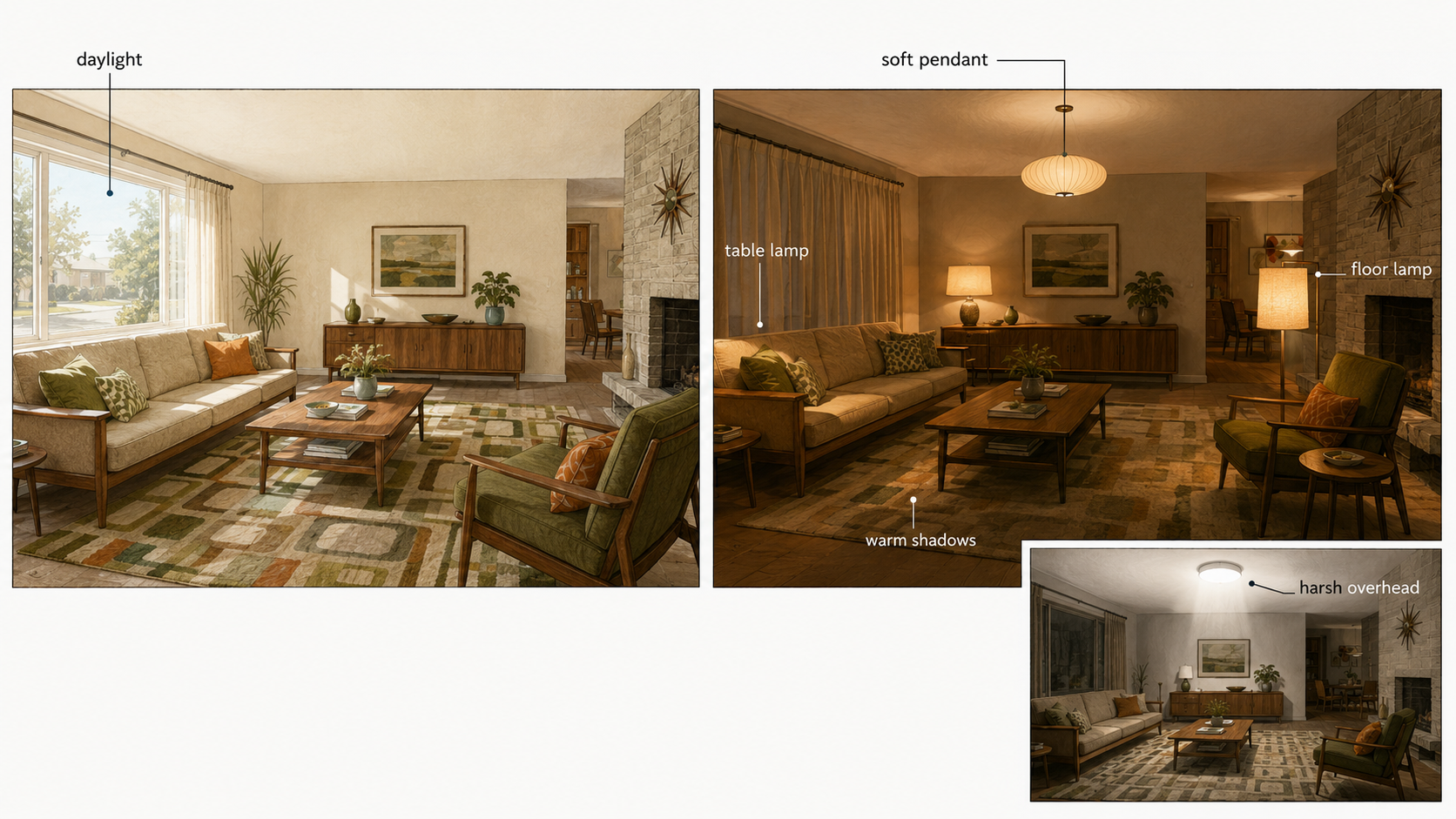
Bad lighting makes 1960s decor look fake faster than any wrong color. These rooms need layered light — a ceiling fixture or pendant, one or two table lamps, a floor lamp, sometimes a wall light — because the furniture sat low and the materials ran warm, and a single cold overhead fixture flattens all of that into something dead.
Globe pendants, drum shades, ceramic and brass lamps, smoked glass, simple wall lights all fit; the trick is to not make every fixture a statement. And if the room has a brick fireplace, wood paneling, or warm upholstery, light it so those materials come alive after dark. A room can look perfect at noon and fall apart at 7 p.m. when the shadows land in the wrong places.
Materials Give the Room Its Weight
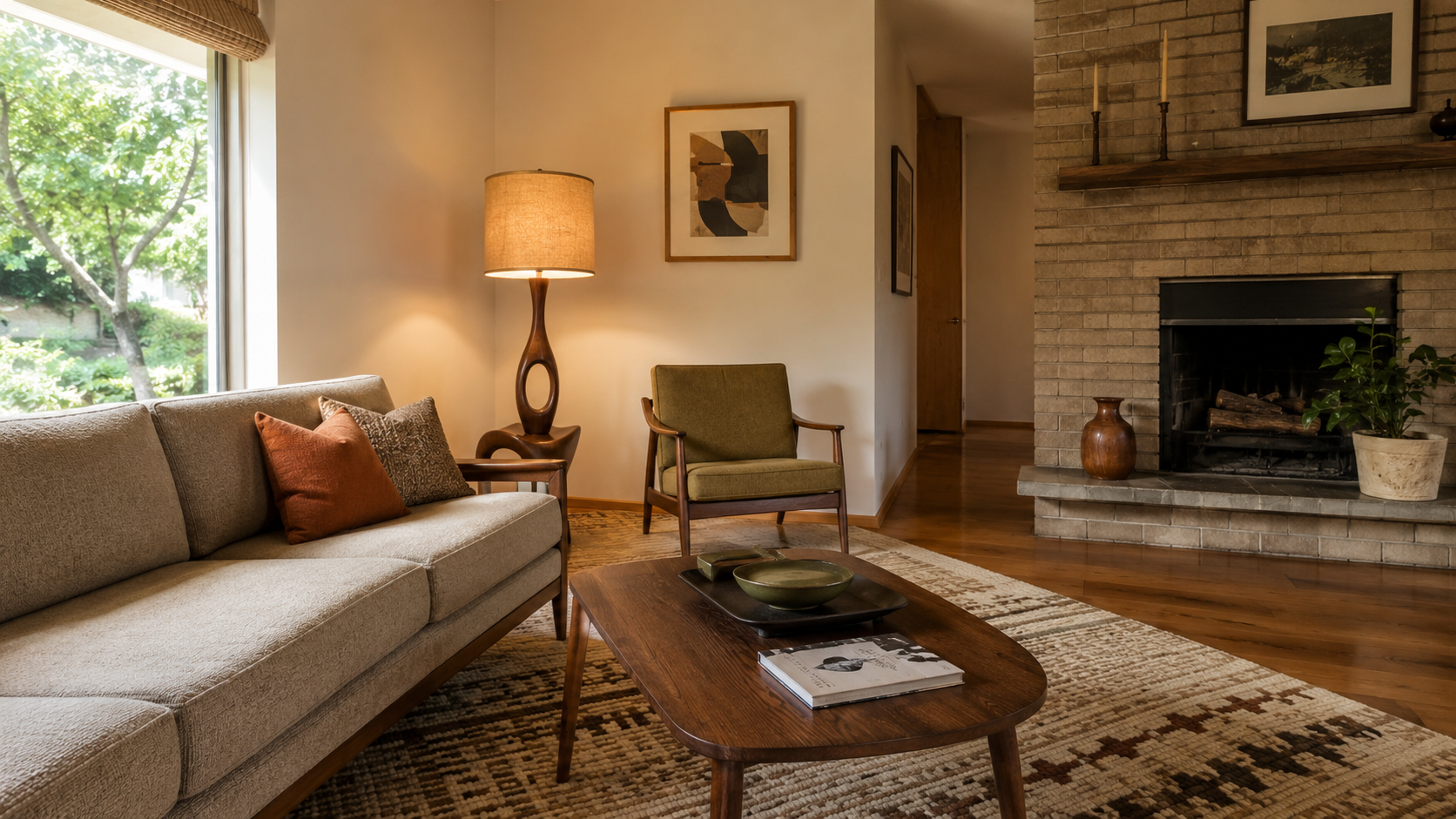
1960s interiors were never only about color — they had texture. Wood case goods, brick fireplaces, stone floors, vinyl tile, ceramic lamps, grasscloth, woven shades, textured upholstery, chrome legs, brass hardware, laminate counters, glass tables, all of it in different corners of the decade.
The modern version has to keep some of that weight. Turn everything into white drywall, pale flooring, flat cabinets, and thin black metal and the room may look current, but the 1960s thread is gone. So keep one or two original materials when they are sound — a brick fireplace, a wood built-in, vintage tile, a good cabinet box can anchor the whole room — and replace the weak parts around them. That is where a 1960s house can save money and look better in the same move.
The Part That Makes 60s Decor Look Fake
More often than not, the fake look is a scale problem, not a color problem. A tiny orange chair lost in a large room. A too-small rug floating under a big sofa. A pendant hung too high. A console that looks like a stage prop. Wallpaper that ignores the door trim, the window height, the ceiling line. Every piece can be authentically 1960s and the room still reads staged.
So work from the room's real measurements before the labels — sofa length, window width, fireplace size, ceiling height, walkway clearance, lamp height, rug size. A living room rug should be big enough to catch at least the front legs of the main seating. A pendant over a table should hang low enough to light the table, not the ceiling. A credenza should answer to the wall width, not the TV. That is the line between 1960s decorating and a pile of retro objects.
Why Some 1960s Rooms Stay in Memory
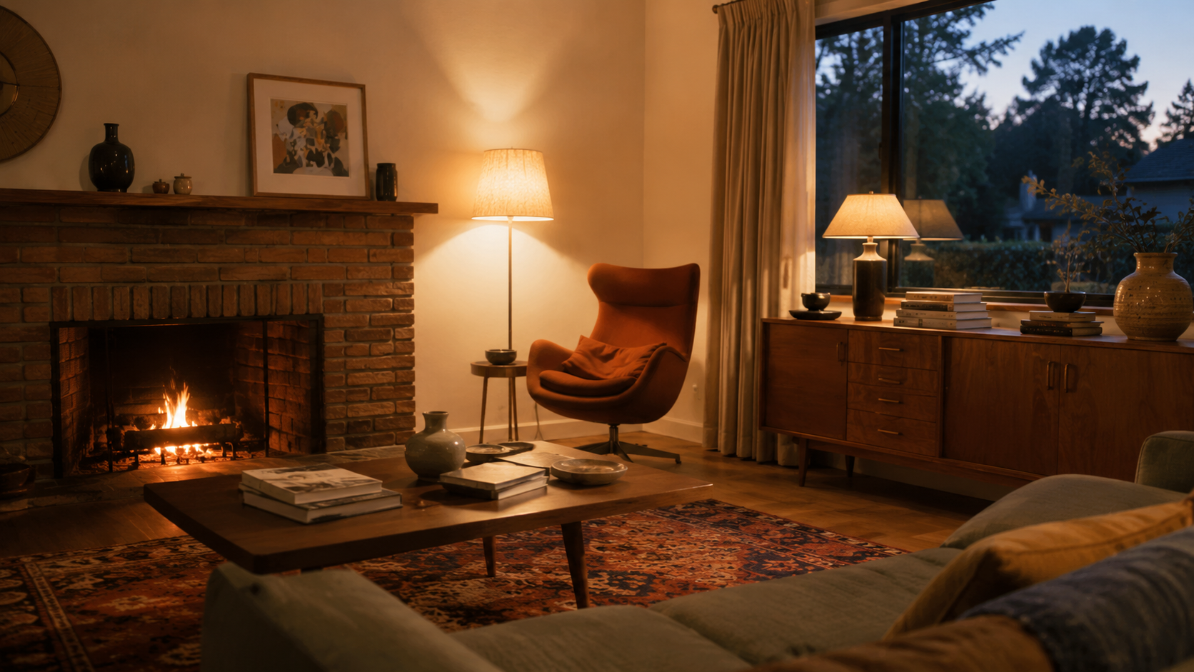
The rooms people actually remember lead with warmth, not novelty — a brick fireplace, a low wood table, a lamp that throws good evening light, a chair in one strong color, a rug that settles the seating, and the small signs of use: books, plants, ceramics. Treat 1960s decorating as a shopping list and the room comes out flat. The version worth copying is not the loudest one. It is the one that still feels good after dinner with the lamps on.
What to Keep From an Original 1960s Interior
Do not tear everything out just because it looks old. A lot of original 1960s interiors are hiding useful pieces under tired finishes — wood built-ins, brick fireplaces, simple stair railings, original tile, flat-panel cabinet doors, long windows, pocket doors, ceiling beams, and room proportions that still work. Keep the pieces that hold the room up.
Then remove or repair what is actually failing: worn carpet, damaged paneling, poor lighting, unsafe wiring, bad ventilation, stained ceilings, broken tile, swollen cabinets, failing floors, or any finish that traps the room in the dark. For the architecture side of the decade, use 1960s house style. If decorating is turning into remodeling, read 1960s house renovation before demolition starts.
Kitchen and Dining Rooms Need Restraint
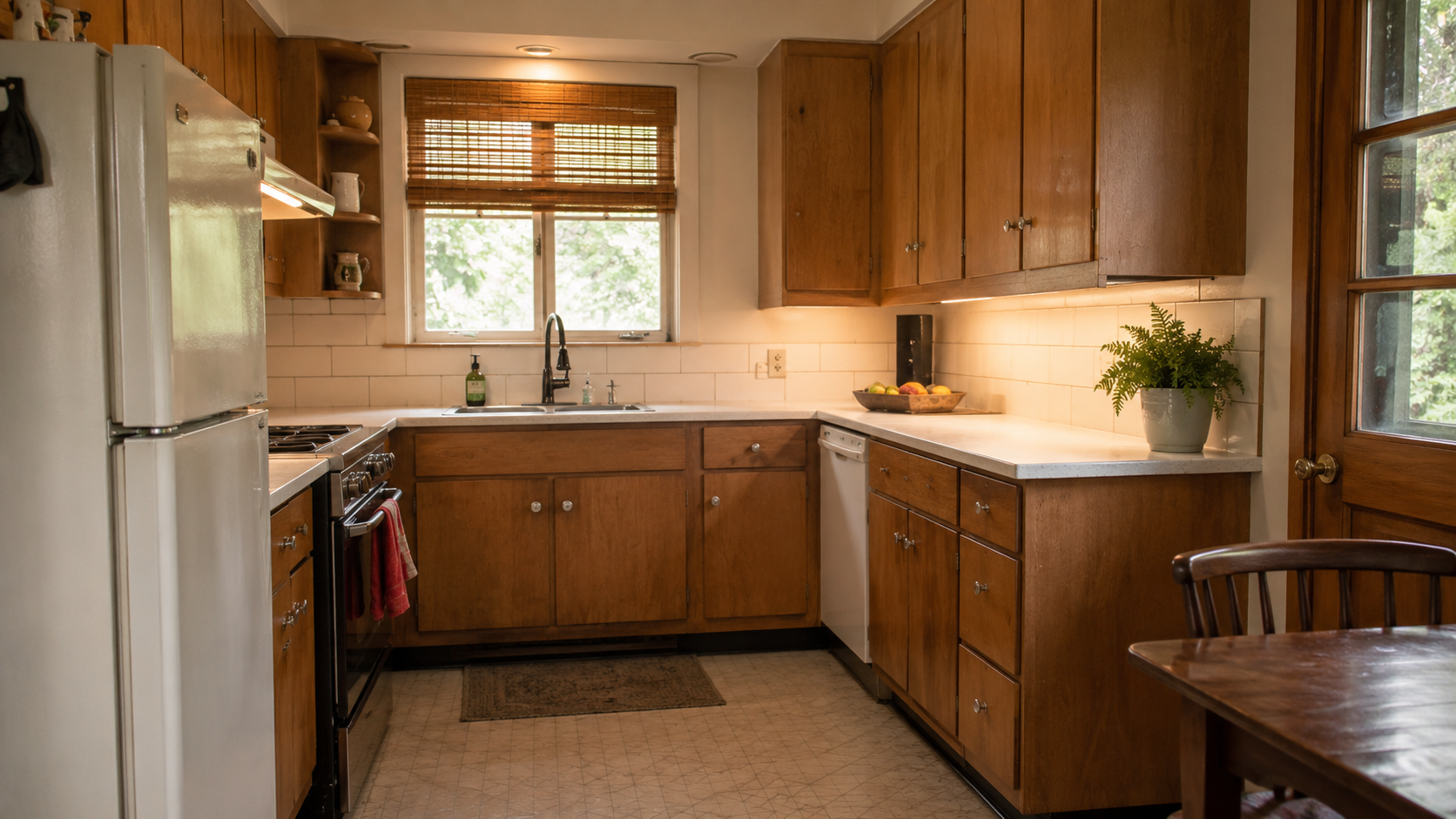
A 1960s kitchen can carry real style, but the room has to work before it gets to be cute. Warm wood cabinets, laminate counters, colored appliances, patterned flooring, pendant lights, banquette seating all belong to the period — and kitchens punish bad nostalgia faster than living rooms do. A cabinet that looks charming on a bad box, with poor clearance, weak ventilation, or failing plumbing behind it, is not worth saving for looks alone, and a brand-new kitchen that ignores the house's lines reads just as wrong.
Start with the cabinet condition, the appliance clearances, the light, the ventilation, the flooring transitions, and the connection to dining or family space. Then decide how much 1960s color, wood, or pattern the room can actually carry.
For kitchen-specific scope, use 1960s kitchen remodel.
Bedrooms Should Be Quieter
Bedrooms can use 1960s style, but they want a softer hand. A walnut dresser, a low bed, simple lamps, a warm rug, textured curtains, or one patterned textile can carry the decade without making the room feel busy. Strong orange, avocado, or mustard walls can work, but they change the light fast — so let the window direction be the control. A north-facing bedroom can go heavy and gloomy under brown and olive; a bright south-facing room handles warm color far better; a small bedroom usually wants its 1960s feeling in the furniture and lamps, not on every wall.
Bathrooms Can Keep Color Without Feeling Dated
1960s bathrooms often came with colored tile, compact vanities, wall-mounted medicine cabinets, chrome, pastel fixtures, or a stronger floor pattern. A lot of that is worth keeping if the tile is sound, the walls are dry, the fan works, and the layout still functions. Color was never the problem — moisture, a weak fan, bad clearances, and failing grout are.
If the tile is solid and the room works, modern lighting, a better fan, fresh caulk, updated hardware, and a simpler wall color can be enough. If the wall is soft, the floor is damaged, or the plumbing is failing, it has stopped being a decorating project. For the remodel side, use 1960s bathroom remodel.
What to Avoid
- Too much orange. It works better as an accent than as the whole room.
- Too many tapered legs. Mix the leggy pieces with one grounded one so the room does not feel nervous.
- Small rugs. A small rug makes good 1960s furniture look like props.
- Cold lighting. Warm materials need layered light, not one harsh fixture overhead.
- Fake retro signs. The room should feel lived in, not labeled.
- Copying only the loudest rooms. Plenty of the best 1960s interiors were warm, practical, and restrained.
FAQ
What is 1960s decorating style?
1960s decorating style uses warm wood, bold color, low furniture, patterned textiles, graphic art, textured materials, and stronger lighting. The best version feels comfortable and useful, not like a retro stage set.
What colors were popular in 1960s home decor?
Common colors included avocado, olive, mustard, gold, rust, orange, brown, cream, teal, white, and warm wood tones. The safest modern approach is to use one strong 1960s color with quieter walls and materials.
What is 1960s living room decor?
It usually means a conversation-focused room with a low sofa, lounge chair, warm wood table or credenza, patterned rug or textile, layered lamps, and one strong color or material move.
How do I make modern 60s decor without making the room look fake?
Use one or two period signals — a wood credenza, a low sofa, a globe lamp, a patterned rug, or a warm accent color — and keep the rest of the room simple and correctly scaled.
What furniture fits a 1960s style living room?
Low sofas, lounge chairs, wood coffee tables, long credenzas, simple side tables, sculptural lamps, and clean-lined upholstered chairs all fit. Avoid filling the room with too many small retro pieces.
Is 1960s interior design the same as mid-century modern?
No. Mid-century modern is one branch of 1960s design. The decade also included ranch interiors, split-level family rooms, bold color, heavier textures, paneling, patterned wallpaper, and more casual suburban decorating.
Read This Next
For the architecture behind the decorating, read 1960s house style.
If the decorating project is becoming a remodel, start with 1960s house renovation.
For kitchen work, use 1960s kitchen remodel. For bathrooms, use 1960s bathroom remodel.