The Model Making Mistakes That Ruin Good Designs
The Real Reason Your Model Isn’t Working
Most architecture models fail for one reason: sloppy thinking. Here’s how to fix the mistakes that wreck good designs.
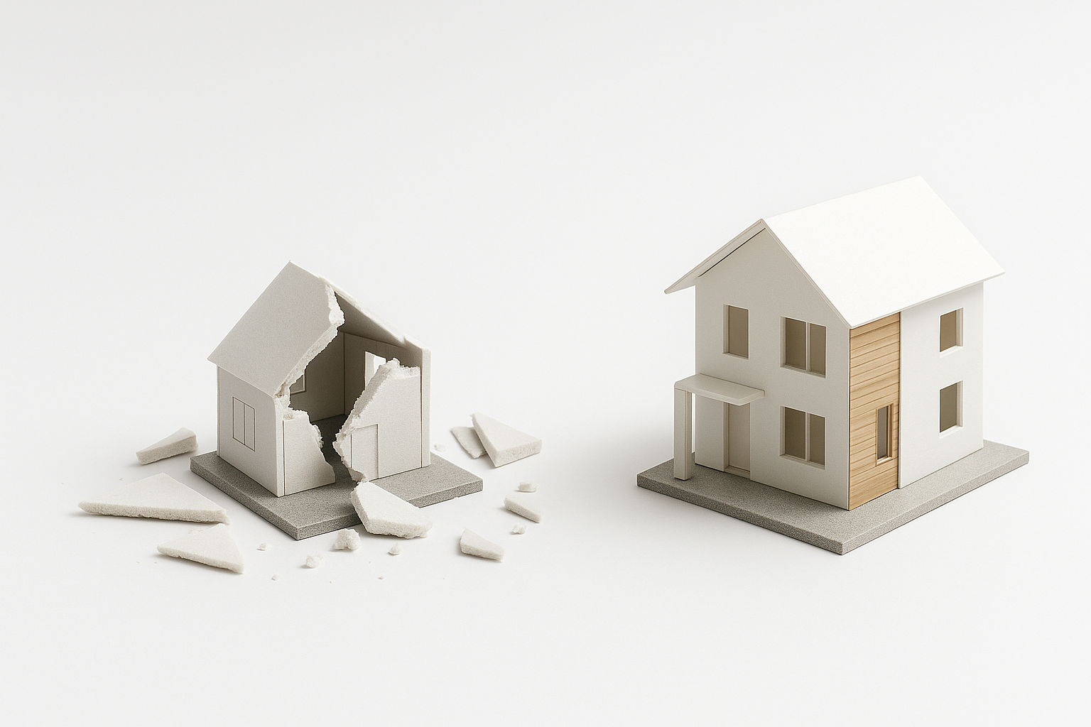
One Bad Cut Wrecks the Whole Thing
A clean model proves you understand space. A sloppy one says the opposite.
Most design students and even young professionals mess up their models in the same ways: bad board choices, wrong glue, lazy cuts, poor proportions, and over-detailing that confuses rather than clarifies.
This guide breaks down every common model-making mistake and what to do instead. Whether you’re prepping for a review, a competition, or a client presentation, here’s how to build something that actually helps your design and not hurts it.
What Most People Get Wrong About Architecture Models
Model Making Mistakes That Cost You Grades and Clients
Tired of your models looking off? These real mistakes ruin proportion, layout, and credibility. Here’s how to avoid every one.
Client Models vs Student Models: What Actually Matters
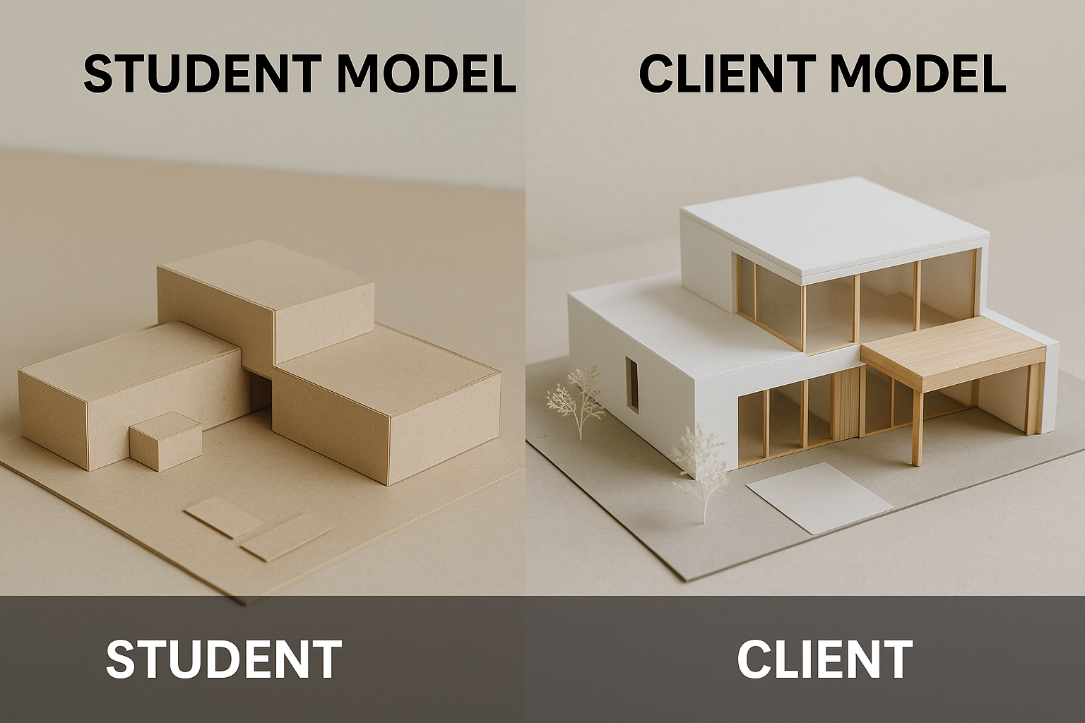
There’s a major difference between models built by practicing architects and those built in school.
Professional presentation models are made to sell. They exist to impress a client, secure approval, and close a deal. These models need to be clean, refined, and visually powerful. Cheap materials, sloppy cuts, or half-finished joints can make clients second-guess your entire design—even if the concept is solid. In the professional world, polish matters. Clients don’t care how you got there. They care how it looks now.
That’s why architecture firms invest in high-end materials, laser cutting, lighting, and detail. These models don’t just explain a space. They sell the story.
Student models are different. Your professor isn’t buying your building. They’re evaluating your thinking. The best student models don’t rely on expensive materials or overworked details. They show layout clarity, material logic, spatial understanding, and structural intent. A student model made from chipboard or paper can win a review if it communicates ideas clearly.
In fact, professors often criticize over-styled models that hide bad design behind fancy finishes. When a model is too “shiny,” it’s often covering weak thinking.
What professors actually look for in student models:
✓ Clear massing and volume logic
✓ Understanding of scale and structure
✓ Clean execution—even with basic materials
✓ A process they can read and follow
✓ Restraint in color, texture, and detail
What clients expect from professional models:
✓ A polished, premium feel
✓ Visual clarity and presentation strength
✓ Detailed finishes, especially in key areas
✓ Materials that feel “real” or refined
✓ A model that makes the project feel buildable and trustworthy
Bottom line:
In school, don’t try to build like a firm. Focus on clarity, purpose, and process. Professors respect sharp thinking over shiny presentation. In practice, though, presentation quality can make or break client trust. Know your audience. Build accordingly.
See also: Conceptual Architecture Examples That Still Hold Up
The Most Expensive Model Still Failed
This happened in a real studio.
One student went all out. Premium materials. Laser-cut precision. Flawless assembly. The final model looked stunning. Good enough for a museum display. But he failed the entire year.
Why?
Because he forgot the basics.
He didn’t bring the older models to show his design process. No rough massing. No iterations. Just the final piece. In architecture, that is a fatal mistake. Reviewers do not just want the result. They want to see the thinking.
Worse, the model focused on flash. Not logic. It didn’t explain how problems were solved. It didn’t show why decisions were made. It looked good, but it said nothing.
It was all execution. No explanation.
That is the trap. Fancy materials and perfect cuts mean nothing if the design does not hold up. If your model does not show thinking, problem-solving, and spatial clarity, it fails.
A good model tells a story. A great one proves you solved a real design problem. Never forget that.
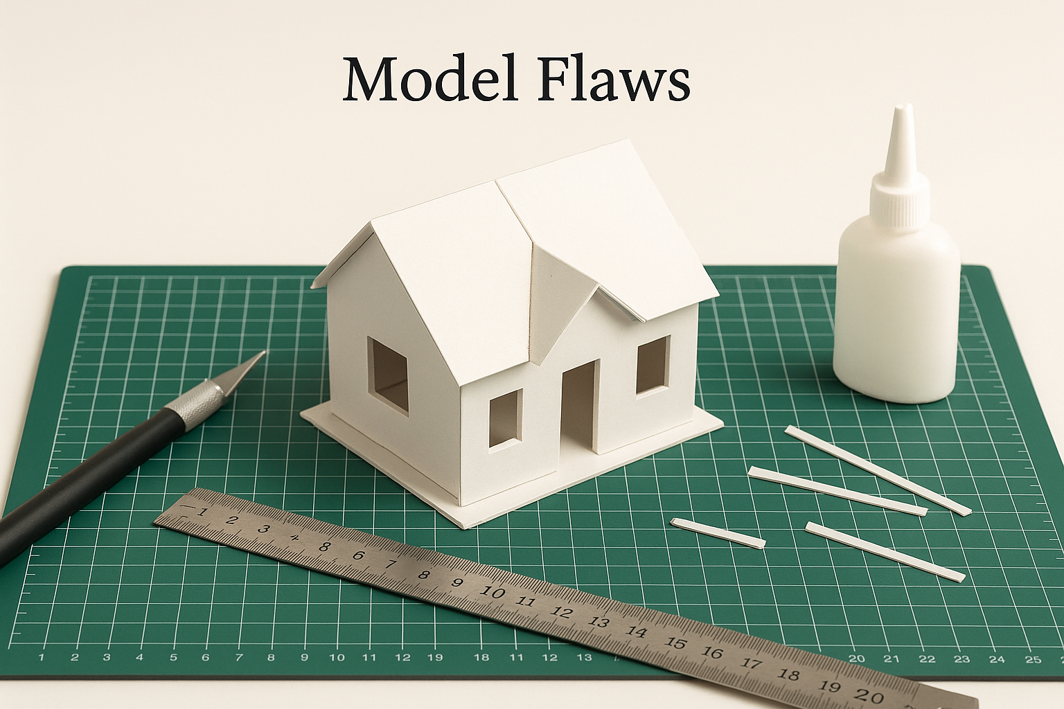
Wrong Materials = Weak Models
Mistake:
Using soft boards, cheap paper, or anything that bends, smudges, or warps after a few hours.
Why It Fails:
Bad materials cheapen the look, weaken structure, and waste your time. Foam core curls. Printer paper buckles. Cheap glue warps.
Fix It:
● Use museum board, chipboard, or MDF for serious work
● Use fresh blades and a solid metal ruler
● Test adhesives on scraps before committing
FIELD PICK
Architectural Modelmaking by Nick Dunn
Used in real studios. Straightforward tips with visuals that show you what works.
→ Buy on Amazon
Sloppy Models, Failed Designs: How to Avoid Basic Errors
Architecture Model Fails: What They Teach and How to Stop Doing Them
Over-Detailing Way Too Early
Mistake:
Adding tiny furniture, stair railings, or finishes before the massing and spatial layout are resolved.
Why It Fails:
Your core volumes and proportions should work before anything else. Detail early = distraction. You can’t decorate your way out of a broken design.
Fix It:
● Build basic massing models first
● Use white or grey tones only until layout and proportion are set
● Add detail last, not first
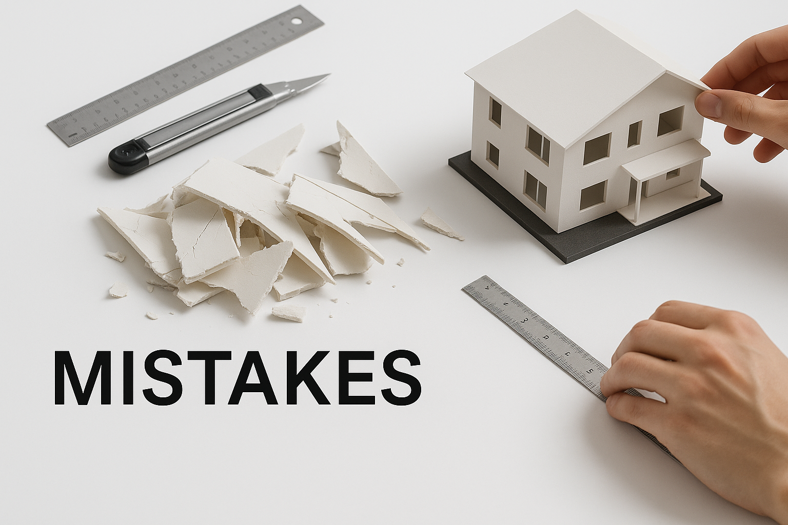
Cutting Without a Plan
Mistake:
Grabbing the blade before sketching, measuring, or thinking through scale.
Why It Fails:
Models are not crafts. They’re communication tools. Random cuts show lazy thinking and waste.
Fix It:
● Sketch elevations before cutting
● Mark cut lines clearly
● Measure twice. Cut once. Every time.
Using Glue Like It’s Paint
Mistake:
Smearing too much glue, using the wrong kind, or letting it ooze out of edges.
Why It Fails:
Glue should hold. Not show. Visible glue lines wreck clean finishes and make your model look rushed.
Fix It:
● Use tacky glue or rubber cement for paper
● Use wood glue sparingly on wood-based materials
● Always use a fine brush or small applicator for precision
Bad Scale Kills Good Ideas
Mistake:
Jumping into 1:50 or 1:100 models without checking if the thickness of your board ruins proportions.
Why It Fails:
Thick walls in a small-scale model make everything look cartoonish or wrong. A 3mm wall at 1:100 is 30cm in real life.
Fix It:
● Match material thickness to your scale
● Use thinner materials for smaller scales
● If in doubt, test one module and adjust
Too Much Color, Texture, or Contrast
Mistake:
Painting walls. Using patterned paper. Mixing too many materials.
Why It Fails:
The goal of a model is clarity. Not chaos. Excess color makes it look like a toy.
Fix It:
● Stick to one material or tone for massing
● Use color only if it communicates something
● Let lighting do the contrast, not textures
Forgetting Context
Mistake:
Making a beautiful building model with no surrounding site, streets, or relevant context.
Why It Fails:
Designs don’t float. Your model needs grounding. A building without context can’t show how it fits, shadows, or responds.
Fix It:
● Include base topography, site boundaries, and nearby buildings
● Even basic cutouts help show placement and proportion
Leaving the Edges Raw
Mistake:
Exposed fluted foam, jagged chipboard, or uneven corner joints.
Why It Fails:
Edges make or break the model. Clean corners show precision. Rough ones show carelessness.
Fix It:
● Always use sharp blades
● Angle joints when needed
● Sand or burnish edges if necessary for polish
Relying Too Much on Laser Cutting
Mistake:
Letting machines do all the thinking and layout.
Why It Fails:
Laser cutting is fast, but thoughtless. You miss design chances when you outsource the whole process to tech.
Fix It:
● Prototype manually before cutting
● Use hand skills to fix and iterate
● Treat machines as helpers, not designers
Last-Minute Assembly
Mistake:
Leaving the model until the day before critique or deadline.
Why It Fails:
Sloppy builds always show. Rushed glue. Crooked joints. No time for fixes. Your professor will know.
Fix It:
● Set milestones for base, structure, and final assembly
● Leave time for fixing, drying, and transporting
What a Clean Model Can Do
One student had a weak plan. But their model was sharp—clear material changes, strong massing, and perfect scale. The review went better than expected because the model showed what the drawings couldn’t. That’s what physical models are for. They fill the gap.
What Clients, Instructors, and Reviewers Actually Look For
✓ Clean joints and sharp lines
✓ Logical structure and proportion
✓ Accurate scale and clear layout
✓ Visual restraint—not decoration
✓ A model that explains the design without needing 5 minutes of talking
Tools That Help You Avoid Mistakes
✓ Metal ruler with cork backing
✓ Self-healing cutting mat
✓ Precision knives with fresh blades
✓ Micro brushes or glue applicators
✓ Calipers for checking scale
FIELD PICK
Model Making: A Basic Guide by Martha Sutherland
Simple, solid, and time-tested. Great for students or anyone learning how to avoid sloppy mistakes.
→ Buy on Amazon
Final Thoughts
You don’t need a perfect model. You need a smart one.
Avoid the mistakes that make your design look worse than it is. Build clean. Stay logical. Respect scale and layout. The right model won’t just impress. It’ll actually teach you something about your design.
FAQs
Getting Started & Workflow Basics
Q1: What is the workflow for building a model from a Rhino or CAD file?
Start with a quick massing sketch in foam or paper. Break it down to key volumes. Then refine in CAD, print or laser-cut, and assemble. Think in stages: concept → layout → detail.
Q2: Are there kits with pre-made shapes?
Yes. You’ll find kits with standard elements—cubes, spheres, columns. They’re great for speed, but don’t let them limit your creativity.
Materials & Scale
Q3: What materials should I use at the start?
For early-stage models, use cheap, easy-to-cut stuff: foam core, chipboard, or corrugated cardboard. They’re forgiving and fast.
Q4: What scale should I choose for my model?
Match your model’s purpose:
-
1:100 or 1:200 for building massing
-
1:500 or 1:1000 for site plans or city context
-
1:10 or 1:20 for interiors or detail studies
Basis: how much detail you need vs. space you have.
Tools, Techniques & Tips
Q5: How do you keep cuts clean and straight?
Keep scalpels sharp. Use a metal ruler with backing. Don’t press too hard—make several light passes.
Q6: Any smart glue tips?
Use a small brush or syringe for glue application. Less glue = cleaner joints. Rubber cement is great for paper models; tacky glues for board.
Q7: Should I 3D print or hand-build?
Use both. Hand-build for early thinking and iteration—3D print for precision and presentation.
Time, Cost & Production
Q8: How long does a model take?
Depends on complexity. Quick concept models: 1-3 days. Detailed presentation models: anywhere from 2 to 6 weeks.
Q9: How much does a model cost?
No fixed price. Range from <$100 for simple school models to thousands for professional builds. Budget depends on scale, detail, and materials.
Presentation, Purpose & Context
Q10: What do reviewers actually look for?
Clean edges, clear spatial logic, accurate scale, and narrative—whether it shows decision-making, light, flow, or spatial hierarchy.
Q11: Do models still matter when digital renders do everything?
Absolutely. Firms like Richard Meier’s still rely on physical models to test light, shadow, and form—things screens can’t show. Models force you to think in 3D space.
Q12: Should I include earlier versions of my model in reviews?
Yes. Showing your process—the rough massing, the errors, the refinements—proves you thought things through. It’s not just the final model that earns marks—it's your design journey.
KEEP LEARNING
Architectural Modelmaking by Nick Dunn is the next-level guide if you’re serious. Covers layout, structure, and presentation with visuals that actually help. → Buy on Amazon
Related
Model Making Tools & Resources
- Architectural Model Making Tools for Beginners & Professionals: What to use, when to upgrade, and how to avoid tool overload.
Visualization & Studio Communication
- Architectural Presentation and Rendering: How to show your design ideas clearly with the right tools and layout.
- Architectural Renderings Enhanced by AI: A look at how AI tools change the way architects communicate and visualize.
- Rendering for Architecture Students: Real advice on producing school-ready visuals that stand out in reviews.
Form, Theory & Technical Design
- Creating Beautiful and Functional Spaces: Expert Tips for All Levels: Tips that bridge concept with real-life use and user experience.
- Form Follows Function in Architecture and Design: Why this old phrase still explains smart modern architecture.
- Form Meets Function: Principles for Great Architectural Design: Where aesthetics and usability overlap—and where they don’t.
- Architectural Form Examples: How Shape Defines Function: Clear examples of how form supports structure, use, and identity.
Interior, Layout & Space Logic
- Interior Design Functional Elegance: Practical Tips for Stunning Interiors: A blunt breakdown of materials, space use, and real beauty in interiors.
- Scale and Proportion in Architectural Design: Balancing Form and Function: How to fix designs that feel “off” with correct proportion and rhythm.
Influential Architects & Planning Concepts
- Frank Lloyd Wright: Merging Form and Function in Architecture: A look at Wright’s process, ideas, and why his influence still matters.
- Clustered Form Architecture: Function, Space, and Design: How spatial clusters shape experience, access, and circulation.