Basic Design Concepts in Architecture
Crits get confusing because studio language is compressed.
A professor says “tighten the hierarchy,” but they may really mean the entry is weak, the plan has no lead space, the section is not proving anything, or the project has too many equal moves fighting for attention.
The words are short. The fixes are not always obvious.
Worth reading first: If you need the bigger foundation, start with Basic Design and Architecture. If your diagrams look clean but never become a believable building, use Design Basics: Architecture and Building Reality.
Studio Terms at a Glance
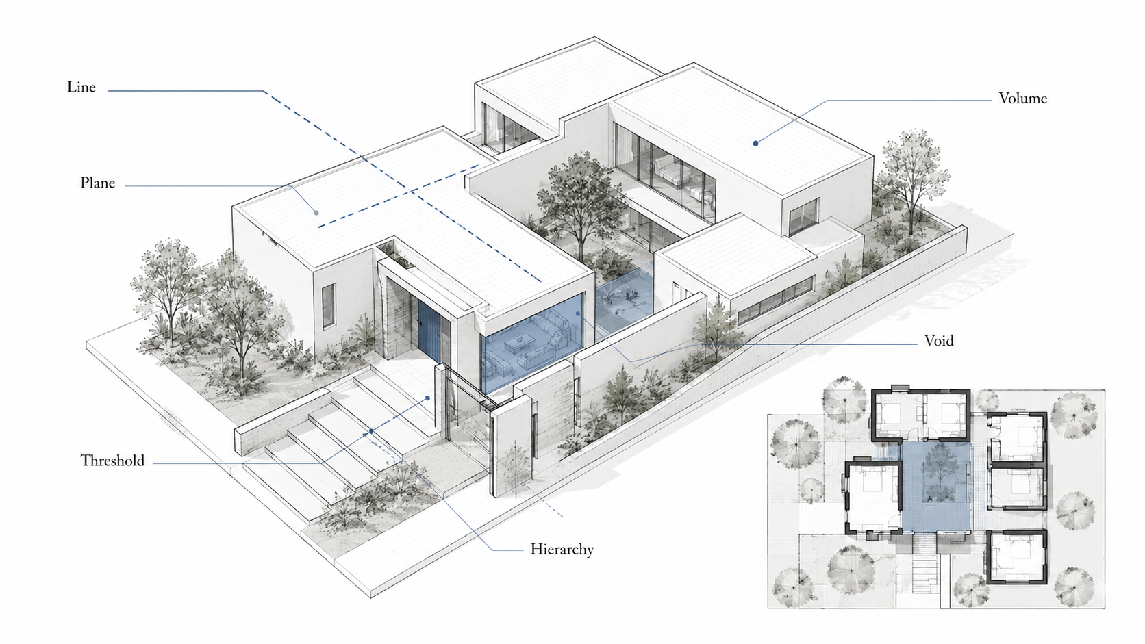
Illustration by ArchitectureCourses.org. Basic design concepts are easier to read when line, plane, volume, void, threshold, hierarchy, and figure-ground appear in one coherent building instead of separate abstract examples.
| Concept | What It Controls | Where It Usually Fails |
|---|---|---|
| Line | Direction, movement, alignment, axis. | The line appears in the diagram but does not organize the plan. |
| Plane | Wall, floor, roof, screen, enclosure. | Planes become decorative panels instead of shaping space. |
| Volume | Mass, interior height, spatial depth. | The perspective looks strong, but the section does not support it. |
| Solid / Void | Built mass and carved space. | Voids become leftover holes with no light, use, or sequence. |
| Figure / Ground | Built form against open space. | The outside space reads as leftover land, not a designed room. |
| Parti | The main organizing idea. | The project has several moves but no clear rule. |
| Datum | Reference line, level, edge, or rhythm. | Openings, paths, structure, and volumes do not lock together. |
| Threshold | Transition between conditions. | The entrance is treated as a door, not an arrival sequence. |
| Hierarchy | What matters first, second, and least. | Everything is equal, so nothing leads. |
Crit Phrases Translated
These comments are rarely random. They usually point to a drawing problem you can test.
- “Tighten the hierarchy.” One idea needs to lead. Right now the project gives the same visual weight to everything.
- “Resolve the edge.” The building meets the ground, street, roofline, or site boundary without a clear decision.
- “Your section is not doing work.” The section is only a slice. It should explain height, structure, light, movement, or the real spatial idea.
- “The parti is unclear.” The project has ingredients but no organizing rule.
- “This is diagram, not architecture.” The drawing is clean, but it does not survive thickness, span, circulation, daylight, material, or construction logic.
The useful move is to stop defending the drawing and ask what the comment is really asking you to fix.
Line

Illustration by ArchitectureCourses.org. Basic design starts with simple relationships: order, voids, entry, proportion, circulation, and open space working together before the building becomes detailed.
A line is the first organizer. It can set direction, mark an axis, hold a façade, guide movement, or create a rhythm for structure.
But a line only matters if the building obeys it.
A circulation spine is a line. A repeated structural bay is a line. A long wall that organizes rooms is a line. A view corridor can also work as one, but only if the plan, section, and approach support it.
Where students get caught is drawing the line after the project is already designed. That makes the axis cosmetic. If the rooms ignore it, the entry ignores it, and the structure ignores it, the line is only graphic decoration.
Fast check: delete the line from the diagram. If nothing in the project changes, it was not doing enough work.
Also useful: Lines in Architectural Sketches helps with the drawing side of this, while Crit Survival for Architecture Students is better for translating the studio comments.
Plane
A plane is a surface that shapes space: wall, floor, roof, screen, canopy, façade, or platform.
The weak version is easy to spot. Random panels appear on the elevation because the drawing needed texture. A screen gets added because the model looked empty. A roof plane floats above the project but does not help with light, shade, water, entry, or structure.
That is where the critique usually lands: the surface exists, but it does not make space.
A strong plane does something. It blocks, frames, shades, holds, divides, protects, or guides. A long wall can make a courtyard feel intentional. A roof plane can mark the public edge of a building. A floor plane can step with the site instead of pretending the ground is flat.
I would test planes in section, not only in elevation. Elevations make weak planes look better than they are.
Volume

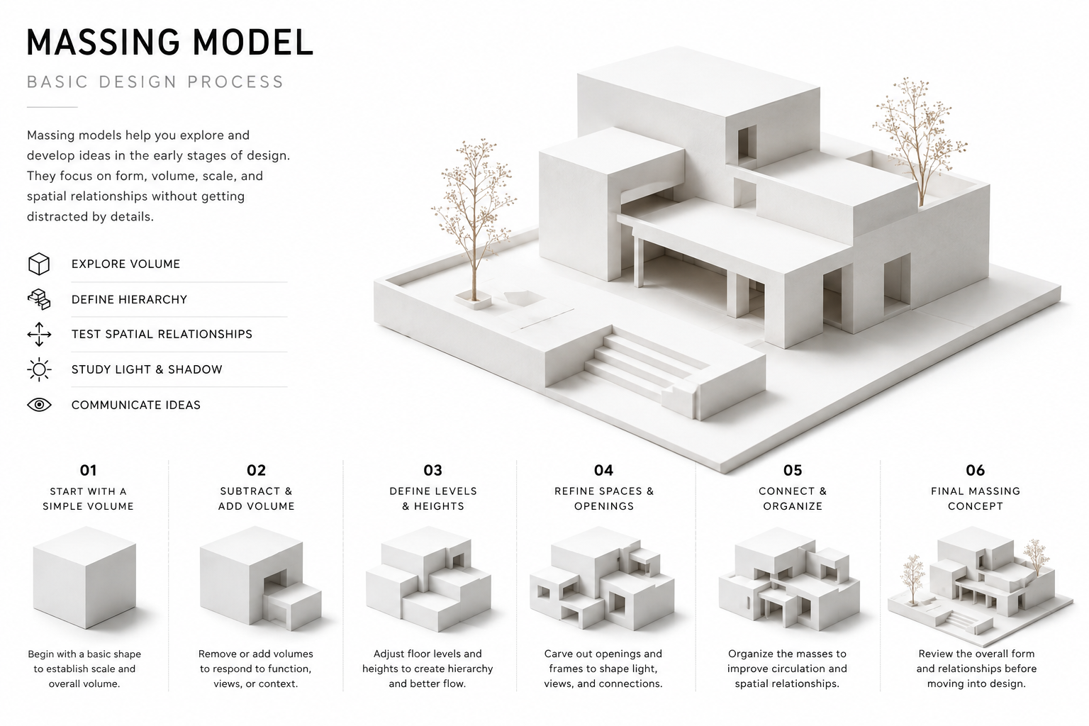
Illustration by ArchitectureCourses.org. Basic architectural design starts with simple massing, hierarchy, section, light, proportion, and circulation before details and finishes are added.
Volume is where shape becomes space.
It is not only massing. A volume has interior height, edge conditions, openings, structure, and a relationship to the volumes around it. A double-height room, a carved courtyard, a tall stair hall, a compressed entry, and a service block can all be volume decisions.
The common student mistake is designing volume from a perspective view first. The image looks dramatic. Then the section exposes the problem: stairs do not land, floor plates do not align, roof thickness was ignored, or the tall space has no structural logic.
That is why a volume should be checked in section early. If the section cannot explain the move, the perspective is probably doing too much of the work.
Recommended reference:
Architecture: Form, Space, and Order by Francis D. K. Ching is still one of the better books for understanding line, plane, volume, form, and spatial order without turning the topic into vague theory.
Solid / Void

Solid is built mass. Void is carved space.
That sounds simple until the plan starts falling apart.
A courtyard is a void. So is an atrium, light well, arcade, terrace, entry pocket, or deep window opening. The question is whether the void has a job. Does it bring light? Does it organize circulation? Does it create a public room? Does it separate noisy and quiet uses? Does it make the building easier to understand?
A dead void is just a hole.
The expensive version of this mistake shows up later when the void has to be enclosed, protected, drained, cleaned, heated, cooled, or structurally bridged. In studio, it shows up as a beautiful white gap in a diagram that nobody can explain.
Figure / Ground
Figure-ground drawings are blunt on purpose.
They strip the project down to built mass and open space. Black and white. No materials. No furniture. No nice shadows hiding the problem.
That is why critics like them. A figure-ground diagram quickly shows whether the building has a clear footprint and whether the outside space is designed or leftover.
A weak figure-ground drawing often looks like scattered pieces floating on a site. Nothing holds the space. There is no primary courtyard, no defined edge, no public-to-private order. The project might have good rooms inside, but the site plan has no discipline.
Try this before the next crit: print the plan small and fill the built mass in black. If the open space does not read at that scale, it probably will not read on the wall either.
Parti

The parti is the move you can still explain when the project gets complicated.
Not the mood. Not the concept board. Not the long paragraph under the render.
A parti might be a spine with rooms attached to it. A courtyard carved out of a block. A bar building lifted above a public ground plane. A thick service wall that frees the rest of the plan. A loop of circulation around a void.
The test is harsh: can you draw it in 30 seconds?
If the parti needs five diagrams, it may not be a parti yet. If the sentence keeps growing, the project is probably carrying too many ideas. That does not mean the building has to be simple. It means the first rule has to be legible.
Before You Move On: for a deeper breakdown, use Parti in Architecture.
Datum
A datum gives the project something to lock onto.
It can be a line, level, wall, edge, grid, canopy, plinth, structural bay, or repeated floor height. The important part is that other decisions respond to it.
Without a datum, everything starts drifting. Windows miss each other. Stairs feel placed instead of integrated. A roof edge has no relationship to the rooms under it. A façade becomes a collection of separate decisions.
A grid is one kind of datum, but not every datum has to be a grid. A single strong wall line can do the job. So can a continuous canopy edge, a courtyard boundary, or a floor level that ties several spaces together.
I would not add a datum as a graphic overlay at the end. Add it as a rule, then redraw the project around it.
Threshold
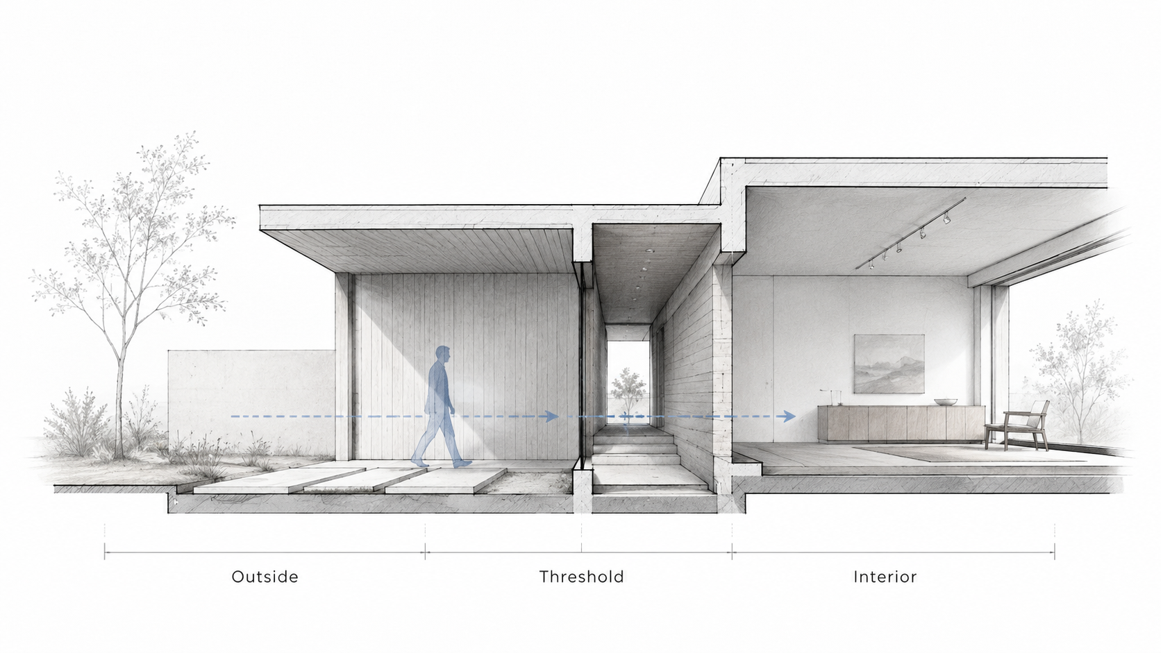
Illustration by ArchitectureCourses.org. A threshold is shaped by cover, compression, light change, floor level, and the slow transition from outside to interior.
A threshold is where one condition becomes another.
Outside to inside. Public to private. Loud to quiet. Bright to dim. Low to tall. Exposed to protected.
The mistake is treating a threshold as a door. A door is hardware. A threshold is a sequence.
A strong entry might start with a change in ground surface, then a canopy, then a compressed vestibule, then a release into a taller room. A weak entry is just an opening cut into a wall. It may function, but it does not teach the visitor how to enter the building.
Thresholds matter most in projects with a strong public/private split: schools, libraries, houses, galleries, religious buildings, clinics, and community buildings. They also matter in small projects because small buildings cannot hide weak transitions behind scale.
Hierarchy
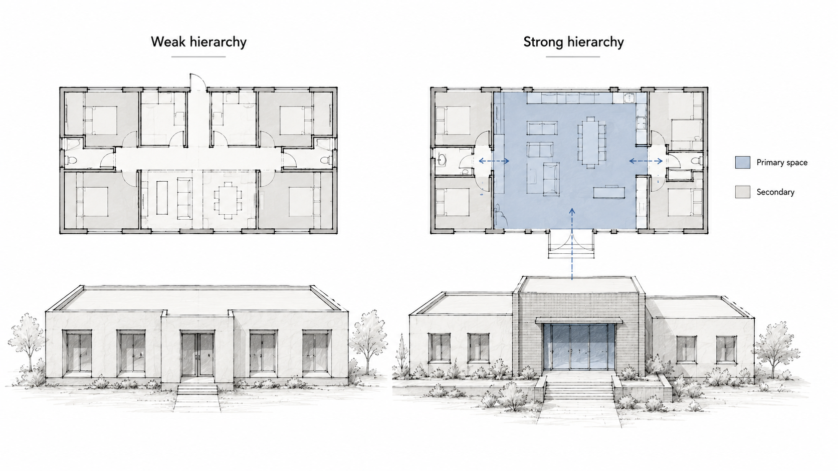
Illustration by ArchitectureCourses.org. Strong hierarchy gives one space or movement path priority, while weak hierarchy makes every room and façade element compete for the same attention.
One main room. One primary path. One important edge. One main courtyard. One major vertical space. The exact answer depends on the project, but the project needs a lead.
When everything gets the same emphasis, the drawing feels flat. Every room gets special treatment. Every façade bay competes. Every diagram uses the same line weight. The reviewer has to hunt for the idea.
That usually means the design has not chosen a priority.
The fix is not always to add more. Often it is to calm the secondary parts down. Make the service spaces quieter. Reduce the number of special moments. Give the primary space better light, height, position, or edge control.
This Part Matters: hierarchy is also a drawing problem. If your line weights, labels, shadows, and diagrams all shout at once, the project may be clearer than the board makes it look.
Better Move vs Common Studio Mistake
| Common Mistake | Better Move | Why It Works |
|---|---|---|
| Draw the concept after the project is done. | Use the concept as a rule while designing. | The drawings start to agree with each other. |
| Add panels, lines, or voids because the board looks empty. | Ask what each move controls: light, movement, structure, edge, privacy, or scale. | The project stops feeling decorative. |
| Fix every crit comment with a new idea. | Translate the note into one concept and test one change. | You avoid redesigning the project into a mess. |
| Make every space important. | Pick the lead space and let the rest support it. | The plan becomes easier to read. |
| Rely on perspective views to prove volume. | Cut a section through the main spatial idea. | Height, structure, daylight, and movement become visible. |
How to Use a Crit Note Fast
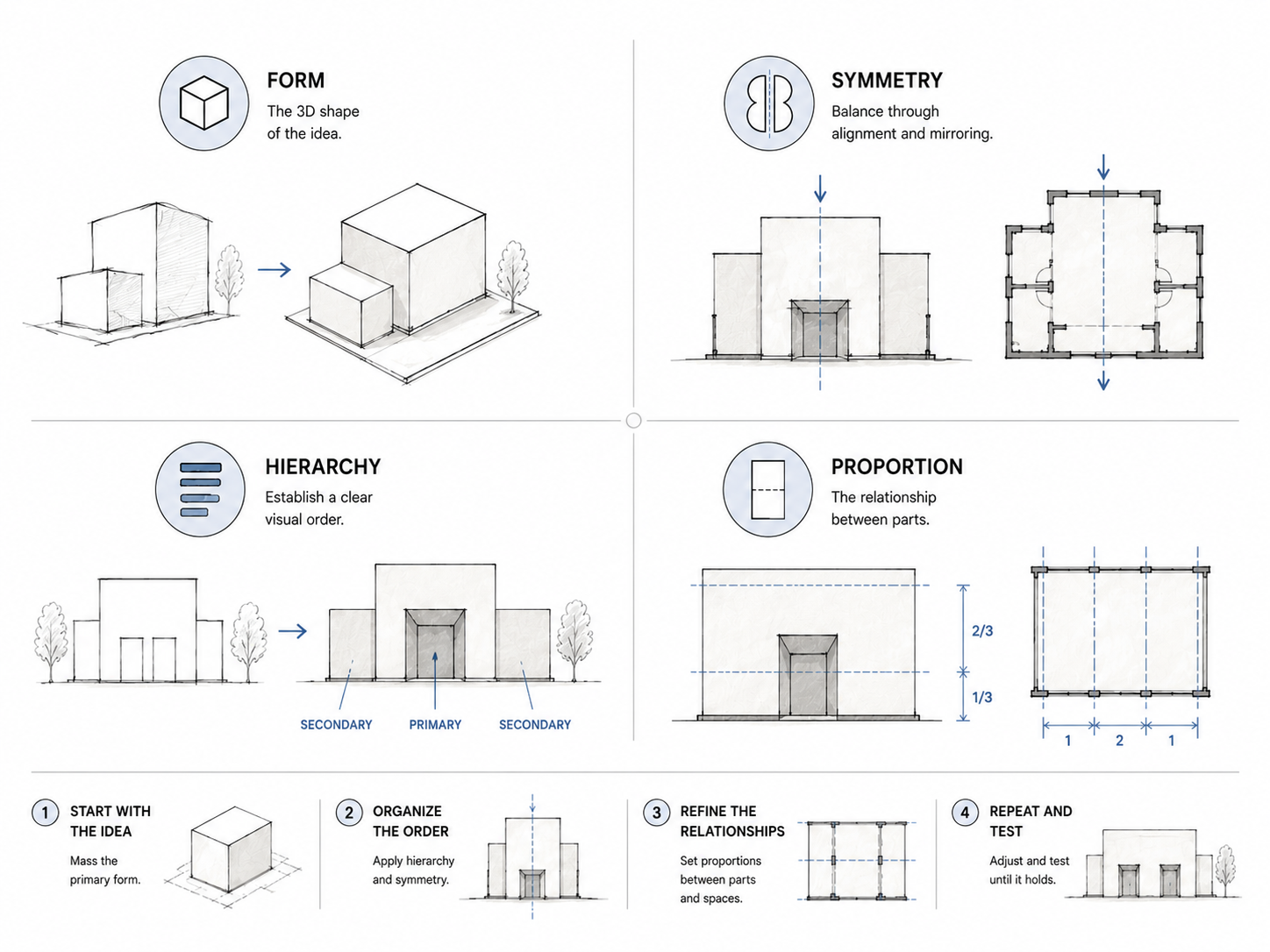
Illustration by ArchitectureCourses.org. A crit note works better when it is sorted into one design concept, then tested with one clear move instead of turning into a full redesign.
A crit note is not a command to redesign everything.
Write the note down in the critic’s words first. Do not translate it while you are still annoyed. “Weak hierarchy.” “Resolve the edge.” “Section is not doing work.” “Parti unclear.” Keep the phrase short.
Then decide which concept it belongs to.
- Hierarchy: the project has no lead.
- Datum: the project has no rule holding the parts together.
- Threshold: the transition is weak.
- Figure-ground: the building and open space do not read clearly.
After that, make one test move. Not seven.
If the note is about hierarchy, enlarge the primary space or reduce the competing spaces. If the note is about the edge, redraw the ground-wall-roof condition. If the note is about the section, cut through the main idea and make it prove light, structure, and movement.
This is where students waste time. They make the board prettier before fixing the logic. A cleaner render will not save a plan that still has no lead.
The One-Page Proof
For the next crit, bring proof that you tested the comment.
One page is enough.
- Before / after: same scale, same view, same crop.
- One sentence: name what changed.
- One diagram: parti, circulation, solid/void, or hierarchy.
- One check: span, width, clearance, daylight direction, entry sequence, or structural grid.
The page should make the change obvious without you standing beside it explaining every line.
Useful studio book:
101 Things I Learned in Architecture School is useful for short, sharp studio lessons. It is not a replacement for drawing, but it can help when you need a concept explained without a full theory lecture.
Where These Concepts Go Wrong
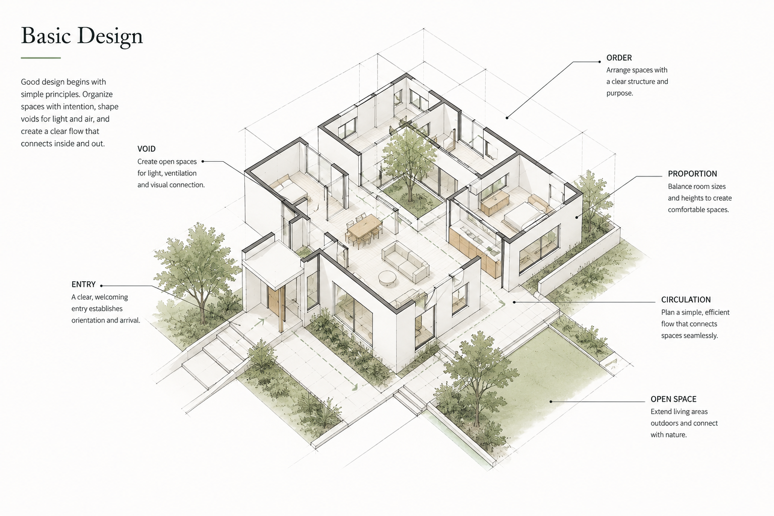
Illustration by ArchitectureCourses.org. Basic design becomes easier to read when order, voids, entry, proportion, circulation, and open space are shown in one coherent house layout.
The biggest problem is treating design concepts as vocabulary.
Knowing the word datum does not make the project more ordered. Saying threshold does not design the entry. Drawing a black-and-white figure-ground does not fix the site plan if the open space is still accidental.
Concepts only matter when they change the drawing.
Use them as tests:
- Does the line organize anything?
- Does the plane shape space?
- Does the volume work in section?
- Does the void have a job?
- Does the hierarchy show up before you explain it?
If the answer is no, the concept is not dead. It is just not built into the project yet.
FAQ
What are basic design concepts in architecture?
They are the working ideas architects use to organize space: line, plane, volume, solid and void, figure-ground, parti, datum, threshold, and hierarchy.
Which concept should beginners learn first?
Start with line, plane, and volume. They are the base. If you cannot control those, the more advanced concepts will feel abstract.
What does parti mean in architecture?
A parti is the main organizing move of the project. It should be simple enough to draw quickly and strong enough to guide the plan, section, massing, and circulation.
What is the difference between concept and parti?
A concept can be broad: light, memory, compression, community, or movement. A parti is more specific. It turns the idea into an organizing rule, such as a courtyard, spine, loop, bar, grid, or carved void.
Why do critics care about figure-ground drawings?
Because they expose weak site planning fast. If built mass and open space do not read clearly in figure-ground, the project may have no strong outdoor order.
What does “your section is not doing work” mean?
It means the section is only showing a cut through the building. A useful section should explain something important: height, structure, daylight, air, movement, roof form, or spatial sequence.
How do I fix weak hierarchy?
Pick the primary move. Then make secondary spaces quieter. Do not try to make every room, edge, façade, and diagram equally important.
Is solid / void the same as massing?
Not exactly. Massing often focuses on the built form. Solid / void also asks what has been carved out, what the empty space does, and whether the spaces between built parts have intention.
What is a datum in simple terms?
A datum is a reference that organizes other decisions. It might be a line, wall, grid, level, roof edge, canopy, or structural rhythm.
How do I know if a design concept is working?
Remove it from the drawing. If nothing important changes, it is not doing enough yet.
Read This Next
Design foundation
- Basic Design and Architecture
- Design Basics: Architecture and Building Reality
- Design Elements in Architecture
Studio and drawing help
Keep it practical