Art Deco gets thin fast.
Too much gold. Too much mirror. Too many zigzags. A room or facade starts throwing every Deco move at you, and the whole thing loses its nerve.
The stronger version is tighter than that. Strong lines. Hard materials. Repetition. Symmetry. A few moves with confidence. Not a pile of references.
This page stays on that question. What makes something Deco in the first place. What to look for on a building. What shows up inside a room. What still holds up. And what drags the style into costume.
Worth Knowing: for the wider decade, read 1920s House Styles. For the building side in more detail, go to Art Deco Architecture. For the decorating side, use Art Deco Interior Design.
What makes it Deco
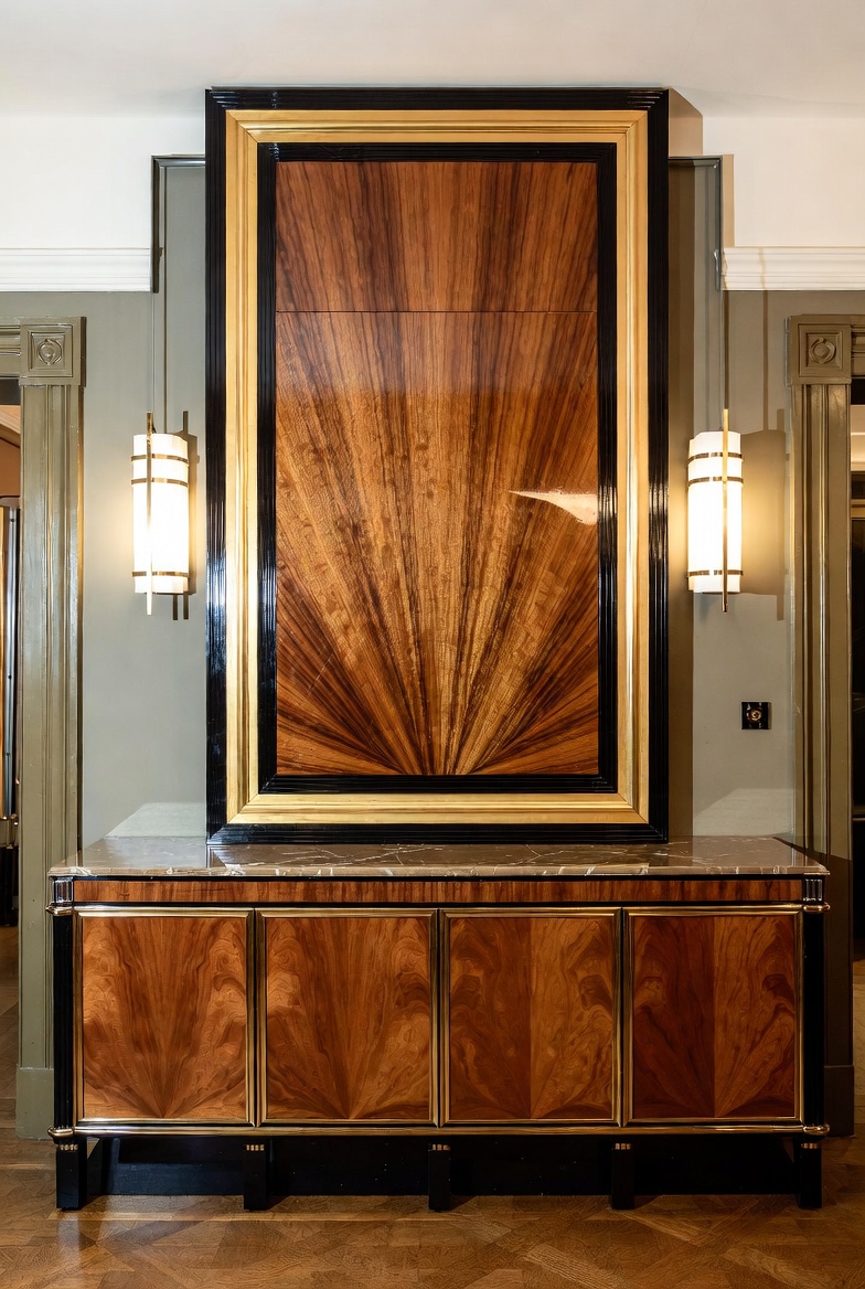
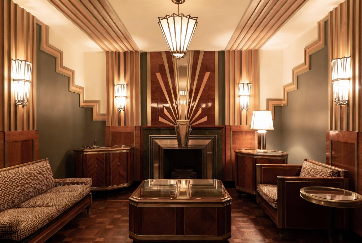
Image by ArchitectureCourses.org. Sunburst veneer, black lacquer framing, and symmetrical wall sconces are classic Art Deco details.
Start with the short version. Art Deco is not just dressed-up 1920s design. It is sharper. More graphic. More controlled.
| Look For This | Not This | What It Means |
|---|---|---|
| Clear geometry | Loose decoration with no pattern | Deco runs on shape and repetition |
| Strong symmetry | Busy layout and random clutter | The style needs order underneath it |
| Materials with weight | Thin fake-glam finishes | Stone, metal, lacquer, and glass carry a lot of the look |
| Stepped forms or vertical pull | Soft drifting lines | Deco likes lift, rhythm, and edge |
| Limited motifs used well | Every motif crowded into one place | Too much kills the effect |
That is the backbone. Once those parts are there, the style reads fast. Without them, you can borrow a mirror, a rug, or a brass lamp and still miss the point.
That is also why weak Deco copies feel off so quickly. They copy the surface tricks and skip the discipline under them.
Why the style hit when it did
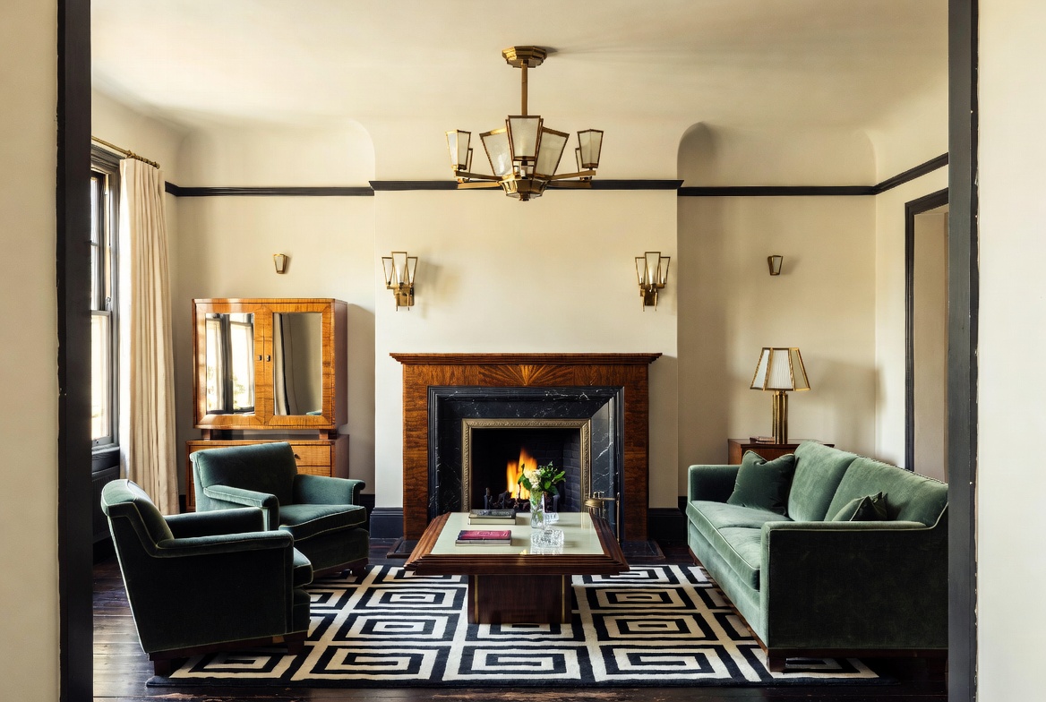
Image by ArchitectureCourses.org. Stepped geometry, polished wood, symmetrical lighting, and a dramatic sunburst focal wall give this room a clear Art Deco identity.
Art Deco came out of a world that wanted speed, polish, and a cleaner picture of the future.
The First World War had ended. Cities were growing. Industry was changing daily life. Travel was changing. Advertising was changing. Buildings were getting taller. Interiors were getting harder and brighter. Design moved with that pressure.
The 1925 Paris Exposition pushed the style into public view. After that, it spread fast. Paris, New York, Miami, London, Shanghai, Mumbai. Different materials. Different climates. Same backbone.
Egypt hit the style hard after Tutankhamun’s tomb was opened in 1922. Sunbursts. wings. stepped forms. hard silhouettes. Those ideas did not get copied straight. They got flattened, sharpened, and worked into Deco language.
Cubism and Futurism mattered too. They pushed designers toward fractured form, direction, and surfaces that still felt active even when they stayed still. That is part of why Deco patterns look like they are moving.
Related Reading: the longer timeline belongs on Art Deco History. This page is the tighter read.
What to look for on a building
Art Deco architecture is not random glamour. It is controlled from the ground up.
That is the first thing worth noticing. The facade does not drift. It is held together. Lines repeat. Panels line up. Ornament sits inside a system. Even the louder buildings still feel disciplined.
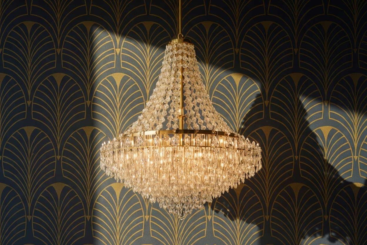
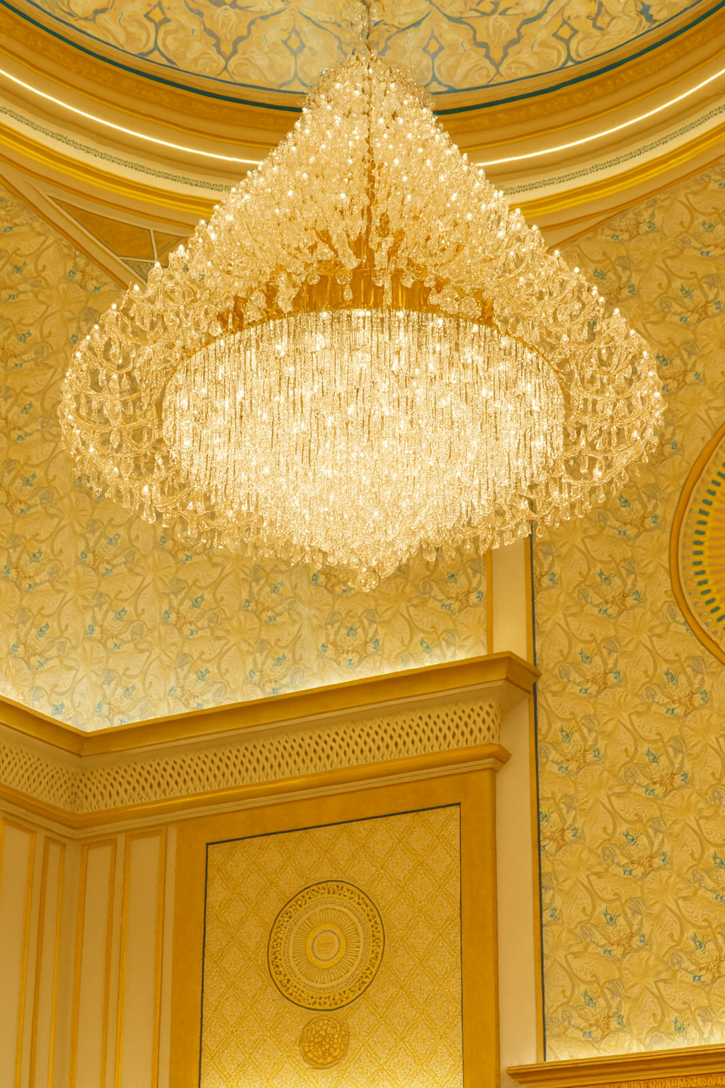
Image by ArchitectureCourses.org. A chandelier and fan-pattern wall covering show how lighting and repeated geometry help build an Art Deco interior.
Symmetry
A lot of Deco facades depend on balance. Centered entrances. repeated windows. paired lights. mirrored panels. Even when the building gets bold, the composition stays controlled.
Vertical pull
Deco loves upward force. Ribs. piers. stacked windows. tiered crowns. The eye gets pushed up whether the building is a tower or a smaller street facade.
Panels and relief
Flat wall, then framed panel, then relief, then another edge. Deco surfaces rarely sit still for long. They get cut, stepped, bordered, or pushed out enough to catch light.
Stone and metal
Good Deco uses them with intent. Elevator doors. entry grilles. handrails. trim bands. lobby walls. floor borders. The point is not richness by itself. The point is crispness.
Motifs with a job
Sunbursts. fans. waves. speed lines. stylized plants. machine forms. They are not filler. They reinforce the rhythm the building already has.

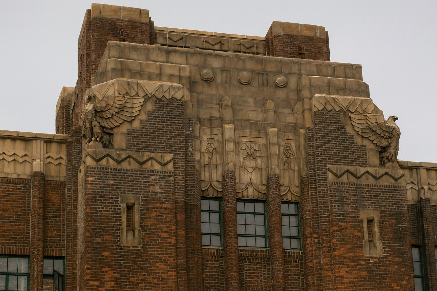
The Chrysler Building is the famous example for a reason. Not just the crown. The whole thing rises the same way. The lines, the metal, the setbacks, the ornament. One language all the way through.
Miami shows another side of the style. Lighter. more curved. more climate-aware. Rounded corners. glass block. softer color outside. Still Deco. Just bent toward heat, coast, and light.
This Part Matters: for the quicker visual breakdown, Art Deco Characteristics is the cleaner companion page.
What to look for inside a room
Inside, Deco gets easier to spot.
Furniture tightens up. Lighting starts acting like sculpture. Finishes get harder. The room stops feeling soft and casual and starts feeling staged in a good way.
Furniture
Curved corners. waterfall edges. lacquer. veneer. strong chair shapes. cabinets with clear fronts and hard lines. The room wants pieces with shape. Not filler furniture. Not farmhouse drift. Not clutter.
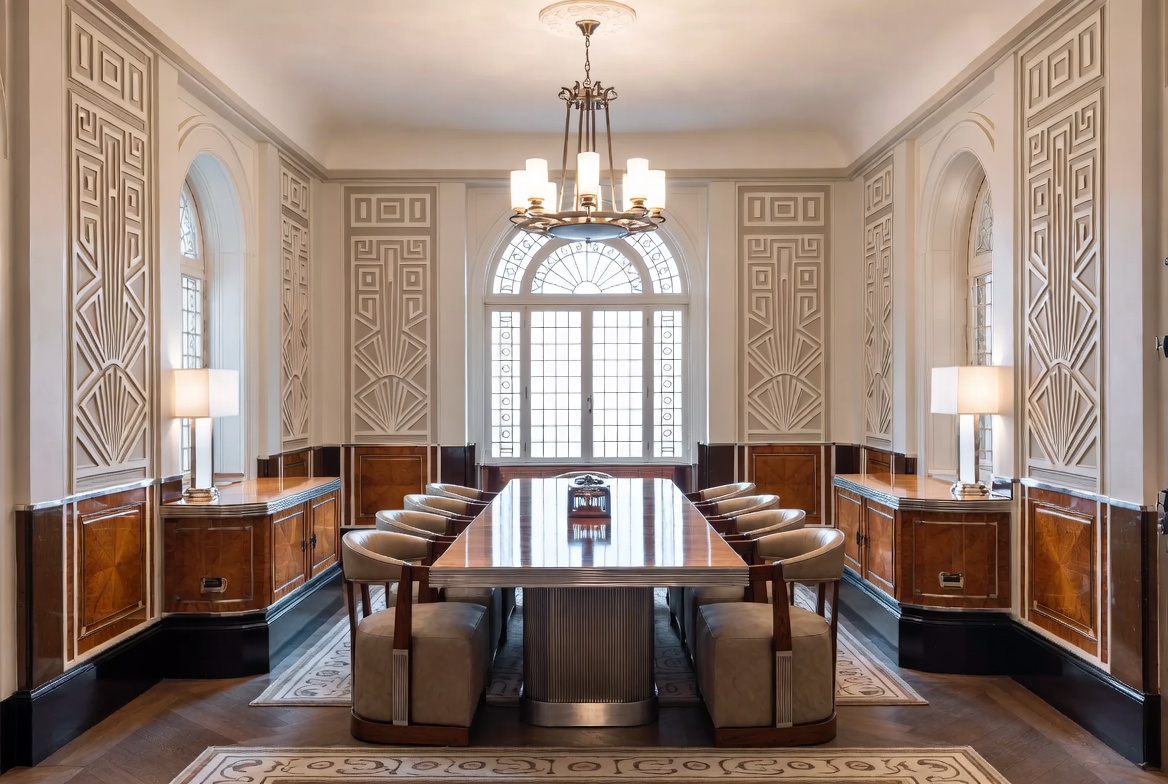
Image by ArchitectureCourses.org. A formal Art Deco dining room with geometric wall framing, polished wood furniture, and the strong symmetry that helps the style read fast.
Lighting
One good Deco light can do half the room. Frosted glass. chrome. nickel. stepped forms. ribbed shades. sconces that give the wall structure instead of just checking a function box.
Materials
Mirror. lacquer. marble. darker wood. metal with some weight. glass that catches light properly. The room gets stronger when the hard materials are chosen well and kept under control.
Textiles

Image by ArchitectureCourses.org. Geometric textiles, polished wood paneling, symmetrical lighting, and a sunburst fireplace wall give this sitting room a clear Art Deco character.
Velvet. leather. heavier drapery. patterned rugs with geometry. The room still needs softness, but not softness that weakens the line of everything around it.
Color
Black and gold get the headlines, but the palette is wider. Deep green. cream. lacquer black. dusty rose. chrome. ivory. charcoal. bronze. pale stone. A tighter palette works better than a loud one.
Before You Move On: the room-use page for this part is Art Deco Interior Design. That page should carry the decorating advice. This one is the style read.
Better moves vs weak ones
This is where the style gets wrecked most often.
| Do This | Instead of This | Why It Holds Up Better |
|---|---|---|
| Use one strong motif | Stack sunbursts, chevrons, fans, scallops, and stepped shapes together | The room or facade stays clear |
| Pick one or two strong materials | Use mirror, brass, chrome, marble, lacquer, and glass everywhere | Contrast works better than overload |
| Let one light fixture lead | Scatter Deco accents across every surface | The space needs a center |
| Keep the geometry disciplined | Throw patterns around with no system | Deco depends on rhythm |
| Use better materials in smaller doses | Fake the look with cheap shiny finishes | Weak finishes fail first |
The same rule applies whether the job is a facade, a lobby, or a living room: a few moves with authority work better than a pile of references.
How far to take it
This is the part that decides whether the room lands or starts acting.
A full Deco room can work. But most spaces do better when the style comes through in a few deliberate places. A chandelier. A cabinet. A mirror. A rug. A stair rail. A bath vanity. A lobby floor. That is enough to set the tone.
Deco gets weaker when everything starts waving for attention at once. One big gesture and a few supporting moves hold up better than a room full of themed details.
This is also why the style slips into parody so easily. It has strong visual hooks. Once the room starts leaning on those hooks instead of the structure under them, it stops feeling sharp and starts feeling borrowed.
How the style spread
America pushed Deco into towers, theaters, hotels, rail stations, apartment houses, and civic buildings. Europe kept more craft in the finish. Shanghai fused it with local screens and detailing. Mumbai bent it toward coast and climate. Australia flattened it into something lighter and more practical.
That flexibility is part of why the style lasted. It was modern enough to travel, but strong enough to keep its shape.
The core stayed the same. Geometry. rhythm. finish. contrast. confidence.
It did not stop at architecture
Deco moved straight into posters, fashion, theater, jewelry, lighting, and advertising. That is part of why it still feels bigger than a building style.
Posters tightened up. lettering sharpened. figures got longer and cleaner. jewelry got harder and more graphic. fashion picked up geometry and shine. Movie palaces pushed the style into public life so hard that it became the face of modern glamour for a while.
That wider spread matters because it explains why the style still feels complete. It was not just a facade treatment. It had a whole world around it.
Why it still lands
Because it still solves the same design problem: how to make a space feel bold without making it messy.
Good Deco is not timid. But it is not loose either. It gives a room edges. It gives a facade rhythm. It gives materials something to do besides sit there.
That is why the style keeps coming back. Hotels use it. apartments use it. restorations use it. A few right moves from Deco can still pull a room together faster than a pile of vague “elegant” decor ever will.
The lesson under it is simple. Bold design works better when it stays disciplined.
FAQ
- What makes Art Deco different from Art Nouveau? Art Nouveau runs softer and more organic. Deco is sharper, more geometric, and more controlled.
- What are the easiest Deco details to spot? Sunbursts, stepped forms, strong verticals, symmetry, polished materials, and repeated geometry.
- Did every 1920s building or room look Deco? No. Deco was one strong part of the decade, not the whole decade by itself.
- Can Deco work in a modern home? Yes. Keep it tight. One or two clear moves work better than turning the whole room into a theme.
What to read next
- Art Deco Architecture for the building-side breakdown.
- Art Deco Characteristics for the quicker visual map.
- Art Deco Interior Design for rooms and decorating.
- Art Deco Houses for how the style reads at house scale.
- Free Art Deco Course for the cluster in one place.