When the Void Does the Work
Negative space is not just empty space around a building. It is what lets light in, gives people room to move, and helps the form read clearly.
A lot of students draw the object first and treat the space around it like background. That is where plans start getting weak. In architecture, the void is part of the work. A courtyard, threshold, stair hall, street edge, or even the space between walls can shape the project as much as the solid parts do.
That is why negative space belongs with the other core ideas in basic design and architecture. It is part of how a building works, not just how it looks.
What Negative Space Means in Architecture
There are two clean ways to understand it.
First: figure and ground. In a plan, the building is the figure and the space around it is the ground. Good projects do not just make the black shape look good. They make the white shape work too. When the white space reads clearly, movement improves, light reaches farther, and the plan stops feeling accidental.
Second: interval. Japanese spatial thinking gives us a useful word for this in the concept of Ma. It is the charged pause between things. Not emptiness for its own sake. Not blankness. A measured gap that gives the rest of the composition force.
That is the key point: negative space is not absence. It is shaped room around, between, above, and through architecture.
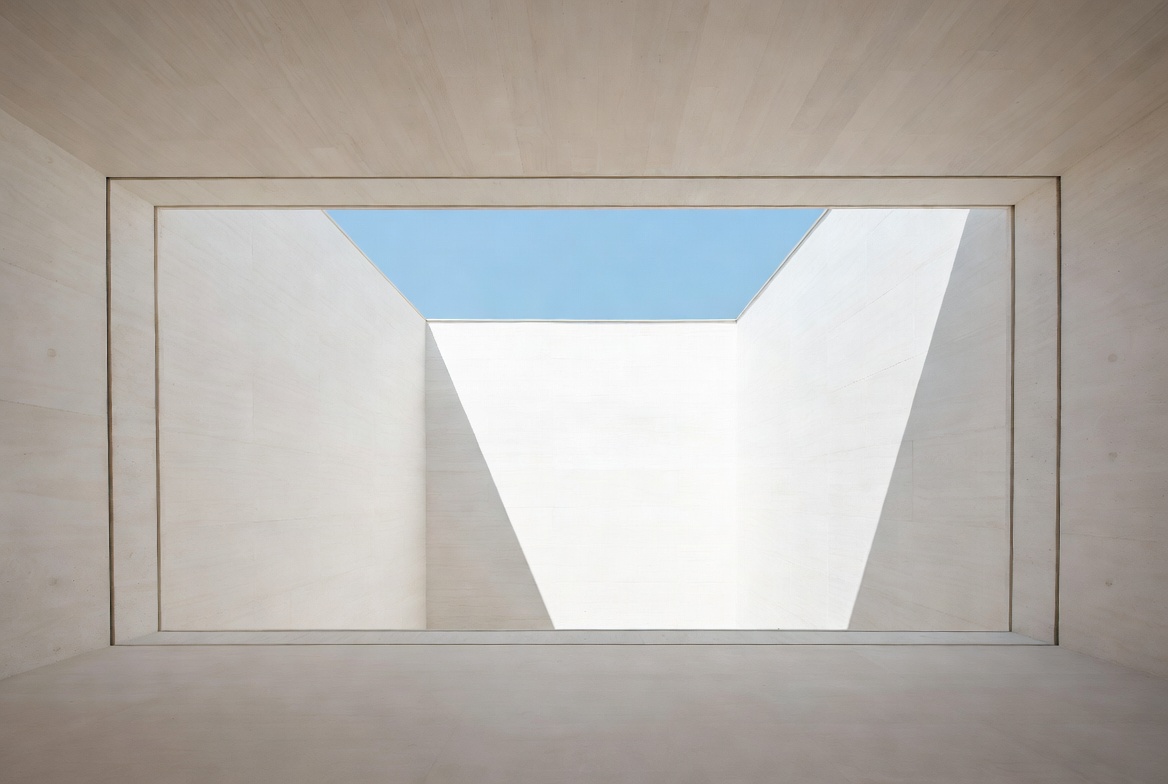
Where Negative Space Does Its Best Work
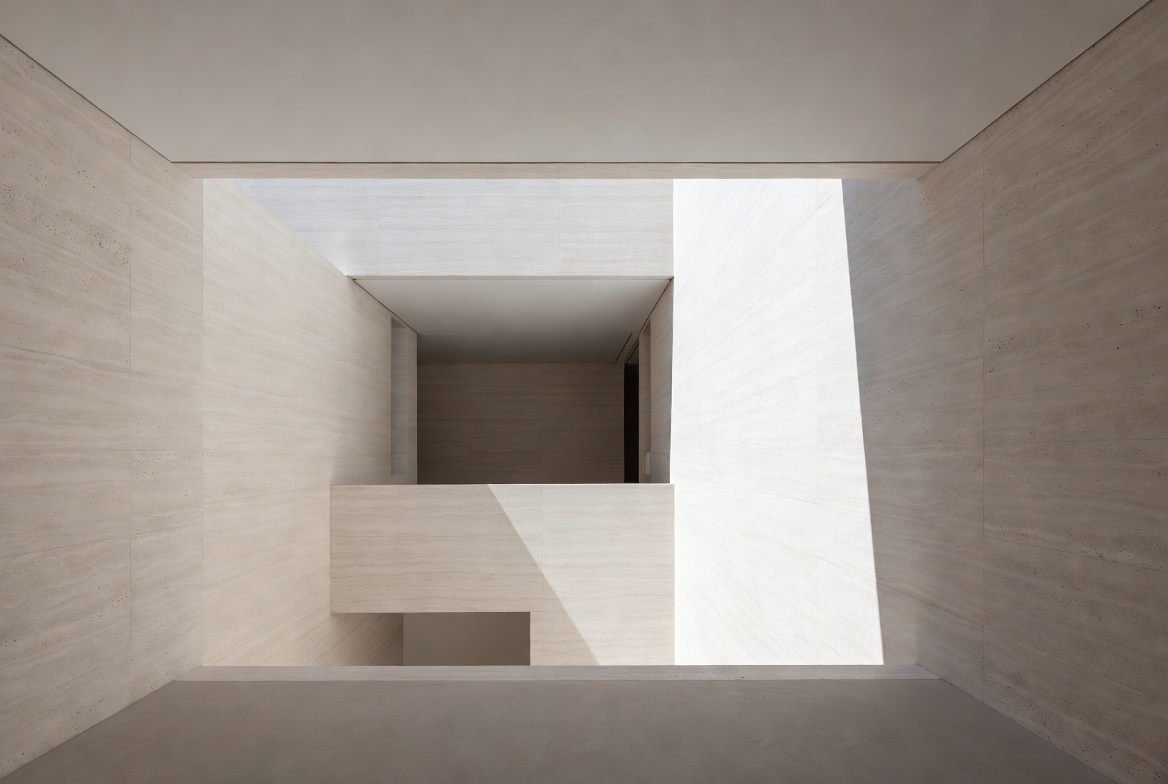
Image by ArchitectureCourses.org. Negative space gets stronger when edges, depth, and occupation make the void feel measured rather than accidental.
It helps to stop thinking about it as one abstract idea. Different kinds of voids do different jobs.
| Type of Negative Space | What It Does | What Goes Wrong |
|---|---|---|
| Courtyard | Pulls daylight and air into a deep plan | Too narrow, too dark, or too exposed at noon |
| Threshold | Slows arrival and makes transitions legible | Too thin to register as an experience |
| Atrium or stair void | Organizes circulation and can support stack ventilation | Becomes expensive volume with no thermal or spatial job |
| Street edge setback | Creates pause, shade, and usable public room | Turns into dead lawn, parking, or blank frontage |
| Space around form | Makes massing readable and hierarchy clear | Object feels crowded or confused |
That last row matters more than students think. Negative space is one of the fastest ways to establish hierarchy in architecture. The main mass reads as main because the surrounding space gives it room to dominate.
Why the Void Earns Its Keep

Void costs area. That is true. You will defend it in sketches, in reviews, and in budget talks. The defense gets much easier when the void does more than one job.
Light
A cut in the roof, a narrow court, or even a widened stair hall can bring daylight into the part of the plan that would otherwise stay dead all day. This is where scale and proportion matter fast. A court that is too tight becomes gloomy. A void with dark surfaces eats the light you fought to bring in.
Air
Vertical voids can move air by stack effect, but only if the section makes sense. Warm air needs a path out. Cooler air needs a path in. A tall slot with token openings is not passive ventilation. It is just a drawing.
Circulation
Good negative space makes movement clearer. You know where to go because the open area leads you there. That is one reason it pairs well with space planning. The plan becomes easier to read because the void helps organize paths, pauses, and destinations.
Form
Solid form becomes stronger when the surrounding space is controlled. This is one of the cleanest ways to understand form in architecture: mass and void work as one composition, not as separate problems.
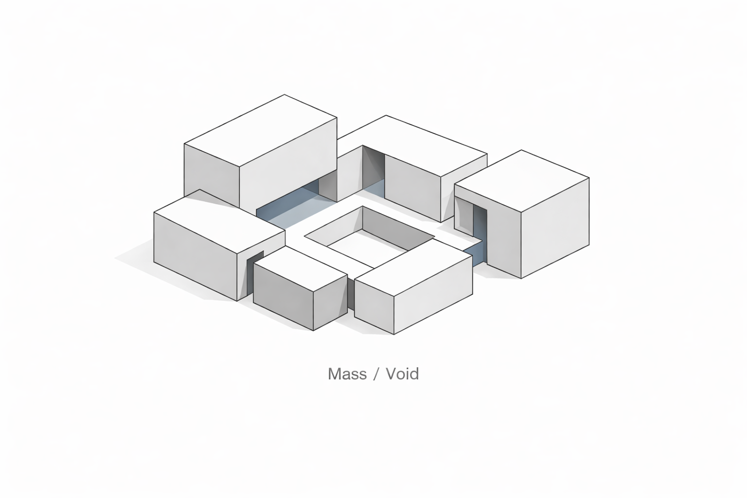
Rules I Use Early in Plan and Section
Illustration by ArchitectureCourses.org. Negative space becomes easier to read when the solid mass and the void are seen together in plan.
Draw the white, not just the black
Flip the plan and study the empty part first. If the open space breaks into scraps, the building is not settled yet.
Make the void do a job
Daylight. Ventilation. Arrival. Pause. Wayfinding. Social spill space. Pick at least one. Two is better. Decorative emptiness gets cut first.
Work in section as early as plan
Negative space lies in plan all the time. A court that looks calm from above can turn into a dark slot when you cut the section. Draw both together.
Use service zones to sharpen the edges
Stairs, risers, storage, bathrooms, and thickened walls can define the boundary of the void and keep the main rooms cleaner. This is where a strong parti helps. The void is not floating by itself. It is tied to the organizing idea of the whole project.
Design one reveal
Every good void has a first felt moment. Low then high. Dark then bright. Tight then open. If the sequence never changes, the space may still work, but it will not stay with people.
Useful Ratios Before You Open Software
These are starting points, not hard laws.
- Courtyard width to height: around 1:1 for a tighter, more enclosed feel; closer to 2:1 when you need more sky and more light.
- Atrium height to width: around 2:1 to 4:1 is a workable early range if you want the section to support air movement.
- Skylight area: around 3 to 5 percent of the floor area it serves is a conservative first pass for daylight checks.
- Surface brightness: walls brighter than floors, ceilings brightest, but keep finishes matte enough to avoid glare.
- Street pause zones: if two people cannot stop without blocking the path, the threshold is too mean.
Those numbers do not replace proper modeling. They just stop bad geometry from surviving too long.
A Worked Example: Cutting Light Into a Deep Plan
Take a deep studio or office floor plate with good perimeter light and a heavy middle. The easy mistake is to keep packing program into the dark center and try to solve the problem with more fixtures and lighter paint later.
The stronger move is to cut a controlled court into the plan and let that cut reorganize the whole interior. Not a giant atrium for drama. A measured void that reaches the problem area and improves the rooms around it.
Once that happens, several things start working at the same time. Interior desks or worktables move into soft daylight. Circulation wraps the void instead of drifting. The section becomes easier to ventilate. The plan gets a center that people can understand without being told.
This is one reason drawing skill still matters. A quick section or flipped plan can show the idea before software slows you down. If students struggle to see that early, I push them back to drawing for architects and basic diagram work until the space reads cleanly.
Where Projects Start to Go Wrong
The void has no job
A double-height lobby that does nothing for movement, comfort, or light is just expensive air.
The plan looks better than the section
This is common with courtyards and stair slots. The plan drawing feels clean. The built space feels cramped or dim.
The edges are dead
Blank walls around an open area kill it. Negative space needs good boundaries. A void with weak edges feels accidental.
Acoustics get ignored
Hard surfaces plus height can turn a nice open volume into a drum. Add absorption early, not as a panic fix after complaints start.
Maintenance is treated as someone else’s problem
If vents, skylights, drains, or shades cannot be reached easily, the space will not keep performing. Beauty fails fast when no one can service the details.
Write the Void Into the Brief, Not Just the Rendering
This is the strongest move in the whole article, and most teams skip it. They defend the void with mood and perspective views. Then value engineering arrives and the void gets filled, narrowed, or cheapened because nobody wrote down what it was supposed to do.
Better move: describe the void as a performance requirement.
- Light: what part of the plan is supposed to receive daylight because of the cut?
- Air: where does air enter, where does it leave, and what openings make that possible?
- Use: is the space for movement, pause, gathering, orientation, or all four?
- Acoustics: what keeps the space from becoming harsh?
- Maintenance: who can reach the operating parts and how fast?
When negative space is written as a measurable part of the design intent, it survives longer. It stops sounding optional.
A Fast Studio Check Before You Call It Done
- Flip the plan. Does the open space read clearly?
- Cut one section. Does the void still work when height, sun, and edge thickness appear?
- Name its job. If you cannot say what it does in one sentence, it is too vague.
- Test movement. Does it help arrival, pause, or circulation?
- Check hierarchy. Does the open space make the main form stronger or blur it?
- Check the edge. Does the boundary feel deliberate, inhabited, and maintainable?
That is enough to catch a surprising amount of weak work before it hardens.
Read This Next
If this topic is clicking, the next useful moves are not random. They sit right beside it.
- Parti in Architecture if you want the big idea that ties mass, void, and circulation together.
- Hierarchy in Architecture if you want to sharpen what leads and what supports.
- Drawing for Architects if your ideas make sense in your head but still fall apart on paper.
FAQ
What is negative space in architecture in simple terms?
It is the shaped open space around, between, above, or through built form. Courtyards, thresholds, atriums, street edges, and pauses in a plan are all forms of negative space.
Is negative space just an aesthetic idea?
No. It affects daylight, airflow, circulation, hierarchy, and how the building is understood. Good negative space changes performance, not just appearance.
Why do students struggle with it so much?
Because they draw objects first. The building gets all the attention and the open space is treated like residue. That reverses the design problem.
What is the quickest way to improve my understanding of it?
Start flipping plans and reading the white shape first. Then cut sections early. Negative space becomes much clearer when you stop judging it only from plan outlines.
How is negative space related to form?
Form reads through contrast with surrounding space. A strong mass needs controlled emptiness around it, otherwise the composition gets crowded or flat.
Can a small project still use negative space well?
Yes. A narrow entry court, a pause at the stair, a better setback, or a clean gap between volumes can change the whole reading of a small project.
What is the most common mistake?
Leaving the void without a job. If the open space does not improve light, movement, air, hierarchy, or experience, it will feel weak and get challenged fast.