
A color can look calm on a sample card and wrong the second it meets wood flooring, tile, daylight, trim, and furniture. That is where interior color theory starts to matter.
Not as art-school vocabulary. As a way to stop a room from feeling muddy, cold, flat, too loud, or slightly off even after the paint job is done.
Color Starts Failing When It Meets Real Rooms
Color theory for interior design is not just the color wheel. The wheel helps, but rooms are harder than paper because color changes with light, surface texture, scale, and whatever is already fixed in the space.
A beige wall can look pink beside yellow oak. A white can turn green at night. A blue that felt soft on a chip can feel icy across four walls. The color did not change. The room changed how you read it.
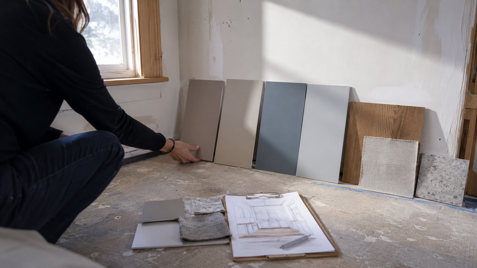
Good palettes start with the parts that are expensive or annoying to replace: flooring, countertops, tile, cabinets, large upholstery, stone, brick, and trim. Paint comes after those decisions, not before them.
Hue, Value, Saturation
Most color mistakes come from treating color as one thing. It is really three decisions at once.
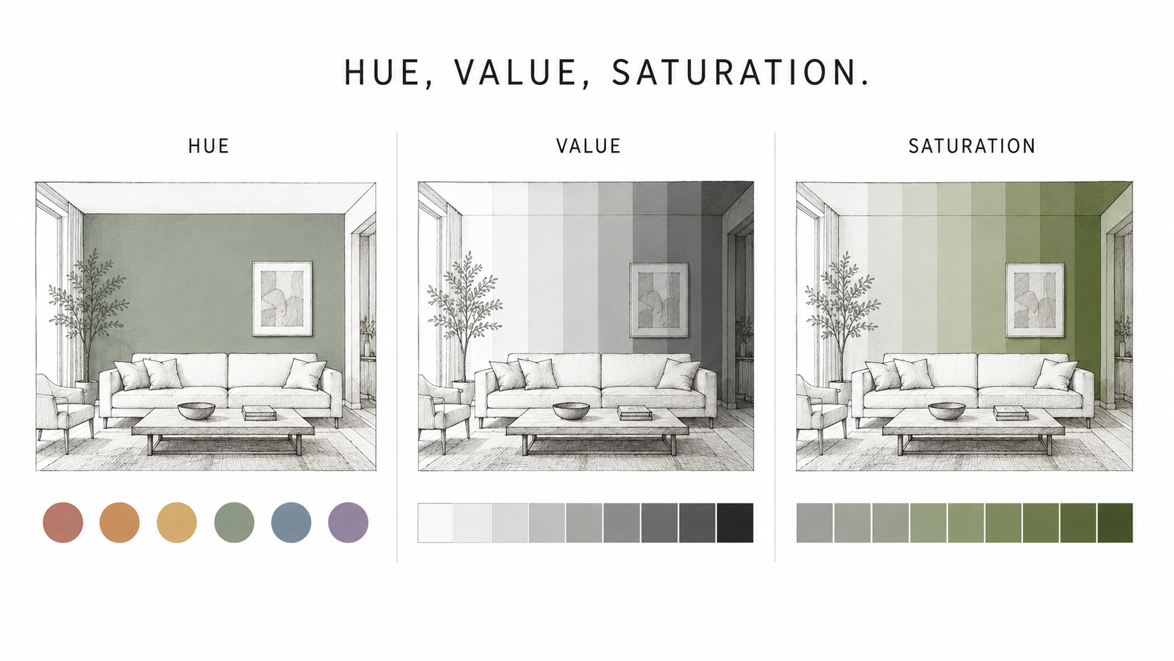
Hue is the color family: blue, green, red, yellow, orange, violet. It tells you where the color sits on the wheel.
Value is how light or dark the color is. This affects how open, heavy, bright, or enclosed a room feels.
Saturation is intensity. A muted olive and a bright lime may both be green, but they behave completely differently in a room.
Interiors usually tolerate lower saturation better than high saturation. A strong color on a pillow is one thing. The same strength on 350 square feet of wall can become exhausting.
Warm and Cool Colors Behave Differently Indoors
Warm colors tend to move toward you. Cool colors tend to pull away. That is the basic rule, but the room decides how far you can push it.
Warm whites, creams, tans, terracotta, rust, ochre, caramel, and warm woods can make a room feel closer and more social. They work well when the space already has daylight, texture, and enough visual breathing room.
Cool whites, blues, blue-greens, cool grays, and soft greens can make a room feel calmer and cleaner. They help in bedrooms, bathrooms, and rooms where heat or visual clutter already feels high.
The trap is mixing temperatures without control. Cool gray walls beside orange wood floors often make the floor look more orange and the wall look colder. Neither finish is wrong by itself. The combination is wrong.
The Color Wheel Without the Art-School Lecture
The color wheel is useful when it helps you make a decision. It shows which colors sit beside each other, which colors oppose each other, and which combinations will feel quiet or active.
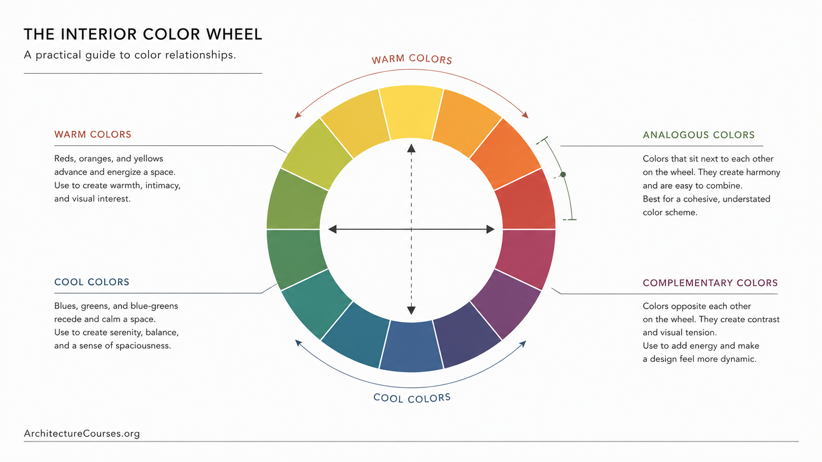
Analogous colors sit near each other. Blue, blue-green, and green will usually feel cohesive because the shift is small.
Complementary colors sit opposite each other. Blue and orange, green and red, yellow and violet create energy. In interiors, one should usually lead and the other should stay smaller.
Monochromatic palettes use one hue in different values. They can look calm and expensive, but they need texture or they go flat.
Color Harmony Is Really Color Hierarchy
A room does not need every color to match. It needs the colors to know their job.
One color family should dominate. One should support. One should add pressure or contrast. When every color asks for equal attention, the room starts to feel busy even if there is not much furniture in it.
This is why a small accent can work better than a big accent wall. A muted blue repeated in artwork, one pillow, and a vase can feel intentional. The same blue covering one full wall may feel disconnected if nothing else in the room supports it.
The 60-30-10 Rule and When to Break It
The 60-30-10 rule is useful because it gives a room a color hierarchy before the decorating starts.
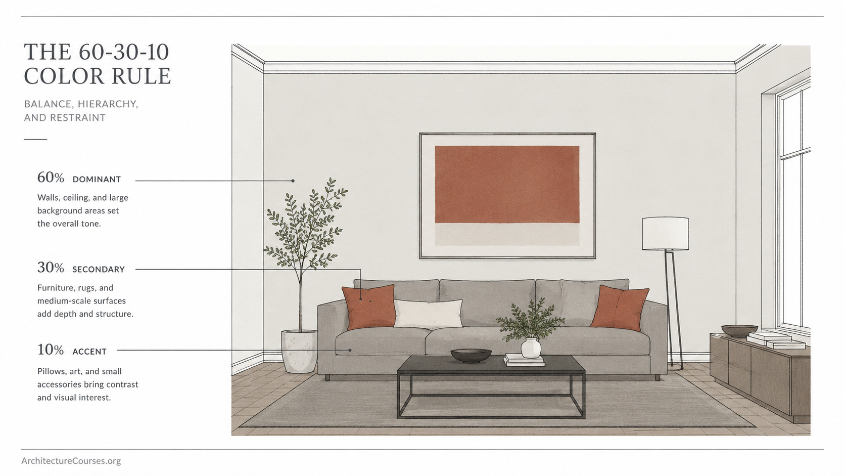
About 60 percent is the dominant color: usually walls, large background surfaces, or the main visual field.
About 30 percent is the secondary color: sofa, rug, cabinets, bedding, drapery, or larger repeated surfaces.
About 10 percent is the accent: art, pillows, hardware, lamps, small furniture, or one controlled color moment.
Break the rule when the architecture already gives you structure. A dark library, a small powder room, or a room with strong paneling may work with a heavier color ratio. Open-plan spaces usually need more restraint because one bad color decision travels across several zones.
Undertones Are Where Safe Colors Go Wrong
Undertone is the quiet color hiding inside a neutral. Beige can lean pink, yellow, green, or gray. White can lean blue, cream, gray, or green. Gray can lean purple, blue, green, or brown.
This is where “safe” colors cause trouble. The wall color may look neutral in the store, but next to flooring, trim, tile, and light, the undertone shows up.
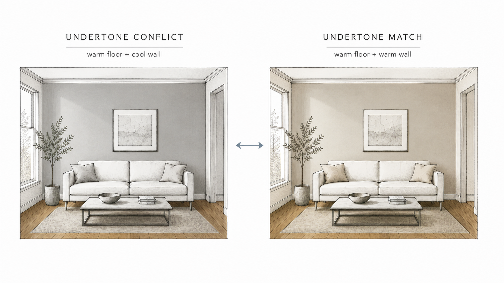
A common failure is warm wood flooring with cool gray walls. The floor gets louder. The wall gets colder. The room feels unsettled.
The fix is not always a new color family. Sometimes it is one step warmer, one step quieter, or one step lower in saturation.
Lighting Changes Every Color Twice a Day
Color does not sit still in a room. Morning light, afternoon light, evening bulbs, and shadows all change it.
North-facing rooms often make colors feel cooler and flatter. South-facing rooms usually give stronger, warmer light. East-facing rooms can feel crisp in the morning and dull later. West-facing rooms can go warm and golden late in the day.
Bulbs matter too. Around 2700K feels warm and cozy. Around 3000K feels warm but cleaner. Around 4000K can feel too clinical in many homes unless the whole design is built for it.
Test large sample boards for at least 48 hours. Move them beside the floor, trim, sofa, tile, and window. Look in the morning, afternoon, and at night with lights on. That is when the room tells you the truth.
LRV Controls Brightness, Not Just Mood
Light Reflectance Value, or LRV, tells you how much light a color reflects. Higher LRV colors bounce more light. Lower LRV colors absorb more light.
A low-light hallway, basement, or small room usually needs more care with low-LRV colors. Dark paint can look rich in a room with layered lighting. It can look dead in a room with one ceiling fixture and weak daylight.
High-LRV colors are not automatically better. A bright white in a room with strong sun can glare. A slightly lower-value warm neutral may feel calmer and more finished.
How Color Changes Room Size and Visual Weight
Light colors usually soften edges and make a room feel more open. Dark colors add weight and depth. Contrast controls how chopped-up the space feels.
If the wall, ceiling, trim, and adjacent rooms are close in value, the eye moves more smoothly. That can make a small home feel larger.
If every room jumps sharply from white to navy to green to beige, the house starts to feel broken into pieces. That can work in old homes with strong room separation. It is harder in open plans.
Ceilings and trim are part of the palette. A cold white ceiling above warm walls can make the walls look dirty. A creamy trim beside a cool wall can make the trim look yellow.
Fixed Finishes Control the Palette
Floors, cabinets, tile, counters, brick, stone, and large upholstery set the limits. Paint is flexible. Those finishes are not.
Start there. If the floor is warm, test warm neutrals first. If the countertop has gray-blue veining, a yellow beige wall may fight it. If the bathroom tile is pink-beige, a cold white wall can make the tile look worse.
The expensive mistake is choosing paint in isolation. The cheaper move is to build a small material stack before buying gallons: floor sample, cabinet finish, countertop, fabric, trim color, and two or three wall options.
Room-by-Room Color Moves
A living room usually needs a stable dominant color because it carries furniture, art, traffic, and daylight shifts. Warm neutrals, muted greens, soft grays, and layered off-whites work when the fixed finishes agree.
A kitchen is less forgiving. Cabinets, counters, backsplash, flooring, metal finishes, and appliance color all compete. The wall color should usually support the cabinets and counters, not become the main event.
A bedroom can handle lower contrast and softer saturation. Strong color works better behind the bed, in textiles, or in a darker muted wall color than in a bright full-room treatment.
A bathroom depends on tile and mirror light. White paint beside tile is risky if the undertones do not match. Small bathrooms can handle darker color, but only if the lighting is planned.
Where Color Decisions Usually Break Down
The usual order is backwards. Someone picks a favorite paint color, then tries to make the floor, sofa, curtains, and counters agree with it.
In a real room, the fixed pieces should lead. Paint should respond.
This matters because paint is cheap compared with tile, flooring, cabinets, or a sofa. If the palette is wrong, repainting may not fix the room. The real conflict may be between the floor and the counter, the sofa and the wall, or the trim and the lighting.
Before changing the wall color, check the materials that are forcing the problem. That one step can prevent a second paint job, a returned rug, or a room that still feels wrong after money has already been spent.
Simple Palette Method
- Start with fixed finishes: floor, cabinet, tile, countertop, stone, brick, and trim.
- Identify the temperature: warm, cool, or mixed.
- Choose one dominant color family for the room or connected area.
- Add one supporting color in a different value or texture.
- Keep the accent small and repeat it two or three times.
- Test the palette in daylight and at night before committing.
FAQ
What is color theory in interior design?
It is the use of hue, value, saturation, contrast, harmony, undertone, and light to make rooms feel balanced. In interiors, it has to work with materials, daylight, furniture, and fixed finishes.
Do I need the color wheel to decorate a room?
You do not need to use it academically. You need the basic relationships: neighboring colors feel calmer, opposite colors create energy, and one color should usually lead.
Why does my paint look different on every wall?
Each wall gets different light. One may face a window, one may sit in shadow, and another may pick up color reflected from flooring, furniture, or nearby surfaces.
What is the 60-30-10 rule?
It is a simple way to control color hierarchy: 60 percent dominant color, 30 percent secondary color, and 10 percent accent color. It works best when the accent stays small enough not to take over.
Why do neutral colors clash?
Neutrals have undertones. A beige can lean pink, yellow, or green. A gray can lean blue, purple, or brown. When undertones fight fixed finishes, the room feels off.
Are dark colors bad for small rooms?
No. Dark colors fail when lighting is weak, contrast is uncontrolled, and the room has too much visual clutter. With good lighting and a simple palette, dark color can make a small room feel intentional.
What color makes a room feel bigger?
Higher-value colors, lower contrast, and continuity between rooms usually make a space feel larger. The exact color depends on daylight, flooring, and trim.
Should wall color match the furniture?
It should relate, not match. Matching everything can make a room feel flat. A better goal is shared undertone, controlled contrast, and repeated color in small doses.
What should I choose first: paint, furniture, or flooring?
Start with what is hardest to change. Flooring, tile, cabinets, counters, and large furniture should guide paint. Paint is usually the most flexible layer.