This is the little routine that saves you from “why does it look green at night?” panic. You’re not testing color. You’re testing behavior: undertone + light + surrounding surfaces.
- Goal: decide fast if a paint is a yes, a no, or “maybe, but only in this room.”
- Time: 10 minutes to set up. Then you just observe.
- What you’re looking for: undertone shift, value (too light/dark), and how it reacts next to your fixed stuff (floor, trim, counters).
What you need
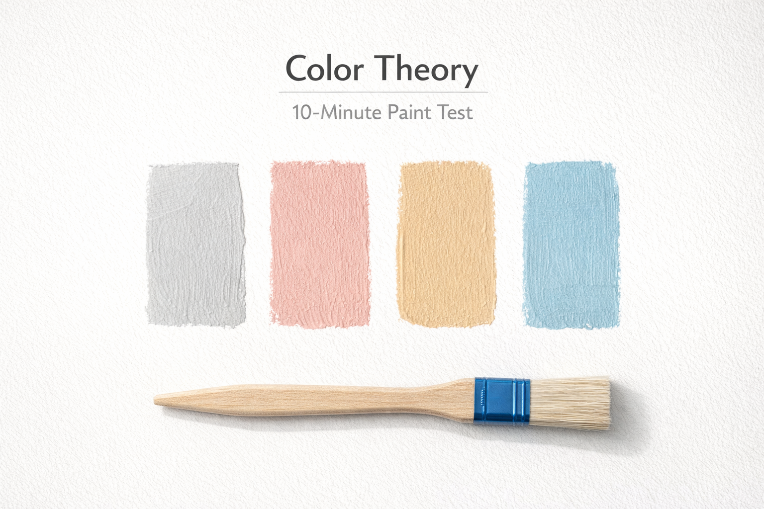
- 2–4 sample colors (don’t test 10; you’ll learn nothing)
- White poster board or foam board (at least 12"×18")
- Painter’s tape
- A marker to label each sample
- Your phone camera (not for accuracy—just for comparison)
If you want the deeper “why a swatch lies,” the core idea is in design elements (color + light).
Step 1: Don’t paint the wall first
Paint the sample on the board, not the drywall. Two coats. Let it dry enough that it’s not glossy-wet. Label it big.
- Make each sample big: at least 8"×10" per color. Tiny swatches hide undertones.
- Leave a white border: that border helps you see undertone drift against “true-ish” white.
Step 2: Tape samples where light actually hits
Move the boards around. Don’t “choose a spot.” Use three positions that represent the whole room.
- Bright zone: near a window or strongest daylight
- Shadow zone: the darkest corner (where paint looks worst)
- Transition zone: mid-wall, where your eye will live day-to-day
If you’re planning a full finish workflow, the sequencing matters too (paint after the dusty stuff). See order of operations for finishing work.
Step 3: Test it against your “fixed” materials
Most paint choices fail because they ignore the stuff you’re not changing.
- Floors / rugs: wood tones pull paint warm or cool
- Trim: your trim white can make your wall color look dirty or pink
- Cabinets / counters: especially in kitchens—undertones bounce
- Big furniture: sofa color reads like a giant pigment sample
Hold the board right next to those surfaces. You’re looking for “fight” vs “blend.” If the room looks tense, it usually is.
Step 4: Do the two-light check
Paint that looks good at 2pm can look awful at 9pm. So you test both.
- Daylight check: stand back 6–10 feet. Squint. Which one still reads clean?
- Night check: turn on your actual bulbs. Don’t change lighting “for the test.” You’re choosing paint for your real life.
Fast rule: if a white turns green, or a gray turns lavender, it’s usually undertone + bulb temperature working together. If you want the psychology layer behind “why this feels calm vs twitchy,” park it in your head and read color psychology basics later.
Step 5: Use your phone the right way
Your camera lies. Good. Use it anyway.
- Same angle, same spot, same time for each sample
- Don’t edit photos, don’t crank brightness
- Look for relative differences: which one shifts more from day to night?
This is especially useful when your eye “adapts” and stops noticing the cast.
Step 6: The “gray card” trick (optional, but brutal)
If you have a neutral gray object (even a plain gray notebook), place it beside the sample. Undertones show themselves fast.
- Green cast shows: the paint suddenly looks a bit swampy next to neutral gray
- Pink cast shows: the paint starts reading rosy or makeup-y
- Blue cast shows: the paint feels colder than you remembered
Decision rules (so you don’t overthink)
- If it looks “clean” in the dark corner: it will look good everywhere else.
- If it shifts hard at night: either change the bulb temperature or pick a different paint. Don’t pretend you won’t notice.
- If two colors look identical in daylight: pick the one that behaves better under lamps.
- If it only looks good in one spot: it’s not a wall color—it’s an accent color.
Common mistakes that ruin the test
- Testing too many colors (your eye gets numb and everything looks “fine”)
- Using tiny swatches (undertones hide until you scale up)
- Judging it once (paint behavior is a day/night thing)
- Ignoring trim/floor/cabinet influence (the room is a color system)
- Choosing paint to “fix lighting” instead of fixing lighting (sometimes bulbs are the real problem)
FAQ
(Quick answers people keep asking)
Do I really need to test paint if I’m using a popular color?
Yes. “Popular” doesn’t mean “stable in your room.” Undertones react differently in north-facing light, warm LEDs, and rooms with strong wood tones. The test is less about popularity and more about how the color behaves in your specific conditions.
How many samples should I test at once?
Two to four. If you test ten, your brain averages them out and you lose the ability to see undertones. Keep it tight and comparative.
Why does my paint look perfect in the store but weird at home?
Stores have different lighting and different surrounding colors. Your house has warm/cool bulbs, daylight direction, and big surfaces (floors, cabinets, furniture) that bounce color back onto the wall.
What’s the fastest way to spot undertones?
Use a larger sample on a board, compare it beside a neutral gray object, and check it under your real bulbs at night. Undertones show up when you stop testing in “perfect light.”
In basic terms, color is a “paint choice.” But in a real room, it’s more like a perception choice. It changes how big a space feels, how clean it reads, whether it looks warm or washed out, and whether people relax or feel slightly on edge. So yeah—more than “just color.”
Most color mistakes aren’t dramatic, and they shouldn’t be. They’re small: wrong undertone under your lighting, a white that goes green at night, a bold accent that looks great on a swatch but screams across a full wall.
If you want the psychology side, start with color psychology basics and come back here for the field moves.