
Baroque and Rococo can look similar at first because both use curves, ornament, gilding, painted ceilings, mirrors, and carved detail. The mistake is treating them as the same decorative mood.
Baroque is heavier, more dramatic, and more public. It wants to control the eye from a distance. Rococo is lighter, smaller in scale, and more intimate. It wants the eye to wander across surfaces, furniture, mirrors, panels, flowers, shells, and soft color.
That difference matters. If you are studying architecture, drawing interiors, restoring an old room, or borrowing historical ideas for a modern space, Baroque and Rococo do not solve the same design problem.
| Question | Baroque | Rococo |
|---|---|---|
| Main feeling | Drama, weight, power, awe | Lightness, charm, comfort, play |
| Best scale | Large halls, staircases, palaces, public rooms | Salons, bedrooms, sitting rooms, smaller interiors |
| Composition | Strong axes, symmetry, big focal points | Asymmetry, curves, loose movement across surfaces |
| Color | Deep reds, dark blues, gold, marble tones, strong contrast | Pastels, cream, pale blue, pale green, soft pink, light gilding |
| Ornament | Heavy, sculptural, theatrical | Delicate, shell-like, floral, scrolling, lace-like |
| Common mistake | Using gold and heavy furniture without the scale to support it | Using pale colors and curves without enough craft or detail |
What Baroque Design Is Really Doing

Baroque architecture grew from a world where buildings were used to persuade. Palaces, civic interiors, gardens, fountains, stair halls, and formal rooms were designed to make power visible. The space did not sit quietly in the background. It moved toward the visitor.
The typical Baroque room or facade uses strong contrast, deep shadow, large gestures, heavy materials, and a clear route for the eye. Columns, arches, domes, staircases, painted ceilings, mirrors, and sculpture often work together as one system.
This is why Baroque architecture cannot be understood only by looking at ornament. The ornament is part of a larger performance. The room is usually trying to make the visitor feel small, impressed, guided, or emotionally pulled into the space.
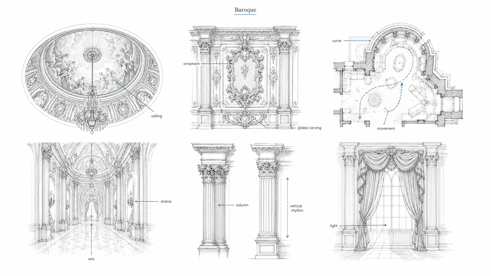
Baroque features to look for
- Big focal points: domes, staircases, central halls, painted ceilings, fountains, or major wall compositions.
- Strong axes: the plan often pulls the eye toward one dominant point.
- Dramatic light: bright openings, deep shadows, reflective surfaces, and controlled contrast.
- Heavy materials: marble, dark wood, gilding, stone, plaster, bronze, and richly colored surfaces.
- Integrated arts: architecture, sculpture, painting, and decoration often blur into one visual scene.
What Baroque teaches today
Baroque is useful when a space needs ceremony, weight, sequence, or a strong arrival moment. A modern room does not need to copy a palace to use this lesson. A stair, fireplace wall, entry axis, ceiling treatment, or lighting plan can still borrow Baroque thinking.
The danger is copying the surface only. Gold trim, a large chandelier, or a dark marble wall will not feel Baroque if the room has no proportion, no focal point, and no control of light.
What Rococo Design Is Really Doing
Rococo did not simply shrink Baroque. It changed the purpose of the room.
Instead of grand public drama, Rococo often works through closeness. The best Rococo interiors are made for conversation, display, leisure, and social movement. The detail is smaller. The colors are softer. The curves are more playful. The room feels less like a stage set and more like a decorated shell around daily social life.
Rococo ornament often uses shells, scrolls, flowers, leaves, vines, C-curves, S-curves, mirrors, porcelain, and asymmetrical panels. The surface rarely feels still. Even a small wall panel may seem to curl, bend, or dissolve at the edges.
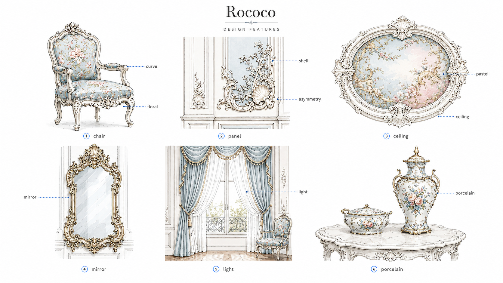
Rococo features to look for
- Asymmetry: one side of an ornament may not mirror the other side exactly.
- Curved lines: chair legs, mirror frames, wall panels, and ceiling borders often use soft S- and C-shaped curves.
- Pastel color: pale blue, cream, pale green, soft rose, light gray, and warm white are common.
- Shell and floral motifs: rocaille ornament, flowers, vines, leaves, and delicate carved forms appear often.
- Mirrors and lightness: reflection makes rooms feel brighter, wider, and more animated.
- Smaller furniture scale: chairs, tables, and cabinets often feel lighter and more mobile than Baroque furniture.
What Rococo teaches today
Rococo is useful when a room needs softness, intimacy, and movement without feeling heavy. It can help small rooms feel more finished, especially when mirrors, curved furniture, painted panels, and soft lighting work together.
The danger is making it sugary. Pale color alone is not Rococo. A curved chair alone is not Rococo. The style depends on a relationship between surface, furniture, light, and fine detail.
Baroque vs Rococo in One Sentence
Baroque uses drama to command the room; Rococo uses detail to charm the room.
That is the simplest difference, but it is also the most useful. When you are looking at an interior, ask where your eye goes first. If the room pulls you toward one strong dramatic point, it is leaning Baroque. If your eye wanders across mirrors, panels, curves, furniture, and small ornament, it is leaning Rococo.
The Part Most Comparisons Miss: How Each Style Controls the Room
Most Baroque vs Rococo comparisons stop at color, ornament, and timeline. That misses the better lesson. These styles control the room in completely different ways.
Baroque controls the room from a distance. You understand the main idea almost as soon as you enter. The stair rises. The ceiling opens. The axis points forward. The dome, fountain, stage, facade, or central hall tells you where to look. The details support the big gesture.
Rococo controls the room up close. You notice it by moving through it slowly. The curve of a chair leg matters. The mirror frame matters. The little break in a wall panel matters. The ornament is not only placed on the room; it changes how the surface feels.
This is why Baroque often photographs well from the doorway, while Rococo often needs closer views. Baroque gives you the total scene. Rococo gives you a chain of details.
| Design control | Baroque | Rococo |
|---|---|---|
| Where it works from | Across the hall, down an axis, from a staircase, through a doorway | At chair height, around mirrors, beside panels, near furniture |
| How it guides the eye | One strong direction or focal point | Many small movements across surfaces |
| How the body moves | Procession, arrival, pause, spectacle | Conversation, sitting, turning, noticing |
| What fails when copied badly | The room feels fake-heavy or theatrical | The room feels weak, cute, or decorative without depth |
This is the section most articles skip because it is harder than naming motifs. But it is the part designers, students, and homeowners can use. Before borrowing either style, decide how the room should control attention. Should it create an arrival moment, or should it reward close looking?
Where People Mix Them Up
Baroque and Rococo overlap because Rococo grew after Baroque and kept some of its love of movement, surface, and ornament. The confusion happens when every curved, gilded, old European-looking room gets called Baroque.
Use these tests instead.
If the room feels heavy, public, and dramatic
It is probably closer to Baroque. Look for deep colors, strong light and shadow, massive columns, bold ceiling paintings, large-scale sculpture, dark polished surfaces, marble, and a strong central composition.
If the room feels light, playful, and intimate
It is probably closer to Rococo. Look for pastel panels, mirrors, shell-like ornament, delicate furniture, loose asymmetry, floral carving, porcelain, and curved edges that soften the room.
If it has both
Some buildings and interiors sit between the two, especially in regions where Baroque lasted longer or where Rococo was layered into older rooms. Do not force every example into a clean box. Style history is often messy in real buildings.
Examples That Make the Difference Clear
Versailles is useful because it shows how court architecture can use reflection, alignment, ceremony, and scale. The lesson is not simply “gold.” The stronger lesson is how a long room, repeated mirrors, windows, chandeliers, and garden views make power visible.
The Salon de la Princesse at the Hôtel de Soubise in Paris is useful for Rococo because the room works through curves, pale surfaces, mirrors, gilded frames, and intimate scale. It does not need the same heavy drama as a Baroque hall. Its strength is in the surface rhythm.
Amalienburg in Munich is another useful Rococo example because the decoration feels light, reflective, and highly finished without needing Baroque weight. It shows how mirrors, pale ornament, and curved detail can make a smaller interior feel animated.
For a different comparison, Baroque vs Gothic architecture is useful because Gothic verticality and Baroque theatrical movement solve different spatial problems. Baroque does not simply mean “old and ornate.”
Modern Design: How to Borrow Without Making the Room Look Fake
The best way to borrow from Baroque or Rococo is to choose one job for the style. Do not cover every surface with historical references.
Use Baroque when the room needs a focal point
Baroque thinking can work in an entry, dining room, stair hall, hotel lobby, theater space, restaurant, or formal living room. The modern version may be a strong light fixture, a deep wall color, a shaped stair, a central fireplace wall, a bold mirror, or a ceiling that gives the room hierarchy.
Keep the rest of the room disciplined. If every object tries to be the main event, the room loses the Baroque lesson.
Use Rococo when the room needs softness and close detail
Rococo thinking can work in a bedroom, sitting room, dressing area, powder room, reading corner, boutique interior, or small hospitality space. The modern version may be a curved chair, pale wall color, delicate mirror, floral fabric, shaped panel, or light ornamental ceiling edge.
Keep the detail controlled. Cheap-looking gold paint, oversized scrollwork, and random pastel furniture can turn Rococo into theme decor fast.
The Practical Problem: Ornament Has to Be Maintained
Historical style articles rarely talk about upkeep, but ornament is not free. Carved trim catches dust. Gilded surfaces show bad touch-ups. Plaster cracks at joints. Mirrors double clutter if the room is not organized. Painted ceilings look strange under flat modern lighting. Curved furniture can be harder to reupholster than plain furniture.
This matters if you are using Baroque or Rococo ideas in a real house, hotel, restaurant, or renovation. The more detailed the room becomes, the more every bad joint, vent, switch plate, recessed light, return grille, and cheap molding shows.
| Design choice | Hidden problem | Better move |
|---|---|---|
| Heavy Baroque-style trim | Can make a low ceiling feel pressed down | Use one strong wall or ceiling edge instead of trimming everything |
| Large chandelier | Looks wrong if the ceiling height and table scale do not support it | Size the fixture to the room, not the fantasy image |
| Pastel Rococo palette | Can feel flat under cold LED light | Use warm layered lighting and test paint at night |
| Gold accents | Cheap finishes read fake quickly | Use less gilding but better material quality |
| Decorative wall panels | Bad seams, outlets, and vents interrupt the pattern | Plan panels around real wall conditions first |
This is where historical design meets construction reality. A room can borrow Baroque drama or Rococo softness, but the details have to survive normal use.
Baroque and Rococo Compared With Neoclassical and Art Deco
Baroque and Rococo also become easier to understand when placed near later styles.
Neoclassical architecture tends to pull design back toward order, proportion, columns, restraint, and classical clarity. It often feels more controlled and less restless than Baroque or Rococo.
Art Deco uses decoration too, but it usually favors geometry, vertical emphasis, stylized pattern, machine-age glamour, and sharp edges rather than Baroque drama or Rococo shells and curves.
This is why “ornate” is not enough as a style label. A Baroque room, a Rococo salon, a Neoclassical facade, and an Art Deco lobby may all be decorative, but they organize space in different ways.
Common Mistakes in Baroque vs Rococo Articles
The first mistake is saying Baroque is only architecture and Rococo is only decoration. Baroque includes architecture, painting, sculpture, landscape, interiors, and urban space. Rococo is strongest in interiors and decorative arts, but it also shaped architecture and room planning.
The second mistake is saying Baroque is always symmetrical and Rococo is always asymmetrical. That is too neat. Baroque often uses strong symmetry and axes, but it can also use movement and curved surfaces. Rococo often uses asymmetry, but it still has order. The difference is the kind of order each style prefers.
The third mistake is using one building type as the only reference point. Baroque and Rococo both appear in palaces, salons, furniture, theaters, stair halls, gardens, hotels, and domestic interiors. For this page, the design lesson is broader than one building type.
What Students Should Sketch
If you are learning these styles for architecture or interior design, do not start by sketching every ornament. Start with the room logic.
- For Baroque, draw the axis, the focal point, the light source, and the main movement through the space.
- For Rococo, draw the wall panels, mirror placement, furniture curves, ceiling edge, and how small details move across the room.
- For both, separate structure from applied ornament. That one step makes the style easier to understand.
This approach also helps when comparing them with broader architecture styles. Style is not only what a building looks like. It is how space, surface, light, material, and movement work together.
The Better Way to Remember It
Baroque is the arrival. Rococo is the conversation.
Baroque wants the room to impress you before you understand every detail. Rococo wants you to stay close enough to notice the details. Once you see that difference, the two styles become much easier to read.
FAQ
What is the main difference between Baroque and Rococo?
Baroque is heavier, more dramatic, and more monumental. Rococo is lighter, more delicate, and more intimate. Baroque usually controls the room through big spatial drama. Rococo usually controls the room through surface detail, curves, mirrors, and soft color.
Did Rococo come after Baroque?
Yes. Rococo developed after Baroque, especially in early 18th-century France. It kept some Baroque movement and ornament but made the mood lighter, more playful, and more suited to intimate interiors.
Is Rococo just a smaller version of Baroque?
No. Rococo is not simply Baroque made smaller. It changes the room’s purpose. Baroque often creates awe and ceremony. Rococo often creates comfort, social ease, and close visual pleasure.
Which style is better for a small room?
Rococo usually adapts better to small rooms because it uses lighter colors, smaller furniture, mirrors, and delicate surface detail. Baroque can work in a small room only if it is used carefully, usually as one strong focal point rather than a full-room treatment.
Can Baroque and Rococo be mixed?
They can be mixed, but one should lead. A Baroque room with a few lighter Rococo details can work. A Rococo room with one stronger Baroque focal point can also work. Problems start when heavy drama and delicate playfulness fight for control of the same room.
Why do people confuse Baroque and Rococo?
They both use ornament, curves, gilding, mirrors, and decorated surfaces. The difference is scale and mood. Baroque feels grand and theatrical. Rococo feels light, decorative, and intimate.