Graphic Design Essentials for Architecture, Interiors, and Built-Environment Work
Architecture and interior projects don’t stop at drawings. They have to be shown, compared, approved, taught, priced, and promoted. Graphic design is the part that makes all of those visual and easy to read. The same skills that make a poster clear will make a competition board clear, a client deck clear, and a learning page about space and proportion clear, just like the ones in design basics in architecture and building.
This guide keeps graphic design practical for people who work with plans, elevations, sections, axons, and renders — layout, hierarchy, type, color, and how they support architectural material.
What Graphic Design Does Here
Graphic design is visual communication with text, image, and layout. In architecture it turns plans, sections, perspectives, and notes into a story someone can follow in seconds. The aim is always the same: show the main thing first, show proof second, keep everything aligned.
For the architectural side of the same idea, see Introduction to Architecture: A Beginner’s Guide to Building Design.
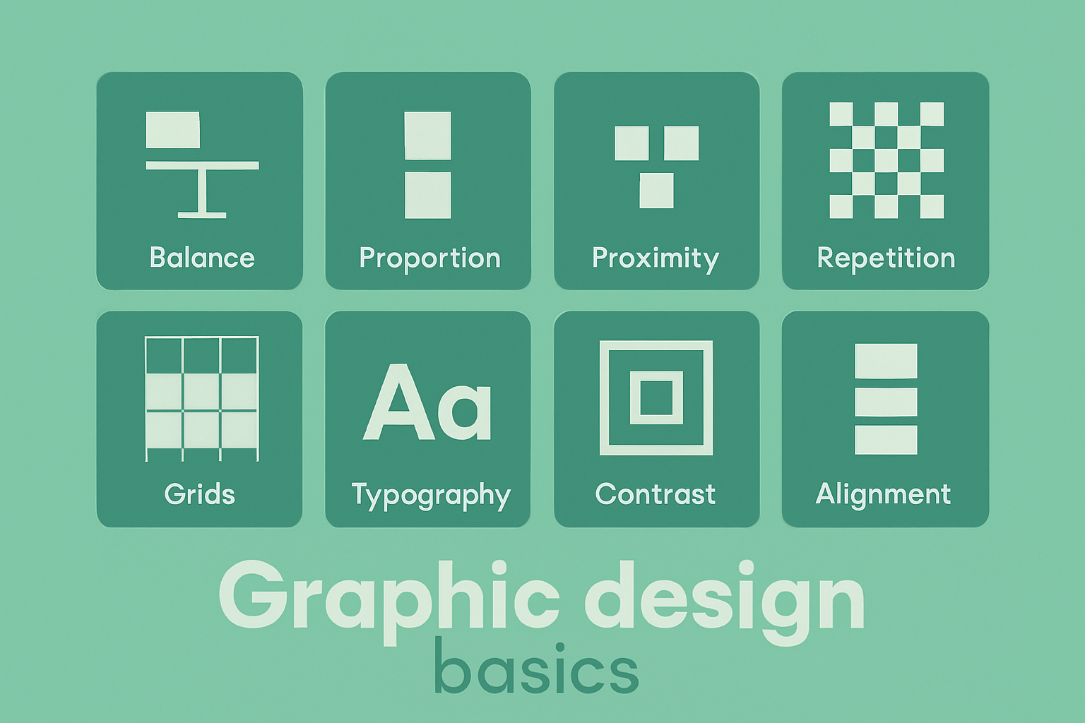
The Seven Elements You Keep Using
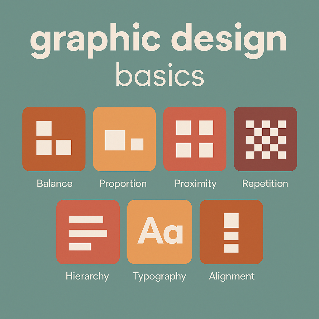
Every board, one-page sheet, or project presentation is built from the same elements.
1. Line
Lines separate content, connect labels to drawings, and create quiet structure. Use one or two line weights only — thin lines for dividers, slightly thicker lines for section breaks.
2. Shape
Rectangles and simple bands help hold headings or highlight data. In architecture work, flat, simple shapes match plan and elevation logic better than decorative ones.
3. Color
Color creates focus. One accent color plus light backgrounds is usually enough. Take colors from the project itself — landscape green, timber brown, concrete gray — so the page feels tied to the design. For help with palettes and mood, see color psychology basics.
4. Texture
Very light texture or background tone stops a page from feeling empty. Keep it subtle so it doesn’t fight with linework or renders.
5. Typography
Typography is how text is chosen and placed. Use one family for headings and one for body, or one family in two weights. Headings must be clearly larger. Captions must be smaller and close to the image they describe.
6. Space
Space (white space) is what makes a layout look finished. Leave room around images and text blocks. Crowding is what makes student boards look unfinished even when the drawings are good.
7. Form
3D views, shadows, and perspective give form. Put these at the top of the layout or in the largest cell so visitors see the project before the notes.
Principles That Make Pages Readable
Elements are the pieces. Principles tell you how to arrange them.
- Hierarchy: one item is most important — usually a render or the project name.
- Alignment: images and text land on a common grid, not floating.
- Contrast: big vs small, light vs dark, image vs text to guide the eye.
- Repetition: same heading style, same caption style across all pages of the project.
If a layout looks noisy, it is usually because hierarchy or alignment was ignored.
How to Build One Architecture-Friendly Layout
- Set margins and a grid. Two or three columns work for most project sheets.
- Place the hero image. Main render, perspective, or site view at the top.
- Add the title and basic info. Project name, type, place.
- Add proof. Plan, section, axon, or diagram so visitors know it’s real design.
- Add text. Short explanation, not a wall of writing.
- Check alignment and spacing. Everything should sit on the grid with air between blocks.
This single pattern works for housing, interiors, and studio work, and it lines up with form in architecture.
Uses in Architectural Practice
Client presentations
Clients read images first. One large image, one sentence that says what it is, and one smaller drawing that proves it. No stacked paragraphs. No five colors.
Competition boards
Juries scan from a distance. Give them: concept diagram → plan/section row → hero render. Keep titles in the same position on every board so the set feels unified.
Marketing and project pages
Project pages work better when every project uses the same skeleton: main image, short overview, drawings, extra photos. Graphic design is what keeps that skeleton consistent.
Documents and reports
Progress reports, fee proposals, and small guides read faster when headings are clear, lists are aligned, and images have captions. Same visual logic as good drawing sheets.
Why This Helps Architects
Clear graphics reduce explanations in meetings. The layout decides the order of reading, not the presenter. That makes approvals faster and makes the work look organized. It also helps when different teams touch the same project — if every sheet uses the same text style and the same spacing, the full package looks like one office, not four people.
It also helps when work is published or shared. Social posts, event announcements, “new project” banners, and AI-tool walkthroughs look connected if they all follow the same typography and spacing.
Why This Helps Architecture Students
Students are graded on clarity as well as ideas. A simple layout — big hero, clear title, supporting drawings, readable text — makes panels easier to talk through during critique. It also makes it easier to reuse studio work in a portfolio, because every sheet already has margins, alignments, and captions in place.
Students who learn basic hierarchy and spacing early can move faster in later semesters, when the focus is on analysis, structure, or environment. More detail is in design elements in architecture.
Graphic Design in Architectural Content
Related reading: Balance in Architecture: Key Principles for Stunning Designs
Color and Typography Guidelines
Color
- Use one accent color from the project.
- Use light backgrounds for drawings and plans.
- Use color to group: all diagrams in green, all notes in gray.
Typography
- One font for headings, one for body.
- Headings 1.5–2× the size of body text.
- Captions smaller and close to the image.
- Left align long text for better reading.
Common Problems and Fixes
- Crowded page: remove one image and increase padding.
- No clear entry point: enlarge the main render or title.
- Text on busy image: add a light panel behind text.
- Uneven captions: align all captions to the same grid line.
- Too many colors: reduce to one accent + neutrals.
How It Supports Presentations, Management, and Promotion
Architecture work is often seen by people outside the design team — clients, funders, students, the public. Clear graphics make it easier to:
- show proposal vs built condition,
- compare two design options,
- prepare event or course pages,
- share project summaries on social or newsletters,
- create internal standards for staff and interns.
One visual style across all of those keeps the practice recognizable.
Beginner Steps
- Pick one layout and reuse it for a whole project.
- Set fixed margins (for example 32px on web, 20mm on print).
- Limit yourself to two fonts.
- Check every page for alignment before publishing.
10 Graphic Design Tasks AI Can Speed Up for Architecture and Interiors
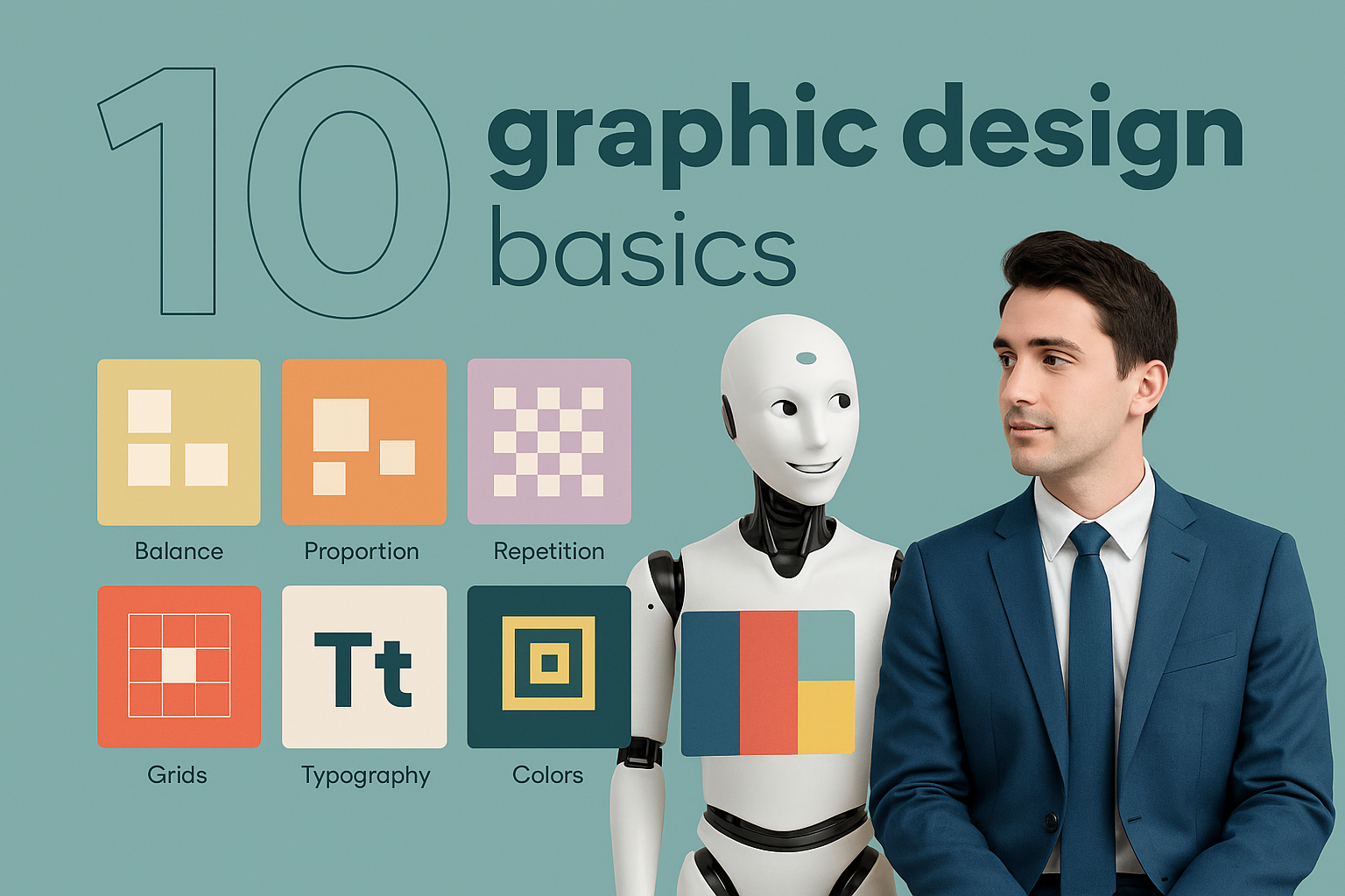
AI is good at the repetitive, layout-heavy parts of graphic design — the parts that usually slow down architects, students, and interior designers who just need to show the project. Here are 10 things AI can help with right now.
1. Auto-sizing images for boards and pages
Dropping 6 different screenshots and renders into one layout used to mean 10 minutes of resizing. AI-driven layout tools can detect the “hero” image and scale the rest to fit the grid.
2. Generating color palettes from the project
AI can pull a palette from the render, material board, or site photo — one accent, two neutrals — so graphics stay tied to the project.
3. Cleaning backgrounds and cutouts
Removing messy backgrounds behind people, plants, or product shots is something AI already does well. Faster cutouts mean faster mood boards and cleaner diagrams.
4. Turning rough notes into presentable text blocks
AI can take bullet points like “lobby – warm – timber – plants – reception visible” and turn them into a two-line caption. Useful when you have many images to label.
5. Suggesting layout variations from one source file
You make one solid layout — hero image, heading, text, diagram — and AI can offer vertical, social, two-column, and print versions.
6. Matching typography to existing brand styles
If the office already has a font and heading size, AI can apply that style to new pages so nothing looks off.
7. Auto-labeling diagrams and plans
AI can detect arrows and numbered parts and suggest labels like “entry,” “core,” or “terrace.” You still review, but the first pass is faster.
8. Generating social-friendly crops
One project image can become banner, square, and story format without guessing the crop. AI can keep the building or room centered.
9. Consistent icon and illustration style
AI can restyle or generate icons in one line weight so all diagrams look like they belong together.
10. Accessibility and contrast checks
AI can flag text that is too light on a background. That matters for public-facing pages, signage, or PDF reports.
Used together, these save small chunks of time on every project — which adds up when you’re producing course pages like space planning essentials, project case studies, and client decks from the same source material.
Will AI Replace Graphic Designers in Architecture Work?
Short answer: no, but it will strip out a lot of the slow parts. AI is already good at resizing, cleaning backgrounds, making extra versions, and writing short captions. That means the “push pixels for 2 hours” part gets smaller. What stays human is the part where someone decides what the client should see, what order things go in, and how the page matches the rest of the office material.
Architecture, interiors, and built-environment projects are not random social posts — they have context, codes, drawings, and real budgets. AI does not know which plan is final, which render is approved, or which diagram the client must sign. A person still has to choose the right images and put them in the right order.
What AI will take over
- making 3–4 layout variations from one source
- pulling colors from a render or material board
- removing backgrounds from people, plants, and product shots
- checking contrast and readability
- turning bullets into short captions
- auto-cropping for social, web, and print
All of that is production. It is recipe work. AI is good at recipe work.
What AI will not do well
- deciding which drawings tell the story of the project
- matching the page to the level of the audience (client vs jury vs students)
- keeping a whole office on one graphic standard
- pairing architecture diagrams with the right words from the PM
- making a board that looks like the studio, not like the model’s default style
That part is design judgment. It needs someone who knows what the building is and what the review is about.
What happens to “the graphic person” in the office
They stop being the person who resizes jpegs. They become the person who sets the base layout, sets the text styles, picks the color logic, and tells everyone else “run it through the AI with this template.” So one designer can support more projects at once.
What this means for students
If you can already make a clean layout, AI will just make it faster. If you cannot make a clean layout, AI will make a messy layout faster. So it is still worth learning grids, hierarchy, and spacing first. Then use AI to multiply it.
So no — AI doesn’t wipe out graphic design in architecture. It just removes the boring half and makes the thinking half more obvious.
EXTRA
Is Graphic Design for Architecture a Fun Career?
For people who like buildings and visuals, this lane is actually good. You see real projects, not just ad campaigns. One week it’s a competition board, the next it’s a project page, the next it’s a deck to win a client. You get to work close to architects and interior designers, and your work gets seen — online, in submissions, in meetings.
It’s also less repetitive than pure production design because every project has different drawings, different site photos, and different diagrams. The rules stay the same (grid, hierarchy, spacing), but what you put in the boxes changes all the time.
What makes it fun
- you handle real content — plans, sections, renders, models
- you help people understand design fast (clients like that)
- you can set a visual standard for the office and everyone uses it
- you see the work go live on the site, in awards, in socials
- AI and layout tools remove some of the boring exporting/cropping
What About Salary?
Where the money sits
Pay depends on where you sit in the pipeline. Someone doing only small social tiles for a studio will usually earn less than someone handling full proposal documents, competition boards, and brand-level templates for an architecture or engineering office.
- Entry / student / junior in an architecture or interiors studio: usually close to what junior architectural staff get in that office. Often project-based or part-time at first.
- Mid-level designer inside a firm (handles presentations, competitions, website pages): better pay, because you’re tied to winning work.
- Designer who can do graphics + light web + template systems + AI workflows: easier to argue for higher salary or freelance rates because you speed up everyone else.
- Freelance / external for multiple studios: income can be higher if you bill per deck, per competition, or per “project pack.”
Offices pay more when your graphics help them win work or explain a complex project to a client. That’s why pairing graphic design with architectural understanding — the stuff in design elements in architecture and space planning essentials — makes you harder to replace.
How to move up
- learn the office’s BIM/render workflow so your layouts match what they produce
- build reusable templates (boards, reports, social, project pages)
- add AI steps to speed everyone else up
- be the person who keeps visual consistency across projects
Do those and you stop being “the person who makes things pretty” and become “the person who makes our work readable.” That role survives longer and gets paid better.
FAQ
Do these rules work for both web pages and printed boards?
Yes. Start with grid, hierarchy, and spacing. Then adjust sizes for screen or print.
Can this be used on pages about form, space, or proportions?
Yes. Those pages are clearer when titles, diagrams, and text blocks follow the same layout as project pages.
How much text is enough?
One paragraph to introduce, one paragraph to explain, then diagrams and captions.
Conclusion
Graphic design keeps architectural content readable. With a small set of rules — grid, hierarchy, alignment, limited color, disciplined typography — project pages, studio boards, reports, and marketing posts all become easier to understand and faster to produce.