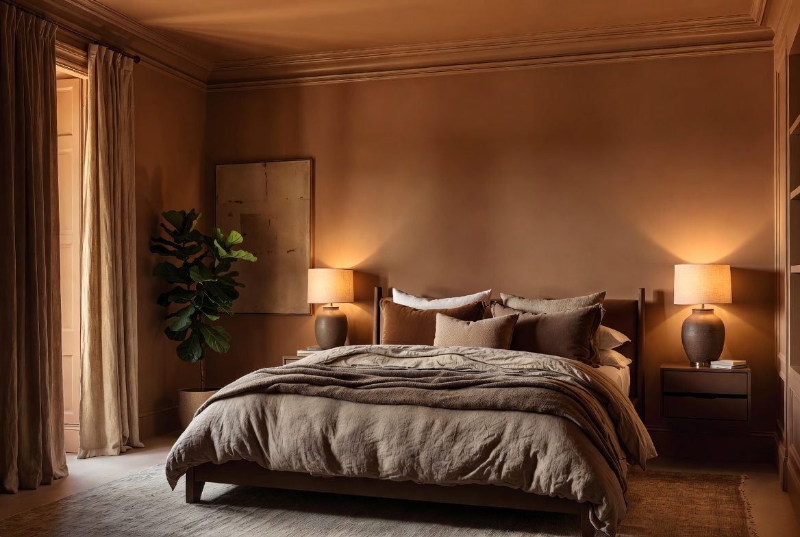
Image by ArchitectureCourses.org. A warm brown bedroom shows how color drenching can make the whole room feel deeper, softer, and more unified.
Color Drenching: How to Make It Look Rich, Not Flat
Color drenching looks easy from across the room. Pick one color. Paint everything. Done.
The trouble starts when color is doing all the work.
The rooms that hold up lean on light, finish, texture, and a little control. The good ones feel calm and complete. The bad ones feel heavy, dull, or strangely cheap even after a lot of work.
What matters most is not painting every surface. It is knowing which edges should disappear and which ones still need to read. Get that right and the room feels deeper. Get it wrong and the whole thing turns into one flat painted box.
If you want a softer version before going all in, fake color drenching is a better place to start. If you are still unsure about the whole move, read when color drenching can go wrong.
What Color Drenching Means
Color drenching works by carrying one main color across multiple surfaces so the room reads as one envelope.
Color drenching means using one main color across most of the room. Walls are part of it, but so are trim, doors, baseboards, built-ins, and sometimes the ceiling.
The point is to reduce visual breaks.
In a standard room, your eye catches every change: wall color, white trim, darker doors, bright ceiling, different shelf color, different cabinet color. In a drenched room, many of those edges quiet down. The room reads as one envelope instead of a stack of separate pieces.
That can do a few useful things:
- make a small room feel more intentional
- calm down busy trim or awkward architecture
- give plain drywall rooms more mood
- help older built-ins and patched millwork feel tied together
It also changes how light moves through the room. Shadows matter more. Texture matters more. Sheen matters more. That is why color drenching can look expensive in one house and clumsy in another, even with a similar paint color.
Start With These Rooms
Some rooms forgive mistakes. Some do not.
| Room | Good Starting Point? | Why It Works | Watch Out For |
|---|---|---|---|
| Powder room | Yes | Small room, short time spent inside, easy place to go bold | Bad lighting can turn a good color muddy fast |
| Bedroom | Yes | Soft edges help the room feel quieter and more settled | Too much gloss kills the calm |
| Office | Yes | Works well when you want focus and less visual noise | Dark colors need better task lighting |
| Hallway | Yes | Turns a pass-through into a strong design moment | Scuffs show fast in high-traffic spaces |
| Living room | Maybe | Can look rich and grounded when the furniture supports it | Large rooms can feel flat if fabrics and lighting are weak |
| Kitchen | Proceed carefully | Works best when cabinetry, wall color, and surfaces are tightly controlled | Too many finishes, appliances, and counters can break the effect |
Bedrooms, offices, hallways, and powder rooms are the safest first try. The room is either compact enough to carry the move or quiet enough to benefit from it.
Living rooms take more discipline. There is more furniture, more daylight change, and more chance for one odd piece to break the whole read. Kitchens are tougher still. Cabinets, counters, backsplash, hardware, and appliances all start competing.
Where It Looks Best
Bedrooms

A soft cream bedroom shows how color drenching can make a room feel quieter without looking dark.
Bedrooms benefit from softer edges. A drenched bedroom feels settled because your eye does not keep jumping from white trim to darker walls to a separate ceiling line. Warm neutrals, olive greens, dusty blues, cocoa tones, and muted reds all work here.
This is one of the few places where painting the ceiling the same color often helps. It makes the room feel wrapped rather than chopped into pieces.
The trick is to keep the finish low and bring in texture through bedding, curtains, rugs, and wood tones. If every surface is smooth and hard, the room can feel dead.
Living Rooms

In a living room, color drenching works best when furniture and textiles stay in the same family instead of fighting the walls.
Living rooms are where people tend to overdo it. They paint the shell, leave a bright sofa, add random art, then wonder why the room feels confused.
A drenched living room works when the larger pieces stay in the same temperature range. That does not mean everything must match. It means the room needs agreement. A deep olive room can handle camel, tobacco, dark wood, brass, black, stone, and muted cream. It struggles when a cool gray sectional and a bright blue rug get dropped in without a plan.
If you lean toward quieter spaces, these pages on minimalist living room decor and small minimalist living rooms pair well with this approach.
Hallways And Entryways

A drenched stair hall shows why narrow transition spaces can carry stronger color than a main room.
Hallways are a smart place to be brave. They are short-stay spaces. They also tend to be awkward, plain, or forgettable. Color drenching can turn them into a strong link between rooms instead of a gap between better spaces.
Dark colors often work better here than people expect. The room does not need to feel large. It needs to feel deliberate.
Bathrooms

Bathrooms can handle full color faster because the room is compact and the finish palette is already tight.
Bathrooms are good testing ground. The footprint is small. The effect lands fast. The room can hold a stronger move without taking over the whole house.
Watch the lighting here. A bathroom with weak overhead bulbs can ruin a good color by morning and again by night. If the room has no daylight, test bigger paint boards before you commit.
What Makes It Look Rich Instead of Flat
This is the part people miss most.
One color on every surface does not create depth by itself. Depth comes from small shifts inside the same family.
Change The Finish, Not The Color
Flat or matte walls with satin or soft eggshell trim can keep the room quiet while still letting the details read. Same color. Different light bounce.
That small shift matters more than people think.
Bring In Texture
Boucle, linen, wool, washed cotton, wood grain, plastery finishes, and woven shades all help. They stop the room from feeling dipped in one coating.
Let A Few Things Stay Separate
A stone tabletop, warm wood chair, aged brass lamp, black frame, or off-tone rug can keep the room grounded. Drenching works better when the room has a few anchors.
Respect The Light
A color that looks calm at noon can go heavy at 6 p.m. North-facing rooms cool colors down. South-facing rooms push warmth harder. Strong daylight can make a muted color feel brighter. Weak lighting can make a nice green look swampy.
Before you choose anything, look at the room the way you use it. Morning. Afternoon. Evening. Lamps on. Lamps off.
Worth knowing: if you need help reading mood before you commit, color psychology is a useful companion page.
Do This Instead Of This
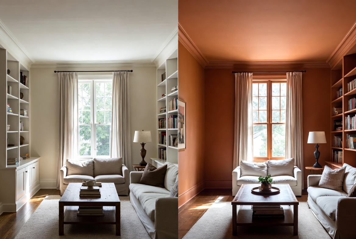
Image by ArchitectureCourses.org. A side-by-side living room shows how color drenching changes depth, mood, and visual contrast.
| Do This | Instead Of This | Why |
|---|---|---|
| Test large painted boards in the room | Trust a tiny swatch chip | Small samples lie. Room light does not. |
| Use one color with finish changes | Use one color in full gloss everywhere | Gloss shows flaws and can make the room feel harsh. |
| Drench one room first | Do the whole house in one weekend | You need one successful room before scaling the idea. |
| Match undertones across furniture and textiles | Keep old pieces that fight the wall color | The shell and the furniture have to agree. |
| Leave a few materials honest | Paint every single thing because you can | Wood, metal, and stone give the room depth. |
| Use drenching to calm awkward trim | Use it to hide a messy room with bad storage | Paint cannot fix clutter or poor layout. |
What To Paint And What To Leave Alone
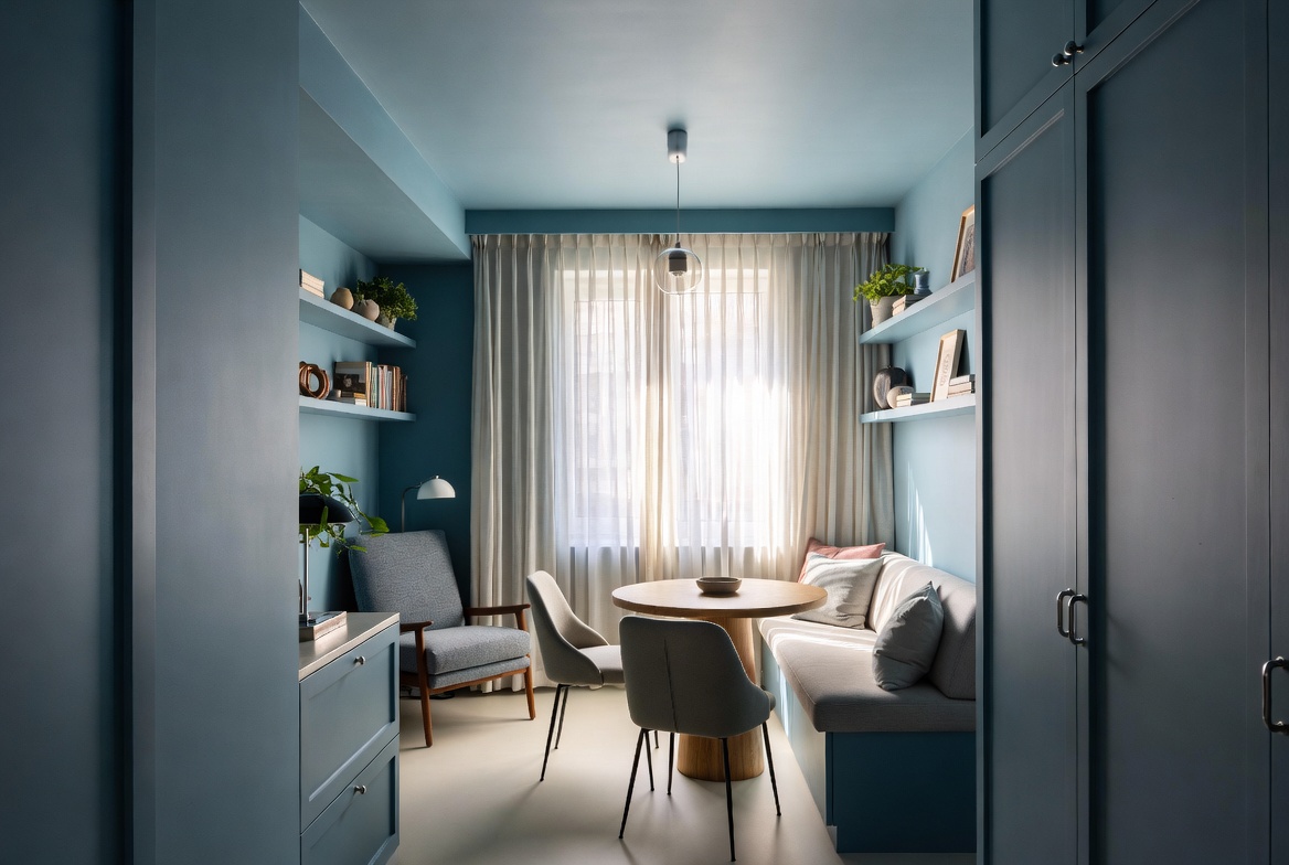
Image by ArchitectureCourses.org. A compact blue nook shows how color drenching can make a small space feel cleaner and more intentional.
You do not have to paint every surface for the room to read as drenched.
Good candidates:
- walls
- trim
- baseboards
- interior doors
- simple built-ins
- radiators or vents that disappear better when painted
Surfaces to think harder about:
- ceilings in low, dark rooms
- kitchen cabinets if counters and backsplash are staying
- ornate furniture that may look overworked once painted
- brick, stone, or wood with strong texture you may later miss
The best move is to decide where you want visual quiet. If white trim is the thing breaking the room apart, paint the trim. If the ceiling line is what keeps pulling your eye up, paint the ceiling too. If the room already has strong flooring and good millwork, stop there.
The Ceiling Decision

Matching the ceiling to the walls can help a compact room feel more continuous, but it depends on color depth and light.
People hear “color drenching” and go straight for the ceiling. Sometimes that helps. Sometimes it is the move that ruins the room.
Paint the ceiling the same color when:
- the room is small and you want fewer visual cuts
- the color is soft, dusty, or mid-tone
- the room gets decent light
- the goal is a cocoon effect
Leave the ceiling lighter when:
- the room is already dim
- the color is very dark
- the ceiling is low and the room feels compressed
- you want the walls to feel strong without closing the room in
There is no prize for painting every surface. The room only has to feel coherent.
Easier Colors To Live With
Some colors stay easy longer than others.
Soft Greens And Dusty Blues
Good in bedrooms, offices, and bathrooms. These tend to calm a room down and work well with wood, brass, black, cream, and stone.
Warm Earth Colors
Clay, tobacco, cocoa, mushroom, rust, and muted terracotta can make plain rooms feel grounded fast. They also help older homes feel less chopped up.
Quiet Neutrals
Taupe, greige, putty, warm gray, and beige are the safest entry point. They can still feel rich when the room has texture and good light.
Dark Tones
Charcoal, forest green, deep navy, and brown can look excellent, but the room needs enough light and enough material contrast to keep the shell from going flat.
If you are trying to figure out the rest of the room around the paint, this broader page on how to decorate your home is a helpful next step.
When Fake Drenching Is The Better Move
Full color drenching is not always the smartest first step.
A softer version often gets you most of the effect with less risk. Paint the walls and trim the same color. Leave the ceiling alone. Or keep the walls one shade and bring the same family into curtains, bedding, upholstery, and art. The room still tightens up, but repainting later is far less painful.
This works well when:
- you are testing a darker color
- the room has weak light
- you rent
- you have strong wood floors or ceilings you do not want to cover
- the furniture is staying and you need more flexibility
Also useful: Fake Color Drenching Like a Pro breaks that version down in more detail.
What People Get Wrong
- They choose paint before studying the room. The light should come first.
- They ignore sheen. One flat finish across everything can make the room collapse visually.
- They keep furniture that fights the wall color. The shell and the contents have to work together.
- They forget the floor. A cold gray floor under a warm brown room can throw the whole thing off.
- They mistake bold for better. The strongest drenched rooms are often muted, layered, and controlled.
- They do it because it looked good online. Your room has different light, different proportions, and different stuff in it.
When To Skip It
Skip full color drenching when the room already feels dark and boxed in, when the furniture is too mixed to support one color family, or when you already know you get tired of paint fast.
Skip it too if the room has bigger problems that paint will not solve. Bad storage. Harsh lighting. Too many finishes. A layout that feels off. Color drenching can sharpen a room. It cannot rescue a weak room plan.
If your hesitation is growing, read Why Color Drenching Might Be a Huge Mistake in Your Home before you buy gallons of paint.
FAQ
Will color drenching make a room look smaller?
Sometimes, but that is not always a bad result. Darker rooms can feel smaller and better at the same time. The better question is whether the room feels deliberate once the color is in place.
Do walls and trim have to be the exact same color?
No. They can be the same color in different finishes, or one can be a very close step apart. The room just needs to read as one family.
Should I color drench a rental?
A softer version makes more sense. Keep the move reversible. Walls plus furnishings can get you close without turning repainting into a full project.
What finish works best?
Matte or flat on walls, then eggshell or satin on trim, doors, or built-ins, is a solid starting point. It keeps the room calm while letting details catch light.
Can I use a neutral and still call it color drenching?
Yes. Some of the best drenched rooms are warm taupe, mushroom, olive-gray, soft beige, or brown. Quiet colors often hold up longer.
What is the safest room to try first?
A powder room, bedroom, or office. You can test the idea without letting one wrong choice throw off your whole main floor.
Read This Next
Not ready for the full version? Start with Fake Color Drenching Like a Pro.
Still unsure whether this trend fits your house? Read Why Color Drenching Might Be a Huge Mistake in Your Home.
Need the room to feel calmer once the paint is done? These guides on minimalist living room decor and small minimalist living rooms are a smart next stop.