Image by ArchitectureCourses.org. A room can look finished and still fail if movement, light, edges, and clearances were not planned first.
Spatial design is easier to understand when you stop reading definitions and start studying failures.
A chair blocks a door. A hallway looks clean but sends people through the wrong zone. A kitchen island looks impressive until it steals the walking path. A desk gets placed near a window, then becomes useless in glare.
These are not style problems. They are spatial problems.
This page studies spatial design through examples, diagrams, and room-planning mistakes. For the broader explanation, start with spatial design. For the step-by-step process, use spatial planning and design. This page is the visual study layer.
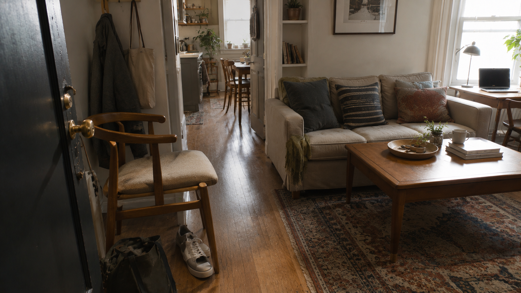
Example 1: A Good-Looking Room With Bad Spatial Logic
The first example matters because it looks believable. That is the danger.
A room can have nice furniture, natural light, decent materials, and still work badly. The problem may be a blocked door swing, a coffee table too close to the sofa, a weak entry zone, or a desk placed in harsh glare.
Study this kind of room by asking one question first: where does the body move? If the answer is unclear, the room is not solved yet.
Example 2: The Same Room in Plan and 3D

Illustration by ArchitectureCourses.org. Circulation has to be planned before furniture starts stealing the path.
This is one of the most useful ways to study spatial design: look at the same room in plan and in 3D.
The plan shows the route. The 3D view shows what the route feels like inside the room. A layout can look acceptable in plan but feel tight once furniture height, storage edges, table depth, and entry movement become visible.
Use this kind of diagram to check whether the room has one clear path, a usable storage edge, enough furniture clearance, and a logical entry point. If the 3D view makes the circulation feel worse than the plan suggests, the layout needs another pass.
Example 3: Blocked Circulation vs Clearer Circulation
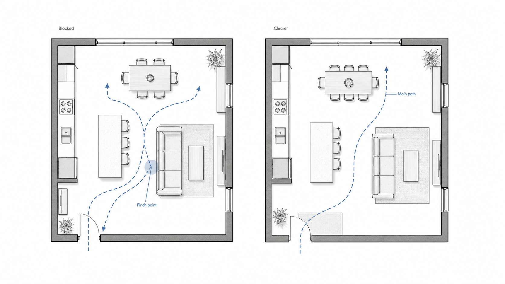
Illustration by ArchitectureCourses.org. Spatial design starts by fixing movement before style.
Circulation is the fastest way to expose a bad plan.
On the blocked side, the furniture, island, chairs, and paths compete for the same space. The room may still look furnished, but the movement is already damaged.
On the clearer side, the path is protected first. Furniture supports the route instead of stealing it. That is the basic difference between a decorated room and a planned room.
When studying any plan, draw the main path over the layout. Entry to seating. Kitchen to table. Bed to closet. Desk to storage. If the line keeps bending around objects that should not be in the way, the plan needs work.
Example 4: The Layers That Decide Whether Space Works
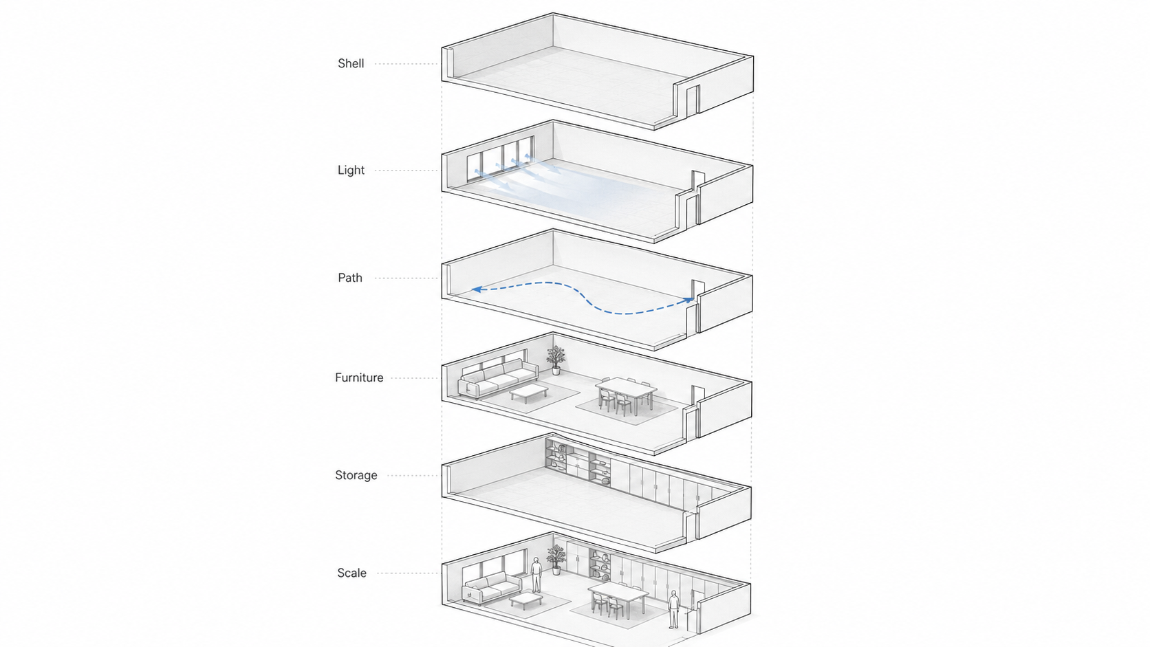
Illustration by ArchitectureCourses.org. Shell, light, movement, furniture, storage, and scale all affect whether a room works.
Spatial design is not one move. It is a stack of decisions.
The shell gives the room its limits. Openings bring light, view, air, and glare. The movement path decides whether people can use the room without friction. Furniture gives activity a place. Storage decides where daily life lands. Scale decides whether the room feels calm, tight, cold, or awkward.
Weak rooms usually fail because one layer ignores another. A window lands where the desk should go. Storage sits across the main path. Furniture fits the room but not the body. The shell looks clean, but the use is wrong.
Example 5: From Needs to Zones to a Plan
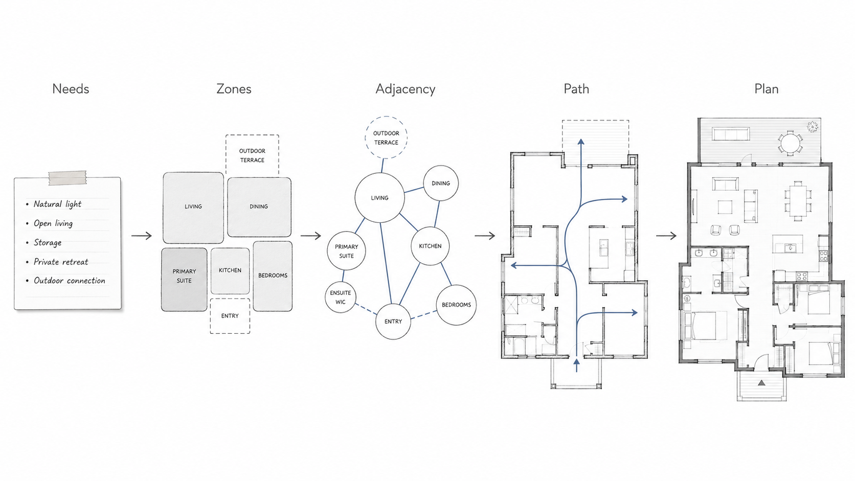
Illustration by ArchitectureCourses.org. Spatial planning turns loose needs into zones, paths, adjacencies, and a plan that can be tested.
A strong plan usually starts rough.
First come the needs. Then the zones. Then the relationships. Then the circulation. Only after that does the plan deserve clean lines.
Beginners often reverse this. They draw clean rooms too early, then try to force the use into them. That makes the drawing look finished before the thinking is done.
A rough plan is not a weak plan. It is the stage where bad relationships are still cheap to fix.
Example 6: Public, Private, Service, and Transition Zones
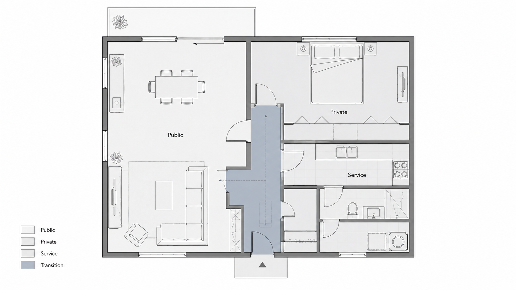
Illustration by ArchitectureCourses.org. A plan usually starts to make sense when public, private, service, and transition zones are separated clearly.
Zoning is not about making every space separate. It is about knowing which overlaps help and which overlaps cause trouble.
Public zones can handle movement, arrival, gathering, and shared use. Private zones need more control. Service zones need access, storage, water, cleaning, equipment, and maintenance. Transition zones are not leftover space; they are where people enter, pause, turn, wait, and change direction.
A plan gets muddy when these zones blur by accident. Public movement cuts through private work. Service storage sits far from where it is used. The entry has no landing space. The hallway is treated as leftover area instead of a working part of the plan.
Example 7: Adjacency Before Walls
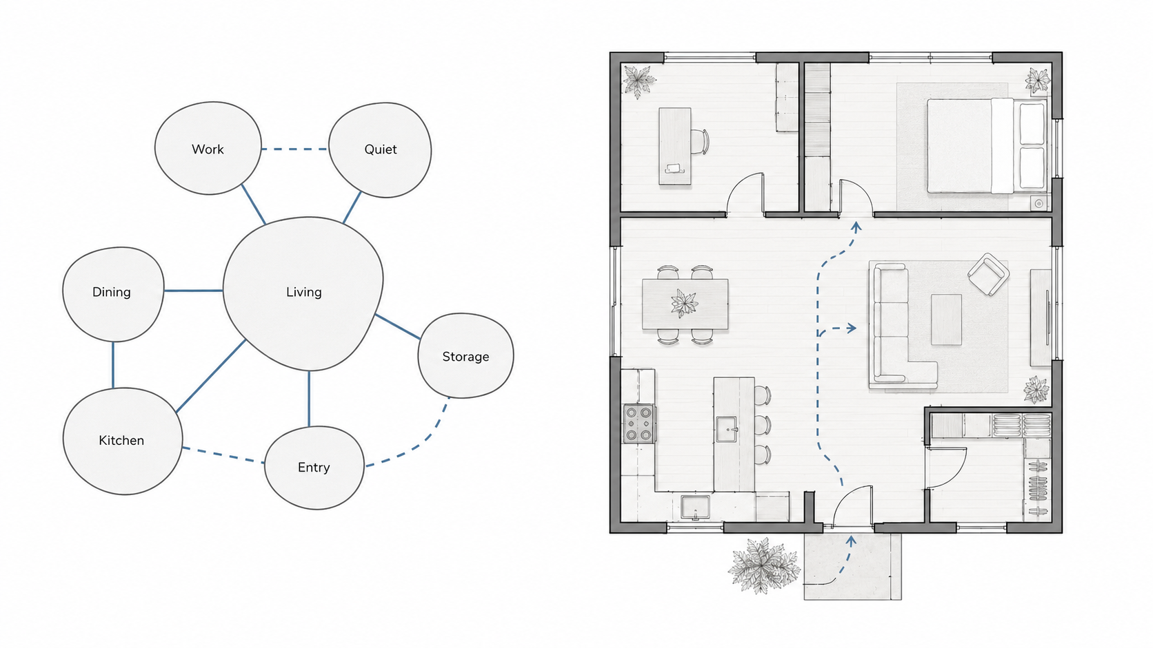
Illustration by ArchitectureCourses.org. Adjacency planning helps decide what belongs near what before the floor plan gets polished.
Adjacency is one of the quiet parts of spatial design. It decides what belongs near what.
Kitchen near dining usually helps. Noisy work beside quiet work usually hurts. Storage near the point of use saves frustration. A bathroom opening directly into a dining zone may technically fit and still feel wrong.
Bubble diagrams work because they delay false certainty. They let you test relationships before wall lines make the plan look more resolved than it is.
Example 8: Interior Layout Mistakes
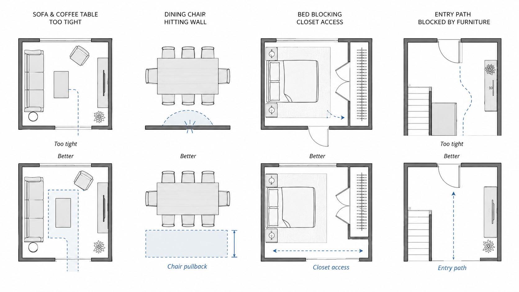
Illustration by ArchitectureCourses.org. Interior space planning fails when furniture is placed before movement, clearance, and daily use are tested.
Interior layout mistakes are usually small on paper and annoying in real life.
A coffee table is too close to the sofa. A dining chair cannot pull back. A bed blocks closet access. An entry path is filled with furniture because nobody planned where bags, shoes, keys, and deliveries would land.
The mistake is trusting fit. Fit is not enough. Furniture has to open, move, pull out, support use, and leave a path for people who are not standing still.
Example 9: The Room After Three Weeks
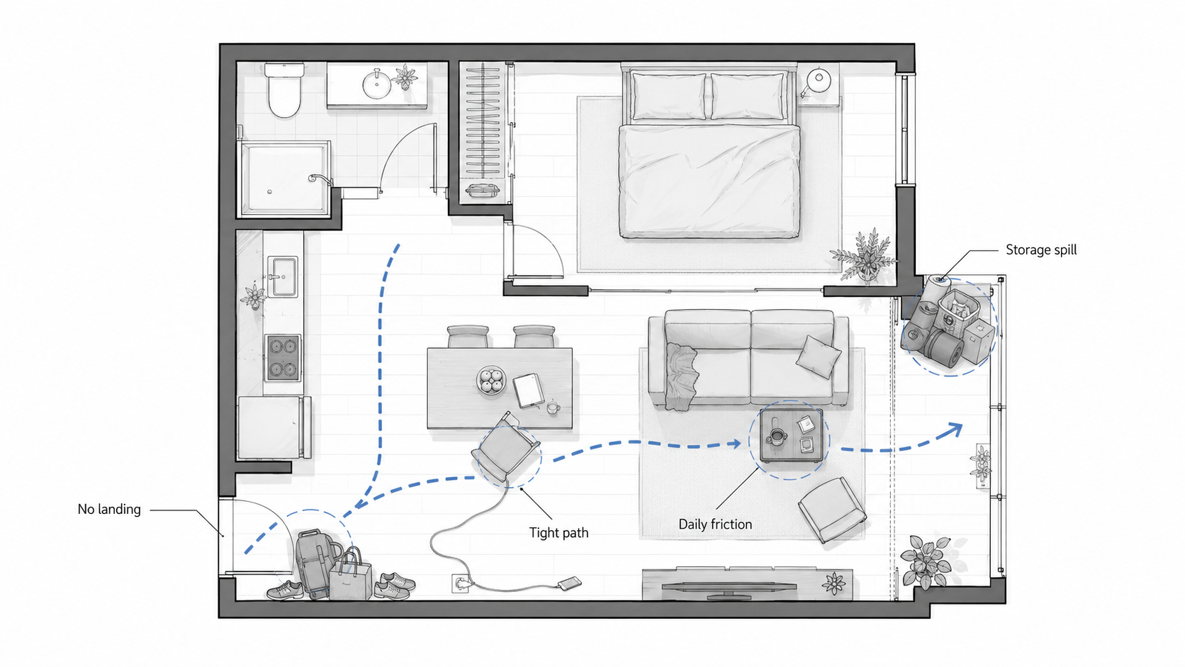
Illustration by ArchitectureCourses.org. A layout is not proven when empty. It is proven after bags, chairs, chargers, storage, doors, and daily movement start using the room.
Empty-room thinking is one of the biggest traps in spatial design.
A layout can pass on day one and fail after ordinary use starts. Bags pile near the entry. Chargers cross the path. A chair blocks circulation. A storage corner becomes the place everything goes because no better place exists.
This is why good spatial examples should be studied as occupied spaces, not empty compositions. A room that only works when nobody lives there is not finished.
Example 10: Small Room Before and After
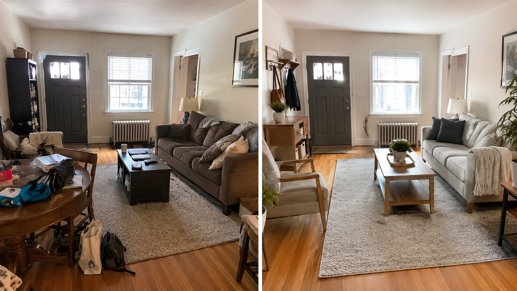
Image by ArchitectureCourses.org. Small rooms usually fail from blocked paths, missing storage, and furniture that is too large for the way the room is used.
Small rooms do not forgive vague planning.
The weak version tries to make every function equal: lounge, work, storage, guest seating, dining, exercise, and display. The result is clutter, not flexibility.
The stronger version chooses a main job first. It protects one clear path. It makes storage vertical or built into an edge. It lets secondary uses become lighter instead of forcing them all to compete.
A small room does not need tricks first. It needs priorities.
Example 11: Renovation Money Check
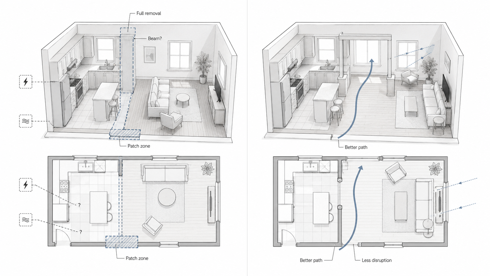
Illustration by ArchitectureCourses.org. A spatial check can stop the wrong renovation decision before demolition starts.
Spatial design gets expensive when layout assumptions turn into construction work.
A homeowner may think the room needs a full wall removal. Sometimes it does. But sometimes the real problem is a bad furniture path, a dark middle zone, a poorly placed opening, or an oversized island.
The diagram matters because it compares the expensive assumption with the smaller planning fix. Before demolition, the question is not “how do we open this up?” The better question is: what exact spatial problem are we trying to solve?
A smaller opening, better light path, or clearer circulation route can sometimes solve the daily problem with less structural, flooring, electrical, and cabinet disruption.
Example 12: AI Layout Check
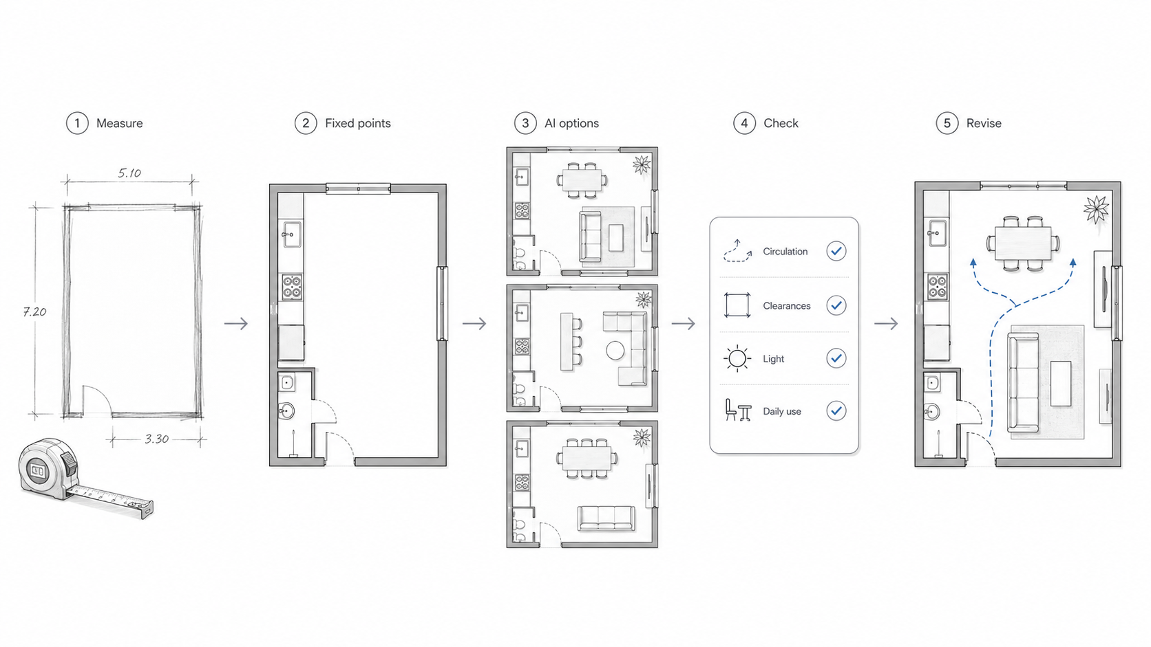
Illustration by ArchitectureCourses.org. AI helps most when it tests the layout before it decorates the room.
AI can help with spatial design, but only if the prompt asks for the right thing.
A weak prompt asks for a beautiful room. A stronger prompt gives room size, door locations, windows, furniture needs, storage problems, fixed plumbing, and the daily issue that needs solving.
Ask AI to test paths, clearances, glare, storage, smaller alternatives, and what could go wrong after furniture arrives. Then check the result yourself.
AI can make a bad plan look confident. It can ignore structure, door swings, outlets, real furniture size, and construction reality. Use it for options. Do not use it as proof.
Example 13: Interior and Spatial Design as a Field
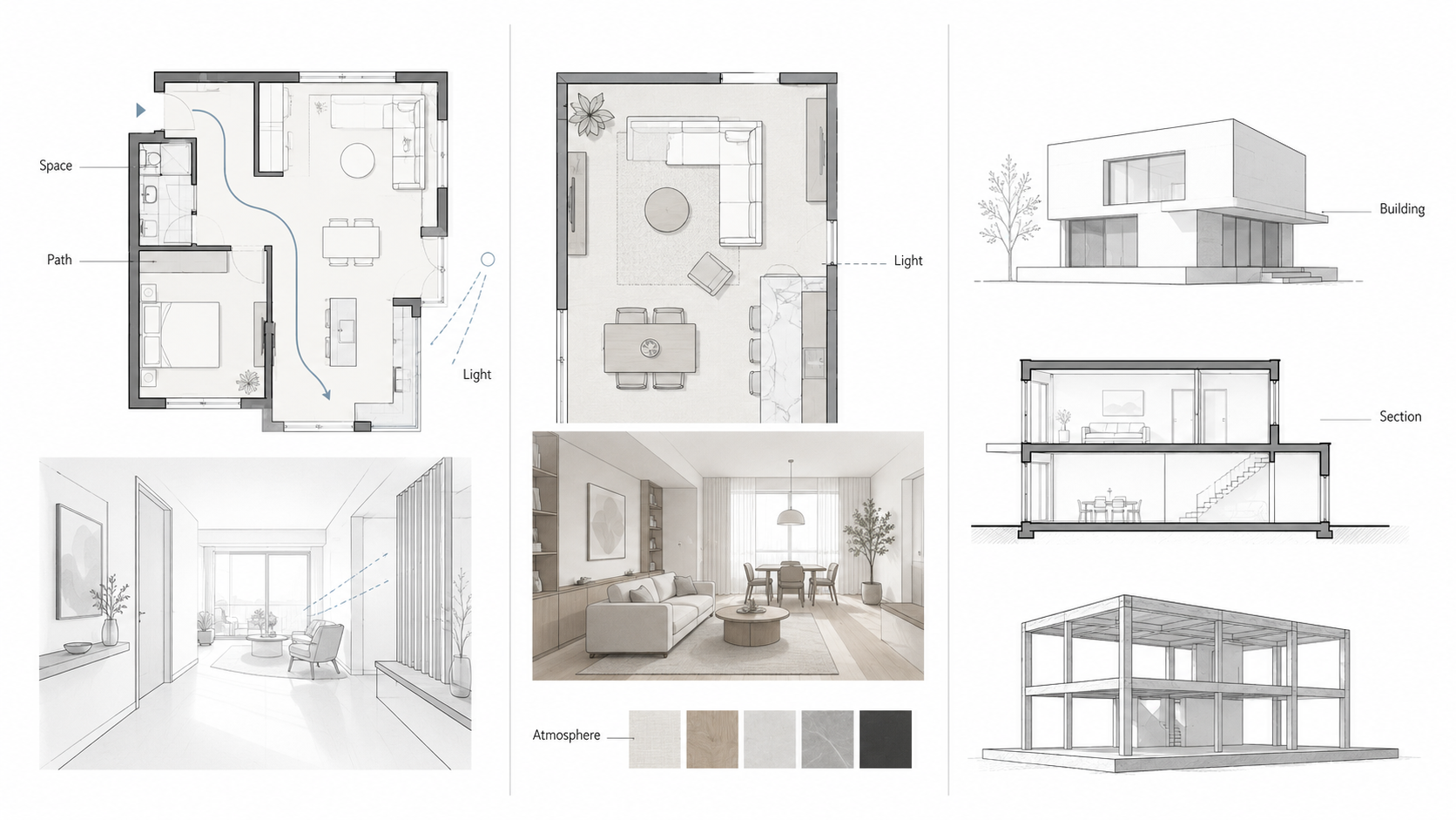
Illustration by ArchitectureCourses.org. Interior and spatial design overlaps with interior design and architecture, but its center is interior space, movement, atmosphere, and use.
This example is useful because it shows where the field sits.
Interior design, architecture, and spatial design overlap. The difference is the center of attention. Architecture often handles the building as a whole. Interior design often handles interior function, furnishing, atmosphere, and finish. Interior and spatial design sits strongly around interior space, movement, sequence, material experience, and use.
For the education and career version, use interior and spatial design.
Example 14: Studio Process, Not Decoration
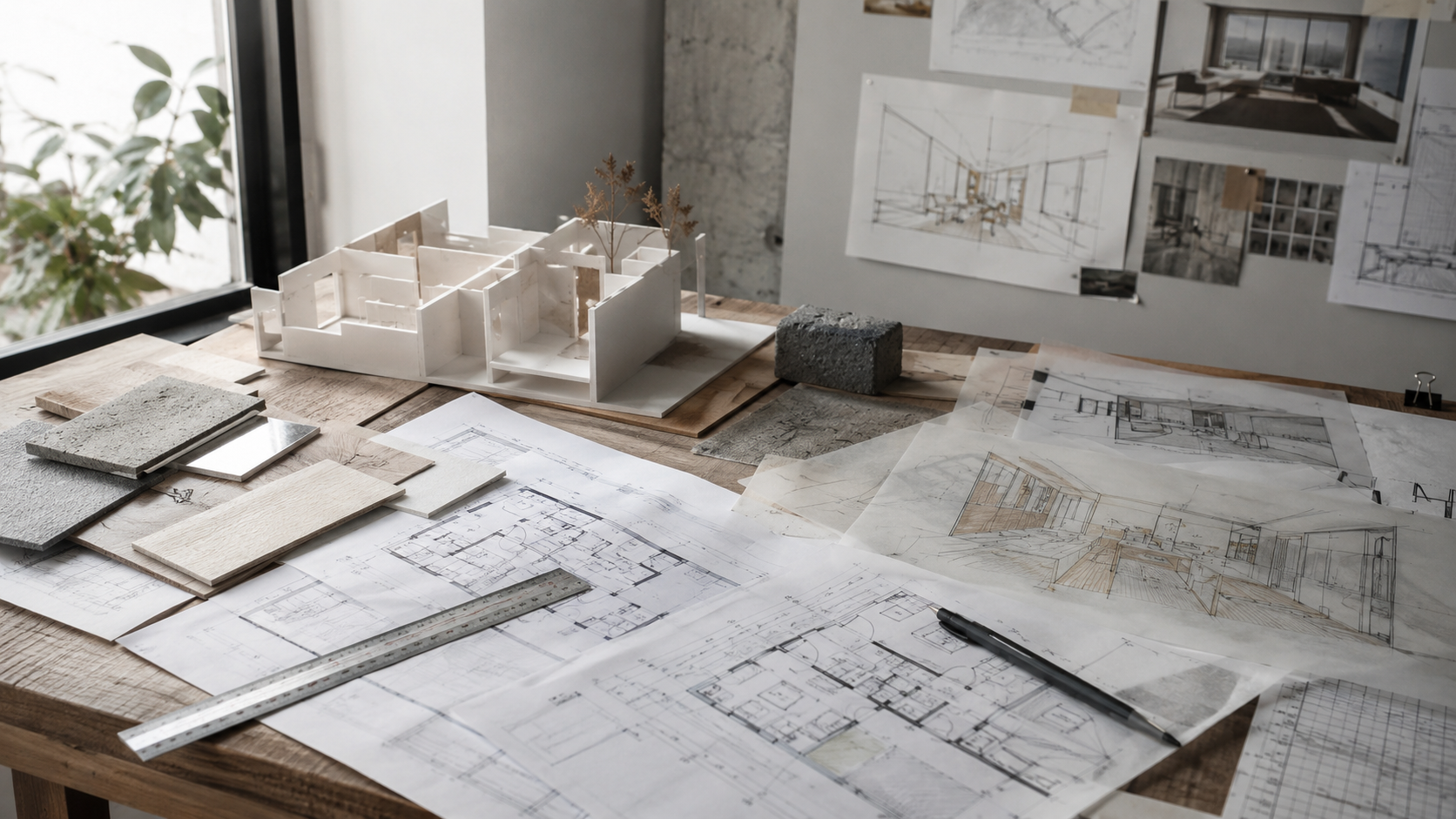
Image by ArchitectureCourses.org. Interior and spatial design begins with plans, models, materials, circulation, and light. The work is not only about styling a room. It is about testing how a space will be used before it is built.
A studio table is a good reminder that spatial design is not only the final image.
Plans, overlays, models, material samples, sketches, and lighting studies all test different parts of the same problem. The drawing checks movement. The model checks volume. The material sample checks touch and scale. The sketch checks an idea before it becomes too fixed.
A good spatial example should show some of that process. The finished view matters, but it should not be the only evidence.
Example 15: Portfolio Evidence
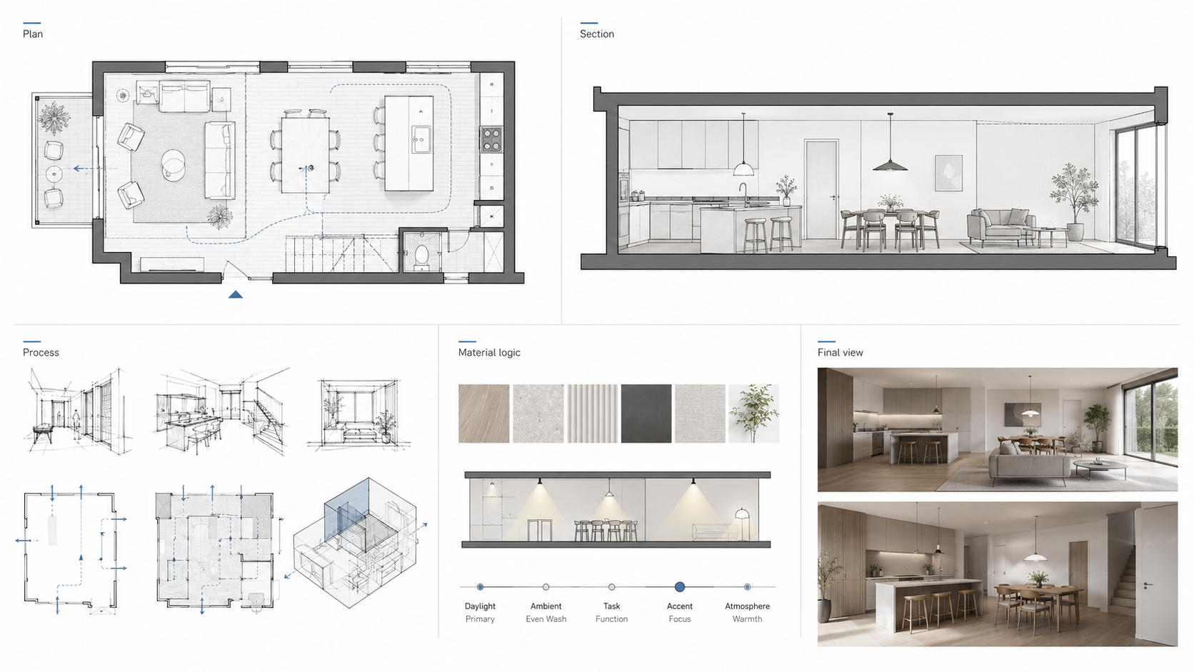
Illustration by ArchitectureCourses.org. Employers usually trust a portfolio that shows process and workable space, not just polished images.
A spatial design example is stronger when it shows process.
A finished view can impress quickly. A plan, section, circulation overlay, material logic, and tested layout prove more. They show that the designer can think, revise, and make a space work before rendering it.
Students should study examples this way. Do not only ask whether the image looks good. Ask whether the plan, path, light, scale, and use are visible.
The Diagram Can Lie If the Constraints Are Missing
A clean diagram can make a bad decision look smart.
This is the part many visual design pages skip. A diagram is only useful if it shows the constraints that matter: doors, windows, structure, plumbing, stairs, furniture clearance, service access, light, storage, and the real path through the room.
A circulation arrow means little if it ignores a door swing. A beautiful zone diagram means little if the kitchen plumbing has to move across the house. A furniture plan means little if the chair pullback is missing. A renovation option means little if the beam, ducts, electrical, and floor patch are not part of the decision.
Use diagrams as tests, not decoration. A strong spatial diagram should make the trade-off clearer. A weak diagram only makes the page look designed.
How To Study Any Spatial Design Example
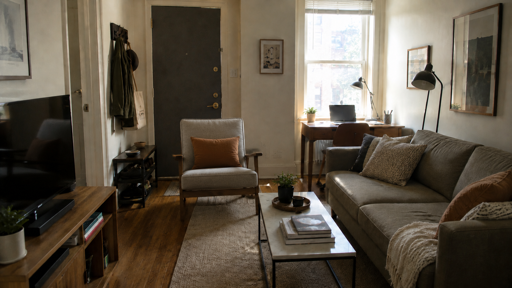
Image by ArchitectureCourses.org. A room can look calm and finished while still failing in daily use. The problem is not style here. It is the blocked entry path, tight furniture spacing, glare at the desk, and weak landing zone near the door.
Do not start by asking whether you like the style.
Start with the plan.
- Trace the main path. Entry to seating, kitchen to table, bed to closet, desk to storage.
- Find the zones. Public, private, service, transition, quiet, active, messy, clean.
- Check the edges. Doors, windows, outlets, cabinets, stairs, built-ins, storage, and furniture backs.
- Test the furniture. Chair pullback, drawers, bed clearance, table reach, walkways, and open doors.
- Study light and glare. Where does daylight help, and where does it make the room harder to use?
- Imagine week three. Bags, chargers, shoes, dishes, laundry, guests, pets, cleaning, and maintenance access.
- Ask what is fixed. Plumbing, structure, windows, stairs, exterior doors, and mechanical routes.
That is how examples become useful. You are not collecting images. You are learning how to see the problem earlier.
Read This Next
For the full concept behind these examples, read spatial design.
For the process of turning needs into zones, paths, adjacencies, and fixed-point checks, go to spatial planning and design.
For room-level layout and furniture decisions, use space planning and layout in interior design.
For the beginner version, keep space planning essentials nearby.
If you are studying the field, degree, or portfolio path, read interior and spatial design.