
CLEAN STRUCTURE
What the Doric Order Actually Does
The Doric Order is all about weight, proportion, and restraint. No ornament, no extra. Just strong columns and clear structure.
I’ve used Doric principles in both restoration and modern builds. When a space needs clarity, rhythm, and mass, this is what works. It gives shape without drawing too much attention—and that’s the point.
Here’s how Doric form holds up today, what makes it different from the others, and how to use it without turning it into a history prop.
What is the Doric Order?

DORIC BASICS
What the Doric Order Is and Why It Still Works
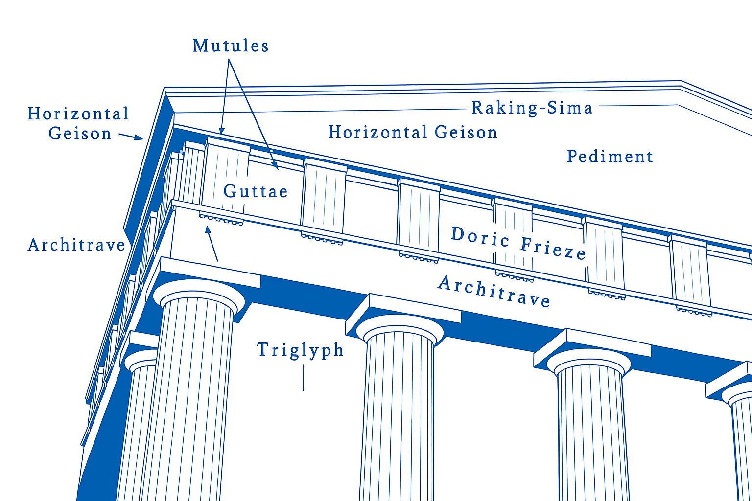
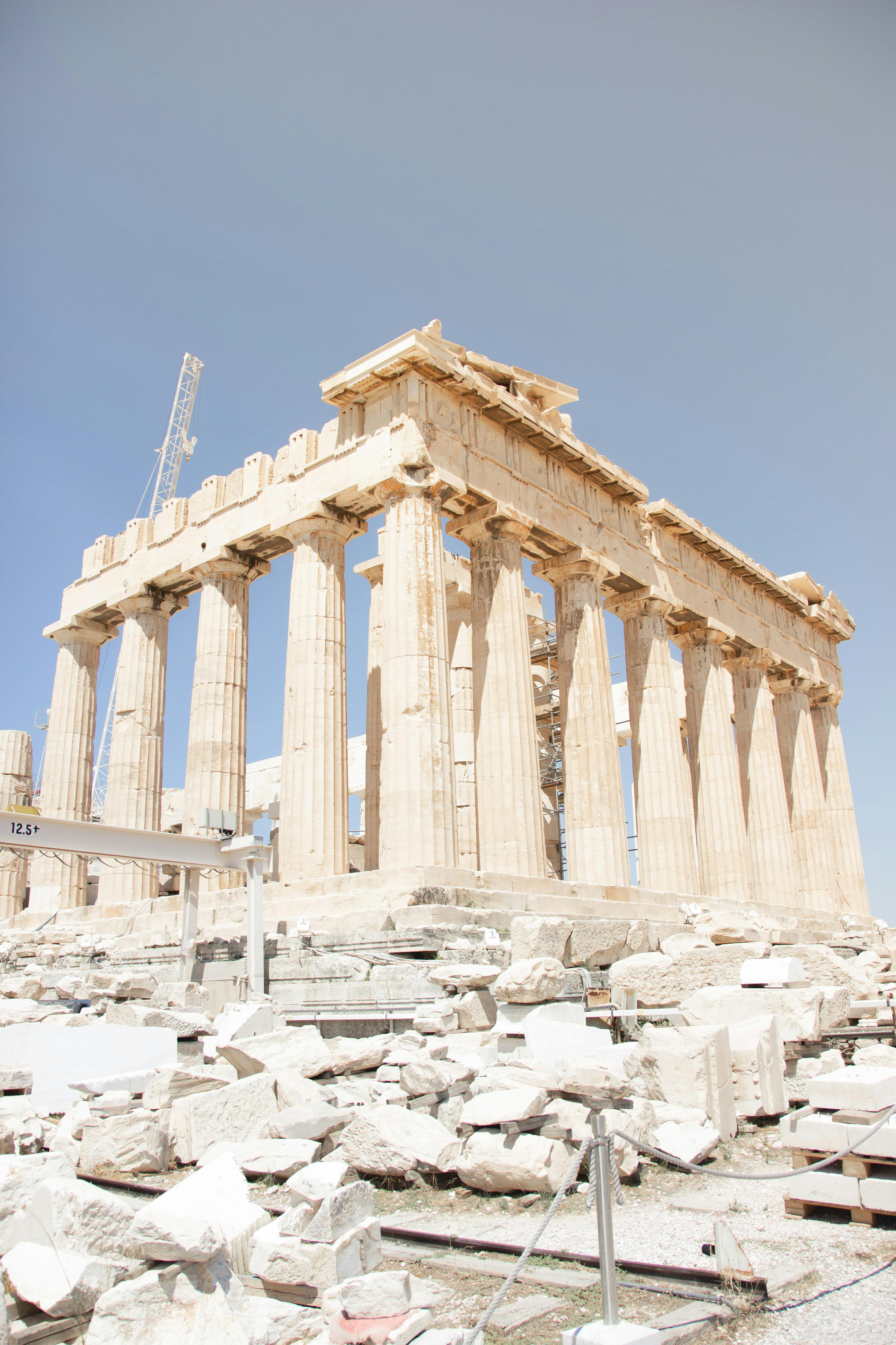
The Doric Order is the oldest and simplest of the classical Greek styles. No base. No curves. Just fluted columns, plain capitals, and solid proportions. Built for strength. Used for temples, halls, and anything meant to last.
KEY FEATURES
● Fluted Columns
Usually 20 vertical grooves. Light hits them clean. Adds rhythm without decoration.
● Plain Capital
No scrolls, no flowers—just a rounded top. Keeps attention on the form, not the fluff.
● No Base
Column hits the ground directly. Looks stable. Feels grounded.
● Simple Entablature
Architrave → Frieze (triglyphs + metopes) → Cornice. Clean layout, sharp rhythm.
WHY IT MATTERS
The Doric style puts structure first. No wasted detail. Just balance, weight, and clean proportion. That’s why it shows up in modern buildings, furniture, and interiors—anything that needs to feel solid and precise.
▪ I’ve used Doric patterns in civic buildings and stripped-down interiors. Works every time. Clean lines. No trend-chasing.
WHAT MAKES IT USEFUL
✓ Built fast, stays strong
✓ Easy to adapt—no ornament to clash with
✓ Matches modern minimalist taste without trying
STILL RELEVANT
Doric Today
Modern designers use Doric principles when they want visual weight and clarity. You’ll see it in stone benches, structural columns, and even table legs. The proportions still hold up. The look still fits.
Related
- Ancient Greek Architecture: Foundations, Features, and Influence
- Doric Architecture: Principles and Influence
WHERE IT STARTED
How the Doric Order First Took Shape
The Doric Order began in mainland Greece around the 7th century BCE. It came out of a need for strong, clear structures that were easy to build and made sense visually. Early versions were built in wood. As builders moved to stone, the same simple layout held up—fluted shafts, no base, solid balance.
It wasn’t about showing off. It was about structure that worked.
WHAT IT MEANT
Why the Doric Order Carried Cultural Weight
Doric wasn’t just a look. It stood for control, proportion, and stability. The Greeks saw it as masculine, civic, and serious—used for temples, public halls, and places where power needed to be shown without decoration.
Clean lines, wide stance, no fluff. It matched their values.
WHERE IT WENT
How Doric Spread and Stuck Around
From Greece, Doric moved across the Mediterranean. Used for forts, markets, and courtyards. The Romans picked it up later. Then the Renaissance brought it back again—same rules, slightly cleaner cuts.
Governments still use Doric forms today. Big steps, heavy columns, serious tone. It sends a message: solid, not fragile.
So:
✓ Origin: Started in Greece as a fix for wooden-to-stone construction.
✓ Meaning: Stood for strength, balance, and civic identity.
✓ Spread: Used in public buildings for 2,000+ years—still shows up in modern civic design.
Simplicity in Design: The Key Characteristics of the Doric Order

CORE ELEMENTS
Doric Order Characteristics That Still Work
The Doric Order is about structure, weight, and rhythm. Each feature has a job. Here’s what to focus on; and when it makes sense to use it.
1. FLUTED SHAFTS
Why the Columns Aren’t Smooth
Doric columns have 20 shallow vertical flutes. They cut shadows into the surface without adding decoration.
● What to Watch For
Flutes should be even, clean, and deep enough to catch light. Too wide and the rhythm breaks. Too shallow and they lose effect.
● Use This When
You want vertical emphasis without surface clutter—pillars, wall reliefs, even table legs.
● Skip This If
The material is too soft or exposed to abrasion—fluting wears fast on outdoor concrete or soft stone.
2. PLAIN CAPITALS
Rounded Tops That Keep It Grounded
No scrolls. No leaves. Doric capitals are basic discs that cap the shaft and carry weight cleanly.
● What to Watch For
Smooth transition between shaft and architrave. The capital should widen slightly without flaring.
● Use This When
You want the structure to feel grounded and quiet—especially in civic, institutional, or stripped-back modern projects.
● Skip This If
You need visual hierarchy or a decorative focal point at the top of your column.
3. NO BASE
Columns Go Straight to the Floor
Doric columns sit flush on the platform—no pedestal, no plinth. It anchors them visually and physically.
● What to Watch For
Clean joint at ground level. No interruption between floor and shaft.
● Use This When
You want the column to feel direct and permanent. Great for interiors where visual simplicity matters.
● Skip This If
You’re dealing with uneven flooring or moisture-prone ground—no base means no buffer.
4. TRIGLYPH FRIEZE
The Rhythm in the Entablature
Above the columns: a plain beam (architrave), then a frieze alternating triglyphs (vertical grooves) and metopes (flat panels). Clean. Repetitive. Solid.
● What to Watch For
Triglyphs must align with the centerlines of columns below. Misalignment breaks the rhythm.
● Use This When
You want visual cadence—great for façades, stair railings, cabinet tops.
● Skip This If
Your design needs flexibility or asymmetry. The Doric frieze locks you into a strict layout.
5. PROPORTIONS THAT HOLD WEIGHT
Wider. Shorter. Built to Support.
Doric columns follow a squat ratio—about 1:6 (height to diameter). It gives them weight and stance.
● What to Watch For
Columns that feel too tall will lose their Doric feel. Stay thick. Stay grounded.
● Use This When
You want to signal strength—good for entries, civic halls, or anything meant to look solid.
● Skip This If
You need elegance or vertical lift. Doric can feel heavy in narrow spaces.
USEFUL NOTES
Small Details That Matter
✓ Triglyphs = Structural Memory
They echo wooden beam ends from early Greek construction.
✓ Entasis = Optical Trick
Doric shafts bulge slightly in the middle to counteract visual sagging.
✓ No Ornament = Longevity
Fewer details mean less to break, chip, or date. That’s why it’s still around.
✓ Used Outside Religion
Don’t box Doric into temples. It showed up in meeting halls, city walls, and later civic structures—and still does today.
Doric design is about structure with discipline. Clean lines. Sharp joints. Real materials. Use it when you want form that holds its own; without needing to shout.
WHY IT STILL MATTERS
Doric Design in Modern Architecture
Doric architecture works because it’s blunt, balanced, and structural. That’s exactly what modern design often needs—something that reads strong without trying too hard.
You’ll see it in civic buildings, libraries, schools, and offices. Not for show. For presence.
Use Case:
Fluted columns in a clean open space add rhythm without decoration. It’s not nostalgia—it’s structure doing its job.
MODERN USES
Where Doric Elements Show Up Now
✓ Public spaces: clean entryways, columned walkways, overhangs
✓ Office lobbies: fluted wall panels, solid support posts
✓ Homes: subtle pilasters, plain capitals, grounded bases
This isn’t about copying history. It’s about using clarity and proportion to shape strong forms.
WHY IT WORKS
Function First, Form Follows
The Doric Order cuts out what you don’t need: no extra curves, no fragile detail. Just strength, proportion, and visual weight.
Design Takeaways:
● Fluting = soft texture without clutter
● Plain capital = clean transition
● No base = direct connection to the ground
● 1:6 ratio = balance without elegance overload
REAL IMPACT
When You Want Something That Looks Built to Last
A modern city office doesn’t need Corinthian leaves. It needs visual weight. Doric delivers that. So does a school, courthouse, or high-traffic commercial space.
This isn’t decoration. It’s structure with clarity.
PRACTICAL BUILDING USE
How to Apply Doric Principles Today
✓ Straightforward Construction
Clean lines = less time, less material waste. Fluted molds in precast concrete = speed and detail together.
✓ Structural Strength
Short, thick columns work. Use Doric dimensions when load-bearing support needs to look intentional.
✓ Modern Materials That Fit
▪ Concrete: easy fluting, strong visual depth
▪ Steel: sleek, scaled-down interpretation
▪ Composites: good for interiors, lightweight but architectural
✓ When It Works Best
● Open interiors that need subtle division
● Projects with symmetry or strict grid layouts
● Public buildings that need to feel stable without being flashy
USABLE DESIGN ELEMENTS
How to Use Doric Without Going Full Classical
Fluting (Vertical Grooves)
Where: Room dividers, wall panels, kitchen islands
Material: MDF, plaster, concrete, stone veneer
Tip: Keep spacing clean and consistent. It’s about rhythm, not detail.
Plain Capitals
Where: Table legs, porch supports, kitchen columns
Material: Timber, steel, stone
Tip: Slight overhangs. No fillets, no scrolls.
Base-less Grounding
Where: Outdoor columns, pergolas, entryways
Tip: Use slab-to-shaft joints. No raised pads unless necessary for drainage.
KEY PRINCIPLES THAT STILL WORK
What Doric Teaches That’s Still Useful
✓ Simple = strong
✓ Rhythm builds order
✓ Function can shape form
✓ You don’t need ornament to get presence
These rules work across design fields—architecture, interiors, even furniture.
CASE STUDY
Public Library with Doric Influence
We used fluted columns to frame the front entrance—no base, no fuss. Inside, exposed beams carried the same rhythm. Visitors mentioned it felt both quiet and solid. That’s the goal.
The point wasn’t to look Greek. It was to build with restraint—and let the layout speak.
WHAT TO KEEP IN MIND
Doric Principles in Real Use
● Only use fluting where it’s visible and clean
● Proportions must feel stable—don’t stretch it
● Avoid mixing orders—stay consistent across structure
● Use honest materials—stone, steel, concrete, or realistic composites
EXTRA DETAILS THAT STILL MATTER
Design Trivia With a Purpose
● Triglyphs = Beam Memory
They came from timber frames, kept for rhythm. Use sparingly today for texture.
● Entasis = Visual Correction
Slight column bulge keeps them from looking concave. Still used in high-end projects.
● Roman Tweaks
They added bases. If you want the look but need durability, that’s a legit modern option.
● Modern Versions
Some designers are casting Doric columns in glass or steel. Works when proportions stay clean.
WHAT MOST PEOPLE MISS
Why Doric Design Feels Honest — And Why That Matters Now
You can spot fake design from a mile away. Veneered columns, decorative panels pretending to hold weight, pointless trim that exists just to exist.
Doric doesn’t do that.
Doric shows structure doing exactly what it’s meant to do—visibly, clearly, with no cover-up. That’s rare in modern construction. Most buildings now hide their bones. They stuff beams in drywall, bury connections, and pretend mass with foam facades.
But here’s the real insight:
The Doric Order was never about style. It was about making strength visible.
You saw where the weight went. You saw how things stacked. The fluting, the spacing, the ratios—none of it was decoration. It was communication.
In a time when most design hides behind surfaces, Doric reminds you how to show the structure with clarity—and still make it beautiful.
That’s why using Doric principles today doesn’t just change the look. It changes the honesty of a space.
▪ Want people to trust what they’re walking into? Show real structure.
▪ Want a lobby to feel permanent, not staged? Show how it holds itself up.
▪ Want architecture that’s more than image? Stop hiding how it’s built.
People feel the difference—even if they can’t name it. It’s the feeling of being in a space that isn’t pretending. That’s the power of Doric done right.
FINAL TAKE
What Makes Doric Useful, Not Just Historic
Doric is about structure that holds its own. It works now for the same reasons it worked 2,500 years ago: clear lines, smart proportions, and materials that age well.
You’re not borrowing from history. You’re using what lasts.
FAQ
1. What is the Doric Order?
The Doric Order is one of the three classical architectural styles from ancient Greece, known for its simplicity and strength. It features fluted columns, plain capitals, and a straightforward entablature, making it the least ornate of the classical orders.
2. What are the key characteristics of the Doric Order?
- Fluted Columns: Vertical grooves running along the shaft.
- Plain Capitals: Rounded, unembellished tops.
- No Base: Columns rest directly on the ground.
- Simple Entablature: Includes a plain architrave, a frieze with triglyphs and metopes, and a simple cornice.
- Proportions: Shorter, sturdier columns designed for stability.
3. Why was the Doric Order used in ancient architecture?
The Doric Order was favored for its practicality and structural integrity. Its sturdy design made it ideal for large public buildings where strength and functionality were essential.
4. How is the Doric Order different from the Ionic and Corinthian Orders?
- Doric: Simplest and sturdiest, with plain capitals and no base.
- Ionic: More decorative, featuring volutes (scroll-like ornaments) on its capitals and a base for its columns.
- Corinthian: The most ornate, with elaborate capitals adorned with acanthus leaves.
5. Where can I see examples of the Doric Order today?
You can find Doric-inspired designs in many civic and institutional buildings around the world. Modern interpretations often appear in government offices, libraries, and even minimalist home designs.
6. How does the Doric Order influence modern architecture?
The Doric Order’s emphasis on clean lines, strong proportions, and functionality aligns perfectly with modern minimalist and functionalist design trends. Its principles are used in both structural elements and decorative features today.
7. What materials were originally used in Doric architecture?
Early Doric structures were made of wood, but later transitioned to stone for greater durability. Today, materials like concrete, steel, and composites are used to emulate Doric aesthetics in contemporary designs.
8. Can Doric principles be adapted for interior design?
Absolutely! Fluted columns, plain capitals, and grounded, base-less structures can be incorporated into interiors as decorative elements or functional supports. They add a sense of timeless elegance to modern spaces.
9. What’s the story behind the triglyphs in the Doric frieze?
Triglyphs represent the ends of wooden beams from early Greek timber construction. Even as architects transitioned to stone, triglyphs were retained as a decorative nod to these structural roots.
10. Why are Doric columns considered “base-less”?
Unlike Ionic and Corinthian columns, Doric columns sit directly on the ground without a base, emphasizing a grounded and sturdy appearance. This feature reinforces the visual and structural simplicity of the Doric style.
Keep Learning:
Books
- "The Classical Orders of Architecture" by Robert Chitham.
- "Radical Classicism: The Architecture of Quinlan Terry" by David Watkin.