Book Review
A plain look at what Erin Gates' 2014 design book still gets right, what feels dated now, and how homeowners and design students should actually use it.
My Take After Reading It Now
Elements of Style is still worth reading more than a decade on, though not because every room in it looks current. It's worth reading because you get to watch a decorator actually think through a room: how she handles scale, restraint, and comfort, how she works around a real family with pets and a budget, and how the small decisions add up to a house that feels finished instead of staged.
Just don't come to it for construction advice. It won't teach you permits, code, structure, drawings, or how to sequence a renovation. Come to it to get better at looking at a room and understanding why one feels calm and another feels expensive and wrong.
I'm Not Judging It Like a New Book
This isn't a review of Elements of Style as a new design book, because it isn't new. It came out in 2014, and parts of it show that. The fairer question is whether it still helps someone make better room decisions today, not whether every fabric and product choice has kept up with the trends. The test I care about is simpler: does it still teach scale, editing, comfort, and judgment?
That's how I read it. The book earns its keep when it slows you down and makes you ask why a room works, and it gets weaker the moment you treat it as a shopping guide or a stack of rooms to copy.
Basic Book Details
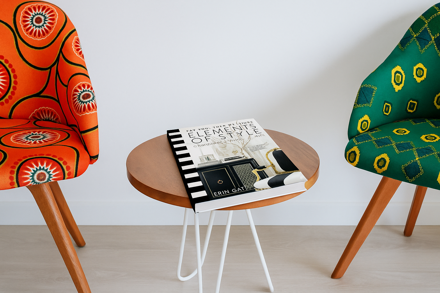
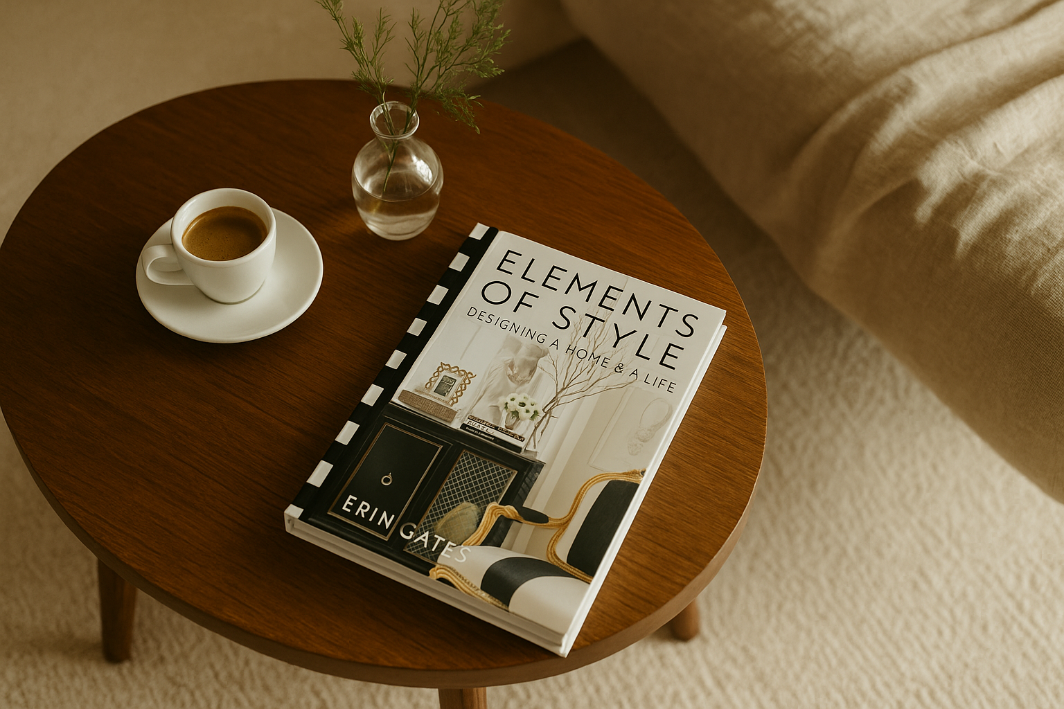
- Title: Elements of Style: Designing a Home & a Life
- Author: Erin Gates
- Publisher: Simon & Schuster
- First published: 2014
- Best for: homeowners, first-time decorators, interior design students, and junior designers learning how to talk about rooms.
- Not best for: technical architecture, construction drawings, permits, or detailed renovation planning.
Why I Still Think It Works
The book works because it never treats a home like a perfect showroom. The rooms are polished, but the real lesson sits under the polish, where Gates is dealing with taste, money, awkward rooms, pets, kids, storage, and the plain fact that a room has to keep working after the photo is taken.
That's the useful part. Anyone can look at a styled room and say they like it; the harder and more useful move is to keep asking why it works, whether the sofa is the right size, whether the rug is doing its job, whether the color is quiet on purpose, whether the pattern is held in check, and whether the calm comes from symmetry, from the lighting, or from half the extra stuff being edited out. That's where Elements of Style still connects with the basic interior design fundamentals, because it hands you enough worked examples to start reading rooms instead of just collecting pretty pictures.
Do Not Use It as a Shopping List
The shallowest way to read this book is as a shopping list. Read it one room at a time instead, and start by asking what problem the room had before it turned pretty. Was it flat, too formal, too dark, too empty, too crowded? Then go looking for the move that fixed it, which might be scale, or lighting, or one strong fabric, or a quieter wall, or just fewer things in the room. That habit will get you further than copying a paint color off a page and hoping your room suddenly looks designed.
What It Gets Right
Scale Comes Before Style
This is probably the best lesson in the book. A lot of bad rooms aren't bad because of color; they're bad because the pieces are the wrong size. The sofa is too deep, the rug floats in the middle of the floor, the art hangs too high, the lamps are too small, the coffee table sits a long reach from the seat. The furniture can be perfectly nice and the whole room still feels slightly off. Gates' stronger examples help you see that proportion sets the room before decoration ever gets a say.
The Rooms Feel Lived In
The strongest pages don't read like museum rooms. They're styled, but they still understand use, and that matters more than it sounds. A room can photograph beautifully for one afternoon and fail the family by the next morning. Where do the shoes, the bags, the chargers, the dog bed, and the daily mail actually go, along with all the ugly things every house has to absorb? The book is at its best when it remembers that a room has to survive ordinary life.
It Teaches Restraint Without Making Rooms Cold
Gates is good at holding back, leaning on texture, trim, soft contrast, good light, and a few well-chosen pieces rather than piling things on. The better rooms are clearly decorated and still don't shout for attention. Beginners tend to reach for more color when a room feels flat, and that can work, but it's not always the fix. It's worth checking the texture, the light, the furniture height, and the rug first, and asking whether the room needs one fewer thing rather than one more. That's where the book quietly teaches texture and pattern better than a dry theory page would.
It Gives Designers Better Words
This part is genuinely useful for students and junior designers. Clients describe rooms with words like classic, modern, cozy, clean, warm, and "not too fancy," and those words can mean wildly different things to different people. A book full of worked rooms gives both sides something concrete to point at, so you can ask whether a room reads calm because of the palette, the symmetry, the window treatment, the lack of clutter, or the soft materials. That's a far better conversation than arguing over style labels.
What Has Aged
You can feel 2014 in the book. Some of the styling, the product references, and the blog-era personal writing belong to that moment. None of that makes it useless; it just means you shouldn't treat it as current shopping advice. Take the product ideas as categories instead, the sofa and rug and lamp and side table and window treatment, and then check today's prices, lead times, quality, and reviews before you buy anything.
Some readers will also wish for less memoir and more room breakdown, which is fair. The personal writing is what gives the book its voice, but if you're in project mode you can skim those stretches and spend the time studying the photos.
What the Book Cannot Teach You
A beautiful room photo never tells you what the house allowed. It doesn't show the outlet locations, the floor slope, the window height, the HVAC grille, the ceiling crack, the old radiator, the awkward door swing, or the storage problem sitting just outside the frame, and those are the details that decide what's actually possible in a real house.
So don't jump straight from a book spread to buying furniture. Measure the room, photograph it from the doorway, mark the walking paths, check the outlets, and watch how the daylight moves before you commit to anything. That goes double in an older home, where the trim, ceiling height, window placement, and room proportions all push back, and the decorating has to respect the building it sits in. That side of the work has more in common with natural lighting in architectural design than with shopping.
How Homeowners Should Use It
- Pick one room, not the whole house.
- Write down the room's main problem in plain words: dark, crowded, flat, cold, mismatched, empty, or hard to use.
- Find one spread in the book with a similar feeling, not just a similar style.
- Study scale before color: rug size, sofa depth, art height, lamp height, and how far the side table sits from the seat.
- Change one thing at a time, instead of repainting, swapping the rug, buying lamps, and adding art all in the same weekend.
How Design Students Should Use It
Students should treat the book as eye training rather than an image library. Saving your favorite rooms isn't the exercise; explaining why each one works is.
- Redraw one room layout and mark the circulation paths.
- Find the largest visual object in the room and notice what it does.
- Find the quietest wall and ask why it was left quiet.
- Compare paired objects with single ones: lamps, chairs, side tables, art, pillows.
- Write one sentence on how the room uses balance.
Pretty isn't analysis. A designer has to see the structure, rhythm, weight, contrast, and use underneath the styling.
Room Lessons Worth Borrowing
Entry
The entry should calm the house down before it decorates it. One mirror, one landing surface, one lamp, and one honest place for the daily mess will usually beat a crowded console.
Living Room
The living room comes down to scale. Get the rug under at least the front legs of the main seating, keep the tables close enough to actually use, and give the room more than one light source, because one ceiling fixture over five decorative objects is still a badly lit room.
Kitchen
The kitchen lesson is restraint. Too many finishes make a kitchen look expensive and nervous at the same time, so let one thing lead, whether that's the cabinet color, the counter, the tile, or the hardware, and don't make all of them compete.
Bedroom
The bedroom is softness with control. The bedding, lamps, curtains, and headboard height do more for the room than a mountain of pillows, and the comfort should look intentional rather than staged.
Bath
The bathroom is about lighting and finish discipline. Side lighting is kinder than one harsh fixture overhead, and a tight finish palette goes a long way, especially in a small bathroom.
Fast Tests Before You Buy Anything

- The doorway test: take a photo from the hall. If the room looks noisy from the entrance, remove something before you add anything.
- The rug test: tape out the rug size on the floor before ordering. A too-small rug makes even good furniture look cheap.
- The lamp test: turn off the ceiling light at night. If the room dies, you don't need more decor, you need better lighting.
- The palette test: keep to three main colors, one wood tone, and one metal direction. More can work, but only when you know what's leading.
- The storage test: decide where the ugly daily items live before you style the visible ones.
Who Should Buy It
- Homeowners who want a better eye before they spend money.
- Beginners who need room-by-room examples instead of abstract design theory.
- Interior design students learning to explain scale, tone, texture, and balance.
- Junior designers who need better client language for classic-modern rooms.
Who Can Skip It
- Readers after construction details, code advice, or architectural drawings.
- Homeowners who only want current product shopping links.
- Designers who already own a shelf of advanced interiors books and want deeper technical analysis.
- Anyone who dislikes personal essays mixed into design advice.
Is It Still Worth Reading?
Yes, with the right expectations. Elements of Style isn't the newest book on the shelf or a current product guide, and some of it is tied to the blog era it came from. But the useful core has held up: it teaches you to look at rooms with judgment, to study the scale, to study the editing, and to see how a calm room is built out of many small decisions. Skip the dated parts, resist copying the rooms outright, and use it to sharpen your eye before you spend the money.
Book Link
Elements of Style by Erin Gates
See price and availability on Amazon: Elements of Style book details.
Read This Next
-
A plain guide to layout, furniture, finishes, and room logic.
-
Core design elements explained
Line, shape, color, texture, and how they affect rooms.
-
Symmetry, asymmetry, visual weight, and why some rooms feel calm.
-
Why size, height, spacing, and rhythm matter before decoration.
-
How undertones, daylight, and mood affect paint and finish choices.
-
Texture and pattern in practice
How to add depth without making a room feel busy.
-
More books for learning architecture, design thinking, and visual judgment.
Sources and book details
Next: use balance in room design to apply these lessons to your own layout.