Most buildings are serious by default. They have to be. Budgets, codes, schedules. Nobody is trying to be funny.
But if you spend enough time around buildings, you start noticing small moments that feel light. Not jokes. Just moments where the space behaves in a way you didn’t expect.
This isn’t theory. It’s observation.
Where it usually shows up
It shows up in small decisions.
- A window that frames one specific tree.
- A stair landing that makes people stop without knowing why.
- A bench that gets used more than the designer probably planned.
- A corner that feels calmer than the rest of the room.
None of these are loud moves. They don’t announce themselves.
Most of it comes from constraints
A lot of these moments exist because something else didn’t work.
- The site was awkward.
- The budget was tight.
- The structure forced a compromise.
- Mechanical systems needed space.
The clean idea gets adjusted. Something odd remains. People notice it later.
This happens more often than people admit.
Architects notice it. Others just feel it.
Architects see the reason behind it. Everyone else just feels the effect.
A space feels lighter. Or easier. Or a little surprising.
This has a lot to do with basic spatial ideas like order and emphasis. Not the academic version. The everyday version. What draws your eye first. What settles into the background. That logic is explained simply in this guide on hierarchy.
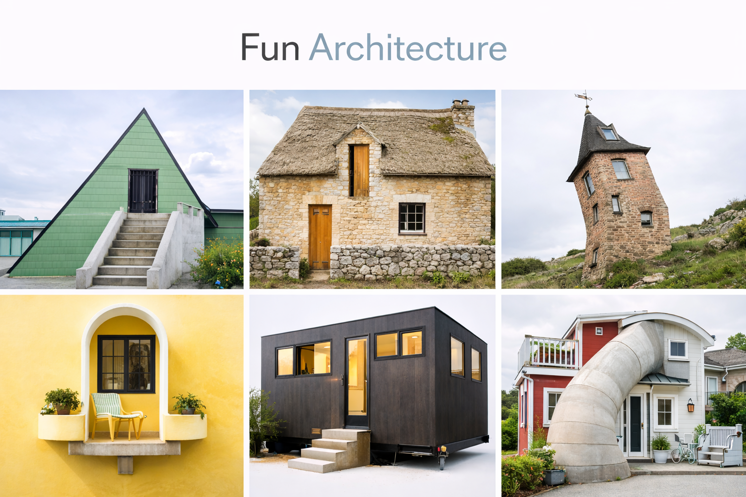
Some buildings lean into it
A few buildings don’t hide their oddness.
The Big Basket building in Ohio looks exactly like what it is. People remember it because it doesn’t pretend to be something else.
The Crooked House in Poland feels distorted, but the distortion is controlled. That’s why it works.
They aren’t jokes. They’re confident decisions.
Student projects show this early
You see this a lot in student work.
Not because students are better designers. Because nothing has been polished away yet.
- Temporary structures.
- Installations that react to movement.
- Spaces that change as you walk through them.
Some of it is messy. Some of it fails. A few ideas stick.
Clear drawing helps these ideas survive. Not fancy drawings. Clear ones. This drawing guide is useful for that.
Why people respond to it
People relax when a building isn’t rigid.
They move slower. They linger. They treat the space better.
That response doesn’t come from decoration. It comes from how space is arranged.
The moment buildings stop behaving
There is a point where a building stops acting like it was drawn.
Not because it failed. Because people took over.
Doors get propped open even though they were designed to close. Corners become meeting spots without chairs. Steps turn into seats. Railings become leaning points. Someone always sits where nobody planned a seat.
This is the part most architecture writing skips.
Design intent ends. Use begins.
Over time, the building develops habits. The quiet shortcut everyone takes. The window people always open. The spot where deliveries pile up no matter how many times it gets cleared.
No drawing shows this.
What’s interesting is that the best buildings don’t fight it. They absorb it.
You can see it years later. Worn stone at one stair edge. A polished patch on a handrail. A door that swings differently because it’s used more than expected.
These marks are not damage. They’re feedback.
Most projects are judged on day one. Photographed clean. Empty. Perfect.
The real test starts after.
Good buildings age into something better than their drawings. Bad ones get brittle and angry.
This is why some spaces feel alive and others feel tight even when they’re new.
The quiet truth is this: the most human part of architecture is the part you didn’t design.
The design process doesn’t stop at buildings
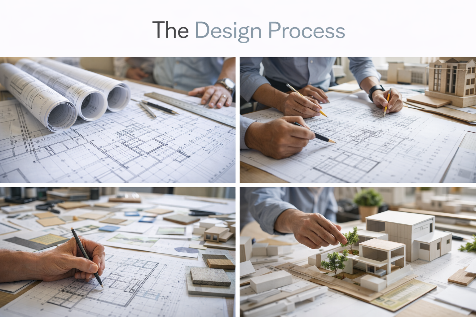
Architecture school teaches a process, but nobody tells you it sticks.
At first it’s just studio. You break problems down. You test options. You move things around until something feels right.
Then it leaks.
You start doing it with everything.
Cooking becomes layout. You prep first because you hate running back and forth. You line ingredients in the order you’ll use them. You adjust heat like you adjust light. Too much, pull back. Too flat, add contrast.
Setting up a desk turns into space planning. Where the screen sits. Where the light comes from. What stays within arm’s reach. What stays out of sight.
Even conversations get filtered. What’s the main idea. What supports it. What’s noise.
This isn’t a personality trait. It’s training.
Architects spend years learning how to look at a mess and turn it into something readable. That habit doesn’t shut off at 6pm.
Sometimes it’s useful. You’re calm when things go sideways. You don’t panic when plans change. You’re good at fixing problems that don’t have clear answers.
Sometimes it’s exhausting.
You overthink simple things. You rearrange rooms that don’t need it. You see flaws everywhere. You notice bad proportions in restaurants and can’t unsee them.
The process becomes muscle memory.
Good days, it feels like a quiet superpower.
Bad days, it means you can’t just leave things alone.
But here’s the part most people miss.
This way of thinking works far beyond architecture. It’s the same logic behind organizing a workflow, fixing a broken routine, or figuring out why something feels off even when it technically works.
That’s why architects tend to drift into other fields without realizing it. Design management. Teaching. Construction. Product. Even running households.
The building was just the training ground.
The real skill was learning how to shape chaos into something livable.
Closing note
Architecture doesn’t need to entertain.
But when a building leaves room for a small human reaction, people notice. Even if they can’t explain why.
FAQ
Is playful architecture intentional?
Sometimes. Often it’s the result of problem-solving.
Does it belong in serious projects?
Yes. Especially where people spend time.
Is it about style?
No. It shows up in many styles.
Why do people remember these buildings?
Because most buildings are neutral. Difference stands out.