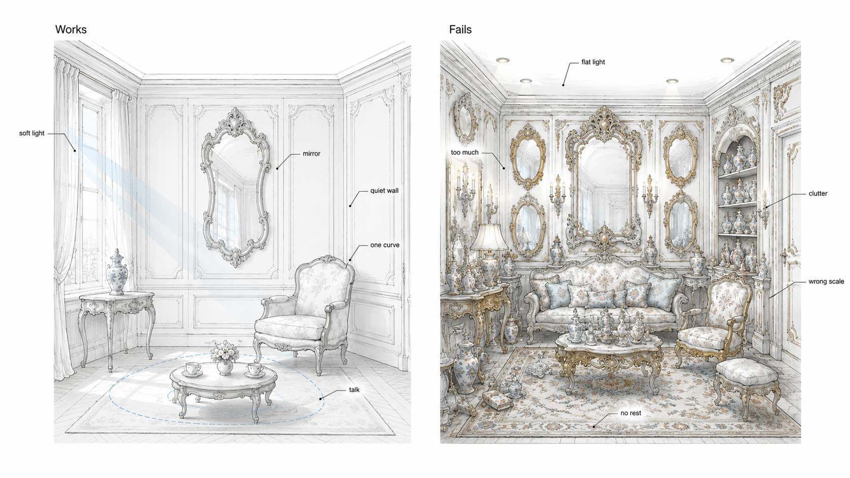
Rococo interior design fails when it becomes a pile of pretty objects.
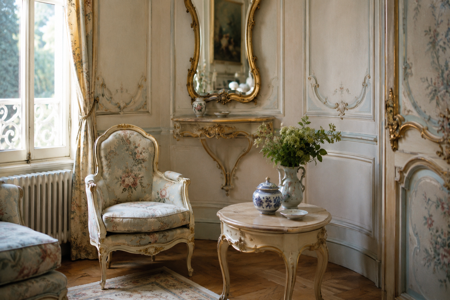
The style works best at close range. A curved chair, a shaped mirror, a pale wall panel, a porcelain object, a soft ceiling edge, and daylight reflected across a room can do more than heavy ornament spread everywhere.
Rococo came after Baroque, but it changed the scale of the experience. Baroque often builds drama through stairs, halls, domes, axes, and large movement. Rococo moves closer to the body. It cares about sitting, talking, looking, reflecting, touching, and noticing small surface changes from a few feet away.
For the larger history, use Baroque and Rococo architecture. For the direct comparison, use Baroque vs Rococo. Here the focus is interiors: rooms, panels, mirrors, color, furniture, light, and the mistakes that make Rococo look fake.
How Rococo Interior Design Organizes a Room
A Rococo room is not organized by one heavy focal point. It is organized by several close-scale moves working together: mirror, panel, chair, light, object, ceiling edge, and conversation.
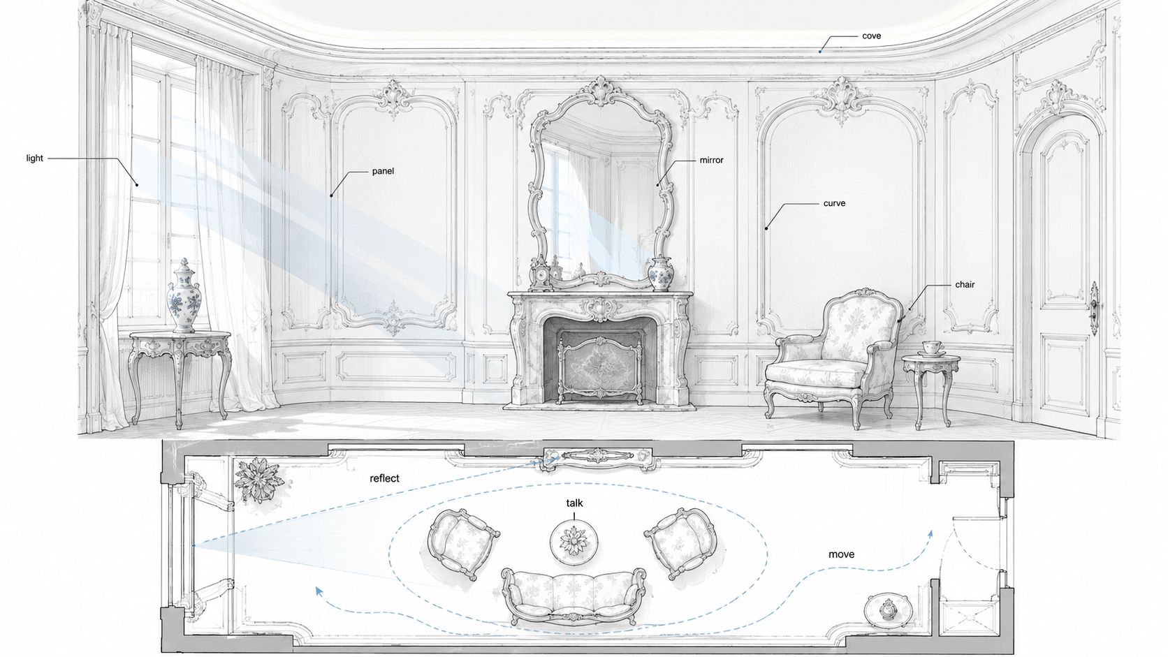
The best Rococo rooms feel light because the parts support each other. The mirror catches daylight. The wall panels give the eye a soft rhythm. The chair and table create a place for conversation. The ceiling edge lifts the room without making it heavy.
What Makes an Interior Rococo?
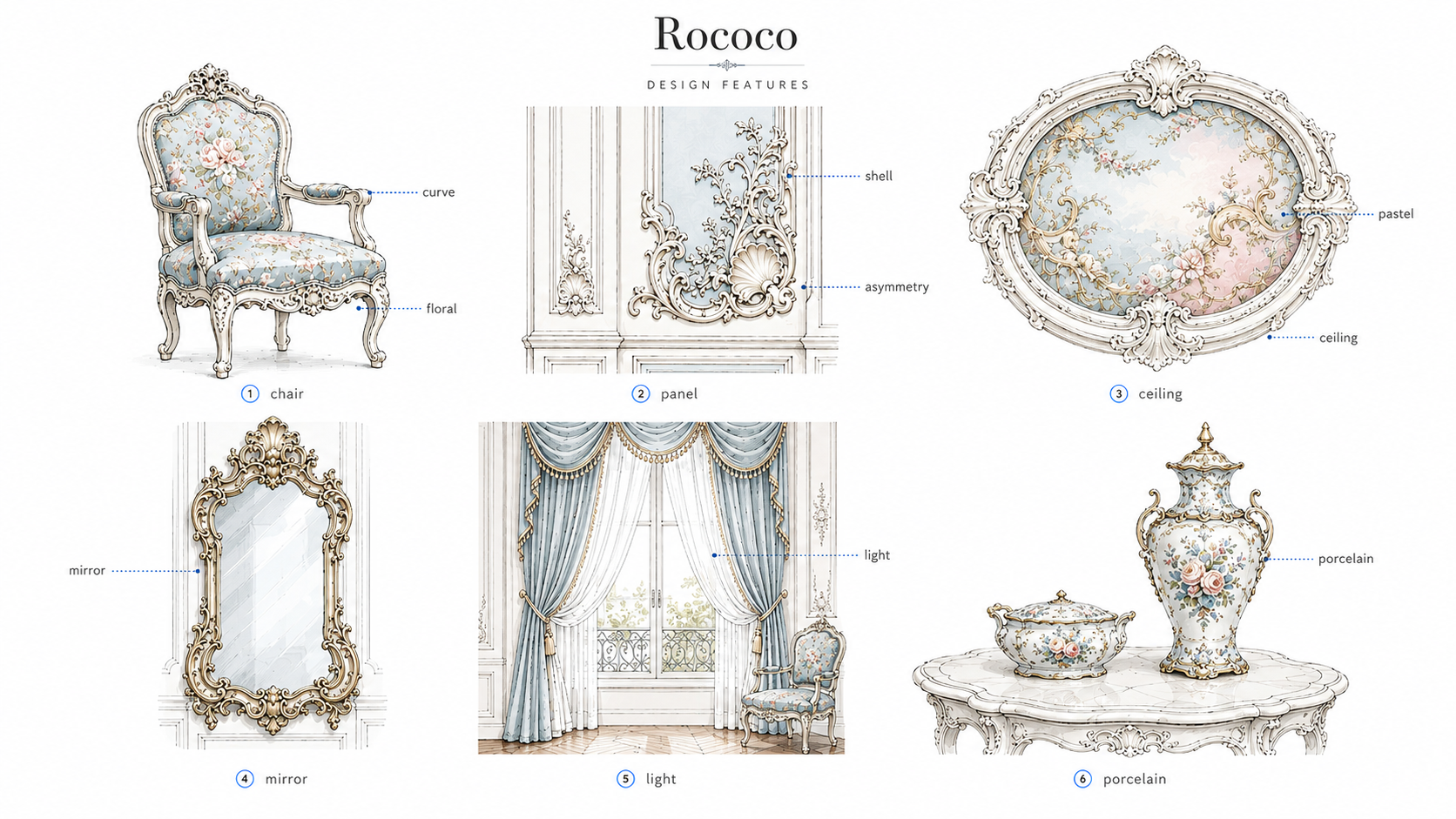
Rococo interiors are built around lightness, curves, reflection, small-scale ornament, and social comfort.
The room usually feels softer than Baroque. Walls may curve or seem to flow through panel lines. Mirrors extend daylight. Furniture legs bend. Colors stay pale. Ornament appears around frames, panels, ceiling edges, and furniture rather than crushing the whole room.
| Rococo element | What to look for | What it does |
|---|---|---|
| Curved panels | C-curves, S-curves, soft frames, shaped wall fields | Makes walls feel lighter and less rigid |
| Mirrors | Shaped frames, paired mirrors, reflected daylight | Expands light and makes small rooms feel animated |
| Pale color | Cream, pale blue, soft green, dusty rose, warm white | Softens the room and keeps ornament from feeling heavy |
| Furniture | Curved legs, small tables, light chairs, conversation groupings | Shapes social use instead of only filling space |
| Close detail | Shells, flowers, gilded edges, porcelain, small carvings | Rewards slow looking from nearby |
Rococo Is an Interior-First Style
Rococo is strongest inside rooms.
That does not make it less architectural. A Rococo room still has structure, proportion, circulation, light control, and hierarchy. The difference is that the architecture and decoration are tied closely to furniture, mirrors, paneling, fabric, and social use.
In a strong Rococo interior, the walls do not sit in the background while furniture gets added later. The chair, mirror, panel, fireplace, console, ceiling edge, and window light all belong to the same room logic.
The room is designed from the seated position
Baroque often impresses while you enter or climb. Rococo often works while you sit.
That changes everything. Mirror height, chair angle, wall panel scale, table size, and daylight direction all matter because people experience the room during conversation, reading, music, tea, dressing, or private gathering.
Curves Should Feel Light, Not Heavy
Rococo curves are usually smaller and more delicate than Baroque curves.
They appear in chair legs, mirror frames, wall panels, ceiling coves, console tables, carved trim, and small decorative objects. The curve should guide the eye gently. It should not make the room feel swollen or overbuilt.
Curves that work
- Curved chair backs that soften a seating group.
- Shaped mirrors that reflect light without dominating the wall.
- Wall panels with rounded corners or flowing frames.
- A light ceiling cove instead of a heavy crown.
- Small console tables with curved legs near a mirror or window.
Curves that fail
- Oversized scrolls in a small room.
- Random curved furniture that blocks circulation.
- Heavy plaster curves under a low ceiling.
- Matching curved pieces everywhere until the room feels restless.
A Rococo room needs movement, but it also needs ease. If every line bends, nothing feels graceful.
Mirrors Are More Than Decoration
Mirrors are one of the main tools of Rococo interior design.
A mirror can brighten a corner, double a window, extend a wall, reflect a chandelier, or create a small moment of depth above a fireplace or console. In small rooms, that matters more than extra ornament.
| Mirror placement | Good effect | Bad effect |
|---|---|---|
| Across from a window | Reflects daylight and makes the room feel deeper | Can create glare if the sun hits directly |
| Above a fireplace | Gives the wall a clear focal point | Looks awkward if the mirror is too tall or too modern |
| Between wall panels | Breaks up the surface and adds light | Feels busy if panels, frames, and furniture all compete |
| Behind a console | Creates a composed small scene | Reflects clutter if storage is poor |
The mirror should reflect something worth seeing: daylight, a calm wall, a garden view, a lamp, a doorway, or a carefully arranged seating area. If it reflects clutter, a television, a ceiling fan, or a hallway mess, it works against the room.
Color Should Soften the Room
Rococo color is usually light, but it should not feel weak.
Cream, warm white, pale blue, dusty rose, soft green, light gray, muted peach, and aged gold can all work. The danger is making the palette too sweet or too cold.
Pale color needs texture. Limewash, plaster, silk, linen, painted wood, porcelain, and aged metal give soft colors something to hold. Flat plastic paint under cool LED light can make Rococo colors feel cheap.
Color combinations that work
- Cream walls with pale blue panels and aged brass details.
- Warm white plaster with dusty rose fabric and dark wood accents.
- Soft green walls with cream trim and a shaped mirror.
- Pale gray-blue with white paneling and porcelain details.
- Muted peach or blush used in a small sitting room, dressing room, or powder room.
Test color at night. Rococo rooms often look good in soft daylight and worse under cold ceiling lights. The palette should survive evening use.
Furniture Has to Shape Conversation
Rococo furniture is not only about curved legs and decorative carvings.
The furniture should help people sit, talk, read, write, drink, play music, or move through the room. Chairs should face each other comfortably. Small tables should be close enough to use. The room should feel social, not staged.
Furniture that fits Rococo logic
- Curved armchairs placed in pairs or small groups.
- Small round or oval tables that support conversation.
- A console table under a mirror.
- A writing desk near soft daylight.
- A settee or small sofa that leaves walking space around it.
Avoid buying a full matching Rococo-style set. That often makes the room feel like a showroom. One or two curved pieces can say enough.
Wall Panels Are Where Rococo Usually Wins or Fails

Wall panels carry much of the Rococo effect.
The panel layout needs to respect doors, windows, outlets, switches, vents, baseboards, furniture height, and mirror placement. If those practical things are ignored, the room looks fake even if the trim itself is expensive.
Good paneling decisions
- Panels sized around real furniture, not drawn as a pattern first.
- Mirrors placed inside or between panel fields.
- Trim shallow enough for the room size.
- Panel rhythm adjusted around windows and doors.
- Wall lights planned before the trim layout is finalized.
Rococo paneling should feel light and coordinated. If it becomes a grid of heavy rectangles, it loses the point.
Ornament Should Stay Close to the Hand
Rococo ornament works best where people can see it closely.
Shells, flowers, leaves, scrolls, gilded edges, porcelain, carved chair frames, small painted scenes, and delicate metalwork belong near mirrors, furniture, consoles, panel edges, and ceiling transitions.
Large high surfaces usually need less detail. A ceiling can have a soft cove, a light medallion, or a painted edge without becoming crowded.
| Ornament location | Good use | Common mistake |
|---|---|---|
| Mirror frame | One shaped frame as a focal point | Too many ornate mirrors in one room |
| Chair frame | Curved legs and small carved detail | Oversized furniture that blocks the room |
| Wall panel | Light trim with small accents | Heavy molding copied from large rooms |
| Ceiling edge | Soft cove or restrained medallion | Busy plaster under a low ceiling |
| Porcelain or objects | A few placed pieces with color and scale | Overfilled shelves that become clutter |
Small Rooms Can Handle Rococo Better Than Baroque
Rococo often works well in small rooms because the style is already close-scale.
Powder rooms, bedrooms, dressing areas, sitting rooms, reading corners, small dining rooms, and boutique interiors can all use Rococo ideas without needing palace scale.
Small-room moves that work
- A shaped mirror with warm side sconces.
- Pale wall color with one delicate panel rhythm.
- A curved chair beside a small table.
- A soft ceiling cove instead of heavy crown molding.
- One porcelain lamp, vase, or object as color detail.
The risk is clutter. Small Rococo rooms need editing. Keep fewer objects, better light, and enough blank surface around the detail.
The Hidden Problem: Rococo Is Hard to Clean and Repair
Rococo looks delicate because it has many edges.
Those edges collect dust. Curved furniture can be harder to repair. Gilding wears unevenly. Fabric stains. Small carvings chip. Mirrors show fingerprints and double clutter. Wall panels crack at joints if the room moves or humidity changes.
| Feature | Maintenance issue | Better choice |
|---|---|---|
| Gilded trim | Shows chips and bad touch-ups | Use aged brass or small gold accents instead of heavy gilding |
| Wall panels | Cracks at joints and conflicts with outlets | Plan panel layout around real services |
| Curved chairs | Harder upholstery and frame repair | Use one or two strong pieces, not a full set |
| Mirrors | Show fingerprints and reflect mess | Place mirrors where they reflect light or calm surfaces |
| Porcelain display | Can become fragile clutter | Use fewer pieces with better spacing |
A Rococo-inspired room should be livable. If the room becomes too fragile to use, the design has failed.
Rococo vs Baroque in Interiors
Rococo and Baroque often get confused because both use curves, ornament, and theatrical effect.
The difference is scale and mood. Baroque is heavier, deeper, and more architectural. Rococo is lighter, smaller, and more intimate. Baroque often controls arrival. Rococo often controls conversation.
| Interior issue | Baroque | Rococo |
|---|---|---|
| Main effect | Drama, power, arrival, depth | Lightness, intimacy, pleasure, conversation |
| Best room type | Hall, stair, dining room, library, lobby | Sitting room, salon, bedroom, powder room, dressing room |
| Furniture | Heavier, more formal, more architectural | Lighter, curved, smaller, more social |
| Color | Dark wood, marble, gold, deep paint, strong contrast | Cream, pastel, soft gold, pale blue, green, rose |
| Common mistake | Too heavy for the room | Too sweet or too cluttered |
For a fuller comparison, use Baroque vs Rococo.
How to Use Rococo Without Making It Look Fake
The safest approach is to choose one Rococo job for each room.
- Powder room: shaped mirror, sconces, pale color, one patterned surface.
- Bedroom: soft paneling, curved headboard, warm lamps, quiet palette.
- Sitting room: curved chairs, small table, mirror, conversation layout.
- Dining room: light chandelier, wall panels, mirror, pale wall color.
- Dressing area: mirror, stool, small table, warm side light.
Do not spread Rococo evenly across the whole house. Use it where intimacy and detail make sense.
What to Avoid
- Too many ornate mirrors in one room.
- Cold LED lighting over pale colors and gilded edges.
- Full matching furniture sets that make the room feel staged.
- Heavy Baroque trim mixed with delicate Rococo furniture.
- Wall panels that ignore outlets, vents, switches, and furniture.
- Pastel colors with no texture or contrast.
- Porcelain and objects filling every shelf.
- Cheap gold paint on plastic trim.
A Practical Room-by-Room Plan
| Room | Best Rococo move | Keep it from looking fake by... |
|---|---|---|
| Powder room | Shaped mirror, sconces, pale wall color | Using good light and one strong surface |
| Bedroom | Soft paneling, curved headboard, warm lamps | Keeping color calm and furniture practical |
| Sitting room | Curved chairs, small table, mirror, conversation layout | Leaving enough walking space |
| Dining room | Light chandelier, mirror, panels, pale walls | Sizing the fixture and panels to the real room |
| Dressing area | Mirror, stool, small console, side light | Avoiding clutter and harsh overhead lighting |
FAQ
What is Rococo interior design?
Rococo interior design is a light, curved, decorative interior style known for pale colors, mirrors, shaped panels, delicate ornament, curved furniture, porcelain, soft light, and intimate room settings.
What colors are common in Rococo interiors?
Common colors include cream, warm white, pale blue, soft green, dusty rose, muted peach, light gray, and small aged-gold accents.
Is Rococo the same as Baroque?
No. Rococo developed after Baroque and is usually lighter, smaller, softer, and more interior-focused. Baroque is heavier and more dramatic.
Can Rococo work in a modern home?
Yes, if it is used with restraint. A shaped mirror, pale paneling, curved chair, warm sconces, or one delicate focal wall can bring Rococo character without making the room feel fake.
What makes Rococo interiors look cheap?
Cheap gold paint, plastic trim, harsh lighting, too many objects, full matching furniture sets, and pastel color with no texture can all make Rococo interiors look fake.
Which rooms are best for Rococo design?
Sitting rooms, bedrooms, powder rooms, dressing areas, small dining rooms, and boutique interiors usually work best because Rococo is a close-scale interior style.
The Better Way to Use Rococo Interiors
Rococo interior design works when it feels intimate, not crowded.
Use curves to soften the room. Use mirrors to move light. Use pale color with texture. Use furniture for conversation. Use ornament close to the hand and eye. Leave enough quiet surface so the detail can breathe.
Rococo should make a room feel lighter, warmer, and more social. If the room becomes fragile, cluttered, or sugary, the style has lost its discipline.