
Color Picks, Hype, and Who’s Actually Pulling the Strings
Most “Color of the Year” articles read like a paint catalog wrote them. Same recycled quotes. Same fake excitement. Same beige nonsense.
But behind all that? There’s a real system. Committees. Forecasting agencies. Brand deals. Psychological testing. It’s not just about what looks nice on a wall—it’s about mood, marketing, and money.
I’ve sat in those strategy meetings. I’ve seen how one shade goes from a Pantone chip to showing up in hotel lobbies, shoe soles, and throw pillows worldwide. And no, it’s not random.
This article cuts the crap. I’ll show you:
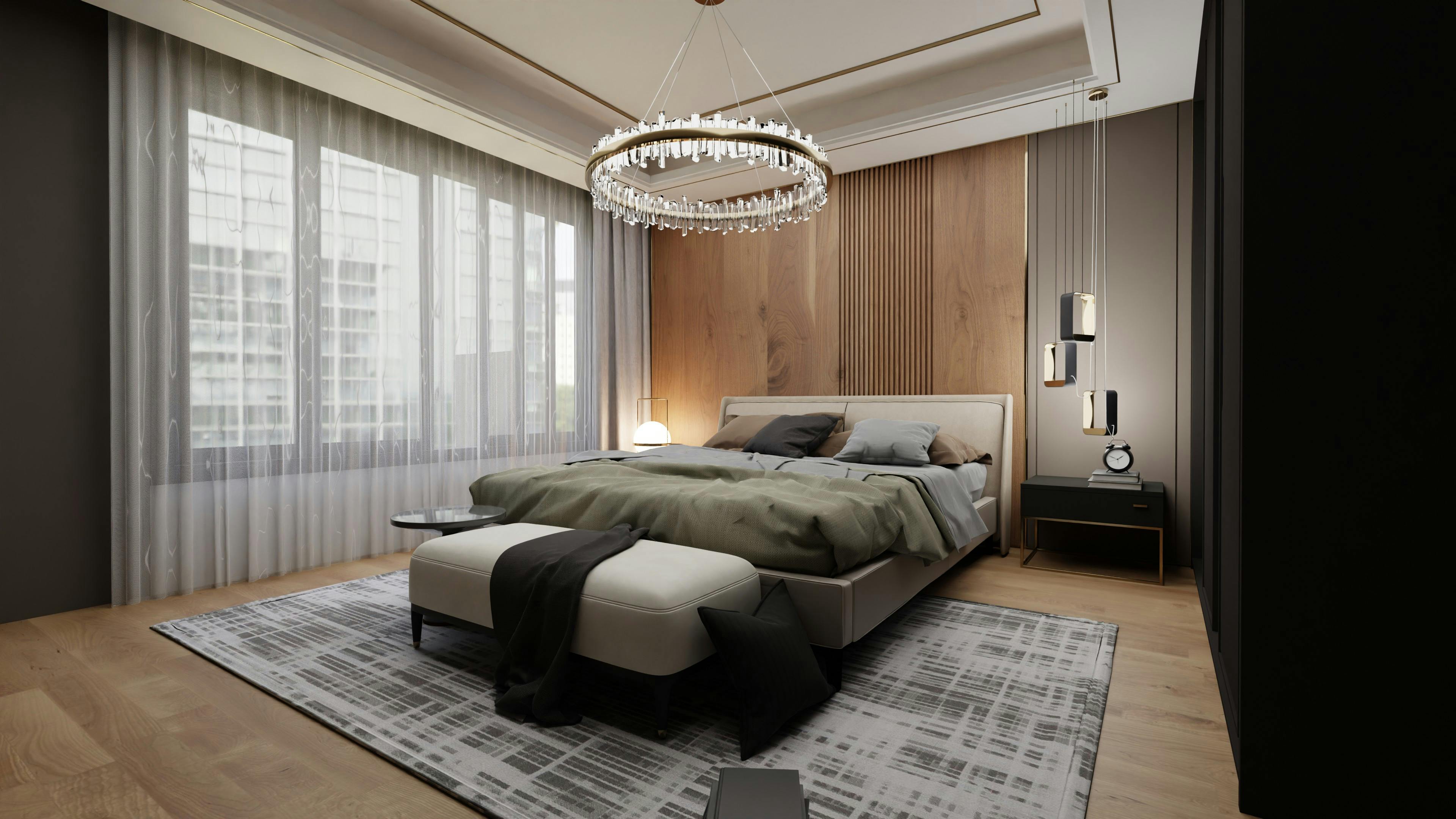
IMAGE: Modern bedroom featuring layered grey tones with black-and-white accents, creating a calm, monochrome look.
● Who’s really choosing these colors
● How they manipulate trends (and us)
● How to actually use the good ones—without looking like you fell into a Pinterest board
Let’s get into the shade story behind the scenes.
Understanding How Colors Are Chosen
The Role of Color Experts
Who Really Picks These Trend Colors
(and Why You Keep Seeing Them Everywhere)
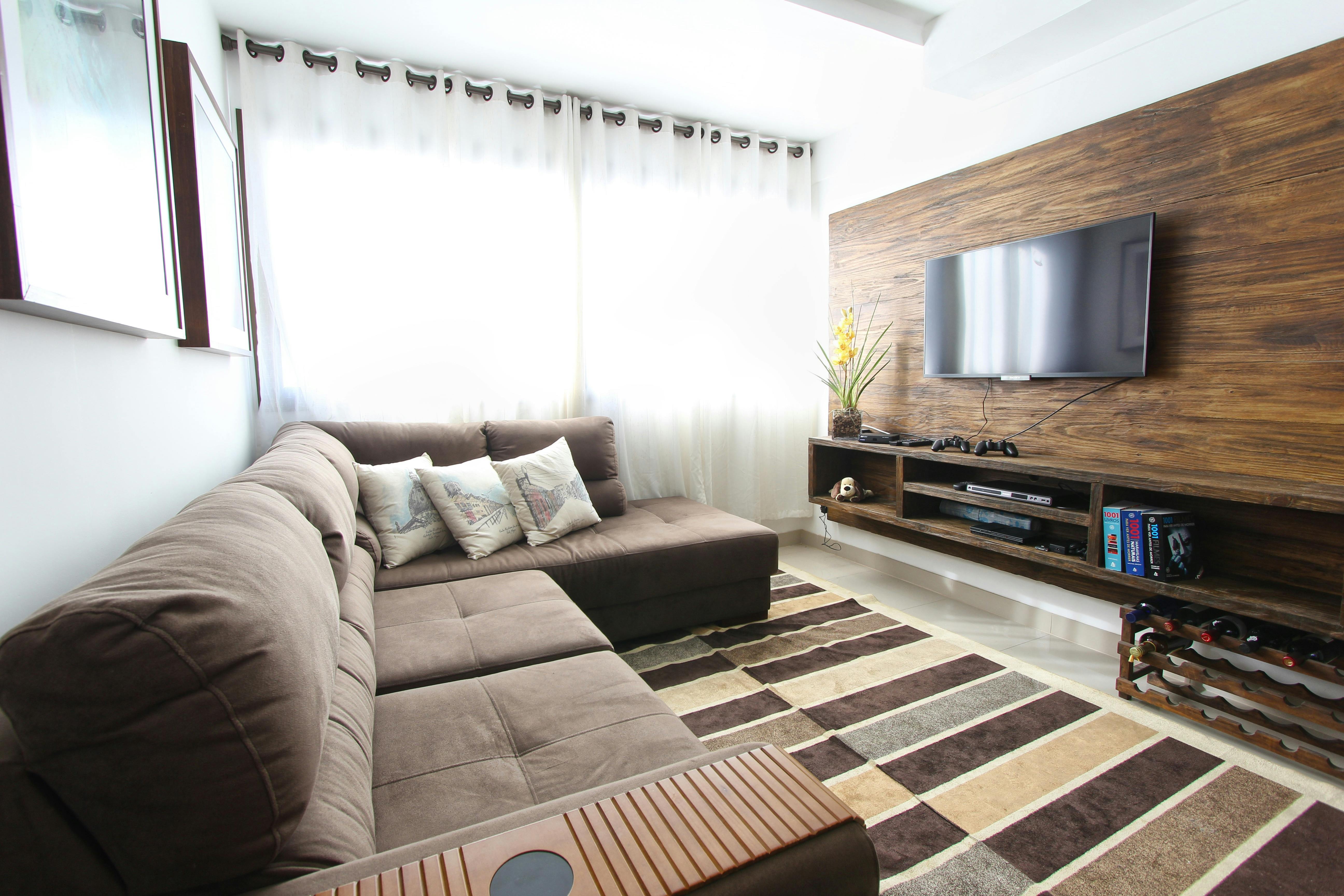
IMAGE: Modern living room featuring a palette of brown shades, combining warm tones and contemporary design for a cozy, stylish atmosphere.
No, they don’t spin a color wheel or throw darts. Big names like Pantone, Sherwin-Williams, and Behr don’t guess. They plan—based on mood, marketing, psychology, and what the world’s going through.
These teams aren’t just designers. They include behavior analysts, market researchers, and brand consultants who study global trends to figure out what color will sell. Not what’s pretty. What will spread.
When Pantone picked “Living Coral” in 2019, it wasn’t just about tropical vibes. It was tied to climate anxiety and fading reefs. “Ultimate Gray” and “Illuminating” came right after lockdowns—gray for fatigue, yellow for hope. There’s always a reason. Usually emotional. Always strategic.
Behind the Curtain of Color Selection
The Secret Society of Hue Enthusiasts
How Colors Catch On (And Who Pushes Them First)
Here’s how it works:
→ Fashion designers use the color first at runway shows.
→ It shows up in interior design, packaging, makeup, tech.
→ Influencers and lifestyle brands push it hard.
→ Then suddenly it’s on your coffee mug and throw blanket.
It's not random. It’s a slow flood—driven by marketing, not magic.
There are whole invite-only conferences where “color forecasters” gather to fight over next year’s shade.
Yes, that’s real.
Agencies like the Color Marketing Group actually vote. Imagine a room full of brand execs arguing over shades of lilac.
The World Affects the Palette
Color trends don’t float in a vacuum.
● When the economy tanks: muted blues and neutrals surge.
● When tech explodes: expect digital neon, purples, hyper-glow pastels.
● When culture shifts: colors follow.
Example? Stranger Things brought back ‘80s tones. Suddenly everyone wanted hot pink, teal, and warm orange again. Minimalist interiors and the “hygge” craze? That’s what gave us the beige explosion.
And let’s be honest—half the colors now are designed to look good on your phone screen first. High contrast. Crisp edges. AR/VR-compatible. These aren’t just paint colors. They’re made to trend on Instagram.
Why Influencers Wear It Before You Even Know What It Is
You think celebrities are just “feeling bold” in magenta coats? Nah. That’s placement. Brands leak their new color picks to influencers to speed up mass adoption. If Zendaya’s wearing it, your cousin’s painting her bathroom with it six months later.
They’ve turned color into a pipeline. And you’re in it—even if you don’t notice.
MUST READ: Color Psychology: Profit From The Psychology of Color: Discover the Meaning and Effects of Color (Psychoprofits)
The “Color Trap” Designers Fall Into (And How to Dodge It)
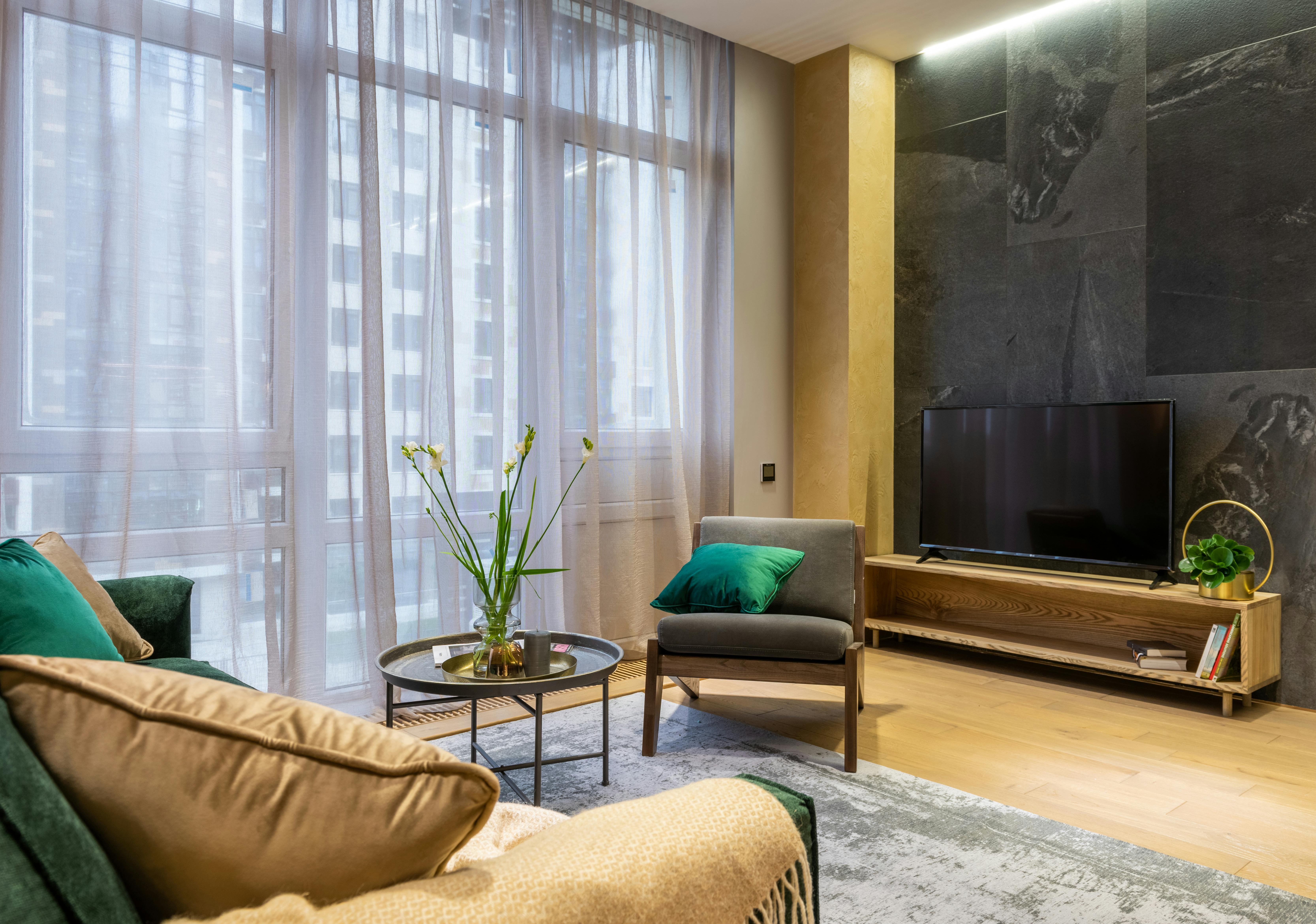
IMAGE: Modern interior combining grey and yellow tones with green accent pieces, creating a fresh and balanced color palette.
Here’s the truth: Most people mess up color not because they pick the wrong shade—but because they don’t think about context.
A color doesn’t exist alone. It lives in contrast. In light. In materials. That soft beige you loved on Pinterest? It turns pink in your apartment because your floors are yellow-toned. Happens all the time.
3 Real-World Traps to Watch For
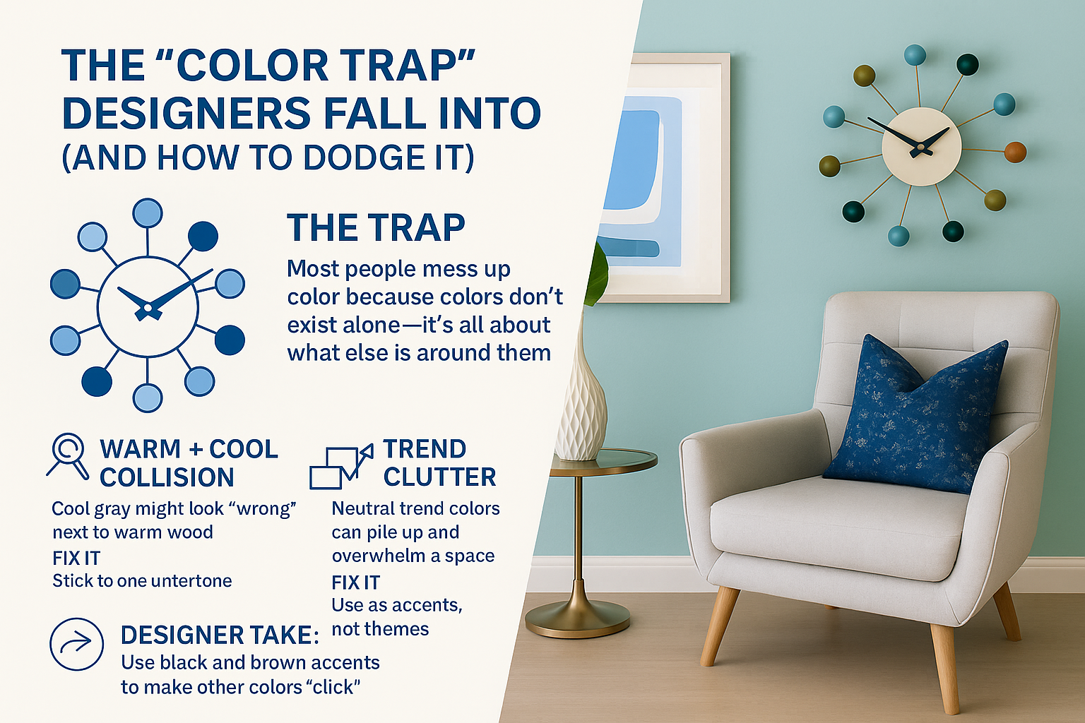
IMAGE: Infographic detailing frequent color design errors like warm/cool clashes and trend clutter, with tips to create balanced and cohesive modern living room palettes.
1. Warm + Cool Collision
People mix cool greys with warm wood—then wonder why the room feels “off.”
Fix it: Stick to one undertone family per zone, or bridge them with a third tone (like green or tan).
2. Over-Sampling in Retail Light
Store lighting is not your home. That color you loved under LEDs will look dead in natural light.
Fix it: Always bring samples home. Test in your lighting, not theirs.
3. Trend Clutter
Too many people layer every “safe” trendy color—greige, blush, sage—and end up with a room that looks like it belongs to no one.
Fix it: Choose one color that reflects you, then let trend colors support, not dominate.
Designer Tip: Use Black and Brown as Anchors
These aren’t just “dark colors.” They’re structure. One black accent (a frame, lamp, chair leg) can make a space feel intentional—even if you used five shades of beige.
Brown grounds a palette. Especially with lighter tones.
Think of it as the shadow behind the color—it gives it weight.
Color of the Year Recap (2015–2025)
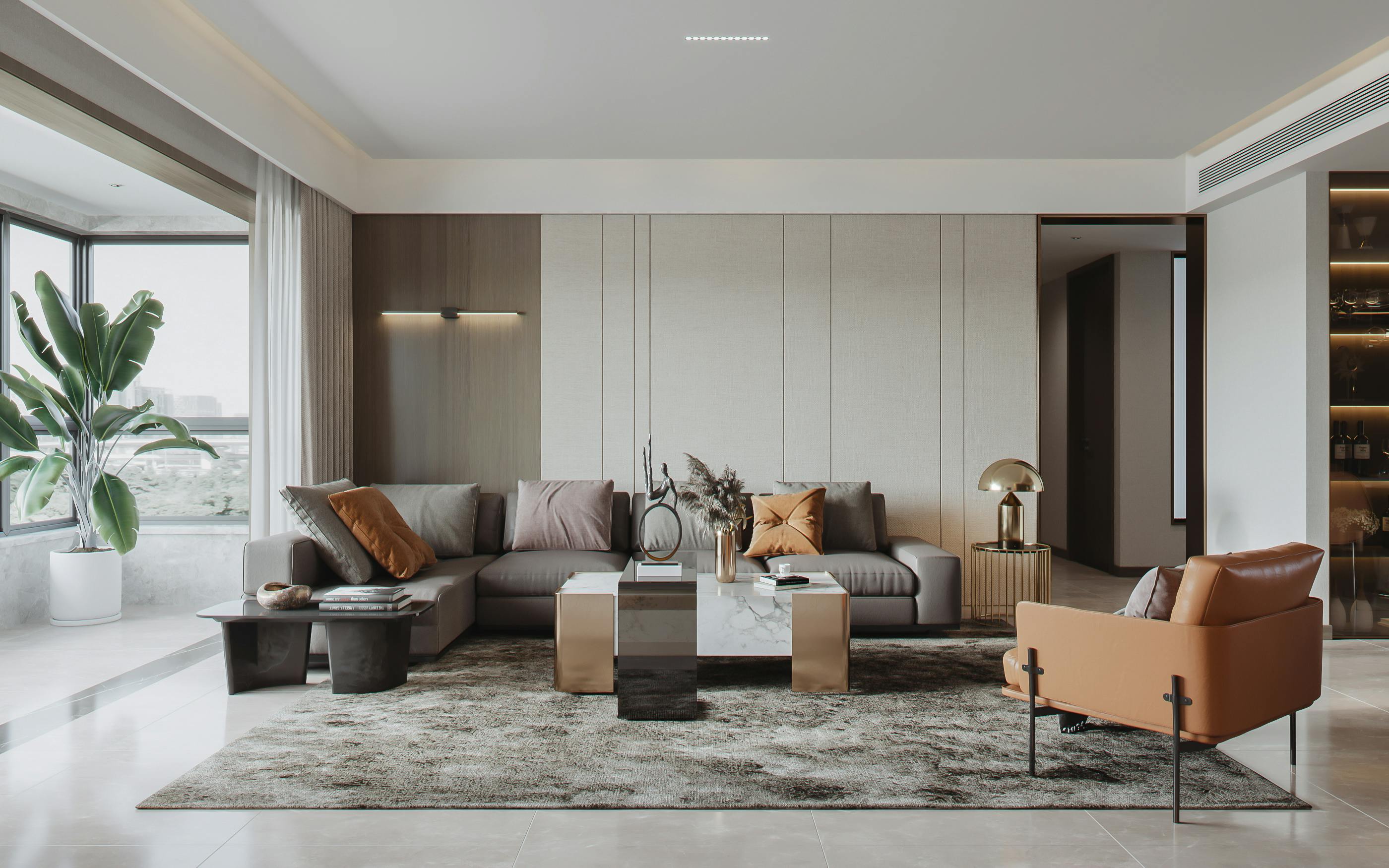
IMAGE: Modern living room combining gray shades on tiled floors and carpet with warm brown accent chairs, reflecting popular 2020s trends blending cool neutrals and warm tones.
What stuck, what flopped, and what it really said about us.
2015 – Marsala
Deep wine red. Cozy, earthy, and felt grown-up. You saw it in lipstick and rugs.
2016 – Rose Quartz & Serenity
Soft pink and pale blue. Pastel therapy after a chaotic year.
2017 – Greenery
Fresh green. Peak plant-parent era. Everyone painted an accent wall and bought a fern.
2018 – Ultra Violet
Moody purple. Bold, weird, creative. Hard to pull off unless you were Rihanna.
2019 – Living Coral
Happy coral with a climate message. Looked like fun, but it had depth.
2020 – Classic Blue
Calm, stable blue. Meant to feel safe—then COVID hit. Timing was rough.
2021 – Ultimate Gray & Illuminating
Gray for grit. Yellow for hope. A strange pair that actually worked.
2022 – Very Peri
Blurred the line between tech and real life. Cool-toned and screen-friendly.
2023 – Viva Magenta
Loud. Confident. Made for people who want to be noticed.
2025 – Peach Fuzz
Soft peachy nude. Cozy, nostalgic, almost quiet. It’s a pause after years of chaos. Less drama, more warmth.
What These Colors Actually Show Us
Color trends follow emotion.
When life feels uncertain, we want safe, soft tones.
When we’re over it? We go loud, bold, even weird.
Look at the pattern:
→ Calm → Fresh → Loud → Safe → Bold → Warm
It’s not random—it’s response.
And you don’t need to repaint every January. Just learn what each color does to a space, then use it smart:
Accent wall. Throw pillow. One chair. That’s how pros do it.
What’s Next
Real Color Predictions for 2026 & 2027
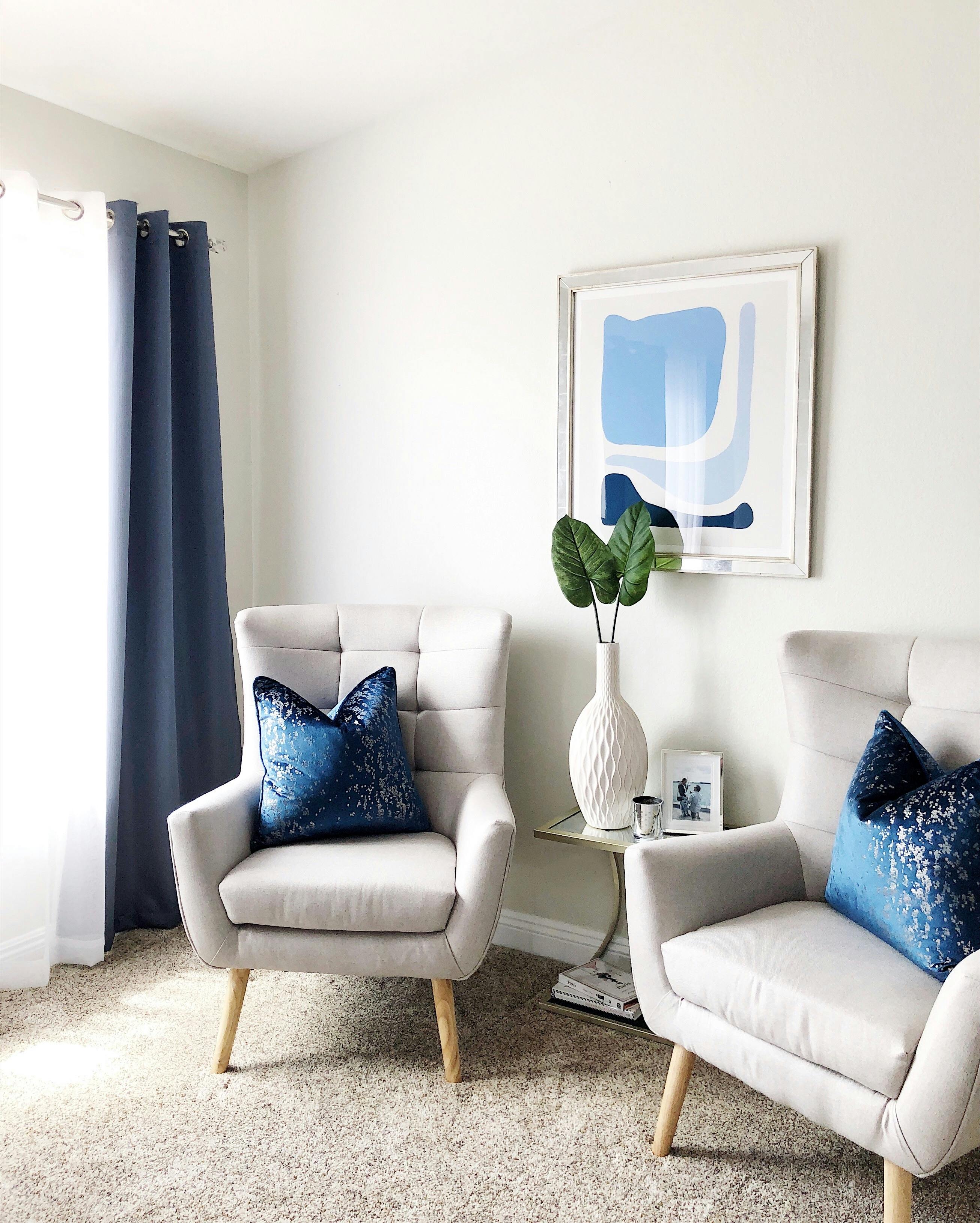
IMAGE: Modern living room featuring light cream walls, soft blue curtains, and blush and sky-blue cushions, demonstrating smart use of the color of the year in interior design.
Forget the Pinterest fluff. Here’s what real designers are watching—and what’s likely to show up on your walls, clothes, and storefronts over the next two years.
2026: What’s Already Taking Shape
1. Greens Stay Dominant—but Shift Warmer
Expect richer, organic greens—olive, moss, eucalyptus—not neon or sage.
They work across everything from kitchen cabinets to upholstery.
→ We’ve seen brands like Lick and Farrow & Ball lean into these tones hard.
→ In real homes? Olive is replacing navy as the “safe bold” wall color.
2. Earth Tones Get Upgraded
Think clay, rust, tobacco brown, and muted terracotta—but used clean and modern.
→ One LA client paired rust-colored cabinets with matte black counters: bold but grounded.
→ These tones play well with raw wood, limestone, and concrete.
3. Soft Tech Blues & Neo-Neutrals
A new wave of blues that look good on screens and walls.
→ Pantone might land somewhere near a “clean slate” blue with a digital polish.
→ Neutrals will have subtle undertones: blush-grey, muddy lavender, putty beige.
What Top Brands Might Pick
🔹 Pantone: Likely to pick a blue-green crossover with emotional grounding. Something that looks good in wellness apps and waiting rooms.
🔹 Sherwin-Williams: Leaning toward “refined rustic”—think rich clays, muted cinnamons, and aged red-browns.
🔹 Benjamin Moore: Likely to go soft again—a warm neutral with an off-pink or gold undertone. Think “greige” but less tired.
How Designers Are Actually Using These Colors
No one’s painting every wall anymore. Smart use = layered, controlled, and functional:
▪ Home offices → Moody greens or desaturated teals to boost focus
▪ Bathrooms → Warm neutrals like stone, buff, and beige-pink for calm
▪ Kitchens → Bold on lower cabinets only; upper walls stay pale
▪ Furniture → Accent chairs, velvet cushions, powder-coated metals
▪ Artwork → High-contrast pops—burnt sienna next to pastel blush works
2027 Early Predictions (Still Loose, But Building)
Pantone → “Future Dusk”
A muted, dark blue-purple. Serious, moody, reflective. Think post-digital burnout.
→ Works great in bedrooms, powder rooms, and gallery walls.
→ Looks luxe with soft lighting, brass, and heavy textures.
AkzoNobel → Bright Mood Yellow (aka “True Joy”)
An intentional optimism play. Soft goldenrod, not screaming sunshine.
→ Seen used already in Scandi design—frames, kitchen backsplashes, textiles.
Behr → “Rumors” (Deep Wine Red)
Not 2015’s Marsala. This is cooler, moodier, and used as contrast—trim, textiles, dining room walls.
Valspar → “Encore 8002” (Softened Deep Blue)
A safe bet. Almost denim. Universally usable—bathrooms, bedrooms, branding palettes.
Real Tips: How to Use These Colors Without Regret
▪ Start Small – Try a half-wall, door, or powder room before committing.
▪ Mix Textures – Warm tones feel richer with stone, leather, and linen.
▪ Use Real Light – Don’t trust the swatch. Test colors in your actual space—morning vs evening.
▪ Know the Pairing – That muted blue? It dies next to grey. Looks amazing next to brass or warm wood.
Bottom Line
The future of color isn’t just about what’s trendy—it’s about how people feel.
→ Stress = softer tones
→ Overstimulation = moody depth
→ Climate focus = earthy, rooted palettes
→ Digital saturation = colors that soothe
Watch how people live, not just what brands post.
How to Build a Color Palette That Actually Works for You
Trends come and go. Your space stays. So here’s how to create a palette that feels personal, holds up over time, and doesn’t look like a copy-paste from Pinterest.
Start with What You Already Love
Forget the wheel. Look around:
▪ What color clothes do you keep wearing?
▪ What art, photos, or spaces make you feel good?
▪ What colors are already in your furniture or finishes?
That’s your real palette—start there.
Example:
If you always wear olive green and beige, don’t fight it. Use those as base tones. Layer in one bold accent if you want contrast—like burnt orange or soft navy.
Use the 60-30-10 Rule
Old-school rule, but it works:
▪ 60% = main/base color (walls, large furniture)
▪ 30% = secondary tone (curtains, bedding, rugs)
▪ 10% = accent (art, pillows, decor)
Example:
→ 60% warm white
→ 30% clay red or sage
→ 10% black, brass, or deep green
Blend Trends Without Losing Yourself
Want to use the color of the year? Fine. Just don’t let it hijack your space. Use trendy colors in small doses:
▪ One throw blanket
▪ A painted stool
▪ An art print
Let your base palette stay you. The trend is just seasoning.
Test It in Real Life, Not in Your Head
Colors shift under real light. Always test them at home.
▪ Paint a big swatch—don’t rely on that tiny sample card.
▪ Check it morning, afternoon, and night.
▪ Ask yourself: Do I actually like this? Or am I just used to seeing it online?
Expert trick:
Pair every color with natural textures—linen, wood, stone, metal. It keeps bold tones grounded and makes neutrals feel intentional.
When In Doubt...
No, not the Al Pacino kind. We mean: Steal from Nature.
Nature doesn’t mess up palettes. Forests, coastlines, deserts—they all blend tone, depth, and contrast perfectly.
→ Beach palette? Think sand, driftwood, sea glass.
→ Forest? Deep greens, bark brown, fog gray.
→ Desert? Terracotta, sun-bleached beige, cactus green.
Use that as your blueprint—it always works.
The Psychology of Color—Why You Love What You Love
Why You Like Certain Colors?
and What That Says About You...
Color is memory, emotion, and biology.
The shades you love? They’re doing something deeper than decorating your walls.
How Color Preference Actually Works
Your favorite color isn’t random. It usually links back to something personal:
▪ Grew up near the ocean? Blue feels safe.
▪ Loved your grandma’s garden? Green brings comfort.
▪ Big city kid? You might lean into bold reds or blacks—fast, expressive, loud.
And it’s not just mental. Your body reacts too:
→ Red raises heart rate.
→ Blue calms it down.
→ Yellow triggers serotonin.
→ Dark tones can slow brain activity.
Your nervous system is literally reading color signals—before you even think about it.
What Your Go-To Color Might Reveal
Blue
You like things calm, quiet, steady. You probably avoid drama and prefer control over chaos. Blue lovers often lean analytical or introverted.
Red
You want intensity—emotion, action, attention. You’re likely driven, competitive, or naturally bold. Red is for people who don’t sit still.
Yellow
You gravitate toward warmth, energy, and optimism. You’re a social spark plug. You probably talk with your hands and make fast decisions.
Green
You want peace, balance, and a sense of grounding. Green people often care about fairness, health, or sustainability—whether they say it or not.
Purple
You’re creative, maybe a bit eccentric. Purple lovers tend to have rich internal lives—art, ideas, daydreams. It’s rarely a casual choice.
Yes, Color Phobias Are Real
Some people fear colors—literally.
▪ Chromophobia = fear of colors
▪ Xanthophobia = fear of yellow
▪ Melanophobia = fear of black
Why? It’s usually tied to trauma or culture. Yellow can feel like sickness. Red like blood. Black like death. Sounds extreme, but in design, this matters—especially in shared or public spaces.
Don’t ignore it. Use color with intent, not just instinct.
How Designers Use Color to Shift Mood
Want to manipulate how a space feels? Color can do the job instantly:
▪ Need calm? → Use soft blues, sage greens, off-whites. Great for bedrooms, bathrooms, or anywhere your nervous system needs a break.
▪ Need energy? → Use saturated reds, warm oranges, or golden yellow. Ideal for kitchens or places where people gather and move.
▪ Need focus? → Use beiges, cool grays, olive. These colors stay in the background—perfect for home offices or study corners.
▪ Need creativity? → Try dusty purple, teal, or deep coral. They work best in short doses—accents, artwork, or feature walls.
Pro tip: Want to test color without risk? Start with a pillow, curtain, or lamp in your chosen tone. If it feels off after a week, it wasn’t right for the space—or you.
Keep Learning
Recommended Color Psychology Books:
- "Color Psychology And Color Therapy" by Faber Birren
- What’s in it? This book explores how colors can influence our emotions and behavior in everyday life, from choosing the right outfit to creating a productive workspace.
- Why You Should Buy It: It’s a great resource for anyone who wants to understand the psychological effects of color on human behavior, perfect for both personal and professional use.
- “The Secret Lives of Color” by Kassia St. Clair
- What’s in it? A fascinating dive into the history and cultural significance of different colors, from ancient times to modern day.
- Why You Should Buy It: This book offers an entertaining yet informative look at colors, perfect for those who love a good story behind every hue.
- “Living with Color: Inspiration and How-Tos to Brighten Up Your Home” by Rebecca Atwood
- What’s in it? This book provides practical tips on incorporating colors into your home in a way that feels personal and unique.
- Why You Should Buy It: If you’re looking to refresh your space but don’t know where to start, this book will guide you through the process with ease.
- “Color Theory for Dummies” by Eric Hibit
- What’s in it? A beginner-friendly guide to understanding the basics of color theory and how to apply it in design.
- Why You Should Buy It: Perfect for anyone new to design, this book breaks down complex concepts into easy-to-understand language.
- “Pantone: The Twentieth Century in Color” by Leatrice Eiseman
- What’s in it? A visual history of color trends throughout the 20th century, showcasing how different shades have shaped our world.
- Why You Should Buy It: This book is a must-have for design enthusiasts and history buffs alike, offering a stunning visual journey through time.
- "Color Psychology Made Simple: A Reference Guide to the Meanings and Uses of Colors for Branding, Marketing, Graphic Design & Art Projects" by EM SANS
- "Handbook of Color Psychology (Cambridge Handbooks in Psychology)" by Andrew J. Elliot (Editor)
- "Colour Design: Theories and Applications (The Textile Institute Book Series 128)" by Janet Best (Editor)
Final Thoughts
What This Really Tells Us About Color
Trends are fine—but color is personal.
You don’t need to chase what’s “in.” What matters is how a color makes your space feel. Calm. Bold. Grounded. Clean. That’s the part that lasts.
There’s a whole industry shaping what ends up in your paint aisle—but you’re the one who has to live with it. Pick the shade that works for you. That holds up when the trend fades. That actually fits your life.
That’s smart design.
FAQ
Choosing Colors That Actually Work
Q: Do I have to follow color trends?
No. Use them if they fit your style. Otherwise, skip them. A good palette lasts. Trends don’t.
Q: What’s the easiest way to test colors at home?
Paint large swatches on different walls—not just a tiny patch. Check them in natural light, at night, and next to furniture. Photos online lie. Your lighting doesn’t.
Q: How many colors should I use in a room?
Stick to 3 main tones:
▪ A base (neutral or soft)
▪ A secondary (richer, supporting)
▪ An accent (bold or contrast)
More than 4, and it gets messy fast.
Q: Can I mix warm and cool tones?
Yes—but do it on purpose. Example: Warm beige walls with cool blue accents can work if the undertones balance. Just don’t mix randomly.
Q: How do I know if a color “feels right”?
Live with it. Tape up a pillowcase, a paint chip, or a colored object and stare at it for a day or two. If you keep noticing it—in a good way—it’s right.
Q: I like bold colors but I’m scared to commit. What’s the move?
Use bolds in small places:
▪ Entryways
▪ Powder rooms
▪ Accent chairs
▪ Art
Or go neutral on walls and bold on fabric, rugs, or tile.
Q: What colors make a space feel bigger?
Lighter tones with low contrast—like soft whites, warm greys, pale sage. Keep the ceiling light too. Dark trim and loud accents shrink a room fast.
Q: What color works everywhere?
Muted green-gray. It works in bedrooms, kitchens, bathrooms, exteriors—modern or traditional. It plays nice with wood, stone, metal, and light.
Affiliate Note
We share tools, books, and design resources we actually use or trust. Some links are affiliate links. If you buy through them, we earn a small commission—at no extra cost to you. It helps us keep the content real, useful, and free.
REFERENCES
Color Psychology & Research
-
Pantone Color Institute – Official color of the year, forecasting methods, global influence.
🔗 https://www.pantone.com -
Color Marketing Group (CMG) – International association of color experts and trend forecasters.
🔗 https://colormarketing.org -
The Interaction of Color by Josef Albers (Yale University Press) – A foundational resource in color theory.
🔗 https://yalebooks.yale.edu/book/9780300179354/the-interaction-of-color/ -
NCS Colour Academy – Scientific color system and research-based color training.
🔗 https://ncscolour.com/academy -
Verywell Mind – Psychology of Color – Overview of how color affects mood and behavior, reviewed by psychologists.
🔗 https://www.verywellmind.com/color-psychology-2795824
Interior Design & Paint Brand Resources
-
Sherwin-Williams Color Forecast – Annual color trends with palettes and use cases.
🔗 https://www.sherwin-williams.com/en-us/color/color-forecast -
Benjamin Moore Color Trends – Seasonal and annual picks with real design examples.
🔗 https://www.benjaminmoore.com/en-us/color-overview/color-palettes/color-of-the-year -
Behr Color Trends – Consumer-focused trends and color tools for interiors.
🔗 https://www.behr.com/consumer/inspiration/2025-color-trends -
AkzoNobel / Dulux Global Aesthetic Center – Global color research and annual ColourFutures report.
🔗 https://www.akzonobel.com/en/colourfutures
Design & Architecture Education
-
AIA (American Institute of Architects) – Professional guidance on color use in space design.
🔗 https://www.aia.org -
Design Seeds – Visual inspiration for creating palettes based on real-life imagery.
🔗 https://www.design-seeds.com -
Material Bank – Color Trends & Spec Resources
🔗 https://www.materialbank.com
About the Author
I’m a working interior designer with 15+ years in residential and commercial spaces. My job isn’t to impress you with theory—it’s to help you build rooms that look good, feel right, and actually work.
I’ve tested every shade, fought with every paint finish, and stood in front of that same wall of swatches you have.
I write what I wish someone told me earlier.