
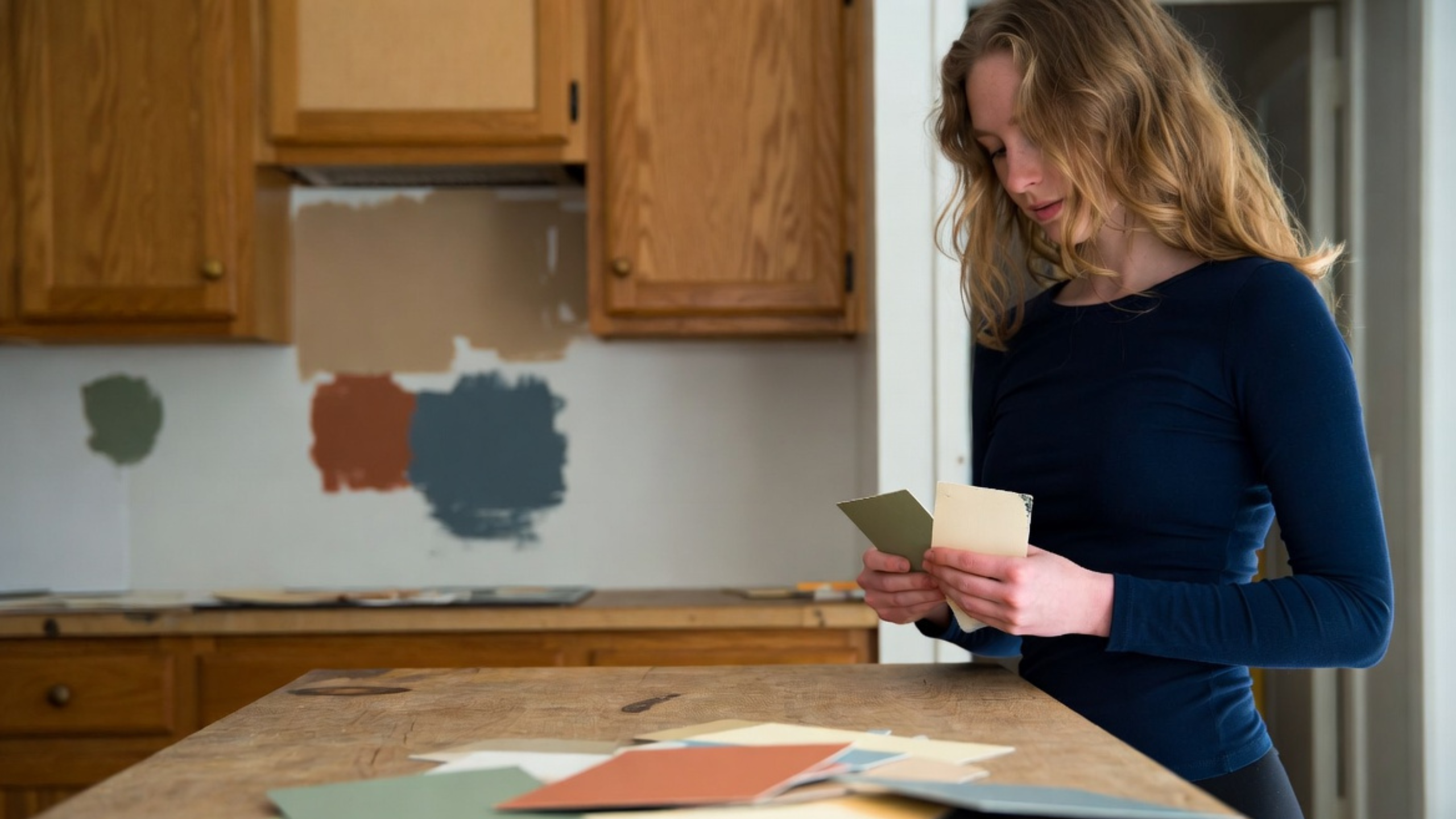
Kitchen colors sound like the fun part. Then you bring the samples home.
The warm white that looked clean in the showroom turns yellow beside the countertop. The gray looks blue near the window. The green is lovely in the morning and far too dark when the ceiling lights come on. Soon there are six cabinet doors leaning against the wall and none of them feel right.
Most kitchens already have a color scheme, even if nobody planned one. The floor, countertop, backsplash and wood tones are already in the room, and at least a few of them are usually staying.
So let’s look at kitchen color combinations that work with those fixed pieces, where to use the stronger color, and which pairings tend to fall apart once you bring them home.
Kitchen Color Combinations at a Glance
These kitchen cabinet color combinations are starting points. Each one still has to be tested against the floor, the countertop and the light in your own room.
| Combination | Where the stronger color works | Useful supporting surface | Main risk |
|---|---|---|---|
| Warm white, olive and oak | Island or lower cabinets | Quiet cream stone | Too much yellow warmth |
| White, oak and navy | Island or one lower run | Balanced white counter | Navy that reads as black |
| Sage, wood and white | Lower cabinets or perimeter | Low-movement cream quartz | Green that shifts to mint |
| Navy, walnut and white stone | Island or cabinet bank | Pale stone | Too many dark surfaces |
| Light oak, warm white and gray stone | No strong color; texture leads | Gray stone with warmth in it | A warm half and a cold half |
| Walnut, black and white stone | Perimeter or one cabinet bank | Pale stone | Closing in an 8-foot room |
| Mint, white and gray | Walls or a small island | Mid-gray counter | A cold, hard-edged room |
| Black, white and stone | Island and repeated details | Quiet pale stone | Dark work surfaces at night |
| Yellow, white and natural wood | Lowers or one freestanding unit | White wall and tile | Everything merging to one cast |
What Else in the Room Counts as Color
Cabinets take up a large share of the view. They still do not run the room on their own. A dark stone island can carry as much weight as a wall of doors. Strong floor grain pulls the eye down. A patterned backsplash breaks up every cabinet run, even though it covers a small area.
Before you collect paint cards, list the surfaces that are staying:
- Flooring
- Countertops
- Backsplash tile and grout
- Unpainted wood cabinets
- Appliances
- Adjacent floors and wall colors you can see from the kitchen
Those finishes are already part of the kitchen color scheme, whatever you do next. If cream granite, honey oak and beige tile are staying, a cold white-and-blue scheme has to work against three warm surfaces every day of the year.
The broader Kitchen Colors hub covers how fixed finishes, undertones and lighting change a single color. What follows is about what happens where all six surfaces meet.
Value Comes Before Color
Value is how light or dark a surface looks. Two colors can have very different names and sit at almost the same value. Put midtone taupe cabinets beside a midtone beige counter, a midtone oak floor and a midtone gray wall, and the room goes flat with four colors in it.
A combination that reads well usually has separation built in. Light uppers lift the top of the room. A middle-value counter or floor ties the materials together. Deeper lower cabinets or an island give the eye a place to stop.
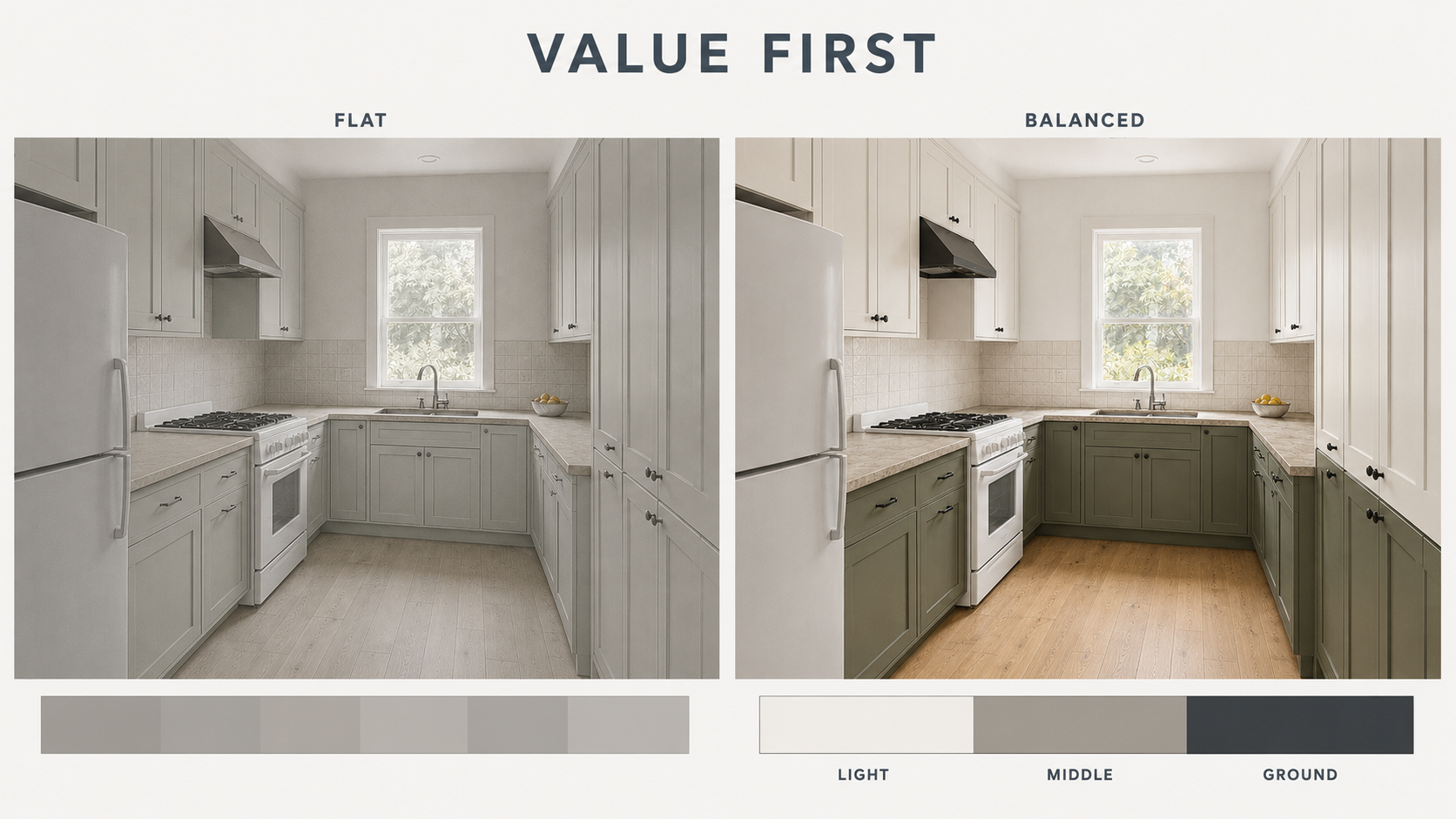
Take a phone photo of the samples together and switch it to grayscale. It will not tell you whether the undertones agree. It will tell you fast whether every surface is crowding the same band. It also flags combinations that rest on a tiny color difference, which is the kind that vanishes after dark.
The Number on the Back of the Paint Chip
Every major paint brand publishes a Light Reflectance Value, or LRV. The scale runs from 0 for a true black to 100 for a perfect white, and it states how much of the light hitting a surface comes back off it. Sherwin-Williams prints the number on the back of every color chip.[2] It is measured with an instrument, so it settles arguments that color names cannot.
The numbers get uncomfortable fast. Sherwin-Williams Naval, a common navy for cabinets, has an LRV of about 4.5. Tricorn Black, a true black, sits at about 2.8. Those two finishes are less than two points apart on a hundred-point scale. In a kitchen with one window, a navy island and a black island send back almost the same amount of light. The blue only shows where daylight lands straight on the door.
Run the same check across the rest of the palette. A white such as Pure White sits near 84. A mid gray such as Agreeable Gray sits near 60. If your uppers, counter and floor all land between 55 and 65, three surfaces are doing one job.
There is a hole in this method and it is worth naming. Paint has a published LRV. Your quartz slab, your tile and your oak floor do not. You can measure one of six surfaces and estimate the other five. The grayscale photo is the workaround, and it is a rough one, because the reading shifts with whatever light you shot it in.
Check Undertones Where Materials Touch
Warm white and cool white are both sold as white. One leans cream or yellow. The other leans blue or gray. That difference shows up as soon as the sample sits against stone, tile or wood.
Test undertones at the joints. Put the cabinet sample against the actual countertop edge. Add the backsplash and the floor beside it. A cool gray cabinet can look calm alone and turn violet against warm quartz. A cream tile can go yellow against a cleaner white door.
The materials do not need matching undertones. Warm wood works with muted blue, and black works with cream. What the combination needs is a bridge: a countertop with both warm and cool movement, a wall color that relates to the cabinet and the floor, or wood repeated often enough that the warmth looks planned.
Hardware will not fix an undertone problem. Brass adds warmth and nickel backs up a cooler palette, but a faucet is too small to settle a disagreement between cabinets, counters and flooring. If the samples are fighting at the joint, change a sample.
Let One Surface Lead
Most combinations that work have a clear leader. It might be green cabinetry, figured stone, a wood island or a patterned tile wall. Problems start when two or three permanent surfaces all want that role.
If the countertop has large, high-contrast veining, keep the cabinets and backsplash quiet so the stone has room. When the cabinet color is the feature, low-movement stone keeps the paint clear. Strong wood grain counts as activity too. Treating it as a blank neutral is a common way to end up with three loud surfaces.
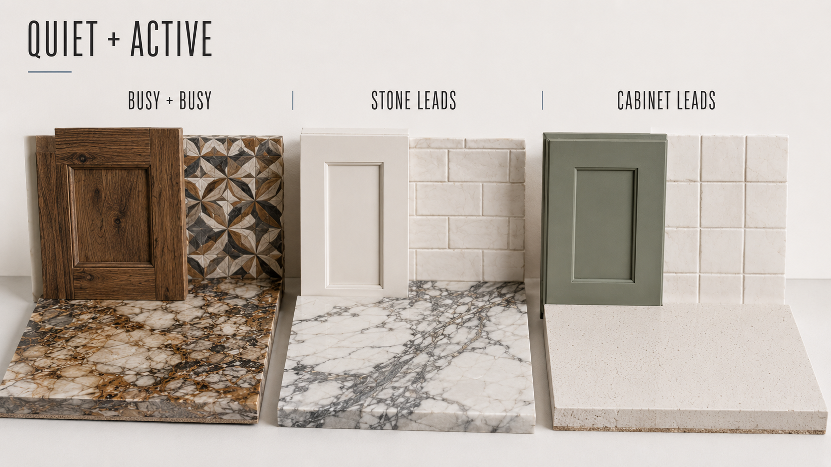
Quiet does not mean plain white. A soft mushroom cabinet, a lightly textured cream tile or a low-contrast oak can all be quiet. The test is whether the surface supports the leader without pulling equal attention.
Where to Put the Stronger Color
Placement changes the risk more than the color does. Painting every cabinet blue is a different decision from putting blue on one island. A deep color on the lowers grounds the room. The same color across all the uppers makes an 8-foot ceiling feel lower.
An island is usually the easiest place for a strong color, because it reads as one object. A separate pantry wall can carry a second finish without cutting into every cabinet run. In a small kitchen with no island, deeper lowers under lighter uppers can work, as long as the countertop makes a clean break between them.
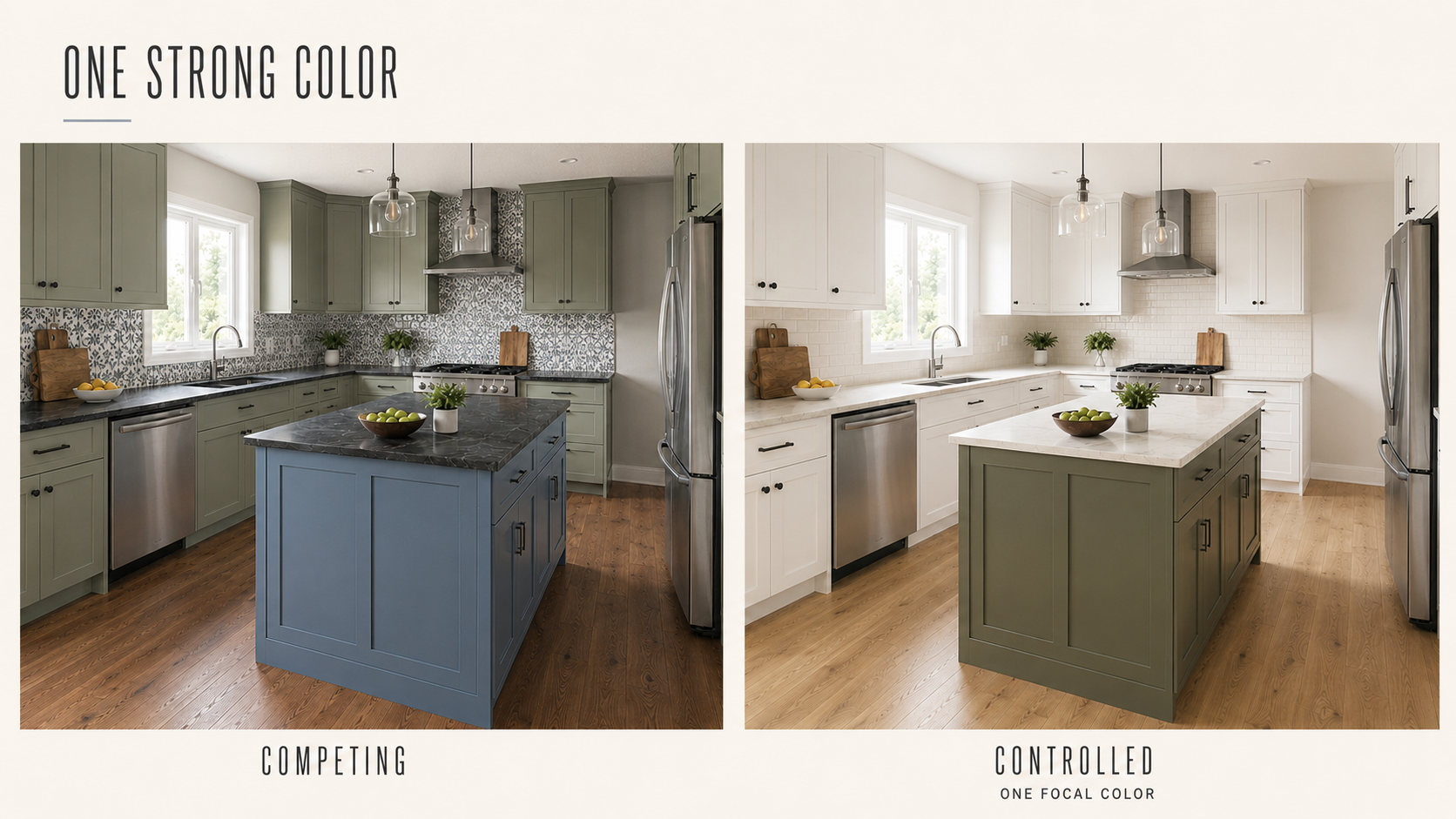
One strong color is not a rule. Rich, layered kitchens work all the time, but they need tighter control of value, undertone and repetition. Red once, green once and blue once looks accidental. A color repeated at two or three chosen points starts to look like a decision.
Kitchen Color Combinations That Hold Together
Each of these works for a different reason. None of them is safe everywhere. Every one depends on the floor you already have, the light you get and how much of each surface you hand over to color.
Warm White, Olive Green and Natural Oak
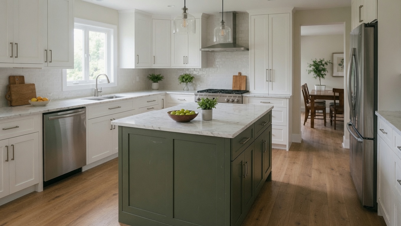
This one works when all three materials carry a muted warmth. Warm white keeps the perimeter light. Olive adds color without going sharp. Oak brings variation through grain instead of another painted hue.
Keep the countertop and backsplash quiet. Cream, warm white or a soft beige-gray stone will tie the cabinet paint to the floor. A blue-white quartz splits the green from the oak and pushes the warm white toward yellow.
Works well in: kitchens with warm daylight, cream tile, oak floors or brass details.
Watch for: olive that goes muddy in weak light, or yellow-green under very warm bulbs.
White, Oak and Navy
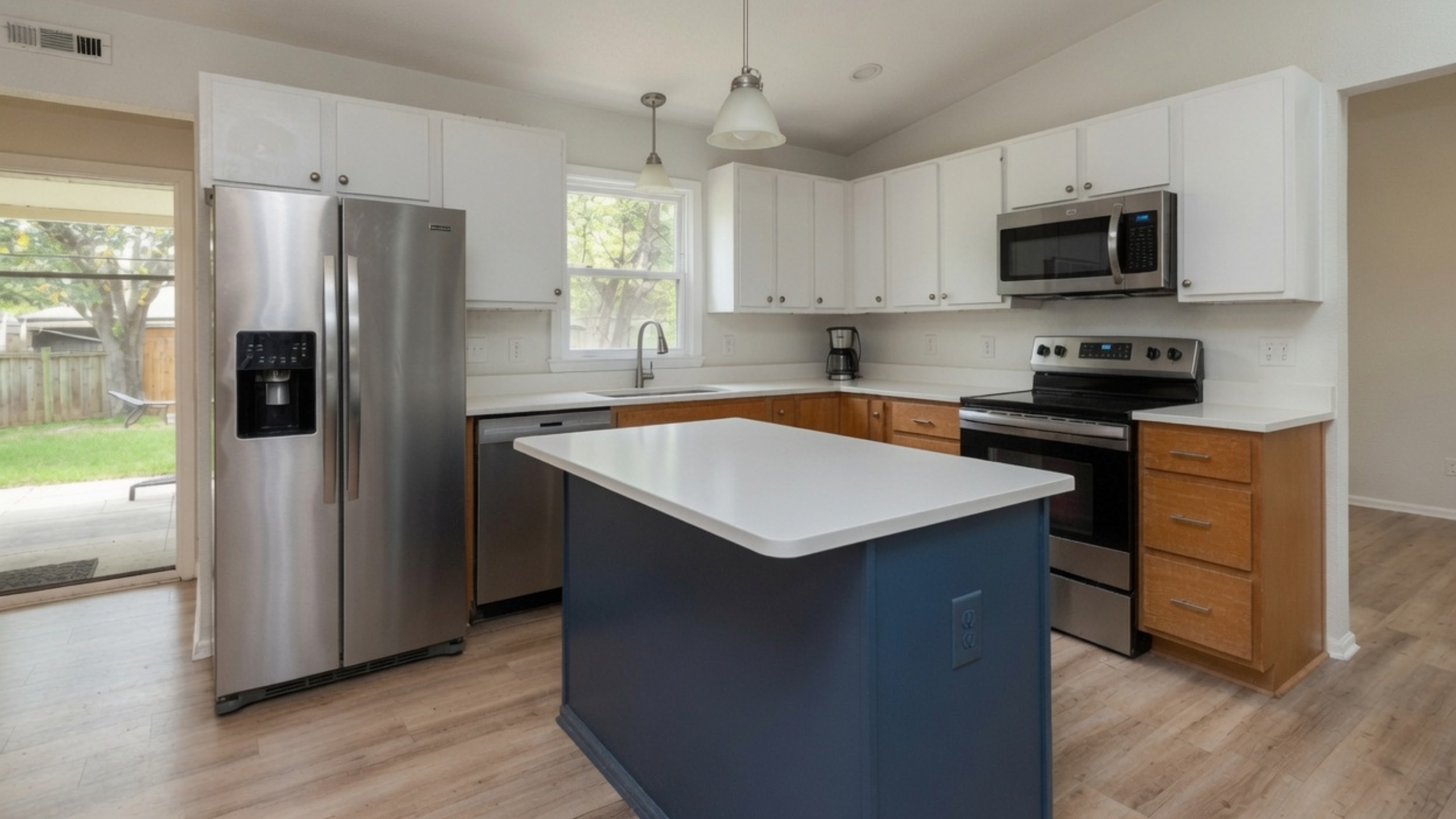
White cuts visual weight, oak keeps the palette from going cold, and navy gives you one dark anchor. It is a useful three-finish set because each material has a separate job.
The white still has to agree with the oak. A slightly warm or balanced white sits better beside honeyed wood than an icy one. Navy can lean green, gray or violet, so hold the painted sample against the wood and the counter rather than judging it from a photo.
Works well in: compact kitchens where the island or one lower run carries the navy.
Watch for: navy spread across too many uppers in a room with one window. At an LRV near 4, it will read as black most of the day.
Sage Green, Natural Wood and White
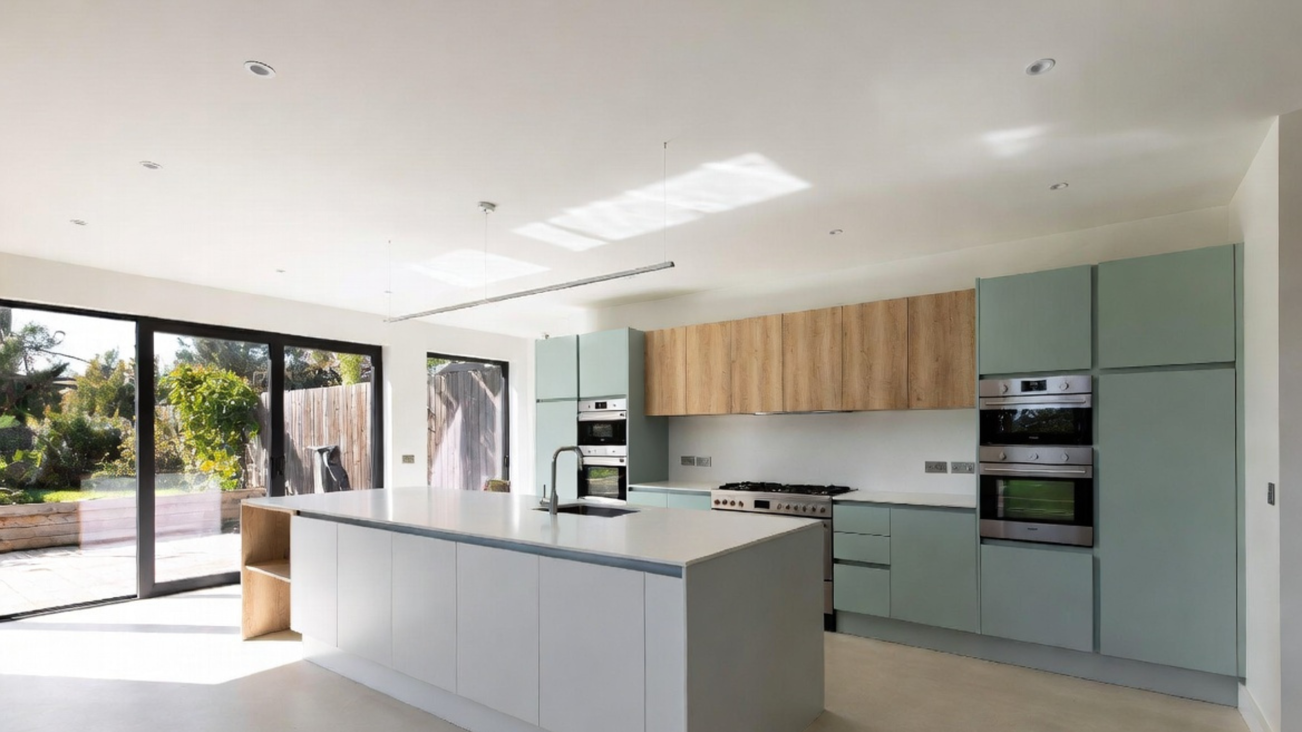
Sage works here as a muted color rather than a bright botanical green. Wood gives it warmth and texture. White supplies enough separation to keep the two earthy finishes from merging into one.
A green-gray sage turns mint beside cool white stone and olive beside golden flooring. Sample it on the same material the doors will be made from, and look at it again through the day.
Works well in: kitchens with oak, walnut, cream stone and quiet brass.
Watch for: green cabinets, green backsplash and green accessories all sitting at slightly different undertones.
Navy, Walnut and White Stone
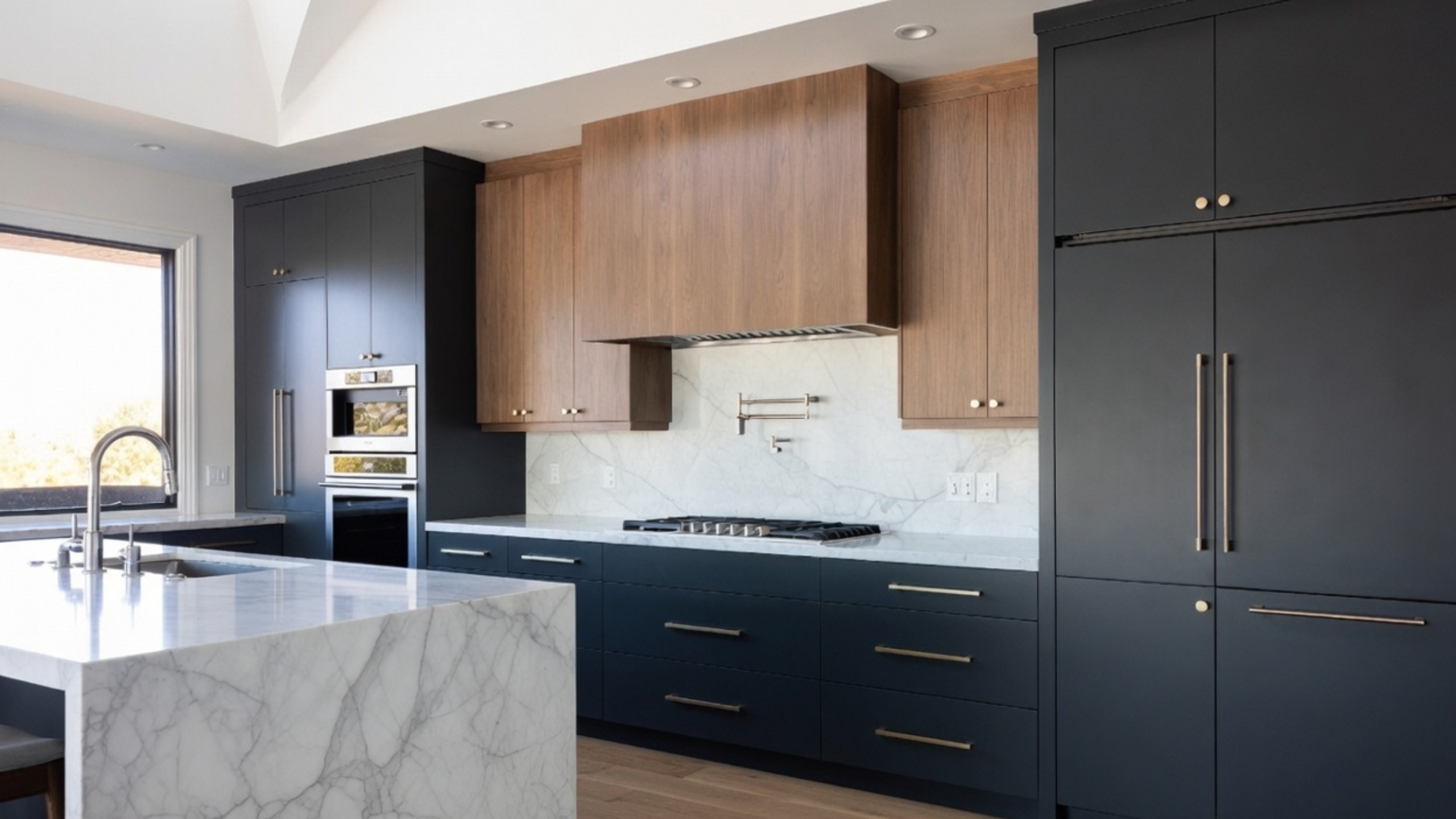
Navy and walnut are both heavy. White stone keeps them from closing the room in and gives you a work surface you can read. Brass picks up the warmth in the walnut, but it should stay a detail.
This set needs enough light to show the gap between navy and black, and that gap is small. In a dim kitchen, very dark blue doors and dark walnut collapse into one mass.
Works well in: medium and large kitchens with clear daylight and pale counters.
Watch for: heavily figured walnut paired with heavily veined stone.
Light Oak, Warm White and Gray Stone
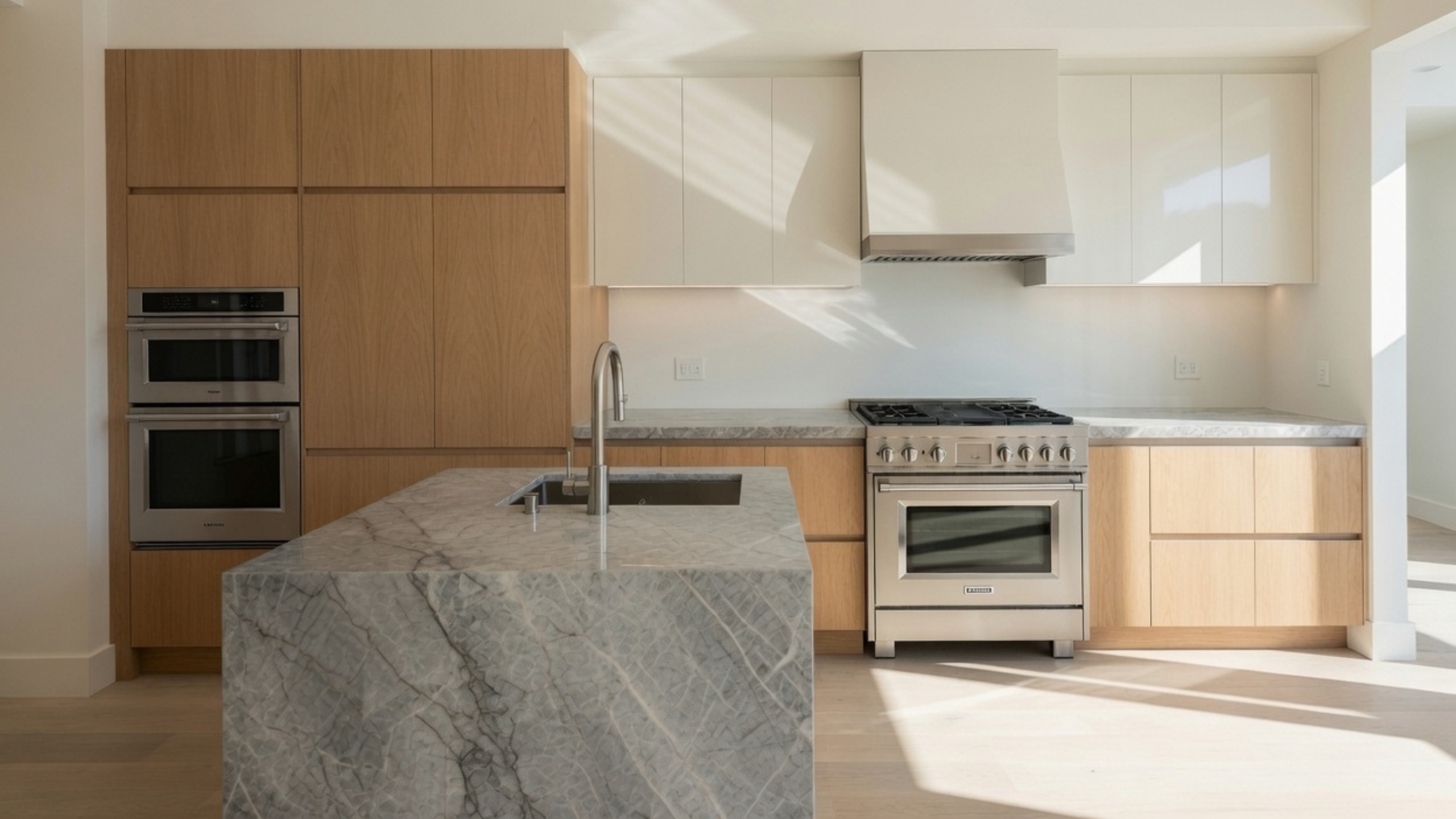
Light oak and warm white stay close enough in value to give you a calm background. Gray stone adds definition. It needs enough warmth in it to connect with the wood, or the room splits into a warm half and a cold half.
The whole set is quiet, so texture does the work. Oak grain, a honed or softly reflective counter and some variation in the tile keep the pale surfaces from looking unfinished.
Works well in: small and medium kitchens that need light without going all white.
Watch for: blue-gray stone beside yellow oak, or warm white doors that read cream against a colder countertop.
Walnut, Black and White Stone
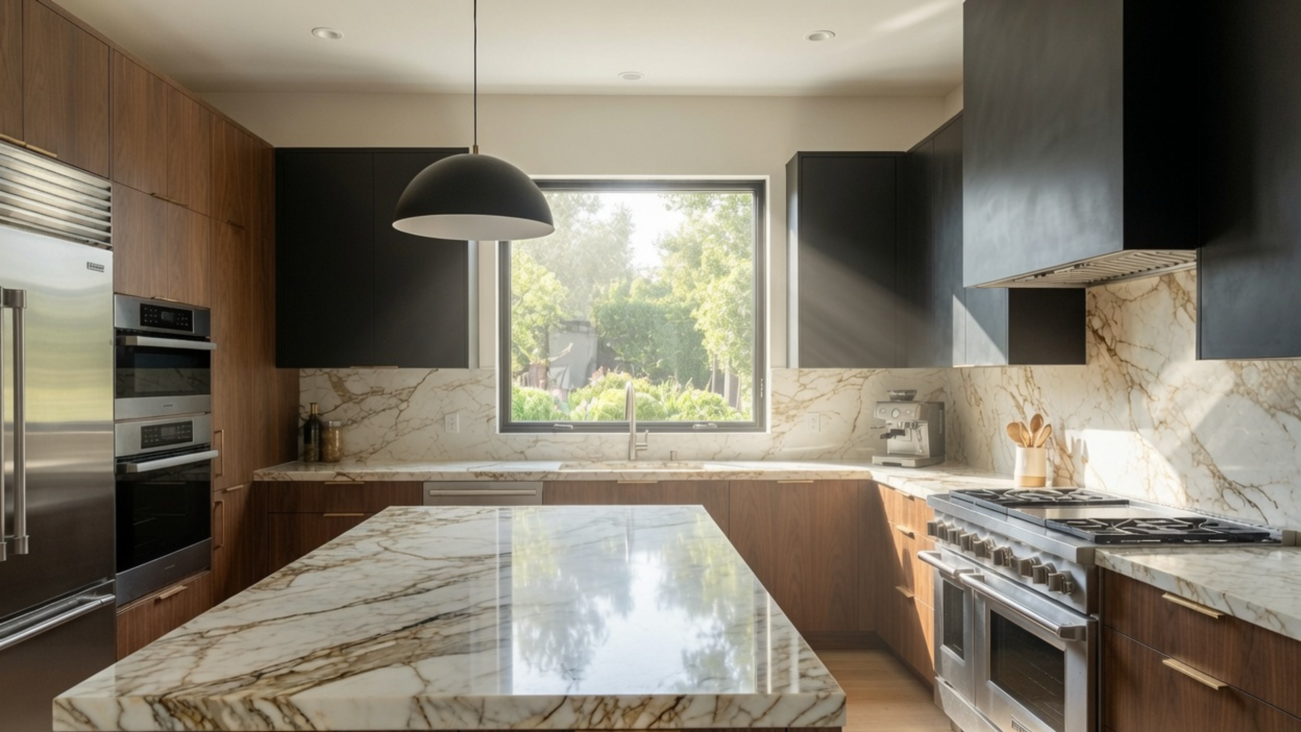
Black gives you a crisp edge and walnut keeps the room from going cold. Pale stone separates the two dark finishes and leaves a work surface you can see.
Keep the wood species and the black finish consistent. Several unrelated brown woods next to black cabinetry turn a planned three-part set into something that looks pieced together over years.
Works well in: kitchens with strong daylight, simple door fronts and pale counters.
Watch for: black uppers, dark walnut and a dark floor in an ordinary 8-foot room.
Pale Mint, White and Gray
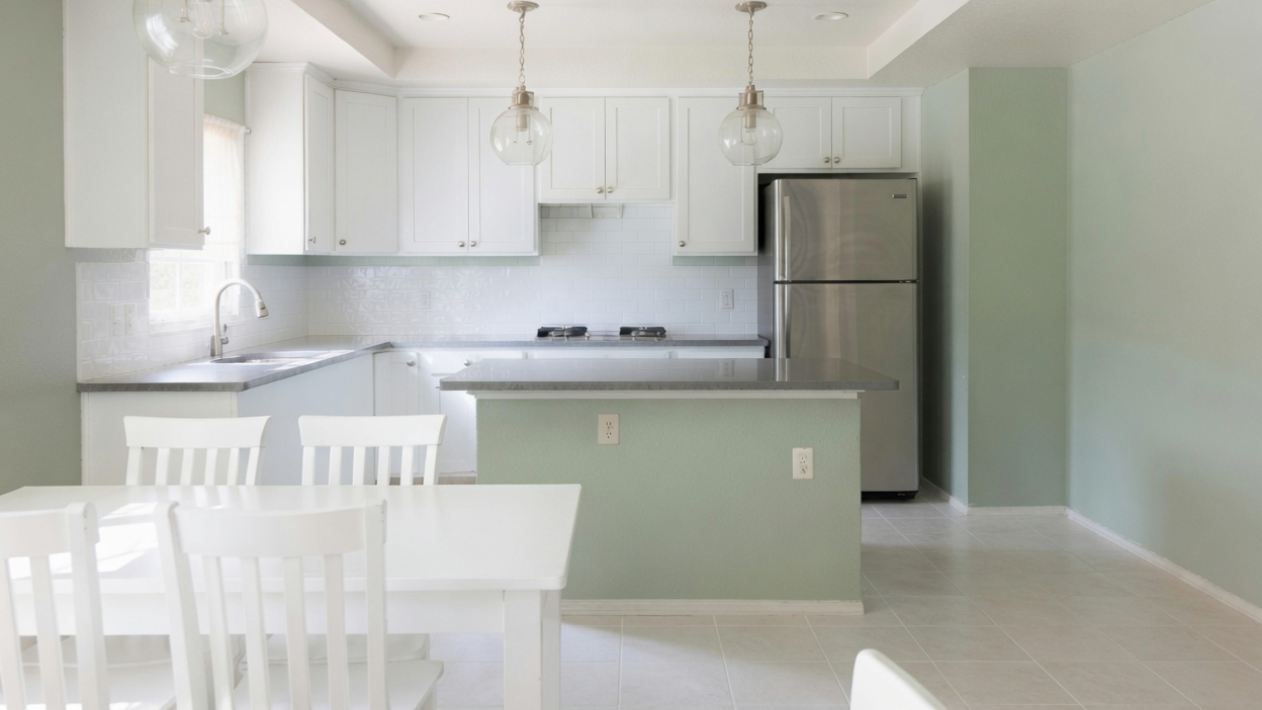
Mint and white sit close in value, which helps a small kitchen stay continuous. Gray counters and stainless appliances add a firmer middle note so the palette does not go washed out.
The risk is coolness with nothing to check it. North light, cool bulbs, blue-gray counters and mint paint together push a room toward the look of a school hallway. A warmer floor, or a gray with less blue in it, brings it back.
Works well in: small kitchens that need gentle color without strong contrast.
Watch for: mint picked from a screen. Subtle greens move more with light than almost any other family.
Black, White and Stone
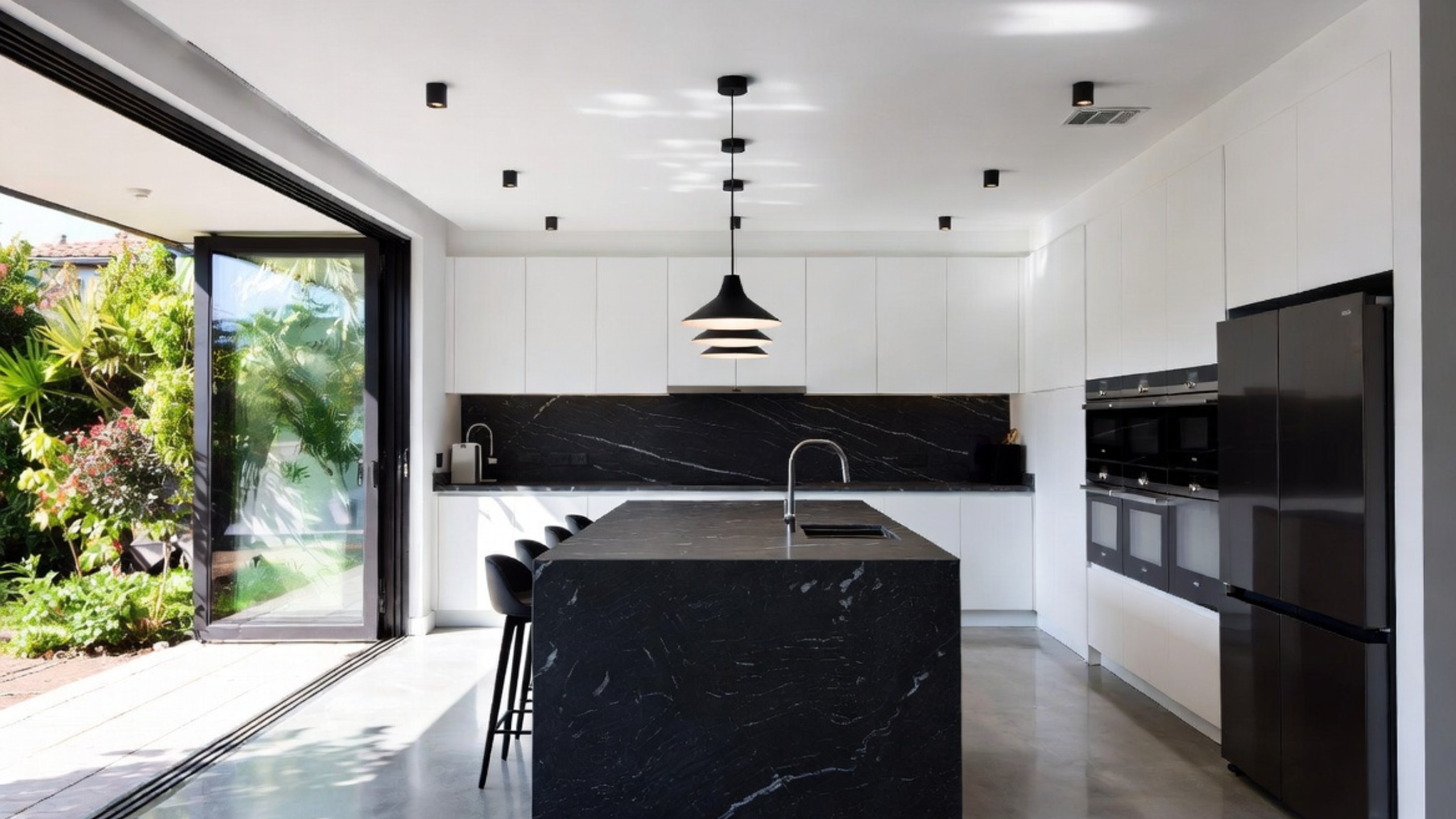
Black and white work when the proportion is controlled. White takes the larger background while black repeats on a smaller number of connected pieces. That repetition is what makes the dark finish look chosen rather than scattered.
The stone sets the character. Strong black-and-white veining makes the whole thing more graphic, and quieter stone calms it down. Warm wood flooring keeps the room from feeling stark, though it brings in a third temperature the white has to sit with.
Works well in: kitchens with strong task lighting and one clearly defined dark island or cabinet bank.
Watch for: black on the floor, the cabinets and the counter at once. After sunset you lose track of where the work surface ends.
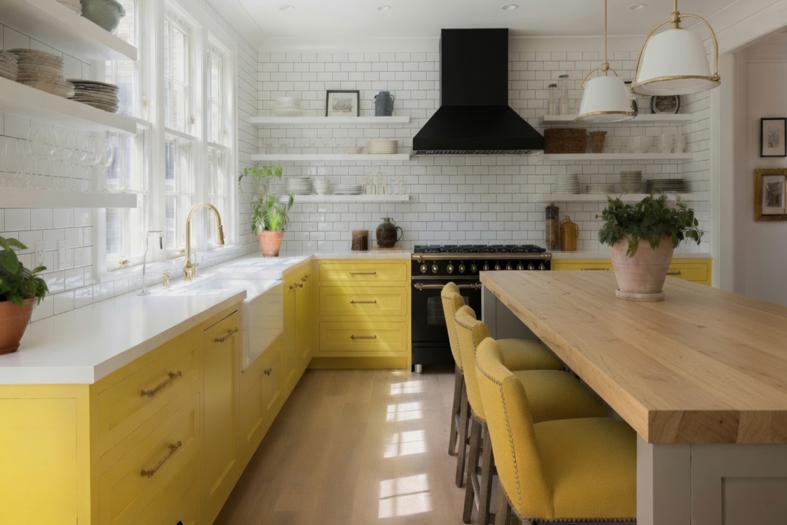
Yellow, White and Natural Wood
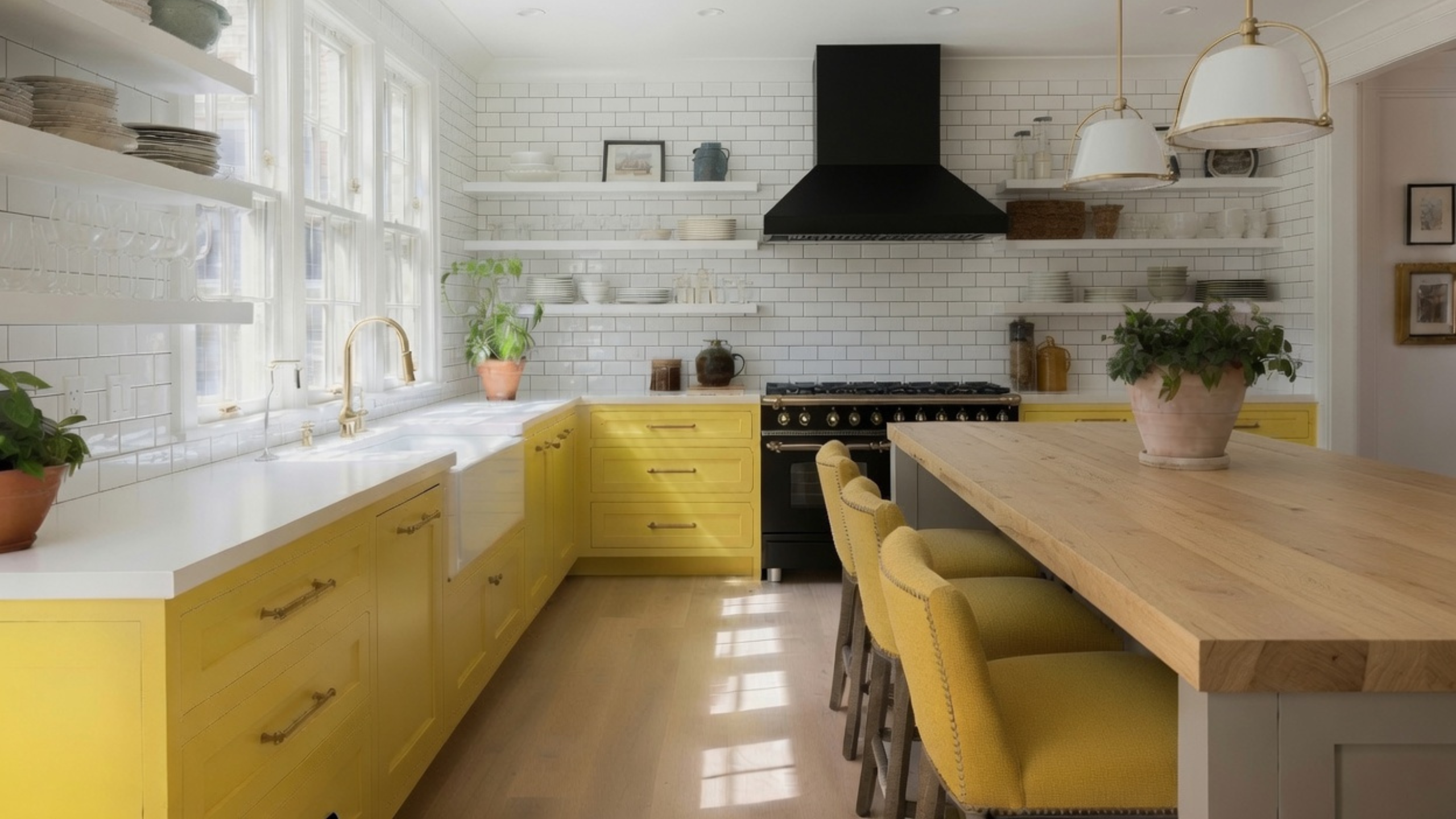
Yellow works when you limit its territory. Lower cabinets or one freestanding unit can carry it while white walls and tile give relief. Wood keeps the set warm without adding a second painted color.
Yellow gets stronger under warm lamps and next to golden oak. A shade that looks muted at noon can be much louder at nine at night. Test it under the bulbs you plan to keep before you commit it to a long run of doors.
Works well in: kitchens where you want a cheerful color held to one area.
Watch for: yellow doors, cream counters, golden floors and 2700K bulbs merging into a single cast.
If painted yellow cabinetry is more commitment than you want, keep the permanent finishes white and wood and move the mustard onto stools, dishes or lighting. Accessories need the same discipline. Repeat one accent two or three times and stop. Five unrelated accents make a neutral kitchen busier than one painted island ever would.
An Existing Kitchen and a Full Remodel Start in Different Places
In an existing kitchen, start with the costliest thing that is staying. That is usually the floor, the countertop or the wood cabinetry. Bring candidate colors to it, in that order.
In a full remodel there may be no fixed finish yet, which is harder, not easier. Do not pick each item on its own. Start with the material that varies most from slab to slab or board to board, often natural stone or a distinctive wood, and build the rest around it. Approve cabinet door, countertop, backsplash and flooring as one physical group before any order goes in.
Wall paint comes near the end. It has thousands of options and it is the cheapest surface to redo. Choose it first and you spend the rest of the project asking expensive materials to match the one thing that was always flexible.
Test the Whole Group Under the Same Light
A cabinet sample approved in a showroom, stone approved in a warehouse and tile approved from a phone photo have never been tested together.
Bring the physical samples into the kitchen. Stand the cabinet door upright, since a sample lying flat catches light differently. Lay the counter sample flat. Hold the backsplash behind it and put the flooring below. That puts each material roughly where it will sit in the finished room.
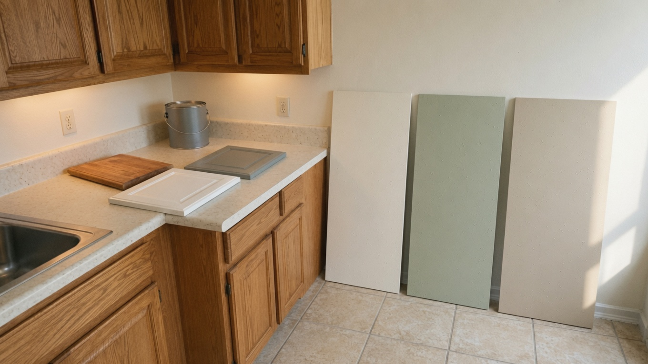
Look at the group near the window, at the dark end of the cabinet run and under the under-cabinet lights. Look again after sunset. Sherwin-Williams sets out how the direction of daylight, the time of day and the paint sheen all change how a color appears.[1]
Settle the bulb temperature before you approve anything. Mixed warm and cool lamps make one cabinet run look like two colors.
Bulb quality counts as much as bulb color, and it is the part most people skip. CRI, the color rendering number on the box, is an average of eight test colors, and all eight are muted. Saturated red is scored separately as R9 and left out of that average. Most bulbs sold at CRI 80 run an R9 near 0. At CRI 90 it is around 50, and at CRI 95 around 90.[3] Red is a large part of what makes oak, walnut, cherry, brick and terracotta look like themselves, so the R9 figure decides whether your wood reads warm or brown after dark. Most bulbs on a hardware store shelf are CRI 80, and Waveform Lighting recommends against them in kitchens, under-cabinet strips included.[3] Ask for the R9 number, since two bulbs with the same CRI can handle red very differently.
The View From the Next Room
Samples usually get judged while you stand at the counter. That is not the view you live with most of the time.
Step into the hallway, the family room or the dining area. From there the floor is often the largest colored surface in sight. An island can block the lighter perimeter cabinets so only the dark finish shows. In an open plan, the kitchen wall color sits directly beside upholstery, brick or wood belonging to another room.
Take one photo from every doorway before you approve the palette. Look for hard transitions and for repeats you did not plan. A green island can be balanced inside the kitchen and still argue with a blue-gray fireplace wall ten feet away. A black cabinet bank can look sharp up close and turn into a dark rectangle from the sofa.
This check matters most where a new kitchen floor stops at an opening. Those two floors meet every day. Their undertones and plank directions will affect the palette far more than a faucet or a pendant finish.
A Practical Approval Order
- Identify what is staying. Record the undertone, value, pattern and sheen of each fixed finish.
- Choose the leader. Decide whether the cabinets, stone, wood or backsplash carries the strongest character.
- Build value separation. Check that the major surfaces are not all crowding the same light, middle or dark band.
- Approve cabinet and countertop together. This is the largest and most expensive relationship in the room.
- Add the floor and backsplash. Review the actual joints, not separate samples.
- Set the lighting. Do not judge final colors under temporary or mismatched bulbs.
- Select wall paint. Use it to balance the fixed group instead of making the group follow the wall.
- Finish with metals and accents. Hardware, stools and accessories reinforce a combination. They do not repair one.
Leave the samples in place for several days. A group that survives cloudy daylight, direct sun, evening lamps and the view from the next room is worth more than one that looked right for ten minutes on a showroom table.
FAQ
How many colors should a kitchen have?
There is no set number, because wood, stone and metal all register as color. Most kitchens are easier to control with one dominant background, one supporting color or material, and one smaller accent. Count pattern and strong grain as activity even when they are technically neutral.
Should countertops be lighter or darker than cabinets?
Either works. A lighter counter makes the work surface easier to read above dark cabinets, and a dark counter grounds light cabinetry. What matters is enough separation between the two, plus a workable relationship with the floor and backsplash.
Should the backsplash match the countertop?
It does not have to match, but the two meet along a long visible joint. If the counter is strongly veined, a quieter backsplash is easier to control. If the counter is simple, the tile can carry more pattern or color.
Can warm and cool colors be mixed in a kitchen?
Yes. Warm wood with muted blue is the familiar example. Include a bridge that relates to both, such as a balanced stone, a warm white or a quiet gray-beige. Test the materials together so the contrast reads as a decision.
What is the safest kitchen color combination?
None of them is safe in every room. Warm white, natural wood and a quiet stone are the most flexible, and they can still disagree if the white is too cold or the stone carries an undertone you did not expect. The safest combination is the physical group that works with your fixed finishes and your final lighting.
Can a small kitchen use dark cabinets?
Yes. Keep the countertop readable, put in good task lighting and control the other high-contrast surfaces. Dark lowers with lighter uppers or walls usually sit better than a dark finish on every cabinet.