
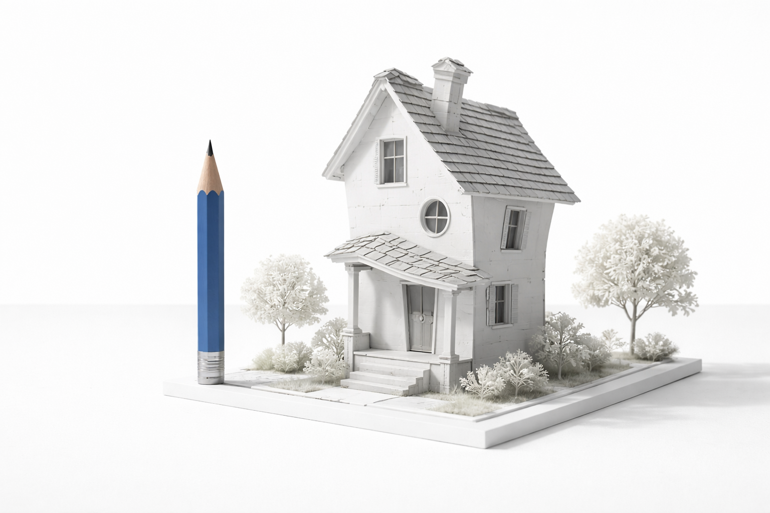
“Funny architecture” is usually a search made by someone who wants one of two things: something worth looking at (weird buildings, quirky buildings, novelty buildings)… or a concept they can actually use for a project without it turning into a leak-prone money pit.
This page is for both. It treats funny architecture as a real design-and-delivery problem: icon vs maintenance, attention vs code, “fun form” vs boring water management.
What This Covers:
- What “funny architecture” usually means in real projects
- The common types people search for (and why they exist)
- The failure patterns that show up after the photos
- The decisions that make quirky buildings survive
- A quick checklist and FAQ based on repeated real questions
The Big Misunderstanding
Funny architecture is just “a wild shape.” If it looks good, it works.
The shape is the easy part. The hard part is everything the camera doesn’t show: waterproofing continuity, thermal movement, code paths, maintenance access, and how fast custom parts become “no longer available.”
If you want a quirky building that lasts, you design two things at the same time: the joke (the form) and the boring survival layer behind it (the enclosure and maintenance plan).
Why People Build It
Funny architecture survives in the US because it solves a business problem.
Drive-By Attention
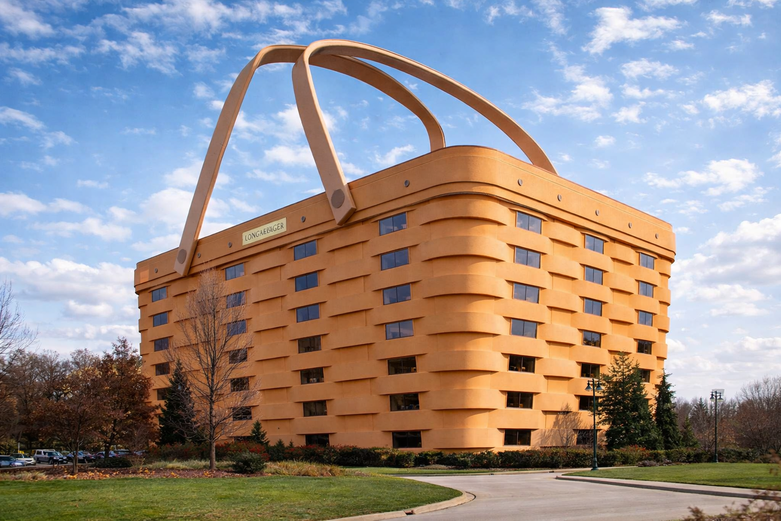
Roadside and retail projects use unusual form as advertising. The building becomes the sign. It’s the oldest trick in commercial architecture, and it still works when you’re fighting for attention.
Tourism And Local Identity
A town wants a landmark. A museum wants a hook. A brand wants “the photo everyone takes.” Quirky buildings can become part of a place’s identity fast.
Client Psychology
Some clients want delight. Not “luxury.” Delight. The building is part product, part experience.
What Counts As Funny
Most “funny architecture” searches cluster into a few repeatable categories. If you’re writing or designing, these are the buckets that actually show up in real discussions.
Object Buildings
Buildings shaped like what they sell or what they are “about.” Shoe, donut, coffee pot, fruit, animal, tool, etc. They’re memorable because they’re literal.
Upside-Down And Tilted Forms
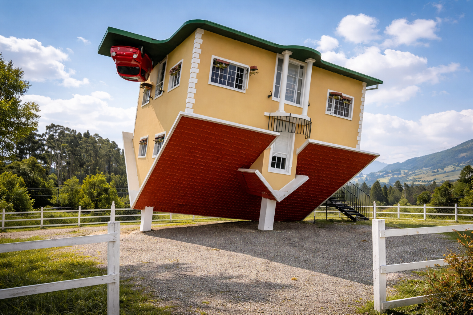
The “gravity is wrong” trick. Upside-down houses. Leaning facades. Skewed windows. The goal is disorientation without actually being unsafe.
Cartoon Proportions
Oversized doors. Tiny windows. Big eyes. Exaggerated rooflines. It reads as playful because it breaks the normal human scale rules on purpose.
Playable Buildings
Slides instead of stairs, crawl-through spaces, interactive surfaces. These only work when accessibility and egress are handled cleanly.
Decorated Sheds
A normal, efficient structure that carries the humor through graphics, signage, color, lighting, cladding, or a single “feature object.” This is often the most durable option for small budgets.
What Usually Goes Wrong
This is the part people don’t post when they share the photo.
Leaks At Weird Junctions
Funny forms create too many edges, seams, inside corners, and transitions. Water finds the weak point. It always does.
Failure timing: often first big storm, first freeze-thaw season, or year 2 when sealants age and movement shows up.
Thermal Movement Cracks
Curved cladding, mixed materials, and “non-standard” assemblies move differently with heat. If the joints aren’t designed for movement, you get cracks, gaps, oil-canning, and fastener issues.
Failure timing: first summer/winter swing, then it gets worse every year.
Maintenance Is Impossible
The shape looks great, but you can’t safely reach the gutters, drains, lighting, signage, or high panels without renting equipment every time. The building becomes expensive to keep alive.
Custom Parts Become Orphans
Custom windows, curved glazing, specialty panels, one-off fixtures. When they break, the replacement is slow, expensive, or discontinued. That’s when “quirky” becomes “patchwork.”
Code Surprises
The design is playful, but egress, fire separation, accessibility, and occupancy requirements don’t care about playful. If those paths aren’t solved early, the project either gets redesigned late or ends up with awkward compromises.
Budget Drift
Funny architecture is usually sold as “one big idea.” Then procurement happens. Custom fabrication quotes land. Engineering gets involved. Suddenly it’s not funny anymore.
Failure timing: cost drift shows up as soon as you move from renderings to shop drawings and actual bids.
Design Decisions That Work
If you’re going to keep a “funny architecture” page, it needs the decisions. Not just examples.
Pick The Right Strategy
Trade-off: icon strength vs durability and cost.
- Full Object Building: strongest icon, highest risk and cost. Best when tourism/branding payoff is huge.
- Partial Object Feature: one obvious “signal” (roofline, entry volume, facade element). Often the best compromise.
- Decorated Shed: normal structure with a strong graphic/sign element. Cheapest to build and easiest to maintain.
If the project has a normal budget and a normal maintenance plan, the decorated-shed approach wins more often than people expect.
Make Water Boring
Funny buildings fail from water first. Not aesthetics. Not structure.
Practical rule: design a continuous water-shedding layer behind the joke. Treat the “fun skin” as replaceable.
- Continuous drainage plane
- Simple flashing logic you can actually build
- Joints designed for movement (not just caulk hope)
- Real slope to drains and gutters (no “flat because it looks clean”)
Control Custom Geometry
Custom geometry is the cost multiplier. The trick is to fake complexity with repeatable parts.
- Use repeating panel sizes even on curved surfaces (faceting works better than perfect curves)
- Limit custom windows and doors (custom glazing is where budgets go to die)
- Keep the “odd” parts mostly cosmetic and removable
Engineer Early
Funny forms create unusual load paths and weird cantilevers. If you push engineering late, you get redesign.
Sequence: concept form first, then structural and enclosure feasibility immediately after. Don’t wait until “design development” to ask if it can be built.
Design For Access
If you can’t access it, it won’t get maintained. And then it fails.
- Access panels where services actually run
- Safe roof access or defined lift points
- Lighting and signage that can be serviced without a circus
Plan The Code Path
Funny architecture gets easier when the code story is simple.
- Confirm occupancy and egress early
- Don’t “invent” stairs, ramps, or exits without checking accessibility and life safety requirements
- If the building is public-facing, assume scrutiny goes up, not down
Real Examples To Steal From
These are useful because they’re clear signals. You can explain the concept in one sentence, which is usually the test.
Kansas City “Book Spine” Garage
A parking garage that reads like a shelf of giant book spines. It’s not subtle, and that’s the point: it turns dead frontage into a civic billboard.
Elephant Building, Bangkok
Elephant-shaped massing at tower scale. The “legs” and “trunk” are readable from a distance, which is why people remember it.
Piano & Violin House, Huainan
Literal instrument forms. A grand piano paired with a transparent violin volume. It’s a pure “you will photograph this” object-building.
The Crooked House, Sopot
Melting/storybook facade. It looks like a cartoon, but it’s still a working commercial building, which is why it survives as more than a gag.
Robot Building, Bangkok
A tower with a robot face and “eyes.” It’s architecture as character, tied to a very specific era of tech optimism.
Binoculars Building, Los Angeles
Giant binoculars as an entry volume. It’s basically a piece of street-level sculpture that also solves a doorway problem.
Duck-Shaped Buildings
The “Big Duck” style shows up everywhere: simple form, immediate recognition, roadside logic. It’s the cleanest case study for “building as sign.”
Toilet, Teapot, Shoe, Fish Buildings
Classic novelty roadside architecture. Most are goofy on purpose. The good ones still get the envelope and drainage right.
Cube Houses, Rotterdam
Weird but iconic: tilted cubes that still function as housing. This is the useful version of “odd form,” because people actually live there.
Upside-Down House Attractions
Tourism-first buildings designed for photos. The concept is obvious. The business model is volume and churn.
Detail People Miss
Situation: a quirky form with lots of seams and transitions.
What people do wrong: they treat the exterior as one continuous sculpture, then expect sealant to do the waterproofing job.
The correct move (sequence matters): build a conventional, continuous weather-resistive strategy first, then “hang” the funny skin as a secondary layer with drainage and movement joints.
What it prevents: early leaks (first storm), joint cracking (first season swing), and the year-2 “why is this failing already?” spiral.
Limits: this only works if detailing is disciplined. If the funny skin gets treated like a one-off art project with no drainage logic, the building will still lose.
Worth Angle
If ~1,000 people a month are searching “funny architecture,” you don’t need a course outline. You need a page that wins the intent.
- For readers: a clean framework for weird buildings that’s more useful than a listicle.
- For students: a way to talk about novelty architecture without sounding like it’s “just silly.”
- For real projects: the failure patterns and decisions that make playful buildings survive.
That’s the hook. “Look at these weird buildings” is entertainment. “Here’s how they work (or fail)” is value.
Quick Checklist
- Decide early: full object, partial feature, or decorated shed
- Write the maintenance plan before you lock the form
- Design the water layer first, not last
- Limit custom glazing and one-off parts
- Detail movement joints like you expect seasons to exist
- Confirm occupancy, egress, and accessibility early
- Engineer the weird geometry before you sell the concept
- Make service access boring and obvious
- Keep the “fun” layer replaceable
- Budget custom fabrication honestly, not optimistically
FAQ
What Is Funny Architecture
In practice, it usually means novelty or quirky architecture: buildings designed to be memorable on purpose through shape, proportion, signage, or a single exaggerated idea. The best versions still behave like real buildings: dry, safe, maintainable.
Is It Real Architecture
Yes. The difference is intent. Funny architecture is often communication-first (attention, identity, tourism). The professional challenge is making the communication layer not sabotage the building layer.
Why Do Weird Buildings Leak
Because weird forms create more seams, corners, transitions, and thermal movement. If the waterproofing strategy relies on sealant alone, it will fail. Often early.
What Is The Cheapest Way
A decorated-shed approach: a normal structure with one strong feature element (entry volume, roof gesture, facade graphic, oversized sign). You get attention without custom-building the whole envelope.
Can You Make It Code Compliant
Usually yes, but you solve the code path early. Egress, accessibility, and fire/life safety requirements don’t care that the building is playful. If you ignore them, you’ll redesign late.
What Makes One Worth Visiting
The form gets you to stop. The experience keeps it alive: clear entry, good circulation, comfort, and details that don’t feel cheap up close. If it only works from one camera angle, it usually disappoints in person.
How Do Architects Get Ideas
Most of the time it’s one clear signal: a literal object, a distorted familiar form, or a “rule break” (scale, gravity, proportion). The better projects keep the idea simple enough that the building can still be built and maintained.
Next Steps
If you keep a funny architecture page, keep it honest: show the categories people actually search for, then teach the real constraints that make the buildings survive. That’s the difference between a disposable listicle and a page that earns links and repeat traffic.